
1. Before you begin
From the start, Jetpack Compose was designed with View interoperability, which means that Compose and the View system can share resources and work together side by side to display the UI. This functionality lets you add Compose to your existing View-based app. That means Compose and Views can co-exist in your codebase until your entire app is fully in Compose.
In this codelab, you change the view-based list item in the Juice Tracker app to Compose. You can convert the rest of Juice Tracker's views on your own, if you wish.
If you have an app with a View-based UI, you might not want to rewrite its entire UI all at once. This codelab helps you convert a single view in a view-based UI to a Compose element.
Prerequisites
- Familiarity with a View-based UI.
- Knowledge of how to build an app using a View-based UI.
- Experience with the Kotlin syntax, including lambdas.
- Knowledge of how to build an app in Jetpack Compose.
What you'll learn
- How to add Compose to an existing screen that was built with Android views.
- How to preview a Composable added to your View-based app.
What you'll build
- You convert a View-based list item to Compose in the Juice Tracker app.
2. Starter app overview
This codelab uses the Juice Tracker app solution code from the Build an Android App with Views as the starter code. The starter app already saves data using the Room persistence library. The user can add juice info to the app database, like juice name, description, color, and rating.
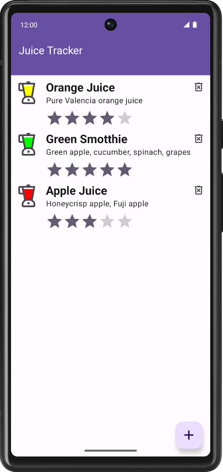
In this codelab, you convert the view-based list item to Compose.
Download the starter code for this codelab
To get started, download the starter code:
Alternatively, you can clone the GitHub repository for the code:
$ git clone https://github.com/google-developer-training/basic-android-kotlin-compose-training-juice-tracker.git
$ cd basic-android-kotlin-compose-training-juice-tracker
$ git checkout views
You can browse the code in the JuiceTracker GitHub repository.
3. Add Jetpack Compose library
Recollect, Compose and Views can exist together on a given screen; you can have some UI elements in Compose and others in the View system. For example, you can have only the list in Compose, while the rest of the screen is in the View system.
Complete the following steps to add the Compose library to the Juice Tracker app.
- Open the Juice Tracker in Android Studio.
- Open the app-level
build.gradle.kts. - Inside the
buildFeaturesblock, add acompose = trueflag.
buildFeatures {
    //...
    // Enable Jetpack Compose for this module
    compose = true
}
This flag enables Android Studio to work with Compose. You have not done this step in the previous codelabs because Android Studio automatically generates this code when you create a new Android Studio Compose template project.
- Below the
buildFeatures, add thecomposeOptionsblock. - Inside the block, set
kotlinCompilerExtensionVersionto"1.5.1"to set the Kotlin compiler version.
composeOptions {
    kotlinCompilerExtensionVersion = "1.5.1"
}
- In the
dependenciessection, add Compose dependencies. You need the following dependencies to add Compose to a View based app. These dependencies help integrate Compose with the Activity, add the Compose design components library, support Compose Jetpack theming, and provide tools for better IDE support.
dependencies {
    implementation(platform("androidx.compose:compose-bom:2023.06.01"))
    // other dependencies
    // Compose
    implementation("androidx.activity:activity-compose:1.7.2")
    implementation("androidx.compose.material3:material3")
    implementation("com.google.accompanist:accompanist-themeadapter-material3:0.28.0")


    debugImplementation("androidx.compose.ui:ui-tooling")
}
Add ComposeView
A ComposeView is an Android View that can host Jetpack Compose UI content. Use setContent to supply the content composable function for the view.
- Open the
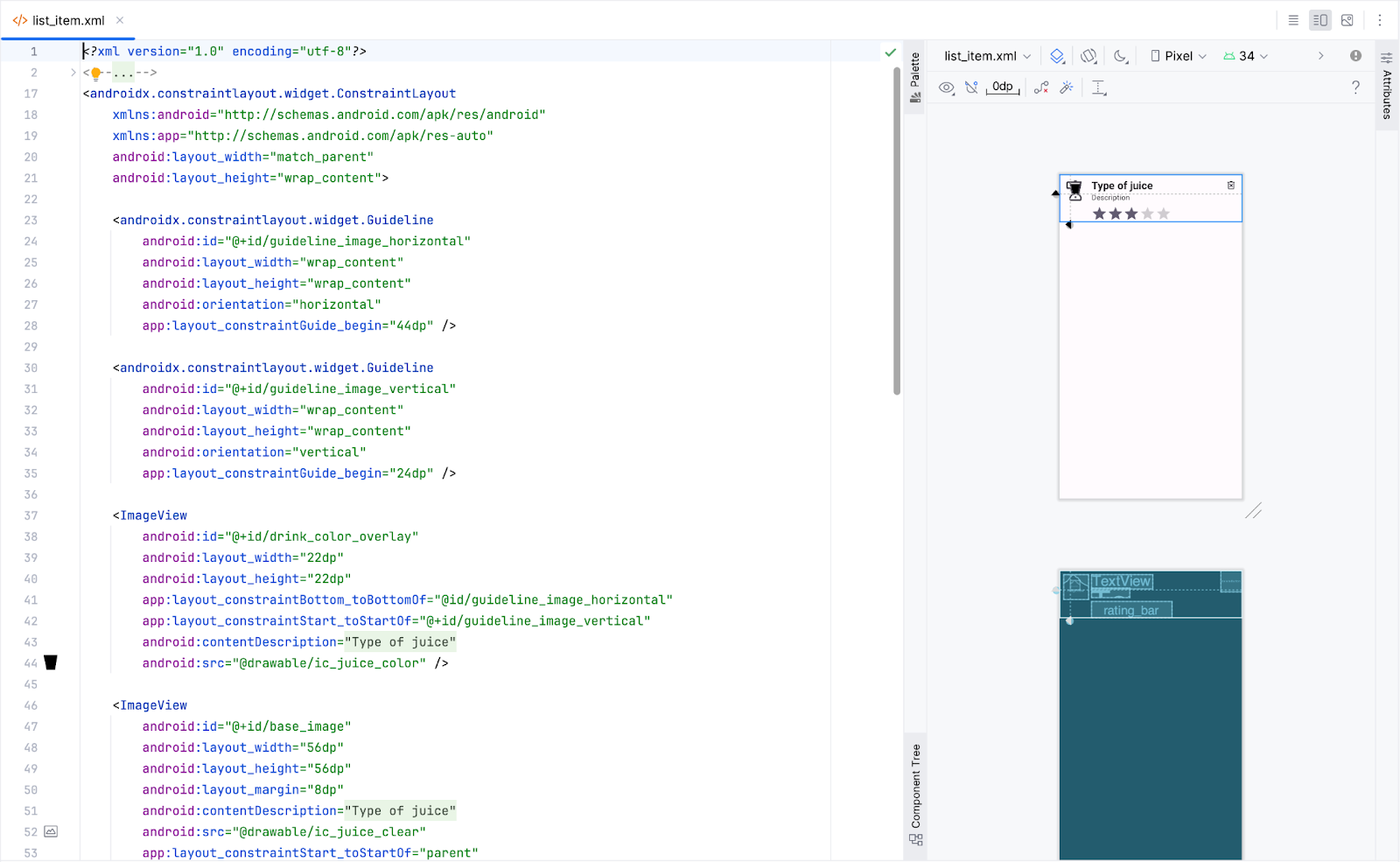
layout/list_item.xmland view the preview in the Split tab.
By the end of this codelab, you will replace this view with a composable.
- In
JuiceListAdapter.kt, removeListItemBindingfrom everywhere. In theJuiceListViewHolderclass, replacebinding.rootwithcomposeView.
import androidx.compose.ui.platform.ComposeView

class JuiceListViewHolder(
    private val onEdit: (Juice) -> Unit,
    private val onDelete: (Juice) -> Unit
): RecyclerView.ViewHolder(composeView)
- In the
onCreateViewHolder()folder, update thereturn()function to match the following code:
override fun onCreateViewHolder(parent: ViewGroup, viewType: Int): JuiceListViewHolder {
   return JuiceListViewHolder(
       ComposeView(parent.context),
       onEdit,
       onDelete
   )
}
- In the
JuiceListViewHolderclass, delete all theprivatevariables and remove all the code from thebind()function. YourJuiceListViewHolderclass now looks like the following code:
class JuiceListViewHolder(
    private val onEdit: (Juice) -> Unit,
    private val onDelete: (Juice) -> Unit
) : RecyclerView.ViewHolder(composeView) {

   fun bind(juice: Juice) {

   }
}
- At this point, you can delete
com.example.juicetracker.databinding.ListItemBindingandandroid.view.LayoutInflaterimports.
// Delete
import com.example.juicetracker.databinding.ListItemBinding
import android.view.LayoutInflater
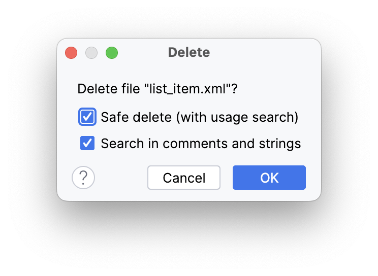
- Delete the
layout/list_item.xmlfile. - Select OK in the Delete dialog.
4. Add composable function
Next, you create a composable that emits the list item. The Composable takes Juice and two callback functions to edit and to delete the list item.
- In
JuiceListAdapter.kt, after theJuiceListAdapterclass definition, create a composable function calledListItem(). - Make the
ListItem()function accept theJuiceobject and a lambda callback for delete.
import androidx.compose.runtime.Composable
import androidx.compose.ui.Modifier


@Composable
fun ListItem(
    input: Juice,
    onDelete: (Juice) -> Unit,
    modifier: Modifier = Modifier
) {
}
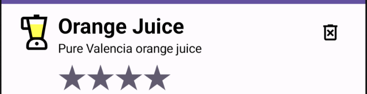
Take a look at the preview of the list item you want to create. Notice that it has a juice icon, juice details, and a delete button icon. You will be implementing these components shortly.
Create Juice icon composable
- In
JuiceListAdapter.kt, after theListItem()composable, create another composable function calledJuiceIcon()that takes acolorand aModifier.
@Composable
fun JuiceIcon(color: String, modifier: Modifier = Modifier) {

}
- Inside the
JuiceIcon()function, add variables for thecolorand the content description as shown in the following code:
@Composable
fun JuiceIcon(color: String, modifier: Modifier = Modifier) {
   val colorLabelMap = JuiceColor.values().associateBy { stringResource(it.label) }
   val selectedColor = colorLabelMap[color]?.let { Color(it.color) }
   val juiceIconContentDescription = stringResource(R.string.juice_color, color)

}
Using colorLabelMap and selectedColor variables you will retrieve the color resource associated with the user selection.
- Add a
Boxlayout to display two iconsic_juice_colorandic_juice_clearon top of each other. Theic_juice_coloricon has a tint and is aligned to the center.
import androidx.compose.foundation.layout.Box


Box(
   modifier.semantics {
       contentDescription = juiceIconContentDescription
   }
) {
   Icon(
       painter = painterResource(R.drawable.ic_juice_color),
       contentDescription = null,
       tint = selectedColor ?: Color.Red,
       modifier = Modifier.align(Alignment.Center)
   )
   Icon(painter = painterResource(R.drawable.ic_juice_clear), contentDescription = null)
}
Since you are familiar with the composable implementation, details about how it is implemented are not provided.
- Add a function to preview
JuiceIcon(). Pass the color asYellow.
import androidx.compose.ui.tooling.preview.Preview
@Preview
@Composable
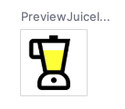
fun PreviewJuiceIcon() {
JuiceIcon("Yellow")
}
Create juice details composables
In the JuiceListAdapter.kt, you need to add another composable function to display the juice details. You also need a column layout to display two Text composables for the name and description, and a rating indicator. To do so, complete the following steps:
- Add a composable function called
JuiceDetails()that takes aJuiceobject and aModifier, and a text composable for juice name and a composable for juice description as shown in the following code:
import androidx.compose.foundation.layout.Arrangement
import androidx.compose.foundation.layout.Column
import androidx.compose.foundation.layout.padding
import androidx.compose.material3.MaterialTheme
import androidx.compose.material3.Text
import androidx.compose.ui.text.font.FontWeight


@Composable
fun JuiceDetails(juice: Juice, modifier: Modifier = Modifier) {
   Column(modifier, verticalArrangement = Arrangement.Top) {
       Text(
           text = juice.name,
           style = MaterialTheme.typography.h5.copy(fontWeight = FontWeight.Bold),
       )
       Text(juice.description)
       RatingDisplay(rating = juice.rating, modifier = Modifier.padding(top = 8.dp))
   }
}
- To resolve the unresolved reference error, create a composable function called
RatingDisplay().
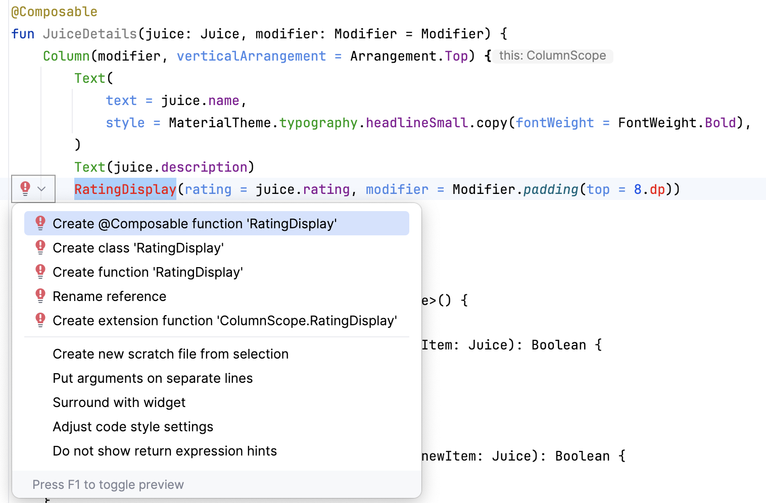
In the View system, you have a RatingBar to display the following rating bar. Compose doesn't have a rating bar composable so you need to implement this element from scratch.
- Define the
RatingDisplay()function to display the stars as per the rating. This composable function displays the number of stars based on the rating.

import androidx.compose.ui.res.painterResource
import androidx.compose.ui.res.pluralStringResource


@Composable
fun RatingDisplay(rating: Int, modifier: Modifier = Modifier) {
   val displayDescription = pluralStringResource(R.plurals.number_of_stars, count = rating)
   Row(
       // Content description is added here to support accessibility
       modifier.semantics {
           contentDescription = displayDescription
       }
   ) {
       repeat(rating) {
           // Star [contentDescription] is null as the image is for illustrative purpose
           Image(
               modifier = Modifier.size(32.dp),
               painter = painterResource(R.drawable.star),
               contentDescription = null
           )
       }
   }
}
To create the star drawable in Compose, you need to create the star vector asset.
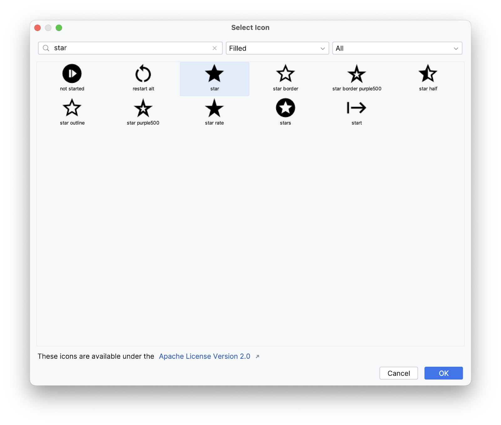
- In the Project pane, right click on drawable > New > Vector Asset.
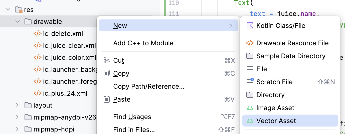
- In the Asset Studio dialog, search for a star icon. Select the filled-in star icon.
- Change the color value of the star to 625B71.
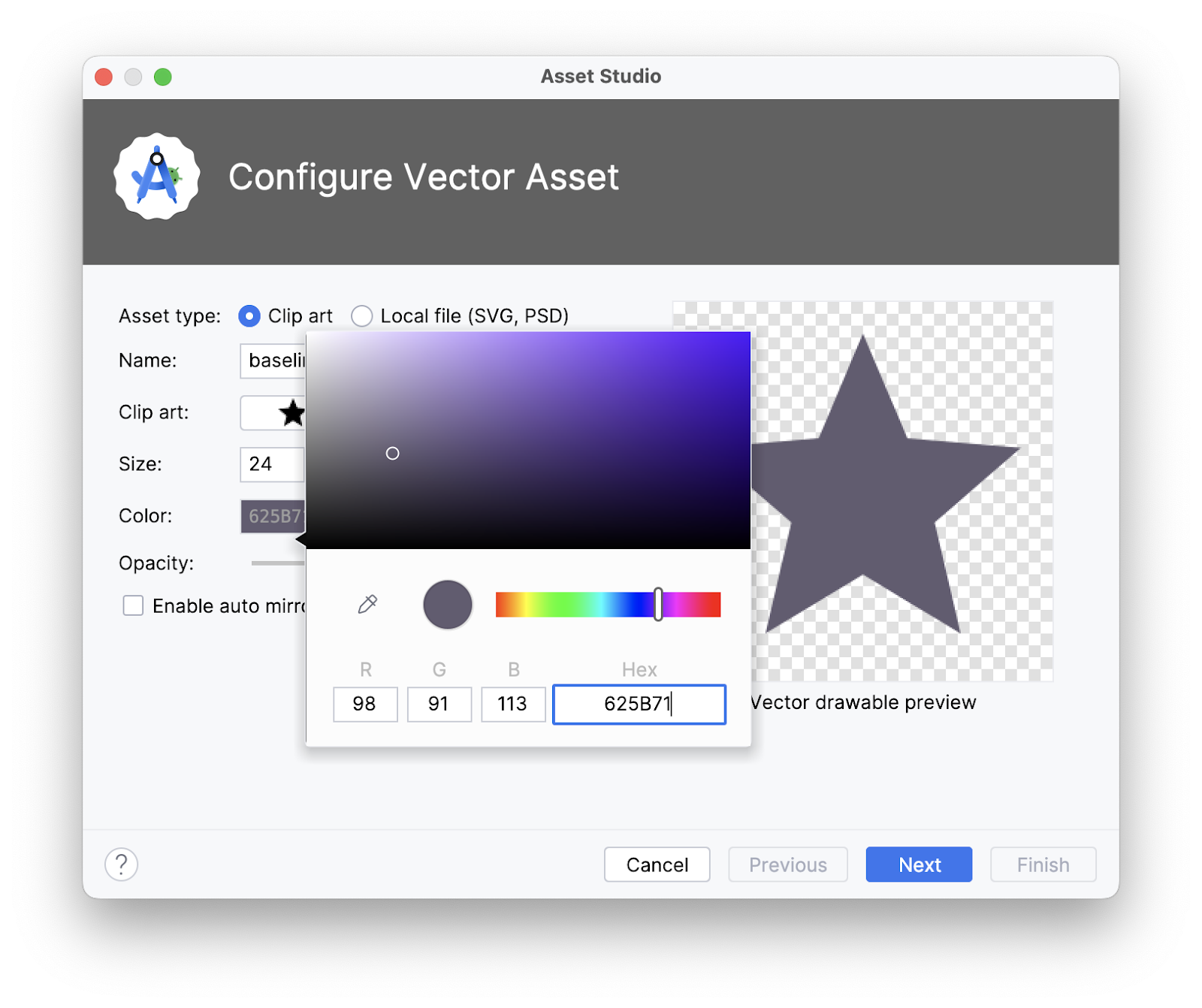
- Click Next > Finish.
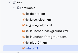
- Notice that a drawable appears in the
res/drawablefolder.
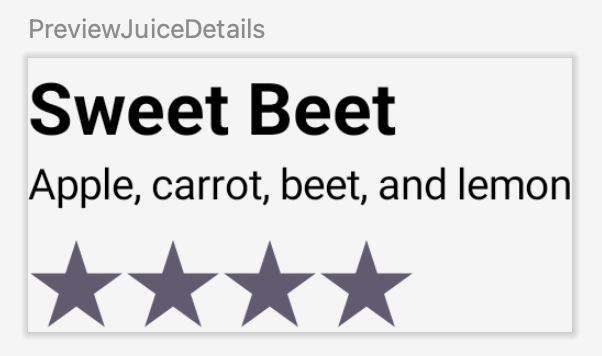
- Add a preview composable to preview the
JuiceDetailscomposable.
@Preview
@Composable
fun PreviewJuiceDetails() {
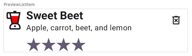
JuiceDetails(Juice(1, "Sweet Beet", "Apple, carrot, beet, and lemon", "Red", 4))
}
Create delete button composable
- In the
JuiceListAdapter.kt, add another composable function calledDeleteButton()that takes a lambda callback function and a Modifier. - Set the lambda to the
onClickargument and pass in theIcon()as shown in the following code:
import androidx.compose.ui.res.painterResource
import androidx.compose.material3.Icon
import androidx.compose.material3.IconButton


@Composable
fun DeleteButton(onDelete: () -> Unit, modifier: Modifier = Modifier) {
    IconButton(
        onClick = { onDelete() },
        modifier = modifier
    ) {
        Icon(
            painter = painterResource(R.drawable.ic_delete),
            contentDescription = stringResource(R.string.delete)
        )
    }
}
- Add a preview function to preview the delete button.
@Preview
@Composable
fun PreviewDeleteIcon() {
    DeleteButton({})
}

5. Implement ListItem function
Now that you have all the required composables to display the list item, you can arrange them in a layout. Notice the ListItem() function you defined in the previous step.
@Composable
fun ListItem(
   input: Juice,
   onEdit: (Juice) -> Unit,
   onDelete: (Juice) -> Unit,
   modifier: Modifier = Modifier
) {
}
In the JuiceListAdapter.kt, complete the following steps to implement the ListItem() function.
- Add a
Rowlayout insideMdc3Theme {}lambda.
import androidx.compose.foundation.clickable
import androidx.compose.foundation.layout.Arrangement
import com.google.accompanist.themeadapter.material3.Mdc3Theme

Mdc3Theme {
   Row(
       modifier = modifier,
       horizontalArrangement = Arrangement.SpaceBetween
   ) {

   }
}
- Inside the
Rowlambda, call the three composablesJuiceIcon,JuiceDetails,DeleteButtonyou created as child elements.
JuiceIcon(input.color)
JuiceDetails(input, Modifier.weight(1f))
DeleteButton({})
Passing the Modifier.weight(1f) to the JuiceDetails() composable ensures the juice details take up the horizontal space remaining after measuring unweighted child elements.
- Pass in the
onDelete(input)lambda and modifier with top alignment as parameters to theDeleteButtoncomposable.
DeleteButton(
   onDelete = {
       onDelete(input)
   },
   modifier = Modifier.align(Alignment.Top)
)
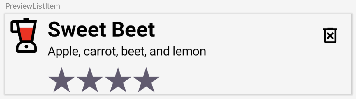
- Write a preview function to preview the
ListItemcomposable.
@Preview
@Composable
fun PreviewListItem() {
   ListItem(Juice(1, "Sweet Beet", "Apple, carrot, beet, and lemon", "Red", 4), {})
}
- Bind the
ListItemcomposable to the view holder. CallonEdit(input)inside theclickable()lambda function to open the edit dialog when the list item is clicked.
In the JuiceListViewHolder class, inside the bind() function, you need to host the composable. You use ComposeView, which is an Android View that can host Compose UI content using its setContent method.
fun bind(input: Juice) {
    composeView.setContent {
        ListItem(
            input,
            onDelete,
            modifier = Modifier
                .fillMaxWidth()
                .clickable {
                    onEdit(input)
                }
                .padding(vertical = 8.dp, horizontal = 16.dp),
       )
   }
}
- Run the app. Add your favorite juice. Notice the shiny compose list item.
 .
. 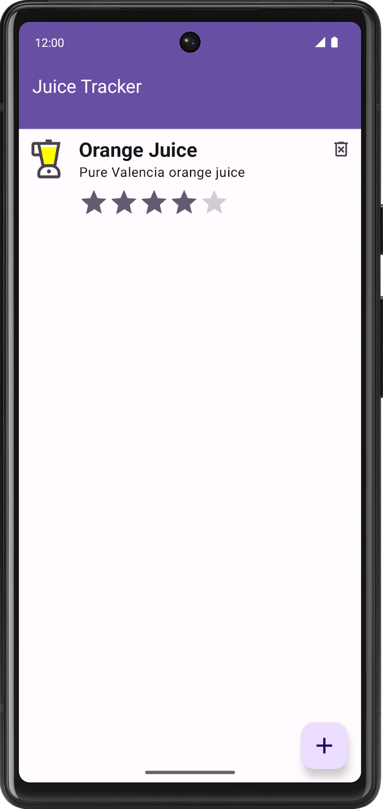
Congratulations! You just created your first Compose interoperability app that uses Compose elements in a view-based app.
6. Get the solution code
To download the code for the finished codelab, you can use these git commands:
$ git clone https://github.com/google-developer-training/basic-android-kotlin-compose-training-juice-tracker.git
$ cd basic-android-kotlin-compose-training-juice-tracker
$ git checkout views-with-compose
Alternatively, you can download the repository as a zip file, unzip it, and open it in Android Studio.
If you want to see the solution code, view it on GitHub.
7. Learn more
Android Developer Documentation
- Tools for Compose | Jetpack Compose | Android Developers
- Interoperability APIs | Jetpack Compose | Android Developers
- Migration strategy | Jetpack Compose | Android Developers
Codelab [Intermediate]