
1. 事前準備
恭喜!在這個課程中,您已瞭解 Material Design 的基本概念,以及如何在應用程式中加入簡單動畫。現在就開始應用所學吧!
在這個練習題中,您將根據此課程中所學概念建立超級英雄應用程式。此應用程式主要是利用「使用 Jetpack Compose 進行 Material Design 主題設定」程式碼研究室所教導的 Material Design 原則,建構可捲動清單和精美 UI 所需的元件。
雖然解決方案程式碼就在這個練習的結尾處,但請先試著解決練習中的問題再查看。請將這些解決方案視為一種實作應用程式的方式。您還有許多進步的空間,因此歡迎您盡量嘗試不同的方式和設計。
請依照自己的步調逐一瞭解問題所在。建議您花些時間仔細思考每個問題的解決方法。
必要條件
- 透過 Jetpack Compose 簡易動畫完成 Compose 課程作業中的 Android 基本概念學習。
軟硬體需求
- 已安裝 Android Studio 且具備網路連線能力的電腦。
建構項目
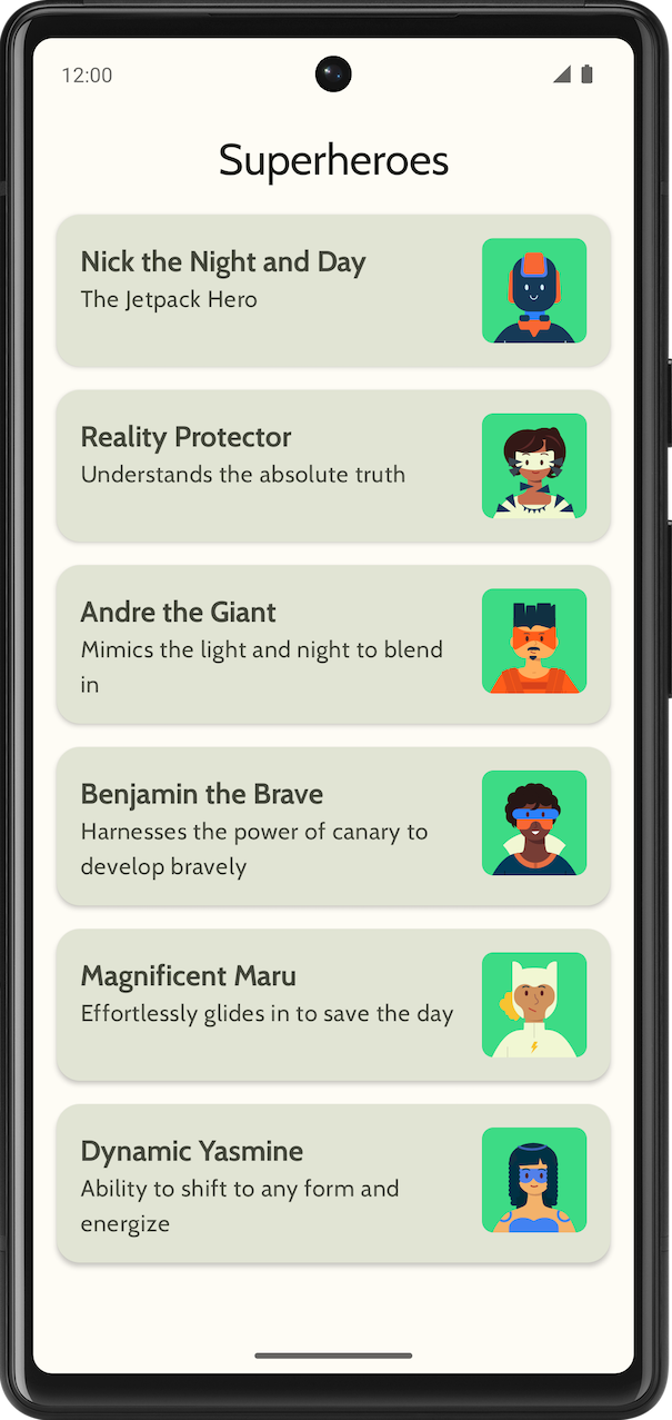
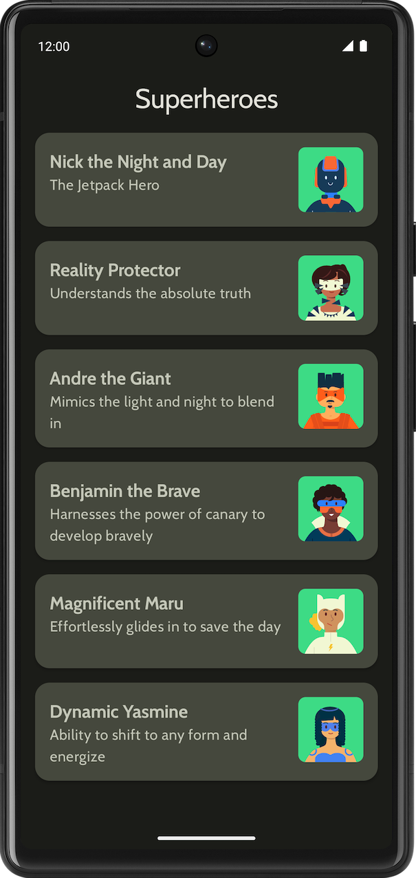
顯示超級英雄清單的超級英雄應用程式。
最終應用程式在淺色和深色主題中應有下列外觀:
|
|
2. 開始操作
在這項工作中,您要設定專案,為超級英雄建立虛擬資料。
- 使用「Empty Activity」範本建立新專案,並將最低 SDK 設為 24。
- 您可以點選這個連結下載應用程式的素材資源,包括超級英雄圖片和應用程式標誌。請參考「變更應用程式圖示」程式碼研究室,複習如何新增應用程式圖示。如要複習如何在應用程式中加入圖片,請參考「建立互動式 Dice Roller 應用程式」程式碼研究室。
- 前往 https://fonts.google.com 下載 Cabin 粗體和 Cabin 一般字型檔案。歡迎瀏覽各種可以使用的字型檔案。另外,請參考「使用 Jetpack Compose 進行 Material Design 主題設定」程式碼研究室,瞭解如何自訂應用程式中的字體。
- 建立資料類別,存放每個超級英雄的資料。您可以為
Hero資料類別建立名為model的新套件,方便整理程式碼。清單項目的外觀應如下所示:
每個超級英雄清單項目都會顯示三段不重複的資訊:名稱、說明和圖片。
- 在同一個
model套件中,為要顯示的所有英雄資訊建立另一個檔案,這些資訊包括名稱、說明和圖片資源。以下是供您參考的範例資料集。
object HeroesRepository {
    val heroes = listOf(
        Hero(
            nameRes = R.string.hero1,
            descriptionRes = R.string.description1,
            imageRes = R.drawable.android_superhero1
        ),
        Hero(
            nameRes = R.string.hero2,
            descriptionRes = R.string.description2,
            imageRes = R.drawable.android_superhero2
        ),
        Hero(
            nameRes = R.string.hero3,
            descriptionRes = R.string.description3,
            imageRes = R.drawable.android_superhero3
        ),
        Hero(
            nameRes = R.string.hero4,
            descriptionRes = R.string.description4,
            imageRes = R.drawable.android_superhero4
        ),
        Hero(
            nameRes = R.string.hero5,
            descriptionRes = R.string.description5,
            imageRes = R.drawable.android_superhero5
        ),
        Hero(
            nameRes = R.string.hero6,
            descriptionRes = R.string.description6,
            imageRes = R.drawable.android_superhero6
        )
    )
}
- 在 strings.xml 檔案中加入英雄名稱和說明字串。
<resources>
    <string name="app_name">Superheroes</string>
    <string name="hero1">Nick the Night and Day</string>
    <string name="description1">The Jetpack Hero</string>
    <string name="hero2">Reality Protector</string>
    <string name="description2">Understands the absolute truth</string>
    <string name="hero3">Andre the Giant</string>
    <string name="description3">Mimics the light and night to blend in</string>
    <string name="hero4">Benjamin the Brave</string>
    <string name="description4">Harnesses the power of canary to develop bravely</string>
    <string name="hero5">Magnificent Maru</string>
    <string name="description5">Effortlessly glides in to save the day</string>
    <string name="hero6">Dynamic Yasmine</string>
    <string name="description6">Ability to shift to any form and energize</string>
</resources>
3. Material Design 主題設定
在本節中,您將新增應用程式的調色盤、字體排版及形狀,提升應用程式的外觀和風格。
以下顏色、類型和形狀只是系統根據主題提供的建議。您可以探索及修改各種色彩配置。
請使用 Material 主題建構工具,為應用程式建立新主題。
顏色
ui.theme/Color.kt
import androidx.compose.ui.graphics.Color

val md_theme_light_primary = Color(0xFF466800)
val md_theme_light_onPrimary = Color(0xFFFFFFFF)
val md_theme_light_primaryContainer = Color(0xFFC6F181)
val md_theme_light_onPrimaryContainer = Color(0xFF121F00)
val md_theme_light_secondary = Color(0xFF596248)
val md_theme_light_onSecondary = Color(0xFFFFFFFF)
val md_theme_light_secondaryContainer = Color(0xFFDDE6C6)
val md_theme_light_onSecondaryContainer = Color(0xFF161E0A)
val md_theme_light_tertiary = Color(0xFF396661)
val md_theme_light_onTertiary = Color(0xFFFFFFFF)
val md_theme_light_tertiaryContainer = Color(0xFFBCECE6)
val md_theme_light_onTertiaryContainer = Color(0xFF00201D)
val md_theme_light_error = Color(0xFFBA1A1A)
val md_theme_light_errorContainer = Color(0xFFFFDAD6)
val md_theme_light_onError = Color(0xFFFFFFFF)
val md_theme_light_onErrorContainer = Color(0xFF410002)
val md_theme_light_background = Color(0xFFFEFCF5)
val md_theme_light_onBackground = Color(0xFF1B1C18)
val md_theme_light_surface = Color(0xFFFEFCF5)
val md_theme_light_onSurface = Color(0xFF1B1C18)
val md_theme_light_surfaceVariant = Color(0xFFE1E4D4)
val md_theme_light_onSurfaceVariant = Color(0xFF45483D)
val md_theme_light_outline = Color(0xFF75786C)
val md_theme_light_inverseOnSurface = Color(0xFFF2F1E9)
val md_theme_light_inverseSurface = Color(0xFF30312C)
val md_theme_light_inversePrimary = Color(0xFFABD468)
val md_theme_light_surfaceTint = Color(0xFF466800)
val md_theme_light_outlineVariant = Color(0xFFC5C8B9)
val md_theme_light_scrim = Color(0xFF000000)

val md_theme_dark_primary = Color(0xFFABD468)
val md_theme_dark_onPrimary = Color(0xFF223600)
val md_theme_dark_primaryContainer = Color(0xFF344E00)
val md_theme_dark_onPrimaryContainer = Color(0xFFC6F181)
val md_theme_dark_secondary = Color(0xFFC1CAAB)
val md_theme_dark_onSecondary = Color(0xFF2B331D)
val md_theme_dark_secondaryContainer = Color(0xFF414A32)
val md_theme_dark_onSecondaryContainer = Color(0xFFDDE6C6)
val md_theme_dark_tertiary = Color(0xFFA0D0CA)
val md_theme_dark_onTertiary = Color(0xFF013733)
val md_theme_dark_tertiaryContainer = Color(0xFF1F4E4A)
val md_theme_dark_onTertiaryContainer = Color(0xFFBCECE6)
val md_theme_dark_error = Color(0xFFFFB4AB)
val md_theme_dark_errorContainer = Color(0xFF93000A)
val md_theme_dark_onError = Color(0xFF690005)
val md_theme_dark_onErrorContainer = Color(0xFFFFDAD6)
val md_theme_dark_background = Color(0xFF1B1C18)
val md_theme_dark_onBackground = Color(0xFFE4E3DB)
val md_theme_dark_surface = Color(0xFF1B1C18)
val md_theme_dark_onSurface = Color(0xFFE4E3DB)
val md_theme_dark_surfaceVariant = Color(0xFF45483D)
val md_theme_dark_onSurfaceVariant = Color(0xFFC5C8B9)
val md_theme_dark_outline = Color(0xFF8F9285)
val md_theme_dark_inverseOnSurface = Color(0xFF1B1C18)
val md_theme_dark_inverseSurface = Color(0xFFE4E3DB)
val md_theme_dark_inversePrimary = Color(0xFF466800)
val md_theme_dark_surfaceTint = Color(0xFFABD468)
val md_theme_dark_outlineVariant = Color(0xFF45483D)
val md_theme_dark_scrim = Color(0xFF000000)
形狀
ui.theme/Shape.kt
import androidx.compose.foundation.shape.RoundedCornerShape
import androidx.compose.material3.Shapes
import androidx.compose.ui.unit.dp

val Shapes = Shapes(
    small = RoundedCornerShape(8.dp),
    medium = RoundedCornerShape(16.dp),
    large = RoundedCornerShape(16.dp)
)
字體排版
ui.theme/Type.kt
import androidx.compose.material3.Typography
import androidx.compose.ui.text.TextStyle
import androidx.compose.ui.text.font.Font
import androidx.compose.ui.text.font.FontFamily
import androidx.compose.ui.text.font.FontWeight
import androidx.compose.ui.unit.sp
import com.example.superheroes.R


val Cabin = FontFamily(
    Font(R.font.cabin_regular, FontWeight.Normal),
    Font(R.font.cabin_bold, FontWeight.Bold)
)
// Set of Material typography styles to start with
val Typography = Typography(
    bodyLarge = TextStyle(
        fontFamily = Cabin,
        fontWeight = FontWeight.Normal,
        fontSize = 16.sp,
        lineHeight = 24.sp,
        letterSpacing = 0.5.sp
    ),
    displayLarge = TextStyle(
        fontFamily = Cabin,
        fontWeight = FontWeight.Normal,
        fontSize = 30.sp
    ),
    displayMedium = TextStyle(
        fontFamily = Cabin,
        fontWeight = FontWeight.Bold,
        fontSize = 20.sp
    ),
    displaySmall = TextStyle(
        fontFamily = Cabin,
        fontWeight = FontWeight.Bold,
        fontSize = 20.sp
    )
)
主題
ui.theme/Theme.kt
import android.app.Activity
import android.os.Build
import androidx.compose.foundation.isSystemInDarkTheme
import androidx.compose.material3.MaterialTheme
import androidx.compose.material3.darkColorScheme
import androidx.compose.material3.dynamicDarkColorScheme
import androidx.compose.material3.dynamicLightColorScheme
import androidx.compose.material3.lightColorScheme
import androidx.compose.runtime.Composable
import androidx.compose.runtime.SideEffect
import androidx.compose.ui.graphics.toArgb
import androidx.compose.ui.platform.LocalContext
import androidx.compose.ui.platform.LocalView
import androidx.core.view.WindowCompat

private val LightColors = lightColorScheme(
   primary = md_theme_light_primary,
   onPrimary = md_theme_light_onPrimary,
   primaryContainer = md_theme_light_primaryContainer,
   onPrimaryContainer = md_theme_light_onPrimaryContainer,
   secondary = md_theme_light_secondary,
   onSecondary = md_theme_light_onSecondary,
   secondaryContainer = md_theme_light_secondaryContainer,
   onSecondaryContainer = md_theme_light_onSecondaryContainer,
   tertiary = md_theme_light_tertiary,
   onTertiary = md_theme_light_onTertiary,
   tertiaryContainer = md_theme_light_tertiaryContainer,
   onTertiaryContainer = md_theme_light_onTertiaryContainer,
   error = md_theme_light_error,
   errorContainer = md_theme_light_errorContainer,
   onError = md_theme_light_onError,
   onErrorContainer = md_theme_light_onErrorContainer,
   background = md_theme_light_background,
   onBackground = md_theme_light_onBackground,
   surface = md_theme_light_surface,
   onSurface = md_theme_light_onSurface,
   surfaceVariant = md_theme_light_surfaceVariant,
   onSurfaceVariant = md_theme_light_onSurfaceVariant,
   outline = md_theme_light_outline,
   inverseOnSurface = md_theme_light_inverseOnSurface,
   inverseSurface = md_theme_light_inverseSurface,
   inversePrimary = md_theme_light_inversePrimary,
   surfaceTint = md_theme_light_surfaceTint,
   outlineVariant = md_theme_light_outlineVariant,
   scrim = md_theme_light_scrim,
)

private val DarkColors = darkColorScheme(
   primary = md_theme_dark_primary,
   onPrimary = md_theme_dark_onPrimary,
   primaryContainer = md_theme_dark_primaryContainer,
   onPrimaryContainer = md_theme_dark_onPrimaryContainer,
   secondary = md_theme_dark_secondary,
   onSecondary = md_theme_dark_onSecondary,
   secondaryContainer = md_theme_dark_secondaryContainer,
   onSecondaryContainer = md_theme_dark_onSecondaryContainer,
   tertiary = md_theme_dark_tertiary,
   onTertiary = md_theme_dark_onTertiary,
   tertiaryContainer = md_theme_dark_tertiaryContainer,
   onTertiaryContainer = md_theme_dark_onTertiaryContainer,
   error = md_theme_dark_error,
   errorContainer = md_theme_dark_errorContainer,
   onError = md_theme_dark_onError,
   onErrorContainer = md_theme_dark_onErrorContainer,
   background = md_theme_dark_background,
   onBackground = md_theme_dark_onBackground,
   surface = md_theme_dark_surface,
   onSurface = md_theme_dark_onSurface,
   surfaceVariant = md_theme_dark_surfaceVariant,
   onSurfaceVariant = md_theme_dark_onSurfaceVariant,
   outline = md_theme_dark_outline,
   inverseOnSurface = md_theme_dark_inverseOnSurface,
   inverseSurface = md_theme_dark_inverseSurface,
   inversePrimary = md_theme_dark_inversePrimary,
   surfaceTint = md_theme_dark_surfaceTint,
   outlineVariant = md_theme_dark_outlineVariant,
   scrim = md_theme_dark_scrim,
)

@Composable
fun SuperheroesTheme(
   darkTheme: Boolean = isSystemInDarkTheme(),
   // Dynamic color is available on Android 12+
   // Dynamic color in this app is turned off for learning purposes
   dynamicColor: Boolean = false,
   content: @Composable () -> Unit
) {
   val colorScheme = when {
       dynamicColor && Build.VERSION.SDK_INT >= Build.VERSION_CODES.S -> {
           val context = LocalContext.current
           if (darkTheme) dynamicDarkColorScheme(context) else dynamicLightColorScheme(context)
       }

       darkTheme -> DarkColors
       else -> LightColors
   }
   val view = LocalView.current
   if (!view.isInEditMode) {
       SideEffect {
           val window = (view.context as Activity).window
           window.statusBarColor = colorScheme.background.toArgb()
           WindowCompat.getInsetsController(window, view).isAppearanceLightStatusBars = !darkTheme
       }
   }

   MaterialTheme(
       colorScheme = colorScheme,
       typography = Typography,
       shapes = Shapes,
       content = content
   )
}
4. 顯示清單
建立清單的第一步,是建立清單項目。
- 在
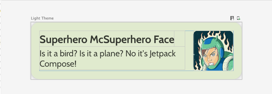
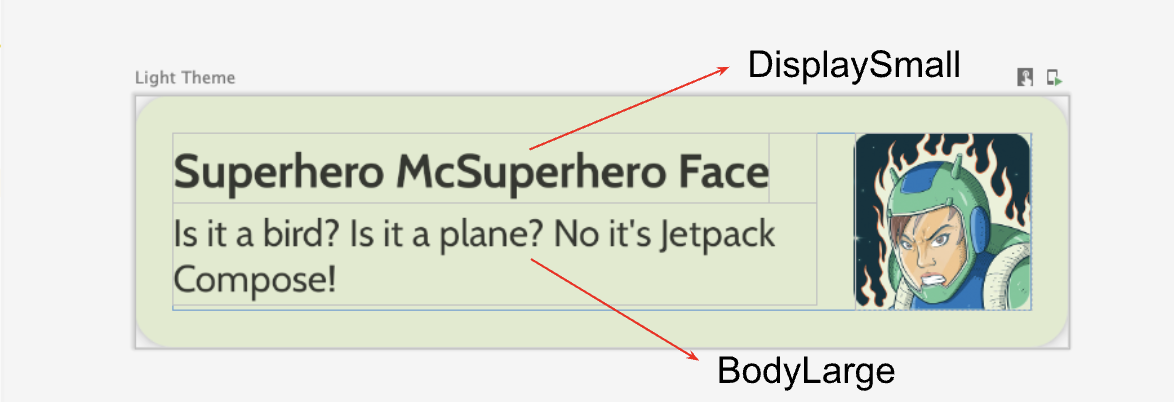
com.example.superheroes套件下建立名為HeroesScreen.kt的檔案。您將在這個檔案中建立清單項目與清單可組合函式。 - 建立代表超級英雄清單項目的可組合函式,如以下螢幕截圖和 UI 規格所示。
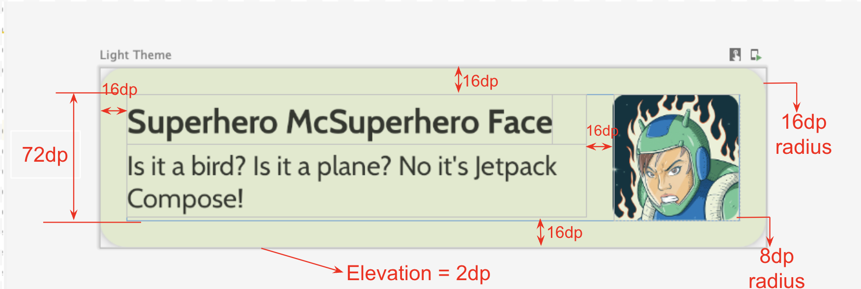
請遵循以下 UI 規格,或發揮創意,設計自己的清單項目:
- 資訊卡高度為
2dp - 清單項目的高度為
72dp,邊框間距為16dp - 清單項目的裁剪半徑為
16dp Box版面配置的圖片大小為72dp- 圖片的裁剪半徑為
8dp - 圖片和文字之間的間隔為
16dp - 超級英雄名稱的樣式為
DisplaySmall - 超級英雄說明的樣式為
BodyLarge
您可以嘗試不同的邊框間距和大小選項,而根據 Material 3 指南規定,邊框間距的遞增單位應為 4dp。
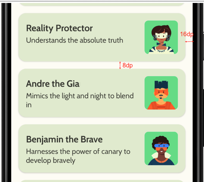
建立延遲欄
- 建立另一個可組合項,用以列出英雄清單並顯示清單。您必須在此使用
LazyColumn。 - 使用以下 UI 規格設定邊框間距。
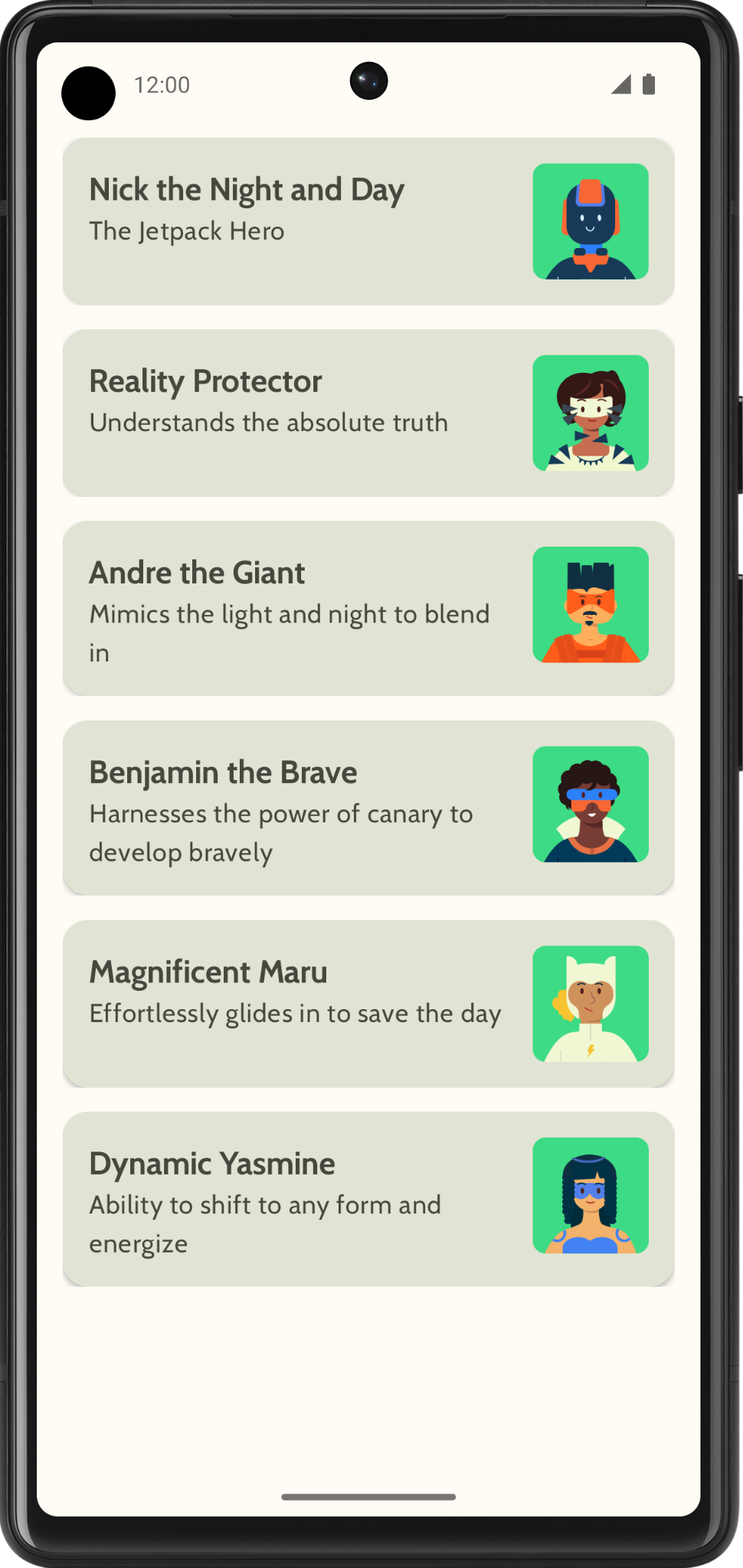
完成實作後,應用程式應與下列螢幕截圖相符:
5. 新增頂端應用程式列
在應用程式中加入頂端應用程式列。
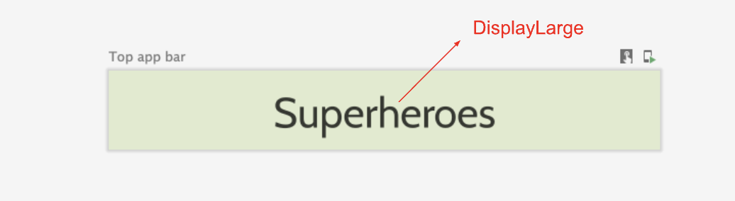
- 在
MainActivity.kt中,新增可顯示頂端應用程式列的可組合函式。在頂端應用程式列中加入文字 (這可能是應用程式名稱)。沿著水平和垂直方向置中對齊。 - 您可以將頂端應用程式列的樣式設為
DisplayLarge。
- 使用
scaffold顯示頂端應用程式列。如有需要,請參閱 Material Design 3 的「頂端應用程式列」說明文件。
自訂狀態列顏色
您可以根據背景顏色,自訂相襯的狀態列顏色,讓應用程式採用無邊框設計。
- 在
Theme.kt中加入這個新方法,將狀態列和導覽列的顏色變更為無邊框設計。
/**
 * Sets up edge-to-edge for the window of this [view]. The system icon colors are set to either
 * light or dark depending on whether the [darkTheme] is enabled or not.
 */
private fun setUpEdgeToEdge(view: View, darkTheme: Boolean) {
    val window = (view.context as Activity).window
    WindowCompat.setDecorFitsSystemWindows(window, false)
    window.statusBarColor = Color.Transparent.toArgb()
    val navigationBarColor = when {
        Build.VERSION.SDK_INT >= 29 -> Color.Transparent.toArgb()
        Build.VERSION.SDK_INT >= 26 -> Color(0xFF, 0xFF, 0xFF, 0x63).toArgb()
        // Min sdk version for this app is 24, this block is for SDK versions 24 and 25
        else -> Color(0x00, 0x00, 0x00, 0x50).toArgb()
    }
    window.navigationBarColor = navigationBarColor
    val controller = WindowCompat.getInsetsController(window, view)
    controller.isAppearanceLightStatusBars = !darkTheme
    controller.isAppearanceLightNavigationBars = !darkTheme
}
- 在
SuperheroesTheme()函式中,從SideEffect區塊呼叫setUpEdgeToEdge()函式。
fun SuperheroesTheme(
    darkTheme: Boolean = isSystemInDarkTheme(),
    // Dynamic color is available on Android 12+
    // Dynamic color in this app is turned off for learning purposes
    dynamicColor: Boolean = false,
    content: @Composable () -> Unit
) {
    //...
    val view = LocalView.current
    if (!view.isInEditMode) {
        SideEffect {
            setUpEdgeToEdge(view, darkTheme)
        }
    }

    //...
}
|
|
6. 取得程式碼解答
完成程式碼研究室後,如要下載當中用到的程式碼,您可以使用以下 Git 指令:
$ git clone https://github.com/google-developer-training/basic-android-kotlin-compose-training-superheroes.git
另外,您也可以下載存放區為 ZIP 檔案,然後解壓縮並在 Android Studio 中開啟。
如要查看程式碼解答,請前往 GitHub。