
1. 시작하기 전에
축하합니다. 본 개발자 과정에서는 Material Design의 기본사항과 앱에 간단한 애니메이션을 추가하는 방법을 배웠습니다. 이제 지금까지 배운 내용을 실전에 적용할 차례입니다.
이 연습 세트에서는 본 개발자 과정에서 배운 개념을 바탕으로 Superheroes 앱을 생성합니다. 이 앱을 통해 Jetpack Compose를 사용한 Material Theming Codelab에서 배운 Material Design 원칙을 사용하여 스크롤 가능한 목록과 세련된 UI를 빌드하는 데 필요한 구성요소를 만들어 봅니다.
솔루션 코드는 마지막에 제공되지만 연습 문제를 해결한 후 답을 확인해 보세요. 솔루션을 앱을 구현하는 한 가지 방법으로 생각하세요. 얼마든지 개선의 여지가 있으니 자유롭게 여러 가지 방법을 실험해 보세요.
나에게 맞는 속도로 문제를 해결합니다. 충분한 시간을 갖고 각 문제를 신중하게 해결하세요.
기본 요건
- Jetpack Compose를 사용한 간단한 애니메이션을 통해 'Compose의 Android 기본사항' 과정을 완료합니다.
필요한 항목
- 인터넷 액세스가 가능하고 Android 스튜디오가 설치된 컴퓨터
빌드할 항목
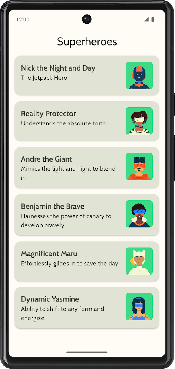
슈퍼히어로 목록을 표시하는 Superheroes 앱
최종 앱은 밝은 테마와 어두운 테마로 다음과 같이 표시됩니다.
|
|

2. 시작하기
이 작업에서는 프로젝트를 설정하고 슈퍼히어로의 더미 데이터를 만듭니다.
- Empty Activity 템플릿 및 최소 SDK 24로 새 프로젝트를 만듭니다.
- 여기에서 앱의 애셋(슈퍼히어로 이미지와 앱 로고)을 다운로드합니다. 앱 아이콘을 추가하는 방법을 복습하려면 앱 아이콘 변경 Codelab을 참고하세요. 앱에 이미지를 추가하는 방법을 복습하려면 대화형 Dice Roller 앱 만들기 Codelab을 참고하세요.
- https://fonts.google.com에서 Cabin bold 및 Cabin regular 글꼴 파일을 다운로드합니다. 사용 가능한 다양한 글꼴 파일을 살펴보세요. 앱의 서체를 맞춤설정하려면 Jetpack Compose를 사용한 Material Theming Codelab을 참고하세요.
- 각 슈퍼히어로의 데이터를 저장할 데이터 클래스를 만듭니다.
Hero데이터 클래스용 새 패키지(model)를 만들어 코드를 구성합니다. 목록 항목은 다음과 같이 표시됩니다.
각 슈퍼히어로 목록 항목은 이름, 설명, 이미지와 같은 세 가지 정보를 표시합니다.
- 동일한
model패키지에, 표시할 모든 히어로 정보를 저장할 파일을 만듭니다. 히어로 정보는 이름, 설명, 이미지 리소스로 이루어질 수 있습니다. 아래의 샘플 데이터 세트를 보고 아이디어를 얻어 보세요.
object HeroesRepository {
    val heroes = listOf(
        Hero(
            nameRes = R.string.hero1,
            descriptionRes = R.string.description1,
            imageRes = R.drawable.android_superhero1
        ),
        Hero(
            nameRes = R.string.hero2,
            descriptionRes = R.string.description2,
            imageRes = R.drawable.android_superhero2
        ),
        Hero(
            nameRes = R.string.hero3,
            descriptionRes = R.string.description3,
            imageRes = R.drawable.android_superhero3
        ),
        Hero(
            nameRes = R.string.hero4,
            descriptionRes = R.string.description4,
            imageRes = R.drawable.android_superhero4
        ),
        Hero(
            nameRes = R.string.hero5,
            descriptionRes = R.string.description5,
            imageRes = R.drawable.android_superhero5
        ),
        Hero(
            nameRes = R.string.hero6,
            descriptionRes = R.string.description6,
            imageRes = R.drawable.android_superhero6
        )
    )
}
- strings.xml 파일에 히어로 이름과 설명 문자열을 추가합니다.
<resources>
    <string name="app_name">Superheroes</string>
    <string name="hero1">Nick the Night and Day</string>
    <string name="description1">The Jetpack Hero</string>
    <string name="hero2">Reality Protector</string>
    <string name="description2">Understands the absolute truth</string>
    <string name="hero3">Andre the Giant</string>
    <string name="description3">Mimics the light and night to blend in</string>
    <string name="hero4">Benjamin the Brave</string>
    <string name="description4">Harnesses the power of canary to develop bravely</string>
    <string name="hero5">Magnificent Maru</string>
    <string name="description5">Effortlessly glides in to save the day</string>
    <string name="hero6">Dynamic Yasmine</string>
    <string name="description6">Ability to shift to any form and energize</string>
</resources>
3. Material Theming
이 섹션에서는 앱의 색상 팔레트, 서체, 도형을 추가하여 앱의 디자인과 분위기를 개선합니다.
다음 색상, 유형, 도형은 테마의 권장사항일 뿐입니다. 다양한 색 구성표를 살펴보고 수정하세요.
Material 테마 빌더를 사용하여 앱의 새 테마를 만듭니다.
색상
ui.theme/Color.kt
import androidx.compose.ui.graphics.Color

val md_theme_light_primary = Color(0xFF466800)
val md_theme_light_onPrimary = Color(0xFFFFFFFF)
val md_theme_light_primaryContainer = Color(0xFFC6F181)
val md_theme_light_onPrimaryContainer = Color(0xFF121F00)
val md_theme_light_secondary = Color(0xFF596248)
val md_theme_light_onSecondary = Color(0xFFFFFFFF)
val md_theme_light_secondaryContainer = Color(0xFFDDE6C6)
val md_theme_light_onSecondaryContainer = Color(0xFF161E0A)
val md_theme_light_tertiary = Color(0xFF396661)
val md_theme_light_onTertiary = Color(0xFFFFFFFF)
val md_theme_light_tertiaryContainer = Color(0xFFBCECE6)
val md_theme_light_onTertiaryContainer = Color(0xFF00201D)
val md_theme_light_error = Color(0xFFBA1A1A)
val md_theme_light_errorContainer = Color(0xFFFFDAD6)
val md_theme_light_onError = Color(0xFFFFFFFF)
val md_theme_light_onErrorContainer = Color(0xFF410002)
val md_theme_light_background = Color(0xFFFEFCF5)
val md_theme_light_onBackground = Color(0xFF1B1C18)
val md_theme_light_surface = Color(0xFFFEFCF5)
val md_theme_light_onSurface = Color(0xFF1B1C18)
val md_theme_light_surfaceVariant = Color(0xFFE1E4D4)
val md_theme_light_onSurfaceVariant = Color(0xFF45483D)
val md_theme_light_outline = Color(0xFF75786C)
val md_theme_light_inverseOnSurface = Color(0xFFF2F1E9)
val md_theme_light_inverseSurface = Color(0xFF30312C)
val md_theme_light_inversePrimary = Color(0xFFABD468)
val md_theme_light_surfaceTint = Color(0xFF466800)
val md_theme_light_outlineVariant = Color(0xFFC5C8B9)
val md_theme_light_scrim = Color(0xFF000000)

val md_theme_dark_primary = Color(0xFFABD468)
val md_theme_dark_onPrimary = Color(0xFF223600)
val md_theme_dark_primaryContainer = Color(0xFF344E00)
val md_theme_dark_onPrimaryContainer = Color(0xFFC6F181)
val md_theme_dark_secondary = Color(0xFFC1CAAB)
val md_theme_dark_onSecondary = Color(0xFF2B331D)
val md_theme_dark_secondaryContainer = Color(0xFF414A32)
val md_theme_dark_onSecondaryContainer = Color(0xFFDDE6C6)
val md_theme_dark_tertiary = Color(0xFFA0D0CA)
val md_theme_dark_onTertiary = Color(0xFF013733)
val md_theme_dark_tertiaryContainer = Color(0xFF1F4E4A)
val md_theme_dark_onTertiaryContainer = Color(0xFFBCECE6)
val md_theme_dark_error = Color(0xFFFFB4AB)
val md_theme_dark_errorContainer = Color(0xFF93000A)
val md_theme_dark_onError = Color(0xFF690005)
val md_theme_dark_onErrorContainer = Color(0xFFFFDAD6)
val md_theme_dark_background = Color(0xFF1B1C18)
val md_theme_dark_onBackground = Color(0xFFE4E3DB)
val md_theme_dark_surface = Color(0xFF1B1C18)
val md_theme_dark_onSurface = Color(0xFFE4E3DB)
val md_theme_dark_surfaceVariant = Color(0xFF45483D)
val md_theme_dark_onSurfaceVariant = Color(0xFFC5C8B9)
val md_theme_dark_outline = Color(0xFF8F9285)
val md_theme_dark_inverseOnSurface = Color(0xFF1B1C18)
val md_theme_dark_inverseSurface = Color(0xFFE4E3DB)
val md_theme_dark_inversePrimary = Color(0xFF466800)
val md_theme_dark_surfaceTint = Color(0xFFABD468)
val md_theme_dark_outlineVariant = Color(0xFF45483D)
val md_theme_dark_scrim = Color(0xFF000000)
도형
ui.theme/Shape.kt
import androidx.compose.foundation.shape.RoundedCornerShape
import androidx.compose.material3.Shapes
import androidx.compose.ui.unit.dp

val Shapes = Shapes(
    small = RoundedCornerShape(8.dp),
    medium = RoundedCornerShape(16.dp),
    large = RoundedCornerShape(16.dp)
)
서체
ui.theme/Type.kt
import androidx.compose.material3.Typography
import androidx.compose.ui.text.TextStyle
import androidx.compose.ui.text.font.Font
import androidx.compose.ui.text.font.FontFamily
import androidx.compose.ui.text.font.FontWeight
import androidx.compose.ui.unit.sp
import com.example.superheroes.R


val Cabin = FontFamily(
    Font(R.font.cabin_regular, FontWeight.Normal),
    Font(R.font.cabin_bold, FontWeight.Bold)
)
// Set of Material typography styles to start with
val Typography = Typography(
    bodyLarge = TextStyle(
        fontFamily = Cabin,
        fontWeight = FontWeight.Normal,
        fontSize = 16.sp,
        lineHeight = 24.sp,
        letterSpacing = 0.5.sp
    ),
    displayLarge = TextStyle(
        fontFamily = Cabin,
        fontWeight = FontWeight.Normal,
        fontSize = 30.sp
    ),
    displayMedium = TextStyle(
        fontFamily = Cabin,
        fontWeight = FontWeight.Bold,
        fontSize = 20.sp
    ),
    displaySmall = TextStyle(
        fontFamily = Cabin,
        fontWeight = FontWeight.Bold,
        fontSize = 20.sp
    )
)
테마
ui.theme/Theme.kt
import android.app.Activity
import android.os.Build
import androidx.compose.foundation.isSystemInDarkTheme
import androidx.compose.material3.MaterialTheme
import androidx.compose.material3.darkColorScheme
import androidx.compose.material3.dynamicDarkColorScheme
import androidx.compose.material3.dynamicLightColorScheme
import androidx.compose.material3.lightColorScheme
import androidx.compose.runtime.Composable
import androidx.compose.runtime.SideEffect
import androidx.compose.ui.graphics.toArgb
import androidx.compose.ui.platform.LocalContext
import androidx.compose.ui.platform.LocalView
import androidx.core.view.WindowCompat

private val LightColors = lightColorScheme(
   primary = md_theme_light_primary,
   onPrimary = md_theme_light_onPrimary,
   primaryContainer = md_theme_light_primaryContainer,
   onPrimaryContainer = md_theme_light_onPrimaryContainer,
   secondary = md_theme_light_secondary,
   onSecondary = md_theme_light_onSecondary,
   secondaryContainer = md_theme_light_secondaryContainer,
   onSecondaryContainer = md_theme_light_onSecondaryContainer,
   tertiary = md_theme_light_tertiary,
   onTertiary = md_theme_light_onTertiary,
   tertiaryContainer = md_theme_light_tertiaryContainer,
   onTertiaryContainer = md_theme_light_onTertiaryContainer,
   error = md_theme_light_error,
   errorContainer = md_theme_light_errorContainer,
   onError = md_theme_light_onError,
   onErrorContainer = md_theme_light_onErrorContainer,
   background = md_theme_light_background,
   onBackground = md_theme_light_onBackground,
   surface = md_theme_light_surface,
   onSurface = md_theme_light_onSurface,
   surfaceVariant = md_theme_light_surfaceVariant,
   onSurfaceVariant = md_theme_light_onSurfaceVariant,
   outline = md_theme_light_outline,
   inverseOnSurface = md_theme_light_inverseOnSurface,
   inverseSurface = md_theme_light_inverseSurface,
   inversePrimary = md_theme_light_inversePrimary,
   surfaceTint = md_theme_light_surfaceTint,
   outlineVariant = md_theme_light_outlineVariant,
   scrim = md_theme_light_scrim,
)

private val DarkColors = darkColorScheme(
   primary = md_theme_dark_primary,
   onPrimary = md_theme_dark_onPrimary,
   primaryContainer = md_theme_dark_primaryContainer,
   onPrimaryContainer = md_theme_dark_onPrimaryContainer,
   secondary = md_theme_dark_secondary,
   onSecondary = md_theme_dark_onSecondary,
   secondaryContainer = md_theme_dark_secondaryContainer,
   onSecondaryContainer = md_theme_dark_onSecondaryContainer,
   tertiary = md_theme_dark_tertiary,
   onTertiary = md_theme_dark_onTertiary,
   tertiaryContainer = md_theme_dark_tertiaryContainer,
   onTertiaryContainer = md_theme_dark_onTertiaryContainer,
   error = md_theme_dark_error,
   errorContainer = md_theme_dark_errorContainer,
   onError = md_theme_dark_onError,
   onErrorContainer = md_theme_dark_onErrorContainer,
   background = md_theme_dark_background,
   onBackground = md_theme_dark_onBackground,
   surface = md_theme_dark_surface,
   onSurface = md_theme_dark_onSurface,
   surfaceVariant = md_theme_dark_surfaceVariant,
   onSurfaceVariant = md_theme_dark_onSurfaceVariant,
   outline = md_theme_dark_outline,
   inverseOnSurface = md_theme_dark_inverseOnSurface,
   inverseSurface = md_theme_dark_inverseSurface,
   inversePrimary = md_theme_dark_inversePrimary,
   surfaceTint = md_theme_dark_surfaceTint,
   outlineVariant = md_theme_dark_outlineVariant,
   scrim = md_theme_dark_scrim,
)

@Composable
fun SuperheroesTheme(
   darkTheme: Boolean = isSystemInDarkTheme(),
   // Dynamic color is available on Android 12+
   // Dynamic color in this app is turned off for learning purposes
   dynamicColor: Boolean = false,
   content: @Composable () -> Unit
) {
   val colorScheme = when {
       dynamicColor && Build.VERSION.SDK_INT >= Build.VERSION_CODES.S -> {
           val context = LocalContext.current
           if (darkTheme) dynamicDarkColorScheme(context) else dynamicLightColorScheme(context)
       }

       darkTheme -> DarkColors
       else -> LightColors
   }
   val view = LocalView.current
   if (!view.isInEditMode) {
       SideEffect {
           val window = (view.context as Activity).window
           window.statusBarColor = colorScheme.background.toArgb()
           WindowCompat.getInsetsController(window, view).isAppearanceLightStatusBars = !darkTheme
       }
   }

   MaterialTheme(
       colorScheme = colorScheme,
       typography = Typography,
       shapes = Shapes,
       content = content
   )
}
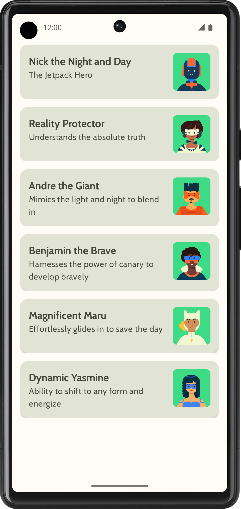
4. 목록 표시
목록을 만드는 첫 번째 단계는 목록 항목을 만드는 것입니다.
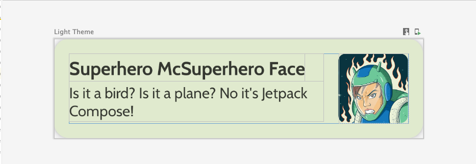
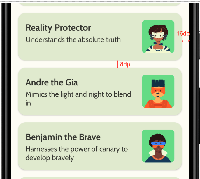
com.example.superheroes패키지에HeroesScreen.kt파일을 만듭니다. 이 파일에서 목록 항목과 목록 컴포저블을 만듭니다.- 슈퍼히어로 목록 항목을 나타내는 컴포저블을 만듭니다. 아래의 스크린샷과 UI 사양을 참고하세요.
다음 UI 사양을 그대로 따라도 좋고, 나만의 목록 항목을 디자인해도 좋습니다.
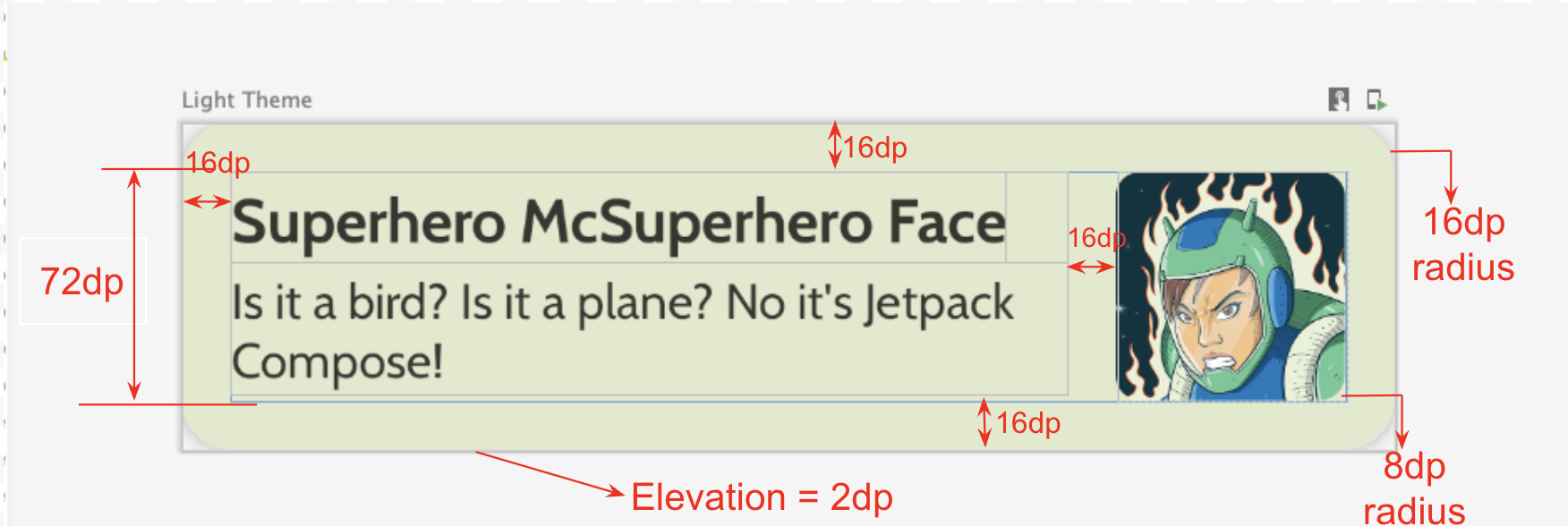
- 카드 고도:
2dp - 목록 항목의 높이:
72dp(패딩이16dp적용됨) - 목록 항목의 클립 반경:
16dp - 크기가
72dp인 이미지가 포함된Box레이아웃 - 이미지의 클립 반경:
8dp - 이미지와 텍스트 사이의 간격:
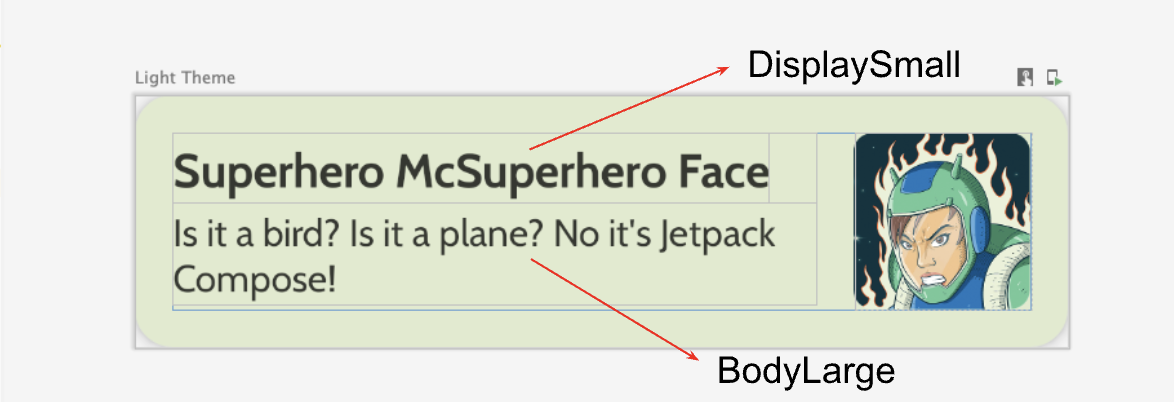
16dp - 슈퍼히어로 이름 스타일:
DisplaySmall - 슈퍼히어로 설명 스타일:
BodyLarge
Material 3 가이드라인에 따라 다양한 패딩 및 크기 옵션을 살펴봅니다. 패딩은 4dp씩 증가해야 합니다.
지연 열 만들기
- 히어로 목록을 받아서 목록을 표시하는 컴포저블을 만듭니다. 이 작업에는
LazyColumn을 사용합니다. - 패딩으로는 다음과 같은 UI 사양을 적용합니다.
구현을 완료하면 앱이 다음 스크린샷과 같이 표시됩니다.
5. 상단 앱 바 추가
앱의 상단 앱 바를 추가합니다.
MainActivity.kt에 상단 앱 바를 표시하는 컴포저블을 추가합니다. 상단 앱 바에 텍스트를 추가합니다. 상단 앱 바는 앱 이름일 수 있습니다. 앱 바를 가로와 세로 방향으로 중심에 위치시킵니다.- 스타일이 있는 상단 앱 바를
DisplayLarge로 설정할 수 있습니다.
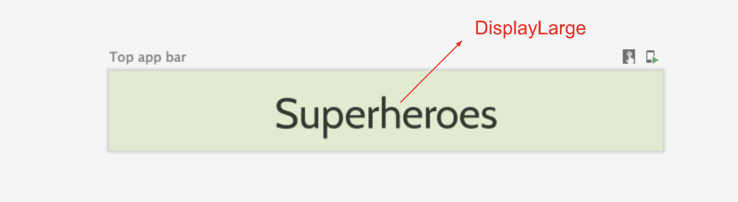
scaffold를 사용하여 상단 앱 바를 표시합니다. 필요한 경우 상단 앱 바: Material Design 3 문서를 참고하세요.
상태 표시줄 색상 맞춤설정
앱을 더 넓은 화면으로 만들려면 배경 색상과 일치하도록 상태 표시줄 색상을 맞춤설정하면 됩니다.
Theme.kt에서 이 새로운 메서드를 추가하여 상태 표시줄과 탐색 메뉴 색상을 가장자리까지 변경합니다.
/**
 * Sets up edge-to-edge for the window of this [view]. The system icon colors are set to either
 * light or dark depending on whether the [darkTheme] is enabled or not.
 */
private fun setUpEdgeToEdge(view: View, darkTheme: Boolean) {
    val window = (view.context as Activity).window
    WindowCompat.setDecorFitsSystemWindows(window, false)
    window.statusBarColor = Color.Transparent.toArgb()
    val navigationBarColor = when {
        Build.VERSION.SDK_INT >= 29 -> Color.Transparent.toArgb()
        Build.VERSION.SDK_INT >= 26 -> Color(0xFF, 0xFF, 0xFF, 0x63).toArgb()
        // Min sdk version for this app is 24, this block is for SDK versions 24 and 25
        else -> Color(0x00, 0x00, 0x00, 0x50).toArgb()
    }
    window.navigationBarColor = navigationBarColor
    val controller = WindowCompat.getInsetsController(window, view)
    controller.isAppearanceLightStatusBars = !darkTheme
    controller.isAppearanceLightNavigationBars = !darkTheme
}
SuperheroesTheme()함수의SideEffect블록 내에서setUpEdgeToEdge()함수를 호출합니다.
fun SuperheroesTheme(
    darkTheme: Boolean = isSystemInDarkTheme(),
    // Dynamic color is available on Android 12+
    // Dynamic color in this app is turned off for learning purposes
    dynamicColor: Boolean = false,
    content: @Composable () -> Unit
) {
    //...
    val view = LocalView.current
    if (!view.isInEditMode) {
        SideEffect {
            setUpEdgeToEdge(view, darkTheme)
        }
    }

    //...
}
|
|
6. 솔루션 코드 가져오기
완료된 Codelab의 코드를 다운로드하려면 이 git 명령어를 사용하면 됩니다.
$ git clone https://github.com/google-developer-training/basic-android-kotlin-compose-training-superheroes.git
또는 ZIP 파일로 저장소를 다운로드한 다음 압축을 풀고 Android 스튜디오에서 열어도 됩니다.
솔루션 코드를 보려면 GitHub에서 확인하세요.