
1. Avant de commencer
Félicitations ! Dans ce parcours, vous avez découvert les principes de base de Material Design et vous avez ajouté des animations simples à votre application. L'heure est venue de mettre en pratique ce que vous avez appris.
Dans ces exercices guidés, vous développerez les concepts que vous avez étudiés dans ce parcours en créant une application de super-héros. Cette application se concentre sur la conception des composants nécessaires à la création d'une liste déroulante et d'une interface utilisateur soignée à l'aide des principes Material Design que vous avez appris dans l'atelier de programmation Thématisation Material avec Jetpack Compose.
Le code de solution est disponible à la fin, mais essayez de résoudre les exercices par vous-même avant de consulter les réponses. La solution ne représente qu'un moyen de mettre en œuvre l'application. N'hésitez pas à tester différentes approches, car de nombreuses améliorations sont possibles.
Résolvez les problèmes à votre rythme. Nous vous encourageons à prendre le temps nécessaire pour résoudre chaque problème de manière réfléchie.
Prérequis
- Vous avez suivi la formation aux principes de base d'Android dans Compose via l'atelier de programmation Animation simple avec Jetpack Compose.
Ce dont vous avez besoin
- Un ordinateur avec un accès à Internet et Android Studio installé
Objectifs de l'atelier
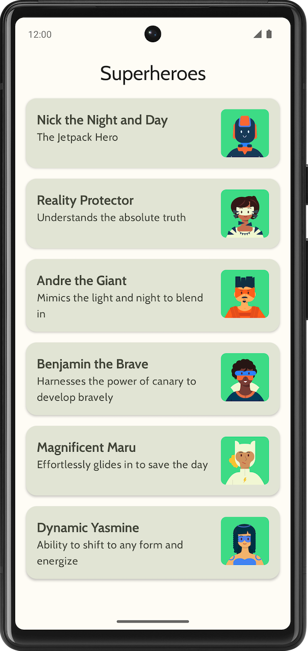
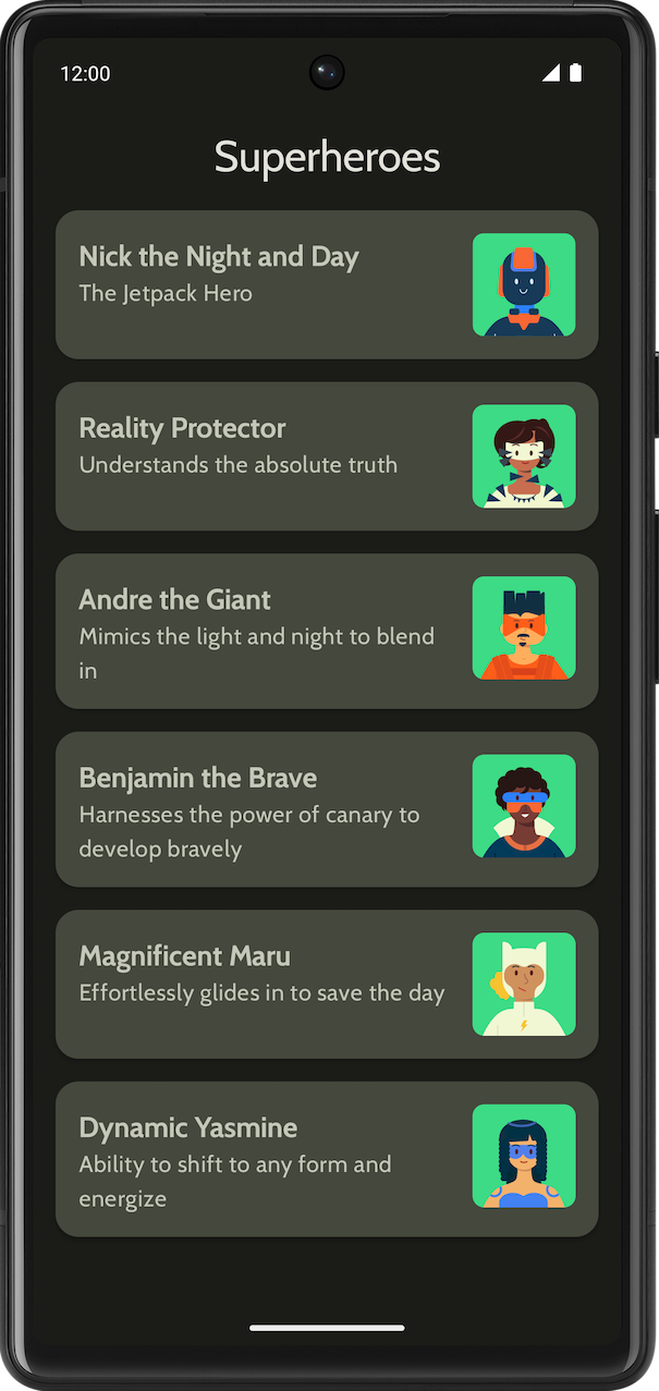
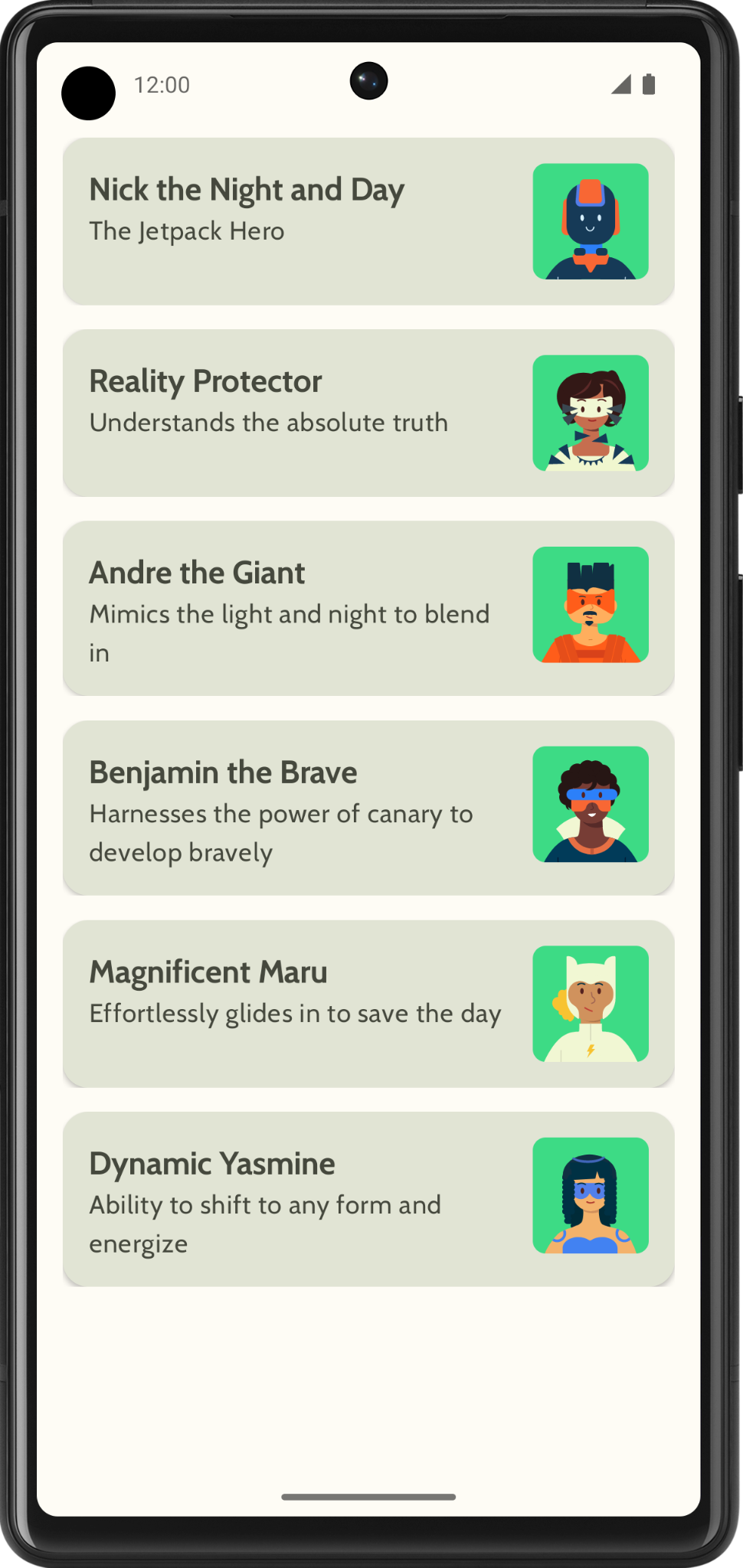
Application affichant une liste de super-héros
Voici ce à quoi la version finale de l'application en thème clair et en thème sombre :
|
|
2. Premiers pas
Dans cette tâche, vous configurerez le projet et créerez les données factices correspondant aux super-héros.
- Créez un projet avec le modèle Empty Activity (Activité vide) et un SDK minimal de 24.
- Téléchargez les éléments de l'application (images de super-héros et logo de l'application) sur cette page. Consultez l'atelier de programmation Modifier l'icône d'application pour obtenir un rappel sur l'ajout d'une icône d'application. Consultez l'atelier de programmation Créer une application interactive : Dice Roller pour obtenir un rappel sur l'ajout d'images à votre application.
- Téléchargez les fichiers de police Cabin bold et Cabin regular sur https://fonts.google.com. Explorez les différents fichiers de polices disponibles. Reportez-vous à l'atelier de programmation Thématisation Material avec Jetpack Compose pour personnaliser la typographie dans votre application.
- Créez une classe de données pour stocker les données de chaque super-héros. Créez un package nommé
modelpour la classe de donnéesHeroafin d'organiser votre code. Votre élément de liste peut se présenter comme suit :
Chaque élément de la liste des super-héros affiche trois informations uniques : un nom, une description et une image.
- Dans le même package
model, créez un autre fichier contenant toutes les informations principales que vous souhaitez afficher (nom, description et ressource d'image, par exemple). Voici un exemple d'ensemble de données pour vous inspirer.
object HeroesRepository {
    val heroes = listOf(
        Hero(
            nameRes = R.string.hero1,
            descriptionRes = R.string.description1,
            imageRes = R.drawable.android_superhero1
        ),
        Hero(
            nameRes = R.string.hero2,
            descriptionRes = R.string.description2,
            imageRes = R.drawable.android_superhero2
        ),
        Hero(
            nameRes = R.string.hero3,
            descriptionRes = R.string.description3,
            imageRes = R.drawable.android_superhero3
        ),
        Hero(
            nameRes = R.string.hero4,
            descriptionRes = R.string.description4,
            imageRes = R.drawable.android_superhero4
        ),
        Hero(
            nameRes = R.string.hero5,
            descriptionRes = R.string.description5,
            imageRes = R.drawable.android_superhero5
        ),
        Hero(
            nameRes = R.string.hero6,
            descriptionRes = R.string.description6,
            imageRes = R.drawable.android_superhero6
        )
    )
}
- Ajoutez les chaînes correspondant au nom et à la description des héros dans le fichier strings.xml.
<resources>
    <string name="app_name">Superheroes</string>
    <string name="hero1">Nick the Night and Day</string>
    <string name="description1">The Jetpack Hero</string>
    <string name="hero2">Reality Protector</string>
    <string name="description2">Understands the absolute truth</string>
    <string name="hero3">Andre the Giant</string>
    <string name="description3">Mimics the light and night to blend in</string>
    <string name="hero4">Benjamin the Brave</string>
    <string name="description4">Harnesses the power of canary to develop bravely</string>
    <string name="hero5">Magnificent Maru</string>
    <string name="description5">Effortlessly glides in to save the day</string>
    <string name="hero6">Dynamic Yasmine</string>
    <string name="description6">Ability to shift to any form and energize</string>
</resources>
3. Thématisation Material
Dans cette section, vous ajouterez la palette de couleurs, la typographie et les formes de l'application afin d'améliorer son apparence.
Les options de couleur, de type et de forme suivantes ne sont que des recommandations pour le thème. Explorez et modifiez différents jeux de couleurs.
Utilisez Material Theme Builder pour créer un thème pour l'application.
Couleur
ui.theme/Color.kt
import androidx.compose.ui.graphics.Color

val md_theme_light_primary = Color(0xFF466800)
val md_theme_light_onPrimary = Color(0xFFFFFFFF)
val md_theme_light_primaryContainer = Color(0xFFC6F181)
val md_theme_light_onPrimaryContainer = Color(0xFF121F00)
val md_theme_light_secondary = Color(0xFF596248)
val md_theme_light_onSecondary = Color(0xFFFFFFFF)
val md_theme_light_secondaryContainer = Color(0xFFDDE6C6)
val md_theme_light_onSecondaryContainer = Color(0xFF161E0A)
val md_theme_light_tertiary = Color(0xFF396661)
val md_theme_light_onTertiary = Color(0xFFFFFFFF)
val md_theme_light_tertiaryContainer = Color(0xFFBCECE6)
val md_theme_light_onTertiaryContainer = Color(0xFF00201D)
val md_theme_light_error = Color(0xFFBA1A1A)
val md_theme_light_errorContainer = Color(0xFFFFDAD6)
val md_theme_light_onError = Color(0xFFFFFFFF)
val md_theme_light_onErrorContainer = Color(0xFF410002)
val md_theme_light_background = Color(0xFFFEFCF5)
val md_theme_light_onBackground = Color(0xFF1B1C18)
val md_theme_light_surface = Color(0xFFFEFCF5)
val md_theme_light_onSurface = Color(0xFF1B1C18)
val md_theme_light_surfaceVariant = Color(0xFFE1E4D4)
val md_theme_light_onSurfaceVariant = Color(0xFF45483D)
val md_theme_light_outline = Color(0xFF75786C)
val md_theme_light_inverseOnSurface = Color(0xFFF2F1E9)
val md_theme_light_inverseSurface = Color(0xFF30312C)
val md_theme_light_inversePrimary = Color(0xFFABD468)
val md_theme_light_surfaceTint = Color(0xFF466800)
val md_theme_light_outlineVariant = Color(0xFFC5C8B9)
val md_theme_light_scrim = Color(0xFF000000)

val md_theme_dark_primary = Color(0xFFABD468)
val md_theme_dark_onPrimary = Color(0xFF223600)
val md_theme_dark_primaryContainer = Color(0xFF344E00)
val md_theme_dark_onPrimaryContainer = Color(0xFFC6F181)
val md_theme_dark_secondary = Color(0xFFC1CAAB)
val md_theme_dark_onSecondary = Color(0xFF2B331D)
val md_theme_dark_secondaryContainer = Color(0xFF414A32)
val md_theme_dark_onSecondaryContainer = Color(0xFFDDE6C6)
val md_theme_dark_tertiary = Color(0xFFA0D0CA)
val md_theme_dark_onTertiary = Color(0xFF013733)
val md_theme_dark_tertiaryContainer = Color(0xFF1F4E4A)
val md_theme_dark_onTertiaryContainer = Color(0xFFBCECE6)
val md_theme_dark_error = Color(0xFFFFB4AB)
val md_theme_dark_errorContainer = Color(0xFF93000A)
val md_theme_dark_onError = Color(0xFF690005)
val md_theme_dark_onErrorContainer = Color(0xFFFFDAD6)
val md_theme_dark_background = Color(0xFF1B1C18)
val md_theme_dark_onBackground = Color(0xFFE4E3DB)
val md_theme_dark_surface = Color(0xFF1B1C18)
val md_theme_dark_onSurface = Color(0xFFE4E3DB)
val md_theme_dark_surfaceVariant = Color(0xFF45483D)
val md_theme_dark_onSurfaceVariant = Color(0xFFC5C8B9)
val md_theme_dark_outline = Color(0xFF8F9285)
val md_theme_dark_inverseOnSurface = Color(0xFF1B1C18)
val md_theme_dark_inverseSurface = Color(0xFFE4E3DB)
val md_theme_dark_inversePrimary = Color(0xFF466800)
val md_theme_dark_surfaceTint = Color(0xFFABD468)
val md_theme_dark_outlineVariant = Color(0xFF45483D)
val md_theme_dark_scrim = Color(0xFF000000)
Forme
ui.theme/Shape.kt
import androidx.compose.foundation.shape.RoundedCornerShape
import androidx.compose.material3.Shapes
import androidx.compose.ui.unit.dp

val Shapes = Shapes(
    small = RoundedCornerShape(8.dp),
    medium = RoundedCornerShape(16.dp),
    large = RoundedCornerShape(16.dp)
)
Typographie
ui.theme/Type.kt
import androidx.compose.material3.Typography
import androidx.compose.ui.text.TextStyle
import androidx.compose.ui.text.font.Font
import androidx.compose.ui.text.font.FontFamily
import androidx.compose.ui.text.font.FontWeight
import androidx.compose.ui.unit.sp
import com.example.superheroes.R


val Cabin = FontFamily(
    Font(R.font.cabin_regular, FontWeight.Normal),
    Font(R.font.cabin_bold, FontWeight.Bold)
)
// Set of Material typography styles to start with
val Typography = Typography(
    bodyLarge = TextStyle(
        fontFamily = Cabin,
        fontWeight = FontWeight.Normal,
        fontSize = 16.sp,
        lineHeight = 24.sp,
        letterSpacing = 0.5.sp
    ),
    displayLarge = TextStyle(
        fontFamily = Cabin,
        fontWeight = FontWeight.Normal,
        fontSize = 30.sp
    ),
    displayMedium = TextStyle(
        fontFamily = Cabin,
        fontWeight = FontWeight.Bold,
        fontSize = 20.sp
    ),
    displaySmall = TextStyle(
        fontFamily = Cabin,
        fontWeight = FontWeight.Bold,
        fontSize = 20.sp
    )
)
Thème
ui.theme/Theme.kt
import android.app.Activity
import android.os.Build
import androidx.compose.foundation.isSystemInDarkTheme
import androidx.compose.material3.MaterialTheme
import androidx.compose.material3.darkColorScheme
import androidx.compose.material3.dynamicDarkColorScheme
import androidx.compose.material3.dynamicLightColorScheme
import androidx.compose.material3.lightColorScheme
import androidx.compose.runtime.Composable
import androidx.compose.runtime.SideEffect
import androidx.compose.ui.graphics.toArgb
import androidx.compose.ui.platform.LocalContext
import androidx.compose.ui.platform.LocalView
import androidx.core.view.WindowCompat

private val LightColors = lightColorScheme(
   primary = md_theme_light_primary,
   onPrimary = md_theme_light_onPrimary,
   primaryContainer = md_theme_light_primaryContainer,
   onPrimaryContainer = md_theme_light_onPrimaryContainer,
   secondary = md_theme_light_secondary,
   onSecondary = md_theme_light_onSecondary,
   secondaryContainer = md_theme_light_secondaryContainer,
   onSecondaryContainer = md_theme_light_onSecondaryContainer,
   tertiary = md_theme_light_tertiary,
   onTertiary = md_theme_light_onTertiary,
   tertiaryContainer = md_theme_light_tertiaryContainer,
   onTertiaryContainer = md_theme_light_onTertiaryContainer,
   error = md_theme_light_error,
   errorContainer = md_theme_light_errorContainer,
   onError = md_theme_light_onError,
   onErrorContainer = md_theme_light_onErrorContainer,
   background = md_theme_light_background,
   onBackground = md_theme_light_onBackground,
   surface = md_theme_light_surface,
   onSurface = md_theme_light_onSurface,
   surfaceVariant = md_theme_light_surfaceVariant,
   onSurfaceVariant = md_theme_light_onSurfaceVariant,
   outline = md_theme_light_outline,
   inverseOnSurface = md_theme_light_inverseOnSurface,
   inverseSurface = md_theme_light_inverseSurface,
   inversePrimary = md_theme_light_inversePrimary,
   surfaceTint = md_theme_light_surfaceTint,
   outlineVariant = md_theme_light_outlineVariant,
   scrim = md_theme_light_scrim,
)

private val DarkColors = darkColorScheme(
   primary = md_theme_dark_primary,
   onPrimary = md_theme_dark_onPrimary,
   primaryContainer = md_theme_dark_primaryContainer,
   onPrimaryContainer = md_theme_dark_onPrimaryContainer,
   secondary = md_theme_dark_secondary,
   onSecondary = md_theme_dark_onSecondary,
   secondaryContainer = md_theme_dark_secondaryContainer,
   onSecondaryContainer = md_theme_dark_onSecondaryContainer,
   tertiary = md_theme_dark_tertiary,
   onTertiary = md_theme_dark_onTertiary,
   tertiaryContainer = md_theme_dark_tertiaryContainer,
   onTertiaryContainer = md_theme_dark_onTertiaryContainer,
   error = md_theme_dark_error,
   errorContainer = md_theme_dark_errorContainer,
   onError = md_theme_dark_onError,
   onErrorContainer = md_theme_dark_onErrorContainer,
   background = md_theme_dark_background,
   onBackground = md_theme_dark_onBackground,
   surface = md_theme_dark_surface,
   onSurface = md_theme_dark_onSurface,
   surfaceVariant = md_theme_dark_surfaceVariant,
   onSurfaceVariant = md_theme_dark_onSurfaceVariant,
   outline = md_theme_dark_outline,
   inverseOnSurface = md_theme_dark_inverseOnSurface,
   inverseSurface = md_theme_dark_inverseSurface,
   inversePrimary = md_theme_dark_inversePrimary,
   surfaceTint = md_theme_dark_surfaceTint,
   outlineVariant = md_theme_dark_outlineVariant,
   scrim = md_theme_dark_scrim,
)

@Composable
fun SuperheroesTheme(
   darkTheme: Boolean = isSystemInDarkTheme(),
   // Dynamic color is available on Android 12+
   // Dynamic color in this app is turned off for learning purposes
   dynamicColor: Boolean = false,
   content: @Composable () -> Unit
) {
   val colorScheme = when {
       dynamicColor && Build.VERSION.SDK_INT >= Build.VERSION_CODES.S -> {
           val context = LocalContext.current
           if (darkTheme) dynamicDarkColorScheme(context) else dynamicLightColorScheme(context)
       }

       darkTheme -> DarkColors
       else -> LightColors
   }
   val view = LocalView.current
   if (!view.isInEditMode) {
       SideEffect {
           val window = (view.context as Activity).window
           window.statusBarColor = colorScheme.background.toArgb()
           WindowCompat.getInsetsController(window, view).isAppearanceLightStatusBars = !darkTheme
       }
   }

   MaterialTheme(
       colorScheme = colorScheme,
       typography = Typography,
       shapes = Shapes,
       content = content
   )
}
4. Afficher la liste
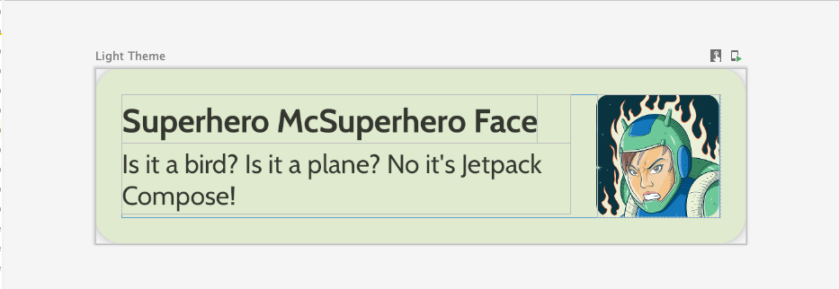
La première étape pour concevoir une liste consiste à créer un élément de liste.
- Créez un fichier nommé
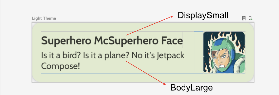
HeroesScreen.ktsous le packagecom.example.superheroes. Vous allez créer un élément de liste et des composables de liste dans ce fichier. - Créez un composable qui représente un élément de liste de super-héros, ressemblant à la capture d'écran et aux spécifications de l'UI suivantes.
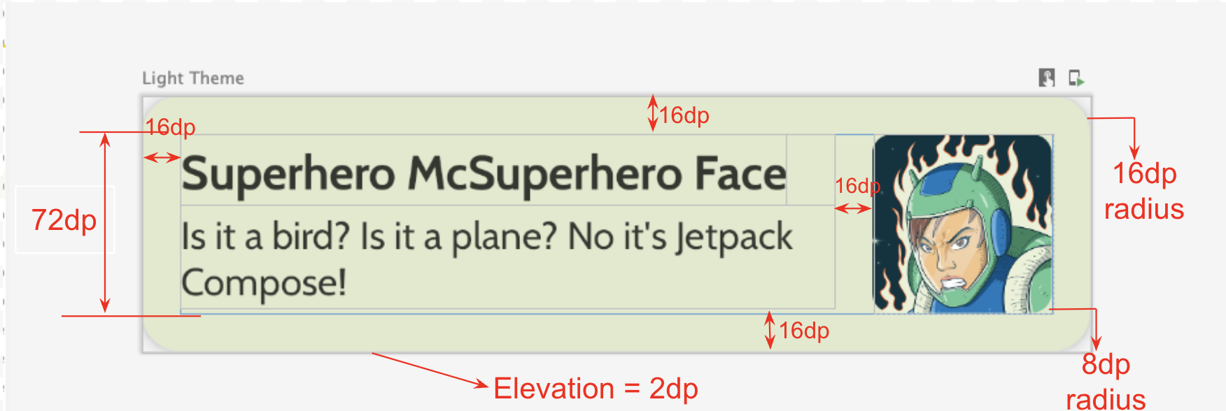
Respectez les spécifications concernant l'interface utilisateur ou faites preuve de créativité pour concevoir votre propre élément de liste :
- L'élévation de la fiche est de
2dp. - La hauteur de l'élément de liste est de
72dpavec une marge intérieure de16dp. - Le rayon de l'élément de liste est de
16dp. - Mise en page
Boxavec une image de taille72dp - Le rayon de l'image est de
8dp. - L'espace entre l'image et le texte est de
16dp. - Le style pour le nom du super-héros est
DisplaySmall. - Le style pour la description du super-héros est
BodyLarge.
Explorez différentes options de marge intérieure et de taille. Conformément aux consignes Material 3, la marge intérieure doit se faire par incréments de 4dp.
Créer la colonne fixe
- Créez un autre composable qui affiche la liste des héros. C'est ici que vous utiliserez un élément
LazyColumn. - Utilisez les spécifications d'interface utilisateur suivantes pour la marge intérieure.
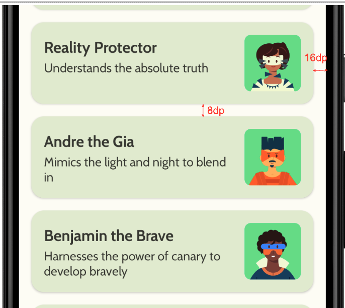
Une fois l'implémentation terminée, votre application devrait ressembler à la capture d'écran suivante :
5. Ajouter une barre d'application supérieure
Ajoutez une barre d'application supérieure à votre application.
- Dans
MainActivity.kt, ajoutez un composable pour afficher la barre d'application supérieure. Ajoutez du texte à la barre d'application supérieure, tel que le nom de l'application. Centrez-le horizontalement et verticalement. - Vous pouvez définir la barre d'application supérieure avec le style
DisplayLarge.
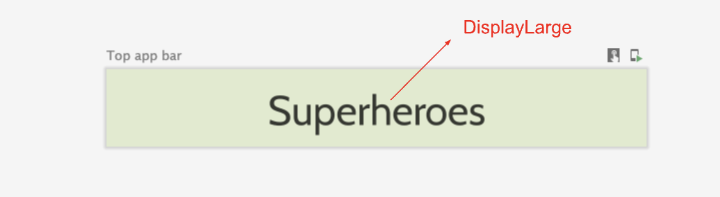
- Utilisez
scaffoldpour afficher la barre d'application supérieure. Reportez-vous à la documentation sur la barre d'application supérieure - Material Design 3 si nécessaire.
Personnaliser la couleur de la barre d'état
Pour que votre application soit bord à bord, vous pouvez personnaliser la couleur de la barre d'état pour qu'elle corresponde à la couleur de l'arrière-plan.
- Dans le fichier
Theme.kt, ajoutez cette nouvelle méthode pour changer les couleurs de la barre d'état et de la barre de navigation de votre application bord à bord.
/**
 * Sets up edge-to-edge for the window of this [view]. The system icon colors are set to either
 * light or dark depending on whether the [darkTheme] is enabled or not.
 */
private fun setUpEdgeToEdge(view: View, darkTheme: Boolean) {
    val window = (view.context as Activity).window
    WindowCompat.setDecorFitsSystemWindows(window, false)
    window.statusBarColor = Color.Transparent.toArgb()
    val navigationBarColor = when {
        Build.VERSION.SDK_INT >= 29 -> Color.Transparent.toArgb()
        Build.VERSION.SDK_INT >= 26 -> Color(0xFF, 0xFF, 0xFF, 0x63).toArgb()
        // Min sdk version for this app is 24, this block is for SDK versions 24 and 25
        else -> Color(0x00, 0x00, 0x00, 0x50).toArgb()
    }
    window.navigationBarColor = navigationBarColor
    val controller = WindowCompat.getInsetsController(window, view)
    controller.isAppearanceLightStatusBars = !darkTheme
    controller.isAppearanceLightNavigationBars = !darkTheme
}
- Dans la fonction
SuperheroesTheme(), appelez la fonctionsetUpEdgeToEdge()depuis le blocSideEffect.
fun SuperheroesTheme(
    darkTheme: Boolean = isSystemInDarkTheme(),
    // Dynamic color is available on Android 12+
    // Dynamic color in this app is turned off for learning purposes
    dynamicColor: Boolean = false,
    content: @Composable () -> Unit
) {
    //...
    val view = LocalView.current
    if (!view.isInEditMode) {
        SideEffect {
            setUpEdgeToEdge(view, darkTheme)
        }
    }

    //...
}
|
|
6. Télécharger le code de solution
Pour télécharger le code de l'atelier de programmation terminé, utilisez la commande Git suivante :
$ git clone https://github.com/google-developer-training/basic-android-kotlin-compose-training-superheroes.git
Vous pouvez également télécharger le dépôt sous forme de fichier ZIP, le décompresser et l'ouvrir dans Android Studio.
Si vous souhaitez voir le code de solution, affichez-le sur GitHub.