
1. Before you begin
Prerequisites
- Ability to create and run a project in Android Studio.
- Experience with Kotlin syntax, collections, and classes.
- Ability to apply basic Jetpack Compose concepts.
- Experience with Compose layouts,
Column, andRow.
What you'll build
- An Android app that can display multiple similar items in a scrollable list or grid.
What you'll need
- A computer with Android Studio installed.
2. Overview
Congratulations on reaching the end of Unit 3!
To help reinforce what you learned in this unit, it is now your turn to use your new skills and abilities to create an app of your own!
The general app guidelines are:
- Decide on a theme and create 30 tips related to this theme. One tip for each day of the month.
- At a minimum, each tip should contain relevant text and an image.
- The tips need to be displayed in a scrollable list (column or row) or a scrollable grid.
- Follow Material Design guidelines to create a distinct brand for the app.
Make it unique! Make it special to you by showcasing what you learned! This is your chance to take an idea of your own from concept to reality.
You should read this full project document before starting, as each section contains important information for building your app.
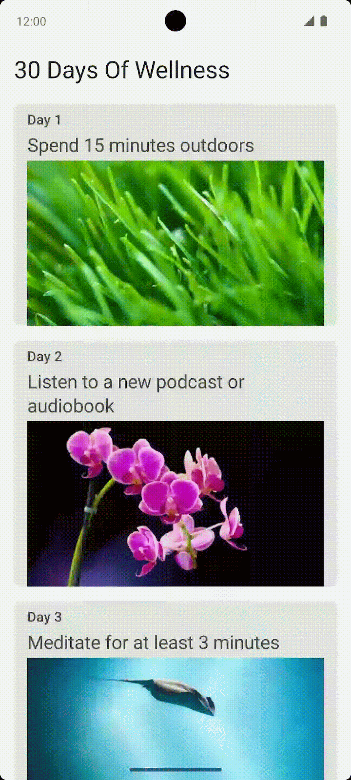
We are sharing a screenshot of the user interface (UI) of our sample app so you have something to refer to, but use this opportunity to make an app your own by using your own imagery, text, and layout.
Our sample app is titled "30 Days Of Wellness".
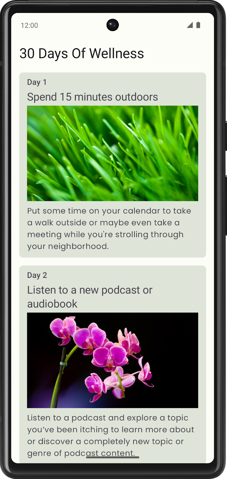
We display a card for each day, with a tip in a scrollable column.
Each card contains an indicator for the day of the month, a summary of the day's goal, an image, and additional text describing the goal for that day in detail.
For styling, we chose a green color theme and the Poppins font for the card's text.
All photos by Romain Guy.
3. Decide on your app's theme, text, and images
Decide on a theme
Now it is your turn to decide on a theme for your app.
What topic interests you and inspires you to create an app? If your topic is too broad, maybe a smaller subset of the topic would be suitable for the app's theme.
If you are stuck, some potential themes are:
- Fitness theme - "30 Days of Fitness" with a different exercise for each day.
- Cooking theme - "30 Days of Recipes" with a different recipe for each day.
- Sewing theme - "30 Days of Sewing" with a different sewing skill for each day.
Decide on text and images
The subject matter of your app is up to you. The cards can contain any images and text you want. This will help your project be unique among all the others.
Gather or create the text and images you will use in your app.
4. Decide on the layout for each tip and app
Choose a layout for each tip
On paper, sketch out some ideas on how you want to display each tip.
Should the text be above or below the image? Do you prefer having the text and the image side-by-side?
Plan the layout for the app
Now that you have an idea for how each tip will look, it is time to plan how the app will look displaying all your tips.
Use a LazyColumn if your app displays a scrolling vertical list.
Another design option to consider is a Lazy grid. There are vertical versions ( LazyVerticalGrid) and horizontal versions ( LazyHorizontalGrid), depending on how you choose to design your app.
Be creative and choose the layout that's best for your app.
5. Material Design Considerations
Once you have sketched out your app idea, what colors, typography, and shaping would make it stand out?
Choose colors for your app
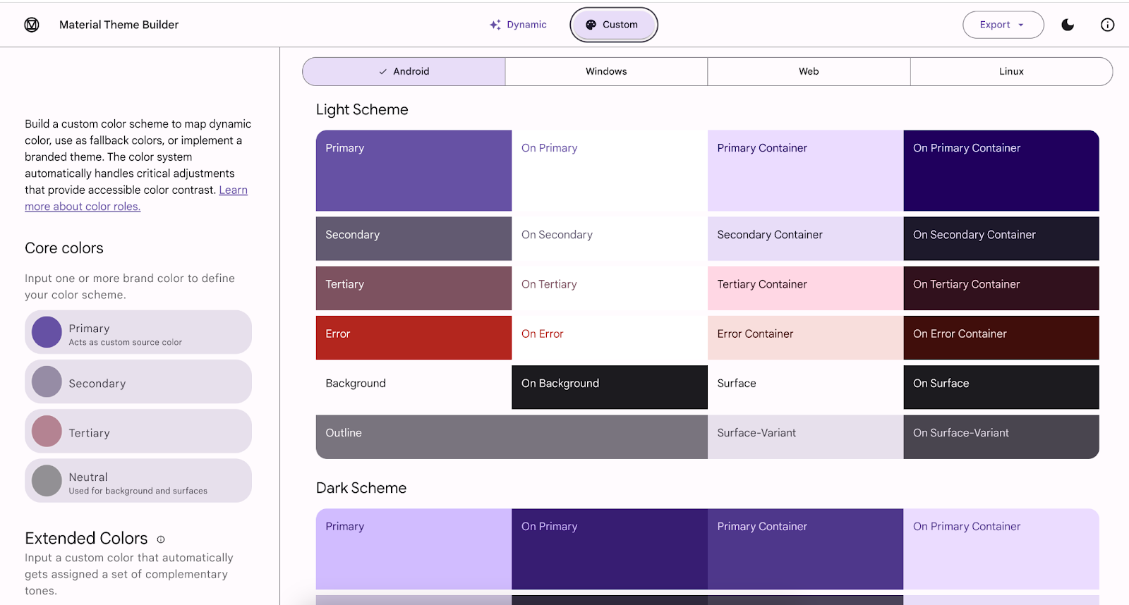
Color is one way for your app to stand out. Using the Material Design color system as a reference, choose primary, secondary, and tertiary colors (if needed) that fit your app's aesthetic.
It is also important to consider a color scheme for dark theme. This can be tested by turning on dark theme on your device.
Feel free to use the Material Theme Builder to experiment with your app's color palette. Material Theme Builder will determine appropriate colors for both a light theme and a dark theme.
Choose fonts for your app
Typography plays an important role in giving your app its distinct identity. The choice of font, whether it's serif or sans serif, cursive or block letters, bold or thin strokes, or even a combination, can add hierarchy to your app's content. You can use as many different styles of fonts for headers, text, captions, etc., but chances are you'll only need a few different variations of text. Somewhere between two and four different text styles should be all you need.
If you're looking for a font with a specific look and feel, we recommend using Google Fonts. There are over 1,000 font families to choose from, so you'll probably find something that fits your app. Please check the license associated with the font before using it in your app.
Shapes
Another design consideration is the shape of the widgets you display in your app.
Do rounded corners accurately convey the feel of your app, or does a cut corner feel more appropriate?
The Material Design documentation on Shapes has additional information that you might find useful while making these decisions.
6. Animations
You can use animations to convey meaningful motion in your app, such as navigation, or showing and hiding content. You may opt for an expandable card that shows a description for the selected item, or perhaps touch & hold an image to reveal additional text with a fade animation. These are just two examples, but how you incorporate animation into your app is entirely up to you.
|
7. Build your app
Once you've made your design decisions, it's time to build your app. This involves many of the Compose topics you learned in this unit. Even if you feel you've already learned each concept, it's not uncommon to refer back to the codelabs when trying to put them into practice.
The following might be useful to you as you work on your project:
- Affirmations - Codelab, Source Code
- Woof - Codelab, Source Code
Remember, this project gives you the opportunity to solidify your knowledge of Material Design and build UIs before moving on to the next unit.