
1. Before you begin
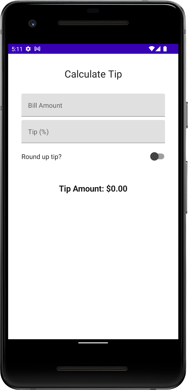
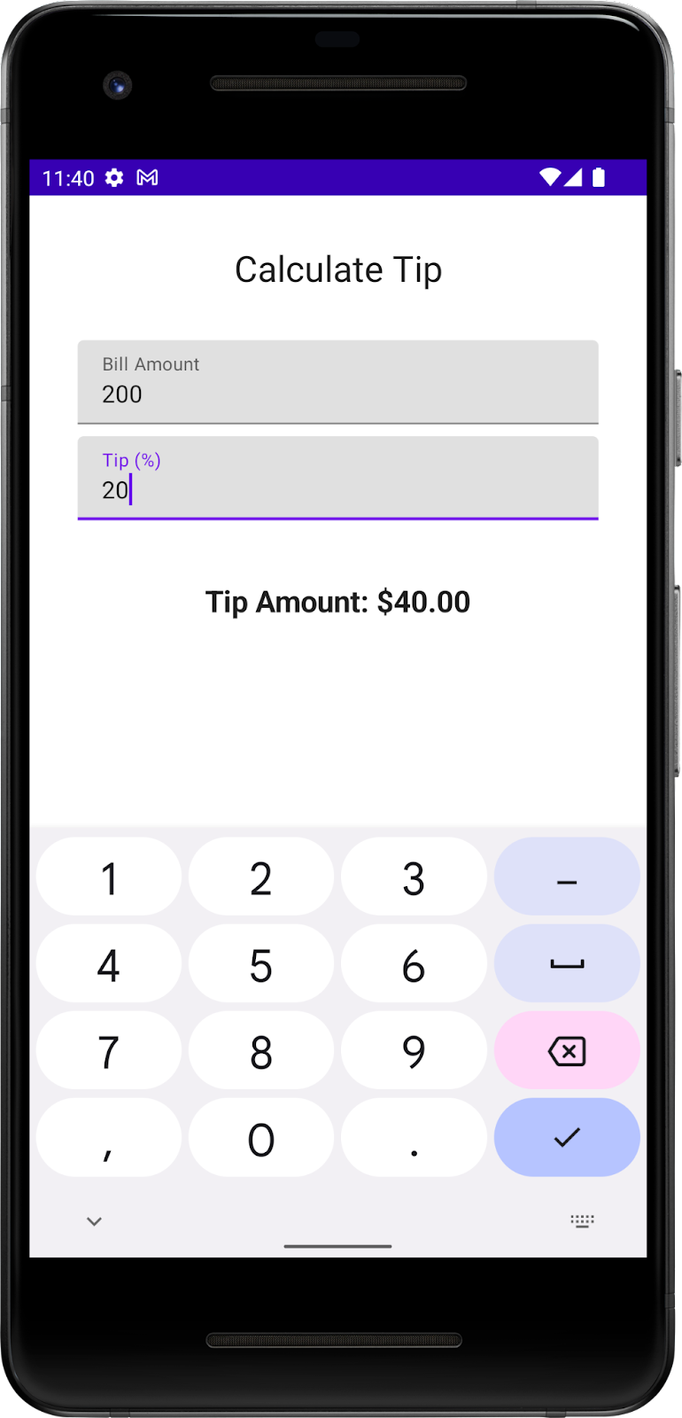
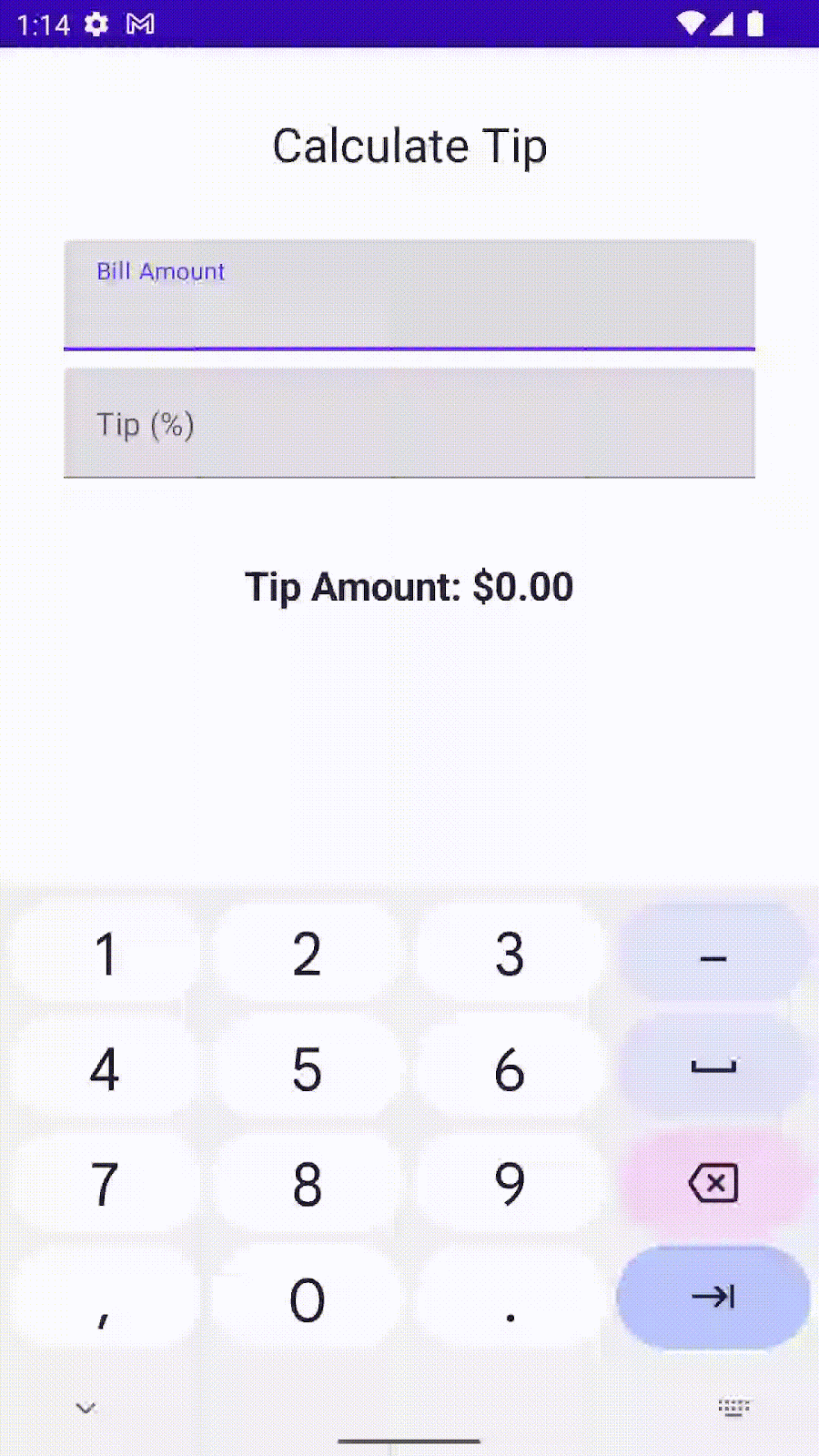
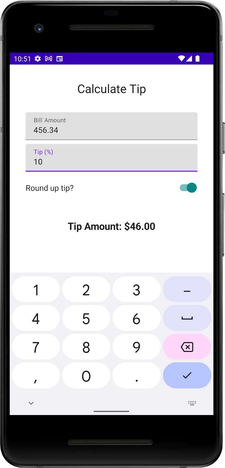
In this codelab, you use the solution code from the Intro to state in Compose codelab to build an interactive tip calculator that can automatically calculate and round a tip amount when you enter the bill amount and tip percentage. You can see the final app in this image:
Prerequisites
- The Use state in Jetpack Compose codelab
- Ability to add
TextandTextFieldcomposables to an app. - Knowledge of the
rememberfunction, state, state hoisting, and the difference between stateful and stateless composable functions
What you'll learn
- How to add an action button to a virtual keyboard.
- How to set up keyboard actions.
- What a
Switchcomposable is and how to use it. - What the Layout Inspector is.
What you'll build
- A Tip Time App that calculates tip amounts based on the user's inputted cost of service and tip percentage.
What you'll need
- Android Studio
- The solution code from the Use state in Jetpack Compose codelab
2. Starter app overview
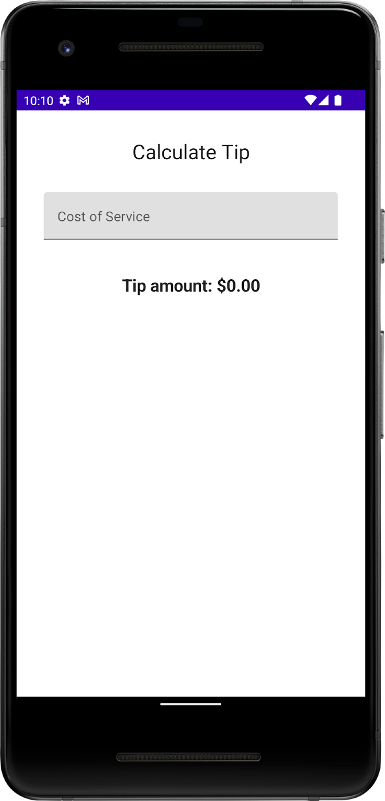
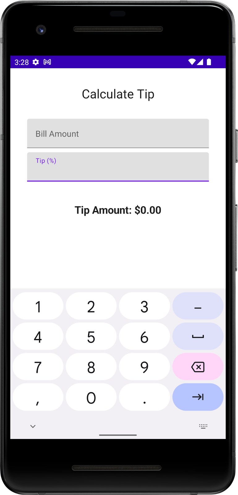
This codelab begins with the Tip Time App from the previous codelab, which provides the user interface needed to calculate a tip with a fixed tip percentage. The Cost of Service text box lets the user enter the cost of the service. The app calculates and displays the tip amount in a Text composable.
|
|
Get the starter code
To get started, download the starter code:
Alternatively, you can clone the Github repository for the code:
$ git clone https://github.com/google-developer-training/basic-android-kotlin-compose-training-tip-calculator.git
$ cd basic-android-kotlin-compose-training-tip-calculator
$ git checkout state
You can browse the code in the Tip Calculator Github repository.
Run the Tip Time App
- Open the Tip Time project in Android Studio and run the app on an emulator or a device.
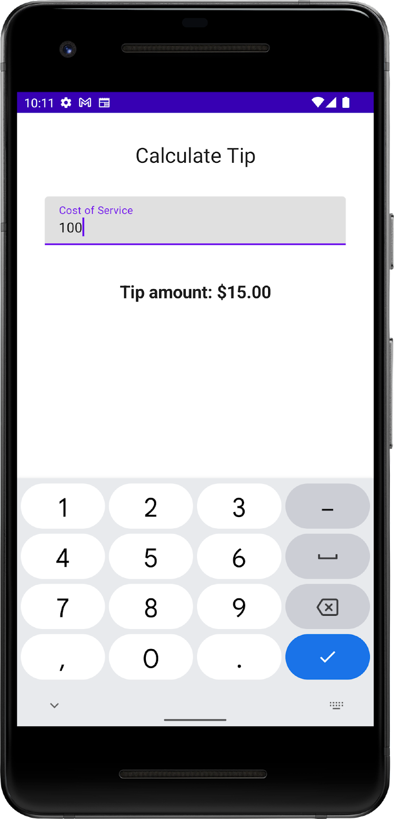
- Enter a cost of service. The app automatically calculates and displays the tip amount.
In the current implementation, the percentage of the tip is hardcoded to 15%. In this codelab, you extend this feature with a text field that lets the app calculate a custom tip percentage and round the tip amount.
Add necessary string resources
- In the Project tab, click res > values > strings.xml.
- In between the
strings.xmlfile's<resources>tags, add these string resources:
<string name="how_was_the_service">Tip (%)</string>
<string name="round_up_tip">Round up tip?</string>
The strings.xml file should look like this code snippet, which includes the strings from the previous codelab:
strings.xml
<resources>
   <string name="app_name">TipTime</string>
   <string name="calculate_tip">Calculate Tip</string>
   <string name="cost_of_service">Cost of Service</string>
   <string name="how_was_the_service">Tip (%)</string>
   <string name="round_up_tip">Round up tip?</string>
   <string name="tip_amount">Tip Amount: %s</string>
</resources>
- Change the
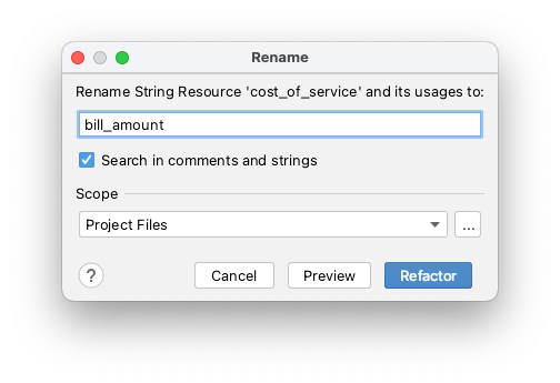
Cost Of Servicestring to aBill Amountstring. In some countries, service means tip, so this change prevents confusion. - In the
Cost of Servicestring, right-click the attribute'snamecost_of_serviceand then select Refactor > Rename. A Rename dialog opens.
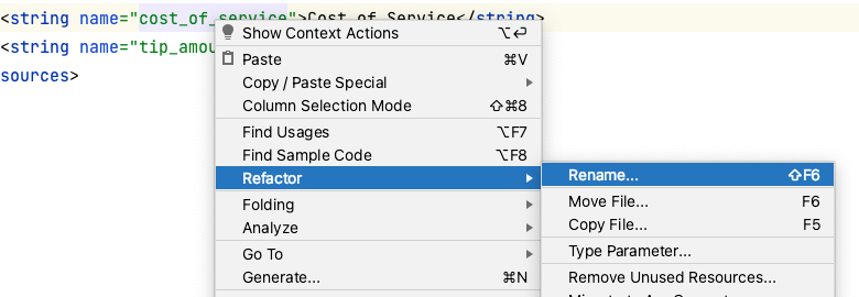
- In the Rename dialog box, replace
cost_of _servicewithbill_amountand the click Refactor. This updates all occurrences of thecost_of_servicestring resource in your project, so you don't need to change the Compose code manually.
- In the
strings.xmlfile, change the string value toBill AmountfromCost of Service:
<string name="bill_amount">Bill Amount</string>
- Navigate to the
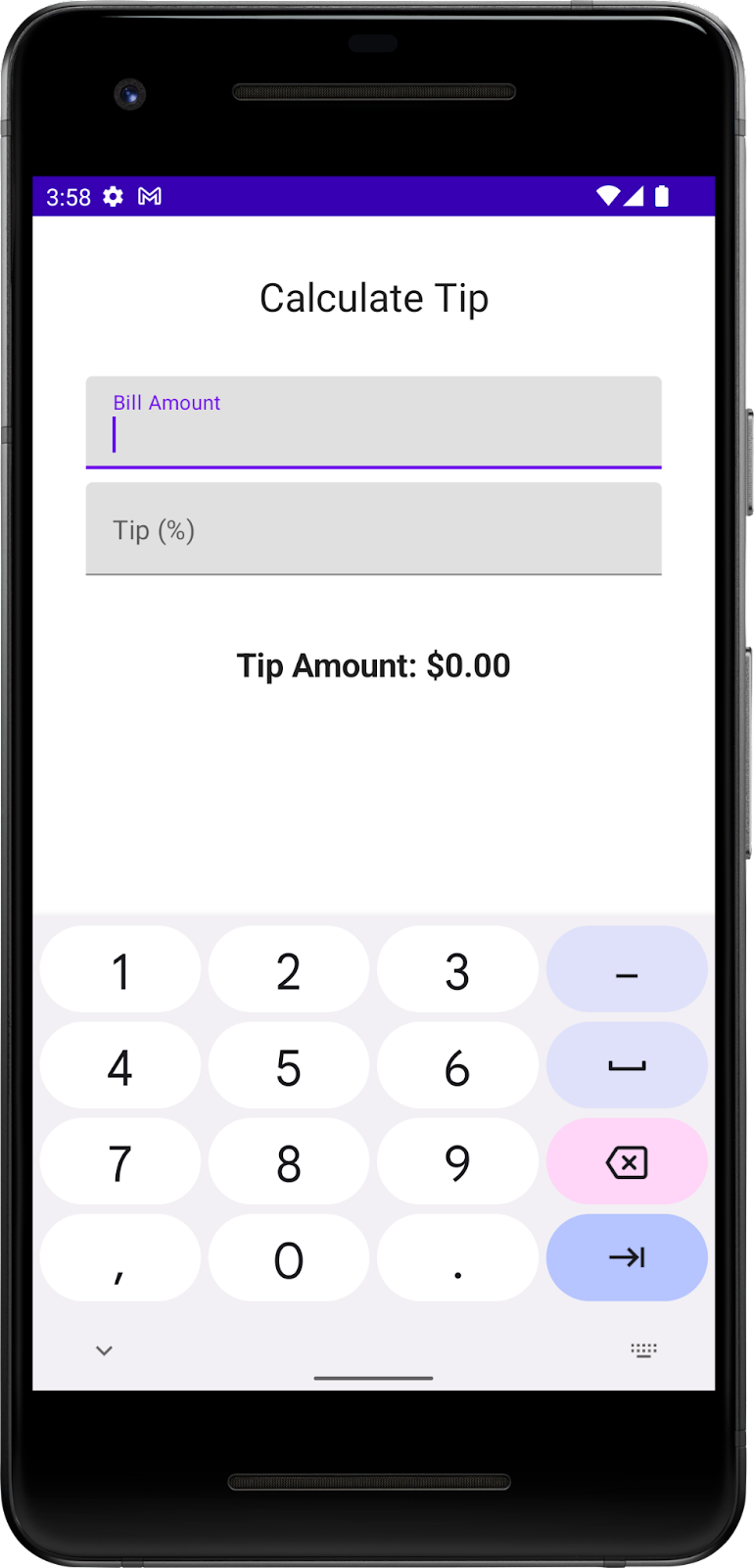
MainActivity.ktfile and then run the app. The label is updated in the text box as you can see in this image:

3. Add a tip-percentage text field
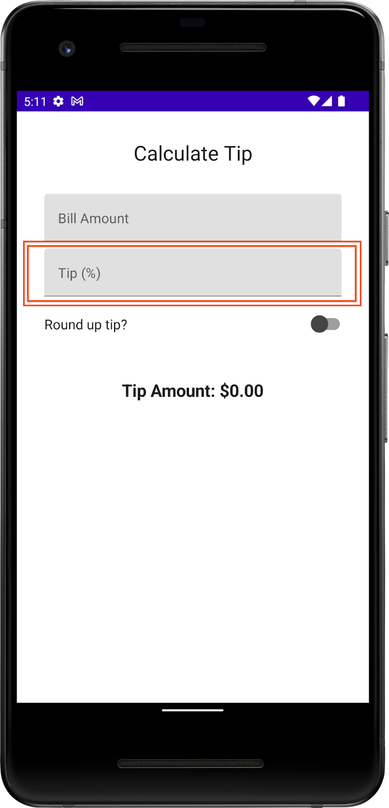
A customer may want to tip more or less based on the quality of the service provided and various other reasons. To accommodate this, the app should let the user calculate a custom tip. In this section, you add a text field for the user to enter a custom tip percentage as you can see in this image:
You already have a Bill Amount text field composable in your app, which is the stateless EditNumberField() composable function. In the previous codelab, you hoisted the amountInput state from the EditNumberField() composable to the TipTimeScreen() function, which made the EditNumberField() composable stateless.
To add a text field, you can reuse the same EditNumberField() composable, but with a different label. To make this change, you need to pass in the label as a parameter, rather than hardcode it inside the EditNumberField() composable function.
Make the EditNumberField() composable function reusable:
- In the
MainActivity.ktfile in theEditNumberField()composable function's parameters, add alabelstring resource ofInttype:
@Composable
fun EditNumberField(
   label: Int,
   value: String,
   onValueChange: (String) -> Unit
)
- Add a
modifierargument ofModifiertype to theEditNumberField()composable function:
@Composable
fun EditNumberField(
   label: Int,
   value: String,
   onValueChange: (String) -> Unit,
   modifier: Modifier = Modifier
)
- In the function body, replace the hardcoded string resource ID with the
labelparameter:
@Composable
fun EditNumberField(
   //...
) {
   TextField(
       //...
       label = { Text(stringResource(label)) },
       //...
   )
}
- To denote that the
labelparameter is expected to be a string resource reference, annotate the function parameter with the@StringResannotation:
@Composable
fun EditNumberField(
   @StringRes label: Int,
   value: String,
   onValueChange: (String) -> Unit,
   modifier: Modifier = Modifier
)
- Import the following:
import androidx.annotation.StringRes
- In the
EditNumberField()function'sTextFieldcomposable, pass thelabelparameter to thestringResource()function.
@Composable
fun EditNumberField(
   @StringRes label: Int,
   value: String,
   onValueChange: (String) -> Unit,
   modifier: Modifier = Modifier
) {
   TextField(
       //...
       label = { Text(stringResource(label)) },
       //...
   )
}
- In the
TipTimeScreen()function'sEditNumberField()function call, set thelabelparameter to theR.string.bill_amountstring resource:
EditNumberField(
   label = R.string.bill_amount,
   value = amountInput,
   onValueChange = { amountInput = it }
)
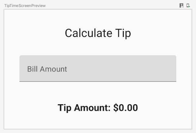
- In the Design pane, click
 Build & Refresh. The app's UI should look like this image:
- In the
TipTimeScreen()function after theEditNumberField()function call, add another text field for the custom tip percentage. Make a call to theEditNumberField()composable function with these parameters:
EditNumberField(
   label = R.string.how_was_the_service,
   value = "",
   onValueChange = { }
)
This adds another text box for the custom tip percentage.
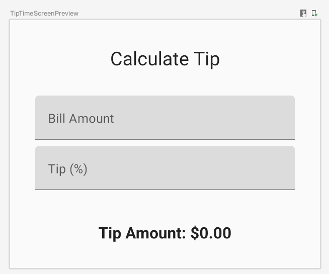
- In the Design pane, click Build & Refresh. The app preview now shows a Tip (%) text field as you can see in this image:
- At the top of the
TipTimeScreen()function, add avarproperty calledtipInputfor the added text field's state variable. UsemutableStateOf("")to initialize the variable and surround the call withrememberfunction:
var tipInput by remember { mutableStateOf("") }
- In the new
EditNumberField()function call, set thevaluenamed parameter to thetipInputvariable and then update thetipInputvariable in theonValueChangelambda expression:
EditNumberField(
   label = R.string.how_was_the_service,
   value = tipInput,
   onValueChange = { tipInput = it }
)
- In the
TipTimeScreen()function after thetipInputvariable's definition, define avalvariable namedtipPercentthat converts thetipInputvariable to aDoubletype, use an elvis operator and return0.0if the value isnull:
val tipPercent = tipInput.toDoubleOrNull() ?: 0.0
- In the
TipTimeScreen()function, update thecalculateTip()function call, pass in thetipPercentvariable as the second parameter:
val tip = calculateTip(amount, tipPercent)
The code for the TipTimeScreen() function should look like this code snippet now:
@Composable
fun TipTimeScreen() {
   var amountInput by remember { mutableStateOf("") }
   var tipInput by remember { mutableStateOf("") }

   val tipPercent = tipInput.toDoubleOrNull() ?: 0.0
   val amount = amountInput.toDoubleOrNull() ?: 0.0
   val tip = calculateTip(amount, tipPercent)

   Column(
       modifier = Modifier.padding(32.dp),
       verticalArrangement = Arrangement.spacedBy(8.dp)
   ) {
       Text(
           text = stringResource(R.string.calculate_tip),
           fontSize = 24.sp,
           modifier = Modifier.align(Alignment.CenterHorizontally)
       )
       Spacer(Modifier.height(16.dp))
       EditNumberField(
           label = R.string.bill_amount,
           value = amountInput,
           onValueChange = { amountInput = it }
       )
       EditNumberField(
           label = R.string.how_was_the_service,
           value = tipInput,
           onValueChange = { tipInput = it }
       )
       Spacer(Modifier.height(24.dp))
       Text(
           text = stringResource(R.string.tip_amount, tip),
           modifier = Modifier.align(Alignment.CenterHorizontally),
           fontSize = 20.sp,
           fontWeight = FontWeight.Bold
       )
   }
}
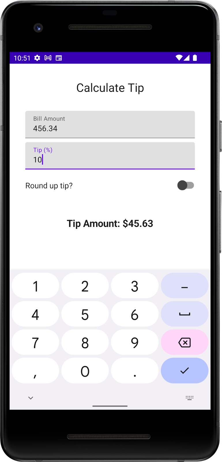
- Run the app on an emulator or a device, and then enter a bill amount and the tip percentage. Does the app calculate tip amount correctly?
4. Set an action button
In the previous codelab, you explored how to use the KeyboardOptions class to set the type of the keyboard. In this section, you explore how to set the keyboard action button with the same KeyboardOptions. A keyboard action button is a button at the end of the keyboard. You can see some examples in this table:
Property | Action button on the keyboard |
|
|
|
|
|
|
In this task, you set two different action buttons for the text boxes:
- A Next action button for the Bill Amount text box, which indicates that the user is done with the current input and wants to move to the next text box.
- A Done action button for the Tip % text box, which indicates that the user finished providing input.
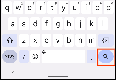
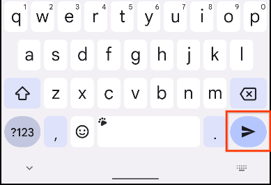
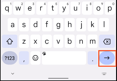
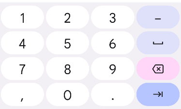
You can see examples of keyboards with these action buttons in these images:
|
|
Add keyboard options:
- In the
EditNumberField()function'sTextField()function call, pass theKeyboardOptionsconstructor animeActionnamed argument set to anImeAction.Nextvalue. Use theKeyboardOptions.Default.copyfunction to use the other default options like capitalization and auto correction.
@Composable
fun EditNumberField(
   //...
) {
   TextField(
       //...
       keyboardOptions = KeyboardOptions.Default.copy(
           keyboardType = KeyboardType.Number,
           imeAction = ImeAction.Next
       )
   )
}
- Run the app on an emulator or a device. The keyboard now displays the Next action button as you can see in this image:
|
|

However, you want two different action buttons for the text fields. You fix this problem shortly.
- Examine the
EditNumberField()function. ThekeyboardOptionsparameter in theTextField()function is hardcoded. To create different action buttons for the text fields, you need to pass in theKeyboardOptionsobject as an argument, which you will do in the next step.
// No need to copy, just examine the code.
fun EditNumberField(
   @StringRes label: Int,
   value: String,
   onValueChange: (String) -> Unit
) {
   TextField(
       //...
       keyboardOptions = KeyboardOptions.Default.copy(
          keyboardType = KeyboardType.Number,
          imeAction = ImeAction.Next
       )
   )
}
- In the
EditNumberField()function definition, add akeyboardOptionsparameter of typeKeyboardOptionstype. In the function body, assign it to theTextField()function'skeyboardOptionsnamed parameter:
@Composable
fun EditNumberField(
   @StringRes label: Int,
   keyboardOptions: KeyboardOptions,
   value: String,
   onValueChange: (String) -> Unit
){
   TextField(
       //...
       keyboardOptions = keyboardOptions
   )
}
- In the
TipTimeScreen()function, update the firstEditNumberField()function call, pass in thekeyboardOptionsnamed parameter for the Bill Amount text field.
EditNumberField(
   label = R.string.bill_amount,
   keyboardOptions = KeyboardOptions(
       keyboardType = KeyboardType.Number,
       imeAction = ImeAction.Next
   ),
   value = amountInput,
   onValueChange = { amountInput = it }
)
- In the second
EditNumberField()function call, change the Tip % text field'simeActiontoImeAction.Done. Your function should look like this code snippet:
EditNumberField(
   label = R.string.how_was_the_service,
   keyboardOptions = KeyboardOptions(
       keyboardType = KeyboardType.Number,
       imeAction = ImeAction.Done
   ),
   value = tipInput,
   onValueChange = { tipInput = it }
)
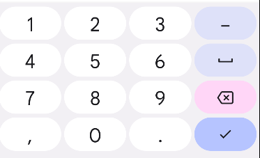
- Run the app. It displays the Next and Done action buttons as you can see in these images:
|
|

- Enter any bill amount and click the Next action button, and then enter any tip percentage and click the Done action button. Nothing happens because you haven't added any functionality to the buttons yet. You do so in the next section.
5. Set keyboard actions
In this section, you implement the functionality to move the focus to the next text field and close the keyboard to improve the user experience with the KeyboardActions class, which lets developers specify actions that are triggered in response to users IME (Input Method editor) action on the software keyboard. An example of an IME action is when the user clicks the Next or Done action button.
You implement the following:
- On Next action: Move the focus to the next text field (the Tip % text box).
- On Done action: Close the virtual keyboard.
- In the
EditNumberField()function, add avalvariable namedfocusManagerand assign it a value ofLocalFocusManager.currentproperty:
val focusManager = LocalFocusManager.current
The LocalFocusManager interface is used to control focus in Compose. You use this variable to move the focus to, and clear the focus from, the text boxes.
- Import
import androidx.compose.ui.platform.LocalFocusManager. - In the
EditNumberField()function signature, add anotherkeyboardActionsparameter ofKeyboardActionstype:
@Composable
fun EditNumberField(
   @StringRes label: Int,
   keyboardOptions: KeyboardOptions,
   keyboardActions: KeyboardActions,
   value: String,
   onValueChange: (String) -> Unit
) {
   //...
}
- In the
EditNumberField()function body, update theTextField()function call, set thekeyboardActionsparameter to the passed inkeyboardActionsparameter.
@Composable
fun EditNumberField(
   //...
) {
   TextField(
       //...
       keyboardActions = keyboardActions
   )
}
Now you can customize the text fields with different functionality for each action button.
- In the
TipTimeScreen()function call, update the firstEditNumberField()function call to include akeyboardActionsnamed parameter as a new argument. Assign it a value,KeyboardActions( onNext ={ }):
// Bill amount text field
EditNumberField(
   //...
   keyboardActions = KeyboardActions(
       onNext = { }
   ),
   //...
)
The onNext named parameter's lambda expression runs when the user presses the Next action button on the keyboard.
- Define the lambda, request
FocusManagerto move the focus downwards to the next composable, Tip %. In the lambda expression, call themoveFocus()function on thefocusManagerobject and then pass in theFocusDirection.Downargument:
// Bill amount text field
EditNumberField(
   label = R.string.bill_amount,
   keyboardOptions = KeyboardOptions(
       keyboardType = KeyboardType.Number,
       imeAction = ImeAction.Next
   ),
   keyboardActions = KeyboardActions(
       onNext = { focusManager.moveFocus(FocusDirection.Down) }
   ),
   value = amountInput,
   onValueChange = { amountInput = it }
)
The moveFocus() function moves the focus in the specified direction, which is down to the Tip % text field in this case.
- Import the following:
import androidx.compose.ui.focus.FocusDirection
- Add a similar implementation to the Tip % text field. The difference is that you need to define an
onDonenamed parameter instead ofonNext.
// Tip% text field
EditNumberField(
   //...
   keyboardActions = KeyboardActions(
       onDone = { }
   ),
   //...
)
- After the user enters the custom tip, the Done action on the keyboard should clear the focus, which inturn closes the keyboard. Define the lambda, request
FocusManagerto clear the focus. In the lambda expression, call theclearFocus()function on thefocusManagerobject:
EditNumberField(
   label = R.string.how_was_the_service,
   keyboardOptions = KeyboardOptions(
       keyboardType = KeyboardType.Number,
       imeAction = ImeAction.Done
   ),
   keyboardActions = KeyboardActions(
       onDone = { focusManager.clearFocus() }),
   value = tipInput,
   onValueChange = { tipInput = it }
)
The clearFocus() function clears focus from the component that's in focus.
- Run the app. The keyboard actions now change the component in focus as you can see in this GIF:
6. Add a switch
A switch toggles the state of a single item on or off. There are two-states in a toggle that let the user select between two options. A toggle consists of a thumb and a track as you can see in this images:
|
|
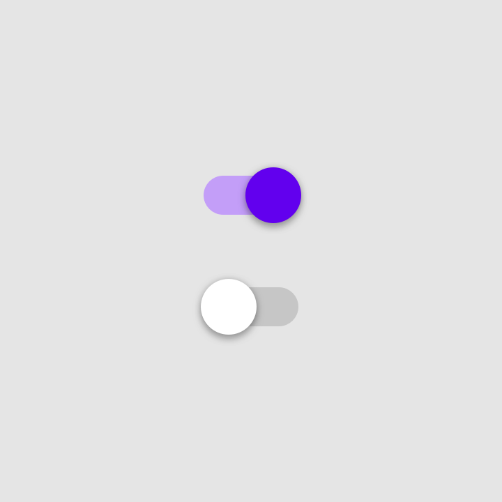
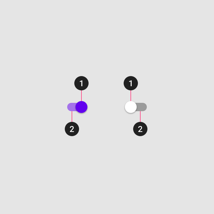 1. Thumb
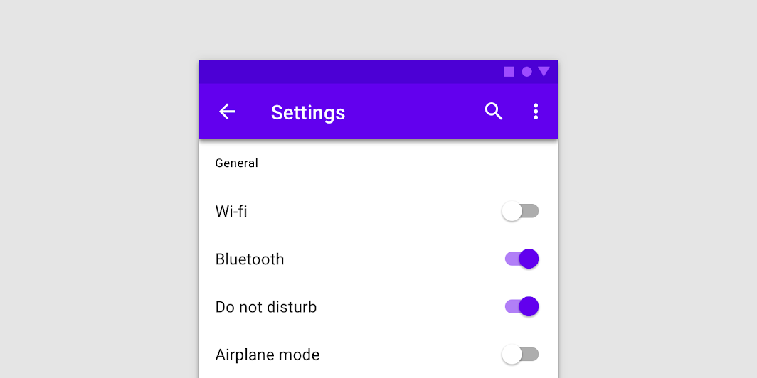
Switch is a selection control that can be used to enter decisions or declare preferences, such as settings as you can see in this image:
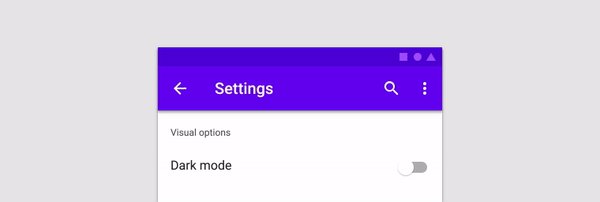
The user may drag the thumb back and forth to choose the selected option, or simply tap the switch to toggle. You can see another example of a toggle in this GIF in which the Visual options setting is toggled to Dark mode:
To learn more about switches, see the Switches documentation.
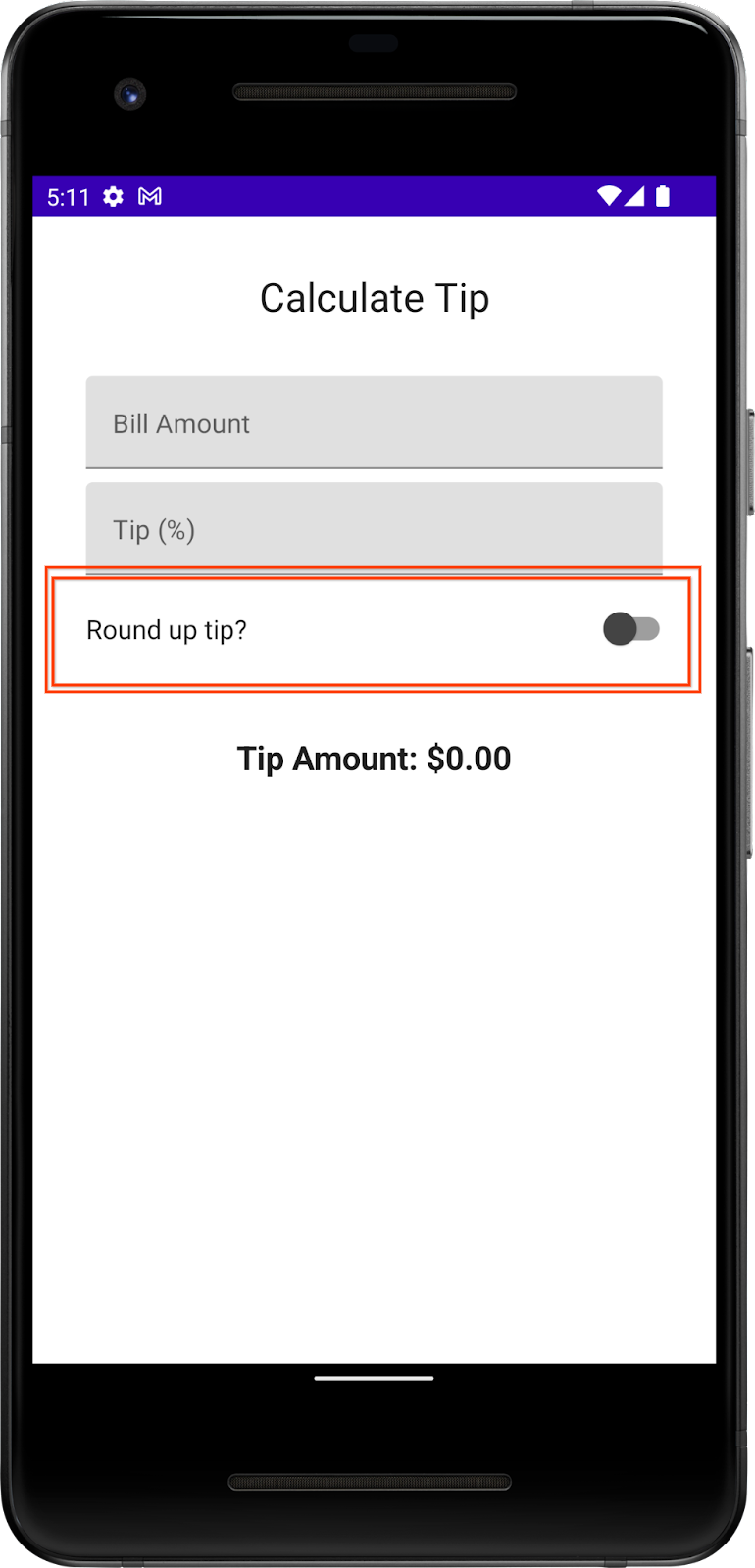
You use the Switch composable so that the user can choose whether to round up the tip to the nearest whole number as you can see in this image:
Add a row for the Text and Switch composables:
- After the
EditNumberField()function, add aRoundTheTipRow()composable function and then pass in a defaultModifier, as arguments similar to theEditNumberField()function:
@Composable
fun RoundTheTipRow(modifier: Modifier = Modifier) {
}
- Implement the
RoundTheTipRow()function, add aRowlayout composable with the followingmodifierto set the child elements' width to the maximum on the screen, center the alignment, and ensure a48dpsize:
Row(
   modifier = Modifier
       .fillMaxWidth()
       .size(48.dp),
   verticalAlignment = Alignment.CenterVertically
) {
}
- Import the following:
import androidx.compose.foundation.layout.Row
import androidx.compose.foundation.layout.Size
- In the
Rowlayout composable's lambda block, add aTextcomposable that uses theR.string.round_up_tipstring resource to display aRound up tip?string:
Text(text = stringResource(R.string.round_up_tip))
- After the
Textcomposable, add aSwitchcomposable, and pass acheckednamed parameter set it toroundUpand anonCheckedChangenamed parameter set it toonRoundUpChanged.
Switch(
    checked = roundUp,
    onCheckedChange = onRoundUpChanged,
)
This table contains information about these parameters, which are the same parameters that you defined for the RoundTheTipRow() function:
Parameter | Description |
| Whether the switch is checked. This is the state of the |
| The callback to be called when the switch is clicked. |
- Import the following:
import androidx.compose.material.Switch
- In the
RoundTipRow()function, add aroundUpparameter ofBooleantype and anonRoundUpChangedlambda function that takes aBooleanand returns nothing:
@Composable
fun RoundTheTipRow(
   roundUp: Boolean,
   onRoundUpChanged: (Boolean) -> Unit,
   modifier: Modifier = Modifier
)
This hoists the switch's state.
- In the
Switchcomposable, add thismodifierto align theSwitchcomposable to the end of the screen:
       Switch(
           modifier = modifier
               .fillMaxWidth()
               .wrapContentWidth(Alignment.End),
           //...
       )
- Import the following:
import androidx.compose.foundation.layout.wrapContentWidth
- In the
TipTimeScreen()function, add a var variable for theSwitchcomposable's state. Create avarvariable namedroundUpset it tomutableStateOf(), withfalseas the default argument. Surround the call withremember { }.
fun TipTimeScreen() {
   //...
   var roundUp by remember { mutableStateOf(false) }

   //...
   Column(
       ...
   ) {
     //...
  }
}
This is the variable for the Switch composable state, and false will be the default state.
- In the
TipTimeScreen()function'sColumnblock after the Tip % text field, call theRoundTheTipRow()function with the following arguments:roundUpnamed parameter set to aroundUpand anonRoundUpChangednamed parameter set to a lambda callback that updates theroundUpvalue:
@Composable
fun TipTimeScreen() {
   //...

   Column(
       ...
   ) {
       Text(
           ...
       )
       Spacer(...)
       EditNumberField(
           ...
       )
       EditNumberField(
           ...
       )
       RoundTheTipRow(roundUp = roundUp, onRoundUpChanged = { roundUp = it })
       Spacer(...)
       Text(
           ...
       )
   }
}
This displays the Round up tip row.
- Run the app. The app displays the Round up tip? toggle, but the thumb of the toggle is barely visible as you can see in this image:
|
|
 1. Thumb
You improve the thumb's visibility in the next steps by changing it to dark gray.
- In the
RoundTheTipRow()function'sSwitch()composable, add acolorsnamed parameter. - Set the
colorsnamed parameter to aSwitchDefaults.colors()function that accepts anuncheckedThumbColornamed parameter set to aColor.DarkGrayargument.
Switch(
   //...
   colors = SwitchDefaults.colors(
       uncheckedThumbColor = Color.DarkGray
   )
)
- Import the following:
import androidx.compose.material.SwitchDefaults
import androidx.compose.ui.graphics.Color
The RoundTheTipRow() composable function should now look like this code snippet:
@Composable
fun RoundTheTipRow(roundUp: Boolean, onRoundUpChanged: (Boolean) -> Unit) {
   Row(
       modifier = Modifier
           .fillMaxWidth()
           .size(48.dp),
       verticalAlignment = Alignment.CenterVertically
   ) {
       Text(stringResource(R.string.round_up_tip))
       Switch(
           modifier = Modifier
               .fillMaxWidth()
               .wrapContentWidth(Alignment.End),
           checked = roundUp,
           onCheckedChange = onRoundUpChanged,
           colors = SwitchDefaults.colors(
               uncheckedThumbColor = Color.DarkGray
           )
       )
   }
}
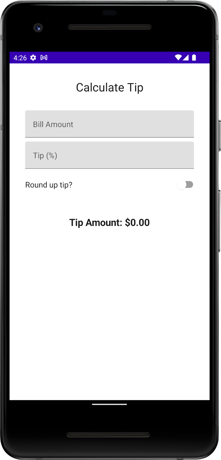
- Run the app. The switch's thumb color is different as you can see in this image:
- Enter a bill amount and tip percentage, and then select the Round up tip? toggle. The tip amount isn't rounded because you still need to update the
calculateTip()function, which you do in the next section.
Update the calculateTip() function to round the tip
Modify the calculateTip() function to accept a Boolean variable to round up the tip to the nearest integer:
- To round up the tip, the
calculateTip()function should know the state of the switch, which is aBoolean. In thecalculateTip()function, add aroundUpparameter ofBooleantype:
private fun calculateTip(
   amount: Double,
   tipPercent: Double = 15.0,
   roundUp: Boolean
): String {
   //...
}
- In the
calculateTip()function before thereturnstatement, add anif()condition that checks theroundUpvalue. If theroundUpistrue, define atipvariable and set tokotlin.math.ceil()function and then pass the functiontipas argument:
if (roundUp)
   tip = kotlin.math.ceil(tip)
The completed calculateTip() function should look like this code snippet:
private fun calculateTip(amount: Double, tipPercent: Double = 15.0, roundUp: Boolean): String {
   var tip = tipPercent / 100 * amount
   if (roundUp)
       tip = kotlin.math.ceil(tip)
   return NumberFormat.getCurrencyInstance().format(tip)
}
- In the
TipTimeScreen()function, update thecalculateTip()function call and then pass in aroundUpparameter:
val tip = calculateTip(amount, tipPercent, roundUp)
- Run the app. Now it rounds up the tip amount as you can see in these images:
|
|
7. Get the solution code
To download the code for the finished codelab, you can use this git command:
$ git clone https://github.com/google-developer-training/basic-android-kotlin-compose-training-tip-calculator.git
Alternatively you can download the repository as a zip file, unzip it, and open it in Android Studio.
If you want to see the solution code, view it on GitHub.
8. Conclusion
Congratulations! You added custom tip functionality to your Tip Time App. Now your app lets users input a custom tip percentage and round up the tip amount. Share your work on social media with #AndroidBasics!