1. Introduction

Android apps should be usable by everyone, including people with accessibility needs. Common conditions that affect a person's use of an Android device include blindness or low vision, deafness or impaired hearing, restricted motor skills, cognitive disabilities, and color blindness. And this is just a partial list.
In this codelab, you will learn about commonly occurring accessibility issues in apps. Specifically, you will focus on three such issues:
- Missing labels
- Inadequate touch targets
- Poor contrast between foreground and background
You will learn how these issues affect users, how you can check if these issues are present in your apps, and how you can go about fixing them.
The codelab is structured in small, discrete steps. Each step focuses on a specific aspect of accessibility.
Audience and Prerequisites
This codelab is intended for Android developers who want to understand how to make their apps accessible to users with accessibility needs. No previous knowledge of accessibility APIs or guidelines is assumed.
This codelab assumes the following:
- Basic familiarity with writing Android apps.
- Access to an Android device running Lollipop (API level 21) or higher.
- Ability to install the Accessibility Scanner app from the Google Play Store.
2. Getting Set Up
What you'll be building
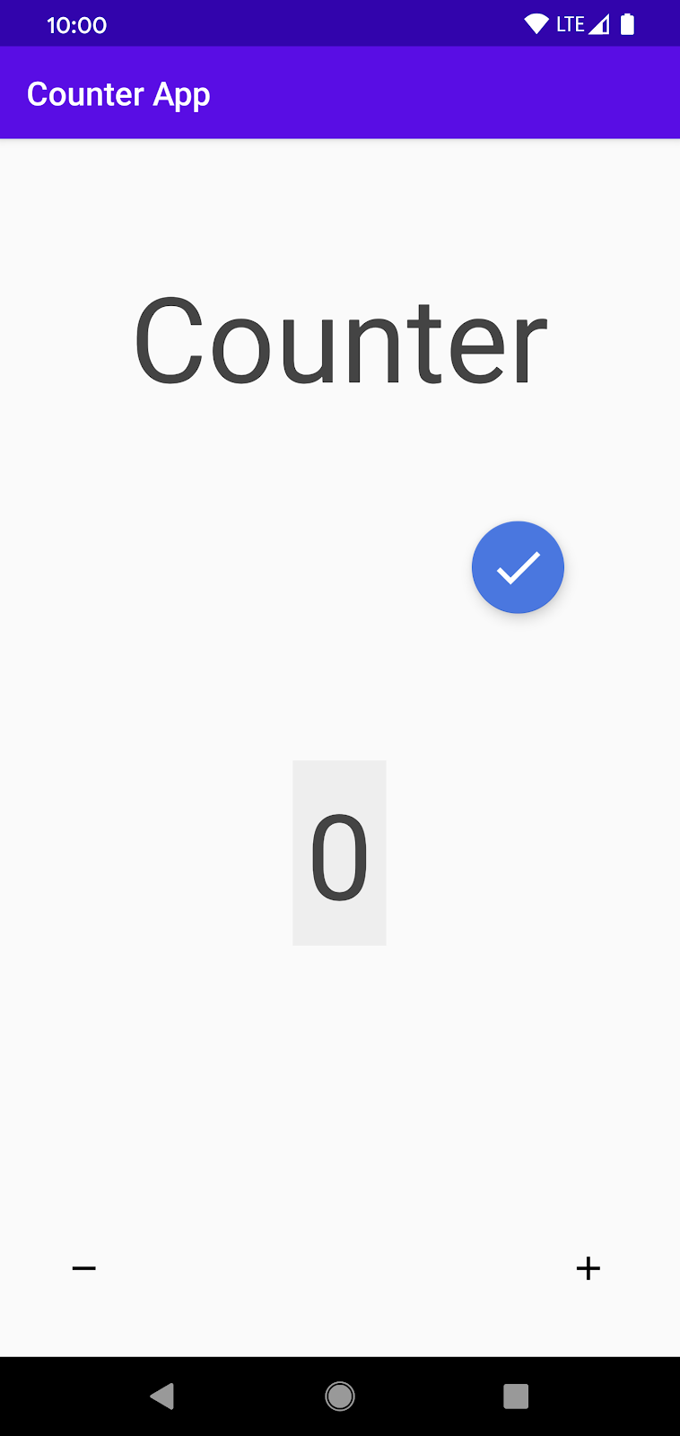
In this codelab, you'll be working with an existing app, Counter. This app allows users to track, increment, and decrement a numerical count. Even though the app is simple, you'll discover that it has numerous accessibility issues that make it hard for many users to properly interact with it.
During the course of this codelab, you'll improve this app and make it more accessible. Your improvements will help blind and low vision users as well as users with mobility and dexterity issues. Fixing Counter will provide you with basic knowledge about accessibility that you can use to improve the accessibility of your own apps.
Download the Code
You can get the source code for the starting version of the app from GitHub. Clone the repo, and open Counter in Android Studio.
Each step in this codelab is structured so that you work on a feature that has been implemented in a less accessible manner. By the end of each step, you will have modified the code, and you will have made the screen or feature more accessible.
Launching the demo application
- Launch Android Studio and open the Counter project. Make sure a device is connected to your computer.
- Press the green Play icon
 from the menu bar towards the top of the screen. This should launch the Counter app. The landing page for that app looks something like this:
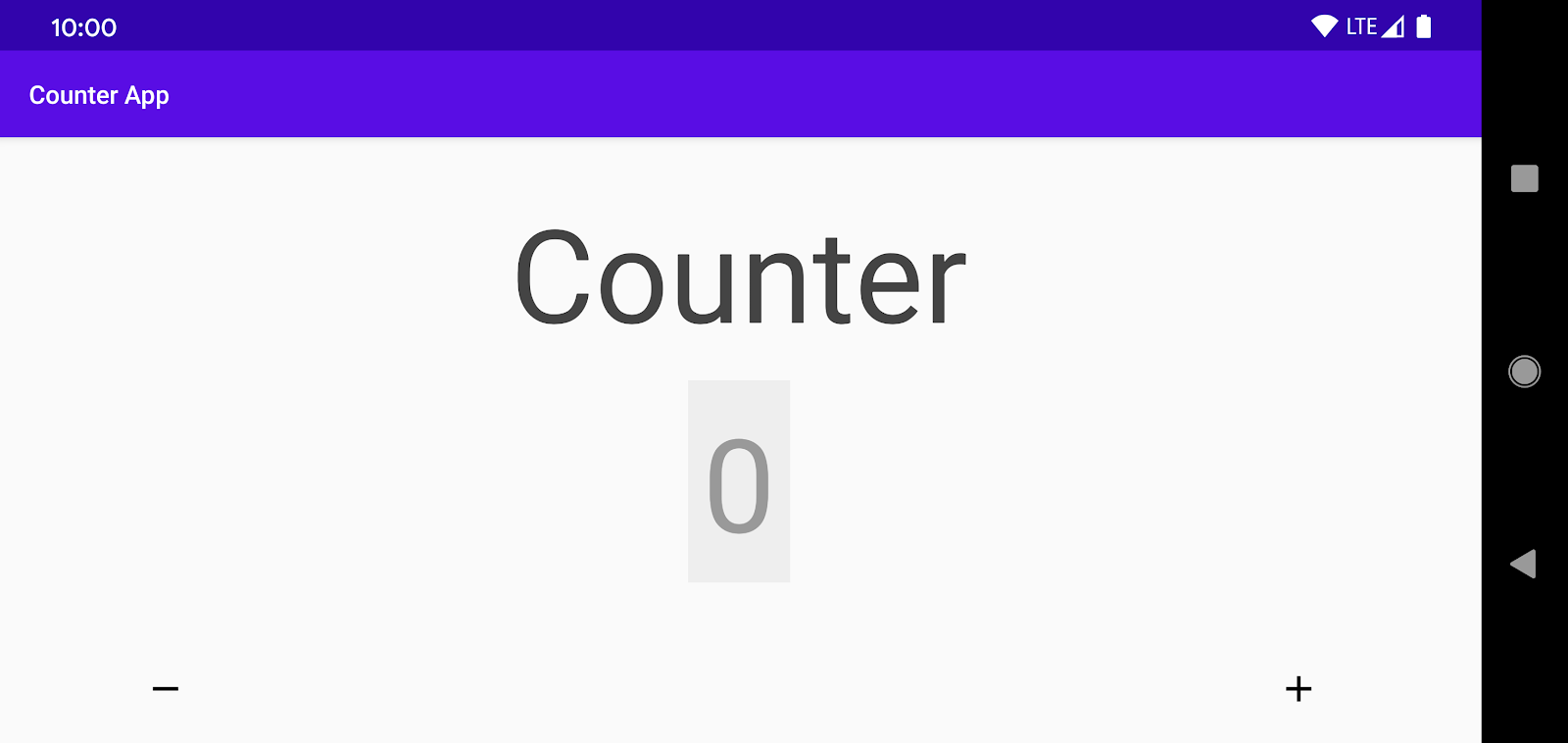
- Play with the demo app a little bit, using the increment ("+") and decrement ("-") buttons to change the count.
For many users, this is an easy app to use. But accessibility issues make it challenging for some users. You'll find out more about those challenges in this codelab.
First, you'll set up Accessibility Scanner, the tool you'll be using in this codelab to identify accessibility issues.
3. Accessibility Scanner
Accessibility Scanner is a tool created by Google that suggests accessibility improvements for Android apps—such as enlarging small touch targets, increasing contrast, and providing content descriptions—so that individuals with accessibility needs can use your app more easily.
You can download and configure Accessibility Scanner using the following steps:
- Download Accessibility Scanner from the Google Play Store.
- After you've installed Accessibility Scanner, navigate to Settings > Accessibility on your device. Locate and turn on Accessibility Scanner (Tap "Allow" or "OK", then "Begin Authorization" to complete the setup workflow).
- Return to the Counter app. Your screen should now look like this:
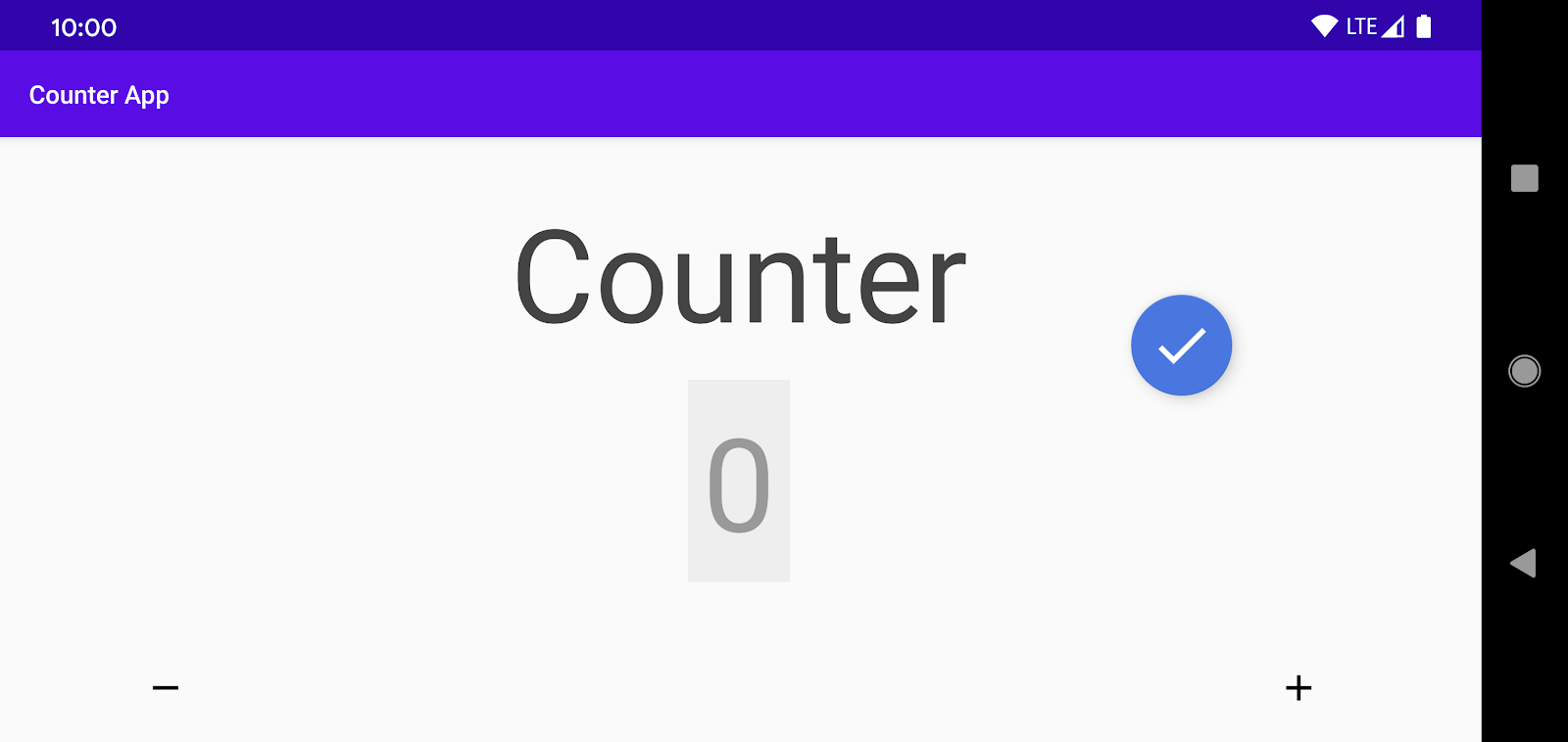
You'll notice that Accessibility Scanner creates a blue Floating Action Button (FAB), which is overlaid on top of any content you have on the screen.
You can tap the FAB to start an accessibility scan (you'll do that in a moment). To move the FAB to another area of the screen, you can long-press on it and drag it.
4. Scanning the Counter App
In this section you'll perform an accessibility audit of the screen using Accessibility Scanner:
- Tap on
 to launch the scan. When you do this, Accessibility Scanner examines the UI of your screen, performs a quick audit for accessibility, and prepares suggestions for accessibility-related improvement.
 - Examine the output from running a scan. It should look something like this:
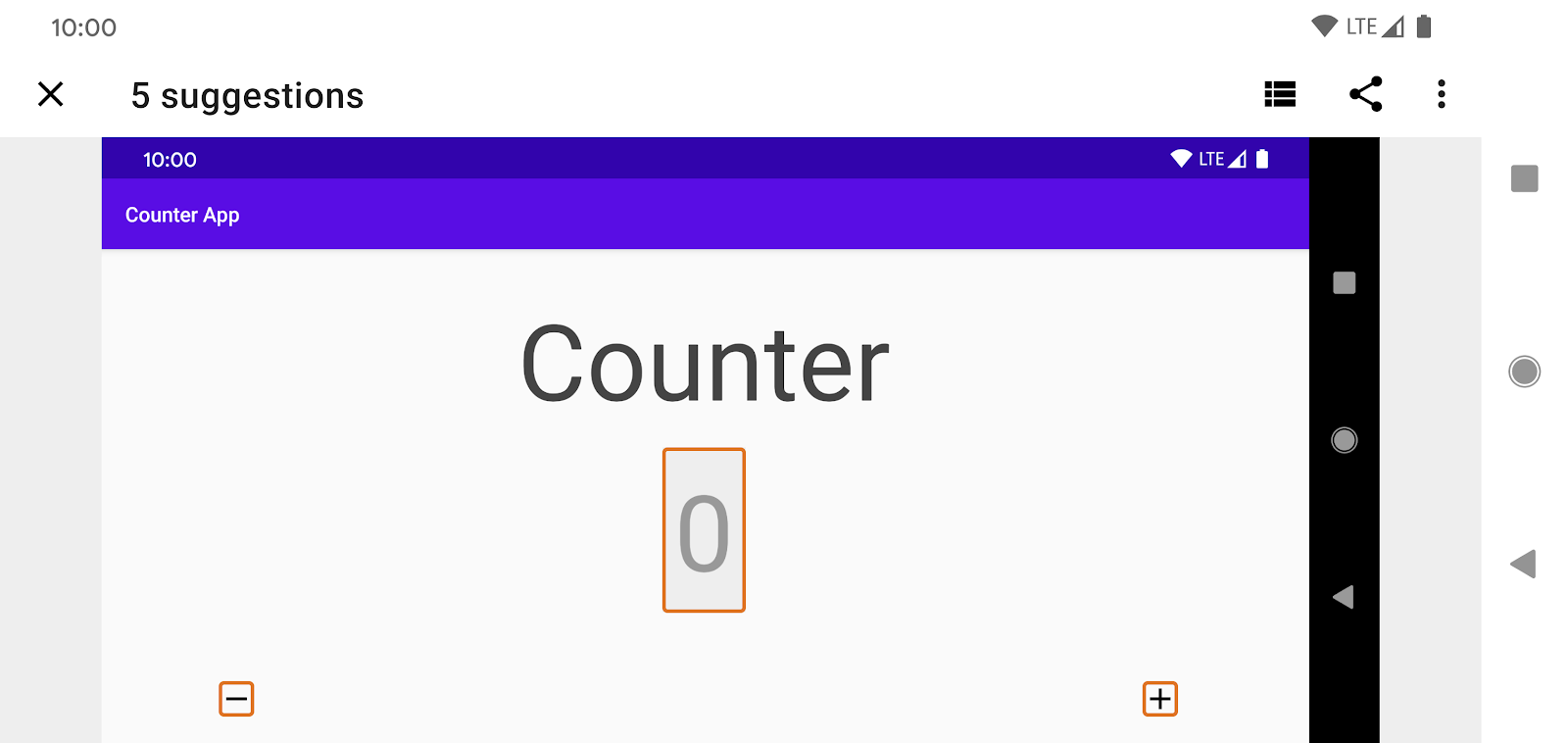
Accessibility Scanner highlights the views that may have accessibility issues, and offers suggestions for how you can fix those issues.
Understanding Accessibility Scanner's suggestions
Accessibility Scanner has five suggestions for improving Counter's accessibility.
Insufficient contrast
Accessibility Scanner recommends fixing the poor color contrast in the view that shows the current count.
- Tap on the count field, outlined in orange in the middle of the screen, and see Scanner's suggestion:
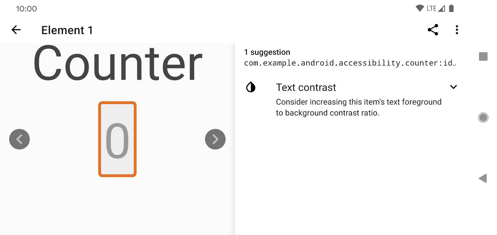
- Expand the error and see details about how to apply Scanner's suggestion. You'll notice that Scanner shows you the foreground and background colors and the existing and suggested contrast ratios:
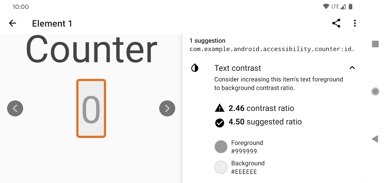
Why does color contrast matter for accessibility? Users with impaired vision have more difficulty reading information on a screen if there is not enough contrast between the foreground and background colors. Low contrast ratios can cause views to blur together for some users, while high contrast ratios make the views stand out more clearly. Different lighting situations can amplify the difficulties created by low contrast ratios.
Missing labels
Scanner flags the missing labels in the "-" and "+" ImageButtons, which makes it hard for screenreader users to know the purpose of these controls.
- Tap on the errors associated with either the "-" and "+" buttons, and read the suggestions related to the missing labels:
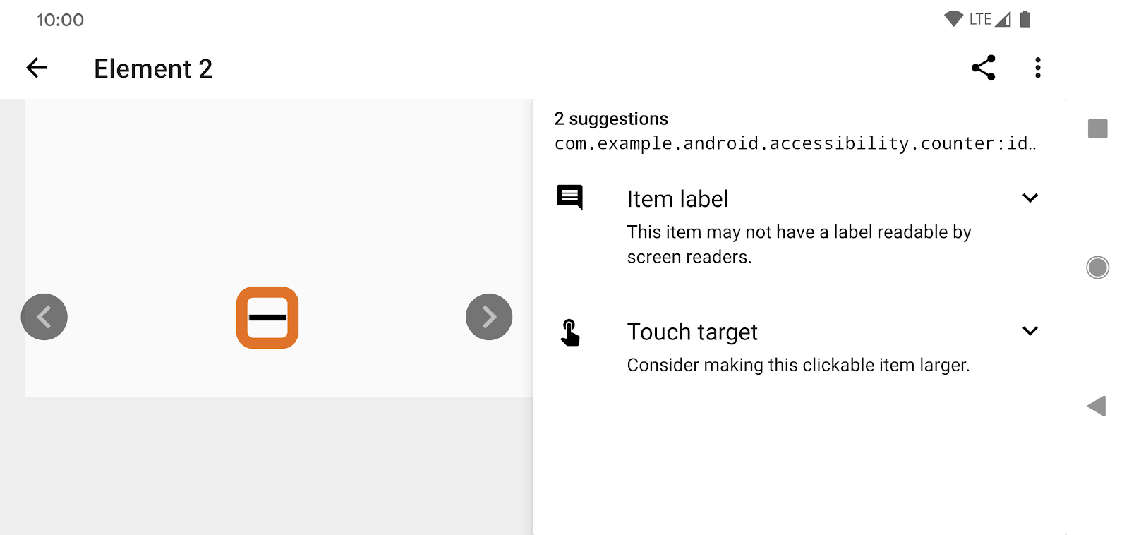
Why are missing labels problematic for accessibility? Users who are blind or visually impaired use screenreaders like Talkback to interact with their devices. Talkback announces the screen content to the user who can then interact with the discovered content. When an element does not have associated text (an ImageButton, for example), Talkback doesn't know how to properly convey that element's purpose to the user; in such a case, it may default to announcing "Unlabelled button", which is unhelpful to the user. When you provide a properly descriptive label, Talkback can announce it to the user.
Insufficient Touch Targets
In addition to the missing labels, Scanner suggests increasing the touchable area for the "-" and "+" buttons:
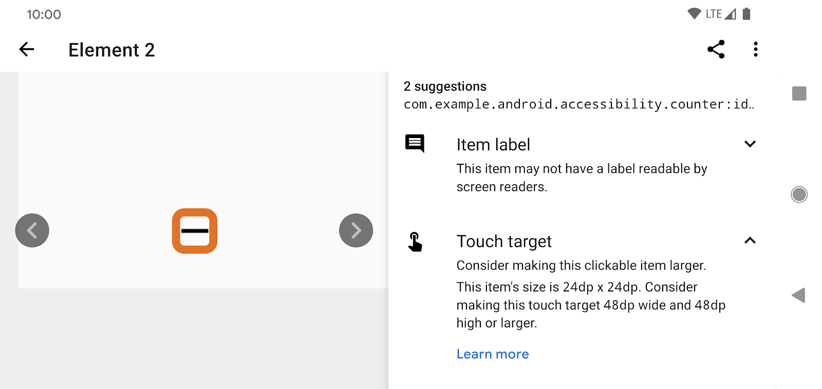
Why are small touch targets problematic for accessibility? Many people have difficulty focusing on small touch targets on the screen. This could simply be because their fingers are large, or because they have a medical condition that impairs their motor skills. Small touch targets also make it harder for screen reader users to navigate apps by moving a finger around the screen, such as when using the Explore by Touch feature in TalkBack.
Summary
You've explored only a tiny fraction of the functionality provided by Accessibility Scanner. But the suggestions that Accessibility Scanner provided—those related to color contrast, item labels, and touch targets—commonly appear in Android apps. Applying the suggestions can go a long way towards making your apps more accessible. And the fixes are often pretty straightforward.
So, let's get coding!
5. Ensuring Adequate Color Contrast
In Counter, the color contrast is straightforward to improve. The TextView displaying the count uses a light grey background and a grey text color:
<TextView
   ...
   android:background="@color/lightGrey"
   android:textColor="@color/grey"
   ...
 />
You can remove the background, pick a lighter background, or pick a darker text color. In this codelab, you'll pick a darker text color. Here are some colors that have been defined for you in colors.xml:
<?xml version="1.0" encoding="utf-8"?>
<resources>
   ...
   <color name="lightGrey">#EEEEEE</color>
   <color name="grey">#999999</color>
   <color name="darkGrey">#666666</color>
</resources>
Open res/layout/activity_main.xml and change android:textColor="@color/grey" to android:textColor="@color/darkGrey" :
<TextView
   ...
   android:background="@color/lightGrey"
   android:textColor="@color/darkGrey"
   ...
 />
Now run the app, and observe the changed contrast:
Before | After |
|
|
The contrast ratio is now 4.94:1, which is considerably better than 2.45: 1, which is what you had before:
Background | Text Color | Contrast ratio | |
Before | #EEEEEE | Light gray (#999999) | 2.45:1 |
After | #EEEEEE | Dark gray (#666666) | 4.94:1 |
So, what constitutes adequate contrast? The Web Content Accessibility Guidelines recommend a minimum contrast ratio of 4.5:1 for all text, with a contrast ratio of 3.0:1 considered acceptable for large or bold text. Try to meet or exceed these contrast ratios in your applications.
 Press the FAB to begin another scan using Accessibility Scanner, and you'll see that the app no longer makes any suggestions related to color contrast:
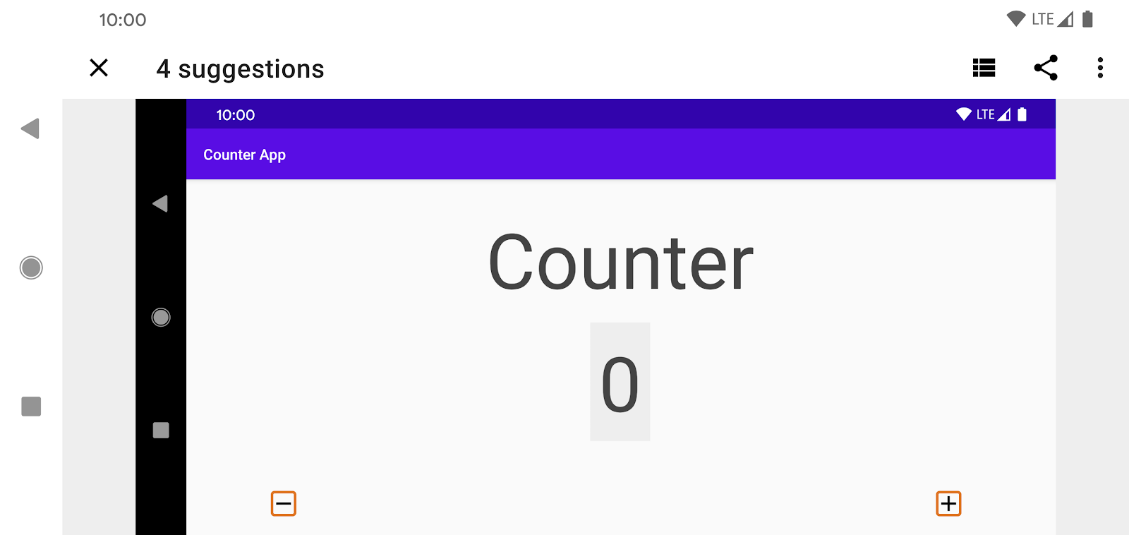
Accessibility Scanner still has 4 suggestions for improving Counter's accessibility, so let's keep working on the app.
6. Adding Missing Labels
Since the "-" and "+" ImageButtons are missing labels, a screenreader like Talkback cannot properly relay the views' semantics to the user, and it simply announces "Unlabelled, Button" when a user focuses on either button:
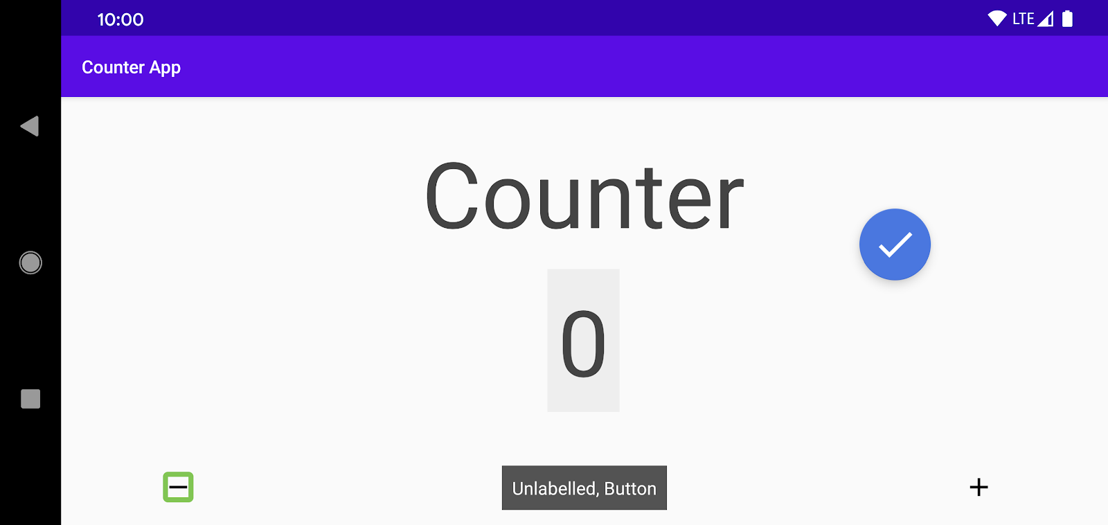
To fix this, assign an android:contentDescription for each button:
<ImageButton
   android:id="@+id/subtract_button"
   ...

   android:contentDescription="@string/decrement" />


<ImageButton
   android:id="@+id/add_button"
   ...
   android:contentDescription="@string/increment" />
Ensure that you use localized strings for content descriptions so that they can be properly translated. For this codelab, the strings have already been defined in res/values/strings.xml.
A screenreader now announces the value of the contentDescription that you provided (appropriately translated to the locale language) when the screenreader user focuses on the buttons.
 Run Accessibility Scanner again. You'll notice that there are no suggestions related to missing labels.

7. Making Touch Targets Larger
Accessibility Scanner continues to suggest that the "-" and "+" should have a larger touch size. In this step, you'll follow that suggestion.
The two buttons in Counter are small (24dp X 24dp). In general, you want the touchable area of focusable items to be at least 48dp X 48dp. Larger than that is even better. Note that by increasing the touchable area from 24dp X 24dp to 48dp X 48dp, you expand the touchable area by a factor of 4.
You have several options for increasing the touchable area of the buttons. For example, you can do either of the following:
- Add padding around the icons.
- Add a
minWidthand/or aminHeight(this will make the icons larger). - Register a TouchDelegate.
Before you change anything, let's get a better sense of how the buttons' touchable area can be measured.
Tooling and layout bounds
For this step, make sure you enable Developer Options on your device.
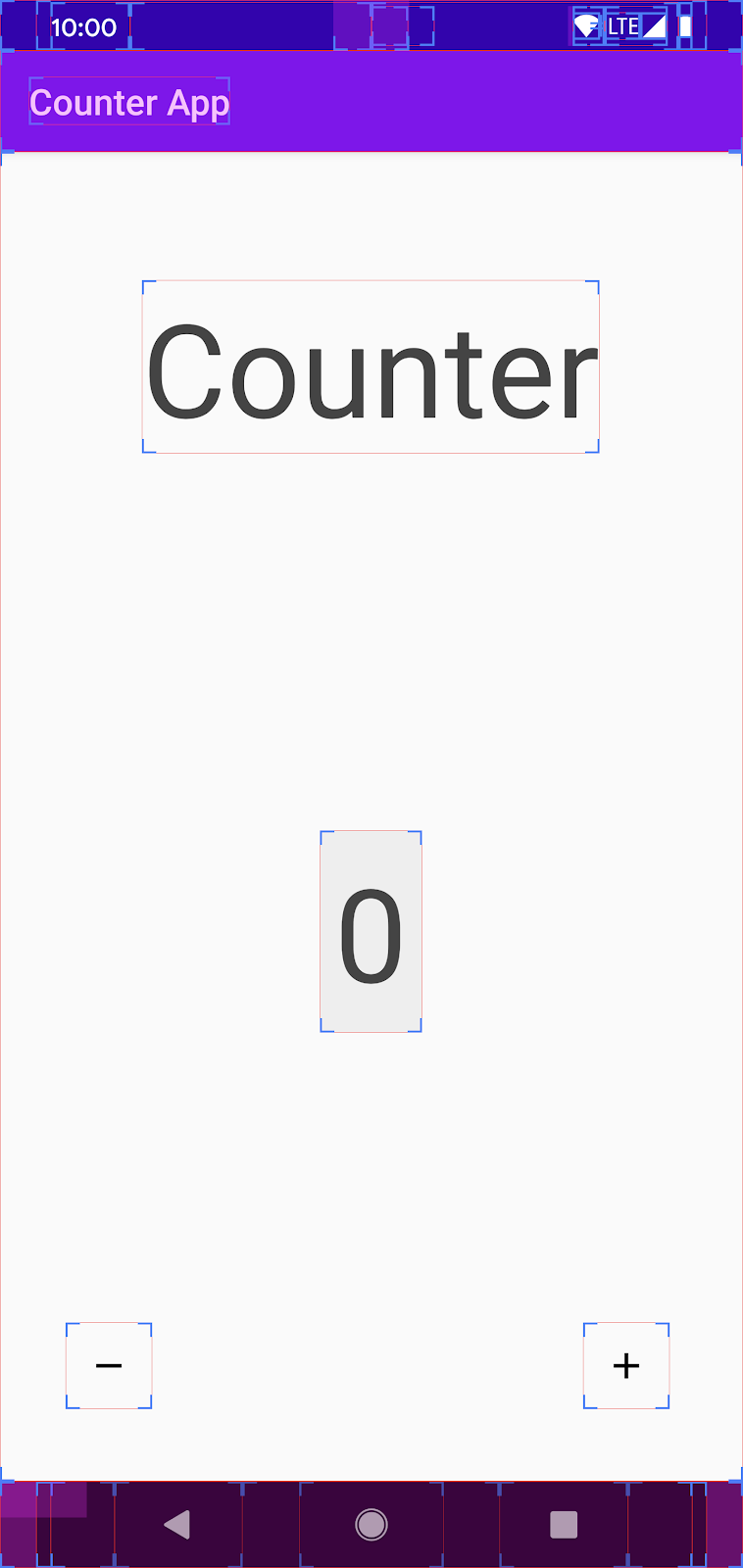
Go to Settings > System > Developer Options. Under the Drawing category, enable "Show layout bounds". Your screen should now show the clip bounds, margins, etc. of every visible view.
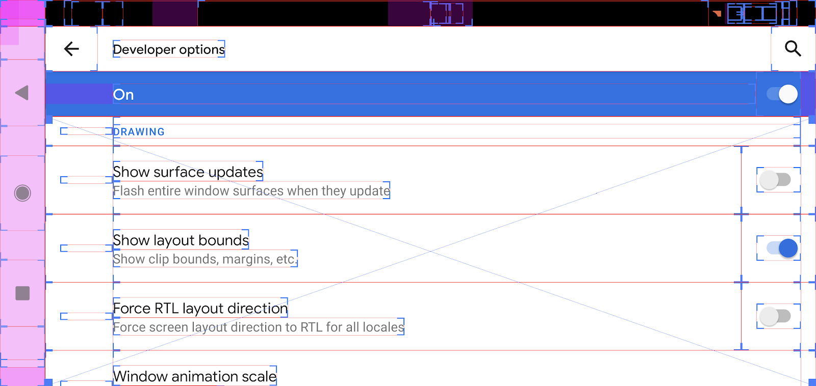
Now observe the layout bounds of Counter screen, focusing on the two buttons**:**
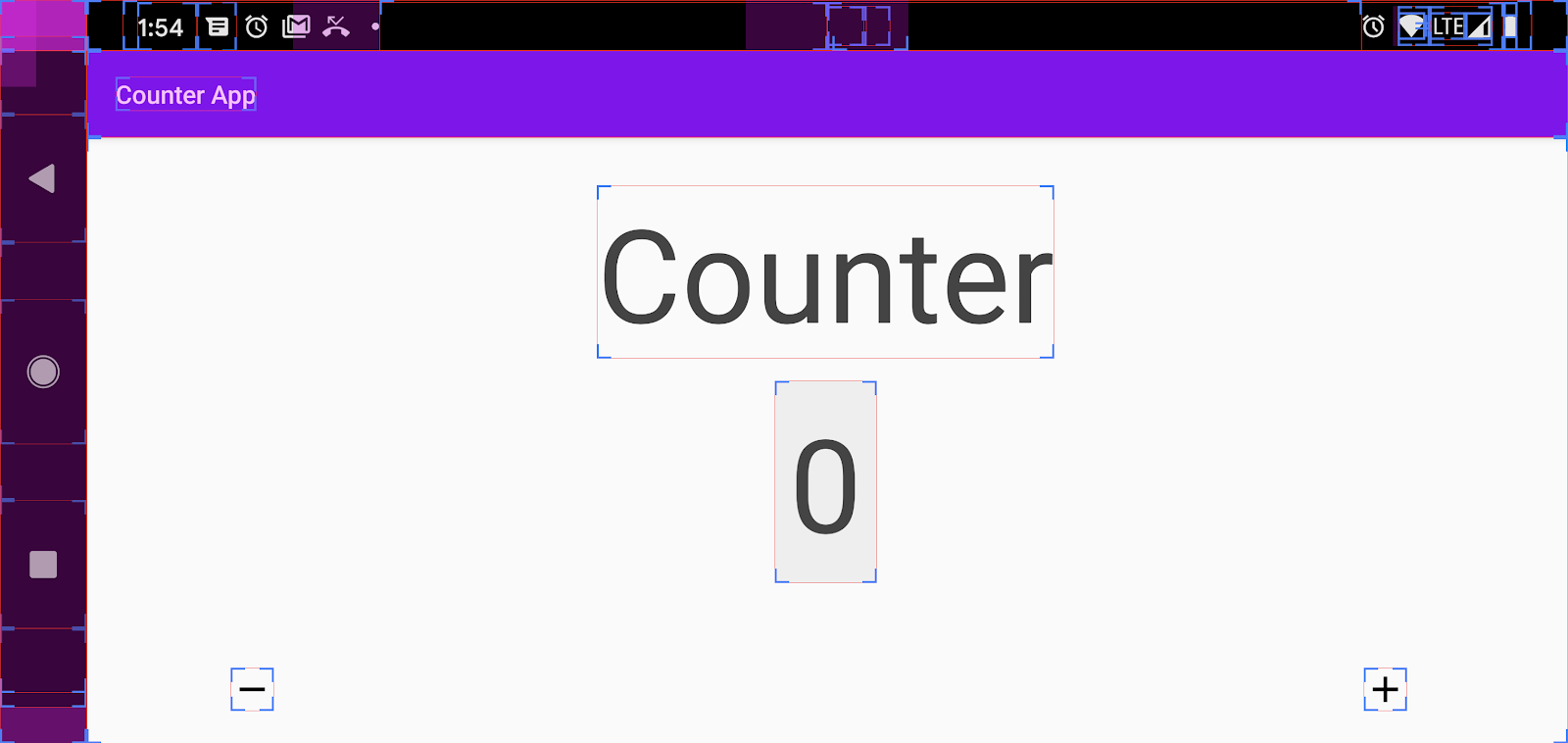
The touchable area extends only to the layout bounds of the icons, and Accessibility Scanner has already informed you that the touchable area (24dp X 24dp) is too small. Let's increase the area for both buttons.
Looking at res/layout/activity_main.xml, you see the following definitions for the two buttons:
<ImageButton
   android:id="@+id/add_button"
   android:layout_width="wrap_content"
   android:layout_height="wrap_content"
   ... />


<ImageButton
   android:id="@+id/subtract_button"
   android:layout_width="wrap_content"
   android:layout_height="wrap_content"
  ... />
Add some padding to each view:
<ImageButton
   ...
   android:padding="@dimen/icon_padding"
   ... />


<ImageButton
   ...
   android:padding="@dimen/icon_padding"
  ... />
The value of @dimen/icon_padding is set to 12dp (see res/dimens.xml). When this padding is applied, the touchable area of the control becomes 48dp X 48dp (24dp + 12dp in each direction).
Run the app again to confirm the new layout bounds:
Before | After |
|
|
Go back to Settings > Developer Options > Drawing category, find "Show layout bounds", and turn it off.
 Run Accessibility Scanner again. This time, the scan should complete without suggestions:
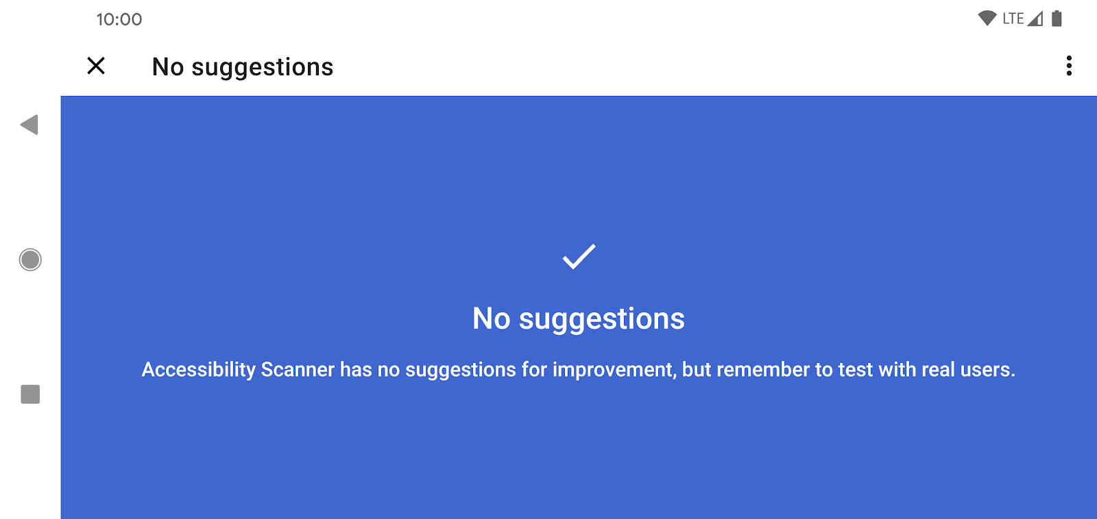
Congratulations, by completing these few simple steps, you've made your app more accessible!
8. Limitations of Accessibility Scanner
While tools like Accessibility Scanner can help you make some significant improvements to your app's accessibility, these tools are no replacement for manual testing.
Accessibility needs to be approached holistically—Accessibility Scanner, for example, will tell you if you're missing a label, but cannot tell whether that label makes sense. Generally, Accessibility Scanner cannot determine whether your user interface conveys semantic information simply and clearly. In addition, Accessibility Scanner cannot report on how well an app supports multiple modes of interaction (touch vs. voice), or if users can successfully complete your app's most common use cases. But Accessibility Scanner provides an introduction to accessibility, and it's an invaluable accessibility tool that you should consider using often.
Turning off Accessibility Scanner
Navigate to Settings > Accessibility and set Accessibility Scanner to Off.
9. Links and Resources
You've touched on a lot of topics related to Android accessibility. Here are some links and resources you can explore:
- To continue learning about Android accessibility, visit developer.android.com.
- To learn more about accessibility services, visit the Android Accessibility Help Center, where you can find documentation for TalkBack, Voice Access, Switch Access, and other Android accessibility features.
- Read about the accessibility and Material Design.


