
1. Before you begin
Material Design is a design system built and supported by Google designers and developers to build high-quality digital experiences for Android, as well as other mobile and web platforms. It provides guidelines on how to build your app UI in a readable, attractive, and consistent manner.
In this codelab, you learn about Material Theming, which allows you to use Material Design in your app, with guidance on customizing colors, typography, and shapes. You can customize as little, or as much, as you like for your app. You also learn how to add a top app bar to display the app's name and icon.
Prerequisites
- Familiar with the Kotlin language, including syntax, functions, and variables.
- Able to build layouts in Compose, including rows and columns with padding.
- Able to create simple lists in Compose.
What you'll learn
- How to apply Material Theming to a Compose app.
- How to add a custom color palette to your app.
- How to add custom fonts to your app.
- How to add custom shapes to elements in your app.
- How to add a top app bar to your app.
What you'll build
- You will build a beautiful app that incorporates Material Design best practices.
What you'll need
- The latest version of Android Studio.
- An internet connection to download the starter code and fonts.
2. App overview
In this codelab, you create Woof, an app that displays a list of dogs and uses Material Design to create a beautiful app experience.
Through this codelab, we will show you some of what is possible using Material Theming. Use this codelab for ideas of how to use Material Theming to improve the look and feel of the apps you create in the future.
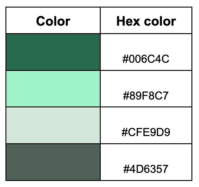
Color palette
Below are the color palettes for both light and dark themes that we will create.


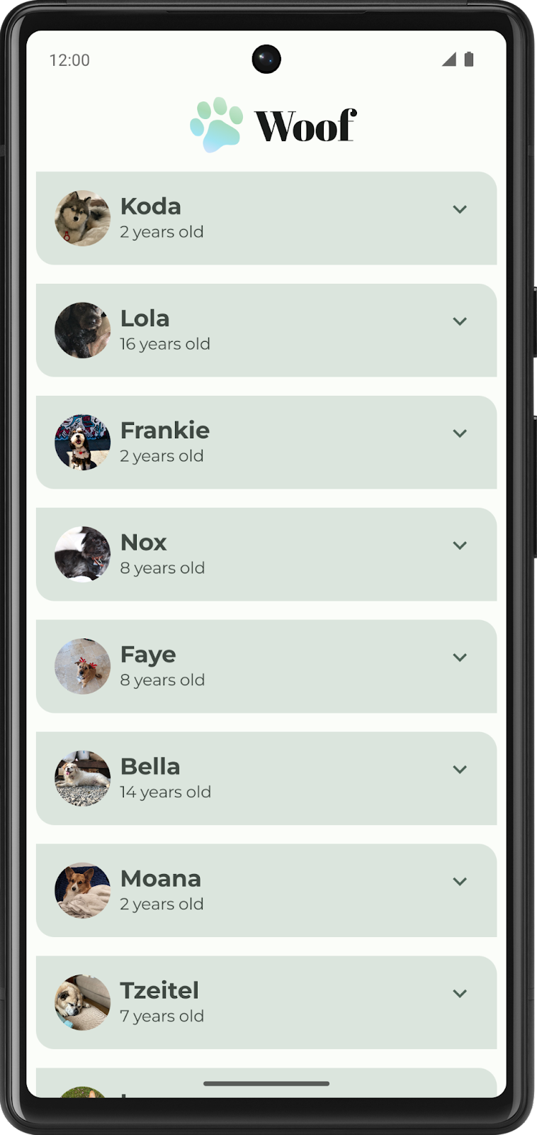
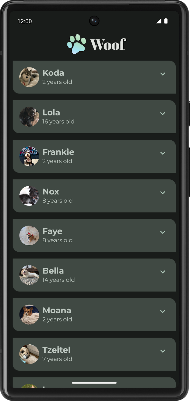
Here is the final app in both light theme and dark theme.
Light theme | Dark theme |
|
|
Typography
Below are the type styles you will use in the app.
Theme file
The Theme.kt file is the file that holds all the information about the theme of the app, which is defined through color, typography, and shape. This is an important file for you to know. Inside of the file is the composable WoofTheme(), which sets the colors, typography, and shapes of the app.
@Composable
fun WoofTheme(
    darkTheme: Boolean = isSystemInDarkTheme(),
    // Dynamic color is available on Android 12+
    dynamicColor: Boolean = false,
    content: @Composable () -> Unit
) {
    val colorScheme = when {
        dynamicColor && Build.VERSION.SDK_INT >= Build.VERSION_CODES.S -> {
            val context = LocalContext.current
            if (darkTheme) dynamicDarkColorScheme(context) else dynamicLightColorScheme(context)
        }

        darkTheme -> DarkColors
        else -> LightColors
    }
    val view = LocalView.current
    if (!view.isInEditMode) {
        SideEffect {
            setUpEdgeToEdge(view, darkTheme)
        }
    }

    MaterialTheme(
        colorScheme = colorScheme,
        shapes = Shapes,
        typography = Typography,
        content = content
    )
}

/**
 * Sets up edge-to-edge for the window of this [view]. The system icon colors are set to either
 * light or dark depending on whether the [darkTheme] is enabled or not.
 */
private fun setUpEdgeToEdge(view: View, darkTheme: Boolean) {
    val window = (view.context as Activity).window
    WindowCompat.setDecorFitsSystemWindows(window, false)
    window.statusBarColor = Color.Transparent.toArgb()
    val navigationBarColor = when {
        Build.VERSION.SDK_INT >= 29 -> Color.Transparent.toArgb()
        Build.VERSION.SDK_INT >= 26 -> Color(0xFF, 0xFF, 0xFF, 0x63).toArgb()
        // Min sdk version for this app is 24, this block is for SDK versions 24 and 25
        else -> Color(0x00, 0x00, 0x00, 0x50).toArgb()
    }
    window.navigationBarColor = navigationBarColor
    val controller = WindowCompat.getInsetsController(window, view)
    controller.isAppearanceLightStatusBars = !darkTheme
    controller.isAppearanceLightNavigationBars = !darkTheme
}
In MainActivity.kt, the WoofTheme() is added to provide the Material Theming for the entire app.
class MainActivity : ComponentActivity() {
   override fun onCreate(savedInstanceState: Bundle?) {
       super.onCreate(savedInstanceState)
       setContent {
           WoofTheme {
               Surface(
                   modifier = Modifier.fillMaxSize()
               ) {
                   WoofApp()
               }
           }
       }
   }
}
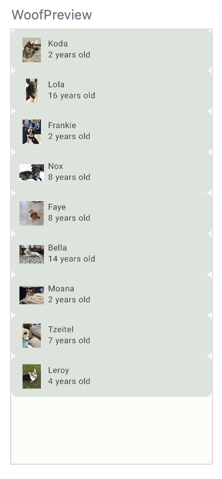
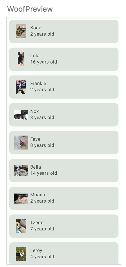
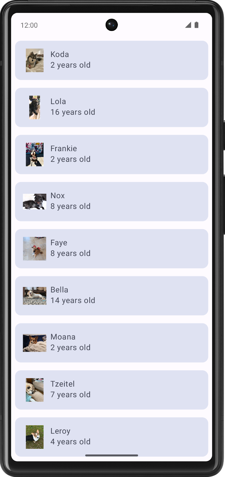
Take a look at the WoofPreview(). The WoofTheme() is added to provide the Material Theming you see in the WoofPreview().
@Preview
@Composable
fun WoofPreview() {
    WoofTheme(darkTheme = false) {
        WoofApp()
    }
}
3. Get the starter code
To get started, download the starter code:
Alternatively, you can clone the GitHub repository for the code:
$ git clone https://github.com/google-developer-training/basic-android-kotlin-compose-training-woof.git
$ cd basic-android-kotlin-compose-training-woof
$ git checkout starter
You can browse the code in the Woof app GitHub repository.
Explore the starter code
- Open the starter code in Android Studio.
- Open com.example.woof > data > Dog.kt. This contains the
Dog data classthat will be used to represent the dog's photo, name, age, and hobbies. It also contains a list of dogs and the information that you will use as the data in your app. - Open res > drawable. This contains all the image assets that you need for this project, including the app icon, dog images, and icons.
- Open res > values > strings.xml. This contains the strings you use in this app, including the app name, dog names, their descriptions, and more.
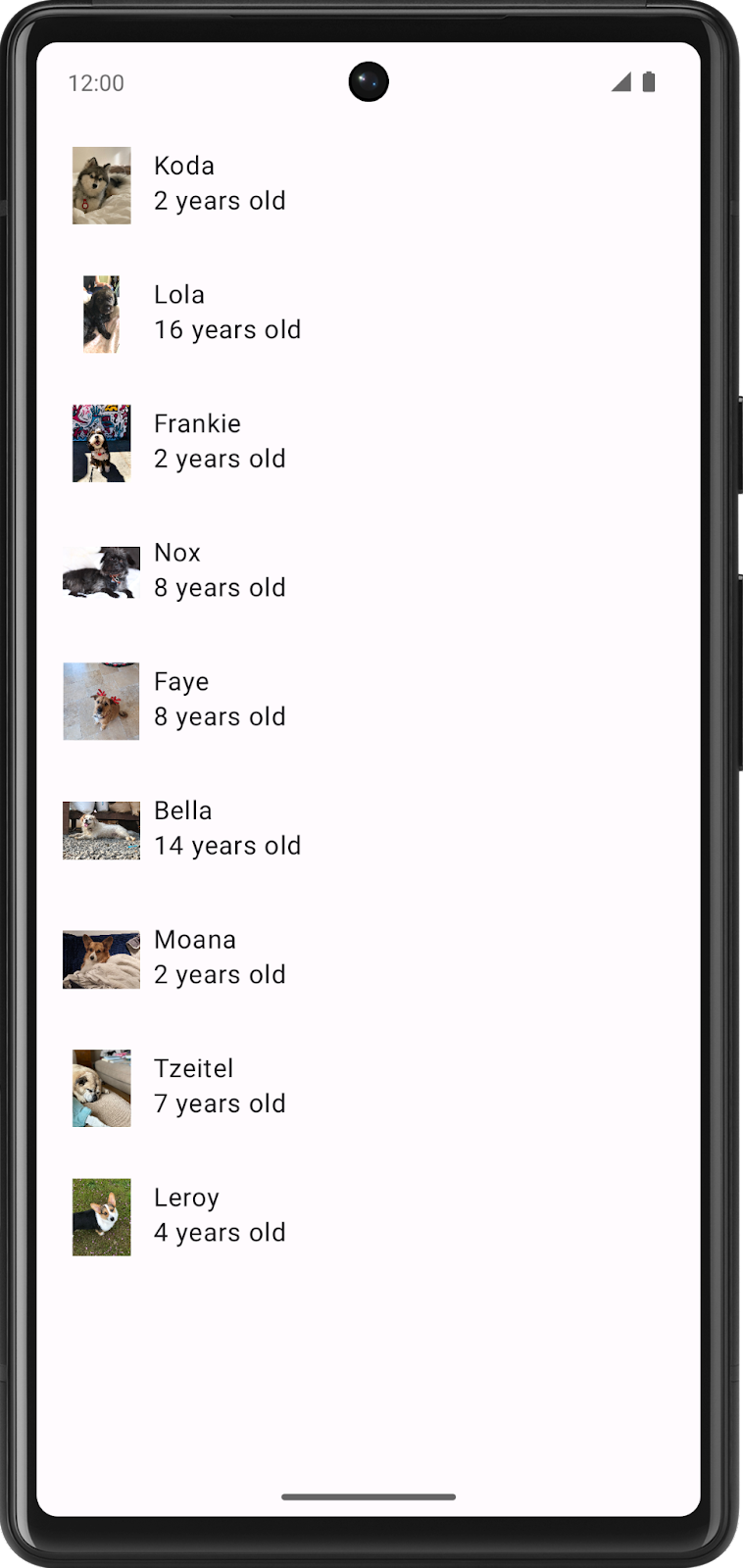
- Open MainActivity.kt. This contains the code to create a simple list that displays a photo of a dog, the dog's name, and the dog's age.
WoofApp()contains aLazyColumnthat displays theDogItems.DogItem()contains aRowthat displays a photo of the dog and information about it.DogIcon()displays a photo of the dog.DogInformation()displays the dog's name and age.WoofPreview()allows you to see a preview of the app in the Design pane.
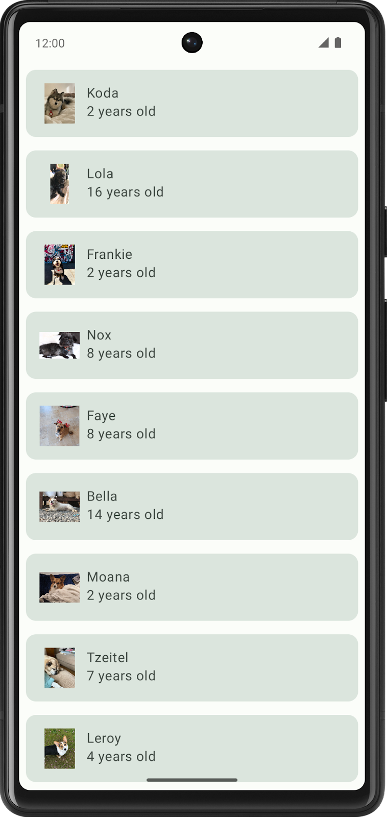
Ensure your emulator/device is in light theme
In this codelab, you will be working with both light and dark themes, however, most of the codelab is in light theme. Before you get started, ensure that your device/emulator is in light theme.
In order to view your app in light theme, on your emulator or physical device:
- Go to the Settings app on the device.
- Search for Dark theme and click into it.
- If Dark theme is on, switch it off.
Run the starter code to see what you're starting with; it's a list that displays dogs with their photos, names, and ages. It is functional, but it doesn't look great, so we are going to fix that.
4. Add color
The first thing you are going to modify in the Woof app is the color scheme.
A color scheme is the combination of colors that your app uses. Different color combinations evoke different moods, which influences how people feel when they use your app.
Color, in the Android system, is represented by a hexadecimal (hex) color value. A hex color code starts with a pound (#) character, and is followed by six letters and/or numbers that represent the red, green, and blue (RGB) components of that color. The first two letters/numbers refer to red, the next two refer to green, and the last two refer to blue.

A color can also include an alpha value—letters and/or numbers—which represents the transparency of the color (#00 is 0% opacity (fully transparent), #FF is 100% opacity (fully opaque)). When included, the alpha value is the first two characters of the hex color code after the pound (#) character. If an alpha value is not included, it is assumed to be #FF, which is 100% opacity (fully opaque).
Below are some example colors and their hex values.
Use Material Theme Builder to create a color scheme
To create a custom color scheme for our app, we will use the Material Theme Builder.
- Click this link to go to the Material Theme Builder.
- On the left pane you will see the Core Colors, click on Primary:

- The HCT color picker will open.

- To create the color scheme shown in the app screenshots, you will change the primary color in this color picker. In the text box replace the current text with #006C4C. This will make the primary color of the app green.

Notice how this updates the apps on the screen to adopt a green color scheme.

- Scroll down the page and you will see the full color scheme for light and dark theme generated off of the color you inputted.
You may wonder what all these roles are and how they are utilized, here are a few of the main ones:
- The primary colors are used for key components across the UI.
- The secondary colors are used for less prominent components in the UI.
- The tertiary colors are used for contrasting accents that can be used to balance primary and secondary colors or bring heightened attention to an element, such as an input field.
- The on color elements appear on top of other colors in the palette, and are primarily applied to text, iconography, and strokes. In our color palette, we have an onSurface color, which appears on top of the surface color, and an onPrimary color, which appears on top of the primary color.
Having these slots leads to a cohesive design system, where related components are colored similarly.
Enough theory about colors—time to add this beautiful color palette to the app!
Add color palette to theme
On the Material Theme Builder page, there is the option to click the Export button to download a Color.kt file and Theme.kt file with the custom theme you created in the Theme Builder.
This will work to add the custom theme we create to your app. However, because the generated Theme.kt file does not include the code for dynamic color which we will cover later in the codelab, copy the files in.
- Open the Color.kt file and replace the contents with the code below to copy in the new color scheme.
package com.example.woof.ui.theme

import androidx.compose.ui.graphics.Color

val md_theme_light_primary = Color(0xFF006C4C)
val md_theme_light_onPrimary = Color(0xFFFFFFFF)
val md_theme_light_primaryContainer = Color(0xFF89F8C7)
val md_theme_light_onPrimaryContainer = Color(0xFF002114)
val md_theme_light_secondary = Color(0xFF4D6357)
val md_theme_light_onSecondary = Color(0xFFFFFFFF)
val md_theme_light_secondaryContainer = Color(0xFFCFE9D9)
val md_theme_light_onSecondaryContainer = Color(0xFF092016)
val md_theme_light_tertiary = Color(0xFF3D6373)
val md_theme_light_onTertiary = Color(0xFFFFFFFF)
val md_theme_light_tertiaryContainer = Color(0xFFC1E8FB)
val md_theme_light_onTertiaryContainer = Color(0xFF001F29)
val md_theme_light_error = Color(0xFFBA1A1A)
val md_theme_light_errorContainer = Color(0xFFFFDAD6)
val md_theme_light_onError = Color(0xFFFFFFFF)
val md_theme_light_onErrorContainer = Color(0xFF410002)
val md_theme_light_background = Color(0xFFFBFDF9)
val md_theme_light_onBackground = Color(0xFF191C1A)
val md_theme_light_surface = Color(0xFFFBFDF9)
val md_theme_light_onSurface = Color(0xFF191C1A)
val md_theme_light_surfaceVariant = Color(0xFFDBE5DD)
val md_theme_light_onSurfaceVariant = Color(0xFF404943)
val md_theme_light_outline = Color(0xFF707973)
val md_theme_light_inverseOnSurface = Color(0xFFEFF1ED)
val md_theme_light_inverseSurface = Color(0xFF2E312F)
val md_theme_light_inversePrimary = Color(0xFF6CDBAC)
val md_theme_light_shadow = Color(0xFF000000)
val md_theme_light_surfaceTint = Color(0xFF006C4C)
val md_theme_light_outlineVariant = Color(0xFFBFC9C2)
val md_theme_light_scrim = Color(0xFF000000)

val md_theme_dark_primary = Color(0xFF6CDBAC)
val md_theme_dark_onPrimary = Color(0xFF003826)
val md_theme_dark_primaryContainer = Color(0xFF005138)
val md_theme_dark_onPrimaryContainer = Color(0xFF89F8C7)
val md_theme_dark_secondary = Color(0xFFB3CCBE)
val md_theme_dark_onSecondary = Color(0xFF1F352A)
val md_theme_dark_secondaryContainer = Color(0xFF354B40)
val md_theme_dark_onSecondaryContainer = Color(0xFFCFE9D9)
val md_theme_dark_tertiary = Color(0xFFA5CCDF)
val md_theme_dark_onTertiary = Color(0xFF073543)
val md_theme_dark_tertiaryContainer = Color(0xFF244C5B)
val md_theme_dark_onTertiaryContainer = Color(0xFFC1E8FB)
val md_theme_dark_error = Color(0xFFFFB4AB)
val md_theme_dark_errorContainer = Color(0xFF93000A)
val md_theme_dark_onError = Color(0xFF690005)
val md_theme_dark_onErrorContainer = Color(0xFFFFDAD6)
val md_theme_dark_background = Color(0xFF191C1A)
val md_theme_dark_onBackground = Color(0xFFE1E3DF)
val md_theme_dark_surface = Color(0xFF191C1A)
val md_theme_dark_onSurface = Color(0xFFE1E3DF)
val md_theme_dark_surfaceVariant = Color(0xFF404943)
val md_theme_dark_onSurfaceVariant = Color(0xFFBFC9C2)
val md_theme_dark_outline = Color(0xFF8A938C)
val md_theme_dark_inverseOnSurface = Color(0xFF191C1A)
val md_theme_dark_inverseSurface = Color(0xFFE1E3DF)
val md_theme_dark_inversePrimary = Color(0xFF006C4C)
val md_theme_dark_shadow = Color(0xFF000000)
val md_theme_dark_surfaceTint = Color(0xFF6CDBAC)
val md_theme_dark_outlineVariant = Color(0xFF404943)
val md_theme_dark_scrim = Color(0xFF000000)
- Open the Theme.kt file and replace the contents with the code below to add the new colors to the theme.
package com.example.woof.ui.theme

import android.app.Activity
import android.os.Build
import android.view.View
import androidx.compose.foundation.isSystemInDarkTheme
import androidx.compose.material3.MaterialTheme
import androidx.compose.material3.darkColorScheme
import androidx.compose.material3.dynamicDarkColorScheme
import androidx.compose.material3.dynamicLightColorScheme
import androidx.compose.material3.lightColorScheme
import androidx.compose.runtime.Composable
import androidx.compose.runtime.SideEffect
import androidx.compose.ui.graphics.Color
import androidx.compose.ui.graphics.toArgb
import androidx.compose.ui.platform.LocalContext
import androidx.compose.ui.platform.LocalView
import androidx.core.view.WindowCompat

private val LightColors = lightColorScheme(
    primary = md_theme_light_primary,
    onPrimary = md_theme_light_onPrimary,
    primaryContainer = md_theme_light_primaryContainer,
    onPrimaryContainer = md_theme_light_onPrimaryContainer,
    secondary = md_theme_light_secondary,
    onSecondary = md_theme_light_onSecondary,
    secondaryContainer = md_theme_light_secondaryContainer,
    onSecondaryContainer = md_theme_light_onSecondaryContainer,
    tertiary = md_theme_light_tertiary,
    onTertiary = md_theme_light_onTertiary,
    tertiaryContainer = md_theme_light_tertiaryContainer,
    onTertiaryContainer = md_theme_light_onTertiaryContainer,
    error = md_theme_light_error,
    errorContainer = md_theme_light_errorContainer,
    onError = md_theme_light_onError,
    onErrorContainer = md_theme_light_onErrorContainer,
    background = md_theme_light_background,
    onBackground = md_theme_light_onBackground,
    surface = md_theme_light_surface,
    onSurface = md_theme_light_onSurface,
    surfaceVariant = md_theme_light_surfaceVariant,
    onSurfaceVariant = md_theme_light_onSurfaceVariant,
    outline = md_theme_light_outline,
    inverseOnSurface = md_theme_light_inverseOnSurface,
    inverseSurface = md_theme_light_inverseSurface,
    inversePrimary = md_theme_light_inversePrimary,
    surfaceTint = md_theme_light_surfaceTint,
    outlineVariant = md_theme_light_outlineVariant,
    scrim = md_theme_light_scrim,
)


private val DarkColors = darkColorScheme(
    primary = md_theme_dark_primary,
    onPrimary = md_theme_dark_onPrimary,
    primaryContainer = md_theme_dark_primaryContainer,
    onPrimaryContainer = md_theme_dark_onPrimaryContainer,
    secondary = md_theme_dark_secondary,
    onSecondary = md_theme_dark_onSecondary,
    secondaryContainer = md_theme_dark_secondaryContainer,
    onSecondaryContainer = md_theme_dark_onSecondaryContainer,
    tertiary = md_theme_dark_tertiary,
    onTertiary = md_theme_dark_onTertiary,
    tertiaryContainer = md_theme_dark_tertiaryContainer,
    onTertiaryContainer = md_theme_dark_onTertiaryContainer,
    error = md_theme_dark_error,
    errorContainer = md_theme_dark_errorContainer,
    onError = md_theme_dark_onError,
    onErrorContainer = md_theme_dark_onErrorContainer,
    background = md_theme_dark_background,
    onBackground = md_theme_dark_onBackground,
    surface = md_theme_dark_surface,
    onSurface = md_theme_dark_onSurface,
    surfaceVariant = md_theme_dark_surfaceVariant,
    onSurfaceVariant = md_theme_dark_onSurfaceVariant,
    outline = md_theme_dark_outline,
    inverseOnSurface = md_theme_dark_inverseOnSurface,
    inverseSurface = md_theme_dark_inverseSurface,
    inversePrimary = md_theme_dark_inversePrimary,
    surfaceTint = md_theme_dark_surfaceTint,
    outlineVariant = md_theme_dark_outlineVariant,
    scrim = md_theme_dark_scrim,
)

@Composable
fun WoofTheme(
    darkTheme: Boolean = isSystemInDarkTheme(),
    // Dynamic color is available on Android 12+
    dynamicColor: Boolean = false,
    content: @Composable () -> Unit
) {
    val colorScheme = when {
        dynamicColor && Build.VERSION.SDK_INT >= Build.VERSION_CODES.S -> {
            val context = LocalContext.current
            if (darkTheme) dynamicDarkColorScheme(context) else dynamicLightColorScheme(context)
        }

        darkTheme -> DarkColors
        else -> LightColors
    }
    val view = LocalView.current
    if (!view.isInEditMode) {
        SideEffect {
            setUpEdgeToEdge(view, darkTheme)
        }
    }

    MaterialTheme(
        colorScheme = colorScheme,
        shapes = Shapes,
        typography = Typography,
        content = content
    )
}

/**
 * Sets up edge-to-edge for the window of this [view]. The system icon colors are set to either
 * light or dark depending on whether the [darkTheme] is enabled or not.
 */
private fun setUpEdgeToEdge(view: View, darkTheme: Boolean) {
    val window = (view.context as Activity).window
    WindowCompat.setDecorFitsSystemWindows(window, false)
    window.statusBarColor = Color.Transparent.toArgb()
    val navigationBarColor = when {
        Build.VERSION.SDK_INT >= 29 -> Color.Transparent.toArgb()
        Build.VERSION.SDK_INT >= 26 -> Color(0xFF, 0xFF, 0xFF, 0x63).toArgb()
        // Min sdk version for this app is 24, this block is for SDK versions 24 and 25
        else -> Color(0x00, 0x00, 0x00, 0x50).toArgb()
    }
    window.navigationBarColor = navigationBarColor
    val controller = WindowCompat.getInsetsController(window, view)
    controller.isAppearanceLightStatusBars = !darkTheme
    controller.isAppearanceLightNavigationBars = !darkTheme
}
In WoofTheme() the colorScheme val uses a when statement
- If
dynamicColoris true and the build version is S or higher, it checks if the device is indarkThemeor not. - If it is in dark theme,
colorSchemewill be set todynamicDarkColorScheme. - If it is not in dark theme, it will be set to
dynamicLightColorScheme. - If the app is not using
dynamicColorScheme, it checks if your app is indarkTheme. If so thencolorSchemewill be set toDarkColors. - If neither of those are true then
colorSchemewill be set toLightColors.
The copied in Theme.kt file has dynamicColor set to false and the devices we are working with are in light mode so the colorScheme will be set to LightColors.
val colorScheme = when {
       dynamicColor && Build.VERSION.SDK_INT >= Build.VERSION_CODES.S -> {
           val context = LocalContext.current
           if (darkTheme) dynamicDarkColorScheme(context) else dynamicLightColorScheme(context)
       }

       darkTheme -> DarkColors
       else -> LightColors
   }
- Re-run your app, notice that the app bar has automatically changed color.
Color mapping
Material components are automatically mapped to color slots. Other key components across the UI like Floating Action Buttons also default to the Primary color. This means that you don't need to explicitly assign a color to a component; it is automatically mapped to a color slot when you set the color theme in your app. You can override this by explicitly setting a color in the code. Read more about color roles here.
In this section we will wrap the Row that contains the DogIcon() and DogInformation() with a Card to differentiate the list item colors with the background.
- In
DogItem()composable function, wrap theRow()with aCard().
Card() {
   Row(
       modifier = modifier
           .fillMaxWidth()
           .padding(dimensionResource(id = R.dimen.padding_small))
   ) {
       DogIcon(dog.imageResourceId)
       DogInformation(dog.name, dog.age)
   }
}
- Since
Cardis now the first child composable inDogItem(), pass in the modifier fromDogItem()to theCard, and update theRow's modifier to a new instance ofModifier.
Card(modifier = modifier) {
   Row(
       modifier = Modifier
           .fillMaxWidth()
           .padding(dimensionResource(id = R.dimen.padding_small))
   ) {
       DogIcon(dog.imageResourceId)
       DogInformation(dog.name, dog.age)
   }
}
- Take a look at
WoofPreview(). The list items have now automatically changed color because of theCardComposables. The colors look great, but there is no spacing between the list items.
Dimens file
Just like you use the strings.xml to store the strings in your app, it is also a good practice to use a file called dimens.xml to store dimension values. This is helpful so you don't hard code values and so if you need to, you can change them in a single place.
Go to app > res > values > dimens.xml and take a look at the file. It stores dimension values for padding_small, padding_medium, and image_size. These dimensions will be used throughout the app.
<resources>
   <dimen name="padding_small">8dp</dimen>
   <dimen name="padding_medium">16dp</dimen>
   <dimen name="image_size">64dp</dimen>
</resources>
To add a value from the dimens.xml file, this the correct format:

For example, to add padding_small, you would pass in dimensionResource(id = R.dimen.padding_small).
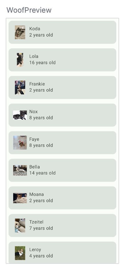
- In
WoofApp(), add amodifierwithpadding_smallin the call toDogItem().
@Composable
fun WoofApp() {
    Scaffold { it ->
        LazyColumn(contentPadding = it) {
            items(dogs) {
                DogItem(
                    dog = it,
                    modifier = Modifier.padding(dimensionResource(R.dimen.padding_small))
                )
            }
        }
    }
}
In WoofPreview(), there is now more definition between list items.
Dark theme
In the Android system, there is the option to switch your device to a dark theme. A dark theme uses darker, more subdued colors, and:
- Can reduce power usage by a significant amount (depending on the device's screen technology).
- Improves visibility for users with low vision and those who are sensitive to bright light.
- Makes it easier for anyone to use a device in a low-light environment.
Your app can opt-in to Force Dark, which means the system will implement a dark theme for you. However, it is a better experience for your users if you implement the dark theme, so that you maintain full control over the app theme.
When choosing your own dark theme, it is important to note that colors for a dark theme need to meet accessibility contrast standards. Dark themes use a dark surface color, with limited color accents.
View dark theme in preview
You already added the colors for dark theme in the previous step. To see the dark theme in action, you will add another Preview Composable to MainActivity.kt. That way, when you change the UI layout in your code, you can see how the light theme and dark theme previews look simultaneously.
- Under
WoofPreview(), create a new function calledWoofDarkThemePreview()and annotate it with@Previewand@Composable.
@Preview
@Composable
fun WoofDarkThemePreview() {

}
- Inside
DarkThemePreview(), add theWoofTheme(). Without addingWoofTheme(), you wouldn't see any of the styling we added in the app. Set thedarkThemeparameter to true.
@Preview
@Composable
fun WoofDarkThemePreview() {
   WoofTheme(darkTheme = true) {

   }
}
- Call
WoofApp()inside ofWoofTheme().
@Preview
@Composable
fun WoofDarkThemePreview() {
   WoofTheme(darkTheme = true) {
       WoofApp()
   }
}
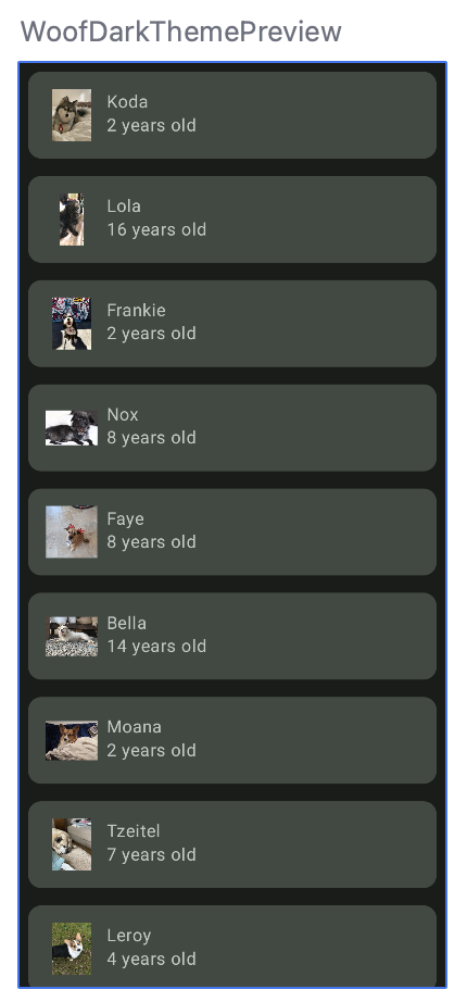
Now scroll down in the Design pane to see the app in dark theme, including the darker app/list item background and the lighter text. Compare the differences between the dark and light themes.
Dark theme | Light theme |
|
|
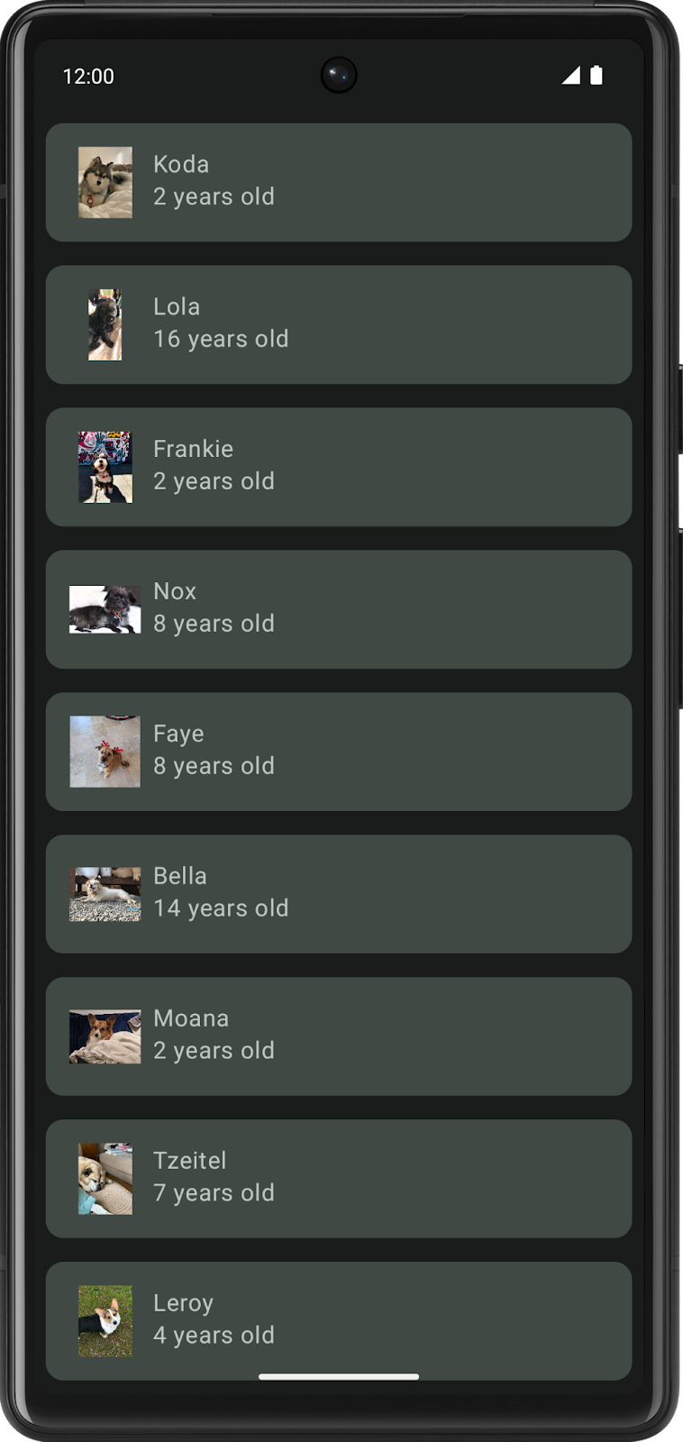
View dark theme on your device or emulator
In order to view your app in dark theme on the emulator or physical device:
- Go to the Settings app on the device.
- Search for Dark theme and click into it.
- Toggle on Dark theme.
- Reopen the Woof app and it will be in dark theme.
This codelab focuses more on the light theme, so before you move forward with the app, turn off the dark theme.
- Go to the Settings app on the device.
- Select Display.
- Toggle off Dark theme.
Compare how the app looked at the beginning of the section versus now. The list items and text are more defined, and the color scheme is more visually appealing.
Without color | With color (light theme) | With color (dark theme) |
|
|
|
Dynamic Color
Material 3 strongly focuses on user personalization - a new feature in Material 3 is Dynamic Color which creates a theme for your app based on the user's wallpaper. This way if the user loves green and has a blue phone background, their Woof app will also be blue to reflect that. Dynamic theming is only on certain devices that are running Android 12 and up.
A custom theme can be used for apps that have strong branding colors and also needs to be implemented for devices that don't support dynamic theming so that your app is still themed.
- To enable dynamic color, open Theme.kt and go to the
WoofTheme()composable and set thedynamicColorparameter to true.
@Composable
fun WoofTheme(
   darkTheme: Boolean = isSystemInDarkTheme(),
   dynamicColor: Boolean = true,
   content: @Composable () -> Unit
)
- To change the background of a device or an emulator, go to Settings, then search for Wallpaper.
- Change the wallpaper to a color or set of colors.
- Rerun your app to see the dynamic theme (note that your device or emulator must be Android 12+ to see dynamic color), feel free to play around with this with different wallpapers!
- This codelab does focus on custom theming, so disable
dynamicColorbefore you move on.
@Composable
fun WoofTheme(
   darkTheme: Boolean = isSystemInDarkTheme(),
   dynamicColor: Boolean = false,
   content: @Composable () -> Unit
)
5. Add shape
Applying a shape can change so much about the look and feel of a composable. Shapes direct attention, identify components, communicate state, and express brand.
Many shapes are defined using RoundedCornerShape, which describes a rectangle with rounded corners. The number passed in defines how round the corners are. If RoundedCornerShape(0.dp) is used, the rectangle has no rounded corners; if RoundedCornerShape(50.dp) is used, the corners will be fully circular.
0.dp | 25.dp | 50.dp |
|
|
|


You can also customize shapes further by adding different rounding percentages on each corner. It's pretty fun to play around with shapes!
Top left: 50.dp | Top left: 15.dp | Top left: 0.dp |
|
|
|


The Shape.kt file is used to define shapes of components in Compose. There are three types of components: small, medium, and large. In this section, you will modify the Card component, which is defined as medium size. Components are grouped into shape categories based on their size.
In this section, you will shape the image of the dog into a circle, and modify the shape of the list item.
Shape the dog image into a circle
- Open the Shape.kt file and notice that the small parameter is set to
RoundedCornerShape(50.dp). This will be used to shape the image into a circle.
val Shapes = Shapes(
   small = RoundedCornerShape(50.dp),
)
- Open MainActivity.kt. In
DogIcon(), add aclipattribute to themodifierof theImage; this will clip the image into a shape. Pass in theMaterialTheme.shapes.small.
import androidx.compose.ui.draw.clip

@Composable
fun DogIcon(
   @DrawableRes dogIcon: Int,
   modifier: Modifier = Modifier
) {
   Image(
       modifier = modifier
           .size(dimensionResource(id = R.dimen.image_size))
           .padding(dimensionResource(id = R.dimen.padding_small))
           .clip(MaterialTheme.shapes.small),
When you look at the WoofPreview(), you'll notice that the dog icons are circular! However, some photos are cut off on the sides and not showing up as fully circular.
- To make all the photos circular, add in a
ContentScaleand aCropattribute; this crops the image to fit. Note thatcontentScaleis an attribute ofImage, and not part of themodifier.
import androidx.compose.ui.layout.ContentScale

@Composable
fun DogIcon(
   @DrawableRes dogIcon: Int,
   modifier: Modifier = Modifier
) {
   Image(
       modifier = modifier
           .size(dimensionResource(id = R.dimen.image_size))
           .padding(dimensionResource(id = R.dimen.padding_small))
           .clip(MaterialTheme.shapes.small),
       contentScale = ContentScale.Crop,
This is the full DogIcon() Composable.
@Composable
fun DogIcon(
    @DrawableRes dogIcon: Int,
    modifier: Modifier = Modifier
) {
    Image(
        modifier = modifier
            .size(dimensionResource(R.dimen.image_size))
            .padding(dimensionResource(R.dimen.padding_small))
            .clip(MaterialTheme.shapes.small),
        contentScale = ContentScale.Crop,
        painter = painterResource(dogIcon),

        // Content Description is not needed here - image is decorative, and setting a null content
        // description allows accessibility services to skip this element during navigation.

        contentDescription = null
    )
}
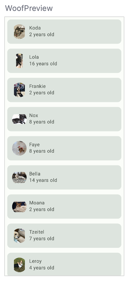
Now in WoofPreview(), the icons are circular.
Add a shape to the list item
In this section, you will add a shape to the list item. The list item is already being displayed through a Card. A Card is a surface that can contain a single composable and contains options for decoration. The decoration can be added through the border, shape, and more. In this section, you will use the Card to add a shape to the list item.

- Open the Shape.kt file. A
Cardis a medium component, so you add the medium parameter of theShapesobject. For this app, the top right and bottom left corners of the list item, but not make them fully circular. To achieve that, pass in16.dpto themediumattribute.
medium = RoundedCornerShape(bottomStart = 16.dp, topEnd = 16.dp)
Since a Card, by default, already uses the medium shape, you do not have to explicitly set it to the medium shape. Check out the Preview and to see the newly shaped Card!

If you go back to the Theme.kt file in WoofTheme(), and look at the MaterialTheme(), you'll see the shapes attribute is set to the Shapes val that you just updated.
MaterialTheme(
   colors = colors,
   typography = Typography,
   shapes = Shapes,
   content = content
)
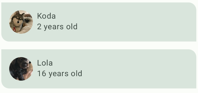
Below is a side-by-side look of the list items before and after shaping. Notice how much more visually appealing the app is with shaping added to it.
Without shaping | With shaping |
|
|
6. Add typography
The Material Design type scale
A type scale is a selection of font styles that can be used across an app, ensuring a flexible, yet consistent, style. The Material Design type scale includes fifteen font styles that are supported by the type system. The naming and grouping have been simplified to: display, headline, title, body, and label, with large, medium, and small sizes for each. You only need to use these choices if you want to customize your app. If you don't know what to set for each type scale category, know that there is a default typography scale that you can use.
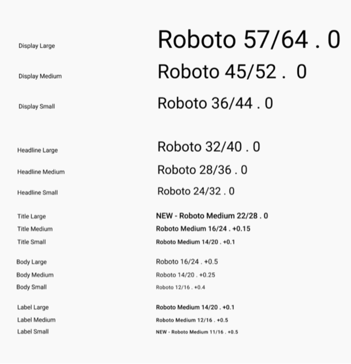
The type scale contains reusable categories of text, each with an intended application and meaning.
Display
As the largest text on the screen, display styles are reserved for short, important text or numerals. They work best on large screens.
Headline
Headlines are best-suited for short, high-emphasis text on smaller screens. These styles can be good for marking primary passages of text or important regions of content.
Title
Titles are smaller than headline styles, and should be used for medium-emphasis text that remains relatively short.
Body
Body styles are used for longer passages of text in your app.
Label
Label styles are smaller, utilitarian styles, used for things like the text inside components or for very small text in the content body, such as captions.
Fonts
The Android platform provides a variety of fonts, but you may want to customize your app with a font not provided by default. Custom fonts can add personality and be used for branding.
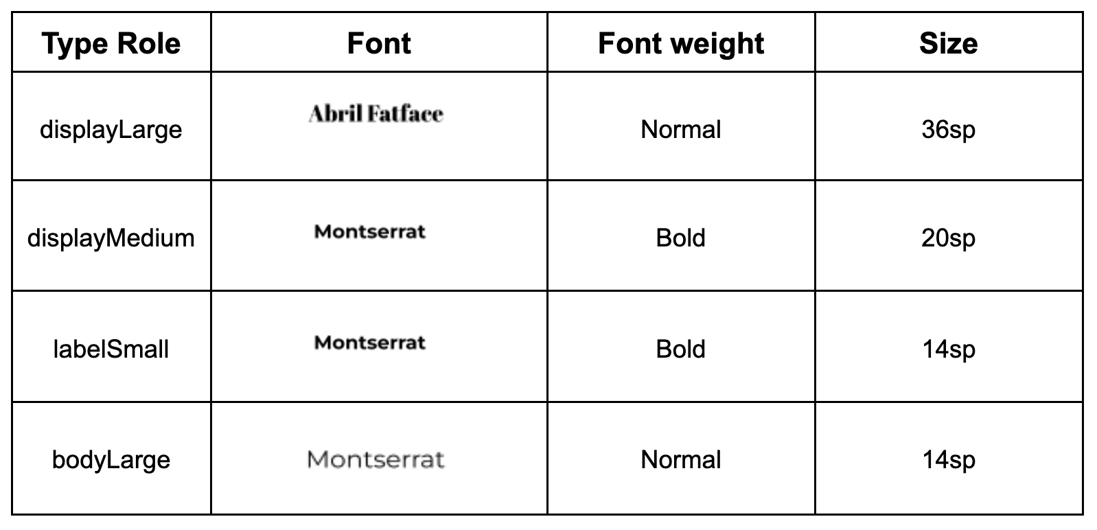
In this section, you will add custom fonts called Abril Fatface, Montserrat Bold, and Montserrat Regular. You will use the displayLarge and displayMedium headlines, and the bodyLarge text from the Material Type system, and add these to the text in your app.
Create a font Android Resource Directory.
Before you add fonts to your app, you will need to add a font directory.
- In the project view of Android Studio, right-click on the res folder.
- Select New > Android Resource Directory.
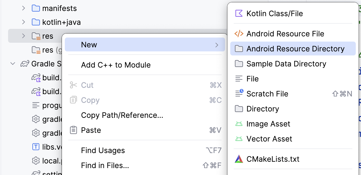
- Name the Directory font, set the Resource type as font, and click OK.

- Open your new font resource directory located at res > font.
Download custom fonts
Since you are using fonts that are not provided by the Android platform, you need to download the custom fonts.
- Go to https://fonts.google.com/.
- Search for Montserrat and click Download family.
- Unzip the zip file.
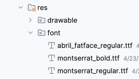
- Open the downloaded Montserrat folder. In the static folder, find Montserrat-Bold.ttf and Montserrat-Regular.ttf (ttf stands for TrueType Font and is the format for font files). Select both fonts and drag them into the font resource directory in your project in Android Studio.

- In your font folder, rename Montserrat-Bold.ttf to montserrat_bold.ttf and rename Montserrat-Regular.ttf to montserrat_regular.ttf.
- Search for Abril Fatface and click Download family.
- Open the downloaded Abril_Fatface folder. Select AbrilFatface-Regular.ttf and drag it into the font resource directory.
- In your font folder, rename Abril_Fatface_Regular.ttf to abril_fatface_regular.ttf.
This is what the font resource directory in your project should look like with the three custom font files:
Initialize fonts
- In the project window, open ui.theme > Type.kt. Initialize the downloaded fonts below the import statements and above the
Typographyval. First, initialize Abril Fatface by setting it equal toFontFamilyand passing inFontwith the font fileabril_fatface_regular.
import androidx.compose.ui.text.font.Font
import androidx.compose.ui.text.font.FontFamily
import com.example.woof.R
val AbrilFatface = FontFamily(
Font(R.font.abril_fatface_regular)
)
- Initialize Montserrat, underneath Abril Fatface, by setting it equal to
FontFamilyand passing inFontwith the font filemontserrat_regular. Formontserrat_bold, also includeFontWeight.Bold. Even though you do pass in the bold version of the font file, Compose doesn't know that the file is bold, so you need to explicitly link the file toFontWeight.Bold.
import androidx.compose.ui.text.font.FontWeight

val AbrilFatface = FontFamily(
   Font(R.font.abril_fatface_regular)
)

val Montserrat = FontFamily(
   Font(R.font.montserrat_regular),
   Font(R.font.montserrat_bold, FontWeight.Bold)
)
Next, you set the different types of headlines to the fonts you just added. The Typography object has parameters for 13 different typefaces discussed above. You can define as many as you need. In this app, we will set displayLarge, displayMedium, and bodyLarge. In the next part of this app, you use labelSmall, so you will add it here.
Below is a table that shows you the font, weight and size of each headline you are adding.
- For the
displayLargeattribute, set it equal toTextStyle, and fill in thefontFamily,fontWeight, andfontSizewith the information from the table above. This means that all the text set todisplayLargewill have Abril Fatface as the font, with a normal font weight, and afontSizeof36.sp.
Repeat this process for displayMedium, labelSmall, and bodyLarge.
import androidx.compose.ui.text.TextStyle
import androidx.compose.ui.unit.sp


val Typography = Typography(
   displayLarge = TextStyle(
       fontFamily = AbrilFatface,
       fontWeight = FontWeight.Normal,
       fontSize = 36.sp
   ),
   displayMedium = TextStyle(
       fontFamily = Montserrat,
       fontWeight = FontWeight.Bold,
       fontSize = 20.sp
   ),
   labelSmall = TextStyle(
       fontFamily = Montserrat,
       fontWeight = FontWeight.Bold,
       fontSize = 14.sp
   ),
   bodyLarge = TextStyle(
       fontFamily = Montserrat,
       fontWeight = FontWeight.Normal,
       fontSize = 14.sp
   )
)
If you go to the Theme.kt file in WoofTheme() and look at the MaterialTheme(), the typography parameter is equal to the Typography val that you just updated.
MaterialTheme(
   colors = colors,
   typography = Typography,
   shapes = Shapes,
   content = content
)
Add typography to app text
Now you'll add the headline types to each instance of text in the app.
- Add
displayMediumas the style for thedogNamebecause it is a short, important piece of information. AddbodyLargeas the style for thedogAgebecause it works well with smaller text sizes.
@Composable
fun DogInformation(
   @StringRes dogName: Int,
   dogAge: Int,
   modifier: Modifier = Modifier
) {
   Column(modifier = modifier) {
       Text(
           text = stringResource(dogName),
           style = MaterialTheme.typography.displayMedium,
           modifier = Modifier.padding(top = dimensionResource(id = R.dimen.padding_small))
       )
       Text(
           text = stringResource(R.string.years_old, dogAge),
           style = MaterialTheme.typography.bodyLarge
       )
   }
}
- Now in the
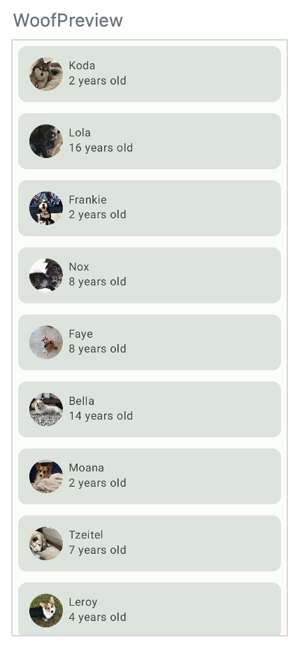
WoofPreview(), the dog's name displays the bold Montserrat font in20.sp, and the dog's age displays the normal Montserrat font in14.sp.

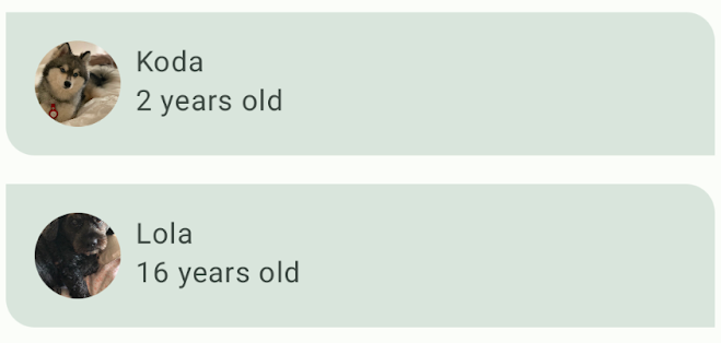
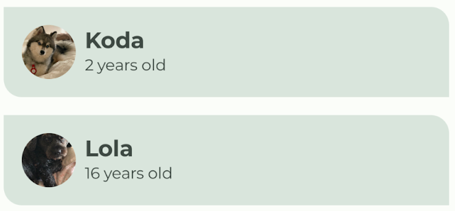
Below is a side-by-side look at the list items before and after adding typography. Notice the font difference between the dog name and the dog age.
Without typography | With typography |
|
|
7. Add a top bar
A Scaffold is a layout that provides slots for various components and screen elements, such as an Image, Row, or Column. A Scaffold also provides a slot for a TopAppBar, which you will use in this section.
A TopAppBar can be used for many purposes, but in this case, you will use it for branding and to give your app personality. There are four different types of TopAppBar: center, small, medium and large. In this codelab you will implement a center top app bar. You will create a composable that looks like the screenshot below, and slot it into the topBar section of a Scaffold.

For this app, our top bar consists of a Row with an image of a logo and text of the app title. The logo features a cute gradient paw and the title of the app!

Add image and text to the top bar
- In MainActivity.kt, create a composable called
WoofTopAppBar()with an optionalmodifier.
@Composable
fun WoofTopAppBar(modifier: Modifier = Modifier) {

}
Scaffoldsupports thecontentWindowInsetsparameter which can help to specify insets for the scaffold content.WindowInsetsare the parts of your screen where your app can intersect with the system UI, these ones are to be passed to the content slot via thePaddingValuesparameters. Read more here.
The contentWindowInsets value is passed to the LazyColumn as the contentPadding.
@Composable
fun WoofApp() {
    Scaffold { it ->
        LazyColumn(contentPadding = it) {
            items(dogs) {
                DogItem(
                    dog = it,
                    modifier = Modifier.padding(dimensionResource(R.dimen.padding_small))
                )
            }
        }
    }
}
- Within the
Scaffold, add atopBarattribute and set it toWoofTopAppBar().
Scaffold(
   topBar = {
       WoofTopAppBar()
   }
)
Below is how the WoofApp() composable will look:
@Composable
fun WoofApp() {
    Scaffold(
        topBar = {
            WoofTopAppBar()
        }
    ) { it ->
        LazyColumn(contentPadding = it) {
            items(dogs) {
                DogItem(
                    dog = it,
                    modifier = Modifier.padding(dimensionResource(R.dimen.padding_small))
                )
            }
        }
    }
}
Nothing has changed in WoofPreview() because there is nothing in the WoofTopAppBar(). Let's change that!

- Within the
WoofTopAppBar() Composable, add in aCenterAlignedTopAppBar()and set the modifier parameter to the modifier passed intoWoofTopAppBar().
import androidx.compose.material3.CenterAlignedTopAppBar

@Composable
fun WoofTopAppBar(modifier: Modifier = Modifier) {
   CenterAlignedTopAppBar(
       modifier = modifier
   )
}
- For the title parameter, pass in a
Rowwhich will hold theImageandTextof theCenterAlignedTopAppBar.
@Composable
fun WoofTopAppBar(modifier: Modifier = Modifier){
   CenterAlignedTopAppBar(
       title = {
           Row() {

           }
       },
       modifier = modifier
   )
}
- Add the logo
Imageinto theRow.
- Set the image size in the
modifieras theimage_sizein thedimens.xmlfile and the padding aspadding_smallfrom thedimens.xmlfile. - Use
painterto set theImageasic_woof_logofrom the drawable folder. - Set the
contentDescriptionas null. In this situation, the app logo does not add any semantic information for users with impaired vision, so we do not have to add a content description.
Row() {
   Image(
       modifier = Modifier
           .size(dimensionResource(id = R.dimen.image_size))
           .padding(dimensionResource(id = R.dimen.padding_small)),
       painter = painterResource(R.drawable.ic_woof_logo),
       contentDescription = null
   )
}
- Next, add a
TextComposable inside theRowafter theImage.
- Use
stringResource()to set it to the value ofapp_name. This sets the text to the name of the app, which is stored instrings.xml. - Set the style of the text to
displayLargesince the app name is short and important text.
Text(
   text = stringResource(R.string.app_name),
   style = MaterialTheme.typography.displayLarge
)

This is what shows up in WoofPreview(), it looks a little off because the icon and text are not vertically aligned.
- To fix that, add in a
verticalAlignmentvalue-parameter to theRowand set it equal toAlignment.CenterVertically.
import androidx.compose.ui.Alignment

Row(
   verticalAlignment = Alignment.CenterVertically
)

That looks a lot better!
This is the full WoofTopAppBar() Composable:
@Composable
fun WoofTopAppBar(modifier: Modifier = Modifier) {
   CenterAlignedTopAppBar(
       title = {
           Row(
               verticalAlignment = Alignment.CenterVertically
           ) {
               Image(
                   modifier = Modifier
                       .size(dimensionResource(id = R.dimen.image_size))
                       .padding(dimensionResource(id = R.dimen.padding_small)),
                   painter = painterResource(R.drawable.ic_woof_logo),

                   contentDescription = null
               )
               Text(
                   text = stringResource(R.string.app_name),
                   style = MaterialTheme.typography.displayLarge
               )
           }
       },
       modifier = modifier
   )
}
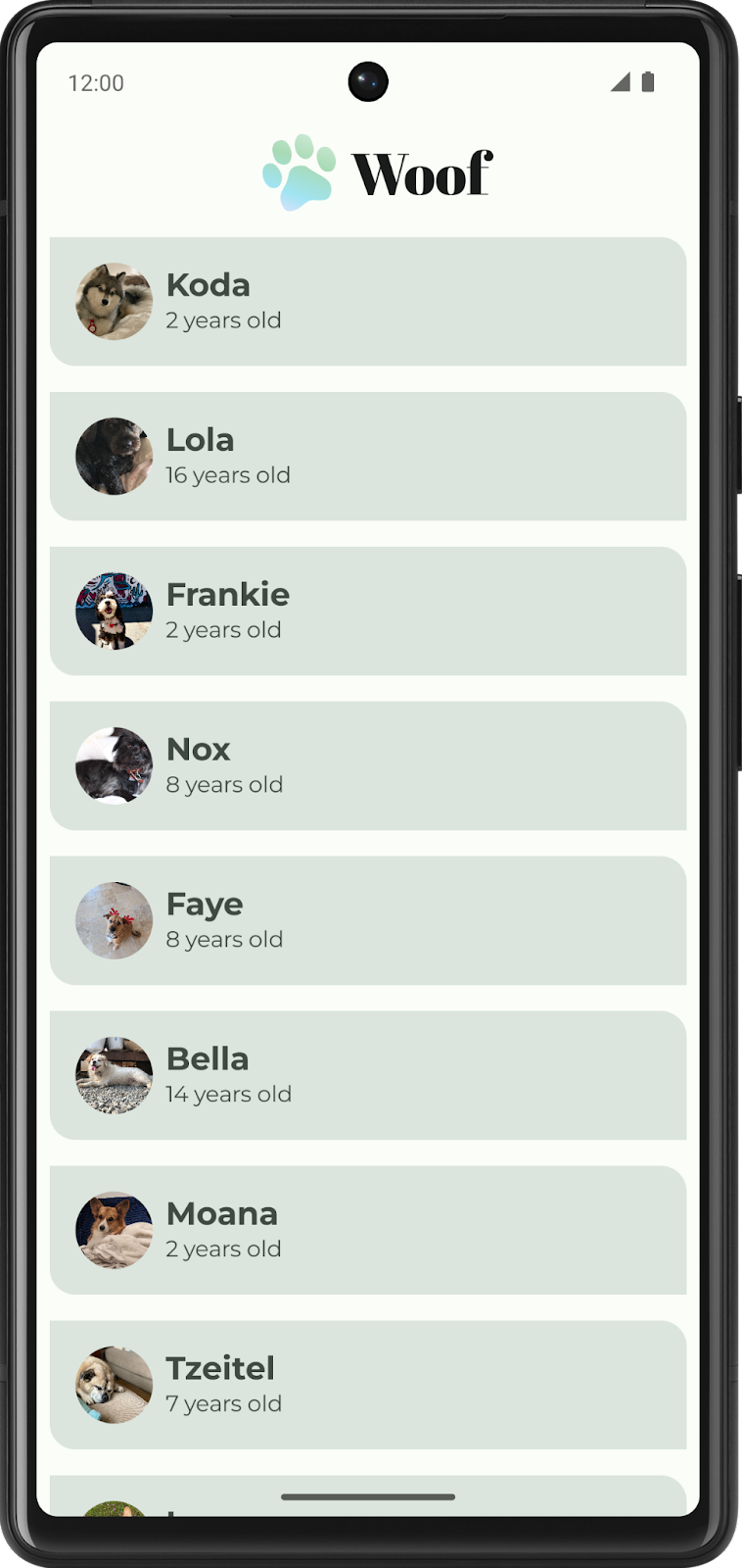
Run the app and admire how beautifully the TopAppBar ties the app together.
Without top app bar | With top app bar |
|
|
Now, check out the final app in dark theme!

Congratulations, you made it to the end of the codelab!
8. Get the solution code
To download the code for the finished codelab, you can use these git commands:
$ git clone https://github.com/google-developer-training/basic-android-kotlin-compose-training-woof.git
$ cd basic-android-kotlin-compose-training-woof
$ git checkout material
Alternatively, you can download the repository as a zip file, unzip it, and open it in Android Studio.
If you want to see the solution code, view it on GitHub.
9. Conclusion
You just created your first Material app! You created a custom color palette for both light and dark themes, created shapes for different components, downloaded fonts and added them to the app, and created a beautiful top bar to tie it all together. Take the skills you learned in this codelab and change colors, shapes, and typography to make apps completely your own!
Summary
- Material Theming allows you to use Material Design in your app, with guidance on customizing colors, typography, and shapes.
- The Theme.kt file is where the theme is defined, through a composable named
[your app name]+Theme()—WoofTheme()in the case of this app. Within this function, theMaterialThemeobject sets thecolor,typography,shapes, andcontentof the app. - Color.kt is where you list the colors you use in the app. Then in Theme.kt, you assign the colors in
LightColorPaletteandDarkColorPaletteto specific slots. Not all slots need to be assigned. - Your app can opt-in to Force Dark, which means the system will implement a dark theme for you. However, it is a better experience for your users if you implement the dark theme so that you maintain full control over the app theme.
- Shape.kt is where you define your app shapes. There are three shape sizes (small, medium, large), and you can specify how the corners are rounded.
- Shapes direct attention, identify components, communicate state, and express brand.
- Type.kt is where you initialize your fonts and assign
fontFamily,fontWeight, andfontSizefor the Material Design type scale. - The Material Design type scale includes a range of contrasting styles that support the needs of your app and its content. The type scale is a combination of 15 styles that are supported by the type system.