
1. Before you begin
Congratulations! You built your first app and acquired knowledge of the basics of Jetpack Compose. Now you're ready to put what you learned into practice.
These exercises focus on how to build apps with the UI composables that you learned. The exercises are inspired by real-world use cases, some of which you probably encountered before.
These exercises provide you with resources that you need for implementation, such as images and strings. The string resources contain the text that's displayed in the UI. You add these strings to the strings.xml file and use them in your code.
Additionally, the exercises provide you with a set of specifications, such as font size, to use for the text content or padding around the UI components. These specifications help you build consistent UIs and often guide developers to visualize and build the screens. You might encounter similar specifications when you work with a team for an organization.
Some exercises might require you to use a Modifier. In such cases, see the References section available for each problem, where you can find links to documentation related to the modifiers or properties. You can read the documentation and determine how to incorporate the concepts in the app. The ability to comprehend documentation is one of the important skills that you should develop to grow your knowledge.
The solution code is available at the end, but try to solve the exercises before you check the answers. Consider the solutions as one way to implement the app. The solution code uses the basic composables and concepts that you learned so far. There's a lot of room for improvement, so feel free to experiment and try different things.
Work through the problems at a pace that's comfortable to you. You're encouraged to take as much time as you need to solve each problem thoughtfully.
Lastly, you should use Android Studio to create separate projects for these exercises.
Prerequisites
- Complete Build a simple app with text composables codelab.
- Complete Add images to your Android app codelab.
- The latest version of Android Studio
- Basic knowledge of the Kotlin programming language
- Ability to create Android projects with default templates in Android Studio.
- Knowledge of different
Composablefunctions, such as theText,Image,Box,Column, andRowfunctions - Knowledge of
Modifierclasses for UI decoration
What you'll need
- A computer with internet access and Android Studio installed.
2. Compose article
The Learn Together app displays a list of articles about several Jetpack libraries. Users can choose the topic of their choice and learn about its latest developments.
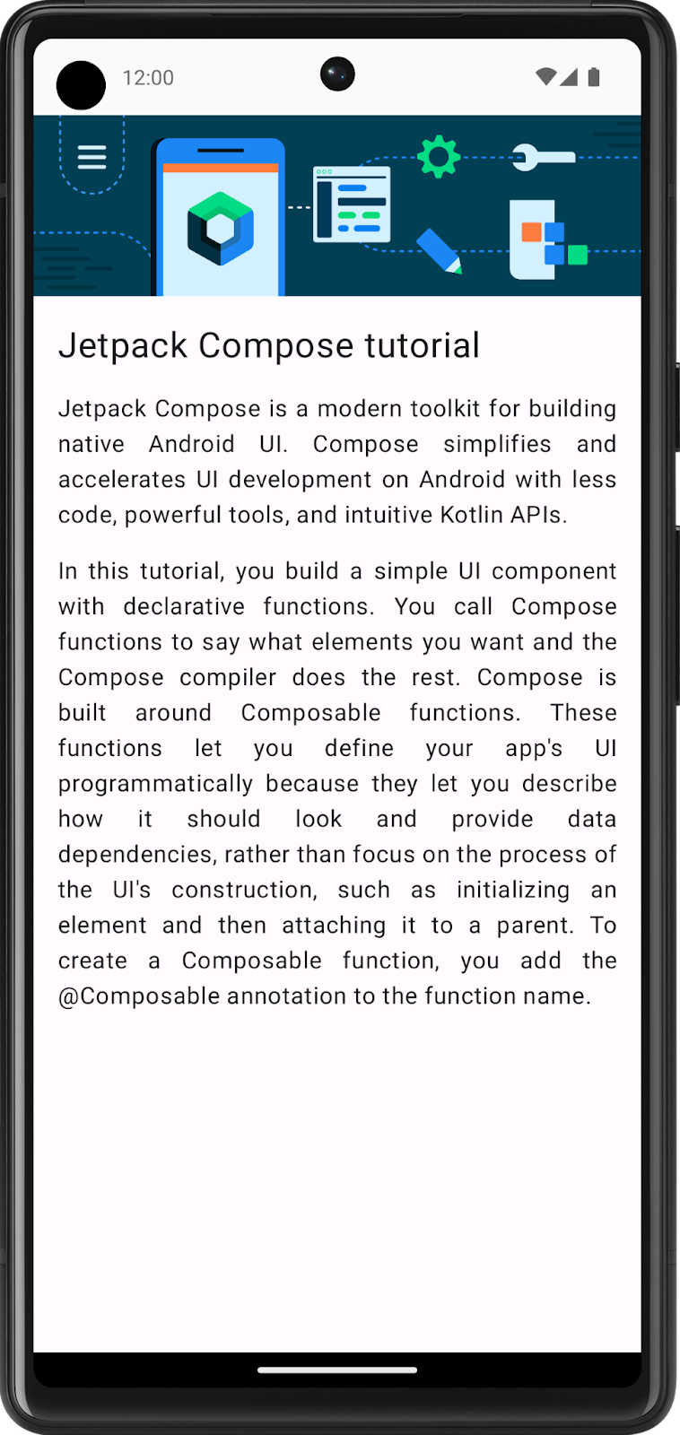
In this exercise, you build a screen for the app, which displays a tutorial for Jetpack Compose. You use the image and string resources provided in the Resources section for this problem.
Final screenshot
After you finish the implementation, your design should match this screenshot:
UI specifications
Follow this UI specification:
- Set the image to fill the entire screen's width.
- Set the first
Textcomposable to a24spfont size and16dppadding (start, end, bottom, and top). - Set the second
Textcomposable to a default font size,16dppadding(start and end), andJustifytext align. - Set the third
Textcomposable to a default font size,16dppadding (start, end, bottom, and top), andJustifytext align.
Resources
You need this image to import into your project and these strings:
Jetpack Compose tutorialJetpack Compose is a modern toolkit for building native Android UI. Compose simplifies and accelerates UI development on Android with less code, powerful tools, and intuitive Kotlin APIs.In this tutorial, you build a simple UI component with declarative functions. You call Compose functions to say what elements you want and the Compose compiler does the rest. Compose is built around Composable functions. These functions let you define your app\'s UI programmatically because they let you describe how it should look and provide data dependencies, rather than focus on the process of the UI\'s construction, such as initializing an element and then attaching it to a parent. To create a Composable function, you add the @Composable annotation to the function name.
Hint: Which composable aligns its children vertically?
References
TextAlign.Justifyproperty
3. Task manager
The Task Manager app lets users manage their day-to-day tasks and check the tasks that they need to complete.
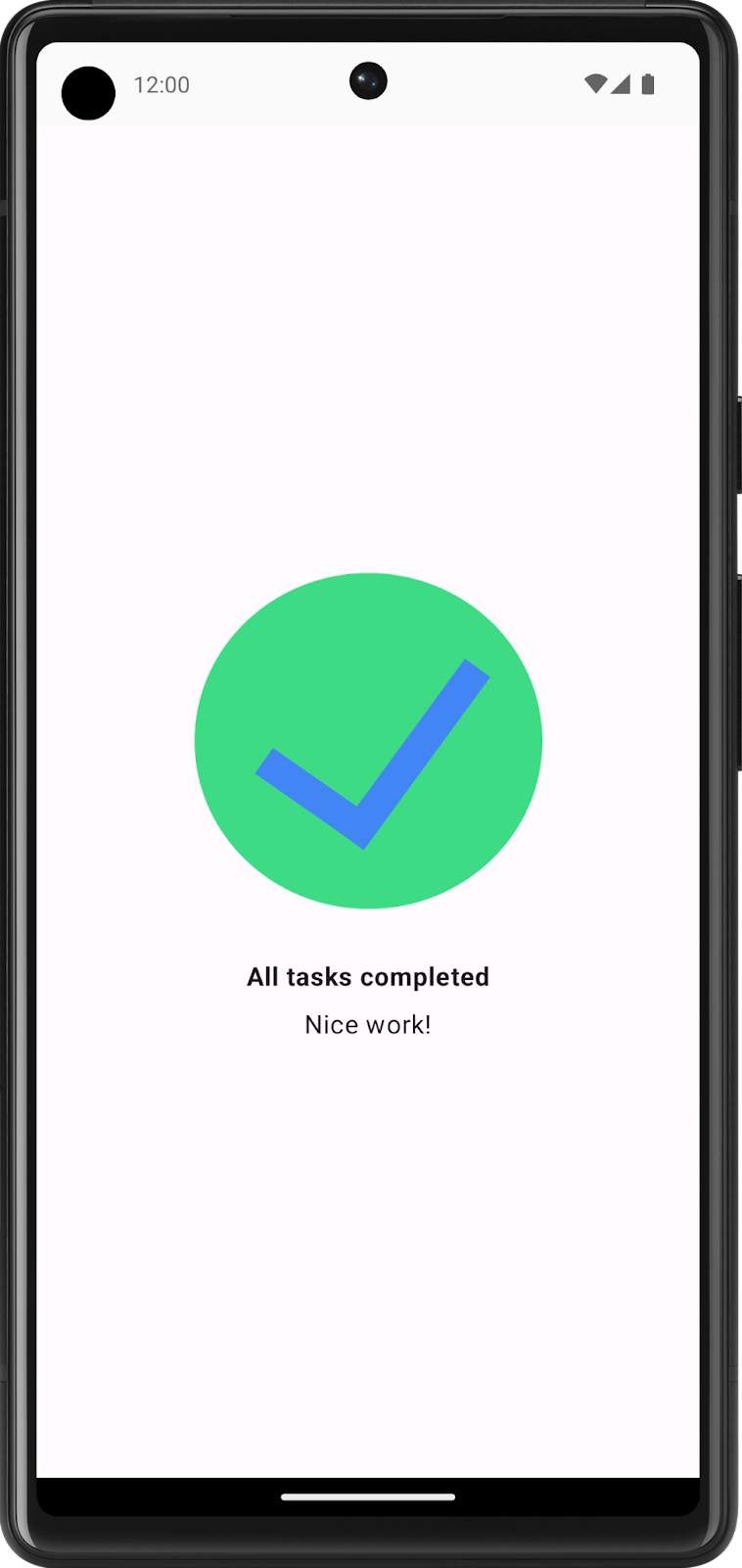
In this exercise, you build a screen that users see when they complete all the tasks for a given day.
Final screenshot
After you finish the implementation, your design should match this screenshot:
UI specification
Follow these UI specifications:
- Center align all of the content vertically and horizontally on the screen.
- Set the first
Textcomposable to aBoldfont weight,24dppadding top, and8dppadding bottom. - Set the second
Textcomposable to a16spfont size.
Resources
This image, which you need to download and then import into your project, and these strings:
All tasks completedNice work!
4. Compose quadrant
In this exercise, you need to apply most of the concepts that you learned so far and then go a step further to explore a new Modifier and properties. This might look like an extra challenge, but don't worry! You can check the References section for this problem, where you can find the links to these Modifier classes and properties, and use them for implementation.
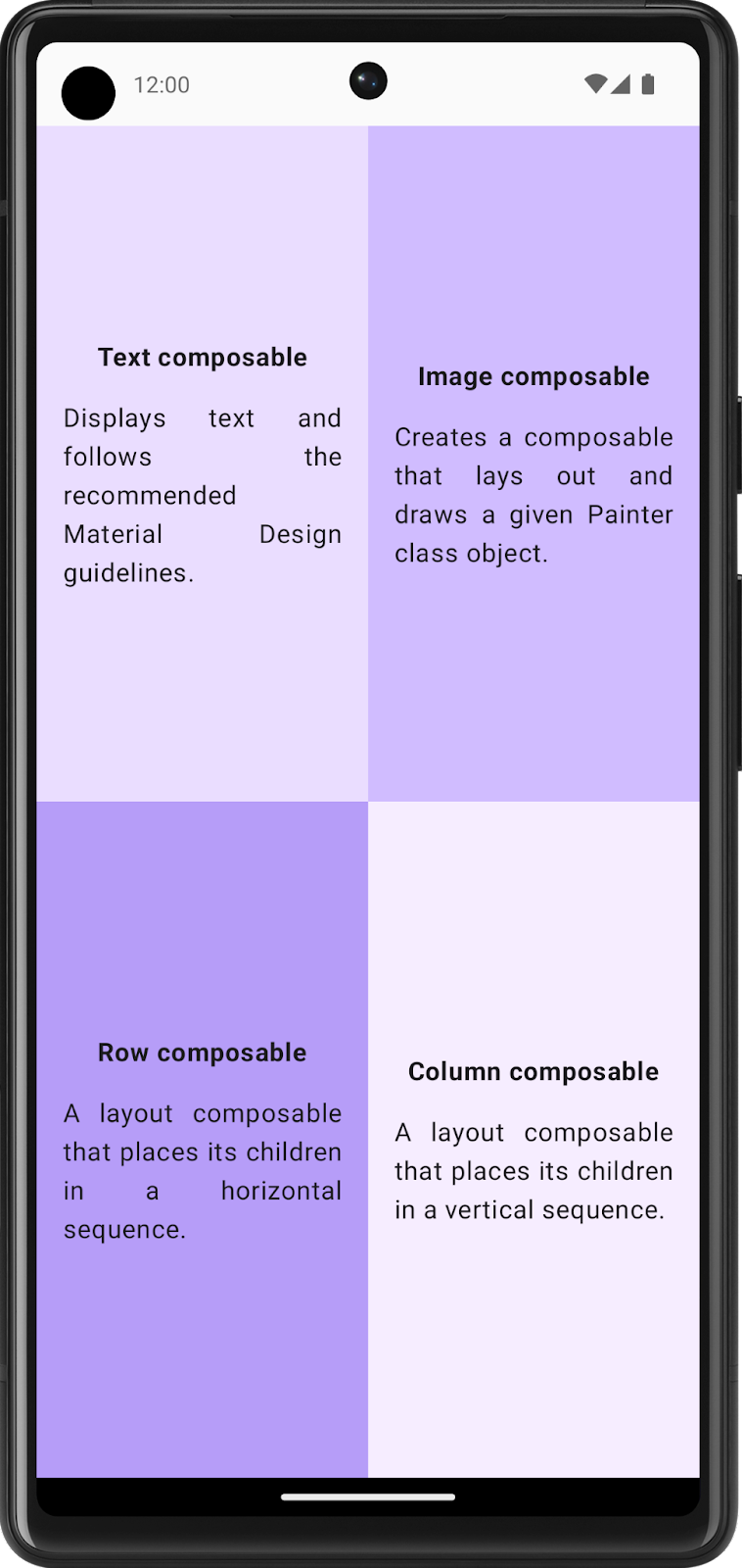
You need to build an app that displays the information about the Composable functions that you learned.
The screen is divided into four quadrants. Each quadrant provides the name of a Composable function and describes it in one sentence.
Final screenshot
After you finish the implementation, your design should match this screenshot:
UI specifications
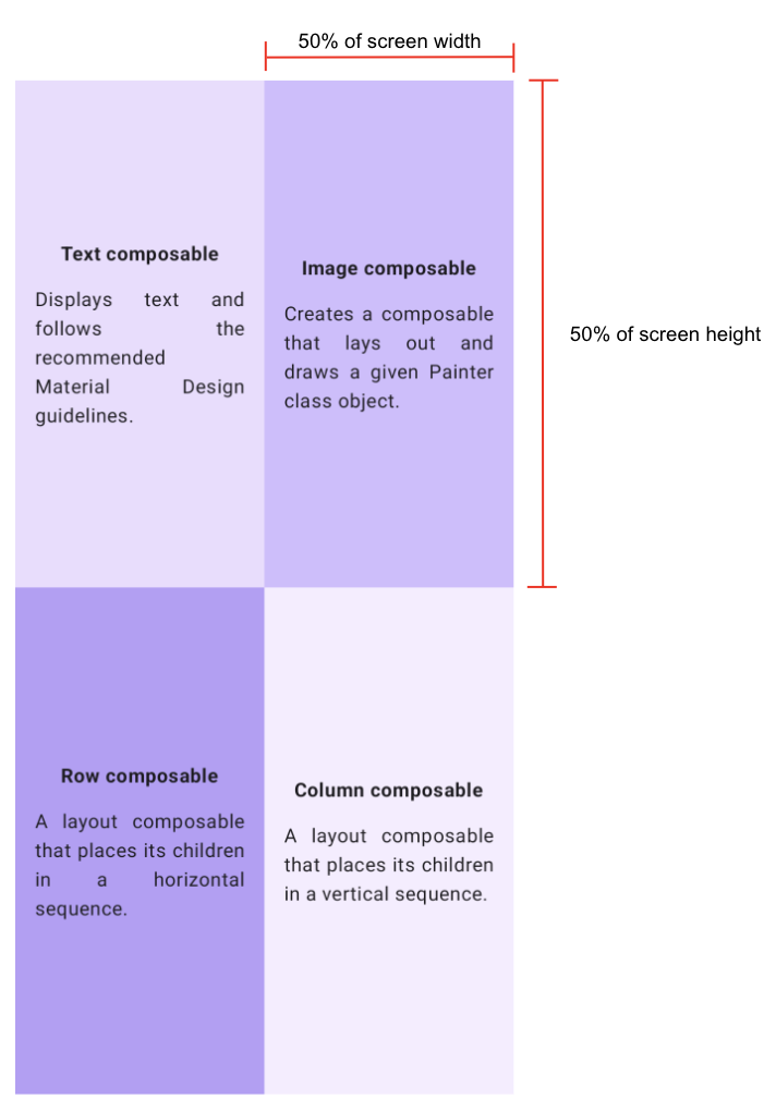
Follow these UI specifications for the entire screen:
- Divide the entire screen into four equal parts, each of which contains a Compose card and displays information about a
Composablefunction.
Follow these specifications for each quadrant:
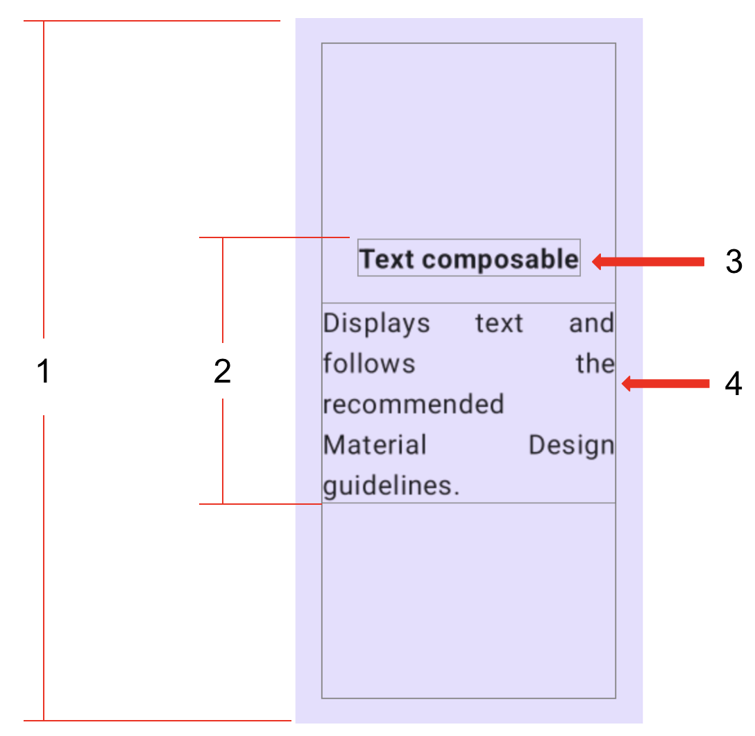
- Set the entire quadrant (start, end, top, and bottom) to a
16dppadding. - Center align all of the content vertically and horizontally in each quadrant.
- Format the first
Textcomposable in bold and set it to a16dppadding bottom. - Set the second
Textcomposable to aDefaultfont size.
Resources
These colors:
Color(0xFFEADDFF)Color(0xFFD0BCFF)Color(0xFFB69DF8)Color(0xFFF6EDFF)
These strings:
Text composableDisplays text and follows the recommended Material Design guidelines.Image composableCreates a composable that lays out and draws a given Painter class object.Row composableA layout composable that places its children in a horizontal sequence.Column composableA layout composable that places its children in a vertical sequence.
References
Weight modifierfunctionFontWeight.BoldpropertyTextAlign.Justifyproperty