1. Before you begin
You apply what you learned in this unit to create your own digital art space — an app that displays an array of artwork that you can showcase. Unlike previous codelabs in which you were given step-by-step instructions to follow, here you're only provided with guidelines and suggestions about what you can build with the concepts that you learned so far. You're encouraged to use your creativity to build the app independently with limited guidance.
It's a challenge to build an app on your own, but don't worry because you have had enough practice! You can use the same skills that you've learned in this new context. You can always refer to previous codelabs if you're unsure how to implement certain parts of the app.
When you build this app on your own and solve the problems that you face along the way, you learn faster and retain the concepts longer. As a side benefit, the app is completely customized, so you can use it to showcase your creation as part of your developer portfolio!
Prerequisites
- Ability to create and run a project in Android Studio.
- Experience with Kotlin syntax, which includes
Booleanandwhenexpressions. - Ability to apply basic Jetpack Compose concepts, such as the use of state with
MutableStateobject. - Experience with composable functions, which includes
Text,Image, andButtoncomposables.
What you'll learn
- How to build low-fidelity prototypes and translate them to code.
- How to build simple layouts with
RowandColumncomposables, and arrange them withhorizontalAlignmentandverticalArrangementparameters. - How to customize Compose elements with a
Modifierobject. - How to identify states and modify them upon triggers, such as button taps.
What you'll build
- An Android app that can display artwork or family photos
What you'll need
- A computer with Android Studio installed.
- Photos or digital art to display in the app.
Here is a sample of how your app might look at the end of this project:
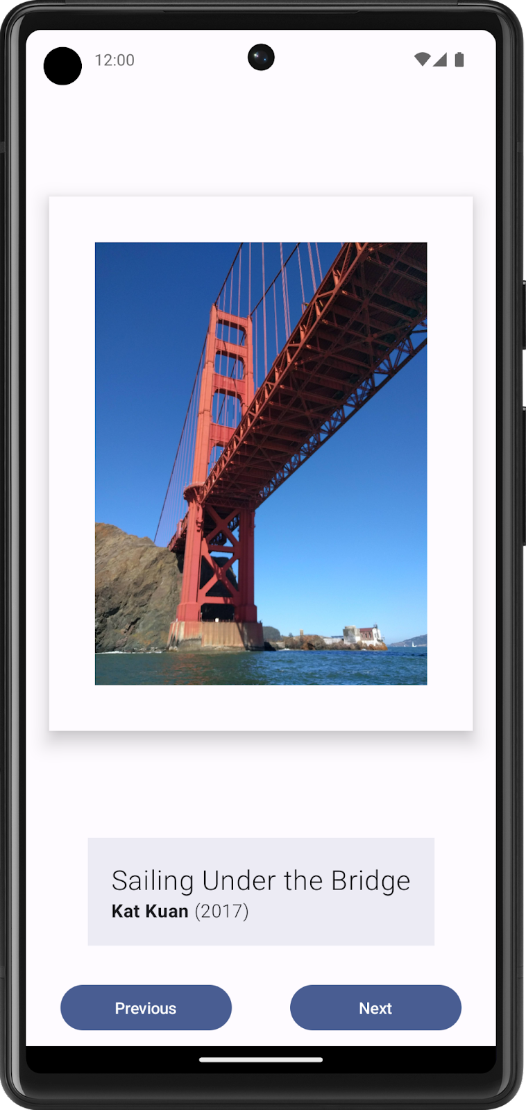
A sample of an Art Space app that displays a curated collection of framed artwork by the Android Basics Training team.
2. Build static UI with composables
Create a low-fidelity prototype
Low-fidelity (low-fi) prototype refers to a simple model, or drawing, that provides a basic idea of what the app looks like.
Create a low-fi prototype:
- Think about what you want to display in your Art Space app and who the target audience is.
- On your preferred medium, add elements that make up your app. Some elements to consider include:
- Artwork image
- Information about the artwork, such as its title, artist, and year of publication
- Any other elements, such as buttons that make the app interactive and dynamic.
- Put these elements in different positions and then evaluate them visually. Don't worry about getting it perfect the first time. You can always settle on one design now and iteratively improve later.
- You may come up with a low-fi design that looks like this image:
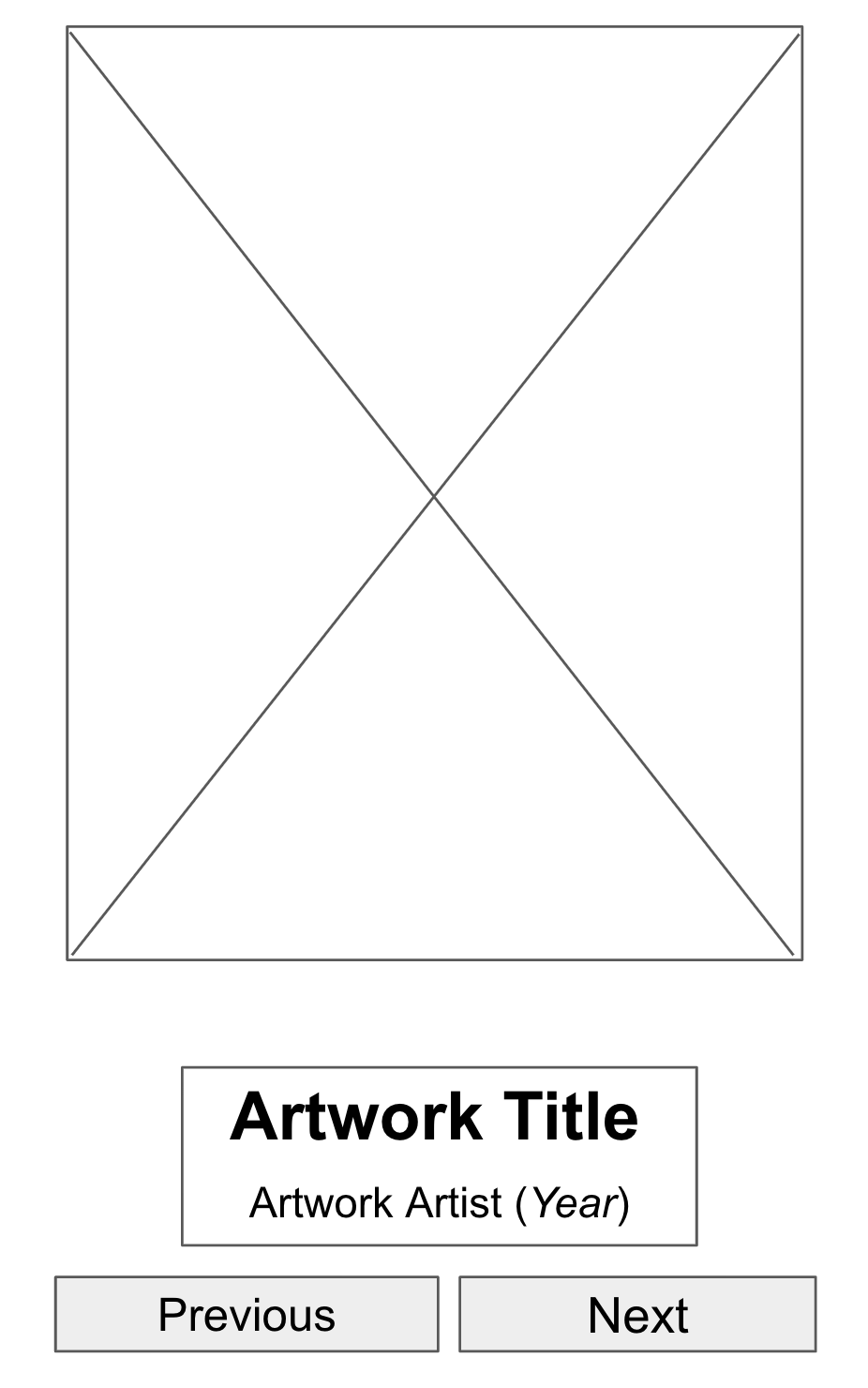
Figure 1. Placeholder elements in UI mockups help to visualize the end product.
Convert design into code
Use your prototype to help translate your design into code:
- Identify UI elements needed to build your app.
For example, from the design example that you made, you need to have one Image composable, two Text composables, and two Button composables in your code.
- Identify different logical sections of the apps and draw boundaries around them.
This step helps you divide your screen into small composables and think about the hierarchy of the composables.
In this example, you can divide the screen into three sections:
- Artwork wall
- Artwork descriptor
- Display controller
You can arrange each of these sections with layout composables, such as a Row or Column composable.
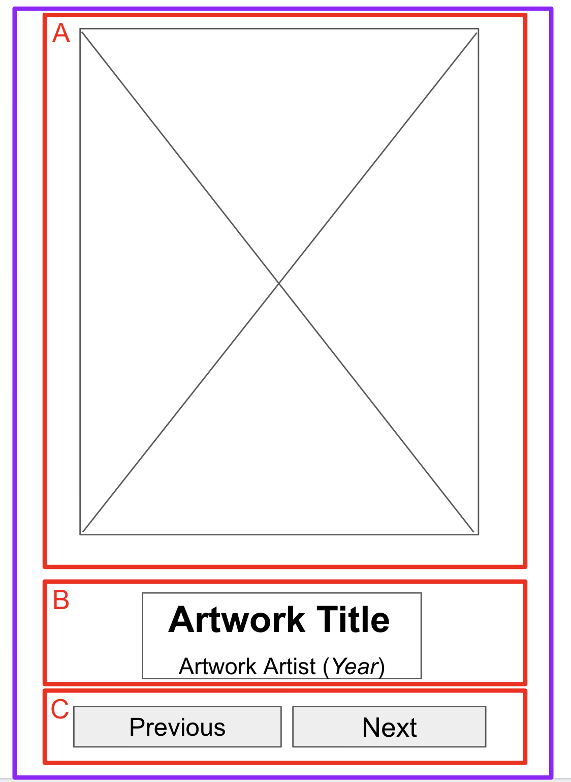
Figure 2. Boundaries around sections help developers conceptualize composables.
- For each section of the app that contains multiple UI elements, draw boundaries around them.
These boundaries help you see how one element relates to another in the section.
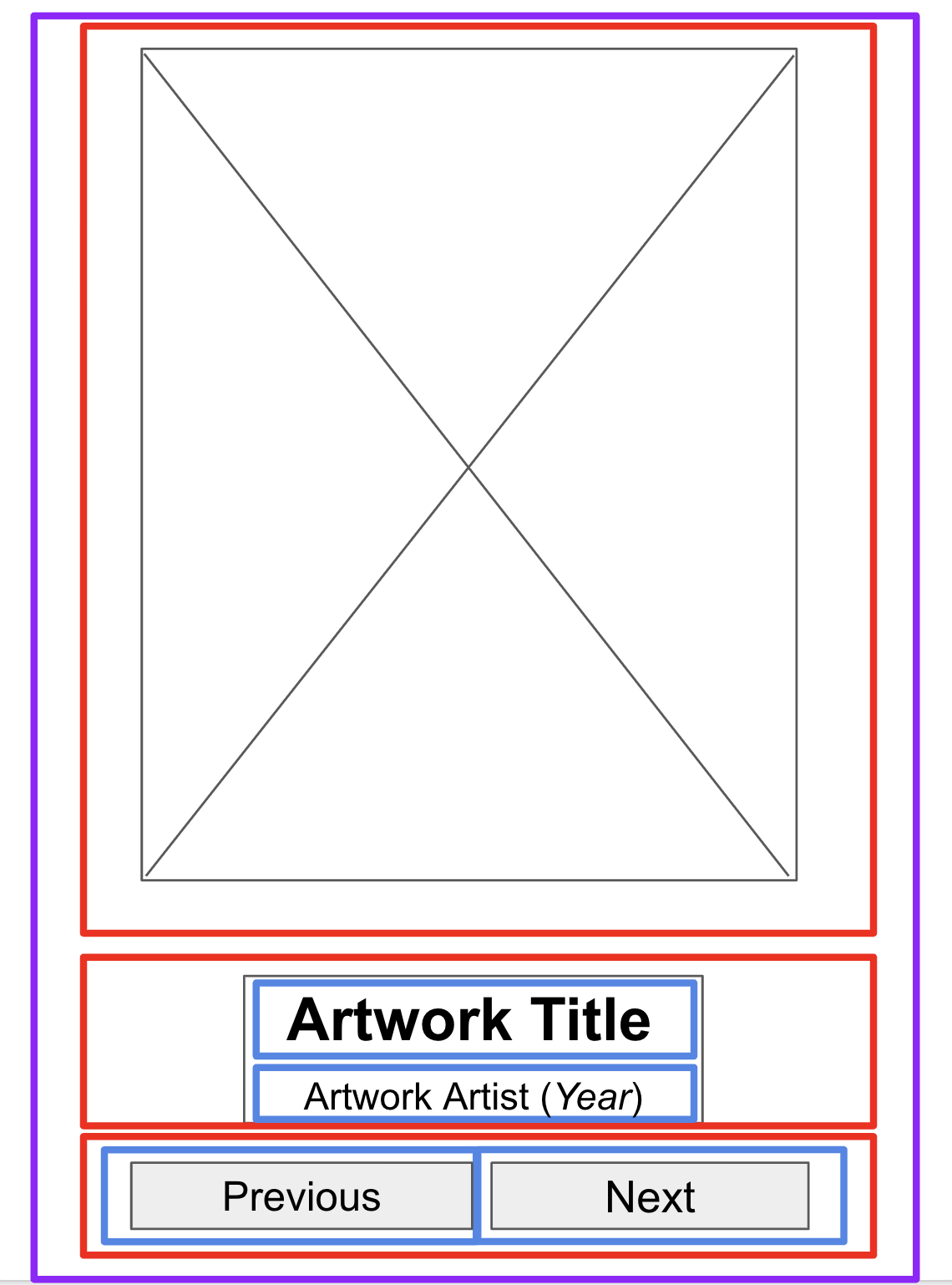
Figure 3. More boundaries around the text and buttons help developers arrange composables.
Now it's easier to see how you can arrange composables, such as Text and Button composables, with layout composables.
Some notes on various composables that you may use:
RoworColumncomposables. Experiment with varioushorizontalArrangementandverticalAlignmentparameters inRowandColumncomposables to match the design that you have.Imagecomposables. Don't forget to fill in thecontentDescriptionparameter. As mentioned in the previous codelab, TalkBack uses thecontentDescriptionparameter to help with the accessibility of the app. If theImagecomposable is only used for decorative purposes or there's aTextelement that describes theImagecomposable, you can set thecontentDescriptionparameter tonull.Textcomposables. You can experiment with various values offontSize,textAlign, andfontWeightto style your text. You may also use abuildAnnotatedStringfunction to apply multiple styles for a singleTextcomposable.Surfacecomposables. You can experiment with various values ofElevation,Color, andBorderStrokeforModifier.borderto create different UIs withinSurfacecomposables.- Spacing and alignment. You can use
Modifierarguments, such aspaddingandweight, to help with the composables arrangement.
- Run the app in an emulator or your Android device.
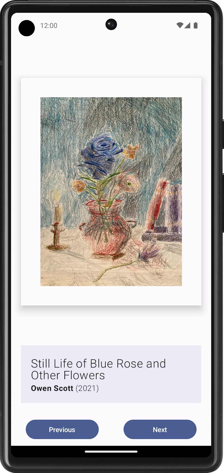
Figure 4. This app shows static content, but users can't interact with it yet.
3. Make the app interactive
Determine user interaction
The advantage of building an art space digitally is that you can make it interactive and dynamic for your users. In the initial design, you built two buttons for the users to interact with. However, it's your own art space! You can change the design and how your users can interact with the app as you want. Now take a minute to think about how you want your users to interact with the app and how the app should respond based on such interactions. Some possible interactions you can add to your app include:
- Show next or previous artwork upon button tap.
- Fast forward artwork displayed to the next album upon swipe.
- Show a tooltip for additional information upon a long button tap.
Create states for dynamic elements
Work on the part of the UI that shows the next or previous artwork upon a button tap:
- First, identify the UI elements that need to change upon user interaction.
In this case, the UI elements are the artwork image, artwork title, artist and year.
- If necessary, create a state for each of the dynamic UI elements with the
MutableStateobject. - Remember to replace hardcoded values with
statesdefined.
Write conditional logic for interaction
- Think about the behavior you need when a user taps the buttons, beginning with the Next button.
When users tap the Next button, they should expect to see the next artwork in the sequence. For now it might be difficult to determine what's the next artwork to be displayed.
- Add identifiers, or IDs, in the form of sequential numbers that begin with 1 for each artwork.
It's now clear that the next artwork refers to the artwork that has the next ID in the sequence.
Because you don't have an infinite number of artwork pieces, you may also want to determine the behavior of the Next button when you display the last artwork piece in your series. A common behavior is to go back to display the first artwork piece after the last artwork piece.
- Write in pseudocode first to capture the logic of the code without the Kotlin syntax.
If there are three artwork pieces to show, the pseudocode for the logic for the Next button may look something like this code snippet:
if (current artwork is the first artwork) {
    // Update states to show the second artwork.
}
else if (current artwork is the second artwork) {
    // Update states to show the third artwork.
}
else if (current artwork is the last artwork) {
   // Update state to show the first artwork.
}
- Convert the pseudocode to Kotlin code.
You may use the when statement to build the conditional logic instead of if else statements to make your code more readable when it manages a large number of artwork cases.
- For this logic to be executed upon a button tap, put it inside the
ButtoncomposablesonClick()argument. - Repeat the same steps to construct the logic for the Previous button.
- Run your app and then tap the buttons to confirm that they change the display to the previous or next artwork.
4. Challenge: Build for different screen sizes
One of the strengths of Android is that it supports many devices and screen sizes, which means that the app that you build can reach a wide range of audiences and be used in a multitude of ways. To ensure the best experience for all users, you should test your apps on devices that your app intends to support. For example, in the current sample app, you may have initially designed, built, and tested the app for mobile devices in portrait mode. However, some of your users might find your app enjoyable to use on a larger screen in landscape mode.
While tablets aren't the primary supported device for this app, you still want to ensure that the app won't break if users use it on a larger screen.
Test your app for a larger screen on a tablet:
- If you don't have an Android tablet device, create an Android Virtual Device (AVD).
- Build and run the app in a tablet AVD in landscape mode.
- Visually inspect that nothing looks unacceptable, such as some UI elements that are cut off, jarred alignment, or button interaction that doesn't work as expected.
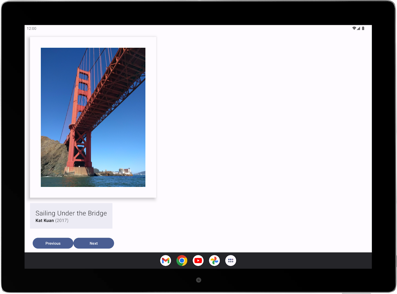
Figure 5. The app needs to be reworked to display correctly on a larger device.
- Modify the code to fix any bugs found. Refer to large screen app quality basic compatibility guidelines as guidance.
- Test the app again for tablet and phone to ensure that the bug fix works on both types of devices.
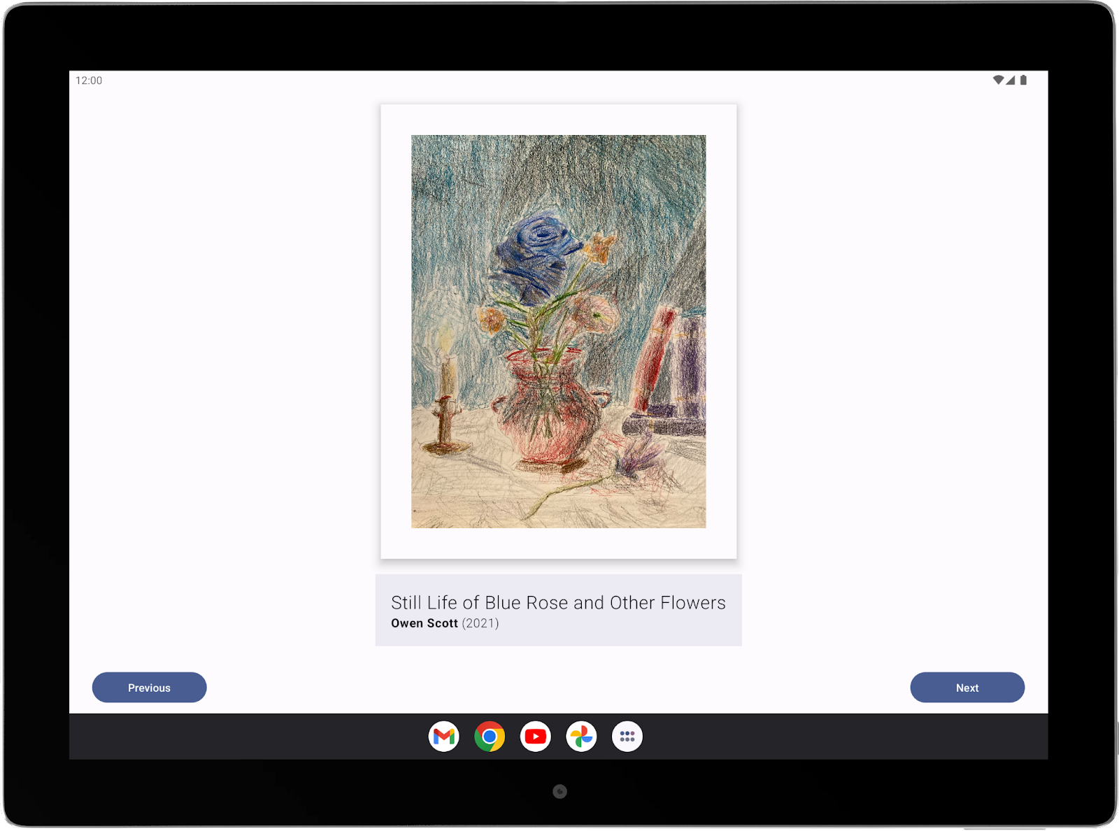
Figure 6. The app now looks good on a large screen.
5. Good luck!
Hopefully, this guide inspires you to create your own art space! Remember, you don't need to create the perfect app the first time around. You can build things from your current knowledge of Android and improve on it later on as your skills expand.
After you're done, showcase your work in your portfolio and share it with your friends and family. If you'd like to share your work on social media, use the hashtag #AndroidBasics.
