
1. Before you begin
Android devices come in all shapes and sizes, so you need to make your app's layout accommodative of different screen sizes to make it available to different users and devices with a single Android Package (APK) or Android App Bundle (AAB). To do so, you need to define your app with a responsive and adaptive layout, rather than define it with static dimensions that assume a certain screen size and aspect ratio. Adaptive layouts change based on the screen space available.
This codelab teaches you the basics of how to build adaptive UIs, and adapt an app that shows a list of sports and details about each sport to support large-screen devices. The sports app consists of three screens: home, favorites, and settings. The home screen shows a list of sports and a placeholder for news when you select a sport from the list. The favorites and settings screens also show placeholder texts. You select the associate item in the bottom navigation menu to switch screens.
The app begins with these layout issues on large screens:
- You can't use it in portrait orientation.
- It shows many blank spaces on large screens.
- It always shows the bottom navigation menu on large screens.
You make the app adaptive so that it:
- Supports landscape and portrait orientation.
- Shows the list of sports and news about each sport side by side when there's enough horizontal space to do so.
- Shows the navigation component in accordance with Material Design guidelines.
The app is a single-activity app with several fragments. You work with these files:
- The
AndroidManifest.xmlfile, which provides the metadata about the sports app. - The
MainActivity.ktfile, which contains a code generated with theactivity_main.xmlfile, theoverrideannotation, anenumclass that represents width window-class sizes, and a method definition to retrieve the width window-size class for the app's window. The bottom navigation menu is initialized when the activity is created. - The
activity_main.xmlfile, which defines the default layout for theMainactivity. - The
layout-sw600dp/activity_main.xmlfile, which defines an alternative layout for theMainactivity. The alternative layout is effective when the app's window width is greater than or equal to a600dpvalue. The content is the same as the default layout at the starting point. - The
SportsListFragment.ktfile, which contains the sports-list implementation and custom back navigation. - The
fragment_sports_list.xmlfile, which defines a layout of the sports list. - The
navigation_menu.xmlfile, which defines bottom navigation menu items.
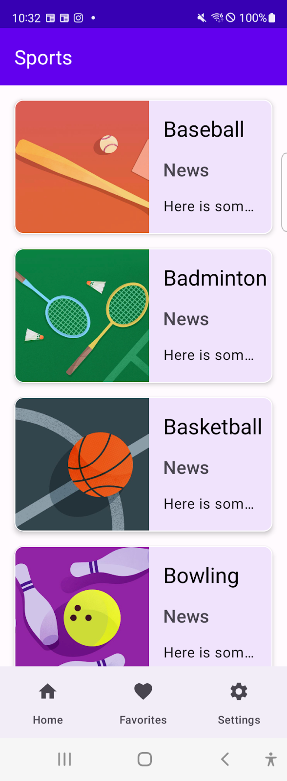
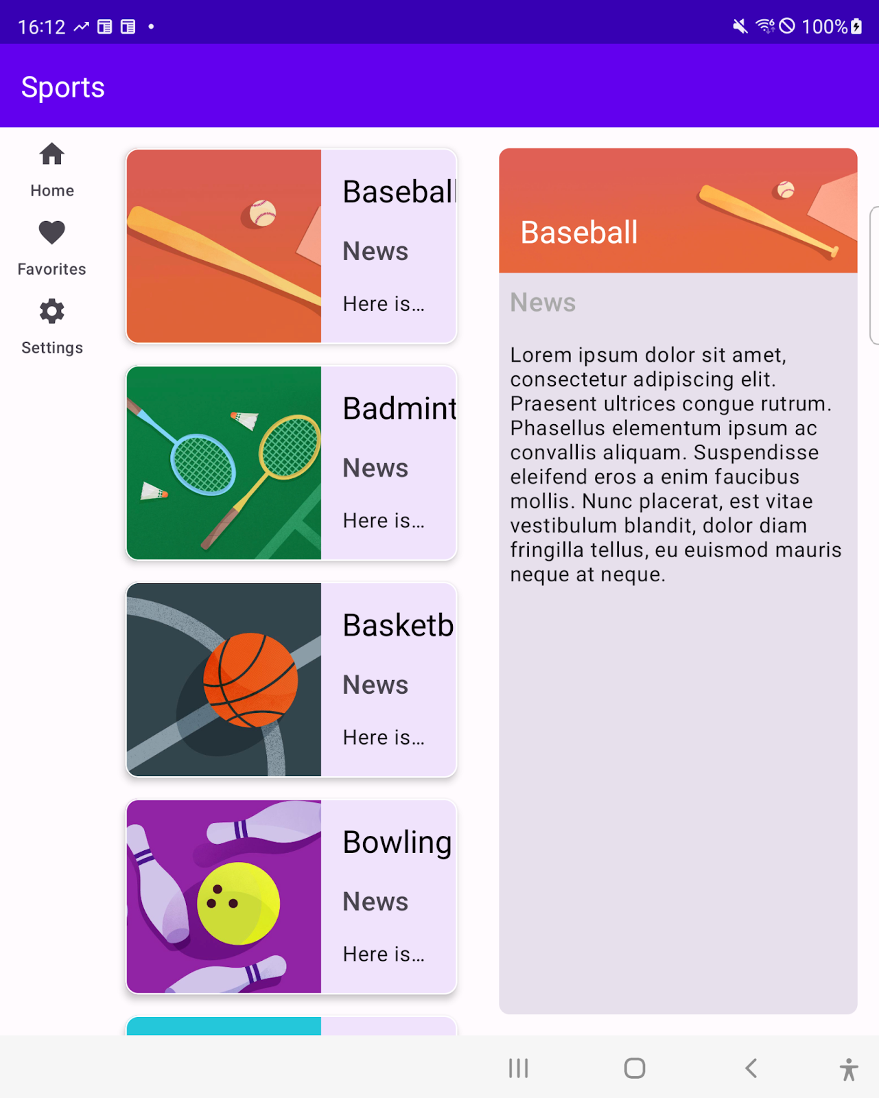
Figure 1. The sports app supports different window sizes with a single APK or AAB.
Prerequisites
- Basic knowledge of view-based UI development
- Experience with Kotlin syntax, including lambda functions
- Completion of the Jetpack Compose basics codelab
What you'll learn
- How to support configuration changes.
- How to add alternative layouts with fewer code modifications.
- How to implement a list detail UI that behaves differently for different window sizes.
What you'll build
An Android app that supports:
- Landscape device orientation
- Tablets, desktops, and mobile devices
- List detail behavior for different screen sizes
What you'll need
- Android Studio Bumblebee | 2021.1.1 or higher
- An Android tablet or emulator
2. Get set up
Download the code for this codelab and set up the project:
- From your command line, clone the code in this GitHub repository:
$ git clone https://github.com/android/add-adaptive-layouts
- In Android Studio, open the
AddingAdaptiveLayoutproject. The project is built in multiple git branches:
- The
mainbranch contains the starter code for this project. You make changes to this branch to complete the codelab. - The
endbranch contains the solution to this codelab.
3. Migrate the top navigation component into Compose
The sports app uses a bottom navigation menu as a top navigation component. This navigation component is implemented with the BottomNavigationView class. In this section, you migrate the top navigation component into Compose.
Represent the content of the associated menu resource as a sealed class
- Create a sealed
MenuItemclass to represent the content of thenavigation_menu.xmlfile, and then pass it aniconIdparameter, alabelIdparameter, and adestinationIdparameter. - Add a
Homeobject,Favoriteobject, andSettingsobject as subclasses that correspond to your destinations.
MenuItem.kt
sealed class MenuItem(
    // Resource ID of the icon for the menu item
    @DrawableRes val iconId: Int,
    // Resource ID of the label text for the menu item
    @StringRes val labelId: Int,
    // ID of a destination to navigate users
    @IdRes val destinationId: Int
) {

    object Home: MenuItem(
        R.drawable.ic_baseline_home_24,
        R.string.home,
        R.id.SportsListFragment
    )

    object Favorites: MenuItem(
        R.drawable.ic_baseline_favorite_24,
        R.string.favorites,
        R.id.FavoritesFragment
    )

    object Settings: MenuItem(
        R.drawable.ic_baseline_settings_24,
        R.string.settings,
        R.id.SettingsFragment
    )
}
Implement the bottom navigation menu as a composable function
- Define a composable
BottomNavigationBarfunction that takes these three parameters: amenuItemsobject set to aList<MenuItem>value, amodifierobject set to aModifier = Modifiervalue, and anonMenuSelectedobject set to a(MenuItem) -> Unit = {}lambda function. - In the body of the composable
BottomNavigationBarfunction, call aNavigationBar()function that takes amodifierparameter. - In the lambda function passed to the
NavigationBar()function, call theforEach()method on themenuItemsparameter and then call aNavigationBarItem()function in the lambda function set to theforeach()method call. - Pass the
NavigationBarItem()function aselectedparameter set to afalsevalue; anonClickparameter set to a lambda function that contains anonMenuSelectedfunction with aMenuItemparameter; aniconparameter set to a lambda function that contains anIconfunction that takes apainter = painterResource(id = menuItem.iconId)parameter and acontentDescription = nullparameter; and alabelparameter set to a lambda function that contains aTextfunction that takes a(text = stringResource(id = menuItem.labelId)parameter.
Navigation.kt
@Composable
fun BottomNavigationBar(
    menuItems: List<MenuItem>,
    modifier: Modifier = Modifier,
    onMenuSelected: (MenuItem) -> Unit = {}
) {

    NavigationBar(modifier = modifier) {
        menuItems.forEach { menuItem ->
            NavigationBarItem(
                selected = false,
                onClick = { onMenuSelected(menuItem) },
                icon = {
                    Icon(
                        painter = painterResource(id = menuItem.iconId),
                        contentDescription = null)
                },
                label = { Text(text = stringResource(id = menuItem.labelId))}
            )
        }
    }
}
Replace the BottomNavigationView element with the ComposeView element in the layout resource file
- In the
activity_main.xmlfile, replace theBottomNavigationViewelement with theComposeViewelement. This embeds the bottom navigation component into a view-based UI layout with Compose.
activity_main.xml
    <androidx.constraintlayout.widget.ConstraintLayout
        android:layout_width="match_parent"
        android:layout_height="match_parent"
        app:layout_behavior="@string/appbar_scrolling_view_behavior">

        <androidx.fragment.app.FragmentContainerView
            android:id="@+id/nav_host_fragment_content_main"
            android:name="androidx.navigation.fragment.NavHostFragment"
            android:layout_width="0dp"
            android:layout_height="0dp"
            app:defaultNavHost="true"
            app:layout_constraintBottom_toTopOf="@id/top_navigation"
            app:layout_constraintLeft_toLeftOf="parent"
            app:layout_constraintRight_toRightOf="parent"
            app:layout_constraintTop_toTopOf="parent"
            app:navGraph="@navigation/nav_graph" />

        <androidx.compose.ui.platform.ComposeView
            android:id="@+id/navigation"
            android:layout_width="0dp"
            android:layout_height="wrap_content"
            app:layout_constraintBottom_toBottomOf="parent"
            app:layout_constraintEnd_toEndOf="parent"
            app:layout_constraintStart_toStartOf="parent"
            app:menu="@menu/top_navigation" />
    </androidx.constraintlayout.widget.ConstraintLayout>
Integrate the Compose-based bottom navigation menu with a view-based UI layout
- In the
MainActivity.ktfile, define anavigationMenuItemsvariable set to a list ofMenuItemobjects. TheMenuItemsobjects appear in the bottom navigation menu in order of the list. - Call the
BottomNavigationBar()function to embed the bottom navigation menu in theComposeViewobject. - Navigate to the destination associated with the item selected by the users in the callback function passed to the
BottomNavigationBarfunction.
MainActivity.kt
val navigationMenuItems = listOf(
    MenuItem.Home,
    MenuItem.Favorites,
    MenuItem.Settings
)

binding.navigation.setContent {
    MaterialTheme {
        BottomNavigationBar(menuItems = navigationMenuItems){ menuItem ->
            navController.navigate(screen.destinationId)
        }
    }
}
4. Support horizontal orientation
If your app supports a large-screen device, it's expected to support landscape orientation and portrait orientation. Right now, your app has only one activity: the MainActivity activity.
The orientation of the activity's display on the device is set in the AndroidManifest.xml file with the android:screenOrientation attribute, which is set to a portrait value.
Make your app support landscape orientation:
- Set the
android:screenOrientationattribute to afullUservalue. With this configuration, users can lock their screen orientation. The orientation is determined by the device-orientation sensor for any of the four orientations.
AndroidManifest.xml
<activity
    android:name=".MainActivity"
    android:exported="true"
    android:screenOrientation="fullUser">
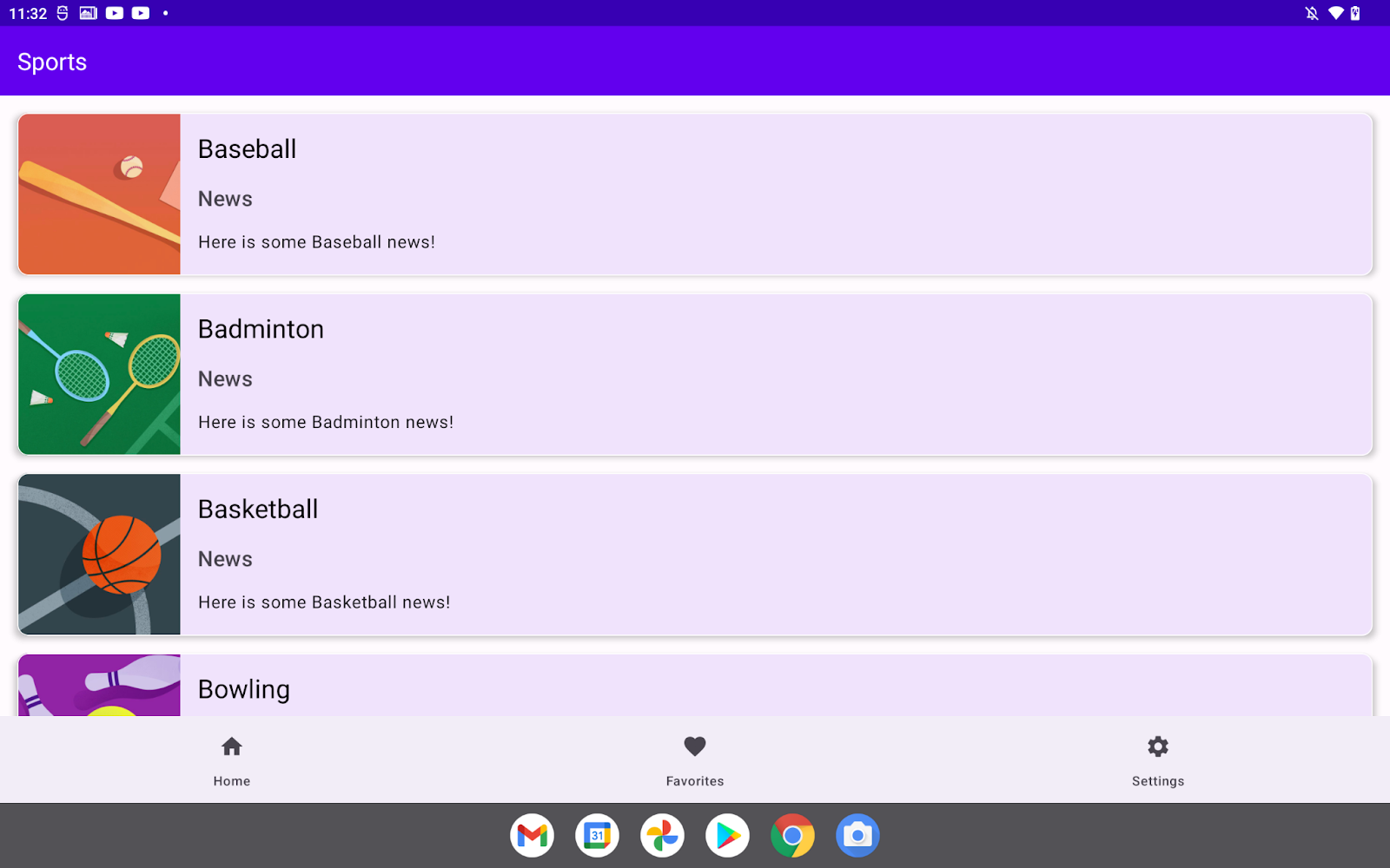
Figure 2. The app runs in horizontal orientation after you update the AndroidManifest.xml file.
5. Window-size classes
These are breakpoint values that help classify window size into predefined size classes—compact, medium and expanded—with the raw window size available for your app. You would use these size classes when designing, developing, and testing your adaptive layout.
The available width and heights are partitioned independently so that your app is always associated with two window-size classes: a width window-size class and a height window-size class.
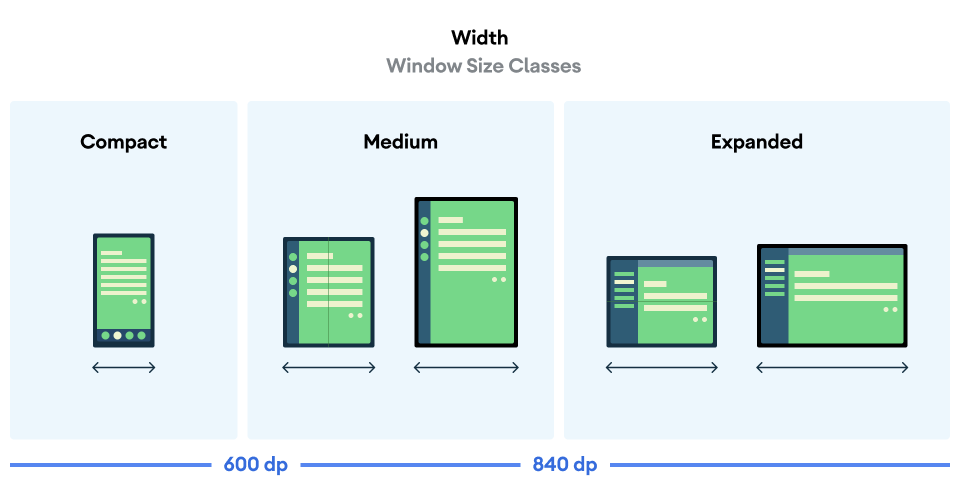
Figure 3. Width window-size classes and associated break points.
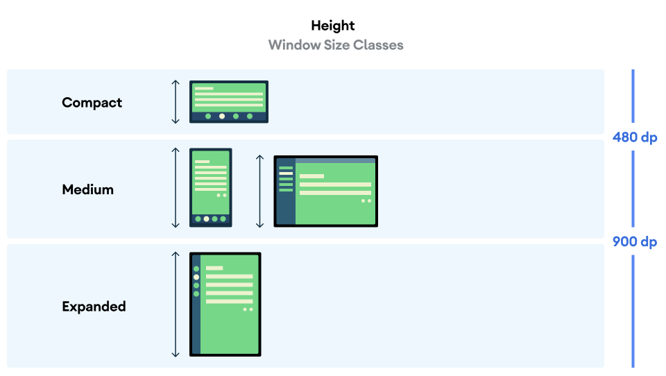
Figure 4. The height window-size classes and their associated break points.
The window-size classes represent the current window size of your app. In other words, you can't determine the window-size class by physical-device size. Even if your app runs on the same device, the associated window-size class changes by configuration, such as when you run your app in split-screen mode. This has two important consequences:
- Physical devices don't guarantee a specific window-size class.
- The window-size class can change throughout the lifetime of your app.
After you add adaptive layouts to your app, you test your app across all ranges of window sizes, especially on compact, medium, and expanded window-size classes. Tests for each window-size class are necessary, but not sufficient in many cases. It's important to test your app on a variety of window sizes so that you can ensure that your UI scales correctly. For more information, see Large screen layouts and Large screen app quality.
6. Lay out the list and details panes side by side on large screens
A list detail UI may need to behave differently according to the current width window-size class. When the medium or expanded width window-size class is associated with your app, it means that your app can have enough space to show the list pane and the details pane side by side, so users can see the list of items and the details of the selected item without screen transition. However, this can become too crowded on smaller screens on which it can be better to display one pane at a time with the list pane displayed initially. The details pane shows the details of the selected item when users tap an item in the list. The SlidingPaneLayout class manages the logic to determine which of these two user experiences is appropriate for the current window size.
Configure the list-pane layout
The SlidingPaneLayout class is a view-based UI component. You modify the layout resource file for the list pane, which is the fragment_sports_list.xml file in this codelab.
The SlidingPaneLayout class takes two child elements. The width and weight attributes of each child element are the key factors for the SlidingPaneLayout class to determine whether the window is large enough to display both views side by side. If not, the full-screen list is replaced by the full-screen detail UI. Weight values are referred to size the two panes proportionally when window size is larger than the minimum requirement to display the panes side by side.
The SlidingPaneLayout class has been applied to the fragment_sports_list.xml file. The list pane is configured to have a 1280dp width. This is the reason why the list pane and the details don't show up side by side.
Make the panes display side by side when the screen is greater than a 580dp width:
- Set the
RecyclerViewto a280dpwidth.
fragment_sports_list.xml
<androidx.slidingpanelayout.widget.SlidingPaneLayout
    xmlns:android="http://schemas.android.com/apk/res/android"
    xmlns:app="http://schemas.android.com/apk/res-auto"
    xmlns:tools="http://schemas.android.com/tools"
    android:id="@+id/sliding_pane_layout"
    android:layout_width="match_parent"
    android:layout_height="match_parent"
    tools:context=".SportsListFragment">

    <androidx.recyclerview.widget.RecyclerView
        android:id="@+id/recycler_view"
        android:layout_width="280dp"
        android:layout_height="match_parent"
        android:layout_weight="1"
        android:clipToPadding="false"
        android:padding="8dp"
        app:layoutManager="androidx.recyclerview.widget.LinearLayoutManager" />

    <androidx.fragment.app.FragmentContainerView
        android:layout_height="match_parent"
        android:layout_width="300dp"
        android:layout_weight="1"
        android:id="@+id/detail_container"
        android:name="com.example.android.sports.NewsDetailsFragment"/>
</androidx.slidingpanelayout.widget.SlidingPaneLayout>
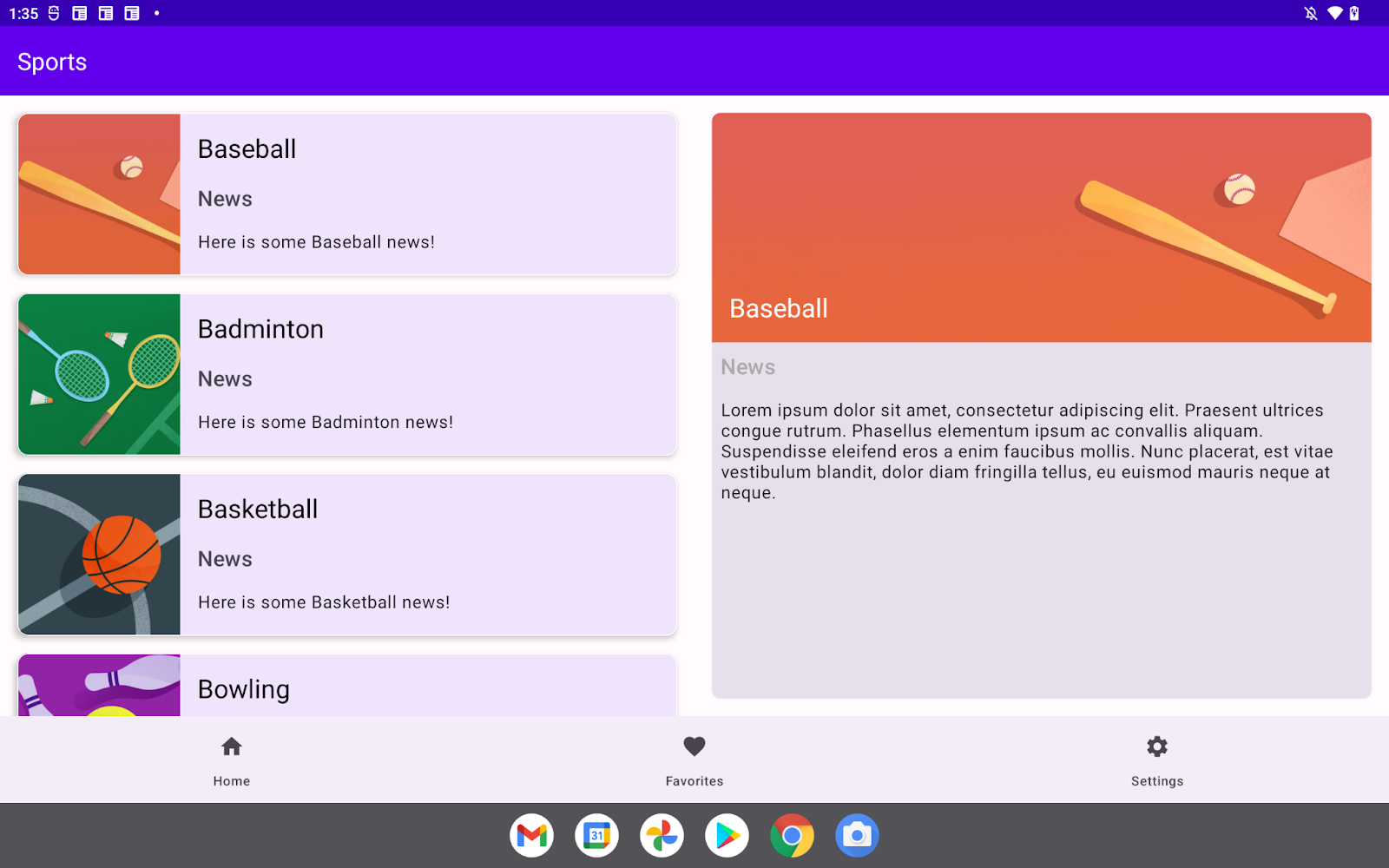
Figure 5. The list and details panes appear side by side after you update the layout resource file.
Swap out the details pane
Now the list and details panes appear side by side when the medium or expanded width window-size class is associated with your app. However, the screen fully transitions to the details pane happens when users select an item from the list pane.
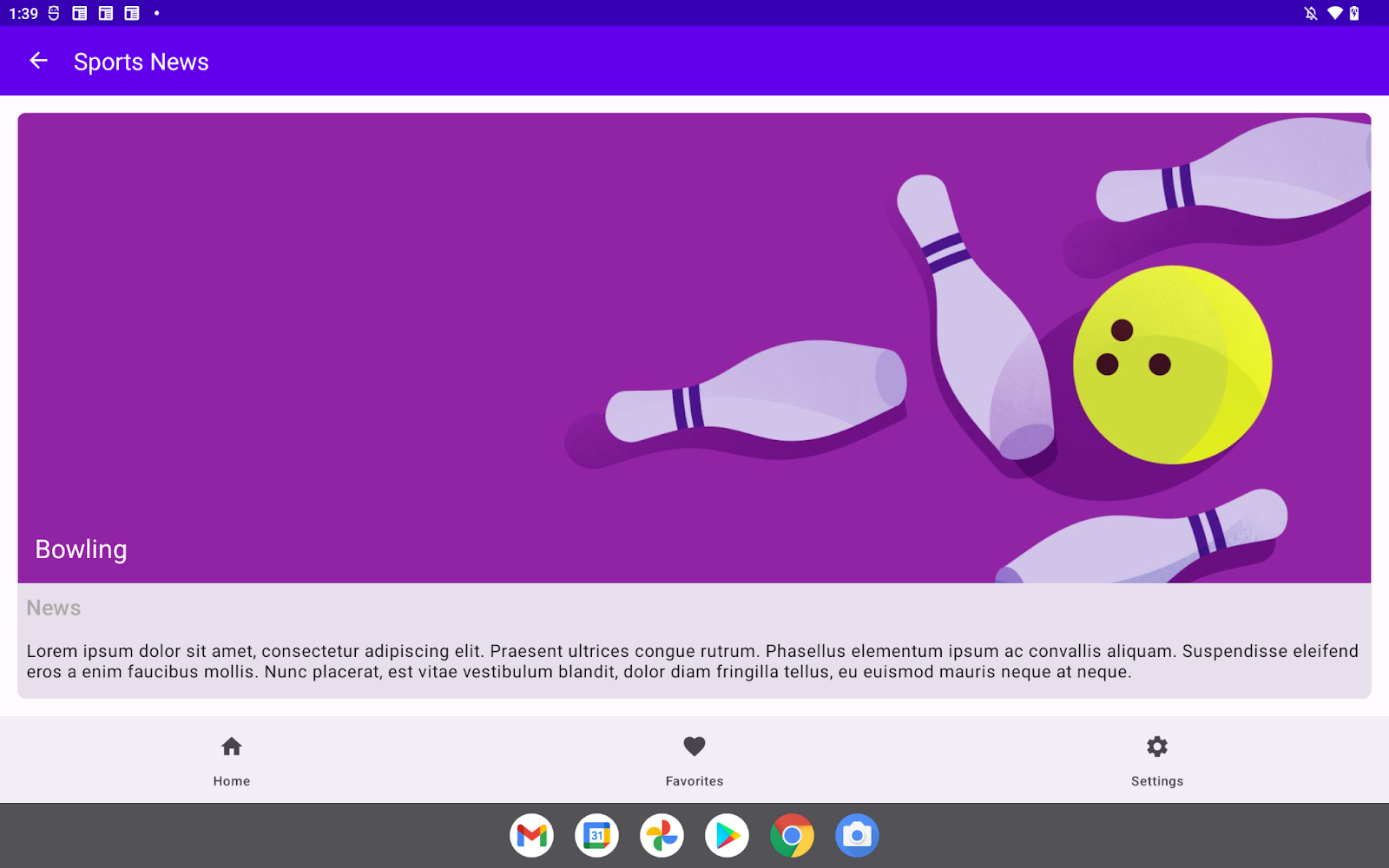
Figure 6. The screen transitions to the details pane after you select a sport from the list.
This issue is caused by the navigation triggered when users select an item from the list pane. The relevant code is available in the SportsListFragment.kt file.
SportsListFragment.kt
val adapter = SportsAdapter {
    sportsViewModel.updateCurrentSport(it)
    // Navigate to the details pane.
    val action =
       SportsListFragmentDirections.actionSportsListFragmentToNewsFragment()
    this.findNavController().navigate(action)
}
Ensure that the screen only fully transitions to the details pane when there's not enough room to display the list and details panes side by side:
- In the
adapterfunction variable, add anifstatement that checks whether theisSlidableattribute of theSlidingPaneLayoutclass is true and that theisOpenattribute of theSlidingPaneLayoutclass is false.
SportsListFragment.kt
val adapter = SportsAdapter {
    sportsViewModel.updateCurrentSport(it)
    if(slidingPaneLayout.isSlidable && !slidingPaneLayout.isOpen){
        // Navigate to the details pane.
        val action =
           SportsListFragmentDirections.actionSportsListFragmentToNewsFragment()
        this.findNavController().navigate(action)
    }
}
7. Choose the correct navigation component by width window-size class
Material Design expects your app to choose components adaptively. In this section, you choose a navigation component for the top navigation bar based on the current width window-size class. This table describes the expected navigation component for each window-size class:
Width window-size class | Navigation component |
Compact | Bottom navigation |
Medium | Navigation rail |
Expanded | Permanent navigation drawer |
Implement the navigation rail
- Create a composable
NavRail()function that takes three parameters: amenuItemsobject set to aList<MenuItem>value, amodifierobject set to aModifiervalue, and anonMenuSelectedlambda function. - In the function body, call a
NavigationRail()function that takes themodifierobject as a parameter. - Call a
NavigationRailItem()function for eachMenuItemobject in themenuItemsobject as you did with theNavigationBarItemfunction in theBottomNavigationBar()function.
Implement the permanent navigation drawer
- Create a composable
NavigationDrawer()function that takes these three parameters: amenuItemsobject set to aList<MenuItem>value, amodifierobject set to aModifiervalue, and anonMenuSelectedlambda function. - In the function body, call a
Column()function that takes themodifierobject as a parameter. - Call a
Row()function for eachMenuItemobject in themenuItemsobject. - In the body of the
Row()function, add theiconandtextlabels as you did with theNavigationBarItemfunction in theBottomNavigationBar()function.
Select the correct navigation component by width window-size class
- To retrieve the current width window-size class, call the
rememberWidthSizeClass()function inside the composable function passed to thesetContent()method on theComposeViewobject. - Create a conditional branch to choose the navigation component based on the retrieved width window-size class and call the selected one.
- Pass a
Modifierobject to theNavigationDrawerfunction to specify its width as a256dpvalue.
ActivityMain.kt
binding.navigation.setContent {
    MaterialTheme {
        when(rememberWidthSizeClass()){
            WidthSizeClass.COMPACT ->
                BottomNavigationBar(menuItems = navigationMenuItems){ menuItem ->
                    navController.navigate(screen.destinationId)
                }
            WidthSizeClass.MEDIUM ->
                NavRail(menuItems = navigationMenuItems){ menuItem ->
                    navController.navigate(screen.destinationId)
                }
            WidthSizeClass.EXPANDED ->
                NavigationDrawer(
                    menuItems = navigationMenuItems,
                    modifier = Modifier.width(256.dp)
                ) { menuItem ->
                    navController.navigate(screen.destinationId)
                }
        }

    }
}
Place the navigation component in the proper position
Now your app can choose the correct navigation component based on the current width window-size class, but the selected components can't be placed as you expected. This is because the ComposeView element is placed under the FragmentViewContainer element.
Update the alternative layout resource for the MainActivity class:
- Open the
layout-sw600dp/activity_main.xmlfile. - Update the constraint to lay out the
ComposeViewelement andFragmentContainerelement horizontally.
layout-sw600dp/activity_main.xml
  <androidx.constraintlayout.widget.ConstraintLayout
        android:layout_width="match_parent"
        android:layout_height="match_parent"
        app:layout_behavior="@string/appbar_scrolling_view_behavior">

        <androidx.fragment.app.FragmentContainerView
            android:id="@+id/nav_host_fragment_content_main"
            android:name="androidx.navigation.fragment.NavHostFragment"
            android:layout_width="0dp"
            android:layout_height="0dp"
            app:defaultNavHost="true"
            app:layout_constraintLeft_toRightOf="@+id/top_navigation"
            app:layout_constraintRight_toRightOf="parent"
            app:layout_constraintTop_toTopOf="parent"
            app:layout_constraintBottom_toBottomOf="parent"
            app:navGraph="@navigation/nav_graph" />

        <androidx.compose.ui.platform.ComposeView
            android:id="@+id/top_navigation"
            android:layout_width="wrap_content"
            android:layout_height="0dp"
            app:layout_constraintTop_toTopOf="parent"
            app:layout_constraintBottom_toBottomOf="parent"
            app:layout_constraintStart_toStartOf="parent"
            app:menu="@menu/top_navigation" />
    </androidx.constraintlayout.widget.ConstraintLayout>
After the modification, the app chooses the correct navigation component based on the associated width window-size class. The first screenshot shows the screen for the medium-width window-size class. The second screenshot shows the screen for the expanded-width window-size class.
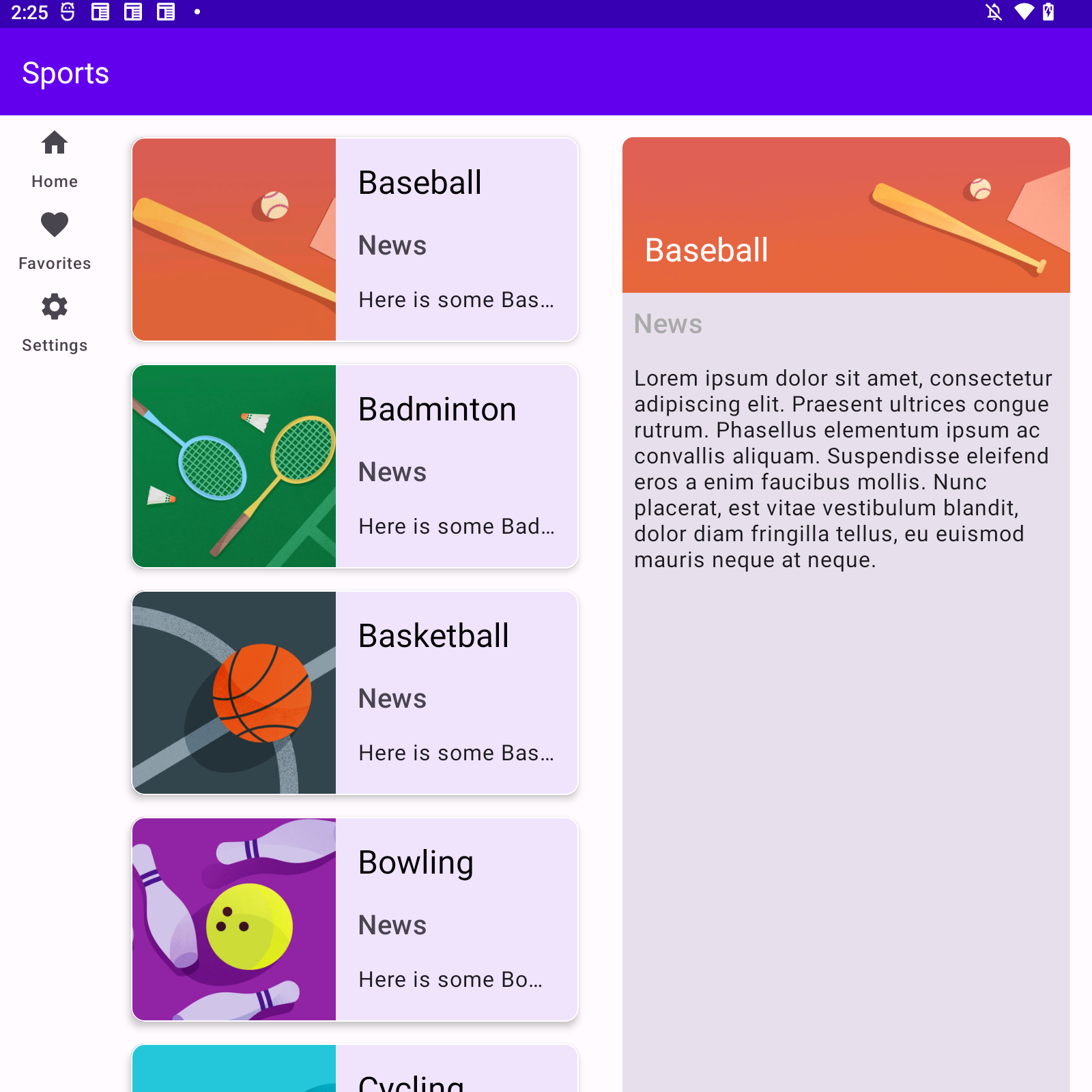
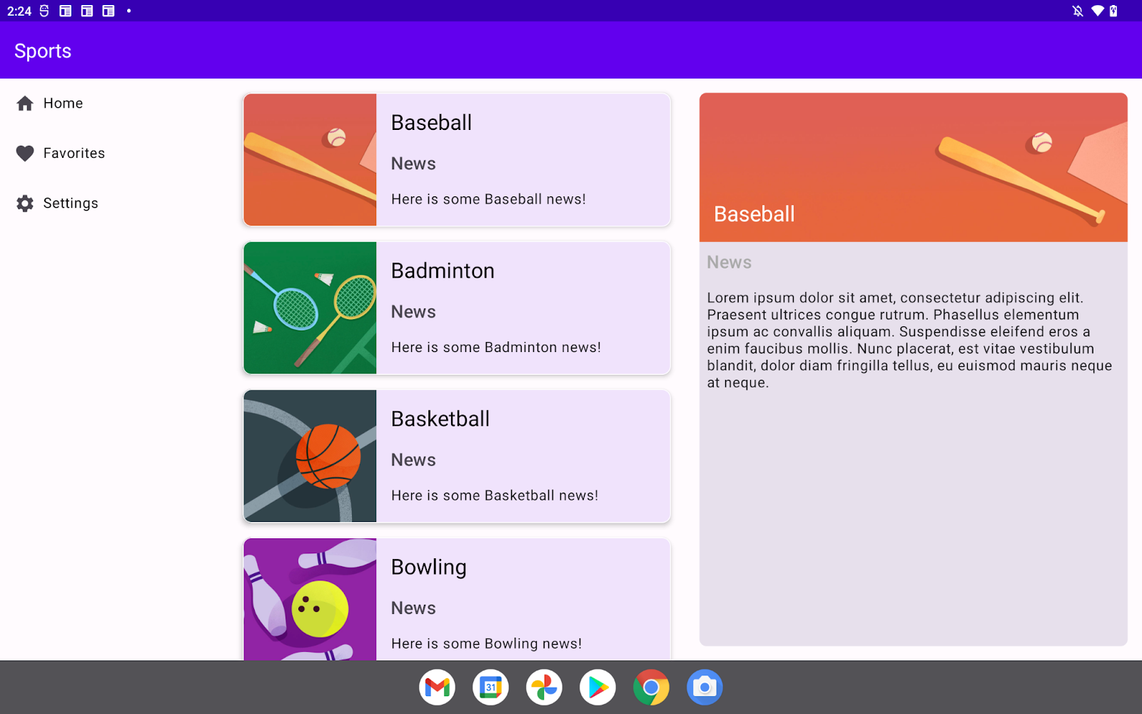
Figure 7. The screens for the medium- and expanded-width window-size classes.
8. Congratulations
Congratulations! You completed this codelab and learned how to add adaptive layouts to a View-based Android app with Compose. In doing so, you learned about the SlidingPaneLayout class, window size classes, and navigation-component selection based on width window-size classes.