
1. Introduction
In this codelab, you will learn about theming your apps in Jetpack Compose using Material Design 3. You'll also learn about the key building blocks of Material Design 3 Color schemes, typography, and shapes, which help you theme your application in personalized and accessible ways.
In addition, you'll explore support of dynamic theming along with different emphasis levels.
What you will learn
In this codelab, you will learn:
- Key aspects of Material 3 theming
- Material 3 color schemes and how to generate themes for your app
- How to support dynamic and light/dark theming for your app
- Typography and shapes to personalize your app
- Material 3 components and customizing to style your app
What you will build
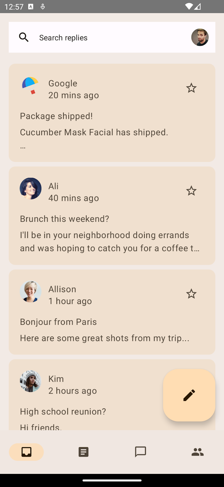
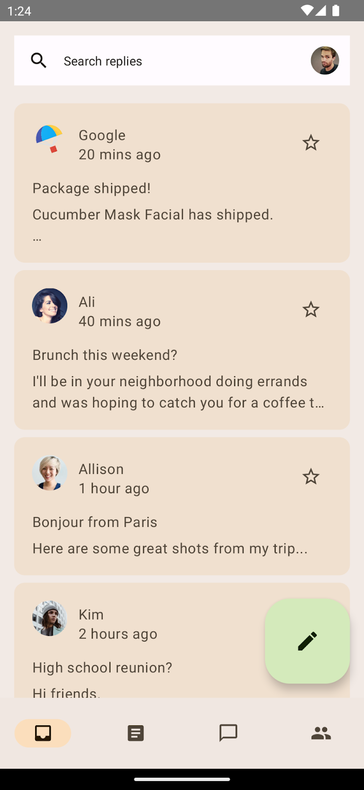
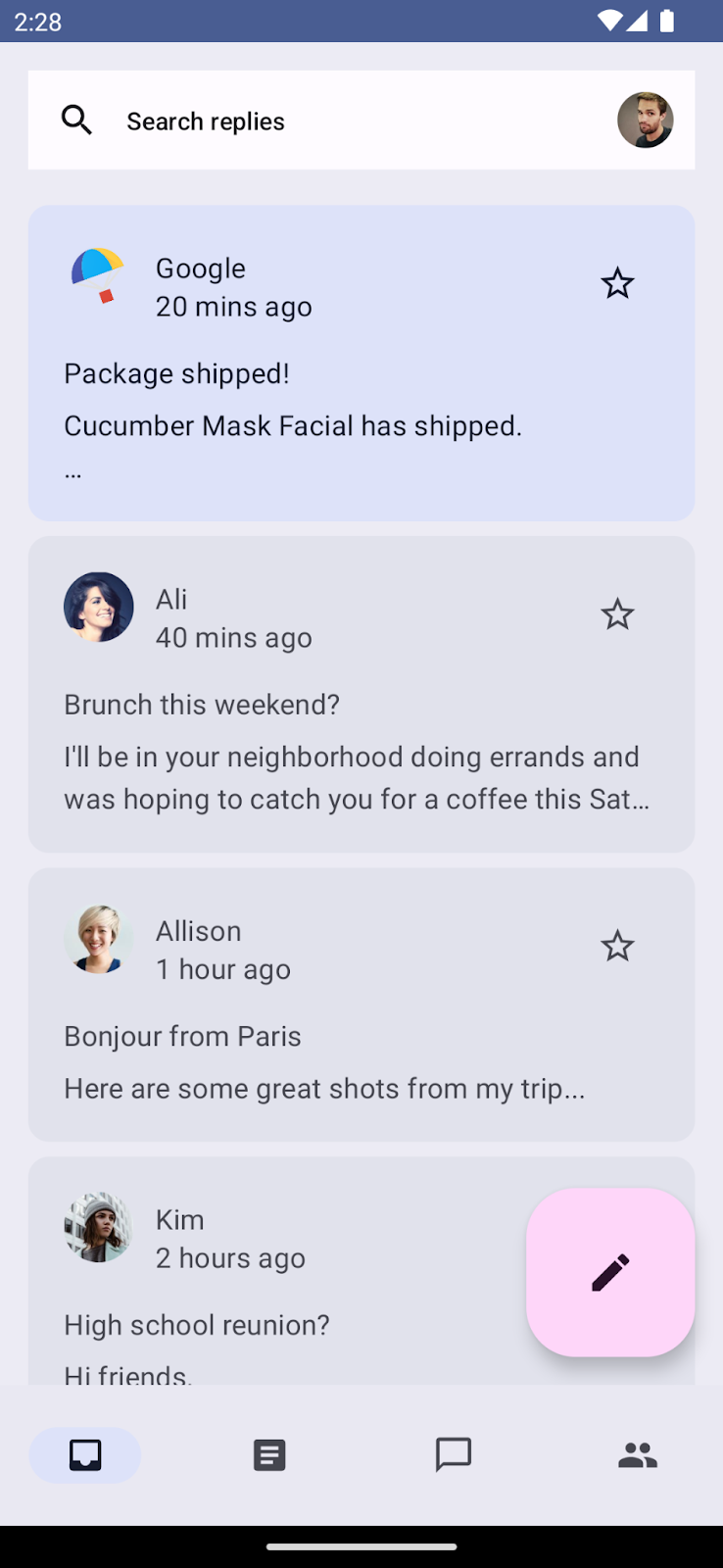
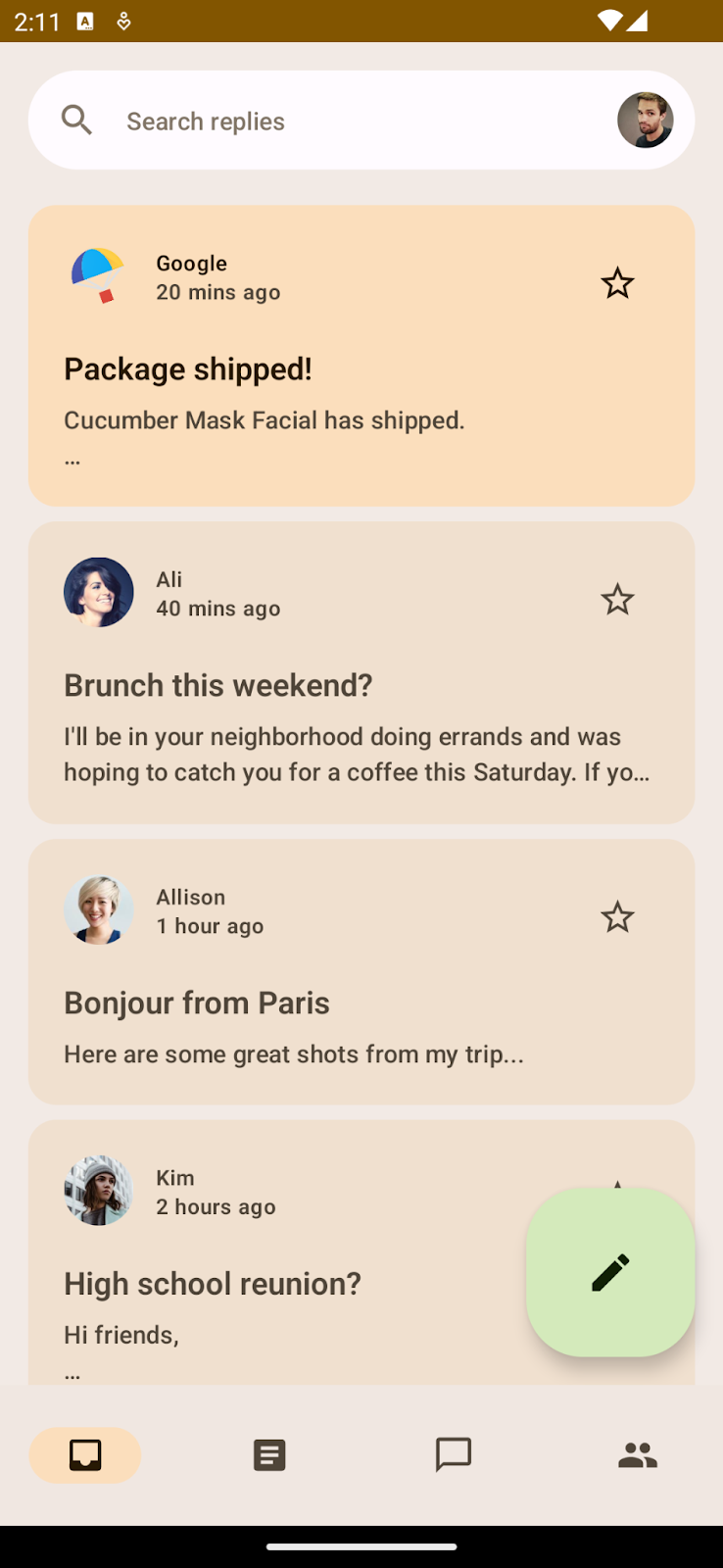
In this codelab, you will theme an email client app called Reply. You begin with an unstyled application, using the baseline theme, and will apply what you learn to theme the application and support dark themes.
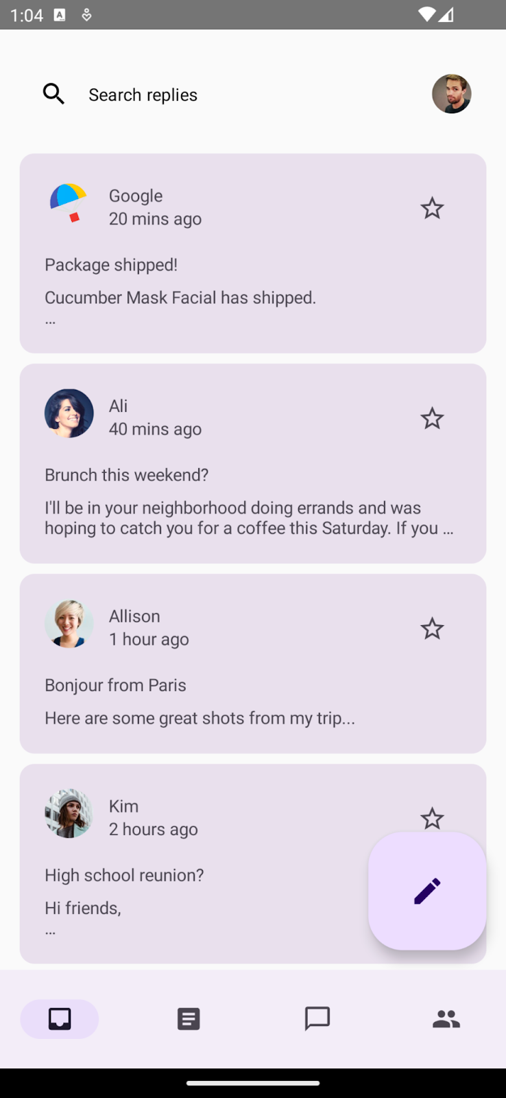
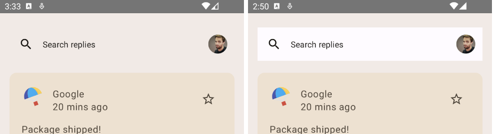
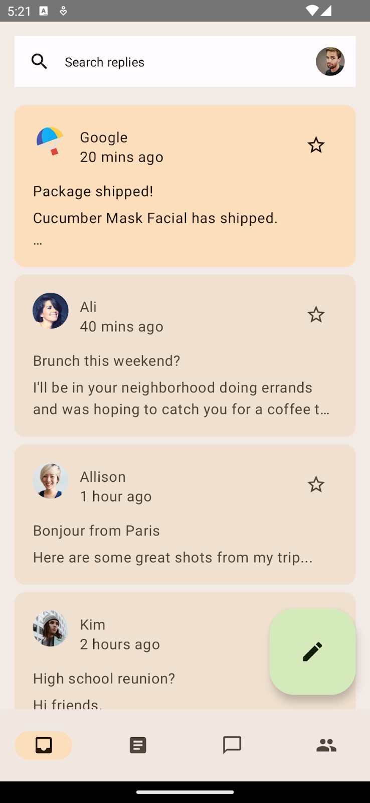
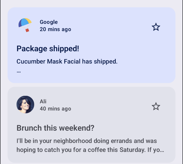
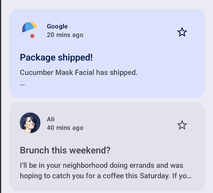
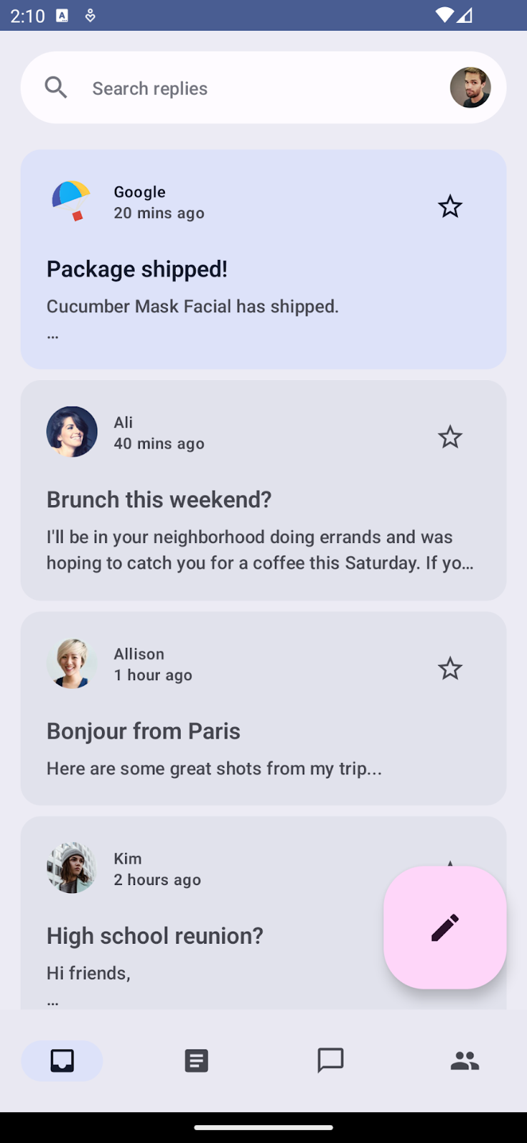
Default starting point of our app with the baseline theme.
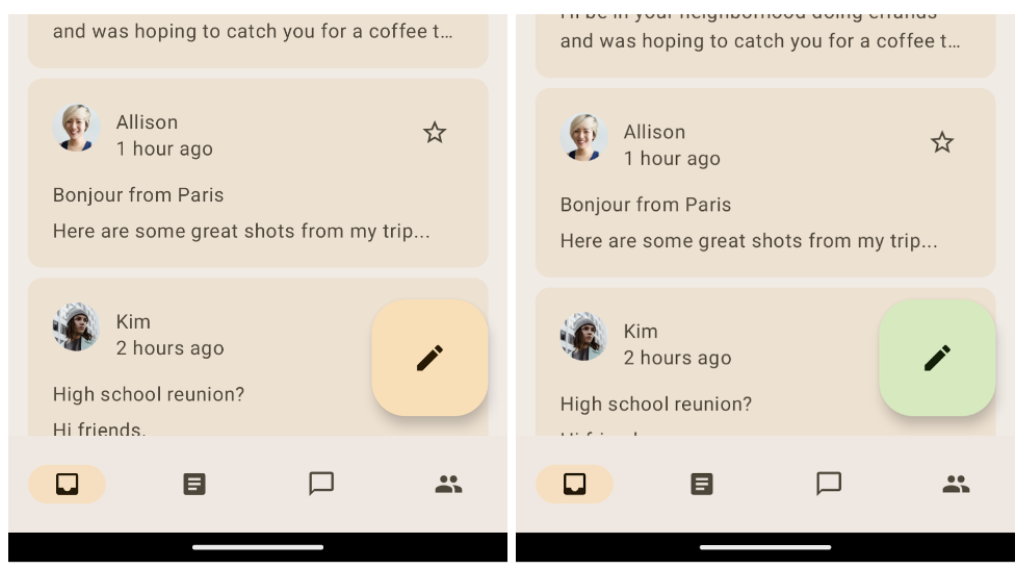
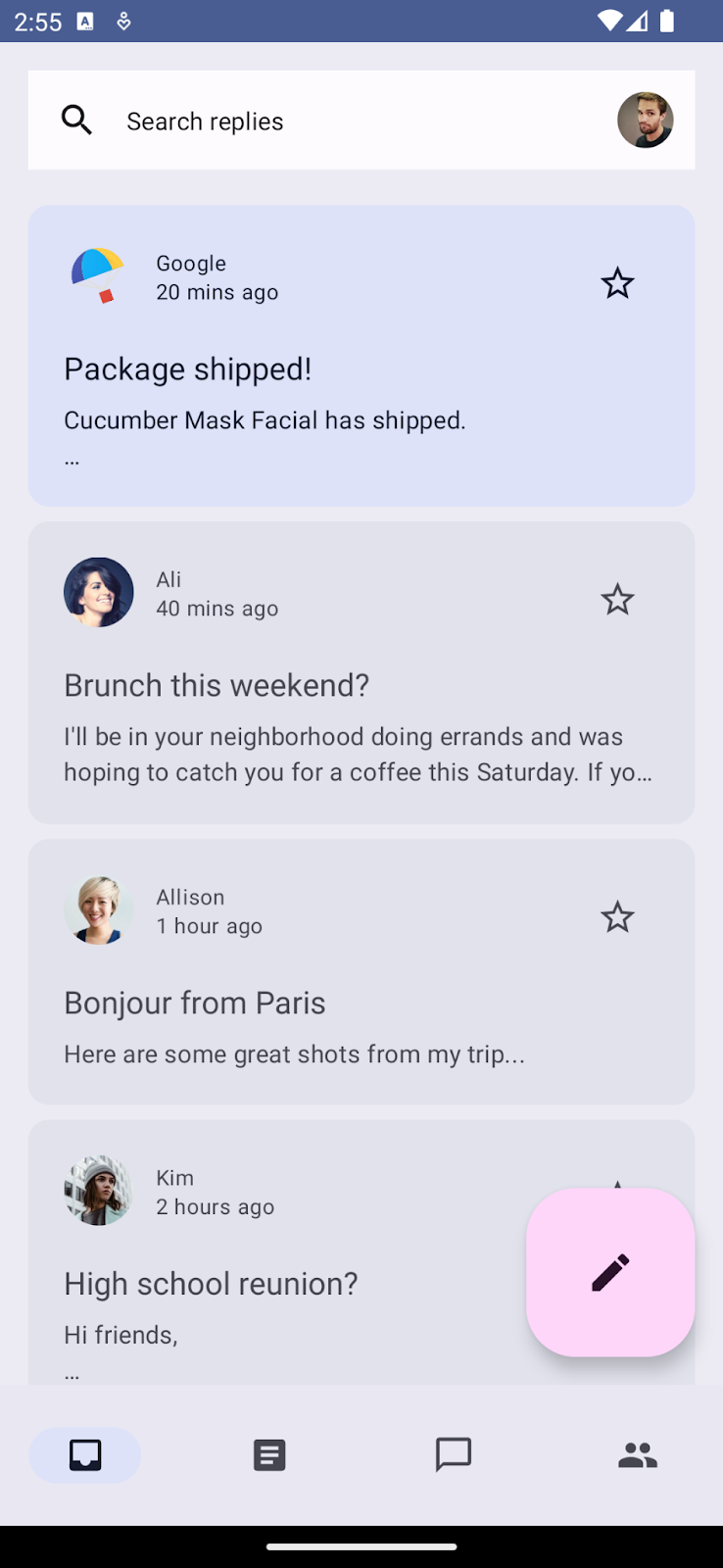
You'll create your theme with color scheme, typography, and shapes, and then apply it to your app's email list and detail page. You will also add dynamic theme support to the app. By the end of codelab, you'll have support for both color and dynamic themes for your app.
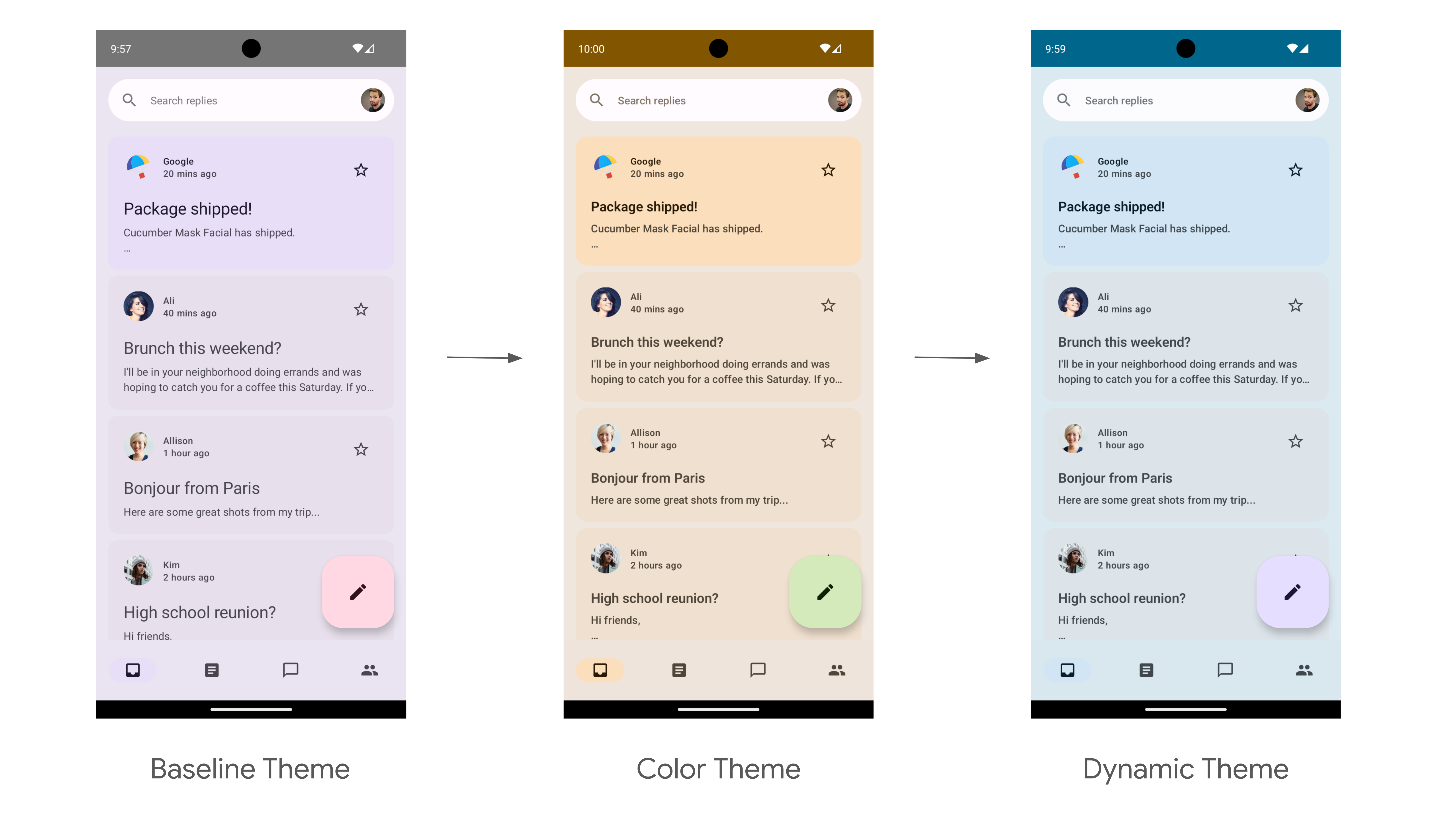
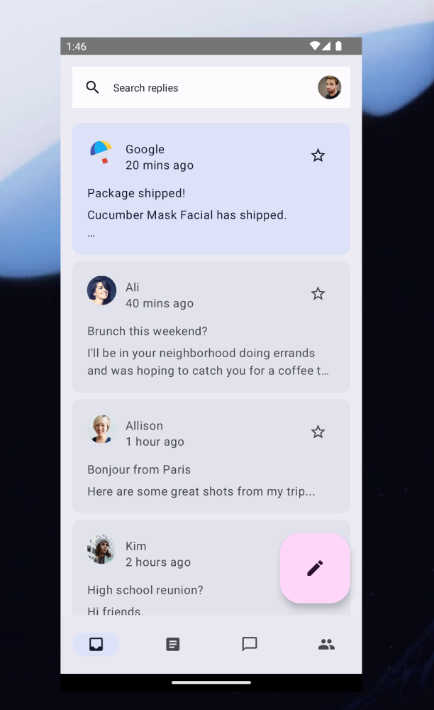
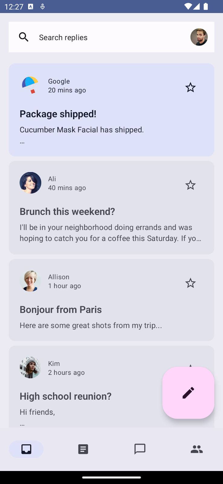
End point of the theming codelab with light color theming and light dynamic theming.
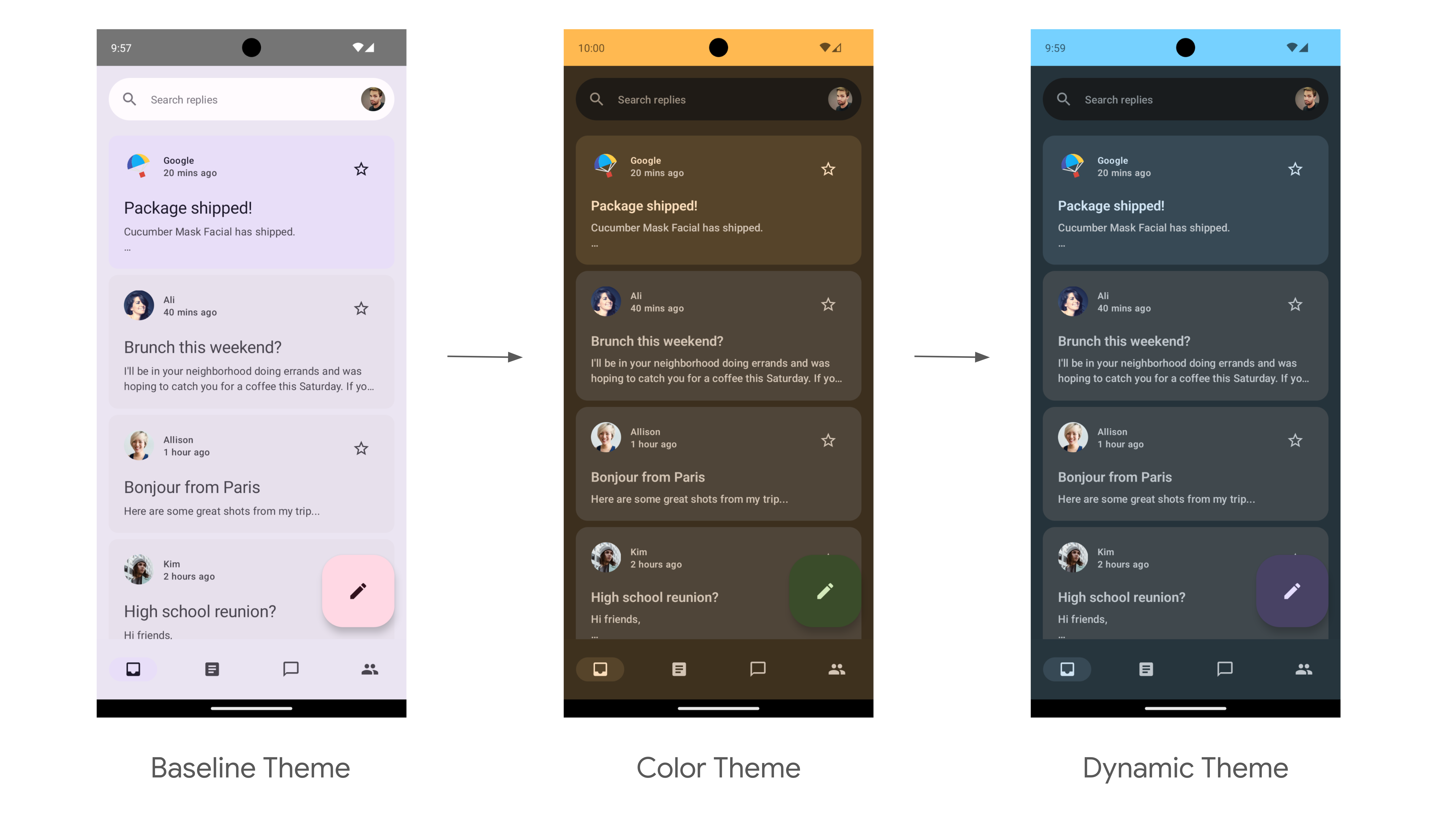
End point of the theming codelab with dark color theming and dark dynamic theming.
What you will need
- The latest version of Android Studio
- Basic experience with the Kotlin language
- Basic understanding of Jetpack Compose
- Basic familiarity with Compose layouts, such as Row, Column, and Modifier
2. Getting set up
In this step, you download the full code of the Reply app that you'll style in this codelab.
Get the code
The code for this codelab can be found in the codelab-android-compose GitHub repository. To clone it, run:
$ git clone https://github.com/android/codelab-android-compose
Alternatively, you can download two zip files:
Check out the sample app
The code you just downloaded contains code for all available Compose codelabs. To complete this codelab, open the ThemingCodelab project inside Android Studio.
We recommend that you start with the code in the main branch and follow the codelab step-by-step at your own pace. At any time, you can run either version in Android Studio by changing the git branch of the project.
Exploring the start code
The main code contains a UI package, which has the following main packages and files that you'll interact with:
MainActivity.kt– Entry point activity where you start the Reply app.com.example.reply.ui.theme– This package contains themes, typography, and color schemes. You will be adding Material theming in this package.com.example.reply.ui.components– Contains the app's custom components like List Items, App Bars, etc. You will apply themes to these components.ReplyApp.kt– This is our main Composable function where the UI tree will be starting. You will apply top level theming in this file.
This codelab will focus on ui package files.
3. Material 3 Theming
Jetpack Compose offers an implementation of Material Design—a comprehensive design system for creating digital interfaces. The Material Design components (Buttons, Cards, Switches, etc) are built on top of Material Theming, which is a systematic way to customize Material Design to better reflect your product's brand.
Material 3 theme comprises the following subsystems to add theming to your app: color scheme, typography, and shapes. When you customize these values, your changes are automatically reflected in the M3 components you use to build your app. Let's dive into each subsystem and implement it in the sample app.
Material 3 subsystem of colors, typography, and shapes.
4. Color schemes
The foundation of a color scheme is the set of five key colors that each relate to a tonal palette of 13 tones which are used by Material 3 components.
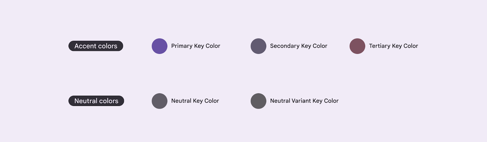
Five baseline key colors for creating an M3 theming.
Each accent color (primary, secondary, and tertiary) is then provided in four compatible colors of different tones for pairing, defining emphasis, and visual expression.
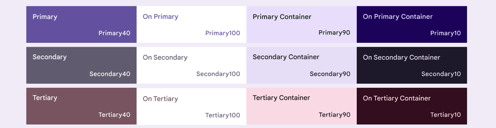
Four tonal colors of primary, secondary, and tertiary baseline accent colors.
Similarly, neutral colors are also divided into four compatible tones used for surfaces and background. These are also important to emphasize text icons when placed on any surface.
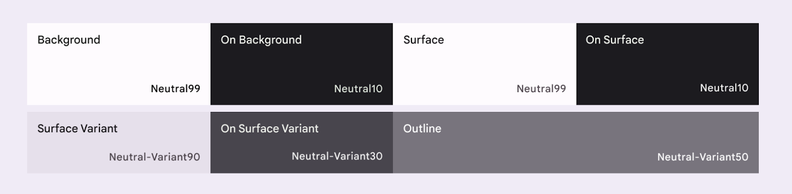
Four tonal colors of baseline neutral colors.
Read more about the Color scheme and color roles.
Generating color schemes
While you can create a custom ColorScheme manually, it's often easier to generate one using source colors from your brand. The Material Theme Builder tool allows you to do this, and optionally export Compose theming code.
You can choose any color you like, but for our use case you will use the default Reply primary color #825500. Click on Primary color in the left Core colors section and add the code in the color picker.
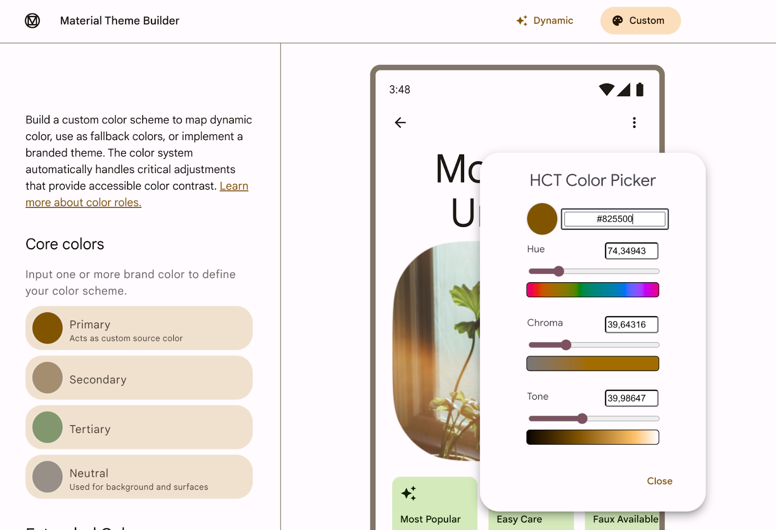
Adding primary color code in Material Theme Builder.
Once you add the primary color in the Material Theme Builder, you should see the following theme and the option to export in the top right corner. For this codelab, you export the theme in Jetpack Compose.
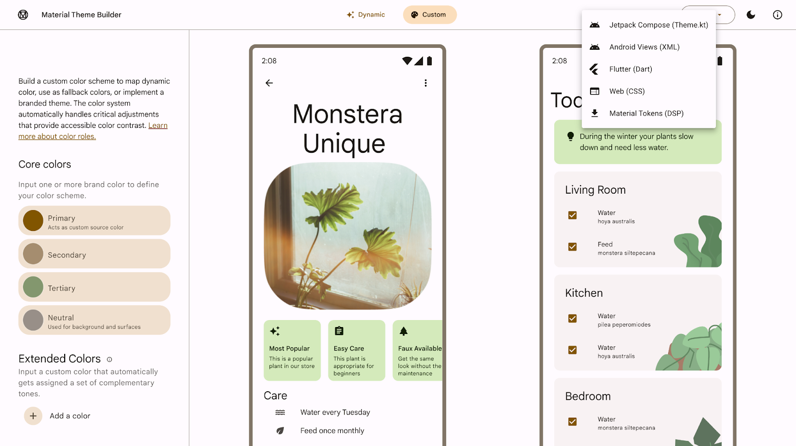
Material Theme Builder with the option to export at the top right corner.
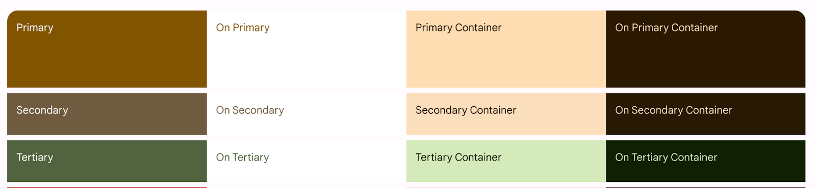
The primary color #825500 generates the following theme that you'll add to the app. Material 3 provides a wide range of color roles to flexibly express a component's state, prominence, and emphasis.
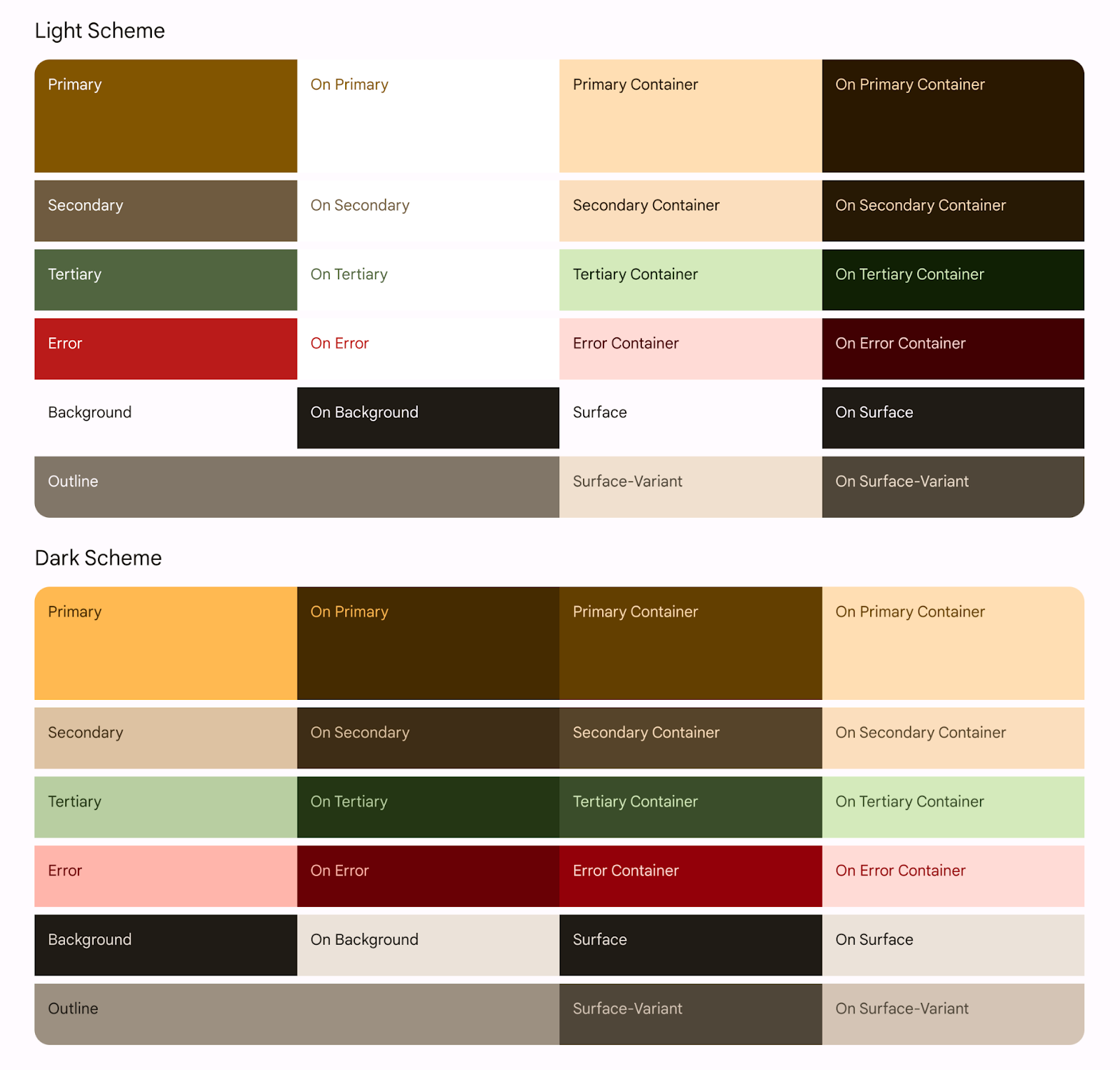
Exported light and dark color scheme from primary color.
The Color.kt generated file contains the colors of your theme with all the roles defined for both light and dark theme colors.
Color.kt
package com.example.reply.ui.theme
import androidx.compose.ui.graphics.Color

val md_theme_light_primary = Color(0xFF825500)
val md_theme_light_onPrimary = Color(0xFFFFFFFF)
val md_theme_light_primaryContainer = Color(0xFFFFDDB3)
val md_theme_light_onPrimaryContainer = Color(0xFF291800)
val md_theme_light_secondary = Color(0xFF6F5B40)
val md_theme_light_onSecondary = Color(0xFFFFFFFF)
val md_theme_light_secondaryContainer = Color(0xFFFBDEBC)
val md_theme_light_onSecondaryContainer = Color(0xFF271904)
val md_theme_light_tertiary = Color(0xFF51643F)
val md_theme_light_onTertiary = Color(0xFFFFFFFF)
val md_theme_light_tertiaryContainer = Color(0xFFD4EABB)
val md_theme_light_onTertiaryContainer = Color(0xFF102004)
val md_theme_light_error = Color(0xFFBA1A1A)
val md_theme_light_errorContainer = Color(0xFFFFDAD6)
val md_theme_light_onError = Color(0xFFFFFFFF)
val md_theme_light_onErrorContainer = Color(0xFF410002)
val md_theme_light_background = Color(0xFFFFFBFF)
val md_theme_light_onBackground = Color(0xFF1F1B16)
val md_theme_light_surface = Color(0xFFFFFBFF)
val md_theme_light_onSurface = Color(0xFF1F1B16)
val md_theme_light_surfaceVariant = Color(0xFFF0E0CF)
val md_theme_light_onSurfaceVariant = Color(0xFF4F4539)
val md_theme_light_outline = Color(0xFF817567)
val md_theme_light_inverseOnSurface = Color(0xFFF9EFE7)
val md_theme_light_inverseSurface = Color(0xFF34302A)
val md_theme_light_inversePrimary = Color(0xFFFFB951)
val md_theme_light_shadow = Color(0xFF000000)
val md_theme_light_surfaceTint = Color(0xFF825500)
val md_theme_light_outlineVariant = Color(0xFFD3C4B4)
val md_theme_light_scrim = Color(0xFF000000)

val md_theme_dark_primary = Color(0xFFFFB951)
val md_theme_dark_onPrimary = Color(0xFF452B00)
val md_theme_dark_primaryContainer = Color(0xFF633F00)
val md_theme_dark_onPrimaryContainer = Color(0xFFFFDDB3)
val md_theme_dark_secondary = Color(0xFFDDC2A1)
val md_theme_dark_onSecondary = Color(0xFF3E2D16)
val md_theme_dark_secondaryContainer = Color(0xFF56442A)
val md_theme_dark_onSecondaryContainer = Color(0xFFFBDEBC)
val md_theme_dark_tertiary = Color(0xFFB8CEA1)
val md_theme_dark_onTertiary = Color(0xFF243515)
val md_theme_dark_tertiaryContainer = Color(0xFF3A4C2A)
val md_theme_dark_onTertiaryContainer = Color(0xFFD4EABB)
val md_theme_dark_error = Color(0xFFFFB4AB)
val md_theme_dark_errorContainer = Color(0xFF93000A)
val md_theme_dark_onError = Color(0xFF690005)
val md_theme_dark_onErrorContainer = Color(0xFFFFDAD6)
val md_theme_dark_background = Color(0xFF1F1B16)
val md_theme_dark_onBackground = Color(0xFFEAE1D9)
val md_theme_dark_surface = Color(0xFF1F1B16)
val md_theme_dark_onSurface = Color(0xFFEAE1D9)
val md_theme_dark_surfaceVariant = Color(0xFF4F4539)
val md_theme_dark_onSurfaceVariant = Color(0xFFD3C4B4)
val md_theme_dark_outline = Color(0xFF9C8F80)
val md_theme_dark_inverseOnSurface = Color(0xFF1F1B16)
val md_theme_dark_inverseSurface = Color(0xFFEAE1D9)
val md_theme_dark_inversePrimary = Color(0xFF825500)
val md_theme_dark_shadow = Color(0xFF000000)
val md_theme_dark_surfaceTint = Color(0xFFFFB951)
val md_theme_dark_outlineVariant = Color(0xFF4F4539)
val md_theme_dark_scrim = Color(0xFF000000)


val seed = Color(0xFF825500)
The Theme.kt generated file contains a setup for light and dark color schemes and the app theme. It also contains the main theming composable function, AppTheme().
Theme.kt
package com.example.reply.ui.theme

import androidx.compose.foundation.isSystemInDarkTheme
import androidx.compose.material3.MaterialTheme
import androidx.compose.material3.lightColorScheme
import androidx.compose.material3.darkColorScheme
import androidx.compose.runtime.Composable


private val LightColors = lightColorScheme(
   primary = md_theme_light_primary,
   onPrimary = md_theme_light_onPrimary,
   primaryContainer = md_theme_light_primaryContainer,
   onPrimaryContainer = md_theme_light_onPrimaryContainer,
   secondary = md_theme_light_secondary,
   onSecondary = md_theme_light_onSecondary,
   secondaryContainer = md_theme_light_secondaryContainer,
   onSecondaryContainer = md_theme_light_onSecondaryContainer,
   tertiary = md_theme_light_tertiary,
   onTertiary = md_theme_light_onTertiary,
   tertiaryContainer = md_theme_light_tertiaryContainer,
   onTertiaryContainer = md_theme_light_onTertiaryContainer,
   error = md_theme_light_error,
   errorContainer = md_theme_light_errorContainer,
   onError = md_theme_light_onError,
   onErrorContainer = md_theme_light_onErrorContainer,
   background = md_theme_light_background,
   onBackground = md_theme_light_onBackground,
   surface = md_theme_light_surface,
   onSurface = md_theme_light_onSurface,
   surfaceVariant = md_theme_light_surfaceVariant,
   onSurfaceVariant = md_theme_light_onSurfaceVariant,
   outline = md_theme_light_outline,
   inverseOnSurface = md_theme_light_inverseOnSurface,
   inverseSurface = md_theme_light_inverseSurface,
   inversePrimary = md_theme_light_inversePrimary,
   surfaceTint = md_theme_light_surfaceTint,
   outlineVariant = md_theme_light_outlineVariant,
   scrim = md_theme_light_scrim,
)


private val DarkColors = darkColorScheme(
   primary = md_theme_dark_primary,
   onPrimary = md_theme_dark_onPrimary,
   primaryContainer = md_theme_dark_primaryContainer,
   onPrimaryContainer = md_theme_dark_onPrimaryContainer,
   secondary = md_theme_dark_secondary,
   onSecondary = md_theme_dark_onSecondary,
   secondaryContainer = md_theme_dark_secondaryContainer,
   onSecondaryContainer = md_theme_dark_onSecondaryContainer,
   tertiary = md_theme_dark_tertiary,
   onTertiary = md_theme_dark_onTertiary,
   tertiaryContainer = md_theme_dark_tertiaryContainer,
   onTertiaryContainer = md_theme_dark_onTertiaryContainer,
   error = md_theme_dark_error,
   errorContainer = md_theme_dark_errorContainer,
   onError = md_theme_dark_onError,
   onErrorContainer = md_theme_dark_onErrorContainer,
   background = md_theme_dark_background,
   onBackground = md_theme_dark_onBackground,
   surface = md_theme_dark_surface,
   onSurface = md_theme_dark_onSurface,
   surfaceVariant = md_theme_dark_surfaceVariant,
   onSurfaceVariant = md_theme_dark_onSurfaceVariant,
   outline = md_theme_dark_outline,
   inverseOnSurface = md_theme_dark_inverseOnSurface,
   inverseSurface = md_theme_dark_inverseSurface,
   inversePrimary = md_theme_dark_inversePrimary,
   surfaceTint = md_theme_dark_surfaceTint,
   outlineVariant = md_theme_dark_outlineVariant,
   scrim = md_theme_dark_scrim,
)

@Composable
fun AppTheme(
   useDarkTheme: Boolean = isSystemInDarkTheme(),
   content: @Composable() () -> Unit
) {
   val colors = if (!useDarkTheme) {
       LightColors
   } else {
       DarkColors
   }

   MaterialTheme(
       colorScheme = colors,
       content = content
   )
}
The core element for implementing theming in Jetpack Compose is the MaterialTheme composable.
You wrap the MaterialTheme() composable in the AppTheme() function, which takes two parameters:
useDarkTheme- this parameter is tied to the functionisSystemInDarkTheme()to observe system theming settings and apply the light or dark theme. If you want to keep your app in a light or dark theme manually, you can pass a boolean value to theuseDarkTheme.content- the content to which the theme will be applied to.
Theme.kt
@Composable
fun AppTheme(
   useDarkTheme: Boolean = isSystemInDarkTheme(),
   content: @Composable() () -> Unit
) {
   val colors = if (!useDarkTheme) {
       LightColors
   } else {
       DarkColors
   }

   MaterialTheme(
       colorScheme = colors,
       content = content
   )
}
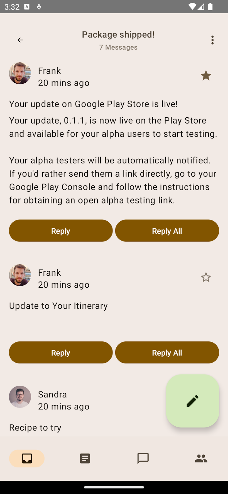
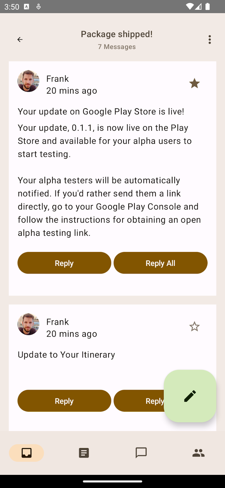
If you try to run the app now, you should see that it looks the same. Even though you have imported our new color scheme with new theming colors, you still see the baseline theming because you haven't applied the theme to the Compose app.
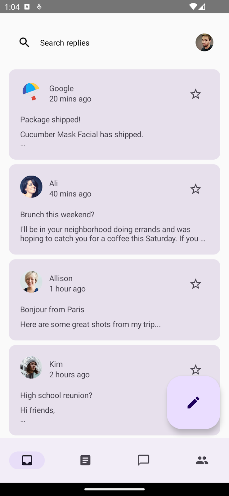
App with baseline theming when no theme is applied.
To apply the new theme, in MainActivity.kt, wrap the main composable ReplyApp with the main theming function, AppTheme().
MainActivity.kt
setContent {
   val uiState by viewModel.uiState.collectAsStateWithLifecycle()

   AppTheme {
       ReplyApp(/*..*/)
   }
}
You'll also update the preview functions to see the theme applied to app previews. Wrap the ReplyApp composable inside ReplyAppPreview() with the AppTheme to apply theming to the previews.
You have both the light and dark system themes defined in the preview parameters, so you'll see both previews.
MainActivity.kt
@Preview(
   uiMode = Configuration.UI_MODE_NIGHT_YES,
   name = "DefaultPreviewDark"
)
@Preview(
   uiMode = Configuration.UI_MODE_NIGHT_NO,
   name = "DefaultPreviewLight"
)
@Composable
fun ReplyAppPreview() {
   AppTheme {
       ReplyApp(
           replyHomeUIState = ReplyHomeUIState(
               emails = LocalEmailsDataProvider.allEmails
           )
       )
   }
}
If you run the app now, you should see app previews with the imported theme colors instead of the baseline theme.
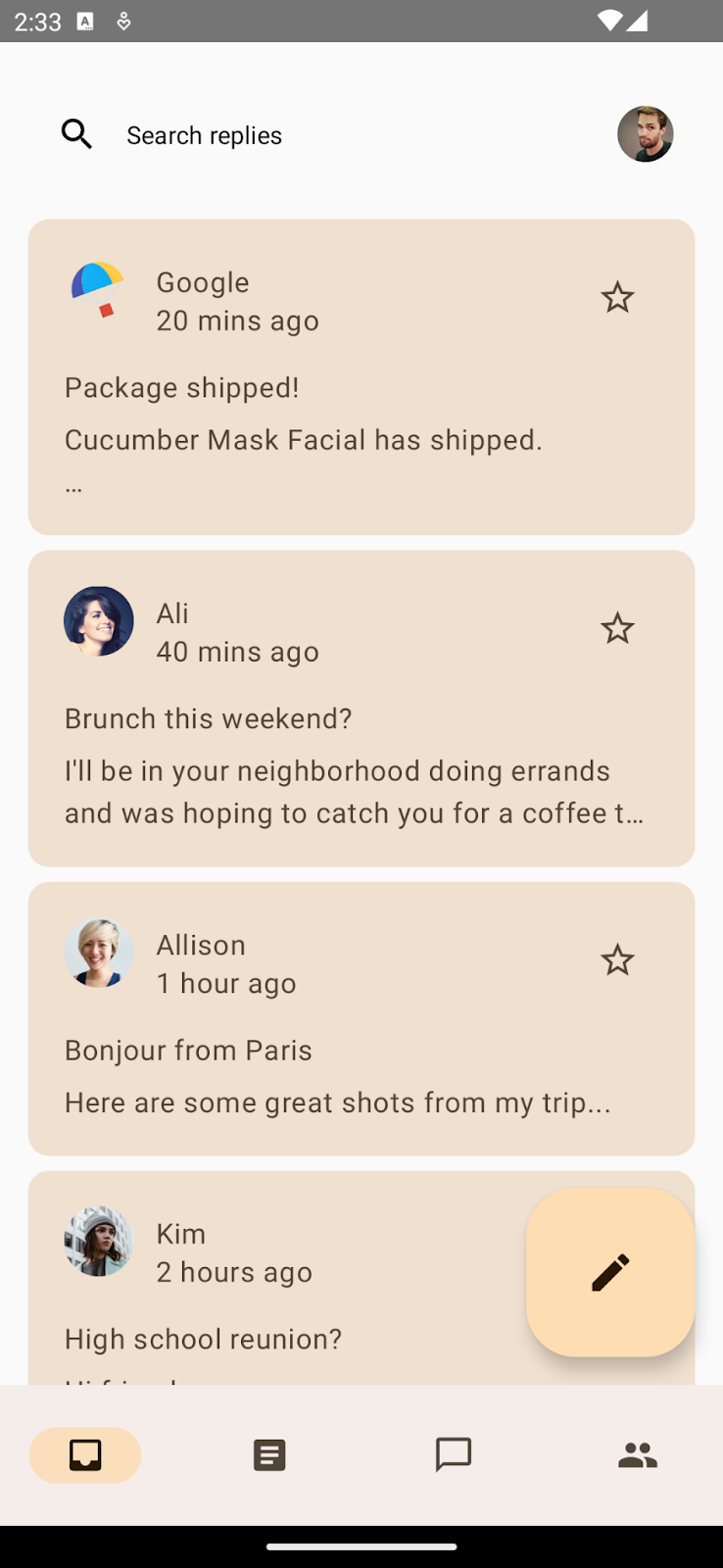
App with baseline theme (Left).
App with imported color theme (Right).
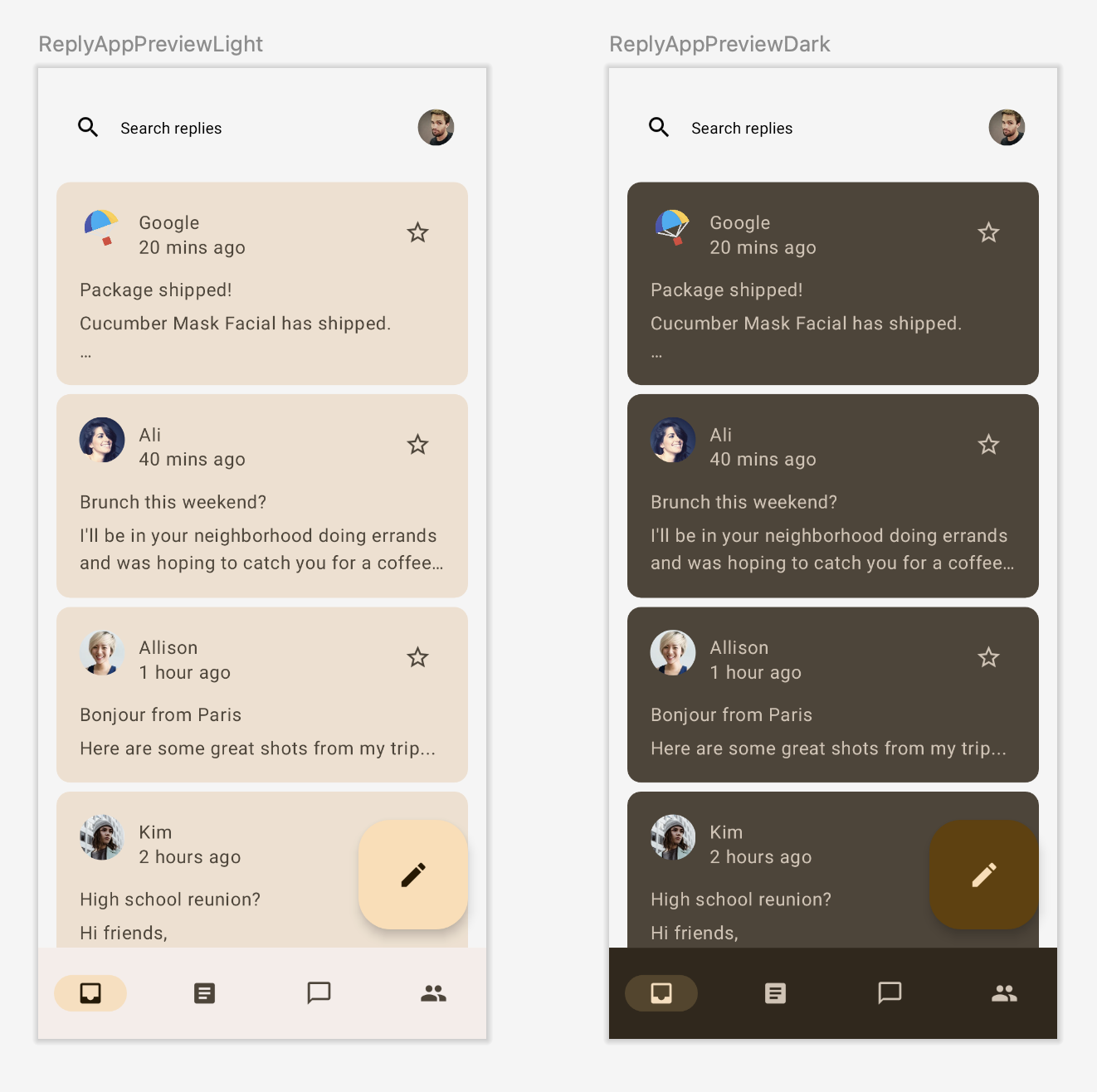
Light and dark app previews with imported color themes.
Material 3 supports both light and dark color schemes. You have only wrapped the app with the imported theme; Material 3 components are using default color roles.
Let's learn about color roles and use before you start adding it to the app.
Color roles and accessibility
Each color role can be used in a variety of places depending on the component's state, prominence, and emphasis.
Color roles of primary, secondary, and tertiary colors.
Primary is the base color, which is used for the main components like prominent buttons and active states.
The secondary key color is used for less prominent components in the UI, such as filter chips.
The tertiary key color is used to provide contrasting accents, and neutral colors are used for the background and surfaces in the app.
Material's color system provides standard tone values and measurements that can be used to meet accessible contrast ratios. Use on-primary on top of primary, on-primary-container on top of primary-container, and the same for other accent and neutral colors to provide accessible contrast to the user.
For more information, see color roles and accessibility.
Tonal and shadow elevations
Material 3 represents elevation mainly using tonal color overlays. This is a new way to differentiate containers and surfaces from each other — increasing tonal elevation uses a more prominent tone — in addition to shadows.
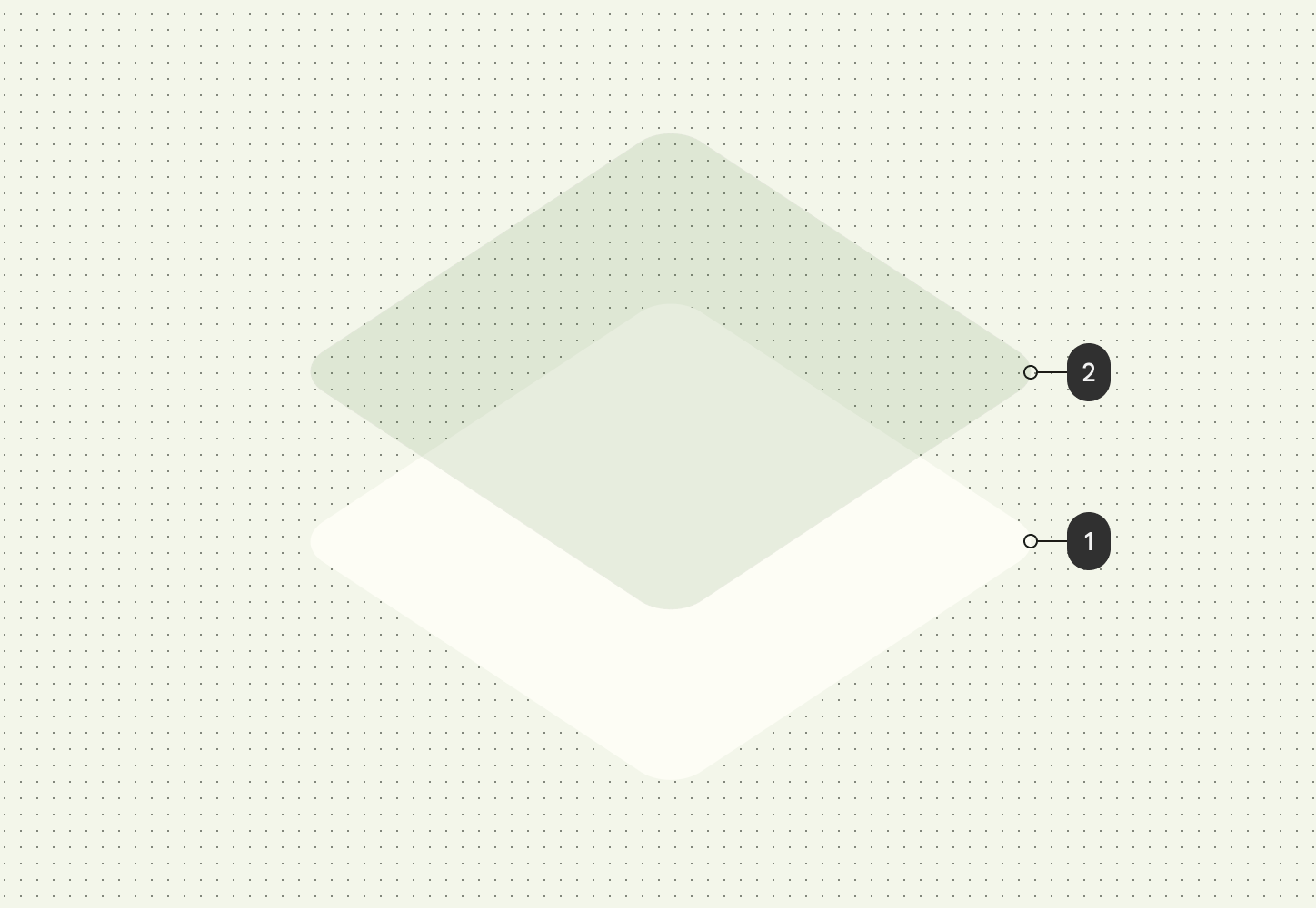 Tonal elevation at level 2 which takes color from the primary color slot.
Elevation overlays in dark themes have also changed to tonal color overlays in Material Design 3. The overlay color comes from the primary color slot.
The M3 Surface — the backing composable behind most M3 components — includes support for both tonal and shadow elevation:
Surface(
   modifier = modifier,
   tonalElevation = {..}
   shadowElevation = {..}
) {
   Column(content = content)
}
Adding colors to app
If you run the app, you can see the exported colors showing in the app where components are taking default colors. Now that we are aware of color roles and usage, let's theme the app with the correct color roles.
App with color theme and components taking default color roles.
Surface colors
In the home screen, you'll start by wrapping the main app composable in a Surface() to provide the base for the app's content to be placed on top of it. Open MainActivity.kt and wrap the ReplyApp() composable with Surface.
You'll also provide a tonal elevation of 5.dp to give the surface a tonal color of primary slot, which helps to provide contrast against the list item and the search bar on top of it. By default, the tonal and shadow elevation for the surface is 0.dp.
MainActivity.kt
AppTheme {
   Surface(tonalElevation = 5.dp) {
       ReplyApp(
           replyHomeUIState = uiState,
          // other parameters
         )
   }
}
If you run your application now and see both the List and Detail page, you should see the tonal surface applied to the whole app.
App background without surface and tonal color (Left).
App background with surface and tonal color applied (Right).
App bar colors
Our custom search bar at the top doesn't have a clear background as the design requests. By default, it falls back to the default base surface. You can provide a background to give a clear separation.
Custom search bar without a background (Left).
Custom search bar with a background (Right).
You'll now edit ui/components/ReplyAppBars.kt, which contains the app bar. You will add MaterialTheme.colorScheme.background to Row Composable's Modifier.
ReplyAppBars.kt
@Composable
fun ReplySearchBar(modifier: Modifier = Modifier) {
   Row(
       modifier = modifier
           .fillMaxWidth()
           .padding(16.dp)
           .background(MaterialTheme.colorScheme.background),
       verticalAlignment = Alignment.CenterVertically
   ) {
       // Search bar content
   }
}
You should now see a clear separation between the tonal surface and the app bar with background color.
Search bar with background color on top of tonal surface.
Floating action button colors
Large FAB without any theming applied (Left).
Themed large FAB with tertiary color (Right).
On the home screen, you can enhance the appearance of the floating action button (FAB) so it can stand out as a call to action button. To implement this, you'll apply a tertiary accent color to it.
In the ReplyListContent.kt file, update the containerColor for the FAB to tertiaryContainer color and the content color to onTertiaryContainer to keep the accessibility and color contrast.
ReplyListContent.kt
ReplyInboxScreen(/*..*/) {
// Email list content
  LargeFloatingActionButton(
    containerColor = MaterialTheme.colorScheme.tertiaryContainer,
    contentColor = MaterialTheme.colorScheme.onTertiaryContainer
  ){
   /*..*/
  }
}
Run the app to see your FAB themed. For this codelab, you are using a LargeFloatingActionButton.
Card colors
The email list on the home screen uses a card component. By default, it is a Filled card that uses surface variant color for the container color to provide a clear separation between surface and card color. Compose also provides implementations of ElevatedCard and OutlinedCard.
You can further highlight some items that are important by providing secondary color tones. You'll modify ui/components/ReplyEmailListItem.kt by updating card container color using CardDefaults.cardColors() for important emails:
ReplyEmailListItem.kt
Card(
   modifier =  modifier
       .padding(horizontal = 16.dp, vertical = 4.dp)
       .semantics { selected = isSelected }
       .clickable { navigateToDetail(email.id) },
   colors = CardDefaults.cardColors(
       containerColor = if (email.isImportant)
           MaterialTheme.colorScheme.secondaryContainer
       else MaterialTheme.colorScheme.surfaceVariant
   )
){
  /*..*/
}
Highlight list item using secondary container color on tonal surface.
Detail list item color
Now, you have themed your home screen. Take a look at the detail page by clicking on any of the email list items.
Default detail page without themed list item (Left).
Detail list item with background theming applied (Right).
Your list item doesn't have any color applied to it, hence falling back to default tonal surface color. You'll apply background color to the list item to create separation and add padding to provide spacing around our background.
ReplyEmailThreadItem.kt
@Composable
fun ReplyEmailThreadItem(
   email: Email,
   modifier: Modifier = Modifier
) {
   Column(
       modifier = modifier
           .fillMaxWidth()
           .padding(16.dp)
           .background(MaterialTheme.colorScheme.background)
           .padding(20.dp)
    ) {
      // List item content
    }
}
You can see that, just by providing background, you have clear separation between the tonal surface and the list item.
You now have both home and detail pages with correct color roles and usage . Let's see how your app can leverage dynamic colors to provide an even more personalized and cohesive experience.
5. Adding dynamic colors in app
Dynamic color is the key part of Material 3, in which an algorithm derives custom colors from a user's wallpaper to be applied to their apps and system UI.
Dynamic theming makes your apps more personalized. It also provides users a cohesive and seamless experience with the system theme.
Dynamic color is available on Android 12 and above. If dynamic color is available, you can set up a dynamic color scheme using dynamicDarkColorScheme() or dynamicLightColorScheme(). If not, you should fall back to using a default light or dark ColorScheme.
Replace the code of the AppTheme function in the Theme.kt file with the one below:
Theme.kt
@Composable
fun AppTheme(
   useDarkTheme: Boolean =  isSystemInDarkTheme(),
   content: @Composable () -> Unit
) {
   val context = LocalContext.current
   val colors = when {
       (Build.VERSION.SDK_INT >= Build.VERSION_CODES.S) -> {
           if (useDarkTheme) dynamicDarkColorScheme(context)
           else dynamicLightColorScheme(context)
       }
       useDarkTheme -> DarkColors
       else -> LightColors
   }

      MaterialTheme(
       colorScheme = colors,
       content = content
     )
}
Dynamic theme taken from Android 13 wallpaper.
When you run the app now, you should see dynamic theming applied using the default Android 13 wallpaper.
You may also want the status bar to style dynamically depending on the color scheme used to theme your app.
App without status bar color applied (Left).
App with status bar color applied (Right).
To update the status bar color depending on the primary color of your theme, add the status bar color after the color scheme selection in the AppTheme composable:
Theme.kt
@Composable
fun AppTheme(
   useDarkTheme: Boolean =  isSystemInDarkTheme(),
   content: @Composable () -> Unit
) {

 // color scheme selection code

 // Add primary status bar color from chosen color scheme.
 val view = LocalView.current
 if (!view.isInEditMode) {
    SideEffect {
        val window = (view.context as Activity).window
        window.statusBarColor = colors.primary.toArgb()
        WindowCompat
            .getInsetsController(window, view)
            .isAppearanceLightStatusBars = useDarkTheme
    }
 }

  MaterialTheme(
    colorScheme = colors,
     content = content
   )
}
When you run the app, you should see the status bar taking your primary color theming. You can also try both light and dark dynamic theming by changing the system dark theme.
Dynamic light (left) and dark (right) theme applied with Android 13 default wallpaper.
So far, you've applied colors to your app that has enhanced how the app looks. However, you can see that all text in the app is the same size, so you can now add typography to the app.
6. Typography
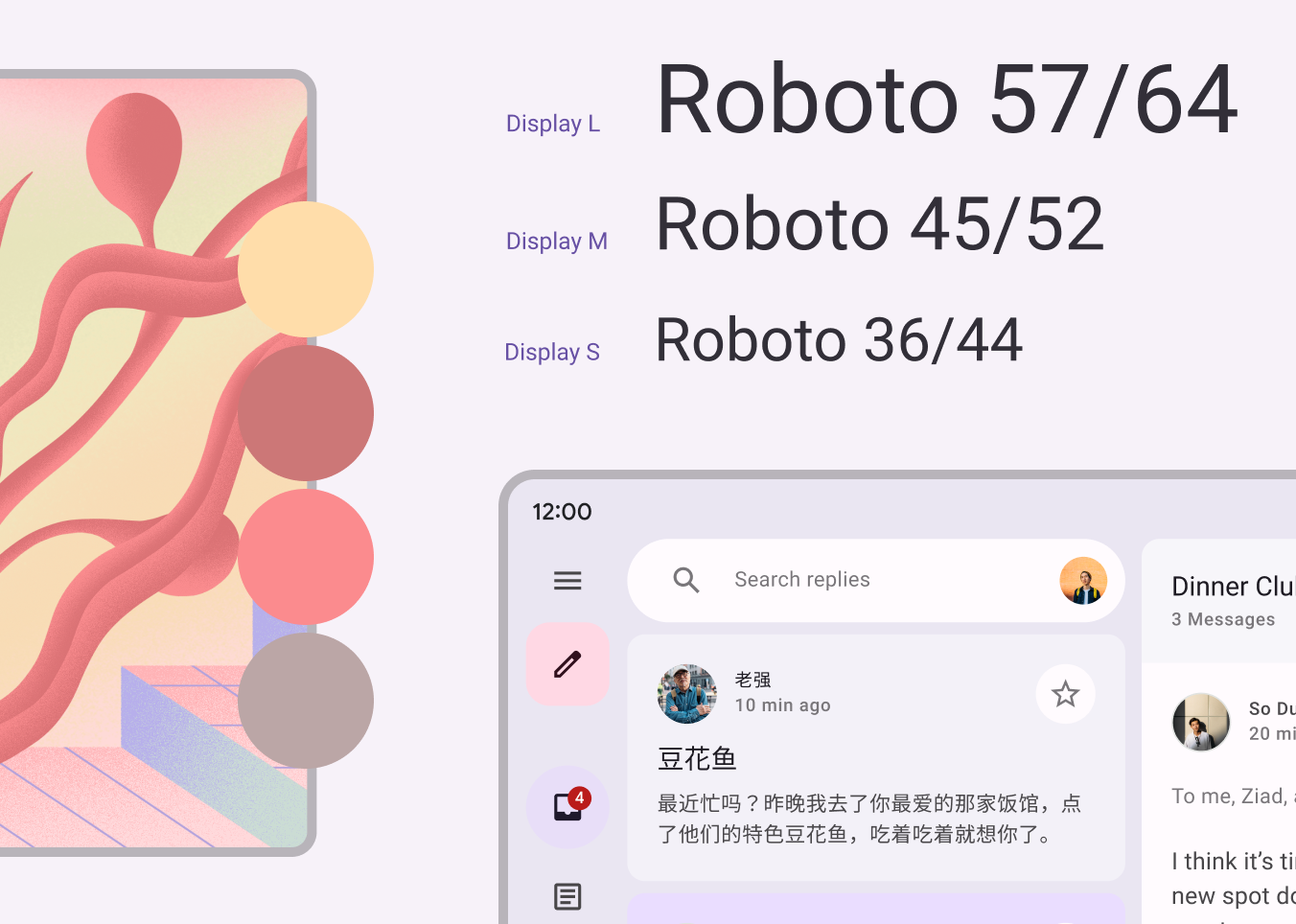
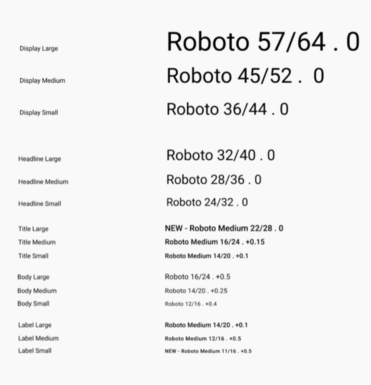
Material Design 3 defines a type scale. The naming and grouping have been simplified to: display, headline, title, body, and label, with large, medium, and small sizes for each.
Material 3 type scale.
Defining typography
Compose provides the M3 Typography class — along with the existing TextStyle and font-related classes — to model the Material 3 type scale.
The Typography constructor offers defaults for each style so you can omit any parameters you don't want to customize. For more information, see typography styles and their default values.
You'll use five typography styles in your app: headlineSmall, titleLarge, bodyLarge, bodyMedium, and labelMedium. These styles will cover both the home screen and detail screen.
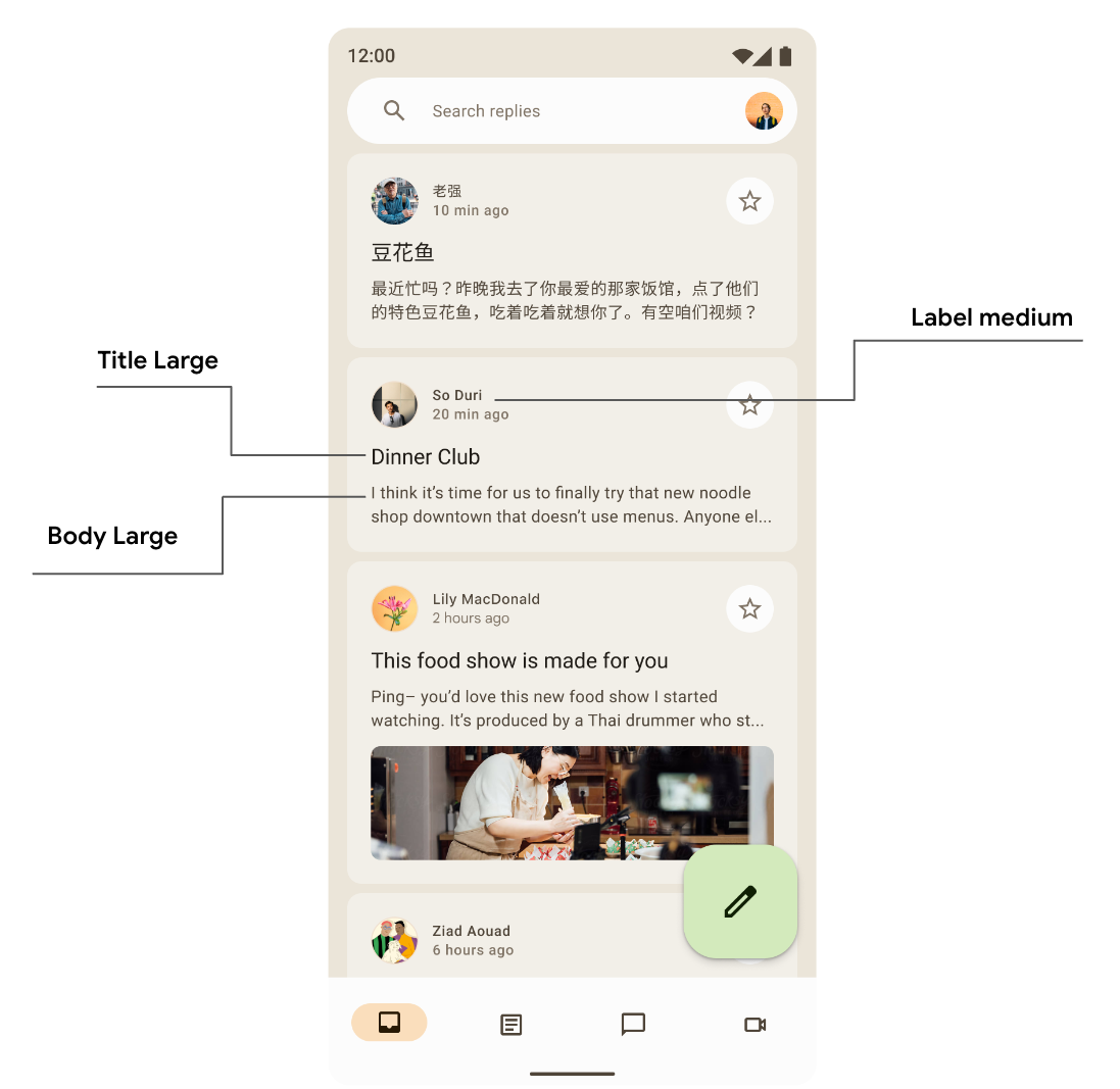
Screen showcasing typography usage of title, label, and body style.
Next, go to the ui/theme package and open Type.kt. Add the following code to provide your own implementation for some of the text styles instead of default values:
Type.kt
val typography = Typography(
   headlineSmall = TextStyle(
       fontWeight = FontWeight.SemiBold,
       fontSize = 24.sp,
       lineHeight = 32.sp,
       letterSpacing = 0.sp
   ),
   titleLarge = TextStyle(
       fontWeight = FontWeight.Normal,
       fontSize = 18.sp,
       lineHeight = 28.sp,
       letterSpacing = 0.sp
   ),
   bodyLarge = TextStyle(
       fontWeight = FontWeight.Normal,
       fontSize = 16.sp,
       lineHeight = 24.sp,
       letterSpacing = 0.15.sp
   ),
   bodyMedium = TextStyle(
       fontWeight = FontWeight.Medium,
       fontSize = 14.sp,
       lineHeight = 20.sp,
       letterSpacing = 0.25.sp
   ),
   labelMedium = TextStyle(
       fontWeight = FontWeight.SemiBold,
       fontSize = 12.sp,
       lineHeight = 16.sp,
       letterSpacing = 0.5.sp
   )
)
Your typography is now defined. To add it to your theme, pass it to the MaterialTheme() composable inside AppTheme:
Theme.kt
@Composable
fun AppTheme(
   useDarkTheme: Boolean = isSystemInDarkTheme(),
   content: @Composable() () -> Unit
) {
  // dynamic theming content

   MaterialTheme(
       colorScheme = colors,
       typography = typography,
       content = content
   )
}
Working with typography
Just like colors, you'll access the typography style for the current theme using MaterialTheme.typography. This gives you the typography instance to use all defined typography in Type.kt.
Text(
   text = "Hello M3 theming",
   style = MaterialTheme.typography.titleLarge
)

Text(
   text = "you are learning typography",
   style = MaterialTheme.typography.bodyMedium
)
Your product will likely not need all 15 default styles from the Material Design type scale. In this codelab, five sizes are chosen while the rest are omitted.
Since you haven't applied typography to the Text() composables, all text falls back to Typography.bodyLarge by default.
Home list typography
Next, apply typography to the ReplyEmailListItem function in ui/components/ReplyEmailListItem.kt to create a distinction between titles and labels:
ReplyEmailListItem.kt
Text(
   text = email.sender.firstName,
   style = MaterialTheme.typography.labelMedium
)

Text(
   text = email.createdAt,
   style = MaterialTheme.typography.labelMedium
)

Text(
   text = email.subject,
   style = MaterialTheme.typography.titleLarge,
   modifier = Modifier.padding(top = 12.dp, bottom = 8.dp),
)

Text(
   text = email.body,
   maxLines = 2,
   style = MaterialTheme.typography.bodyLarge,
   overflow = TextOverflow.Ellipsis
)
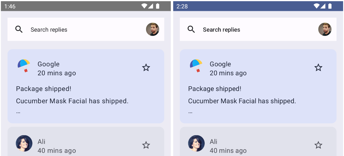
Home screen without typography applied (Left).
Home screen with typography applied (Right).
Detail list typography
Similarly, you'll add the typography in the detail screen by updating all text composables of ReplyEmailThreadItem in ui/components/ReplyEmailThreadItem.kt:
ReplyEmailThreadItem.kt
Text(
   text = email.sender.firstName,
   style = MaterialTheme.typography.labelMedium
)

Text(
   text = stringResource(id = R.string.twenty_mins_ago),
   style = MaterialTheme.typography.labelMedium
)

Text(
   text = email.subject,
   style = MaterialTheme.typography.bodyMedium,
   modifier = Modifier.padding(top = 12.dp, bottom = 8.dp),
)

Text(
   text = email.body,
   style = MaterialTheme.typography.bodyLarge,
   color = MaterialTheme.colorScheme.onSurfaceVariant
)
Detail screen without typography applied (Left).
Detail screen with typography applied (Right).
Customizing typography
With Compose, it is very easy to customize your text style or provide your custom font. You can modify TextStyle to customize font type, font family, letter spacing, etc.
You'll change the text style in the theme/Type.kt file, which will be reflected to all components using it.
Update fontWeight to SemiBold and lineHeight to 32.sp for titleLarge, which is used for the subject in the list item. It will put more emphasis on the subject and provide clear separations.
Type.kt
...
titleLarge = TextStyle(
   fontWeight = FontWeight.SemiBold,
   fontSize = 18.sp,
   lineHeight = 32.sp,
   letterSpacing = 0.0.sp
),
...
Applying custom typography to subject text.
7. Shapes
Material surfaces can be displayed in different shapes. Shapes direct attention, identify components, communicate state, and express brand.
Defining shapes
Compose provides the Shapes class with expanded parameters to implement new M3 shapes. The M3 shape scale, similar to type scale, enables an expressive range of shapes across the UI.
There are different sizes of shapes in the shape scale:
- Extra small
- Small
- Medium
- Large
- Extra large
By default, each shape has a default value that can be overridden. For your app, you'll use the medium shape to modify the list item, but you can declare other shapes as well. Create a new file called Shape.kt in the ui/theme package and add the code for shapes:
Shape.kt
package com.example.reply.ui.theme

import androidx.compose.foundation.shape.RoundedCornerShape
import androidx.compose.material3.Shapes
import androidx.compose.ui.unit.dp

val shapes = Shapes(
   extraSmall = RoundedCornerShape(4.dp),
   small = RoundedCornerShape(8.dp),
   medium = RoundedCornerShape(16.dp),
   large = RoundedCornerShape(24.dp),
   extraLarge = RoundedCornerShape(32.dp)
)
Now that you've defined your shapes, pass it to the M3 MaterialTheme like you did for colors and typography:
Theme.kt
@Composable
fun AppTheme(
   useDarkTheme: Boolean = isSystemInDarkTheme(),
   content: @Composable() () -> Unit
) {
  // dynamic theming content

   MaterialTheme(
       colorScheme = colors,
       typography = typography,
       shapes = shapes,
       content = content
   )
}
Working with shapes
Just like color and typography, you can apply shapes to Material components using MaterialTheme.shape, which gives you the Shape instance to access Material shapes.
Many Material components already have default shapes applied to them, but you can provide and apply your own shapes to components via slots available.
Card(shape = MaterialTheme.shapes.medium) { /* card content */ }
FloatingActionButton(shape = MaterialTheme.shapes.large) { /* fab content */}
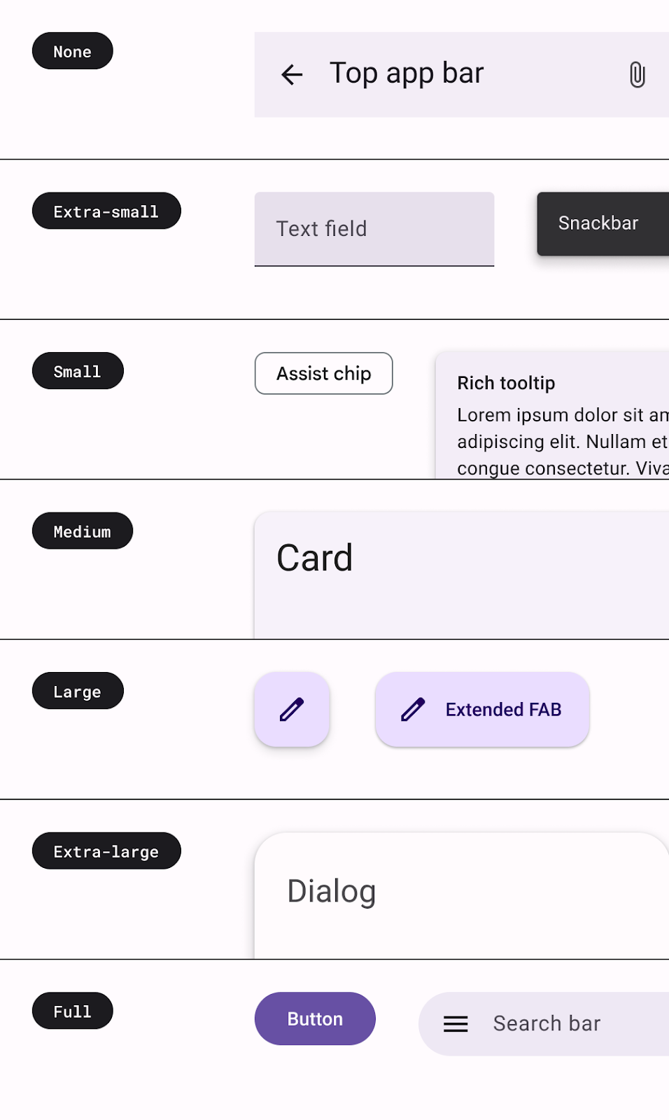 Mapping of Material components using different types of shapes.
You can see the mapping of shapes for all components in the Shape documentation.
There are two other shapes available to use — RectangleShape and CircleShape — which are part of Compose. Rectangle shape has no border radius, and circle shape shows full circled edges.
You can also apply shape to your Components using Modifiers that take shapes, like Modifier.clip, Modifier.background, and Modifier.border.
App bar shape
We want the app bar to have a rounded corner background:
The TopAppBar is using a Row with a background color. To achieve the rounded corner background, define the shape of the background by passing in CircleShape to the background modifier:
ReplyAppBars.kt
@Composable
fun ReplySearchBar(modifier: Modifier = Modifier) {
   Row(
       modifier = modifier
           .fillMaxWidth()
           .padding(16.dp)
           .background(
               MaterialTheme.colorScheme.background,
               CircleShape
           ),
       verticalAlignment = Alignment.CenterVertically
   ) {
       // Search bar content
   }
}
Detail list item shape
In the home screen, you are using a card which is using Shape.Medium by default. However, for our detail page, you used a Column with background color instead. For a uniform list appearance, apply a medium shape to it.

Detail list item column with no shape on list item (Left) and medium shape on list (Right).
ReplyEmailThreadItem.kt
@Composable
fun ReplyEmailThreadItem(
   email: Email,
   modifier: Modifier = Modifier
) {
   Column(
       modifier = modifier
           .fillMaxWidth()
           .padding(8.dp)
           .background(
               MaterialTheme.colorScheme.background,
               MaterialTheme.shapes.medium
           )
           .padding(16.dp)

   ) {
      // List item content

   }
}
Now, running your app shows you a detailed screen list item shaped to medium.
8. Emphasis
Emphasis in the UI helps you to highlight some content over the other, such as when you want to differentiate the title from subtitles. Emphasis in M3 uses variations of color and its on-color combinations. You have two ways to add emphasis:
- Using surface, surface-variant, and background alongside on-surface and on-surface-variants colors from the expanded M3 color system.
For example, surface can be used with on-surface-variant, and surface-variant can be used with on-surface to provide different levels of emphasis.
Surface variants can also be used with accent colors to provide less emphasis than on-accent colors, but still be accessible and follow the contrast ratio.
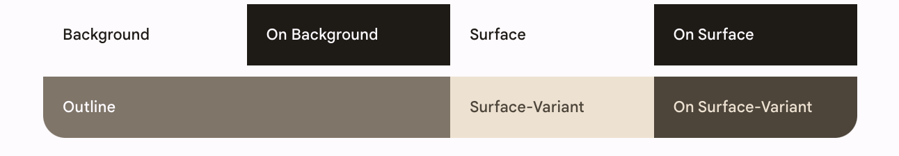
Surface, background, and surface variant color roles.
- Using different font weights for text. As you saw in the typography section, you can provide custom weights to your type scale for providing different emphasis.
Next, update ReplyEmailListItem.kt to provide an emphasis difference using the surface variant. By default, the content of the card is taking the default content color depending on the background.
You'll update the time text and body text composable's color to onSurfaceVariant. This reduces its emphasis compared to onContainerColors, which is applied to subject and title text composables by default.
Time and body text with same emphasis compared to subject and title (Left).
Time and body with reduced emphasis compared to subject and title (Right).
ReplyEmailListItem.kt
Text(
   text = email.createdAt,
   style = MaterialTheme.typography.labelMedium,
   color = MaterialTheme.colorScheme.onSurfaceVariant
)

Text(
   text = email.body,
   maxLines = 2,
   style = MaterialTheme.typography.bodyLarge,
   color = MaterialTheme.colorScheme.onSurfaceVariant,
   overflow = TextOverflow.Ellipsis
)
For the important email card with the background secondaryContainer, all text color is the onSecondaryContainer color by default. For the other emails, the background is surfaceVariant, so all text defaults to onSurfaceVariant color.
9. Congratulations
Congratulations! You have successfully completed this codelab! You have implemented Material theming with Compose using colors, typography, and shapes along with dynamic colors to theme your application and provide a personalized experience.
End of the theming results with dynamic colors and color theme applied.
What's next
Check out our other other codelabs on the Compose pathway:
Further reading
- Compose Theming guide
- Material Theming for Compose
Sample apps
- Reply sample app with full Material 3 theming
- JetChat demonstrating dynamic theming