1. Introduction

Last Updated: 2023-11-21
In this codelab, you will learn how to use some of the Animation APIs in Jetpack Compose.
Jetpack Compose is a modern UI toolkit designed to simplify UI development. If you are new to Jetpack Compose, there are several codelabs you might want to try before this one.
What you'll learn
- How to use several basic Animation APIs
Prerequisites
- Basic Kotlin knowledge
- Basic Compose knowledge including:
- Simple layout (Column, Row, Box, etc)
- Simple UI elements (Button, Text, etc)
- States and recomposition
What you'll need
2. Getting set up
Download the codelab code. You can clone the repository as follows:
$ git clone https://github.com/android/codelab-android-compose.git
Alternatively, you can download the repository as a zip file:
Import the AnimationCodelab project in Android Studio.
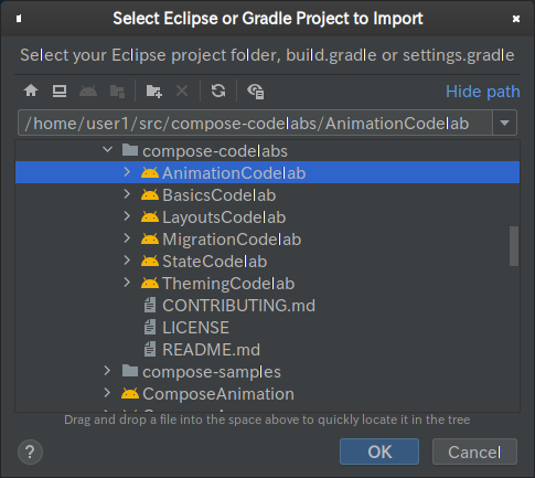
The project has multiple modules in it:
startis the starting state for the codelab.finishedis the final state of the app after completing this codelab.
Make sure that start is selected in the dropdown for the run configuration.

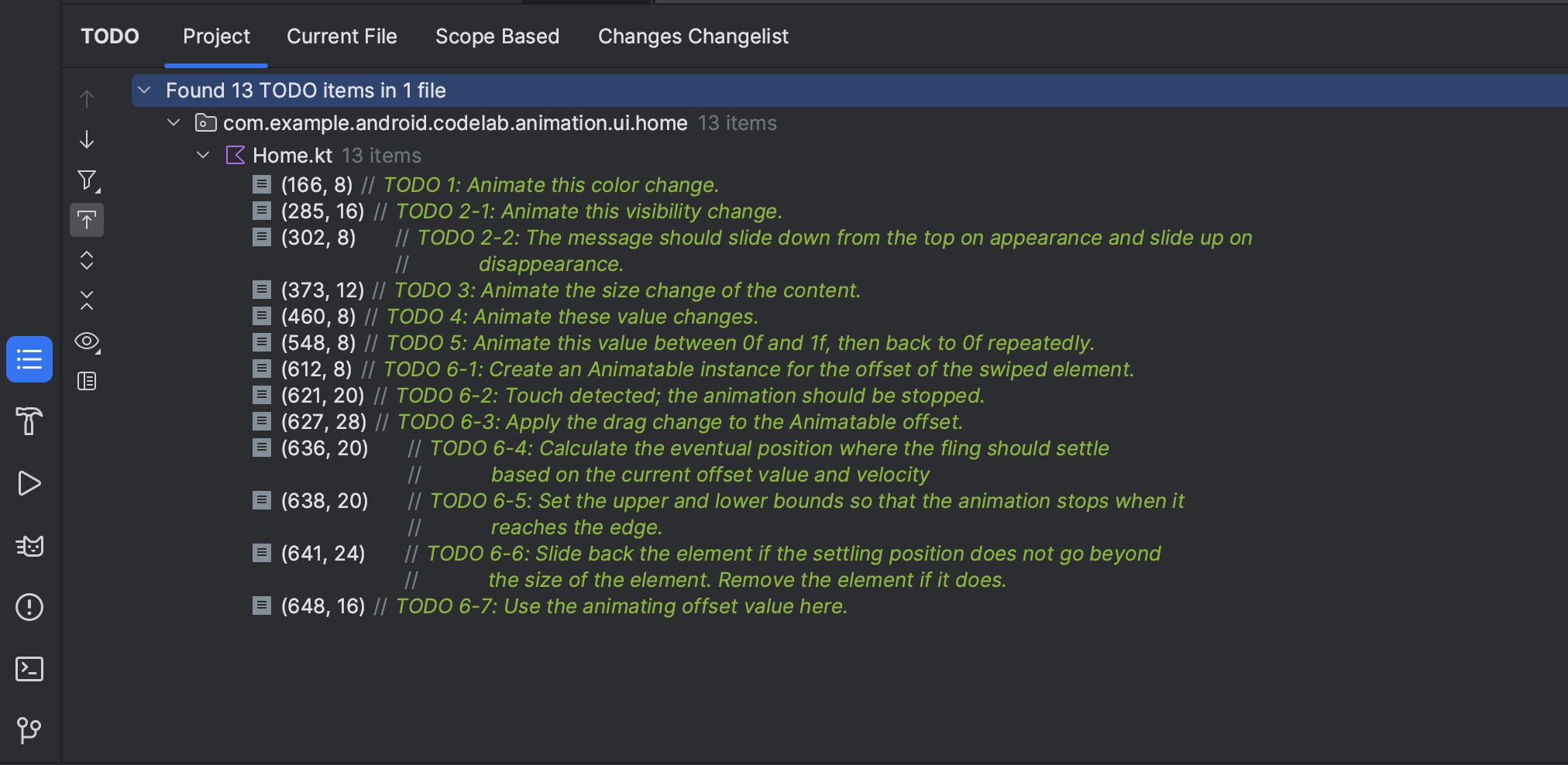
We will start working on several animation scenarios in the next chapter. Every code snippet we work on in this codelab is marked with a // TODO comment. One neat trick is to open the TODO tool window in Android Studio and navigate to each of the TODO comments for the chapter.
3. Animating a simple value change
Let's start with one of the simplest animation APIs in Compose: the animate*AsState APIs. This API should be used when animating State changes.
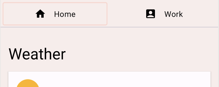
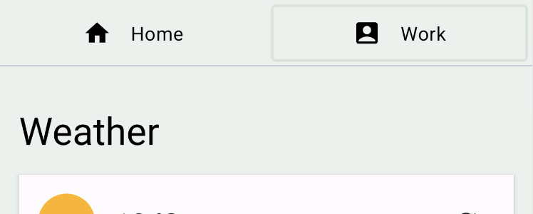
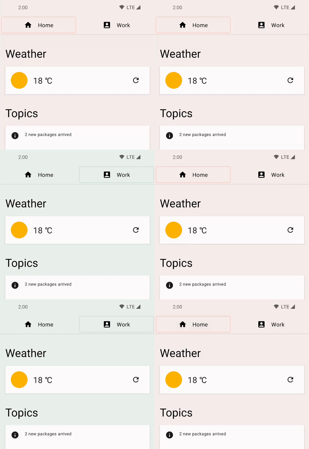
Run the start configuration and try switching tabs by clicking on the "Home" and "Work" buttons at the top. It does not really switch the tab content, but you can see that the background color of the content changes.
|
|
Click on TODO 1 in your TODO tool window and see how this is implemented. It is in the Home composable.
val backgroundColor = if (tabPage == TabPage.Home) Seashell else GreenLight
Here, tabPage is a TabPage backed by a State object. Depending on its value, the background color is toggled between peach and green. We want to animate this value change.
In order to animate a simple value change like this, we can use the animate*AsState APIs. You can create an animation value by wrapping the changing value with the corresponding variant of animate*AsState composables, animateColorAsState in this case. The returned value is a State<T> object, so we can use a local delegated property with a by declaration to treat it like a normal variable.
val backgroundColor by animateColorAsState(
        targetValue = if (tabPage == TabPage.Home) Seashell else GreenLight,
        label = "background color")
Rerun the app and try switching the tabs. The color change is now animated.
4. Animating visibility
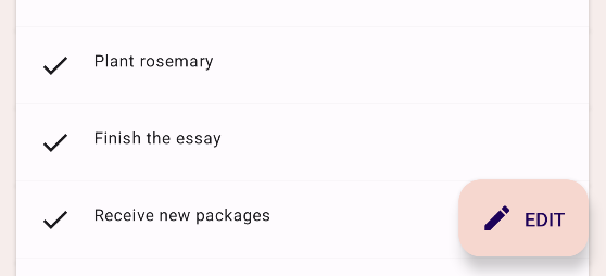
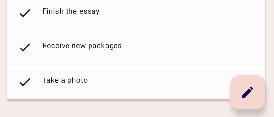
If you scroll the content of the app, you will notice that the floating action button expands and shrinks depending on the direction of your scroll.
|
|
Find TODO 2-1 and check out how this works. It is in the HomeFloatingActionButton composable. The text saying "EDIT" is shown or hidden using an if statement.
if (extended) {
    Text(
        text = stringResource(R.string.edit),
        modifier = Modifier
            .padding(start = 8.dp, top = 3.dp)
    )
}
Animating this visibility change is as simple as replacing the if with an AnimatedVisibility composable.
AnimatedVisibility(extended) {
    Text(
        text = stringResource(R.string.edit),
        modifier = Modifier
            .padding(start = 8.dp, top = 3.dp)
    )
}
Run the app and see how the FAB expands and shrinks now.
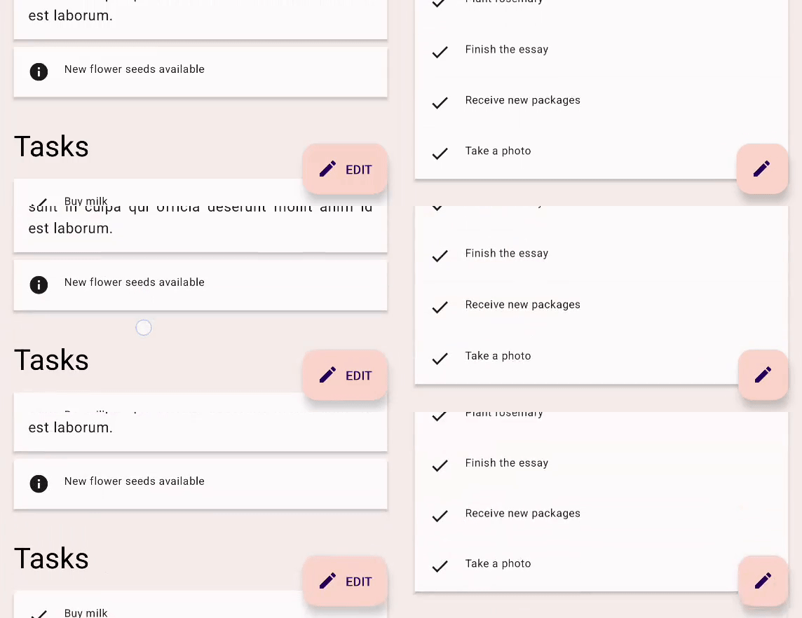
AnimatedVisibility runs its animation every time the specified Boolean value changes. By default, AnimatedVisibility shows the element by fading in and expanding it, and hides it by fading out and shrinking. This behavior works great for this example with FAB, but we can also customize the behavior.
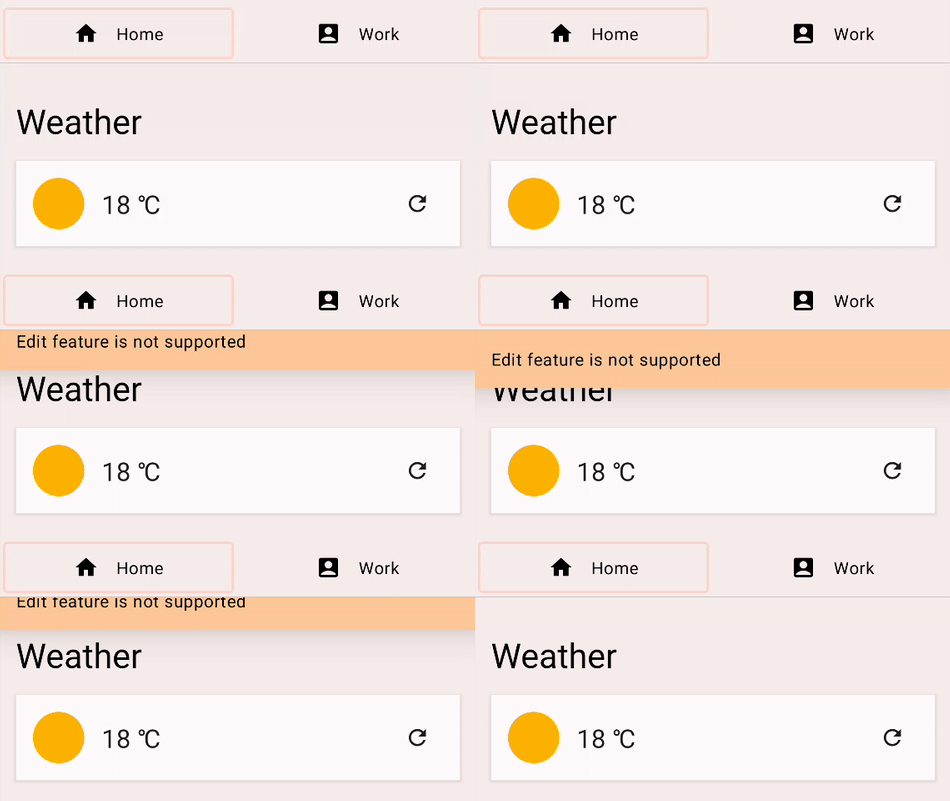
Try clicking on the FAB, and you should see a message saying "Edit feature is not supported". It also uses AnimatedVisibility to animate its appearance and disappearance. Next, you will customize this behavior so that the message slides in from the top, and slides out to the top.
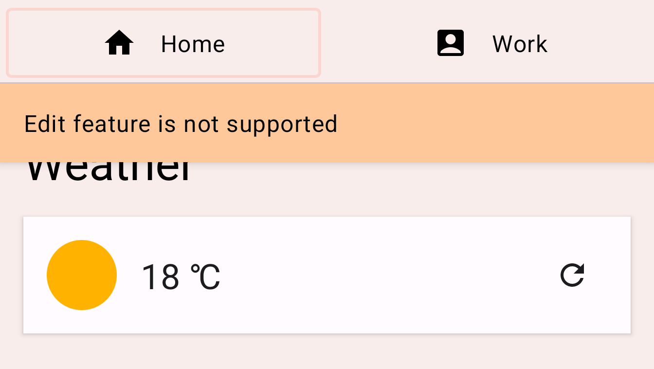
Find TODO 2-2 and check out the code in the EditMessage composable.
AnimatedVisibility(
    visible = shown
) {
    Surface(
        modifier = Modifier.fillMaxWidth(),
        color = MaterialTheme.colorScheme.secondary,
        elevation = 4.dp
    ) {
        Text(
            text = stringResource(R.string.edit_message),
            modifier = Modifier.padding(16.dp)
        )
    }
}
In order to customize the animation, add the enter and exit parameters to the AnimatedVisibility composable.
The enter parameter should be an instance of EnterTransition. For this example, we can use the slideInVertically function to create an EnterTransition and slideOutVertically for the exit transition. Change the code as follows:
AnimatedVisibility(
    visible = shown,
    enter = slideInVertically(),
    exit = slideOutVertically()
)
Run the app again, clicking on the edit button you may notice that the animation looks better, but not exactly correct, this is because the default behavior of slideInVertically and slideOutVertically use half the height of the item.
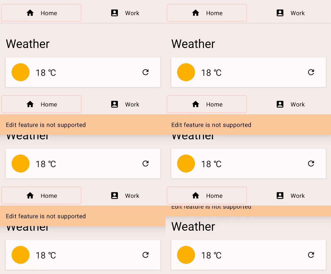
For the enter transition: we can adjust the default behavior to use the entire height of the item to animate it properly by setting the initialOffsetY parameter. The initialOffsetY should be a lambda returning the initial position.
The lambda receives one argument, the height of the element. To ensure that the item slides in from the top of the screen, we return its negative value since the top of the screen has the value of 0. We want the animation to start from -height to 0 (its final resting position) so that it starts from above and animates in.
When using slideInVertically, the target offset for after slide in is always 0 (pixel). initialOffsetY can be specified either as an absolute value or a percentage of the full height of the element via a lambda function.
Similarly, slideOutVertically assumes the initial offset is 0, so only targetOffsetY needs to be specified.
AnimatedVisibility(
    visible = shown,
    enter = slideInVertically(
        // Enters by sliding down from offset -fullHeight to 0.
        initialOffsetY = { fullHeight -> -fullHeight }
    ),
    exit = slideOutVertically(
        // Exits by sliding up from offset 0 to -fullHeight.
        targetOffsetY = { fullHeight -> -fullHeight }
    )
) {
    Surface(
        modifier = Modifier.fillMaxWidth(),
        color = MaterialTheme.colorScheme.secondary,
        elevation = 4.dp
    ) {
        Text(
            text = stringResource(R.string.edit_message),
            modifier = Modifier.padding(16.dp)
        )
    }
}
Running the app again, we can see that the animation is more inline with what we were expecting:

We can customize our animation more with the animationSpec parameter. animationSpec is a common parameter for many Animation APIs including EnterTransition and ExitTransition. We can pass one of various AnimationSpec types to specify how the animating value should change over time. In this example, let's use a simple duration-based AnimationSpec. It can be created with the tween function. The duration is 150 ms and the easing is LinearOutSlowInEasing. For the exit animation, let's use the same tween function for the animationSpec parameter, but with duration of 250 ms and easing of FastOutLinearInEasing.
The resulting code should look as follows:
AnimatedVisibility(
    visible = shown,
    enter = slideInVertically(
        // Enters by sliding down from offset -fullHeight to 0.
        initialOffsetY = { fullHeight -> -fullHeight },
        animationSpec = tween(durationMillis = 150, easing = LinearOutSlowInEasing)
    ),
    exit = slideOutVertically(
        // Exits by sliding up from offset 0 to -fullHeight.
        targetOffsetY = { fullHeight -> -fullHeight },
        animationSpec = tween(durationMillis = 250, easing = FastOutLinearInEasing)
    )
) {
    Surface(
        modifier = Modifier.fillMaxWidth(),
        color = MaterialTheme.colorScheme.secondary,
        elevation = 4.dp
    ) {
        Text(
            text = stringResource(R.string.edit_message),
            modifier = Modifier.padding(16.dp)
        )
    }
}
Run the app and click on the FAB again. You can see that the message now slides in and out from the top with different easing functions and durations:
5. Animating content size change
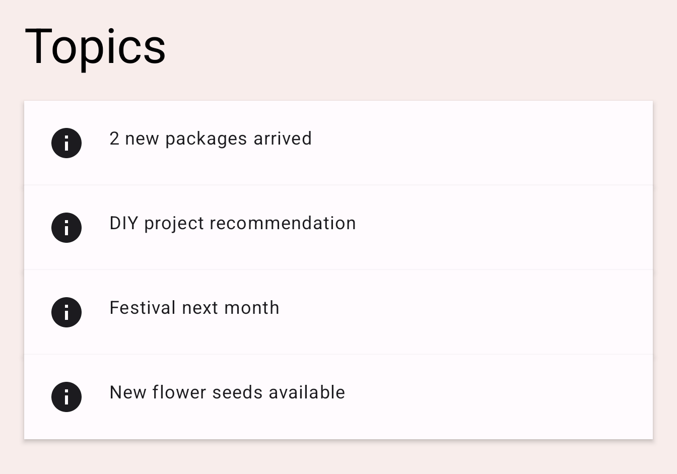
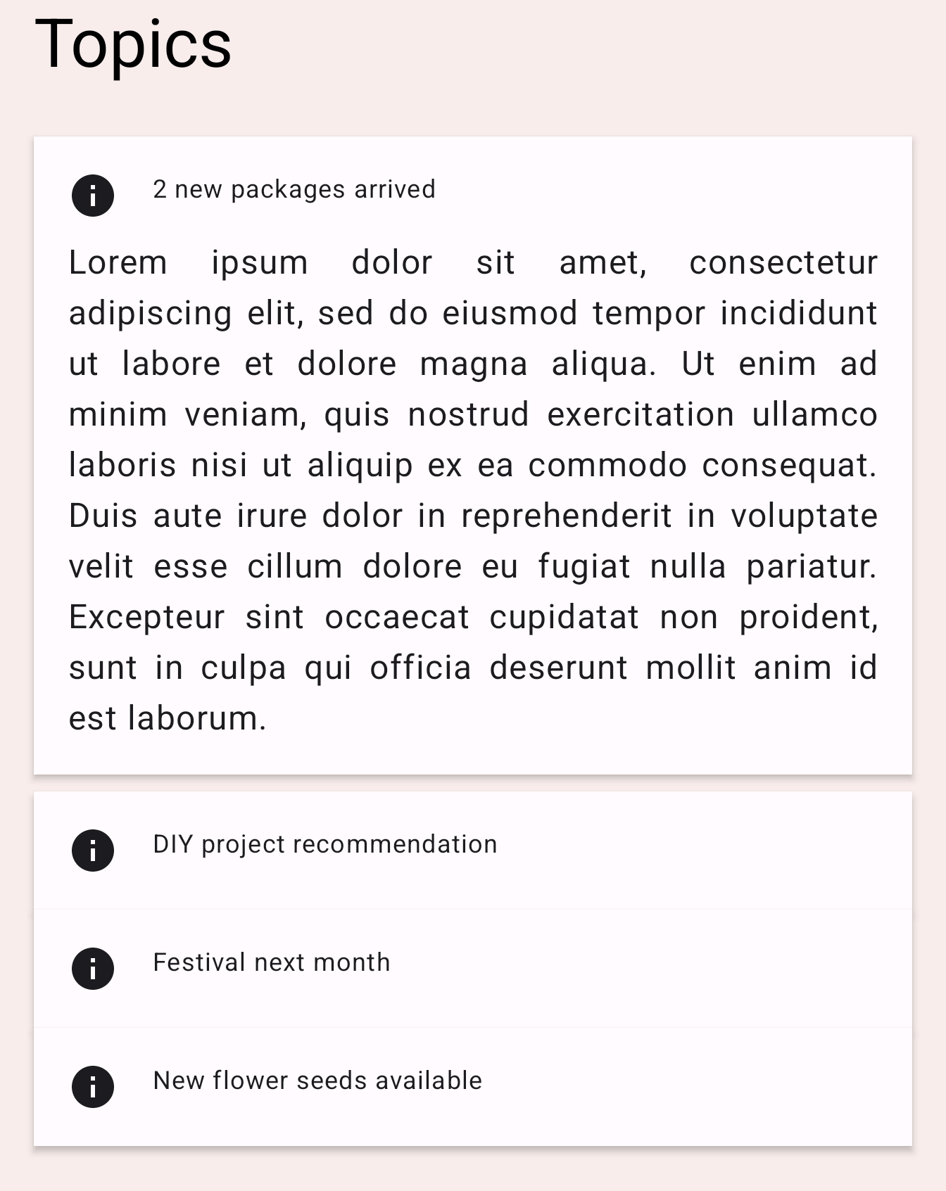
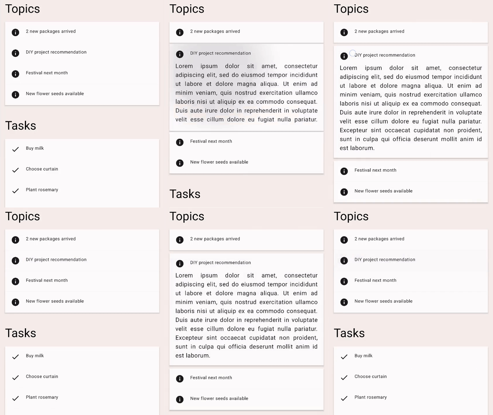
The app shows several topics in the content. Try clicking one of them, and it should open up and show the body text for that topic. The card containing the text expands and shrinks when the body is shown or hidden.
|
|
Check out the code for TODO 3 in the TopicRow composable.
Column(
    modifier = Modifier
        .fillMaxWidth()
        .padding(16.dp)
) {
    // ... the title and the body
}
This Column composable here changes its size as its content is changed. We can animate the change of its size by adding the animateContentSize modifier.
Column(
    modifier = Modifier
        .fillMaxWidth()
        .padding(16.dp)
        .animateContentSize()
) {
    // ... the title and the body
}
Run the app and click one of the topics. You can see that it expands and shrinks with an animation.
animateContentSize can be customized with a custom animationSpec too. We can provide options to change the type of animation from spring to tween etc. See the Customizing Animations documentation for more information.
6. Animating multiple values
Now that we are familiar with some basic Animation APIs, let's see the Transition API that allows us to create more complex animations. Using the Transition API allows us to track when all animations on a Transition are finished, which is not possible when using individual animate*AsState APIs that we've seen previously. The Transition API also allows us to define different transitionSpec's when transitioning between different states. Let's take a look at how we can use it:
For this example, we customize the tab indicator. It is a rectangle shown on the currently selected tab.
|
|
Find TODO 4 in the HomeTabIndicator composable, and see how the tab indicator is implemented.
val indicatorLeft = tabPositions[tabPage.ordinal].left
val indicatorRight = tabPositions[tabPage.ordinal].right
val color = if (tabPage == TabPage.Home) PaleDogwood else Green
Here, indicatorLeft is the horizontal position of the left edge of the indicator in the tab row. indicatorRight is the horizontal position of the right edge of the indicator. The color is also changed between peach and green.
To animate these multiple values simultaneously, we can use a Transition. A Transition can be created with the updateTransition function. Pass the index of the tab currently selected as the targetState parameter.
Each animating value can be declared with the animate* extension functions of Transition. In this example, we use animateDp and animateColor. They take a lambda block and we can specify the target value for each of the states. We already know what their target values should be, so we can wrap the values like below. Note that we can use a by declaration and make it a local delegated property here again because the animate* functions return a State object.
val transition = updateTransition(tabPage, label = "Tab indicator")
val indicatorLeft by transition.animateDp(label = "Indicator left") { page ->
   tabPositions[page.ordinal].left
}
val indicatorRight by transition.animateDp(label = "Indicator right") { page ->
   tabPositions[page.ordinal].right
}
val color by transition.animateColor(label = "Border color") { page ->
   if (page == TabPage.Home) PaleDogwood else Green
}
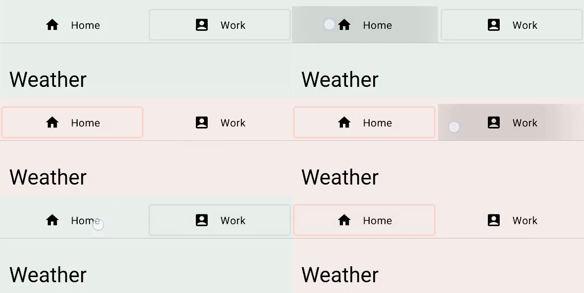
Run the app now and you can see that the tab switch is now much more interesting. As clicking on the tab changes the value of the tabPage state, all the animation values associated with the transition starts animating to the value specified for the target state.
Additionally, we can specify the transitionSpec parameter to customize the animation behavior. For example, we can achieve an elastic effect for the indicator by having the edge closer to the destination move faster than the other edge. We can use the isTransitioningTo infix function in transitionSpec lambdas to determine the direction of the state change.
val transition = updateTransition(
    tabPage,
    label = "Tab indicator"
)
val indicatorLeft by transition.animateDp(
    transitionSpec = {
        if (TabPage.Home isTransitioningTo TabPage.Work) {
            // Indicator moves to the right.
            // The left edge moves slower than the right edge.
            spring(stiffness = Spring.StiffnessVeryLow)
        } else {
            // Indicator moves to the left.
            // The left edge moves faster than the right edge.
            spring(stiffness = Spring.StiffnessMedium)
        }
    },
    label = "Indicator left"
) { page ->
    tabPositions[page.ordinal].left
}
val indicatorRight by transition.animateDp(
    transitionSpec = {
        if (TabPage.Home isTransitioningTo TabPage.Work) {
            // Indicator moves to the right
            // The right edge moves faster than the left edge.
            spring(stiffness = Spring.StiffnessMedium)
        } else {
            // Indicator moves to the left.
            // The right edge moves slower than the left edge.
            spring(stiffness = Spring.StiffnessVeryLow)
        }
    },
    label = "Indicator right"
) { page ->
    tabPositions[page.ordinal].right
}
val color by transition.animateColor(
    label = "Border color"
) { page ->
    if (page == TabPage.Home) PaleDogwood else Green
}
Run the app again and try switching the tabs.

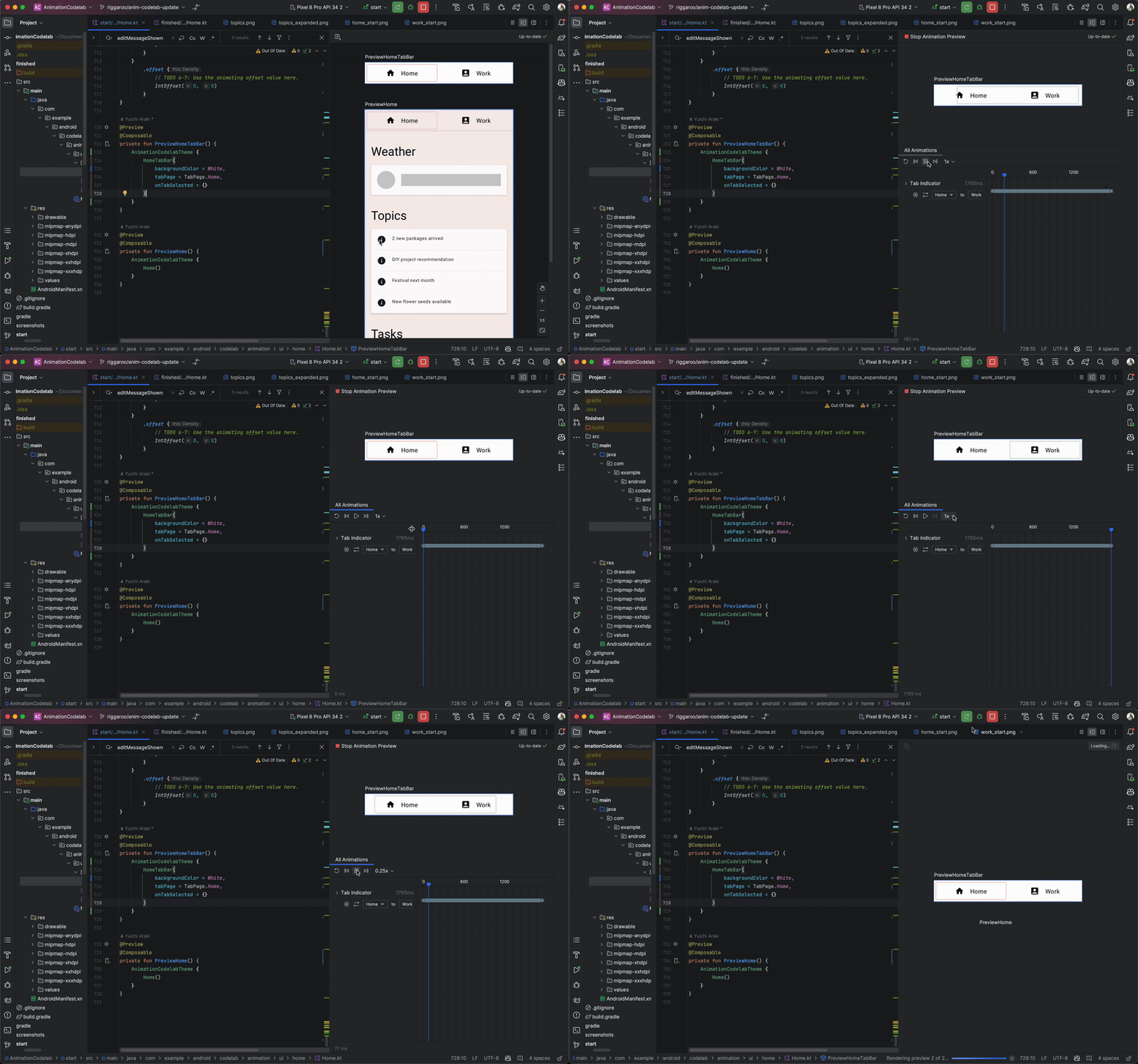
Android Studio supports inspection of Transition in Compose Preview. To use Animation Preview, start interactive mode by clicking on the "Start Animation Preview" icon at the top right corner of a Composable in preview ( ![]() icon). Try clicking on the icon for the
icon). Try clicking on the icon for the PreviewHomeTabBar composable. This opens a new "Animations" pane.
You can run the animation by clicking on the "Play" icon button. You can also drag on the seekbar to see each of the animation frames. For better description of the animation values, you can specify the label parameter in updateTransition and the animate* methods.
7. Repeating animations
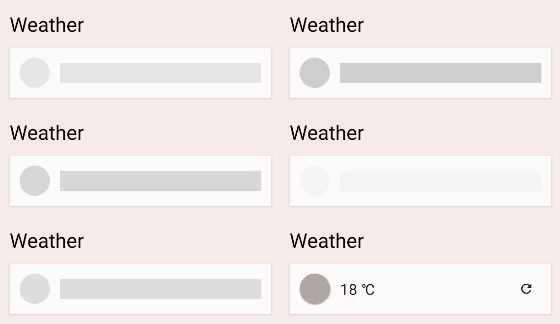
Try clicking on the refresh icon button next to the current temperature. The app starts loading the latest weather information (it pretends). Until the loading is complete, you see a loading indicator, that's a gray circle and a bar. Let's animate the alpha value of this indicator to make it clearer that the process is ongoing.
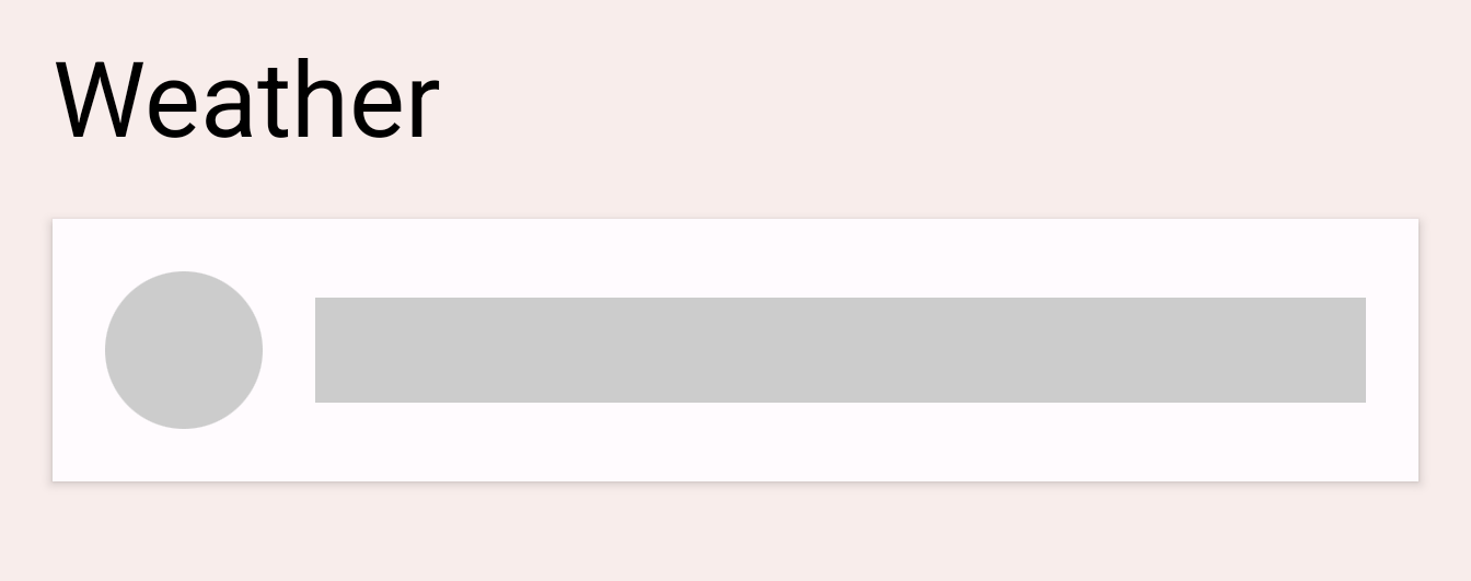
Find TODO 5 in the LoadingRow composable.
val alpha = 1f
We'd like to make this value animate between 0f and 1f repeatedly. We can use InfiniteTransition for this purpose. This API is similar to the Transition API in the previous section. They both animate multiple values, but while Transition animates values based on state changes, InfiniteTransition animates values indefinitely.
To create an InfiniteTransition, use the rememberInfiniteTransition function. Then, each animating value change can be declared with one of the animate* extension functions of InfiniteTransition. In this case, we are animating an alpha value, so let's use animatedFloat. The initialValue parameter should be 0f, and the targetValue 1f. We can also specify an AnimationSpec for this animation, but this API only takes an InfiniteRepeatableSpec. Use the infiniteRepeatable function to create one. This AnimationSpec wraps any duration-based AnimationSpec and makes it repeatable. For example, the resulting code should look like below.
val infiniteTransition = rememberInfiniteTransition()
val alpha by infiniteTransition.animateFloat(
    initialValue = 0f,
    targetValue = 1f,
    animationSpec = infiniteRepeatable(
        animation = keyframes {
            durationMillis = 1000
            0.7f at 500
        },
        repeatMode = RepeatMode.Reverse
    ),
    label = "alpha"
)
The default repeatMode is RepeatMode.Restart . This transitions from initialValue to targetValue and starts again at the initialValue. By setting the repeatMode to RepeatMode.Reverse, the animation progresses from initialValue to targetValue and then from targetValue to initialValue. The animation progresses from 0 to 1 then 1 to 0.
The keyFrames animation is another type of animationSpec (some others being tween and spring) that allows changes of the in-progress value at different millis. We initially set the durationMillis to 1000ms. Then we can define key frames in the animation, for example, at 500ms of the animation, we would like the alpha value to be 0.7f. This will change the animation progression: it'll progress quickly from 0 to 0.7 within 500ms of the animation, and from 0.7 to 1.0 from 500ms to 1000ms of the animation, slowing down towards the end.
If we wanted more than one keyframe, we can define multiple keyFrames as follows:
animation = keyframes {
   durationMillis = 1000
   0.7f at 500
   0.9f at 800
}
Run the app and try clicking on the refresh button. You can now see the loading indicator animating.
8. Gesture animation
In this final section, we will learn about how to run animations based on touch inputs. We are going to build a swipeToDismiss modifier from scratch.
Find TODO 6-1 in the swipeToDismiss modifier. Here, we are trying to make a modifier that makes the element swipeable with touch. When the element is flung to the edge of the screen, we call the onDismissed callback so that the element can be removed.
To build a swipeToDismiss modifier, there are a few key concepts we need to understand. Firstly, a user places their finger on screen, generating a touch event with an x and y coordinate, they will then move their finger to the right or left - moving the x and y based on their movement. The item they are touching needs to move with their finger, so we will update the position of the item based on the touch event's position and velocity.
We can use several of the concepts described in the Compose Gesture documentation. Using the pointerInput modifier, we can get low-level access to incoming pointer touch events and track the velocity in which the user drags using the same pointer. If they let go before the item has gone past the boundary for dismissing, the item will bounce back into position.
There are several unique things to take into account in this scenario. First, any ongoing animation might be intercepted by a touch event. Second, the animation value might not be the only source of truth. In other words, we might need to synchronize the animation value with values coming from touch events.
Animatable is the lowest-level API we've seen so far. It has several features that are useful in gesture scenarios, such as the ability to snap instantly to the new value coming in from a gesture and stop any ongoing animation when a new touch event is triggered. Let's create an instance of Animatable and use it to represent the horizontal offset of the swipeable element. Make sure to import Animatable from androidx.compose.animation.core.Animatable and not androidx.compose.animation.Animatable.
val offsetX = remember { Animatable(0f) } // Add this line
// used to receive user touch events
pointerInput {
    // Used to calculate a settling position of a fling animation.
    val decay = splineBasedDecay<Float>(this)
    // Wrap in a coroutine scope to use suspend functions for touch events and animation.
    coroutineScope {
        while (true) {
            // ...
TODO 6-2 is where we have just received a touch down event. We should intercept the animation if it is currently running. This can be done by calling stop on the Animatable. Note that the call is ignored if the animation is not running. The VelocityTracker will be used to calculate how fast a user is moving from left to right. The awaitPointerEventScope is a suspend function that can await user input events and respond to them.
// Wait for a touch down event. Track the pointerId based on the touch
val pointerId = awaitPointerEventScope { awaitFirstDown().id }
offsetX.stop() // Add this line to cancel any on-going animations
// Prepare for drag events and record velocity of a fling gesture
val velocityTracker = VelocityTracker()
// Wait for drag events.
awaitPointerEventScope {
At TODO 6-3, we are continuously receiving drag events. We have to synchronize the position of the touch event into the animation value. We can use snapTo on the Animatable for this. snapTo has to be called inside another launch block as awaitPointerEventScope and horizontalDrag are restricted coroutine scopes. This means they can only suspend for awaitPointerEvents, snapTo isn't a pointer event.
horizontalDrag(pointerId) { change ->
    // Add these 4 lines
    // Get the drag amount change to offset the item with
    val horizontalDragOffset = offsetX.value + change.positionChange().x
    // Need to call this in a launch block in order to run it separately outside of the awaitPointerEventScope
    launch {
        // Instantly set the Animable to the dragOffset to ensure its moving
        // as the user's finger moves
        offsetX.snapTo(horizontalDragOffset)
    }
    // Record the velocity of the drag.
    velocityTracker.addPosition(change.uptimeMillis, change.position)

    // Consume the gesture event, not passed to external
    if (change.positionChange() != Offset.Zero) change.consume()

}
TODO 6-4 is where the element has just been released and flung. We need to calculate the eventual position the fling is settling into in order to decide whether we should slide the element back to the original position, or slide it away and invoke the callback. We use the decay object created earlier to calculate the targetOffsetX:
// Dragging finished. Calculate the velocity of the fling.
val velocity = velocityTracker.calculateVelocity().x
// Add this line to calculate where it would end up with
// the current velocity and position
val targetOffsetX = decay.calculateTargetValue(offsetX.value, velocity)
At TODO 6-5, we are about to start the animation. But before that, we want to set upper and lower value bounds to the Animatable so that it stops as soon as it reaches the bounds (-size.width and size.width since we don't want the offsetX to be able to extend past these two values). The pointerInput modifier allows us to access the size of the element by the size property, so let's use that to get our bounds.
offsetX.updateBounds(
    lowerBound = -size.width.toFloat(),
    upperBound = size.width.toFloat()
)
TODO 6-6 is where we can finally start our animation. We first compare the settling position of the fling we calculated earlier and the size of the element. If the settling position is below the size, it means that the velocity of the fling was not enough. We can use animateTo to animate the value back to 0f. Otherwise, we use animateDecay to start the fling animation. When the animation is finished (most likely by the bounds we set earlier), we can call the callback.
launch {
    if (targetOffsetX.absoluteValue <= size.width) {
        // Not enough velocity; Slide back.
        offsetX.animateTo(targetValue = 0f, initialVelocity = velocity)
    } else {
        // Enough velocity to slide away the element to the edge.
        offsetX.animateDecay(velocity, decay)
        // The element was swiped away.
        onDismissed()
    }
}
Finally, see TODO 6-7. We have all the animations and gestures set up, so don't forget to apply the offset to the element, this will move the element on screen to the value produced by our gesture or animation:
.offset { IntOffset(offsetX.value.roundToInt(), 0) }
As a result of this section, you will end up with code like below:
private fun Modifier.swipeToDismiss(
    onDismissed: () -> Unit
): Modifier = composed {
    // This Animatable stores the horizontal offset for the element.
    val offsetX = remember { Animatable(0f) }
    pointerInput(Unit) {
        // Used to calculate a settling position of a fling animation.
        val decay = splineBasedDecay<Float>(this)
        // Wrap in a coroutine scope to use suspend functions for touch events and animation.
        coroutineScope {
            while (true) {
                // Wait for a touch down event.
                val pointerId = awaitPointerEventScope { awaitFirstDown().id }
                // Interrupt any ongoing animation.
                offsetX.stop()
                // Prepare for drag events and record velocity of a fling.
                val velocityTracker = VelocityTracker()
                // Wait for drag events.
                awaitPointerEventScope {
                    horizontalDrag(pointerId) { change ->
                        // Record the position after offset
                        val horizontalDragOffset = offsetX.value + change.positionChange().x
                        launch {
                            // Overwrite the Animatable value while the element is dragged.
                            offsetX.snapTo(horizontalDragOffset)
                        }
                        // Record the velocity of the drag.
                        velocityTracker.addPosition(change.uptimeMillis, change.position)
                        // Consume the gesture event, not passed to external
                        change.consumePositionChange()
                    }
                }
                // Dragging finished. Calculate the velocity of the fling.
                val velocity = velocityTracker.calculateVelocity().x
                // Calculate where the element eventually settles after the fling animation.
                val targetOffsetX = decay.calculateTargetValue(offsetX.value, velocity)
                // The animation should end as soon as it reaches these bounds.
                offsetX.updateBounds(
                    lowerBound = -size.width.toFloat(),
                    upperBound = size.width.toFloat()
                )
                launch {
                    if (targetOffsetX.absoluteValue <= size.width) {
                        // Not enough velocity; Slide back to the default position.
                        offsetX.animateTo(targetValue = 0f, initialVelocity = velocity)
                    } else {
                        // Enough velocity to slide away the element to the edge.
                        offsetX.animateDecay(velocity, decay)
                        // The element was swiped away.
                        onDismissed()
                    }
                }
            }
        }
    }
        // Apply the horizontal offset to the element.
        .offset { IntOffset(offsetX.value.roundToInt(), 0) }
}
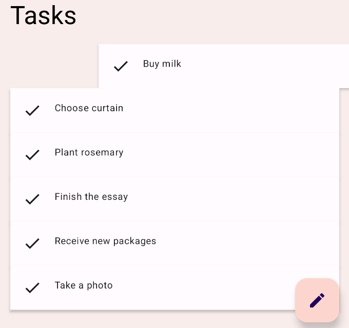
Run the app and try swiping one of the task items. You can see that the element either slides back to the default position or slides away and gets removed depending on the velocity of your fling. You can also catch the element while it is animating.
9. Congratulations!
Congratulations! You have learned basic Compose Animation APIs.
In this codelab, we learned how to use:
High-level animation APIs:
animatedContentSizeAnimatedVisibility
Lower level animation APIs:
animate*AsStatefor animating a single valueupdateTransitionfor animating multiple valuesinfiniteTransitionfor animating values indefinitelyAnimatablefor building custom animations with touch gestures
What's next?
Check out the other codelabs on the Compose pathway.
To learn more, refer to Compose Animations and these reference docs:

