1. Introduction
In this codelab you will learn how to use Jetpack Compose to improve your app's accessibility. We will walk through several common use cases and improve a sample app step by step. We will cover touch target sizes, content descriptions, click labels, and more.
People with impaired vision, color blindness, impaired hearing, impaired dexterity, cognitive disabilities, and many other disabilities use Android devices to complete tasks in their day-to-day lives. When you develop apps with accessibility in mind, you make the user experience better, particularly for users with these and other accessibility needs.
During this codelab, we will use TalkBack to manually test our code changes. TalkBack is an accessibility service primarily used by people with visual impairments. Make sure to also test any changes to your code with other accessibility services, for example Switch Access.
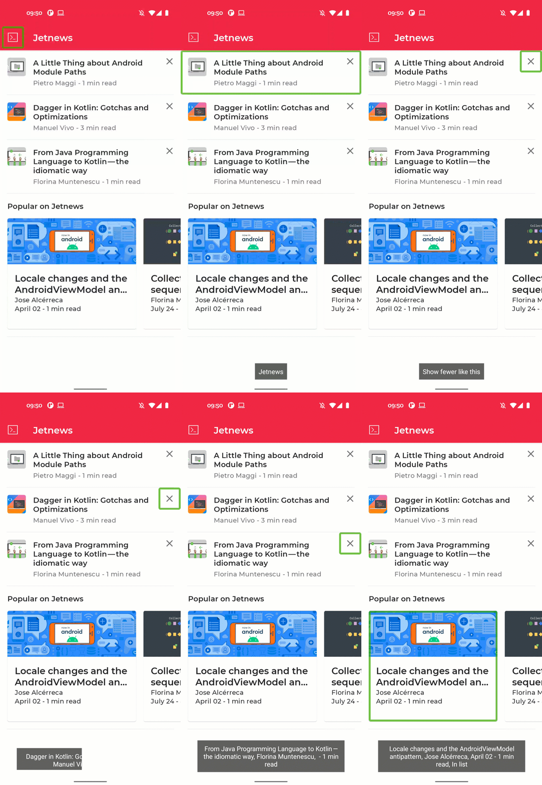
TalkBack in action in the Jetnews app.
What you'll learn
In this codelab, you will learn:
- How to cater to users with impaired dexterity by increasing touch target sizes.
- What semantics properties are and how you change them.
- How to provide information to composables to make them more accessible.
What you'll need
- Experience with Kotlin syntax, including lambdas.
- Basic experience with Compose. Consider taking the Jetpack Compose basics codelab before this codelab.
- An Android device or emulator with TalkBack enabled.
What you'll build
In this codelab we will improve the accessibility of a news-reading app. We will start with an app that misses vital accessibility features and apply what we learn to make our app more usable for people with accessibility needs.
2. Getting set up
In this step, you will download the code for this which comprises a simple news-reader app.
What you will need
Get the code
The code for this codelab can be found in the codelab-android-compose Github repository. To clone it, run:
$ git clone https://github.com/android/codelab-android-compose
Alternatively, you can download two zip files:
Check out the sample app
The code you just downloaded contains code for all Compose codelabs available. To complete this codelab, open the AccessibilityCodelab project inside Android Studio.
We recommend that you start with the code in the main branch and follow the codelab step-by-step at your own pace.
Set up TalkBack
During this Codelab, we will use TalkBack to check our changes. When you use a physical device for testing, follow these instructions to turn TalkBack on. Emulators don't come with TalkBack installed by default. Choose an emulator that includes the Play Store, and download the Android Accessibility Suite.
3. Touch target size
Any on-screen element that someone can click, touch, or otherwise interact with should be large enough for reliable interaction. You should make sure these elements have a width and height of at least 48dp.
If these controls are sized dynamically, or resize based on the size of their content, consider using the sizeIn modifier to set a lower bound on their dimensions.
Some Material components set these sizes for you. For example, the Button composable has its MinHeight set to 36dp, and uses 8dp vertical padding. This adds up to the required 48dp height.
When we open our sample app and run TalkBack, we will notice that the cross icon in the post cards has a very small touch target. We'd like this touch target to be at least 48dp.
Here's a screenshot with our original app on the left, versus our improved solution on the right.

Let's look at the implementation and check the size of this composable. Open PostCards.kt and look for the PostCardHistory composable. As you can see, the implementation sets the size of the overflow menu icon to 24dp:
@Composable
fun PostCardHistory(post: Post, navigateToArticle: (String) -> Unit) {
   // ...

   Row(
       // ...
   ) {
       // ...
       CompositionLocalProvider(LocalContentColor provides MaterialTheme.colorScheme.onSurfaceVariant) {
           Icon(
               imageVector = Icons.Default.Close,
               contentDescription = stringResource(R.string.cd_show_fewer),
               modifier = Modifier
                   .clickable { openDialog = true }
                   .size(24.dp)
           )
       }
   }
   // ...
}
To increase the touch target size of this Icon, we can add padding:
@Composable
fun PostCardHistory(post: Post, navigateToArticle: (String) -> Unit) {
   // ...
   Row(
       // ...
   ) {
       // ...
       CompositionLocalProvider(LocalContentColor provides MaterialTheme.colorScheme.onSurfaceVariant) {
           Icon(
               imageVector = Icons.Default.Close,
               contentDescription = stringResource(R.string.cd_show_fewer),
               modifier = Modifier
                   .clickable { openDialog = true }
                   .padding(12.dp)
                   .size(24.dp)
           )
       }
   }
   // ...
}
In our use case, there is an easier way to make sure the touch target is at least 48dp. We can make use of the Material component IconButton that will handle this for us:
@Composable
fun PostCardHistory(post: Post, navigateToArticle: (String) -> Unit) {
   // ...
   Row(
       // ...
   ) {
       // ...
       CompositionLocalProvider(LocalContentColor provides MaterialTheme.colorScheme.onSurfaceVariant) {
           IconButton(onClick = { openDialog = true }) {
               Icon(
                   imageVector = Icons.Default.Close,
                   contentDescription = stringResource(R.string.cd_show_fewer)
               )
           }
       }
   }
   // ...
}
Going through the screen with TalkBack now correctly shows a touch target area of 48dp. In addition, the IconButton also adds a ripple indication, which shows the user that the element is clickable.
4. Click labels
Clickable elements in your app by default don't provide any information on what clicking that element will do. Therefore, accessibility services like TalkBack will use a very generic default description.
To provide the best experience for users with accessibility needs, we can provide a specific description that explains what will happen when the user clicks this element.
In the Jetnews app, users can click on the various post cards to read the full post. By default this will read out the content of the clickable element, followed by the text "Double tap to activate". Instead, we'd like to be more specific and use "Double tap to read article". This is what the original version looks like, compared to our ideal solution:
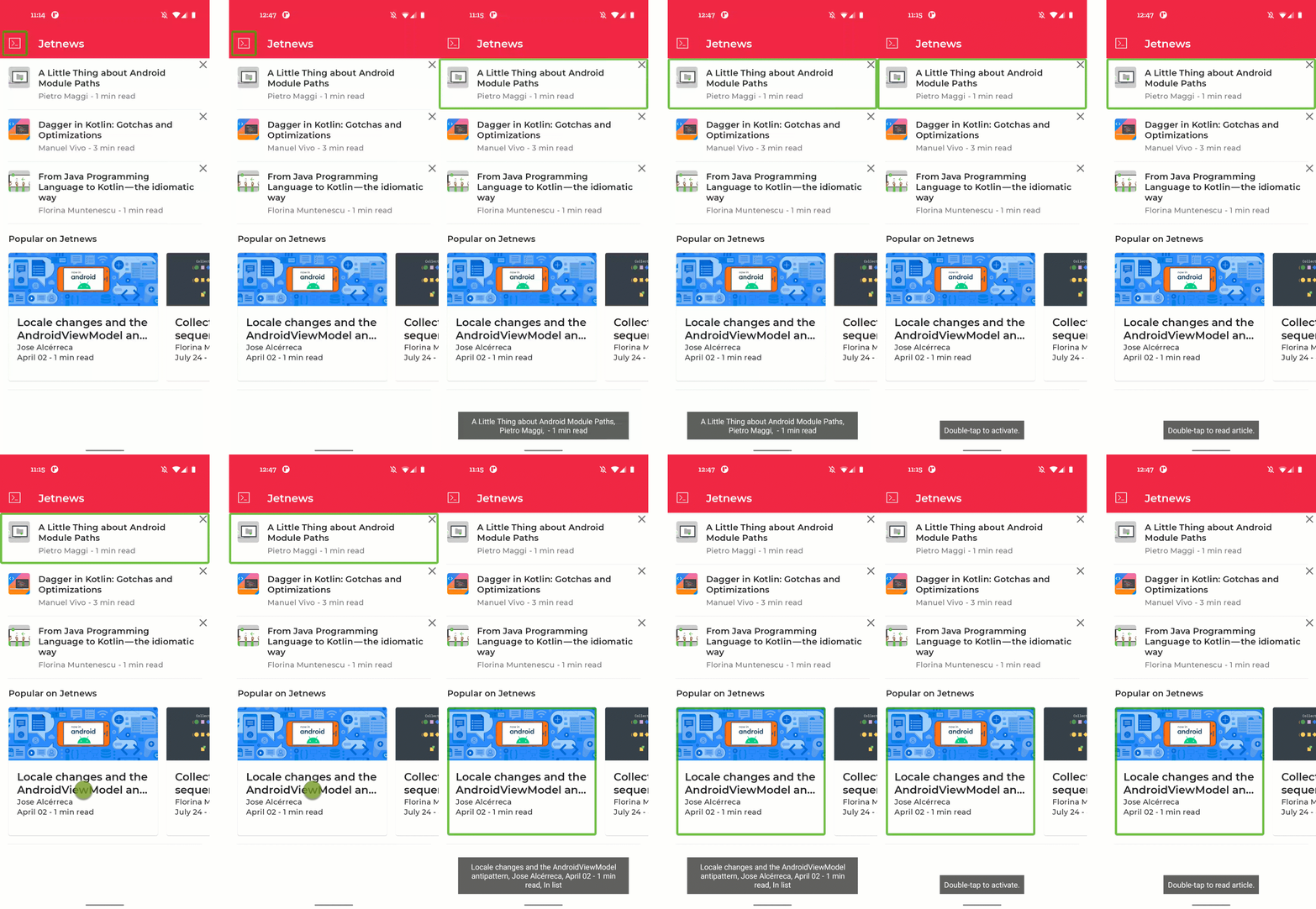
Changing the click label of a composable. Before (on the left) vs after (on the right).
The clickable modifier includes a parameter that allows you to directly set this click label.
Let's take another look at the PostCardHistory implementation:
@Composable
fun PostCardHistory(
   // ...
) {
   Row(
       Modifier.clickable { navigateToArticle(post.id) }
   ) {
       // ...
   }
}
As you can see, this implementation uses the clickable modifier. To set a click label, we can set the onClickLabel parameter:
@Composable
fun PostCardHistory(
   // ...
) {
   Row(
       Modifier.clickable(
               // R.string.action_read_article = "read article"
               onClickLabel = stringResource(R.string.action_read_article)
           ) {
               navigateToArticle(post.id)
           }
   ) {
       // ...
   }
}
TalkBack now correctly announces "Double tap to read article".
The other post cards in our home screen have the same generic click label. Let's take a look at the implementation of the PostCardPopular composable and update its click label:
@Composable
fun PostCardPopular(
   // ...
) {
   Card(
       shape = MaterialTheme.shapes.medium,
       modifier = modifier.size(280.dp, 240.dp),
       onClick = { navigateToArticle(post.id) }
   ) {
       // ...
   }
}
This composable uses the Card composable internally, which does not allow you to directly set the click label. Instead, you can use the semantics modifier to set the click label:
@Composable
fun PostCardPopular(
   post: Post,
   navigateToArticle: (String) -> Unit,
   modifier: Modifier = Modifier
) {
   val readArticleLabel = stringResource(id = R.string.action_read_article)
   Card(
       shape = MaterialTheme.shapes.medium,
       modifier = modifier
          .size(280.dp, 240.dp)
          .semantics { onClick(label = readArticleLabel, action = null) },
       onClick = { navigateToArticle(post.id) }
   ) {
       // ...
   }
}
5. Custom actions
Many apps show some sort of list, where each item in the list contains one or more actions. When using a screen reader, navigating such a list can become tedious, as the same action would be focused over and over again.
Instead, we can add custom accessibility actions to a composable. This way the actions that relate to the same list item can be grouped together.
In the Jetnews app, we're showing a list of articles that the user can read. Each list item includes an action to indicate that the user wants to see less of this topic. In this section we'll move this action to a custom accessibility action, so navigating through the list gets easier.
On the left you can see the default situation, where each cross icon is focusable. On the right, you can see the solution, where the action is included in the custom actions in TalkBack:
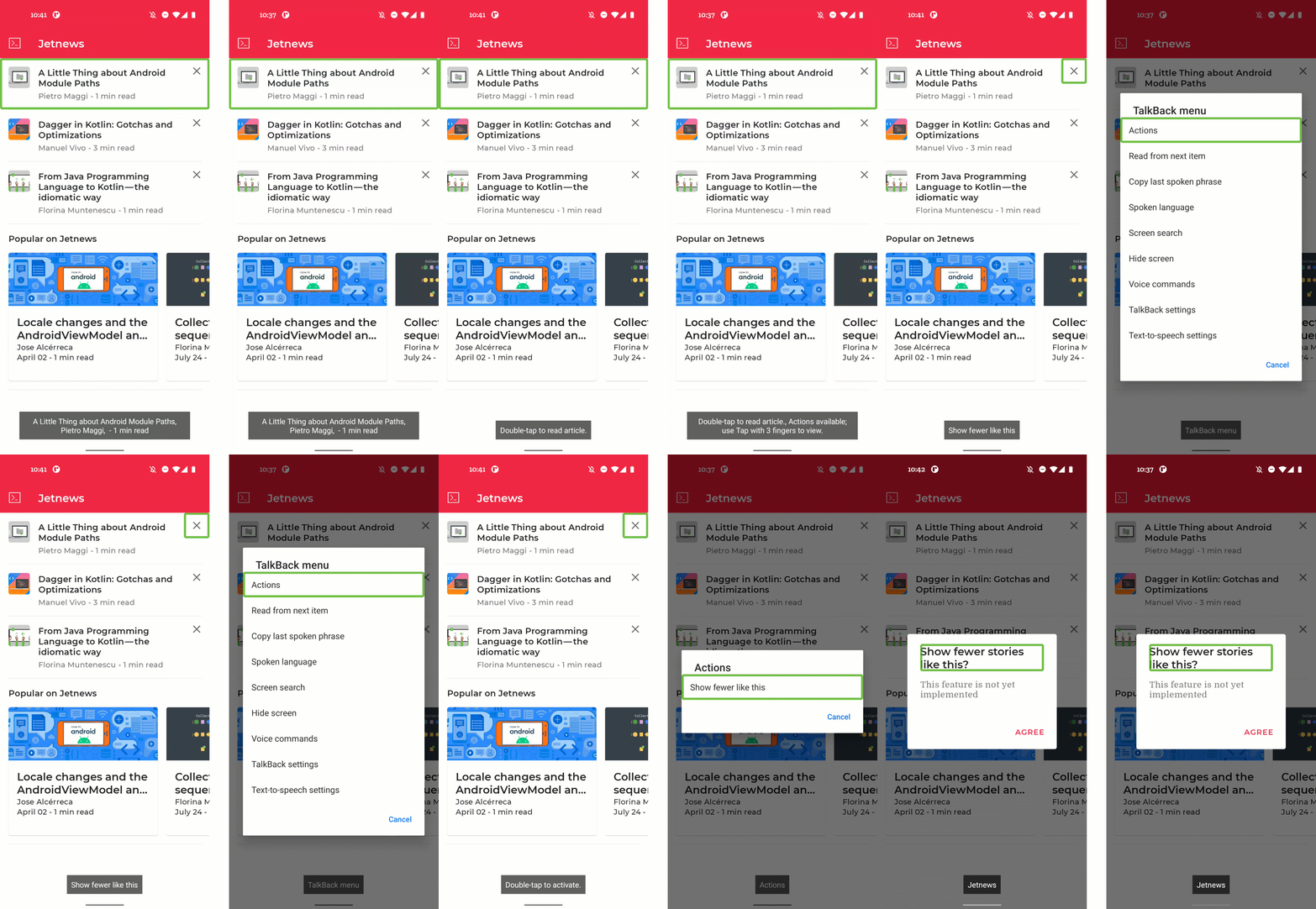
Adding a custom action to a post item. Before (on the left) vs after (on the right).
Let's open PostCards.kt and look at the implementation of the PostCardHistory composable. Note the clickable properties of both the Row and IconButton, using Modifier.clickable and onClick:
@Composable
fun PostCardHistory(post: Post, navigateToArticle: (String) -> Unit) {
   // ...
   Row(
       Modifier.clickable(
           onClickLabel = stringResource(R.string.action_read_article)
       ) {
           navigateToArticle(post.id)
       }
   ) {
       // ...
       CompositionLocalProvider(LocalContentColor provides MaterialTheme.colorScheme.onSurfaceVariant) {
           IconButton(onClick = { openDialog = true }) {
               Icon(
                   imageVector = Icons.Default.Close,
                   contentDescription = stringResource(R.string.cd_show_fewer)
               )
           }
       }
   }
   // ...
}
By default, both the Row and the IconButton composable are clickable and as a result will be focused by TalkBack. This happens for each item in our list, which means a lot of swiping while navigating the list. We rather want the action related to the IconButton to be included as a custom action on the list item. We can tell Accessibility Services not to interact with this Icon by using the clearAndSetSemantics modifier:
@Composable
fun PostCardHistory(post: Post, navigateToArticle: (String) -> Unit) {
   // ...
   Row(
       Modifier.clickable(
           onClickLabel = stringResource(R.string.action_read_article)
       ) {
           navigateToArticle(post.id)
       }
   ) {
       // ...
       CompositionLocalProvider(LocalContentColor provides MaterialTheme.colorScheme.onSurfaceVariant) {
            IconButton(
                modifier = Modifier.clearAndSetSemantics { },
                onClick = { openDialog = true }
            ) {
                Icon(
                    imageVector = Icons.Default.Close,
                    contentDescription = stringResource(R.string.cd_show_fewer)
                )
            }
       }
   }
   // ...
}
However, by removing the semantics of the IconButton, there is now no way to execute the action anymore. We can add the action to the list item instead by adding a custom action in the semantics modifier:
@Composable
fun PostCardHistory(post: Post, navigateToArticle: (String) -> Unit) {
   // ...
   val showFewerLabel = stringResource(R.string.cd_show_fewer)
   Row(
        Modifier
            .clickable(
                onClickLabel = stringResource(R.string.action_read_article)
            ) {
                navigateToArticle(post.id)
            }
            .semantics {
                customActions = listOf(
                    CustomAccessibilityAction(
                        label = showFewerLabel,
                        // action returns boolean to indicate success
                        action = { openDialog = true; true }
                    )
                )
            }
   ) {
       // ...
       CompositionLocalProvider(LocalContentColor provides MaterialTheme.colorScheme.onSurfaceVariant) {
            IconButton(
                modifier = Modifier.clearAndSetSemantics { },
                onClick = { openDialog = true }
            ) {
                Icon(
                    imageVector = Icons.Default.Close,
                    contentDescription = showFewerLabel
                )
            }
       }
   }
   // ...
}
Now we can use the custom action popup in TalkBack to apply the action. This becomes more and more relevant as the number of actions inside a list item increases.
6. Visual element descriptions
Not every user of your app will be able to see or interpret visual elements that show in the app, like icons and illustrations. There's also no way for accessibility services to make sense of visual elements based on their pixels alone. This makes it necessary for you as a developer to pass more information on the visual elements in your app to the accessibility services.
Visual composables like Image and Icon include a parameter contentDescription. Here you pass a localized description of that visual element, or null if the element is purely decorative.
In our app, the article screen is missing some content descriptions. Let's run the app and select the top article to navigate to the article screen.
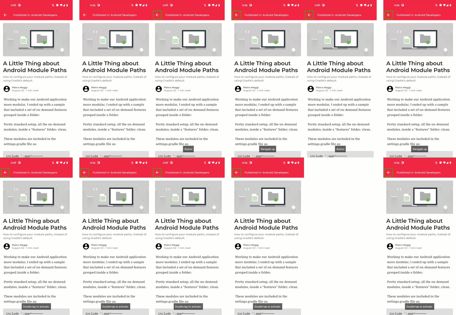
Adding a visual content description. Before (on the left) vs after (on the right).
When we don't provide any information, the top left navigation icon will simply announce "Button, double tap to activate". This does not tell the user anything about the action that will be taken when they activate that button. Let's open ArticleScreen.kt:
@Composable
fun ArticleScreen(
   // ...
) {
   // ...
   Scaffold(
       topBar = {
           InsetAwareTopAppBar(
               title = {
                   // ...
               },
               navigationIcon = {
                   IconButton(onClick = onBack) {
                       Icon(
                           imageVector = Icons.Filled.ArrowBack,
                           contentDescription = null
                       )
                   }
               }
           )
       }
   ) {
       // ...
   }
}
Add a meaningful content description to the Icon:
@Composable
fun ArticleScreen(
   // ...
) {
   // ...
   Scaffold(
       topBar = {
           InsetAwareTopAppBar(
               title = {
                   // ...
               },
               navigationIcon = {
                   IconButton(onClick = onBack) {
                       Icon(
                           imageVector = Icons.Filled.ArrowBack,
                           contentDescription = stringResource(
                               R.string.cd_navigate_up
                           )
                       )
                   }
               }
           )
       }
   ) {
       // ...
   }
}
Another visual element in this article is the header image. In our case, this image is purely decorative, it doesn't show anything that we need to convey to the user. Therefore, the content description is set to null and the element is skipped when we use an accessibility service.
The last visual element in our screen is the profile picture. In this case we're using a generic avatar, so adding a content description here is not necessary. When we would use the actual profile picture of this author, we could ask them to provide a fitting content description for it.
7. Headings
When a screen contains a lot of text, like our article screen, it is quite hard for users with visual difficulties to quickly find the section they're looking for. To help with that, we can indicate which parts of the text are headings. Users can then navigate quickly through these different headings by swiping up or down.
By default, no composables are marked as headings, so there will be no navigation possible. We would like our article screen to provide heading by heading navigation:
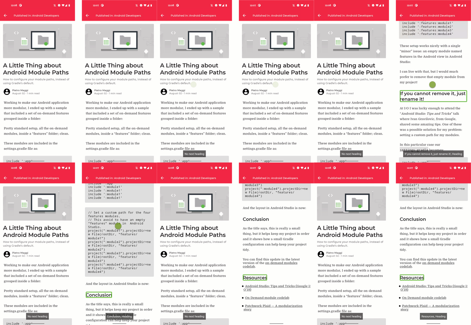
Adding headings. Before (on the left) vs after (on the right).
The headings in our article are defined in PostContent.kt. Let's open that file and scroll to the Paragraph composable:
@Composable
private fun Paragraph(paragraph: Paragraph) {
   // ...
   Box(modifier = Modifier.padding(bottom = trailingPadding)) {
       when (paragraph.type) {
           // ...
           ParagraphType.Header -> {
               Text(
                   modifier = Modifier.padding(4.dp),
                   text = annotatedString,
                   style = textStyle.merge(paragraphStyle)
               )
           }
           // ...
       }
   }
}
Here, the Header is defined as a simple Text composable. We can set the heading semantics property to indicate that this composable is a heading.
@Composable
private fun Paragraph(paragraph: Paragraph) {
   // ...
   Box(modifier = Modifier.padding(bottom = trailingPadding)) {
       when (paragraph.type) {
           // ...
           ParagraphType.Header -> {
               Text(
                   modifier = Modifier.padding(4.dp)
                     .semantics { heading() },
                   text = annotatedString,
                   style = textStyle.merge(paragraphStyle)
               )
           }
           // ...
       }
   }
}
8. Custom merging
As we've seen in the previous steps, accessibility services like TalkBack navigate a screen element by element. By default, each low level composable in Jetpack Compose that sets at least one semantics property receives focus. So for example, a Text composable sets the text semantics property and thus receives focus.
However, having too many focusable elements on screen can lead to confusion as the user navigates them one by one. Instead, composables can be merged together using the semantics modifier with its mergeDescendants property.
Let's check our article screen. Most of the elements get the right level of focus. But the metadata of the article is currently read aloud as several separate items. It can be improved by merging that into one focusable entity:
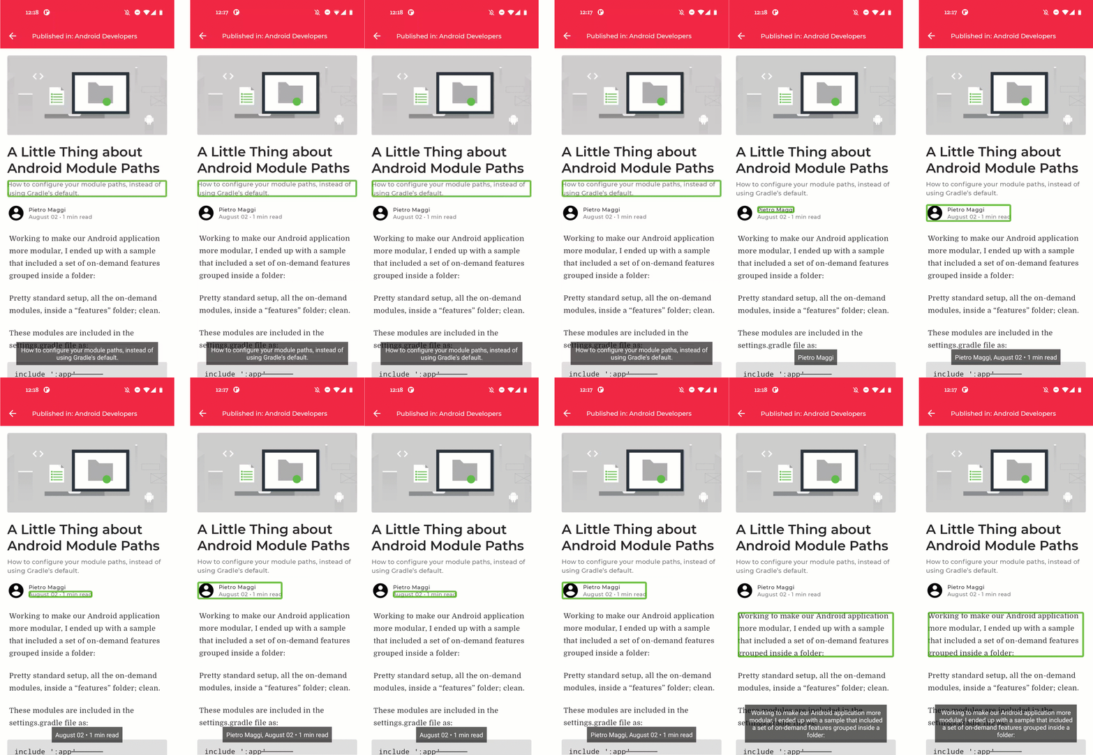
Merging composables. Before (on the left) vs after (on the right).
Let's open PostContent.kt and check the PostMetadata composable:
@Composable
private fun PostMetadata(metadata: Metadata) {
   // ...
   Row {
       Image(
           // ...
       )
       Spacer(Modifier.width(8.dp))
       Column {
           Text(
               // ...
           )

           CompositionLocalProvider(LocalContentColor provides MaterialTheme.colorScheme.onSurfaceVariant) {
               Text(
                   // ..
               )
           }
       }
   }
}
We can tell the top level row to merge its descendants, which will lead to the behavior we want:
@Composable
private fun PostMetadata(metadata: Metadata) {
   // ...
   Row(Modifier.semantics(mergeDescendants = true) {}) {
       Image(
           // ...
       )
       Spacer(Modifier.width(8.dp))
       Column {
           Text(
               // ...
           )

           CompositionLocalProvider(LocalContentColor provides MaterialTheme.colorScheme.onSurfaceVariant) {
               Text(
                   // ..
               )
           }
       }
   }
}
9. Switches and checkboxes
Toggleable elements like Switch and Checkbox read out loud their checked state as they are selected by TalkBack. Without context it can be hard to understand what these toggleable elements refer to though. We can include context for a toggleable element by lifting the toggleable state up, so a user can toggle the Switch or Checkbox by either pressing the composable itself, or the label that describes it.
We can see an example of this in our Interests screen. You can navigate there by opening the navigation drawer from the Home screen. On the Interests screen we have a list of topics that a user can subscribe to. By default, the checkboxes on this screen are focused separately from their labels, which makes it hard to understand their context. We'd prefer the whole Row to be toggleable:
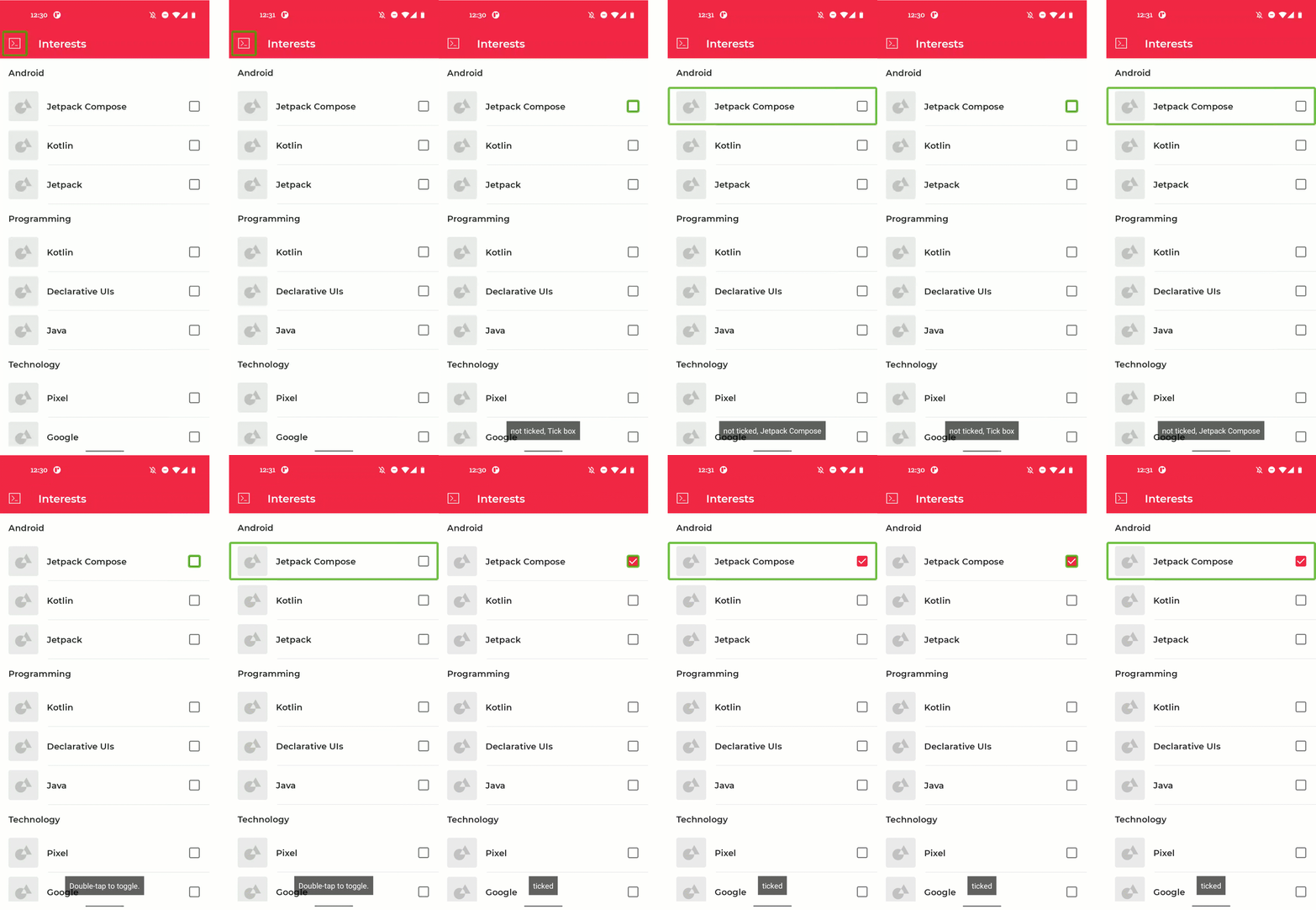
Working with checkboxes. Before (on the left) vs after (on the right).
Let's open InterestsScreen.kt and look at the implementation of the TopicItem composable:
@Composable
private fun TopicItem(itemTitle: String, selected: Boolean, onToggle: () -> Unit) {
   // ...
   Row(
       modifier = Modifier
           .padding(horizontal = 16.dp, vertical = 8.dp)
   ) {
       // ...
       Checkbox(
           checked = selected,
           onCheckedChange = { onToggle() },
           modifier = Modifier.align(Alignment.CenterVertically)
       )
   }
}
As you can see here, the Checkbox has an onCheckedChange callback which handles toggling the element. We can lift this callback to the level of the whole Row:
@Composable
private fun TopicItem(itemTitle: String, selected: Boolean, onToggle: () -> Unit) {
   // ...
   Row(
       modifier = Modifier
           .toggleable(
               value = selected,
               onValueChange = { _ -> onToggle() },
               role = Role.Checkbox
           )
           .padding(horizontal = 16.dp, vertical = 8.dp)
   ) {
       // ...
       Checkbox(
           checked = selected,
           onCheckedChange = null,
           modifier = Modifier.align(Alignment.CenterVertically)
       )
   }
}
10. State descriptions
In the previous step, we lifted the toggle behavior from a Checkbox to the parent Row. We can improve the accessibility of this element even more by adding a custom description for the state of the composable.
By default, our Checkbox status is read as either "Ticked" or "Not ticked". We can replace this description with our own custom description:
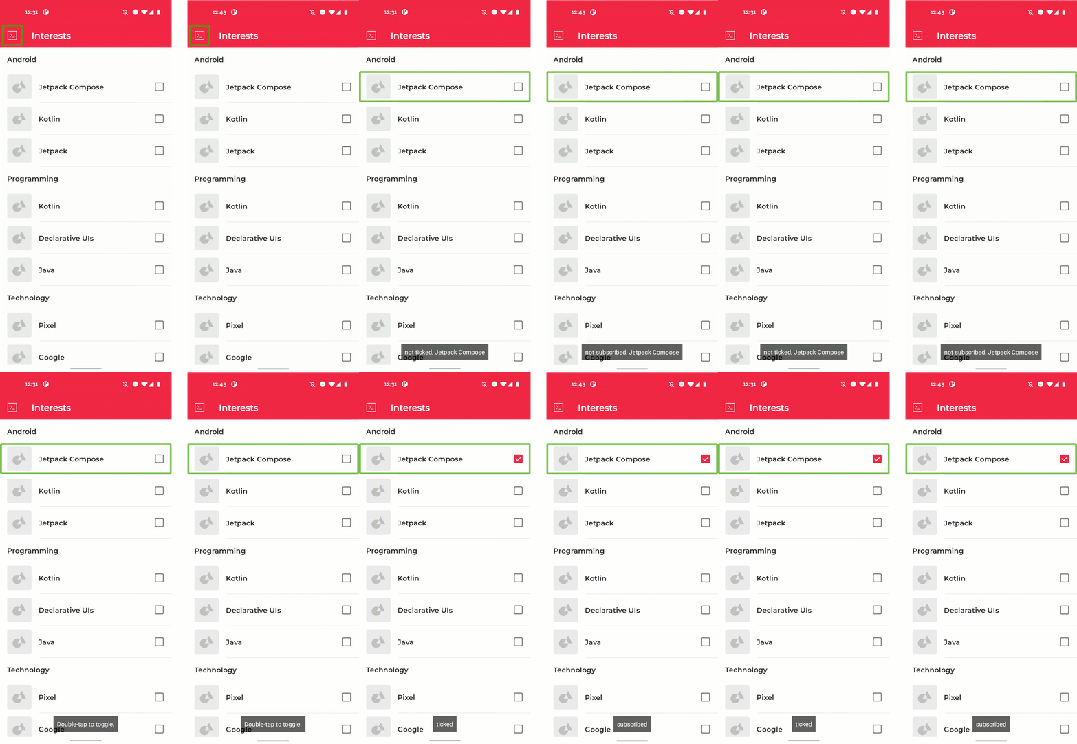
Adding state descriptions. Before (on the left) vs after (on the right).
We can continue with the TopicItem composable that we adapted in the last step:
@Composable
private fun TopicItem(itemTitle: String, selected: Boolean, onToggle: () -> Unit) {
   // ...
   Row(
       modifier = Modifier
           .toggleable(
               value = selected,
               onValueChange = { _ -> onToggle() },
               role = Role.Checkbox
           )
           .padding(horizontal = 16.dp, vertical = 8.dp)
   ) {
       // ...
       Checkbox(
           checked = selected,
           onCheckedChange = null,
           modifier = Modifier.align(Alignment.CenterVertically)
       )
   }
}
We can add our custom state descriptions using the stateDescription property inside the semantics modifier:
@Composable
private fun TopicItem(itemTitle: String, selected: Boolean, onToggle: () -> Unit) {
   // ...
   val stateNotSubscribed = stringResource(R.string.state_not_subscribed)
   val stateSubscribed = stringResource(R.string.state_subscribed)
   Row(
       modifier = Modifier
           .semantics {
               stateDescription = if (selected) {
                   stateSubscribed
               } else {
                   stateNotSubscribed
               }
           }
           .toggleable(
               value = selected,
               onValueChange = { _ -> onToggle() },
               role = Role.Checkbox
           )
           .padding(horizontal = 16.dp, vertical = 8.dp)
   ) {
       // ...
       Checkbox(
           checked = selected,
           onCheckedChange = null,
           modifier = Modifier.align(Alignment.CenterVertically)
       )
   }
}
11. Congratulations!
Congratulations, you've successfully completed this codelab and learned more about accessibility in Compose. You learned about touch targets, visual element descriptions, and state descriptions. You added click labels, headings, custom actions. You know how to add custom merging, and how to work with switches and checkboxes. Applying these learnings to your apps will greatly improve their accessibility!
Check out the other codelabs on the Compose pathway. And other code samples, including Jetnews.
Documentation
For more information and guidance about these topics, check out the following documentation:
