
1. Before you begin
In this codelab, you learn how to make a scrollable list in your app using Jetpack Compose.
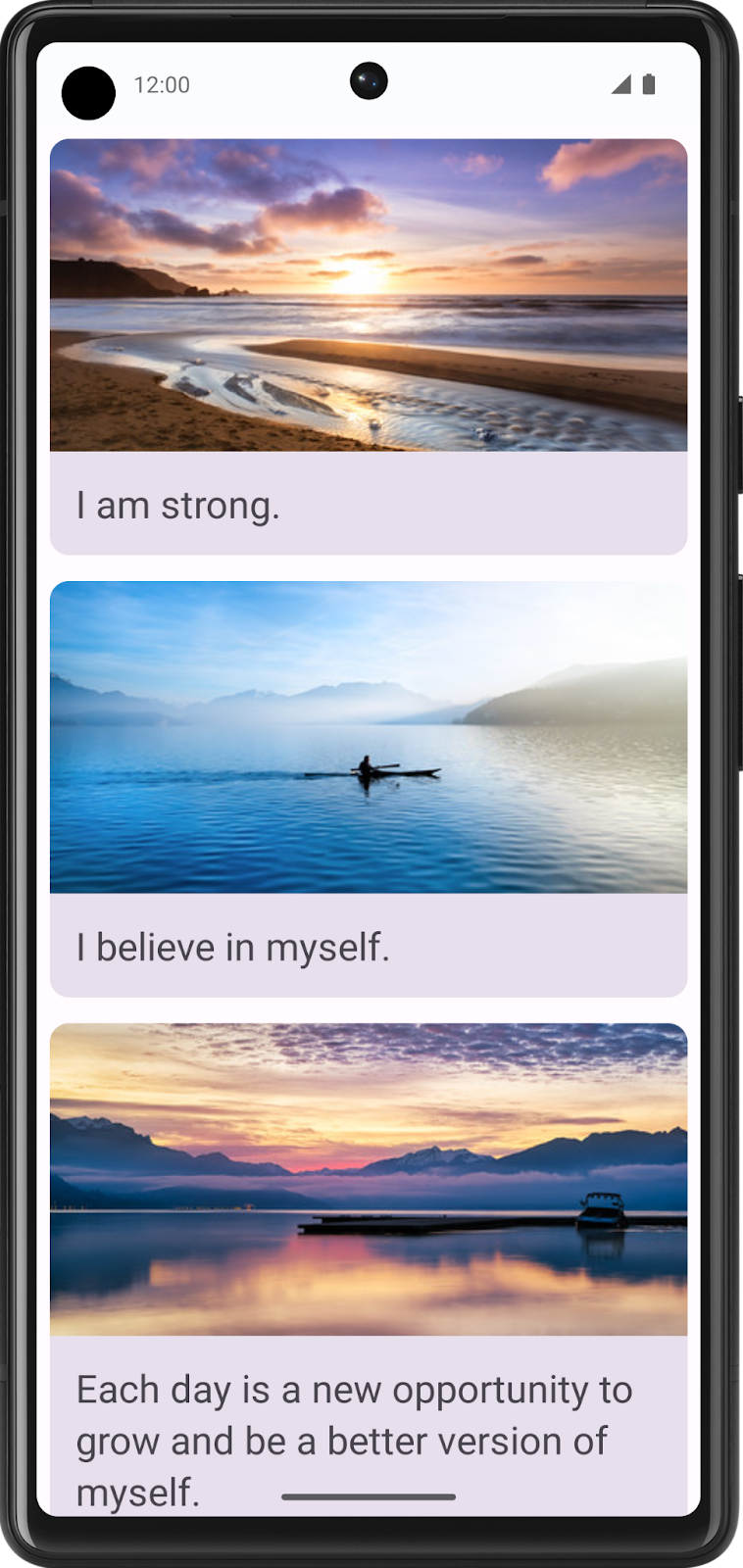
You will be working with the Affirmations app, which displays a list of affirmations paired with beautiful images to bring positivity to your day!
The data is already there, all you need to do is take that data and display it in the UI.
Prerequisites
- Familiarity with lists in Kotlin
- Experience building layouts with Jetpack Compose
- Experience running apps on a device or emulator
What you'll learn
- How to create a material design card using Jetpack Compose
- How to create a scrollable list using Jetpack Compose
What you'll build
- You will take an existing application and add a scrollable list to the UI
The finished product will look like this:
What you'll need
- A computer with internet access, a web browser, and Android Studio
- Access to GitHub
Download the starter code
In Android Studio, open the basic-android-kotlin-compose-training-affirmations folder.
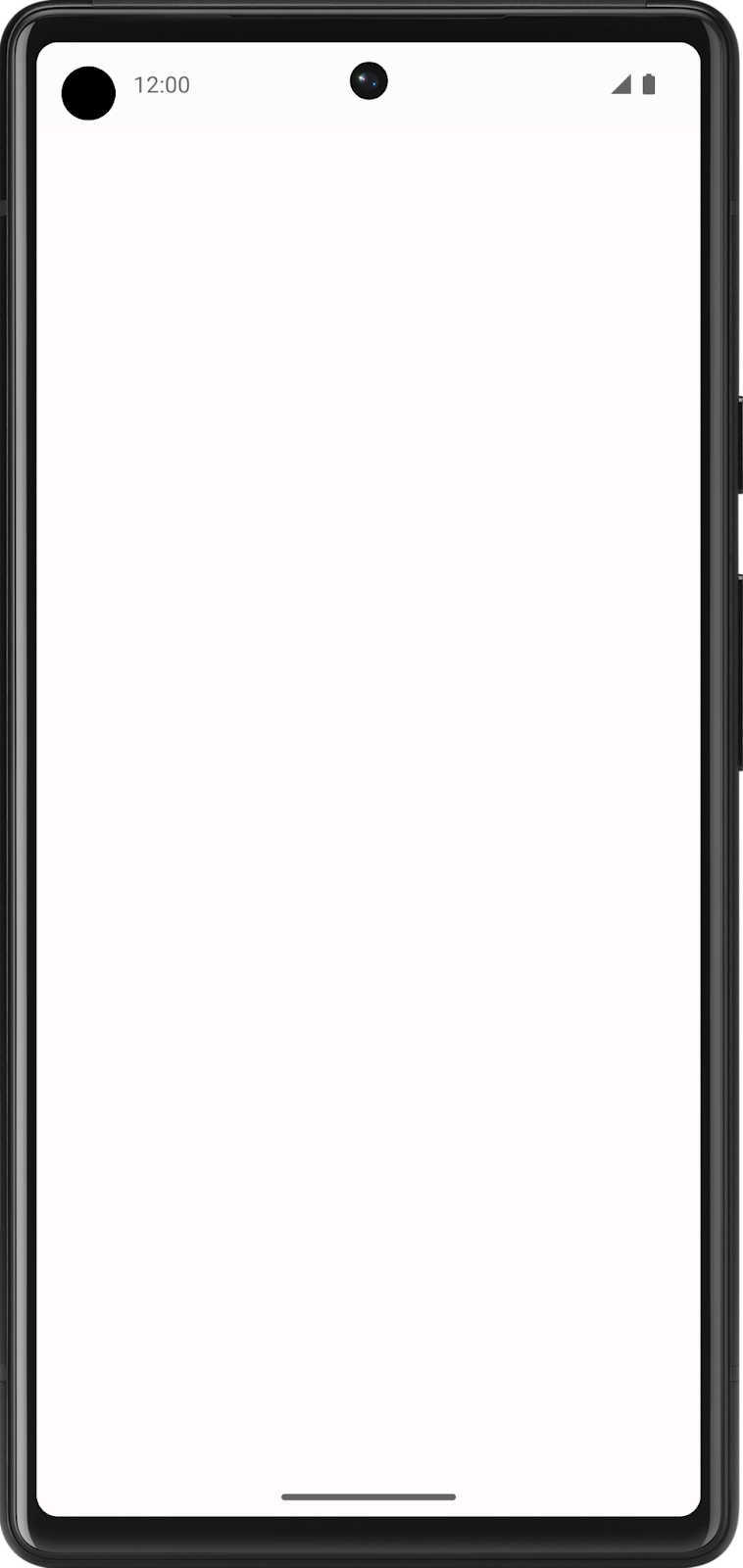
The app is expected to display a blank screen when built from the starter branch code.
2. Create a list item data class
Create a data class for an Affirmation
In Android apps, lists are made up of list items. For single pieces of data, this could be something simple like a string or an integer. For list items that have multiple pieces of data, like an image and text, you will need a class that contains all of these properties. Data classes are a type of class that only contain properties, they can provide some utility methods to work with those properties.
- Create a new package under com.example.affirmations.
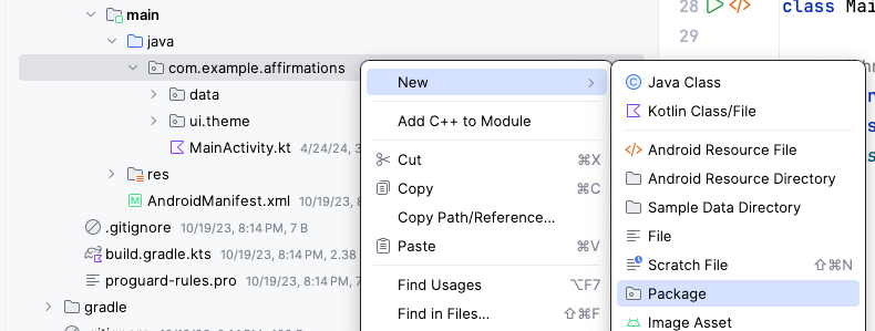
Name the new package model. The model package will contain the data model that will be represented by a data class. The data class will be comprised of properties that represent the information relevant to what will be an "Affirmation," which will consist of a string resource and an image resource. Packages are directories that contain classes and even other directories.

- Create a new class in the com.example.affirmations.model package.
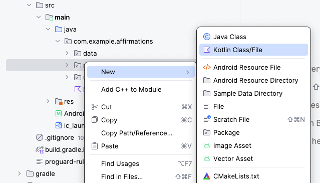
Name the new class Affirmation and make it a Data class.
- Each
Affirmationconsists of one image and one string. Create twovalproperties in theAffirmationdata class. One should be calledstringResourceIdand the otherimageResourceId. They should both be integers.
Affirmation.kt
data class Affirmation(
    val stringResourceId: Int,
    val imageResourceId: Int
)
- Annotate the
stringResourceIdproperty with the@StringResannotation and annotate theimageResourceIdwith the@DrawableResannotation. ThestringResourceIdrepresents an ID for the affirmation text stored in a string resource. TheimageResourceIdrepresents an ID for the affirmation image stored in a drawable resource.
Affirmation.kt
import androidx.annotation.DrawableRes
import androidx.annotation.StringRes

data class Affirmation(
    @StringRes val stringResourceId: Int,
    @DrawableRes val imageResourceId: Int
)
- In the com.example.affirmations.data package, open the Datasource.kt file and uncomment the two import statements and the contents of the
Datasourceclass.
Datasource.kt
import com.example.affirmations.R
import com.example.affirmations.model.Affirmation

class Datasource() {
    fun loadAffirmations(): List<Affirmation> {
        return listOf<Affirmation>(
            Affirmation(R.string.affirmation1, R.drawable.image1),
            Affirmation(R.string.affirmation2, R.drawable.image2),
            Affirmation(R.string.affirmation3, R.drawable.image3),
            Affirmation(R.string.affirmation4, R.drawable.image4),
            Affirmation(R.string.affirmation5, R.drawable.image5),
            Affirmation(R.string.affirmation6, R.drawable.image6),
            Affirmation(R.string.affirmation7, R.drawable.image7),
            Affirmation(R.string.affirmation8, R.drawable.image8),
            Affirmation(R.string.affirmation9, R.drawable.image9),
            Affirmation(R.string.affirmation10, R.drawable.image10))
    }
}
3. Add a list to your app
Create a list item card
This app is meant to display a list of affirmations. The first step in configuring the UI to display a list is to create a list item. Each affirmation item consists of an image and a string. The data for each of these items comes with the starter code, and you will create the UI component to display such an item.
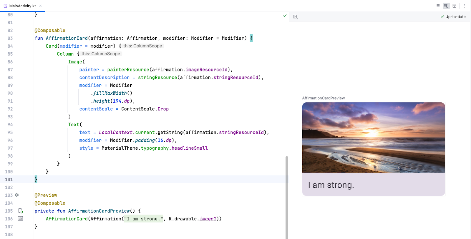
The item will be comprised of a Card composable, containing an Image and a Text composable. In Compose, a Card is a surface that displays content and actions in a single container. The Affirmation card will look like this in the preview:

The card shows an image with some text beneath it. This vertical layout can be achieved using a Column composable wrapped in a Card composable. You can give it a try on your own, or follow the steps below to achieve this.
- Open the MainActivity.kt file.
- Create a new method beneath the
AffirmationsApp()method, calledAffirmationCard(), and annotate it with the@Composableannotation.
MainActivity.kt
@Composable
fun AffirmationsApp() {
}

@Composable
fun AffirmationCard() {

}
- Edit the method signature to take an
Affirmationobject as a parameter. TheAffirmationobject comes from themodelpackage.
MainActivity.kt
import com.example.affirmations.model.Affirmation

@Composable
fun AffirmationCard(affirmation: Affirmation) {

}
- Add a
modifierparameter to the signature. Set a default value ofModifierfor the parameter.
MainActivity.kt
@Composable
fun AffirmationCard(affirmation: Affirmation, modifier: Modifier = Modifier) {

}
- Inside of the
AffirmationCardmethod, call theCardcomposable. Pass in themodifierparameter.
MainActivity.kt
import androidx.compose.material3.Card

@Composable
fun AffirmationCard(affirmation: Affirmation, modifier: Modifier = Modifier) {
    Card(modifier = modifier) {

    }
}
- Add a
Columncomposable inside of theCardcomposable. Items within aColumncomposable arrange themselves vertically in the UI. This allows you to place an image above the associated text. Conversely, aRowcomposable arranges its contained items horizontally.
MainActivity.kt
import androidx.compose.foundation.layout.Column

@Composable
fun AffirmationCard(affirmation: Affirmation, modifier: Modifier = Modifier) {
    Card(modifier = modifier) {
        Column {

        }
    }

}
- Add an
Imagecomposable inside of the lambda body of theColumncomposable. Recall that anImagecomposable always requires a resource to display, and acontentDescription. The resource should be apainterResourcepassed to thepainterparameter. ThepainterResourcemethod will load either vector drawables or rasterized asset formats like PNGs. Also, pass astringResourcefor thecontentDescriptionparameter.
MainActivity.kt
import androidx.compose.foundation.Image
import androidx.compose.ui.res.painterResource
import androidx.compose.ui.res.stringResource

@Composable
fun AffirmationCard(affirmation: Affirmation, modifier: Modifier = Modifier) {
    Card(modifier = modifier) {
        Column {
            Image(
                painter = painterResource(affirmation.imageResourceId),
                contentDescription = stringResource(affirmation.stringResourceId),
            )
        }
    }
}
- In addition to the
painterandcontentDescriptionparameters, pass amodifierand acontentScale. AcontentScaledetermines how the image should be scaled and displayed. TheModifierobject should have thefillMaxWidthattribute set and a height of194.dp. ThecontentScaleshould beContentScale.Crop.
MainActivity.kt
import androidx.compose.foundation.layout.fillMaxWidth
import androidx.compose.foundation.layout.height
import androidx.compose.ui.unit.dp
import androidx.compose.ui.layout.ContentScale

@Composable
fun AffirmationCard(affirmation: Affirmation, modifier: Modifier = Modifier) {
    Card(modifier = modifier) {
        Column {
            Image(
                painter = painterResource(affirmation.imageResourceId),
                contentDescription = stringResource(affirmation.stringResourceId),
                modifier = Modifier
                    .fillMaxWidth()
                    .height(194.dp),
                contentScale = ContentScale.Crop
            )
        }
    }
}
- Inside of the
Column, create aTextcomposable after theImagecomposable. Pass astringResourceof theaffirmation.stringResourceIdto thetextparameter, pass aModifierobject with thepaddingattribute set to16.dp, and set a text theme by passingMaterialTheme.typography.headlineSmallto thestyleparameter.
MainActivity.kt
import androidx.compose.material3.Text
import androidx.compose.foundation.layout.padding
import androidx.compose.ui.platform.LocalContext

@Composable
fun AffirmationCard(affirmation: Affirmation, modifier: Modifier = Modifier) {
    Card(modifier = modifier) {
        Column {
            Image(
                painter = painterResource(affirmation.imageResourceId),
                contentDescription = stringResource(affirmation.stringResourceId),
                modifier = Modifier
                    .fillMaxWidth()
                    .height(194.dp),
                contentScale = ContentScale.Crop
            )
            Text(
                text = LocalContext.current.getString(affirmation.stringResourceId),
                modifier = Modifier.padding(16.dp),
                style = MaterialTheme.typography.headlineSmall
            )
        }
    }
}
Preview the AffirmationCard composable
The card is the core of the UI for the Affirmations app, and you worked hard to create it! To check that the card looks correct, you can create a composable that can be previewed without launching the entire app.
- Create a private method called
AffirmationCardPreview(). Annotate the method with@Previewand@Composable.
MainActivity.kt
import androidx.compose.ui.tooling.preview.Preview

@Preview
@Composable
private fun AffirmationCardPreview() {

}
- Inside of the method, call the
AffirmationCardcomposable, and pass it a newAffirmationobject with theR.string.affirmation1string resource and theR.drawable.image1drawable resource passed into its constructor.
MainActivity.kt
@Preview
@Composable
private fun AffirmationCardPreview() {
    AffirmationCard(Affirmation(R.string.affirmation1, R.drawable.image1))
}
- Open the Split tab and you will see a preview of the
AffirmationCard. If necessary, click Build & Refresh in the Design pane to display the preview.
Create the list
The list item component is the building block of the list. Once the list item is created, you can leverage it to make the list component itself.
- Create a function called
AffirmationList(), annotate it with the@Composableannotation, and declare aListofAffirmationobjects as a parameter in the method signature.
MainActivity.kt
@Composable
fun AffirmationList(affirmationList: List<Affirmation>) {

}
- Declare a
modifierobject as a parameter in the method signature with a default value ofModifier.
MainActivity.kt
@Composable
fun AffirmationList(affirmationList: List<Affirmation>, modifier: Modifier = Modifier) {

}
- In Jetpack Compose, a scrollable list can be made using the
LazyColumncomposable. The difference between aLazyColumnand aColumnis that aColumnshould be used when you have a small number of items to display, as Compose loads them all at once. AColumncan only hold a predefined, or fixed, number of composables. ALazyColumncan add content on demand, which makes it good for long lists and particularly when the length of the list is unknown. ALazyColumnalso provides scrolling by default, without additional code. Declare aLazyColumncomposable inside of theAffirmationList()function. Pass themodifierobject as an argument to theLazyColumn.
MainActivity.kt
import androidx.compose.foundation.lazy.LazyColumn

@Composable
fun AffirmationList(affirmationList: List<Affirmation>, modifier: Modifier = Modifier) {
    LazyColumn(modifier = modifier) {

    }
}
- In the lambda body of the
LazyColumn, call theitems()method, and pass in theaffirmationList. Theitems()method is how you add items to theLazyColumn. This method is somewhat unique to this composable, and is otherwise not a common practice for most composables.
MainActivity.kt
import androidx.compose.foundation.lazy.items

@Composable
fun AffirmationList(affirmationList: List<Affirmation>, modifier: Modifier = Modifier) {
    LazyColumn(modifier = modifier) {
        items(affirmationList) {

        }
    }
}
- A call to the
items()method requires a lambda function. In that function, specify a parameter ofaffirmationthat represents one affirmation item from theaffirmationList.
MainActivity.kt
@Composable
fun AffirmationList(affirmationList: List<Affirmation>, modifier: Modifier = Modifier) {
    LazyColumn(modifier = modifier) {
        items(affirmationList) { affirmation ->

        }
    }
}
- For each affirmation in the list, call the
AffirmationCard()composable. Pass it theaffirmationand aModifierobject with thepaddingattribute set to8.dp.
MainActivity.kt
@Composable
fun AffirmationList(affirmationList: List<Affirmation>, modifier: Modifier = Modifier) {
    LazyColumn(modifier = modifier) {
        items(affirmationList) { affirmation ->
            AffirmationCard(
                affirmation = affirmation,
                modifier = Modifier.padding(8.dp)
            )
        }
    }
}
Display the list
- In the
AffirmationsAppcomposable, retrieve the current layout directions and save them in a variable. These will be used to configure the padding later.
MainActivity.kt
import com.example.affirmations.data.Datasource

@Composable
fun AffirmationsApp() {
    val layoutDirection = LocalLayoutDirection.current
}
- Now create a
Surfacecomposable. This composable will set the padding for theAffirmationsListcomposable.
MainActivity.kt
import com.example.affirmations.data.Datasource

@Composable
fun AffirmationsApp() {
    val layoutDirection = LocalLayoutDirection.current
    Surface() {
    }
}
- Pass a
Modifierto theSurfacecomposable that fills the max width and height of its parent, sets status bar padding, and sets the start and end padding to thelayoutDirection. Here's an example of how to translate aLayoutDirectionobject into padding:WindowInsets.safeDrawing.asPaddingValues().calculateStartPadding(layoutDirection).
MainActivity.kt
import com.example.affirmations.data.Datasource

@Composable
fun AffirmationsApp() {
    val layoutDirection = LocalLayoutDirection.current
    Surface(
        Modifier = Modifier
        .fillMaxSize()
        .statusBarsPadding()
        .padding(
            start = WindowInsets.safeDrawing.asPaddingValues()
                    .calculateStartPadding(layoutDirection),
            end = WindowInsets.safeDrawing.asPaddingValues()
                    .calculateEndPadding(layoutDirection),
        ),
    ) {
    }
}
- In the lambda for the
Surfacecomposable, call theAffirmationListcomposable, and passDataSource().loadAffirmations()to theaffirmationListparameter.
MainActivity.kt
import com.example.affirmations.data.Datasource

@Composable
fun AffirmationsApp() {
    val layoutDirection = LocalLayoutDirection.current
    Surface(
        Modifier = Modifier
        .fillMaxSize()
        .statusBarsPadding()
        .padding(
            start = WindowInsets.safeDrawing.asPaddingValues()
                    .calculateStartPadding(layoutDirection),
            end = WindowInsets.safeDrawing.asPaddingValues()
                    .calculateEndPadding(layoutDirection),
        ),
    ) {
        AffirmationsList(
            affirmationList = Datasource().loadAffirmations(),
        )
    }
}
Run the Affirmations app on a device or emulator and see the finished product!
4. Get the solution code
To download the code for the finished codelab, you can use these git commands:
$ git clone https://github.com/google-developer-training/basic-android-kotlin-compose-training-affirmations.git
$ cd basic-android-kotlin-compose-training-affirmations
$ git checkout intermediate
Alternatively, you can download the repository as a zip file, unzip it, and open it in Android Studio.
If you want to see the solution code, view it on GitHub.
5. Conclusion
You now know how to create cards, list items, and scrollable lists using Jetpack Compose! Keep in mind that these are just basic tools for creating a list. You can let your creativity roam and customize list items however you like!
Summary
- Use
Cardcomposables to create list items. - Modify the UI contained within a
Cardcomposable. - Create a scrollable list using the
LazyColumncomposable. - Build a list using custom list items.