
1. Introduction
In this codelab, you will learn how to test and improve the accessibility of your apps.
People with impaired vision, color blindness, impaired hearing, impaired dexterity, cognitive disabilities, and many other disabilities use Android devices to complete tasks in their day-to-day lives. When you develop apps with accessibility in mind, you make the user experience better, particularly for users with these and other accessibility needs.
During this codelab, you will use TalkBack and Switch Access to test the accessibility of the Woof app.
- TalkBack allows users to have eyes free control of their devices.
- Switch Access allows users to navigate an app using switches instead of the touch screen.
What you'll learn
- How to interact with an app using TalkBack.
- How to interact with an app using Switch Access instead of the touch screen.
- How to optimize your UI for better accessibility.
What you'll need
- A computer with Android Studio installed.
- An Android device or emulator that has access to the Google Play Store app, or already has the Android Accessibility Suite installed.
- The solution code for the Woof app.
2. Getting set up
Download the starter code
In Android Studio, open the android-basics-kotlin-compose-woof folder.
Open the Woof app code in Android Studio.
Setup your device
If you already have the Android Accessibility Suite installed on your device or emulator, then you can skip this part. If you need to install the Android Accessibility Suite (for access to TalkBack and Switch Access), follow the instructions below.
Configure a device with the Google Play Store app
If you are using a physical device, make sure you:
- Have access to the Play Store app.
- Are logged in to your Google account.
- Have the necessary permissions on your device to download apps from the Play Store app.
If you are using an emulator, follow these steps to set up an emulator that has Play Store app access:
- In Android Studio, open the Device Manager and select Create Device.
- Make sure you select Pixel 8 or any device with a Play Store app icon in the Play Store column. The icon indicates that this emulator comes with the Google Play Store app.
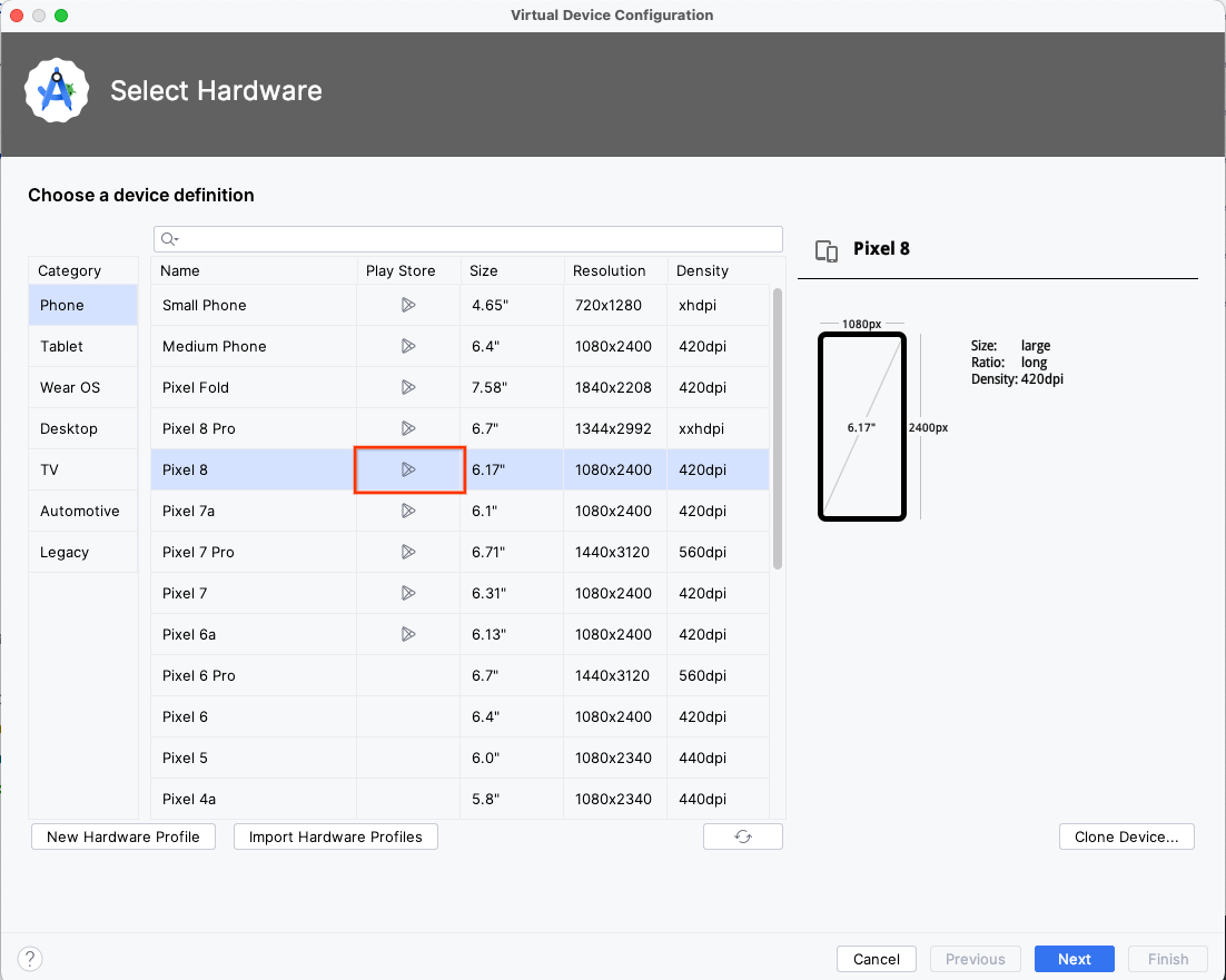
- Click Next and proceed with the emulator creation. If you need a refresher on how to finish creating a new hardware profile, follow the video in this codelab section.
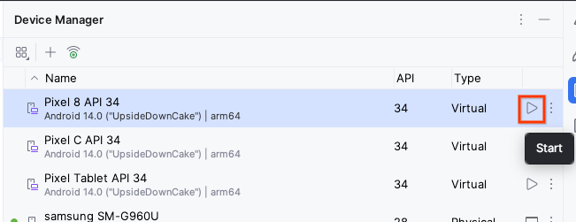
- Once your emulator is created, launch it from the Device Manager by clicking the arrow icon.
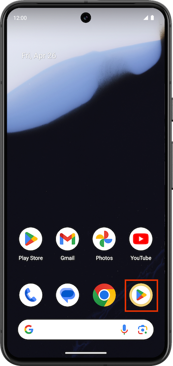
- Launch the Play Store app on the emulator and sign in with a valid Google account.
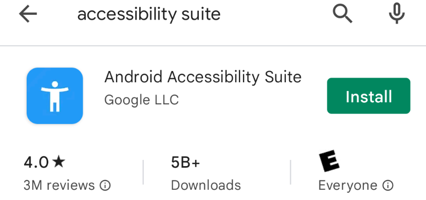
Install the Android Accessibility Suite app
The Android Accessibility Suite contains a collection of accessibility apps. You will need it to use TalkBack and Switch Access later in this codelab.
- Within the Google Play Store app, install the Android Accessibility Suite app.
Install the Woof app
If you created a new Pixel 4 hardware profile at the beginning of this section, you will need to install the Woof app from the solution code you downloaded.
3. Use Woof with TalkBack
TalkBack is a Google screen reader that provides spoken feedback so users can navigate their device without looking at the screen. This is especially helpful for people with impaired vision.
Once TalkBack is enabled, users can navigate their device through spoken feedback and gestures—such as swipes and taps. Navigating with TalkBack is a great way for you to test for areas of improvement in your app.
Follow these steps to gain more familiarity with TalkBack:
- Watch the following video to learn how to configure and use TalkBack.
- Once you familiarize yourself with TalkBack, apply what you learned to the Woof app!
- Disable the TalkBack feature before proceeding to the next section. Take the following steps to disable Talkback:
On your device or emulator, open Settings.
Select Accessibility and then TalkBack.
Turn Use TalkBack off.
Select Ok.
You can learn more ways to disable TalkBack in the support documentation. Keep in mind that some of these options will not be possible on an emulator and others may be deprecated on certain Android versions.
4. Use Woof with Switch Access
Switch Access lets you interact with your Android device using one or more switches instead of the touchscreen. This alternative to using the touchscreen for users is especially helpful to users with limited dexterity.
Switch Access scans the items on your screen, highlighting each item in turn, until you make a selection.
To use Switch Access, you'll first need one or more switches. There are several kinds of switches, but in this codelab we will be using the built-in volume buttons on an Android device.
- Watch the following video to learn how to configure and use Switch Access.
- If you configured the volume buttons as instructed by the video, Switch Access allows you to click the volume down button to navigate to different elements in the app. Once an element is highlighted, it can be selected using the volume up button.
For items with a simple click action, selecting the item is the same as performing a tap action on it. For items that have custom accessibility actions available, selecting the item presents the user with different actions they can take on the item.
When Switch Access is enabled, there is a Menu tab at the top of the device's screen. When selected, the tab opens a global menu with navigation options, such as Back and Home, which are equivalent to the gestures on the device screen. Some options customize Switch Access behavior.
- Once you familiarize yourself with Switch Access, apply what you learned to the Woof app!
- Disable Switch Access before proceeding to the next section.
5. Improving UI accessibility
There are a number of UI design choices to consider when trying to create a more accessible app. In addition to attributes and behaviors that allow for effective usage of TalkBack and Switch Access, below are some UI optimizations you can make to improve the accessibility of your app.
Content description
Users of accessibility services, such as screen readers (like TalkBack), rely on content descriptions to understand the meaning of elements in an interface.
In some cases, such as when information is conveyed graphically within an element, content descriptions can provide a text description of the meaning or action associated with the element.
If elements in a user interface don't provide content labels, it can be difficult for some users to understand the information presented to them, or to perform actions in the interface. In Compose, you can describe visual elements using the contentDescription attribute. For strictly decorative visual elements, it's okay to set the contentDescription to null. Read more about how to apply content descriptions in the documentation.
Touch target size
Any on-screen element that someone can interact with must be large enough for reliable interaction. The minimum touch target size for something clickable is 48dp high x 48dp wide. There are a number of Material Design components for which Compose automatically assigns the correct minimum target size. Keep in mind that the minimum touch target size refers to clickable components smaller than 48dp. Components larger than 48dp will have a touch target that is at least the size of the component. Follow these resources for more information on touch target size:
- Read about minimum target size in the Accessibility in Compose documentation.
- Watch the touch target sizes section of the What's new in Google Accessibility video.
Take a look at the code for the Woof app. In MainActivity.kt, the DogItemButton composable uses an IconButton composable.
@Composable
private fun DogItemButton(
   expanded: Boolean,
   onClick: () -> Unit,
   modifier: Modifier = Modifier
) {
   IconButton(onClick = onClick) {
       Icon(
           imageVector = if (expanded) Icons.Filled.ExpandLess else Icons.Filled.ExpandMore,
           tint = MaterialTheme.colors.secondary,
           contentDescription = stringResource(R.string.expand_button_content_description),
       )
   }
}
The IconButton is a Material Design component. The documentation for the IconButton composable indicates that the minimum touch target size is 48dp x 48dp.
The code below is the source code for the IconButton. Notice that the modifier sets the minimumTouchTargetSize().
@Composable
fun IconButton(
   onClick: () -> Unit,
   modifier: Modifier = Modifier,
   enabled: Boolean = true,
   interactionSource: MutableInteractionSource = remember { MutableInteractionSource() },
   content: @Composable () -> Unit
) {
   Box(
       modifier = modifier
           .minimumTouchTargetSize()
           .clickable(
               onClick = onClick,
               enabled = enabled,
               role = Role.Button,
               interactionSource = interactionSource,
               indication = rememberRipple(bounded = false, radius = RippleRadius)
           ),
       contentAlignment = Alignment.Center
   ) {
       val contentAlpha = if (enabled) LocalContentAlpha.current else ContentAlpha.disabled
       CompositionLocalProvider(LocalContentAlpha provides contentAlpha, content = content)
   }
}
Color contrast
The colors you choose for your app interface affect how easily users can read and understand it. Sufficient color contrast makes text and images easier to read and comprehend.
Along with benefiting users with various visual impairments, sufficient color contrast helps all users when viewing an interface on devices in extreme lighting conditions, such as when exposed to direct sunlight or on a display with low brightness.
You can read more about how to optimize for color contrast in the Android Accessibility Help documentation. In that link, you will find information on contrast ratios to help guide your decision on which colors to use. Additionally, you can use this tool to test your background and foreground colors for sufficient color contrast ratio. Small text has a recommended ratio of 4.5 : 1 and large text has a recommended ratio of 3.0 : 1.
For the Woof app, our designer picked the colors for us, and ensured they had enough color contrast. When you create your own app, remember to check the color contrast. The Color Tool for Material Design has an accessibility tab where you can see appropriate text colors on top of the primary and secondary colors.
6. Conclusion
It is important to keep accessibility in mind as you create new apps and add new features to existing apps. By integrating accessibility features and services, you can improve your app's usability, particularly for users with disabilities.