
1. Antes de começar
Parabéns! Neste Programa de treinamentos, você aprendeu os conceitos básicos do Material Design e como adicionar animações simples ao seu app. Agora, vamos colocar tudo em prática.
Nesta série de exercícios, você vai usar os conceitos do Programa de treinamentos para criar o app Superheroes. O foco é a criação dos componentes necessários para desenvolver uma lista rolável e uma interface sofisticada usando os princípios do Material Design abordados no codelab Temas do Material Design com o Jetpack Compose.
O código da solução é disponibilizado ao final, mas tente resolver os exercícios antes de conferir as respostas. Considere as soluções como uma das maneiras de implementar o app. Existem muitas oportunidades de melhoria, então fique à vontade para fazer testes e usar abordagens diferentes.
Resolva os problemas no seu tempo. Recomendamos que você reserve o tempo que precisar para resolver cada problema com cuidado.
Pré-requisitos
- Concluir o curso Noções básicas do Android no Compose usando a Animação simples com o Jetpack Compose.
O que é necessário
- Um computador com acesso à Internet e o Android Studio instalado.
O que você vai criar
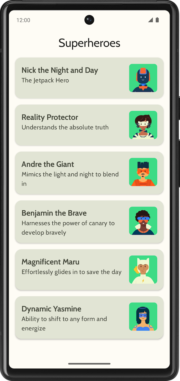
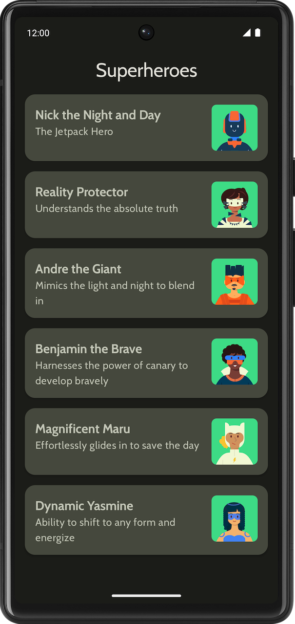
Um app chamado Superheroes que mostra uma lista de super-heróis.
O app final vai ficar assim nos temas claro e escuro:
|
|
2. Começar
Nesta tarefa, você vai configurar o projeto e criar os dados fictícios para os super-heróis.
- Crie um novo projeto com o modelo Empty Activity e defina a versão mínima do SDK como 24.
- Faça o download dos recursos necessários: imagens de super-heróis e logotipo do app neste link. Consulte o codelab Mudar o ícone do app para relembrar como adicionar um ícone. Consulte o codelab Criar um app Dice Roller interativo para relembrar como adicionar imagens ao app.
- Baixe os arquivos "bold" e "regular" da fonte Cabin em https://fonts.google.com. Confira os diferentes arquivos de fonte disponíveis. Consulte o codelab Temas do Material Design com o Jetpack Compose para personalizar a tipografia no seu app.
- Crie uma classe para armazenar os dados de cada super-herói. Crie um novo pacote com o nome
modelna classe de dadosHeropara organizar o código. O item da lista pode ficar parecido com este exemplo:
Cada item da lista de super-heróis mostra três informações exclusivas: um nome, uma descrição e uma imagem.
- No mesmo pacote
model, crie outro arquivo para todas as informações dos heróis que você quer mostrar. Por exemplo, nome, descrição e recurso de imagem. Confira abaixo um exemplo de conjunto de dados como inspiração.
object HeroesRepository {
    val heroes = listOf(
        Hero(
            nameRes = R.string.hero1,
            descriptionRes = R.string.description1,
            imageRes = R.drawable.android_superhero1
        ),
        Hero(
            nameRes = R.string.hero2,
            descriptionRes = R.string.description2,
            imageRes = R.drawable.android_superhero2
        ),
        Hero(
            nameRes = R.string.hero3,
            descriptionRes = R.string.description3,
            imageRes = R.drawable.android_superhero3
        ),
        Hero(
            nameRes = R.string.hero4,
            descriptionRes = R.string.description4,
            imageRes = R.drawable.android_superhero4
        ),
        Hero(
            nameRes = R.string.hero5,
            descriptionRes = R.string.description5,
            imageRes = R.drawable.android_superhero5
        ),
        Hero(
            nameRes = R.string.hero6,
            descriptionRes = R.string.description6,
            imageRes = R.drawable.android_superhero6
        )
    )
}
- Adicione as strings de nome e descrição dos heróis no arquivo strings.xml.
<resources>
    <string name="app_name">Superheroes</string>
    <string name="hero1">Nick the Night and Day</string>
    <string name="description1">The Jetpack Hero</string>
    <string name="hero2">Reality Protector</string>
    <string name="description2">Understands the absolute truth</string>
    <string name="hero3">Andre the Giant</string>
    <string name="description3">Mimics the light and night to blend in</string>
    <string name="hero4">Benjamin the Brave</string>
    <string name="description4">Harnesses the power of canary to develop bravely</string>
    <string name="hero5">Magnificent Maru</string>
    <string name="description5">Effortlessly glides in to save the day</string>
    <string name="hero6">Dynamic Yasmine</string>
    <string name="description6">Ability to shift to any form and energize</string>
</resources>
3. Temas do Material Design
Nesta seção, você vai adicionar a paleta de cores, a tipografia e as formas do app para melhorar a aparência dele.
As cores, os tipos e as formas abaixo são apenas recomendações para o tema. Confira e experimente criar esquemas de cores diferentes.
Use o Criador de Temas do Material Design (link em inglês) para criar um novo tema para o app.
Cor
ui.theme/Color.kt
import androidx.compose.ui.graphics.Color

val md_theme_light_primary = Color(0xFF466800)
val md_theme_light_onPrimary = Color(0xFFFFFFFF)
val md_theme_light_primaryContainer = Color(0xFFC6F181)
val md_theme_light_onPrimaryContainer = Color(0xFF121F00)
val md_theme_light_secondary = Color(0xFF596248)
val md_theme_light_onSecondary = Color(0xFFFFFFFF)
val md_theme_light_secondaryContainer = Color(0xFFDDE6C6)
val md_theme_light_onSecondaryContainer = Color(0xFF161E0A)
val md_theme_light_tertiary = Color(0xFF396661)
val md_theme_light_onTertiary = Color(0xFFFFFFFF)
val md_theme_light_tertiaryContainer = Color(0xFFBCECE6)
val md_theme_light_onTertiaryContainer = Color(0xFF00201D)
val md_theme_light_error = Color(0xFFBA1A1A)
val md_theme_light_errorContainer = Color(0xFFFFDAD6)
val md_theme_light_onError = Color(0xFFFFFFFF)
val md_theme_light_onErrorContainer = Color(0xFF410002)
val md_theme_light_background = Color(0xFFFEFCF5)
val md_theme_light_onBackground = Color(0xFF1B1C18)
val md_theme_light_surface = Color(0xFFFEFCF5)
val md_theme_light_onSurface = Color(0xFF1B1C18)
val md_theme_light_surfaceVariant = Color(0xFFE1E4D4)
val md_theme_light_onSurfaceVariant = Color(0xFF45483D)
val md_theme_light_outline = Color(0xFF75786C)
val md_theme_light_inverseOnSurface = Color(0xFFF2F1E9)
val md_theme_light_inverseSurface = Color(0xFF30312C)
val md_theme_light_inversePrimary = Color(0xFFABD468)
val md_theme_light_surfaceTint = Color(0xFF466800)
val md_theme_light_outlineVariant = Color(0xFFC5C8B9)
val md_theme_light_scrim = Color(0xFF000000)

val md_theme_dark_primary = Color(0xFFABD468)
val md_theme_dark_onPrimary = Color(0xFF223600)
val md_theme_dark_primaryContainer = Color(0xFF344E00)
val md_theme_dark_onPrimaryContainer = Color(0xFFC6F181)
val md_theme_dark_secondary = Color(0xFFC1CAAB)
val md_theme_dark_onSecondary = Color(0xFF2B331D)
val md_theme_dark_secondaryContainer = Color(0xFF414A32)
val md_theme_dark_onSecondaryContainer = Color(0xFFDDE6C6)
val md_theme_dark_tertiary = Color(0xFFA0D0CA)
val md_theme_dark_onTertiary = Color(0xFF013733)
val md_theme_dark_tertiaryContainer = Color(0xFF1F4E4A)
val md_theme_dark_onTertiaryContainer = Color(0xFFBCECE6)
val md_theme_dark_error = Color(0xFFFFB4AB)
val md_theme_dark_errorContainer = Color(0xFF93000A)
val md_theme_dark_onError = Color(0xFF690005)
val md_theme_dark_onErrorContainer = Color(0xFFFFDAD6)
val md_theme_dark_background = Color(0xFF1B1C18)
val md_theme_dark_onBackground = Color(0xFFE4E3DB)
val md_theme_dark_surface = Color(0xFF1B1C18)
val md_theme_dark_onSurface = Color(0xFFE4E3DB)
val md_theme_dark_surfaceVariant = Color(0xFF45483D)
val md_theme_dark_onSurfaceVariant = Color(0xFFC5C8B9)
val md_theme_dark_outline = Color(0xFF8F9285)
val md_theme_dark_inverseOnSurface = Color(0xFF1B1C18)
val md_theme_dark_inverseSurface = Color(0xFFE4E3DB)
val md_theme_dark_inversePrimary = Color(0xFF466800)
val md_theme_dark_surfaceTint = Color(0xFFABD468)
val md_theme_dark_outlineVariant = Color(0xFF45483D)
val md_theme_dark_scrim = Color(0xFF000000)
Forma
ui.theme/Shape.kt
import androidx.compose.foundation.shape.RoundedCornerShape
import androidx.compose.material3.Shapes
import androidx.compose.ui.unit.dp

val Shapes = Shapes(
    small = RoundedCornerShape(8.dp),
    medium = RoundedCornerShape(16.dp),
    large = RoundedCornerShape(16.dp)
)
Tipografia
ui.theme/Type.kt
import androidx.compose.material3.Typography
import androidx.compose.ui.text.TextStyle
import androidx.compose.ui.text.font.Font
import androidx.compose.ui.text.font.FontFamily
import androidx.compose.ui.text.font.FontWeight
import androidx.compose.ui.unit.sp
import com.example.superheroes.R


val Cabin = FontFamily(
    Font(R.font.cabin_regular, FontWeight.Normal),
    Font(R.font.cabin_bold, FontWeight.Bold)
)
// Set of Material typography styles to start with
val Typography = Typography(
    bodyLarge = TextStyle(
        fontFamily = Cabin,
        fontWeight = FontWeight.Normal,
        fontSize = 16.sp,
        lineHeight = 24.sp,
        letterSpacing = 0.5.sp
    ),
    displayLarge = TextStyle(
        fontFamily = Cabin,
        fontWeight = FontWeight.Normal,
        fontSize = 30.sp
    ),
    displayMedium = TextStyle(
        fontFamily = Cabin,
        fontWeight = FontWeight.Bold,
        fontSize = 20.sp
    ),
    displaySmall = TextStyle(
        fontFamily = Cabin,
        fontWeight = FontWeight.Bold,
        fontSize = 20.sp
    )
)
Tema
ui.theme/Theme.kt
import android.app.Activity
import android.os.Build
import androidx.compose.foundation.isSystemInDarkTheme
import androidx.compose.material3.MaterialTheme
import androidx.compose.material3.darkColorScheme
import androidx.compose.material3.dynamicDarkColorScheme
import androidx.compose.material3.dynamicLightColorScheme
import androidx.compose.material3.lightColorScheme
import androidx.compose.runtime.Composable
import androidx.compose.runtime.SideEffect
import androidx.compose.ui.graphics.toArgb
import androidx.compose.ui.platform.LocalContext
import androidx.compose.ui.platform.LocalView
import androidx.core.view.WindowCompat

private val LightColors = lightColorScheme(
   primary = md_theme_light_primary,
   onPrimary = md_theme_light_onPrimary,
   primaryContainer = md_theme_light_primaryContainer,
   onPrimaryContainer = md_theme_light_onPrimaryContainer,
   secondary = md_theme_light_secondary,
   onSecondary = md_theme_light_onSecondary,
   secondaryContainer = md_theme_light_secondaryContainer,
   onSecondaryContainer = md_theme_light_onSecondaryContainer,
   tertiary = md_theme_light_tertiary,
   onTertiary = md_theme_light_onTertiary,
   tertiaryContainer = md_theme_light_tertiaryContainer,
   onTertiaryContainer = md_theme_light_onTertiaryContainer,
   error = md_theme_light_error,
   errorContainer = md_theme_light_errorContainer,
   onError = md_theme_light_onError,
   onErrorContainer = md_theme_light_onErrorContainer,
   background = md_theme_light_background,
   onBackground = md_theme_light_onBackground,
   surface = md_theme_light_surface,
   onSurface = md_theme_light_onSurface,
   surfaceVariant = md_theme_light_surfaceVariant,
   onSurfaceVariant = md_theme_light_onSurfaceVariant,
   outline = md_theme_light_outline,
   inverseOnSurface = md_theme_light_inverseOnSurface,
   inverseSurface = md_theme_light_inverseSurface,
   inversePrimary = md_theme_light_inversePrimary,
   surfaceTint = md_theme_light_surfaceTint,
   outlineVariant = md_theme_light_outlineVariant,
   scrim = md_theme_light_scrim,
)

private val DarkColors = darkColorScheme(
   primary = md_theme_dark_primary,
   onPrimary = md_theme_dark_onPrimary,
   primaryContainer = md_theme_dark_primaryContainer,
   onPrimaryContainer = md_theme_dark_onPrimaryContainer,
   secondary = md_theme_dark_secondary,
   onSecondary = md_theme_dark_onSecondary,
   secondaryContainer = md_theme_dark_secondaryContainer,
   onSecondaryContainer = md_theme_dark_onSecondaryContainer,
   tertiary = md_theme_dark_tertiary,
   onTertiary = md_theme_dark_onTertiary,
   tertiaryContainer = md_theme_dark_tertiaryContainer,
   onTertiaryContainer = md_theme_dark_onTertiaryContainer,
   error = md_theme_dark_error,
   errorContainer = md_theme_dark_errorContainer,
   onError = md_theme_dark_onError,
   onErrorContainer = md_theme_dark_onErrorContainer,
   background = md_theme_dark_background,
   onBackground = md_theme_dark_onBackground,
   surface = md_theme_dark_surface,
   onSurface = md_theme_dark_onSurface,
   surfaceVariant = md_theme_dark_surfaceVariant,
   onSurfaceVariant = md_theme_dark_onSurfaceVariant,
   outline = md_theme_dark_outline,
   inverseOnSurface = md_theme_dark_inverseOnSurface,
   inverseSurface = md_theme_dark_inverseSurface,
   inversePrimary = md_theme_dark_inversePrimary,
   surfaceTint = md_theme_dark_surfaceTint,
   outlineVariant = md_theme_dark_outlineVariant,
   scrim = md_theme_dark_scrim,
)

@Composable
fun SuperheroesTheme(
   darkTheme: Boolean = isSystemInDarkTheme(),
   // Dynamic color is available on Android 12+
   // Dynamic color in this app is turned off for learning purposes
   dynamicColor: Boolean = false,
   content: @Composable () -> Unit
) {
   val colorScheme = when {
       dynamicColor && Build.VERSION.SDK_INT >= Build.VERSION_CODES.S -> {
           val context = LocalContext.current
           if (darkTheme) dynamicDarkColorScheme(context) else dynamicLightColorScheme(context)
       }

       darkTheme -> DarkColors
       else -> LightColors
   }
   val view = LocalView.current
   if (!view.isInEditMode) {
       SideEffect {
           val window = (view.context as Activity).window
           window.statusBarColor = colorScheme.background.toArgb()
           WindowCompat.getInsetsController(window, view).isAppearanceLightStatusBars = !darkTheme
       }
   }

   MaterialTheme(
       colorScheme = colorScheme,
       typography = Typography,
       shapes = Shapes,
       content = content
   )
}
4. Lista de exibição
A primeira etapa para criar uma lista é criar um item.
- Crie um arquivo com o nome
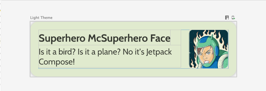
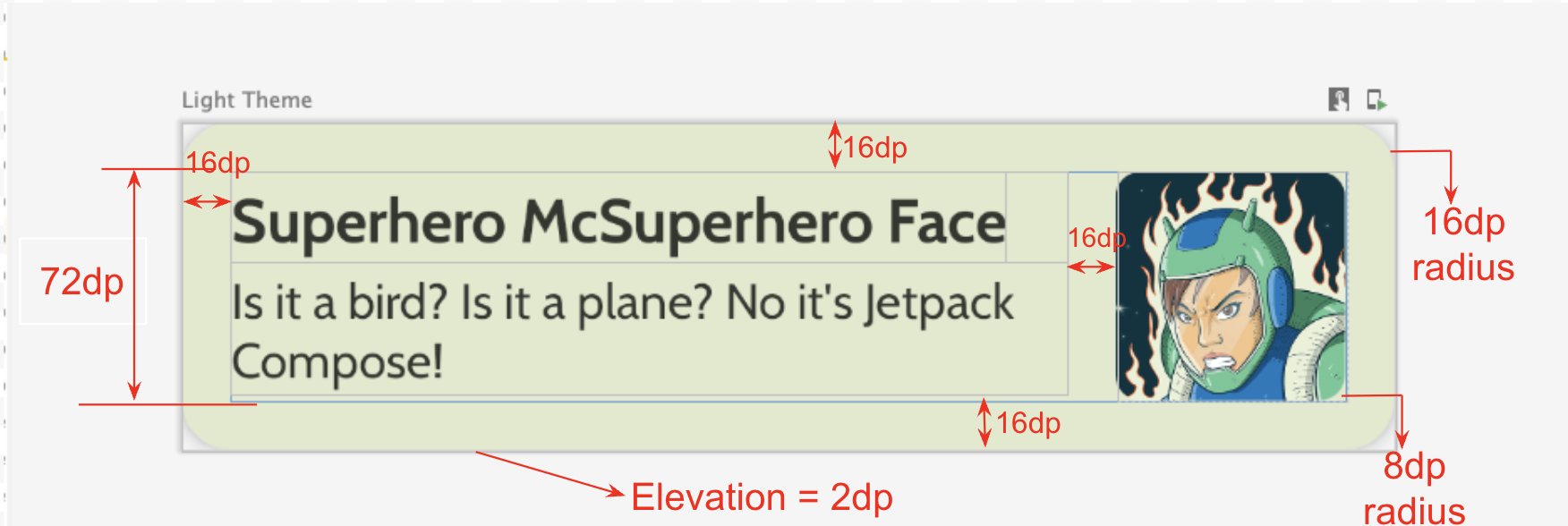
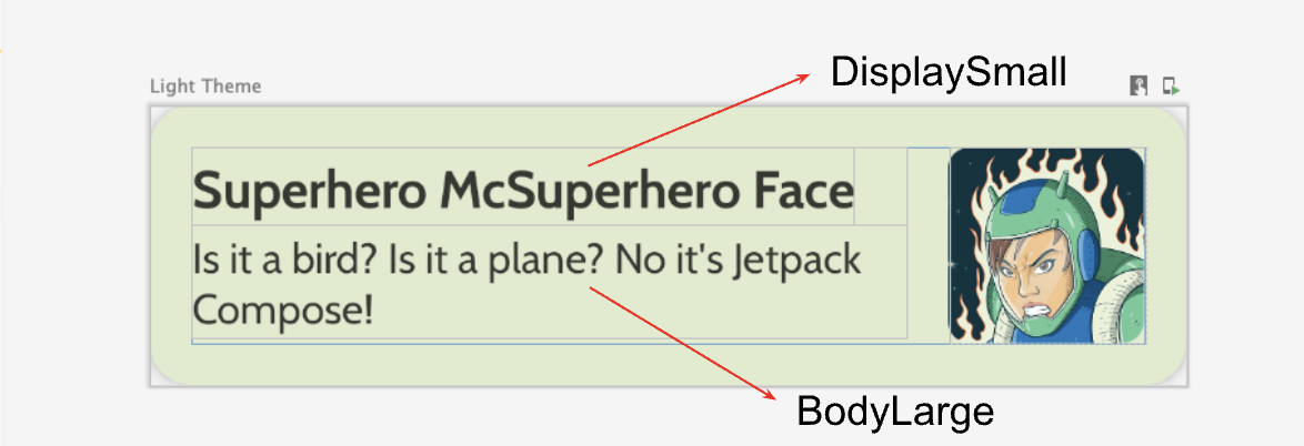
HeroesScreen.ktno pacotecom.example.superheroes. Nesse arquivo, você vai criar um item de lista e elementos combináveis. - Crie um elemento combinável para representar um item da lista de super-heróis. A captura de tela abaixo é um exemplo da aparência e das especificações da interface.
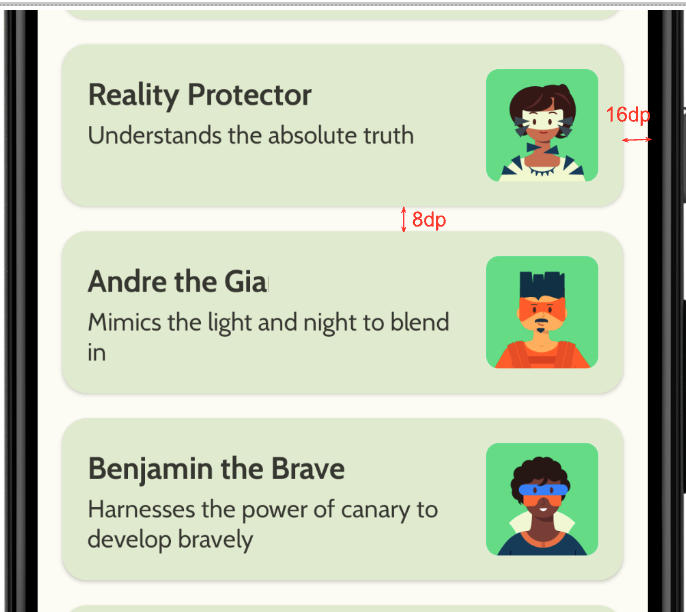
Siga estas especificações ou crie um item como preferir:
- A elevação do card é de
2dp. - A altura do item da lista é de
72dp, com padding de16dp. - O raio de corte do item da lista é de
16dp. - O layout
Boxtem uma imagem no tamanho de72dp. - O raio de corte da imagem é de
8dp. - O espaço entre a imagem e o texto é de
16dp. - O estilo do nome do super-herói é
DisplaySmall. - O estilo da descrição do super-herói é
BodyLarge.
Descubra diferentes opções de tamanho e padding, de acordo com as diretrizes do Material 3, que precisam ser em incrementos de 4dp.
Criar a coluna lenta
- Crie outro elemento combinável para mostrar a lista de heróis. Aqui você vai usar uma
LazyColumn. - Use as especificações de interface abaixo para o padding.
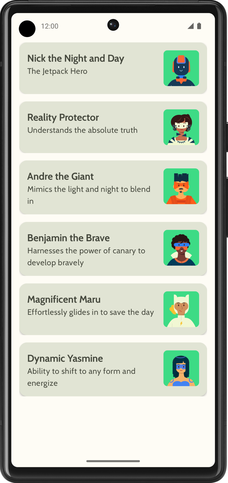
Quando terminar a implementação, seu app vai ficar parecido com esta captura de tela:
5. Adicionar uma barra de apps na parte de cima
Adicione uma barra de apps à parte de cima do app.
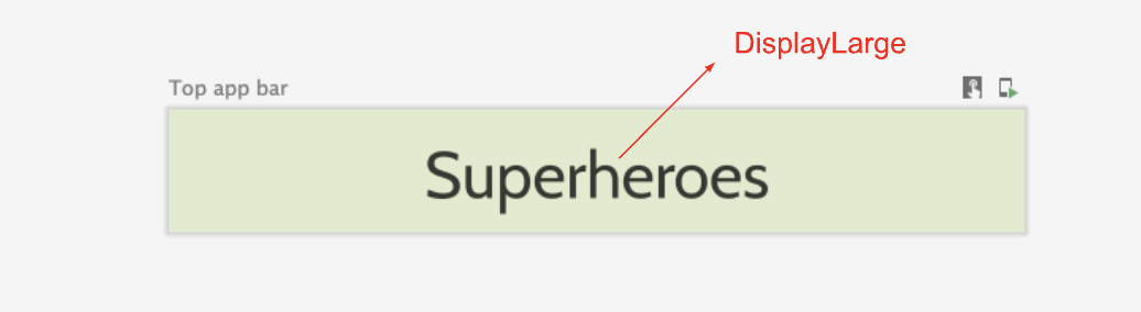
- Em
MainActivity.kt, adicione um elemento combinável para mostrar a barra de apps na parte de cima. Adicione texto a ela. Pode ser o nome do app. Alinhe a barra no centro horizontalmente e verticalmente. - Você pode definir a barra de apps na parte de cima com um estilo, como
DisplayLarge.
- Use
scaffoldpara mostrar a barra de apps na parte de cima. Se necessário, consulte a documentação Barra de apps na parte de cima – Material Design 3 (em inglês).
Personalizar a cor da barra de status
Para mostrar seu app de uma borda da tela à outra, personalize a cor da barra de status de acordo com a do plano de fundo.
- No
Theme.kt, adicione esse novo método para mudar as cores da barra de status e de navegação de uma borda à outra.
/**
 * Sets up edge-to-edge for the window of this [view]. The system icon colors are set to either
 * light or dark depending on whether the [darkTheme] is enabled or not.
 */
private fun setUpEdgeToEdge(view: View, darkTheme: Boolean) {
    val window = (view.context as Activity).window
    WindowCompat.setDecorFitsSystemWindows(window, false)
    window.statusBarColor = Color.Transparent.toArgb()
    val navigationBarColor = when {
        Build.VERSION.SDK_INT >= 29 -> Color.Transparent.toArgb()
        Build.VERSION.SDK_INT >= 26 -> Color(0xFF, 0xFF, 0xFF, 0x63).toArgb()
        // Min sdk version for this app is 24, this block is for SDK versions 24 and 25
        else -> Color(0x00, 0x00, 0x00, 0x50).toArgb()
    }
    window.navigationBarColor = navigationBarColor
    val controller = WindowCompat.getInsetsController(window, view)
    controller.isAppearanceLightStatusBars = !darkTheme
    controller.isAppearanceLightNavigationBars = !darkTheme
}
- Na função
SuperheroesTheme(), chamesetUpEdgeToEdge()no blocoSideEffect.
fun SuperheroesTheme(
    darkTheme: Boolean = isSystemInDarkTheme(),
    // Dynamic color is available on Android 12+
    // Dynamic color in this app is turned off for learning purposes
    dynamicColor: Boolean = false,
    content: @Composable () -> Unit
) {
    //...
    val view = LocalView.current
    if (!view.isInEditMode) {
        SideEffect {
            setUpEdgeToEdge(view, darkTheme)
        }
    }

    //...
}
|
|
6. Acessar o código da solução
Para baixar o código do codelab concluído, use este comando git:
$ git clone https://github.com/google-developer-training/basic-android-kotlin-compose-training-superheroes.git
Se preferir, você pode baixar o repositório como um arquivo ZIP, descompactar e abrir no Android Studio.
Se você quiser conferir o código da solução, acesse o GitHub (em inglês).