
1. Antes de comenzar
¡Felicitaciones! En esta ruta de aprendizaje, aprendiste los conceptos básicos de Material Design y cómo agregar animaciones simples a tu app. Ahora es momento de poner en práctica lo aprendido.
En esta práctica guiada, crearás una app de superhéroes con los conceptos que aprendiste en esta ruta de aprendizaje. La app se enfoca en la creación de los componentes necesarios para compilar una lista desplazable y una IU mejorada con los principios de Material Design que aprendiste en el codelab Temas de Material con Jetpack Compose.
El código de la solución estará disponible al final, pero intenta resolver los ejercicios antes de consultarlo. Considera las soluciones como una forma de implementación para la app. Hay mucho por mejorar, así que no dudes en experimentar y probar diferentes alternativas.
Resuelve los problemas a un ritmo que te resulte cómodo. Tómate todo el tiempo que necesites para resolver cuidadosamente cada problema.
Requisitos previos
- Completa el curso Aspectos básicos de Android en Compose en Animación simple con Jetpack Compose.
Requisitos
- Una computadora con acceso a Internet y Android Studio instalado
Qué compilarás
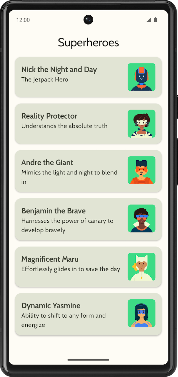
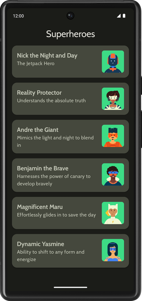
Una app de superhéroes que muestra una lista de superhéroes
La app final tendrá el siguiente aspecto en los temas claro y oscuro:
|
|
2. Primeros pasos
En esta tarea, configurarás el proyecto y crearás los datos ficticios para los superhéroes.
- Crea un proyecto nuevo con la plantilla Empty Activity y un SDK mínimo de 24.
- Descarga aquí los recursos para la app, como las imágenes de superhéroes y el logotipo. Consulta el codelab Cómo cambiar el ícono de la app si quieres obtener información para agregar este ícono. Consulta el codelab Cómo crear una app interactiva de Dice Roller si quieres repasar el modo en que se agregan imágenes a tu app.
- Descarga los archivos de fuentes normal y negrita de Cabin en https://fonts.google.com. Explora los diferentes archivos de fuentes disponibles. Consulta el codelab Temas de Material con Jetpack Compose para personalizar la tipografía en tu app.
- Crea una clase de datos que contenga los datos de cada superhéroe. Crea un paquete nuevo llamado
modelpara la clase de datos deHeropara organizar tu código. Tu elemento de lista podría verse así:
Cada elemento de la lista de superhéroes muestra tres datos únicos: el nombre, una descripción y una imagen.
- En el mismo paquete de
model, crea otro archivo con toda la información de los héroes que quieras mostrar. Por ejemplo, nombre, descripción y recurso de imagen. El siguiente es un conjunto de datos de muestra que te servirá de inspiración.
object HeroesRepository {
    val heroes = listOf(
        Hero(
            nameRes = R.string.hero1,
            descriptionRes = R.string.description1,
            imageRes = R.drawable.android_superhero1
        ),
        Hero(
            nameRes = R.string.hero2,
            descriptionRes = R.string.description2,
            imageRes = R.drawable.android_superhero2
        ),
        Hero(
            nameRes = R.string.hero3,
            descriptionRes = R.string.description3,
            imageRes = R.drawable.android_superhero3
        ),
        Hero(
            nameRes = R.string.hero4,
            descriptionRes = R.string.description4,
            imageRes = R.drawable.android_superhero4
        ),
        Hero(
            nameRes = R.string.hero5,
            descriptionRes = R.string.description5,
            imageRes = R.drawable.android_superhero5
        ),
        Hero(
            nameRes = R.string.hero6,
            descriptionRes = R.string.description6,
            imageRes = R.drawable.android_superhero6
        )
    )
}
- Agrega las cadenas de nombre y descripción de los héroes en el archivo strings.xml.
<resources>
    <string name="app_name">Superheroes</string>
    <string name="hero1">Nick the Night and Day</string>
    <string name="description1">The Jetpack Hero</string>
    <string name="hero2">Reality Protector</string>
    <string name="description2">Understands the absolute truth</string>
    <string name="hero3">Andre the Giant</string>
    <string name="description3">Mimics the light and night to blend in</string>
    <string name="hero4">Benjamin the Brave</string>
    <string name="description4">Harnesses the power of canary to develop bravely</string>
    <string name="hero5">Magnificent Maru</string>
    <string name="description5">Effortlessly glides in to save the day</string>
    <string name="hero6">Dynamic Yasmine</string>
    <string name="description6">Ability to shift to any form and energize</string>
</resources>
3. Temas de Material
En esta sección, agregarás la paleta de colores, la tipografía y las formas de la app para mejorar su aspecto.
Los siguientes elementos Color, Type y Shape son solo recomendaciones para el tema. Explora y modifica diferentes esquemas de colores.
Usa Material Theme Builder para crear un nuevo tema para la app.
Color
ui.theme/Color.kt
import androidx.compose.ui.graphics.Color

val md_theme_light_primary = Color(0xFF466800)
val md_theme_light_onPrimary = Color(0xFFFFFFFF)
val md_theme_light_primaryContainer = Color(0xFFC6F181)
val md_theme_light_onPrimaryContainer = Color(0xFF121F00)
val md_theme_light_secondary = Color(0xFF596248)
val md_theme_light_onSecondary = Color(0xFFFFFFFF)
val md_theme_light_secondaryContainer = Color(0xFFDDE6C6)
val md_theme_light_onSecondaryContainer = Color(0xFF161E0A)
val md_theme_light_tertiary = Color(0xFF396661)
val md_theme_light_onTertiary = Color(0xFFFFFFFF)
val md_theme_light_tertiaryContainer = Color(0xFFBCECE6)
val md_theme_light_onTertiaryContainer = Color(0xFF00201D)
val md_theme_light_error = Color(0xFFBA1A1A)
val md_theme_light_errorContainer = Color(0xFFFFDAD6)
val md_theme_light_onError = Color(0xFFFFFFFF)
val md_theme_light_onErrorContainer = Color(0xFF410002)
val md_theme_light_background = Color(0xFFFEFCF5)
val md_theme_light_onBackground = Color(0xFF1B1C18)
val md_theme_light_surface = Color(0xFFFEFCF5)
val md_theme_light_onSurface = Color(0xFF1B1C18)
val md_theme_light_surfaceVariant = Color(0xFFE1E4D4)
val md_theme_light_onSurfaceVariant = Color(0xFF45483D)
val md_theme_light_outline = Color(0xFF75786C)
val md_theme_light_inverseOnSurface = Color(0xFFF2F1E9)
val md_theme_light_inverseSurface = Color(0xFF30312C)
val md_theme_light_inversePrimary = Color(0xFFABD468)
val md_theme_light_surfaceTint = Color(0xFF466800)
val md_theme_light_outlineVariant = Color(0xFFC5C8B9)
val md_theme_light_scrim = Color(0xFF000000)

val md_theme_dark_primary = Color(0xFFABD468)
val md_theme_dark_onPrimary = Color(0xFF223600)
val md_theme_dark_primaryContainer = Color(0xFF344E00)
val md_theme_dark_onPrimaryContainer = Color(0xFFC6F181)
val md_theme_dark_secondary = Color(0xFFC1CAAB)
val md_theme_dark_onSecondary = Color(0xFF2B331D)
val md_theme_dark_secondaryContainer = Color(0xFF414A32)
val md_theme_dark_onSecondaryContainer = Color(0xFFDDE6C6)
val md_theme_dark_tertiary = Color(0xFFA0D0CA)
val md_theme_dark_onTertiary = Color(0xFF013733)
val md_theme_dark_tertiaryContainer = Color(0xFF1F4E4A)
val md_theme_dark_onTertiaryContainer = Color(0xFFBCECE6)
val md_theme_dark_error = Color(0xFFFFB4AB)
val md_theme_dark_errorContainer = Color(0xFF93000A)
val md_theme_dark_onError = Color(0xFF690005)
val md_theme_dark_onErrorContainer = Color(0xFFFFDAD6)
val md_theme_dark_background = Color(0xFF1B1C18)
val md_theme_dark_onBackground = Color(0xFFE4E3DB)
val md_theme_dark_surface = Color(0xFF1B1C18)
val md_theme_dark_onSurface = Color(0xFFE4E3DB)
val md_theme_dark_surfaceVariant = Color(0xFF45483D)
val md_theme_dark_onSurfaceVariant = Color(0xFFC5C8B9)
val md_theme_dark_outline = Color(0xFF8F9285)
val md_theme_dark_inverseOnSurface = Color(0xFF1B1C18)
val md_theme_dark_inverseSurface = Color(0xFFE4E3DB)
val md_theme_dark_inversePrimary = Color(0xFF466800)
val md_theme_dark_surfaceTint = Color(0xFFABD468)
val md_theme_dark_outlineVariant = Color(0xFF45483D)
val md_theme_dark_scrim = Color(0xFF000000)
Forma
ui.theme/Shape.kt
import androidx.compose.foundation.shape.RoundedCornerShape
import androidx.compose.material3.Shapes
import androidx.compose.ui.unit.dp

val Shapes = Shapes(
    small = RoundedCornerShape(8.dp),
    medium = RoundedCornerShape(16.dp),
    large = RoundedCornerShape(16.dp)
)
Tipografía
ui.theme/Type.kt
import androidx.compose.material3.Typography
import androidx.compose.ui.text.TextStyle
import androidx.compose.ui.text.font.Font
import androidx.compose.ui.text.font.FontFamily
import androidx.compose.ui.text.font.FontWeight
import androidx.compose.ui.unit.sp
import com.example.superheroes.R


val Cabin = FontFamily(
    Font(R.font.cabin_regular, FontWeight.Normal),
    Font(R.font.cabin_bold, FontWeight.Bold)
)
// Set of Material typography styles to start with
val Typography = Typography(
    bodyLarge = TextStyle(
        fontFamily = Cabin,
        fontWeight = FontWeight.Normal,
        fontSize = 16.sp,
        lineHeight = 24.sp,
        letterSpacing = 0.5.sp
    ),
    displayLarge = TextStyle(
        fontFamily = Cabin,
        fontWeight = FontWeight.Normal,
        fontSize = 30.sp
    ),
    displayMedium = TextStyle(
        fontFamily = Cabin,
        fontWeight = FontWeight.Bold,
        fontSize = 20.sp
    ),
    displaySmall = TextStyle(
        fontFamily = Cabin,
        fontWeight = FontWeight.Bold,
        fontSize = 20.sp
    )
)
Tema
ui.theme/Theme.kt
import android.app.Activity
import android.os.Build
import androidx.compose.foundation.isSystemInDarkTheme
import androidx.compose.material3.MaterialTheme
import androidx.compose.material3.darkColorScheme
import androidx.compose.material3.dynamicDarkColorScheme
import androidx.compose.material3.dynamicLightColorScheme
import androidx.compose.material3.lightColorScheme
import androidx.compose.runtime.Composable
import androidx.compose.runtime.SideEffect
import androidx.compose.ui.graphics.toArgb
import androidx.compose.ui.platform.LocalContext
import androidx.compose.ui.platform.LocalView
import androidx.core.view.WindowCompat

private val LightColors = lightColorScheme(
   primary = md_theme_light_primary,
   onPrimary = md_theme_light_onPrimary,
   primaryContainer = md_theme_light_primaryContainer,
   onPrimaryContainer = md_theme_light_onPrimaryContainer,
   secondary = md_theme_light_secondary,
   onSecondary = md_theme_light_onSecondary,
   secondaryContainer = md_theme_light_secondaryContainer,
   onSecondaryContainer = md_theme_light_onSecondaryContainer,
   tertiary = md_theme_light_tertiary,
   onTertiary = md_theme_light_onTertiary,
   tertiaryContainer = md_theme_light_tertiaryContainer,
   onTertiaryContainer = md_theme_light_onTertiaryContainer,
   error = md_theme_light_error,
   errorContainer = md_theme_light_errorContainer,
   onError = md_theme_light_onError,
   onErrorContainer = md_theme_light_onErrorContainer,
   background = md_theme_light_background,
   onBackground = md_theme_light_onBackground,
   surface = md_theme_light_surface,
   onSurface = md_theme_light_onSurface,
   surfaceVariant = md_theme_light_surfaceVariant,
   onSurfaceVariant = md_theme_light_onSurfaceVariant,
   outline = md_theme_light_outline,
   inverseOnSurface = md_theme_light_inverseOnSurface,
   inverseSurface = md_theme_light_inverseSurface,
   inversePrimary = md_theme_light_inversePrimary,
   surfaceTint = md_theme_light_surfaceTint,
   outlineVariant = md_theme_light_outlineVariant,
   scrim = md_theme_light_scrim,
)

private val DarkColors = darkColorScheme(
   primary = md_theme_dark_primary,
   onPrimary = md_theme_dark_onPrimary,
   primaryContainer = md_theme_dark_primaryContainer,
   onPrimaryContainer = md_theme_dark_onPrimaryContainer,
   secondary = md_theme_dark_secondary,
   onSecondary = md_theme_dark_onSecondary,
   secondaryContainer = md_theme_dark_secondaryContainer,
   onSecondaryContainer = md_theme_dark_onSecondaryContainer,
   tertiary = md_theme_dark_tertiary,
   onTertiary = md_theme_dark_onTertiary,
   tertiaryContainer = md_theme_dark_tertiaryContainer,
   onTertiaryContainer = md_theme_dark_onTertiaryContainer,
   error = md_theme_dark_error,
   errorContainer = md_theme_dark_errorContainer,
   onError = md_theme_dark_onError,
   onErrorContainer = md_theme_dark_onErrorContainer,
   background = md_theme_dark_background,
   onBackground = md_theme_dark_onBackground,
   surface = md_theme_dark_surface,
   onSurface = md_theme_dark_onSurface,
   surfaceVariant = md_theme_dark_surfaceVariant,
   onSurfaceVariant = md_theme_dark_onSurfaceVariant,
   outline = md_theme_dark_outline,
   inverseOnSurface = md_theme_dark_inverseOnSurface,
   inverseSurface = md_theme_dark_inverseSurface,
   inversePrimary = md_theme_dark_inversePrimary,
   surfaceTint = md_theme_dark_surfaceTint,
   outlineVariant = md_theme_dark_outlineVariant,
   scrim = md_theme_dark_scrim,
)

@Composable
fun SuperheroesTheme(
   darkTheme: Boolean = isSystemInDarkTheme(),
   // Dynamic color is available on Android 12+
   // Dynamic color in this app is turned off for learning purposes
   dynamicColor: Boolean = false,
   content: @Composable () -> Unit
) {
   val colorScheme = when {
       dynamicColor && Build.VERSION.SDK_INT >= Build.VERSION_CODES.S -> {
           val context = LocalContext.current
           if (darkTheme) dynamicDarkColorScheme(context) else dynamicLightColorScheme(context)
       }

       darkTheme -> DarkColors
       else -> LightColors
   }
   val view = LocalView.current
   if (!view.isInEditMode) {
       SideEffect {
           val window = (view.context as Activity).window
           window.statusBarColor = colorScheme.background.toArgb()
           WindowCompat.getInsetsController(window, view).isAppearanceLightStatusBars = !darkTheme
       }
   }

   MaterialTheme(
       colorScheme = colorScheme,
       typography = Typography,
       shapes = Shapes,
       content = content
   )
}
4. Muestra la lista
El primer paso para desarrollar una lista es crear un elemento de ese tipo.
- Crea un archivo llamado
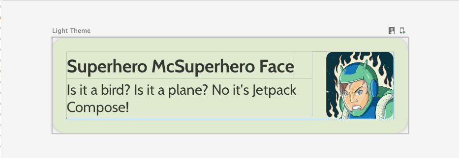
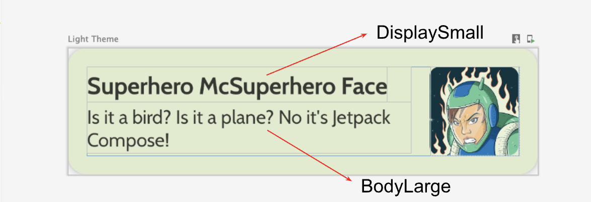
HeroesScreen.kt, en el paquetecom.example.superheroes. En este archivo, crearás un elemento de lista y elementos componibles de lista. - Crea un elemento componible para representar el elemento de lista de un superhéroe, que se verá como la siguiente captura de pantalla y las especificaciones de la IU.
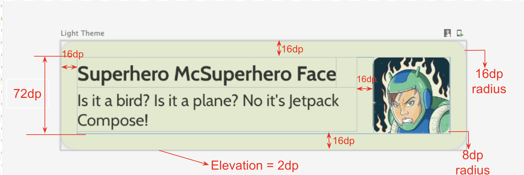
Sigue esta especificación de IU o libera tu creatividad y diseña tu propio elemento:
- La elevación de la tarjeta es de
2dp. - La altura del elemento de lista es
72dpcon padding16dp. - El radio de recorte del elemento de lista es de
16dp. - Diseño
Boxcon imagen con tamaño de72dp. - El radio de recorte de la imagen es de
8dp. - El espacio entre la imagen y el texto es de
16dp. - El estilo del nombre del superhéroe es
DisplaySmall. - El estilo de la descripción del superhéroe es
BodyLarge.
Explora las diferentes opciones de padding y tamaño. De acuerdo con los lineamientos de Material 3, el padding debe ser un incremento de 4dp.
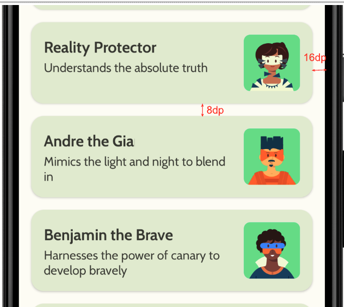
Cómo crear la columna diferida
- Crea otro elemento de componibilidad que tome la lista de héroes y la muestre. Aquí es donde usarás un
LazyColumn. - Usa las siguientes especificaciones de IU para el padding.
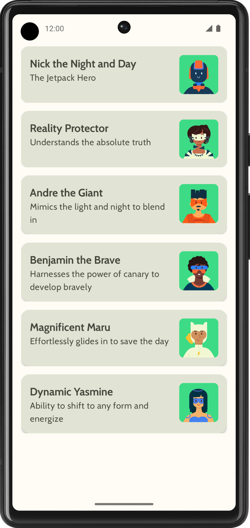
Después de finalizar la implementación, tu app debería parecerse a la siguiente captura de pantalla:
5. Agrega la barra superior de la app
Agrega una barra superior a la app.
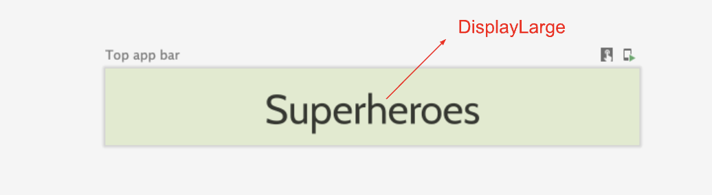
- En
MainActivity.kt, agrega una función de componibilidad para mostrar la barra superior de la app. Agrega texto a la barra superior de la app; este podría ser el nombre. Alinéalo en el centro horizontal y vertical. - Puedes establecer la barra superior de la app con el estilo como
DisplayLarge.
- Usa
scaffoldpara mostrar la barra superior de la app. Consulta la documentación de Barra superior de la app: Material Design 3 si es necesario.
Personaliza el color de la barra de estado
Para que tu app sea de pantalla completa, puedes personalizar el color de la barra de estado para que coincida con el color de fondo.
- En
Theme.kt, agrega este nuevo método para cambiar los colores de la barra de estado y la barra de navegación de borde a borde.
/**
 * Sets up edge-to-edge for the window of this [view]. The system icon colors are set to either
 * light or dark depending on whether the [darkTheme] is enabled or not.
 */
private fun setUpEdgeToEdge(view: View, darkTheme: Boolean) {
    val window = (view.context as Activity).window
    WindowCompat.setDecorFitsSystemWindows(window, false)
    window.statusBarColor = Color.Transparent.toArgb()
    val navigationBarColor = when {
        Build.VERSION.SDK_INT >= 29 -> Color.Transparent.toArgb()
        Build.VERSION.SDK_INT >= 26 -> Color(0xFF, 0xFF, 0xFF, 0x63).toArgb()
        // Min sdk version for this app is 24, this block is for SDK versions 24 and 25
        else -> Color(0x00, 0x00, 0x00, 0x50).toArgb()
    }
    window.navigationBarColor = navigationBarColor
    val controller = WindowCompat.getInsetsController(window, view)
    controller.isAppearanceLightStatusBars = !darkTheme
    controller.isAppearanceLightNavigationBars = !darkTheme
}
- En la función
SuperheroesTheme(), llama a la funciónsetUpEdgeToEdge()desde dentro del bloqueSideEffect.
fun SuperheroesTheme(
    darkTheme: Boolean = isSystemInDarkTheme(),
    // Dynamic color is available on Android 12+
    // Dynamic color in this app is turned off for learning purposes
    dynamicColor: Boolean = false,
    content: @Composable () -> Unit
) {
    //...
    val view = LocalView.current
    if (!view.isInEditMode) {
        SideEffect {
            setUpEdgeToEdge(view, darkTheme)
        }
    }

    //...
}
|
|
6. Obtén el código de la solución
Para descargar el código del codelab terminado, puedes usar este comando de git:
$ git clone https://github.com/google-developer-training/basic-android-kotlin-compose-training-superheroes.git
También puedes descargar el repositorio como un archivo ZIP, descomprimirlo y abrirlo en Android Studio.
Si deseas ver el código de la solución, puedes hacerlo en GitHub.