
1. Before you begin
You apply what you learned in this unit to create your own business card app. Unlike previous codelabs in which you were given step-by-step instructions to follow, here you're only provided with guidelines and suggestions about what you can build with the concepts that you learned so far. You're encouraged to use your creativity to build the app independently with limited guidance.
It's a challenge to build an app on your own, but don't worry because you've had enough practice! You can use the same skills that you learned in this new context. You can always refer to previous codelabs if you're unsure of how to implement certain parts of the app.
When you build this app on your own and solve the problems that you face along the way, you learn faster and retain the concepts longer. As a side benefit, the app is completely customized, so you can personalize and showcase it to your friends and family!
Prerequisites
- Ability to create and run a project in Android Studio.
- Experience with composable functions, which includes
TextandImagecomposables.
What you'll learn
- How to build simple layouts with
RowandColumncomposables, and arrange them withhorizontalAlignmentandverticalArrangementparameters. - How to customize Compose elements with a
Modifierobject.
What you'll build
- An Android app that displays a business card.
What you'll need
- A computer with Android Studio installed.
- The Android logo to display in the app, which is provided for your use in this repo.
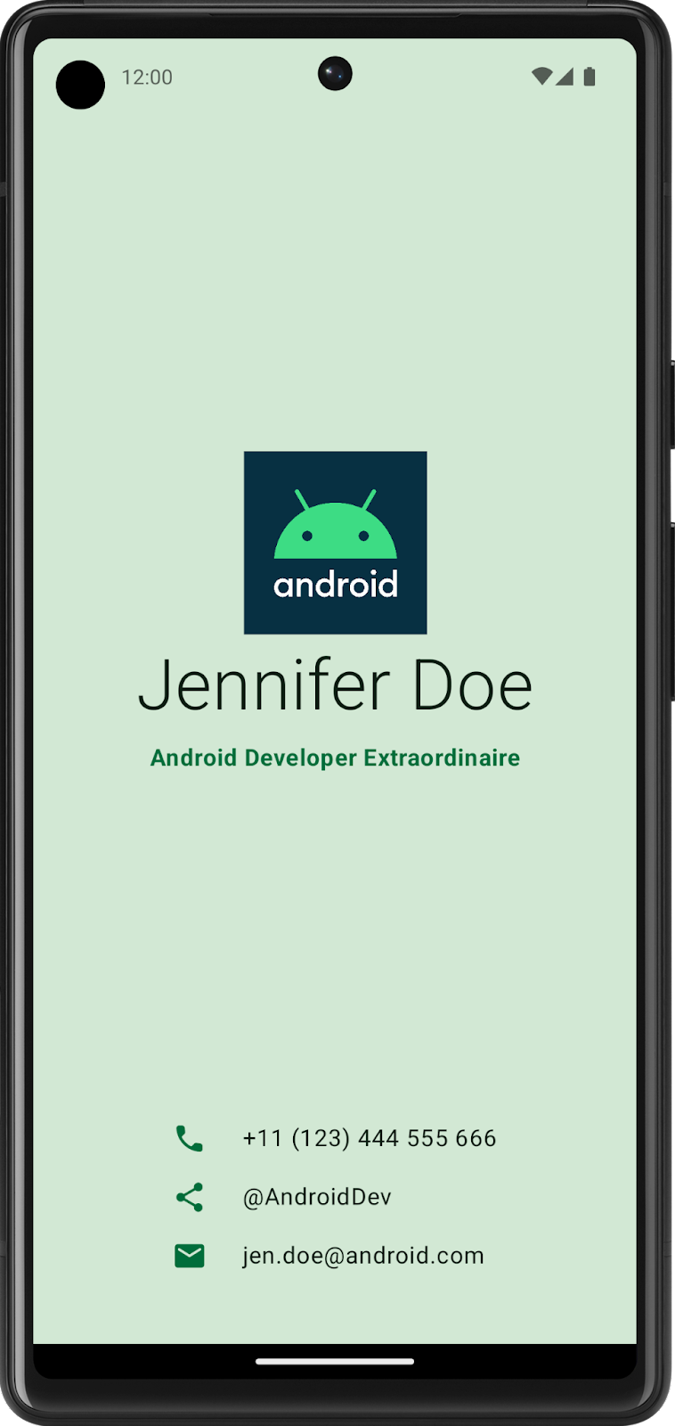
Here's a sample of how your app might look at the end of this project:
2. Build UI with composables
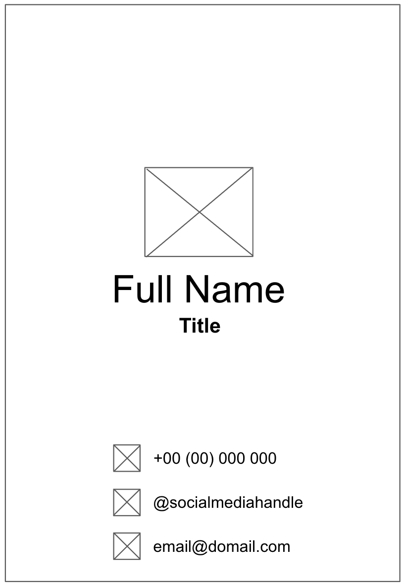
Create a low-fidelity prototype
When you begin a project, it's useful to visualize how UI elements need to fit together on the screen. In professional-development work, oftentimes there are designers or design teams that provide developers with UI mockups, or designs, that contain exact specifications. However, if you don't work with a designer, you can create a low-fidelity, or low-fi, prototype on your own. Low-fi prototype refers to a simple model, or drawing, that provides a basic idea of what the app looks like.
Surprisingly, it's common to work without a designer, which makes the ability to sketch simple UI mockups a handy skill for a developer. Don't worry, you don't need to be a professional designer or even know how to use design tools. You can simply use a pen and paper, Slides, or Drawings to help you build it.
To create a low-fidelity prototype:
- On your preferred medium, add elements that make up your app. Some elements to consider include the Android logo, your name, title, and contact information, icons that indicate contact information. For example, a telephone icon indicates a phone number.
- Add these elements in different positions and then evaluate them visually. Don't worry about getting it perfect the first time. You can always settle on one design now and iteratively improve it later.
You may come up with a low-fi design that looks like this image:
Convert design into code
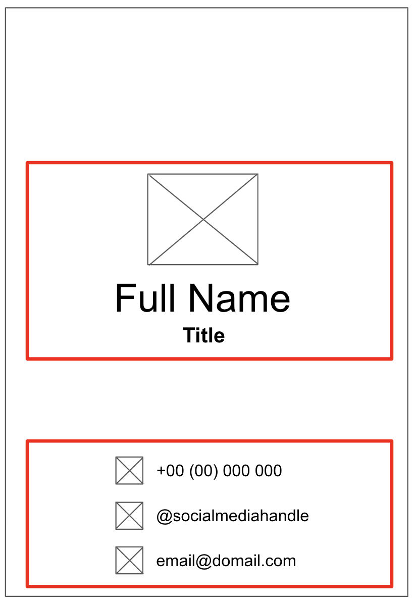
To use your prototype to help translate your design into code:
- Identify different logical sections of the apps and draw boundaries around them. This step helps you divide your screen into small composables and think about the hierarchy of the composables.
In this example, you can divide the screen into two sections:
- Logo, name, and title
- Contact information
Each section can be converted into one composable. This way you are able to build your UI with small composable building blocks. You can arrange each of these sections with layout composables, such as a Row or Column composable.
- For each section of the app that contains multiple UI elements, draw boundaries around them. These boundaries help you see how one element relates to another in the section.
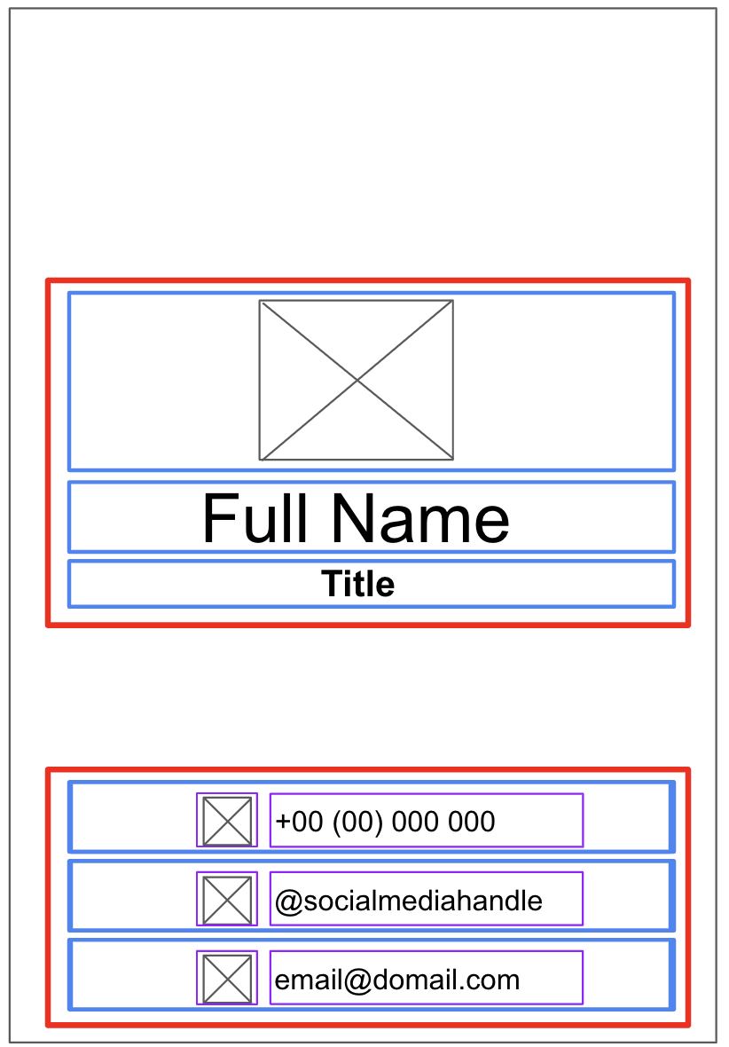
Now it's easier to see how you can arrange Text, Image, Icon, and other composables with layout composables.
Some notes on various composables that you may use:
Row or Column composables
- Experiment with various
horizontalArrangementandverticalAlignmentparameters inRowandColumncomposables to match the design that you have.
Image composables
- Don't forget to fill in the
contentDescriptionparameter. As mentioned in the previous codelab, TalkBack uses thecontentDescriptionparameter to help with the accessibility of the app. If theImagecomposable is only used for decorative purposes or there's aTextelement that describes theImagecomposable, you can set thecontentDescriptionparameter tonull. You can also customize the size of the image by specifying theheightandwidthmodifiers in themodifierparameter.
Icon composables
- You can use the
Iconcomposable to add icons from Material Design. You can change theTintparameter to adjust the icon color to fit the style of your business card. Similar to theImagecomposable, don't forget to fill in thecontentDescriptionparameter.
Text composables
- You can experiment with various values of
fontSize,textAlign,color, andfontWeightparameters to style your text.
Spacing and alignment
- You can use
Modifierarguments, such aspaddingandweightmodifiers, to help with the arrangement of composables. - You can also use
Spacercomposable to make spacing more explicit.
Color customization
- You can use custom color with the
Colorclass and the color hex code (a hexadecimal way to represent a color in RGB format). For example, the green color of Android has a hex code of #3DDC84. You can make your text the same green color with this code:
Text("Example", color = Color(0xFF3ddc84))
- Run the app in an emulator or on your Android device to ensure that it compiles.
3. Good luck!
Hopefully, this guide inspires you to create your own business card with Compose! You can further customize your app with your own logo or even your own photo! After you're done, showcase your work with your friends and family. If you'd like to share your work on social media, use the hashtag #AndroidBasics.