
1. Antes de começar
Neste codelab, você aprenderá a criar uma lista rolável no app usando o Jetpack Compose.
Você vai trabalhar com o app Affirmations, que mostra uma lista de afirmações combinadas com belas imagens para deixar seu dia mais positivo.
Os dados já estão disponíveis. Tudo o que você precisa fazer é mostrá-los na interface.
Pré-requisitos
- Familiaridade com listas no Kotlin
- Experiência em criação de layouts com o Jetpack Compose
- Saber executar apps em um dispositivo ou emulador
O que você vai aprender
- Como criar um card do Material Design usando o Jetpack Compose.
- Como criar uma lista rolável usando o Jetpack Compose.
O que você vai criar
- Partindo de um app já existente, você vai adicionar uma lista rolável à interface
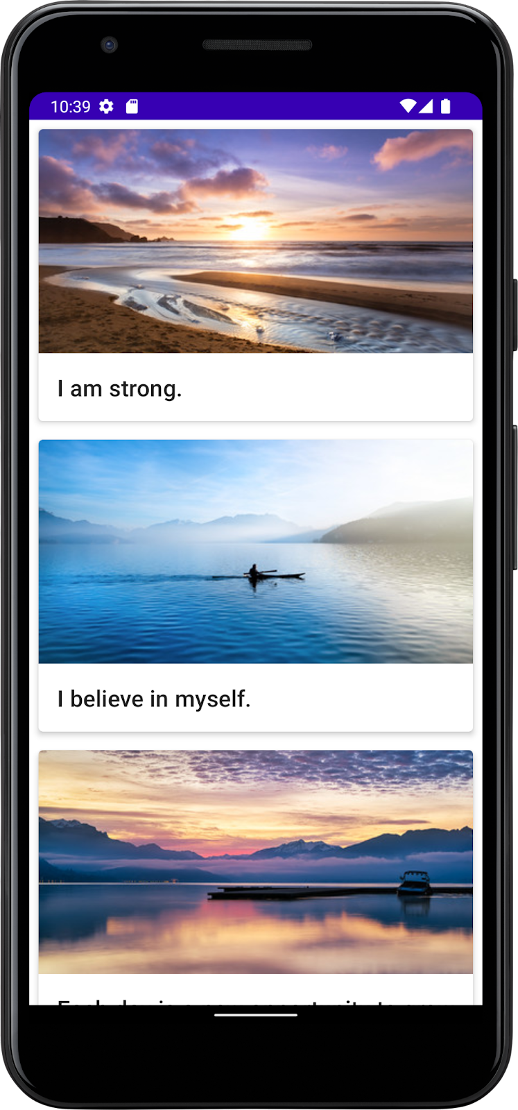
O produto final ficará assim:
Pré-requisitos
- Um computador com acesso à Internet, um navegador da Web e o Android Studio
- Acesso ao GitHub
baixe o código inicial
No Android Studio, abra a pasta basic-android-kotlin-compose-training-affirmations.
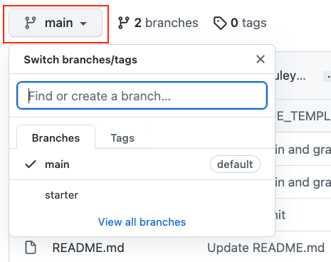
- Navegue até a página do repositório do GitHub fornecida para o projeto.
- Verifique se o nome da ramificação corresponde ao especificado no codelab. Por exemplo, na captura de tela a seguir, o nome da ramificação é main.
- Na página do GitHub do projeto, clique no botão Code, que vai mostrar uma janela pop-up.
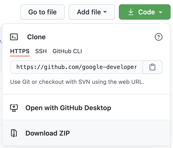
- Na janela pop-up, clique no botão Download ZIP para salvar o projeto no seu computador. Aguarde a conclusão do download.
- Localize o arquivo no computador. Geralmente ele é salvo na pasta Downloads.
- Clique duas vezes para descompactar o arquivo ZIP. Isso cria uma nova pasta com os arquivos do projeto.
Abrir o projeto no Android Studio
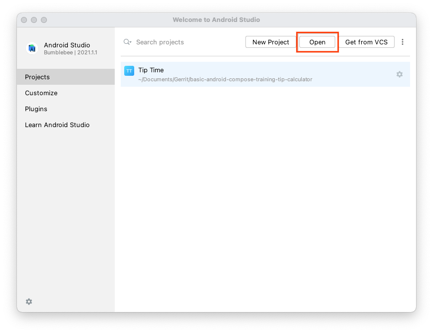
- Inicie o Android Studio.
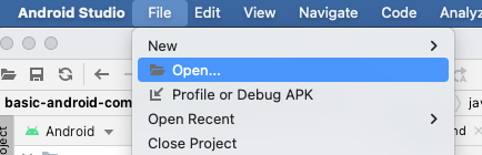
- Na janela Welcome to Android Studio, clique em Open.
Observação: caso o Android Studio já esteja aberto, selecione a opção File > Open.
- No navegador de arquivos, vá até a pasta descompactada do projeto, que provavelmente está na pasta Downloads.
- Clique duas vezes nessa pasta do projeto.
- Aguarde o Android Studio abrir o projeto.
- Clique no botão Run
 para criar e executar o app. Confira se ele é criado da forma esperada.
2. Criar uma classe de dados do item da lista
Criar uma classe de dados para uma afirmação
Em apps Android, as listas são compostas por itens. Para dados únicos, isso pode ser algo simples, como uma string ou um número inteiro. Para itens de lista com vários dados, como imagem e texto, você vai precisar de uma classe que contenha todas essas propriedades. As classes de dados são um tipo de classe que contém apenas propriedades e podem fornecer alguns métodos utilitários para trabalhar com essas propriedades.
- Crie um novo pacote em com.example.affirmations.
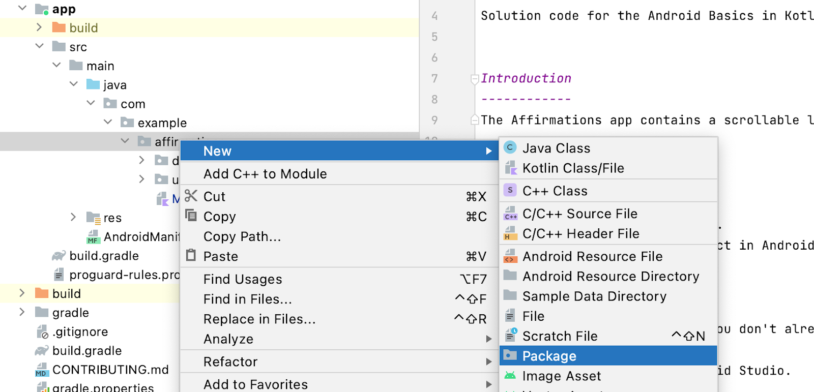
Nomeie o novo pacote como model. O pacote de modelo vai conter o modelo de dados que será representado por uma classe de dados. Essa classe de dados será composta por propriedades que representam as informações relevantes para o que será uma "Afirmação", que consiste em um recurso de string e um de imagem. Os pacotes são diretórios que contêm classes e até mesmo outros diretórios.
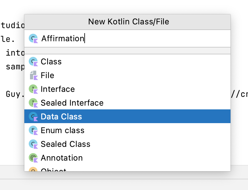
- Crie uma nova classe no pacote com.example.affirmations.model.
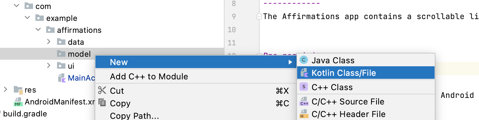
Dê o nome Affirmation à nova classe e defina-a como Data Class.
- Cada
Affirmationconsiste em uma imagem e uma string. Crie duas propriedadesvalna classe de dadosAffirmation. Uma delas precisa ter o nomestringResourceIde a outra,imageResourceId. Ambas precisam ser números inteiros.
Affirmation.kt
data class Affirmation(
   val stringResourceId: Int,
   val imageResourceId: Int
)
- Marque a propriedade
stringResourceIdcom a anotação@StringRese marqueimageResourceIdcom@DrawableRes. OstringResourceIdrepresenta um ID para o texto da afirmação armazenado em um recurso de string. OimageResourceIdrepresenta um ID para a imagem da afirmação armazenada em um recurso drawable.
Affirmation.kt
data class Affirmation(
   @StringRes val stringResourceId: Int,
   @DrawableRes val imageResourceId: Int
)
- Agora, abra o arquivo
Datasource.ktno pacote com.example.affirmations.data e remova a marca de comentário do conteúdo da classeDatasource.
Datasource.kt
class Datasource() {
   fun loadAffirmations(): List<Affirmation> {
       return listOf<Affirmation>(
           Affirmation(R.string.affirmation1, R.drawable.image1),
           Affirmation(R.string.affirmation2, R.drawable.image2),
           Affirmation(R.string.affirmation3, R.drawable.image3),
           Affirmation(R.string.affirmation4, R.drawable.image4),
           Affirmation(R.string.affirmation5, R.drawable.image5),
           Affirmation(R.string.affirmation6, R.drawable.image6),
           Affirmation(R.string.affirmation7, R.drawable.image7),
           Affirmation(R.string.affirmation8, R.drawable.image8),
           Affirmation(R.string.affirmation9, R.drawable.image9),
           Affirmation(R.string.affirmation10, R.drawable.image10))
   }
}
3. Adicionar uma lista ao seu app
Criar um card de item da lista
O app precisa exibir uma lista de afirmações. A primeira etapa na configuração da interface para exibir uma lista é criar um item correspondente. Cada item da afirmação é composto por uma imagem e uma string. Os dados de cada um desses itens vêm com o código inicial, e você vai criar o componente de interface para mostrar cada item.
O item é um elemento Card combinável, que contém os elementos Image e Text. No Compose, Card é uma plataforma que exibe conteúdo e ações em um único contêiner. O card de afirmação ficará assim:

O card mostra uma imagem com texto abaixo. Esse layout vertical pode ser alcançado usando um elemento Column combinável encapsulado em um Card. Você pode fazer um teste ou seguir as etapas abaixo para fazer isso.
- Abrir o arquivo MainActivity.kt.
- Crie um novo método abaixo do método
AffirmationApp(), chamadoAffirmationCard(), e adicione a anotação@Composable.
MainActivity.kt
@Composable
fun AffirmationApp() {
   val context = LocalContext.current
   AffirmationsTheme {

   }
}

@Composable
fun AffirmationCard() {

}
- Edite a assinatura do método para usar um objeto
Affirmationcomo parâmetro. O objetoAffirmationvem do pacotemodel.
MainActivity.kt
@Composable
fun AffirmationCard(affirmation: Affirmation) {

}
- Adicione um parâmetro
modifierà assinatura. Defina um valor padrão deModifierpara o parâmetro.
MainActivity.kt
@Composable
fun AffirmationCard(affirmation: Affirmation, modifier: Modifier = Modifier) {

}
- No método
AffirmationCard, chame o elementoCardcombinável. Transmita estes parâmetros:modifiereelevation. Transmita um objetoModifiercom o atributopaddingdefinido como8.dppara o parâmetromodifier. Transmita um valor de4.dppara oelevation. A propriedadeelevationserá abordada com mais detalhes posteriormente.
MainActivity.kt
@Composable
fun AffirmationCard(affirmation: Affirmation, modifier: Modifier = Modifier) {Card(modifier = modifier.padding(8.dp), elevation = 4.dp) {
  }
}
- Adicione um elemento
Columncombinável aoCard. Os itens em um elementoColumncombinável se organizam verticalmente na interface. Isso permite que você posicione uma imagem acima do texto associado. Por outro lado, umaRowcombinável organiza os itens na horizontal.
MainActivity.kt
@Composable
fun AffirmationCard(affirmation: Affirmation, modifier: Modifier = Modifier) {
  Card(modifier = modifier.padding(8.dp), elevation = 4.dp) {
    Column {
    }
  }
}
- Adicione um elemento
Imagecombinável ao corpo da lambda doColumn. Não esqueça que umaImagecombinável sempre exige um recurso para exibição e umacontentDescription. O recurso precisa ser umpainterResourcetransmitido ao parâmetropainter. O métodopainterResourcecarregará drawables vetoriais ou formatos de recursos rasterizados, como PNGs. Além disso, transmita umstringResourcepara o parâmetrocontentDescription.
MainActivity.kt
@Composable
fun AffirmationCard(affirmation: Affirmation, modifier: Modifier = Modifier) {
  Card(modifier = Modifier.padding(8.dp), elevation = 4.dp) {
    Column {
      Image(
        painter = painterResource(affirmation.imageResourceId),
        contentDescription = stringResource(affirmation.stringResourceId)
      )
    }
  }
}
- Além dos parâmetros
painterecontentDescription, transmita ummodifiere umcontentScale. UmcontentScaledetermina como a imagem deve ser dimensionada e exibida. O objetoModifierprecisa ter o atributofillMaxWidthdefinido e uma altura de194.dp.contentScaleprecisa serContentScale.Crop.
MainActivity.kt
@Composable
fun AffirmationCard(affirmation: Affirmation, modifier: Modifier = Modifier) {
  Card(modifier = Modifier.padding(8.dp), elevation = 4.dp) {
    Column {
      Image(
        painter = painterResource(affirmation.imageResourceId),
        contentDescription = stringResource(affirmation.stringResourceId),
        modifier = Modifier
          .fillMaxWidth()
          .height(194.dp),
        contentScale = ContentScale.Crop
      )
    }
  }
}
- Dentro da
Column, crie umTextcombinável após o elementoImage. Transmita umstringResourcedaaffirmation.stringResourceIdao parâmetrotext, transmita um objetoModifiercom o atributopaddingdefinido como16.dpe defina um tema de texto transmitindoMaterialTheme.typography.h6ao parâmetrostyle.
MainActivity.kt
@Composable
fun AffirmationCard(affirmation: Affirmation, modifier: Modifier = Modifier) {
  Card(modifier = Modifier.padding(8.dp), elevation = 4.dp) {
    Column {
      Image(
        painter = painterResource(affirmation.imageResourceId),
        contentDescription = stringResource(affirmation.stringResourceId),
        modifier = Modifier
          .fillMaxWidth()
          .height(194.dp),
        contentScale = ContentScale.Crop
      )
      Text(
        text = stringResource(affirmation.stringResourceId),
        modifier = Modifier.padding(16.dp),
        style = MaterialTheme.typography.h6
      )
    }
  }
}
Visualizar o elemento AffirmationCard combinável
Você trabalhou duro para criar o card, que é a parte principal da interface do app Affirmations. Para verificar se o card está correto, crie um elemento combinável que pode ser visualizado sem precisar abrir o app inteiro.
- Crie um método particular chamado
AffirmationCardPreview(). Adicione as anotações@Previewe@Composableao método.
MainActivity.kt
@Preview
@Composable
private fun AffirmationCardPreview() {
}
- No método, chame o elemento
AffirmationCardcombinável e transmita um novo objetoAffirmationcom o recurso de stringR.string.affirmation1e o recurso drawableR.drawable.image1transmitido ao construtor.
MainActivity.kt
@Preview
@Composable
private fun AffirmationCardPreview() {
  AffirmationCard(Affirmation(R.string.affirmation1, R.drawable.image1))
}
- Abra a guia Split para visualizar o
AffirmationCard. Se necessário, clique em Build & Refresh no painel Design para exibir a visualização.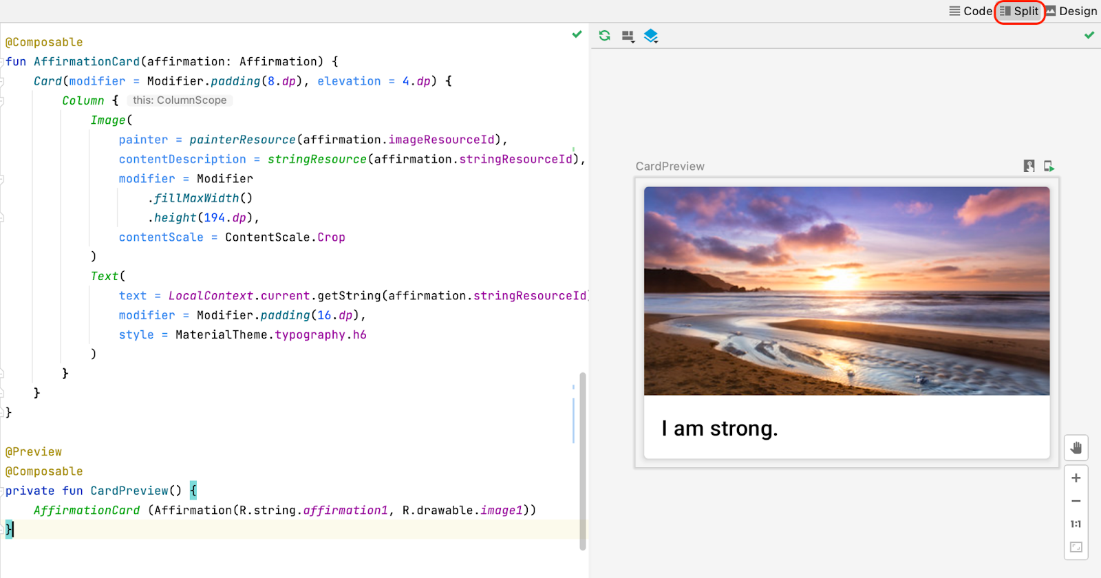
Criar a lista
O componente do item é o elemento fundamental da lista. Depois que o item da lista for criado, ele poderá ser usado para criar o componente da lista.
- Crie um método com o nome
AffirmationList(), adicione a anotação@Composablee declare umaListde objetosAffirmationcomo um parâmetro na assinatura do método.
MainActivity.kt
@Composable
private fun AffirmationList(affirmationList: List<Affirmation>) {
}
- Declare um objeto
modifiercomo um parâmetro na assinatura do método com um valor padrão deModifier.
MainActivity.kt
@Composable
private fun AffirmationList(affirmationList: List<Affirmation>, modifier: Modifier = Modifier) {
}
- No Jetpack Compose, uma lista rolável pode ser feita usando a função
LazyColumn. A diferença entre umaLazyColumne umaColumné que umaColumnprecisa ser usada quando há poucos itens para mostrar, já que o Compose carrega todos de uma só vez. UmaColumnsó pode conter um número predefinido ou fixo de elementos combináveis. UmaLazyColumnpode adicionar conteúdo sob demanda, o que é bom para listas longas, especialmente quando o tamanho da lista é desconhecido. UmaLazyColumntambém oferece rolagem por padrão, sem código adicional. Declare umaLazyColumncombinável dentro do métodoAffirmationList().
MainActivity.kt
@Composable
private fun AffirmationList(affirmationList: List<Affirmation>, modifier: Modifier = Modifier) {
  LazyColumn {
  }
}
- No corpo da lambda da
LazyColumn, chame o métodoitems()e transmita aaffirmationList. O métodoitems()é como você adiciona itens àLazyColumn. Esse método é algo exclusivo desse elemento combinável e não é uma prática comum na maioria dos elementos.
MainActivity.kt
@Composable
private fun AffirmationList(affirmationList: List<Affirmation>, modifier: Modifier = Modifier) {
  LazyColumn {
    items(affirmationList){
    }
  }
}
- Uma chamada para o método
items()requer uma função lambda. Nessa função, especifique um parâmetro deaffirmationque representa um item de afirmação daaffirmationList.
MainActivity.kt
@Composable
private fun AffirmationList(affirmationList: List<Affirmation>, modifier: Modifier = Modifier) {
  LazyColumn {
    items(affirmationList){ affirmation ->
    }
  }
}
- Para cada afirmação da lista, chame o elemento
AffirmationCard()combinável e transmita a ele aaffirmation.
MainActivity.kt
@Composable
private fun AffirmationList(affirmationList: List<Affirmation>, modifier: Modifier = Modifier) {
  LazyColumn {
    items(affirmationList){ affirmation ->
      AffirmationCard(affirmation)
    }
  }
}
Exibir a lista
- Na lambda, chame o elemento
AffirmationListcombinável e transmitaDataSource().loadAffirmations()para o parâmetroaffirmationList.
MainActivity.kt
@Composable
fun AffirmationApp() {
   AffirmationsTheme {
       Scaffold(
           content = {
               AffirmationList(affirmationList = Datasource().loadAffirmations())
           }
       )
   }
}
Execute o app Affirmations em um dispositivo ou emulador e confira o produto final.
4. Acessar o código da solução
Se você quiser conferir o código da solução, acesse o GitHub.
- Navegue até a página do repositório do GitHub fornecida para o projeto.
- Verifique se o nome da ramificação corresponde ao especificado no codelab. Por exemplo, na captura de tela a seguir, o nome da ramificação é main.
- Na página do GitHub do projeto, clique no botão Code, que vai mostrar uma janela pop-up.
- Na janela pop-up, clique no botão Download ZIP para salvar o projeto no seu computador. Aguarde a conclusão do download.
- Localize o arquivo no computador. Geralmente ele é salvo na pasta Downloads.
- Clique duas vezes para descompactar o arquivo ZIP. Isso cria uma nova pasta com os arquivos do projeto.
Abrir o projeto no Android Studio
- Inicie o Android Studio.
- Na janela Welcome to Android Studio, clique em Open.
Observação: caso o Android Studio já esteja aberto, selecione a opção File > Open.
- No navegador de arquivos, vá até a pasta descompactada do projeto, que provavelmente está na pasta Downloads.
- Clique duas vezes nessa pasta do projeto.
- Aguarde o Android Studio abrir o projeto.
- Clique no botão Run para criar e executar o app. Confira se ele é criado da forma esperada.
5. Conclusão
Agora você já sabe como criar cards, itens de lista e listas roláveis usando o Jetpack Compose. Essas são apenas ferramentas básicas para criar uma lista. Você pode soltar a criatividade e personalizar itens da lista como quiser.
Resumo
- Use os elementos combináveis
Cardpara criar itens de lista. - Modifique a UI contida em um elemento combinável
Card. - Crie uma lista rolável usando a
LazyColumncombinável. - Crie uma lista usando itens de lista personalizados