
1. Before you begin
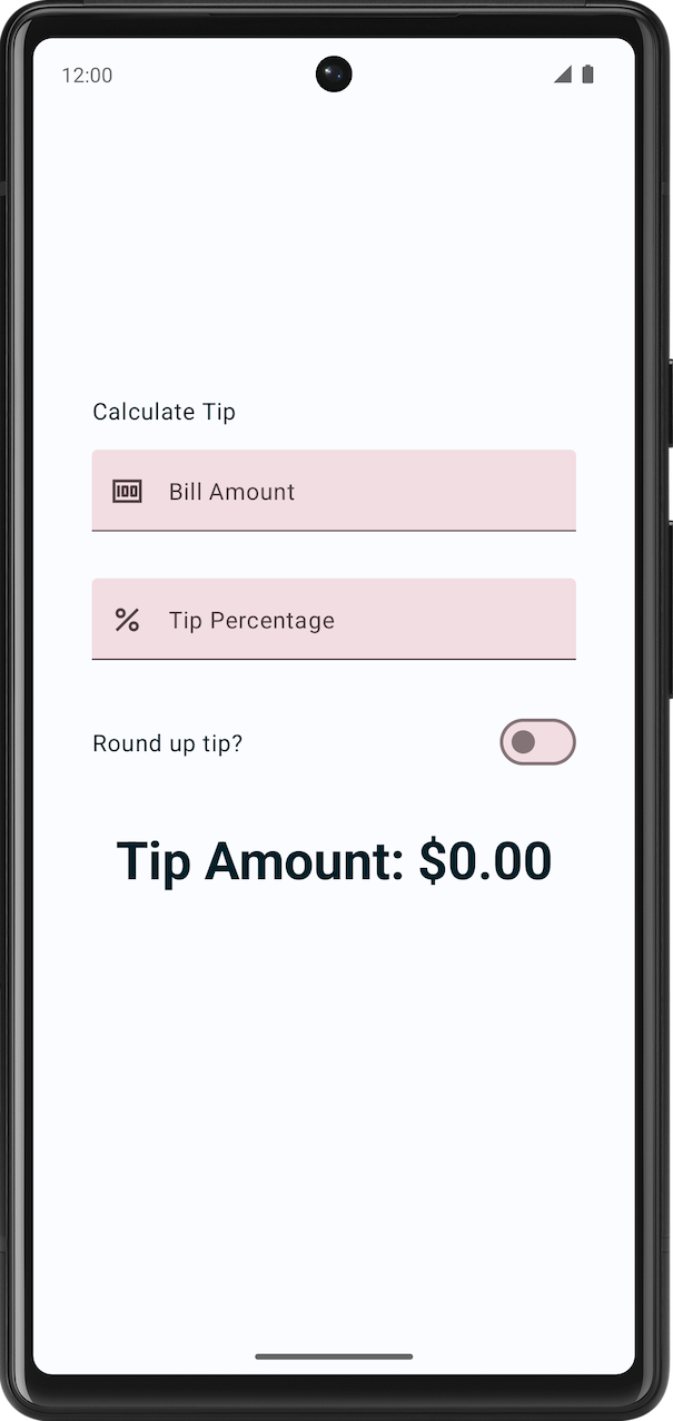
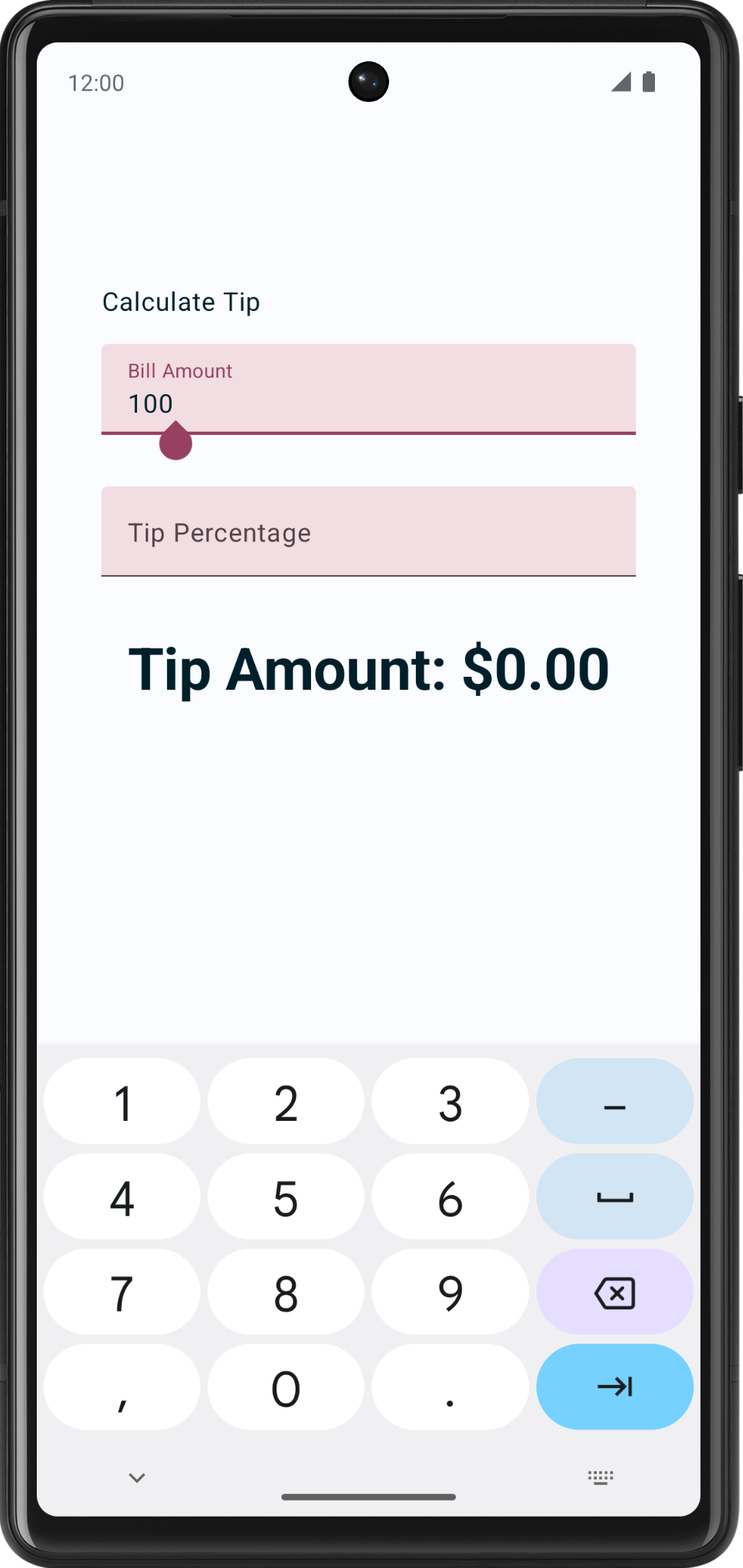
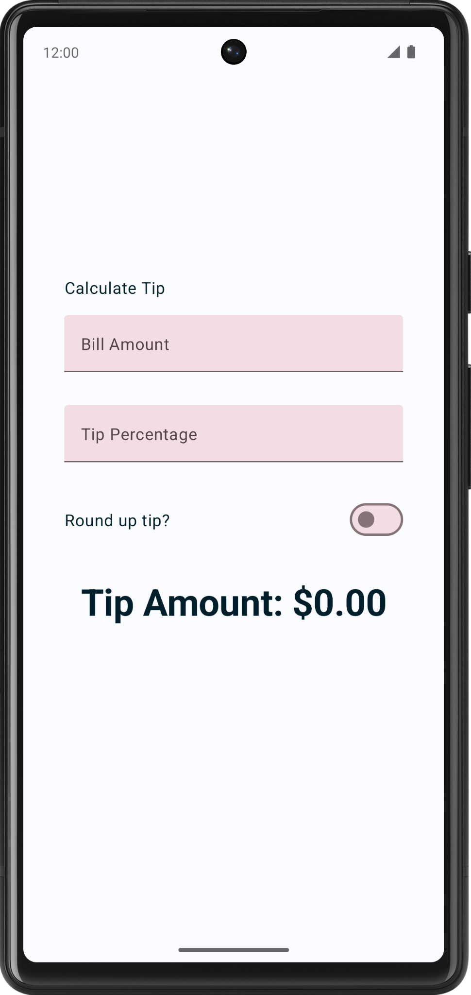
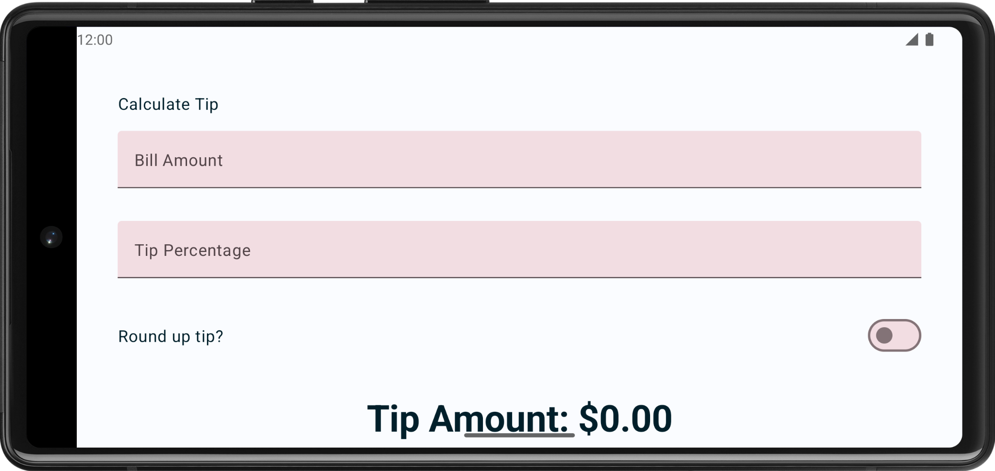
In this codelab, you use the solution code from the Intro to state in Compose codelab to build an interactive tip calculator that can automatically calculate and round a tip amount when you enter the bill amount and tip percentage. You can see the final app in this image:
Prerequisites
- The Intro to state in Compose codelab.
- Ability to add
TextandTextFieldcomposables to an app. - Knowledge of the
remember()function, state, state hoisting, and the difference between stateful and stateless composable functions.
What you'll learn
- How to add an action button to a virtual keyboard.
- What a
Switchcomposable is and how to use it. - Add leading icons to the text fields.
What you'll build
- A Tip Time app that calculates tip amounts based on the user's inputted bill amount and tip percentage.
What you'll need
- The latest version of Android Studio
- The solution code from the Intro to state in Compose codelab
2. Get the starter code
To get started, download the starter code:
Alternatively, you can clone the GitHub repository for the code:
$ git clone https://github.com/google-developer-training/basic-android-kotlin-compose-training-tip-calculator.git
$ cd basic-android-kotlin-compose-training-tip-calculator
$ git checkout state
You can browse the code in the Tip Time GitHub repository.
3. Starter app overview
This codelab begins with the Tip Time app from the previous codelab Intro to state in Compose, which provides the user interface needed to calculate a tip with a fixed tip percentage. The Bill amount text box lets the user enter the cost of the service. The app calculates and displays the tip amount in a Text composable.
Run the Tip Time App
- Open the Tip Time project in Android Studio and run the app on an emulator or a device.
- Enter a bill amount. The app automatically calculates and displays the tip amount.
In the current implementation, the percentage of the tip is hardcoded to 15%. In this codelab, you extend this feature with a text field that lets the app calculate a custom tip percentage and round the tip amount.
Add necessary string resources
- In the Project tab, click res > values > strings.xml.
- In between the
strings.xmlfile's<resources>tags, add these string resources:
<string name="how_was_the_service">Tip Percentage</string>
<string name="round_up_tip">Round up tip?</string>
The strings.xml file should look like this code snippet, which includes the strings from the previous codelab:
strings.xml
<resources>
    <string name="app_name">Tip Time</string>
    <string name="calculate_tip">Calculate Tip</string>
    <string name="bill_amount">Bill Amount</string>
    <string name="how_was_the_service">Tip Percentage</string>
    <string name="round_up_tip">Round up tip?</string>
    <string name="tip_amount">Tip Amount: %s</string>
</resources>
4. Add a tip-percentage text field
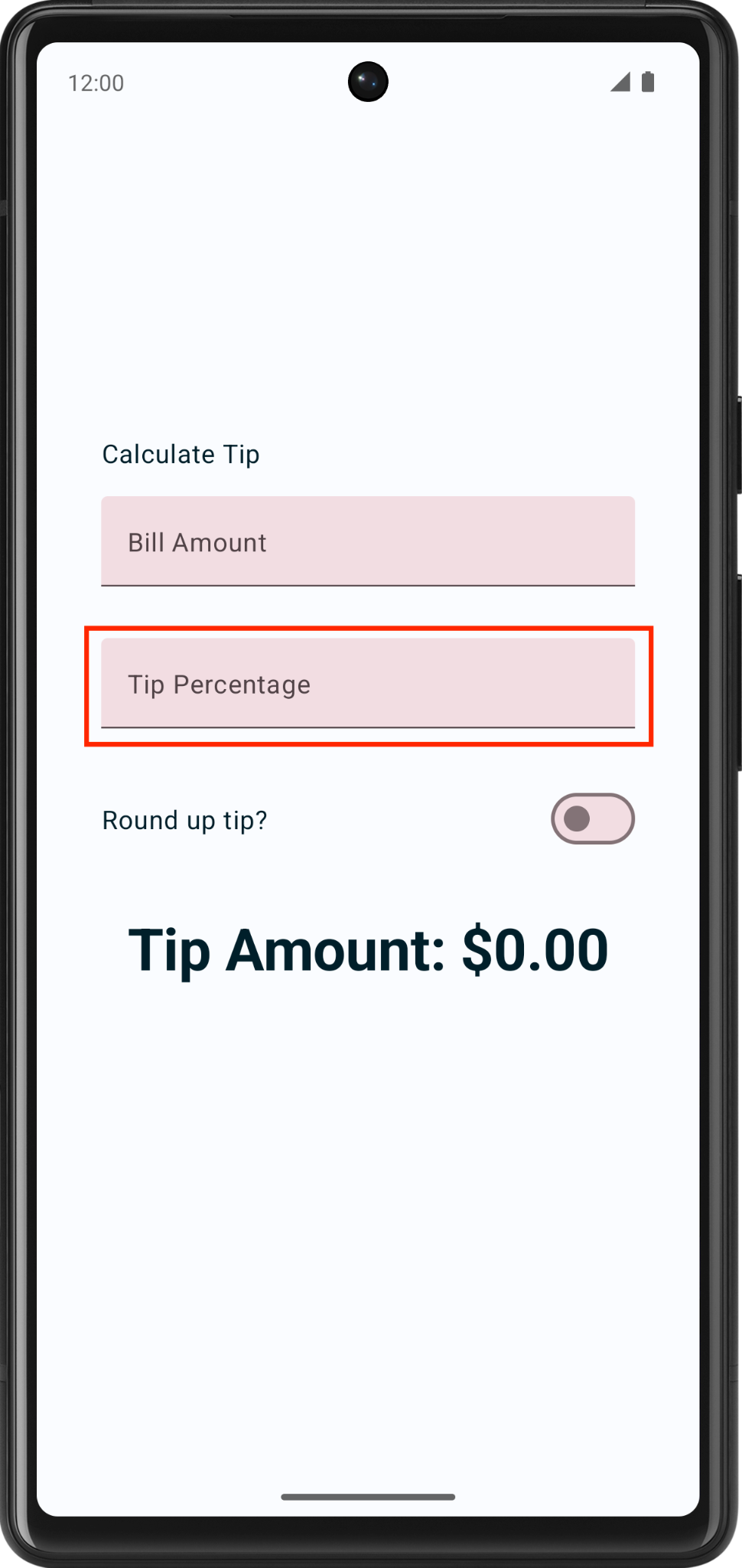
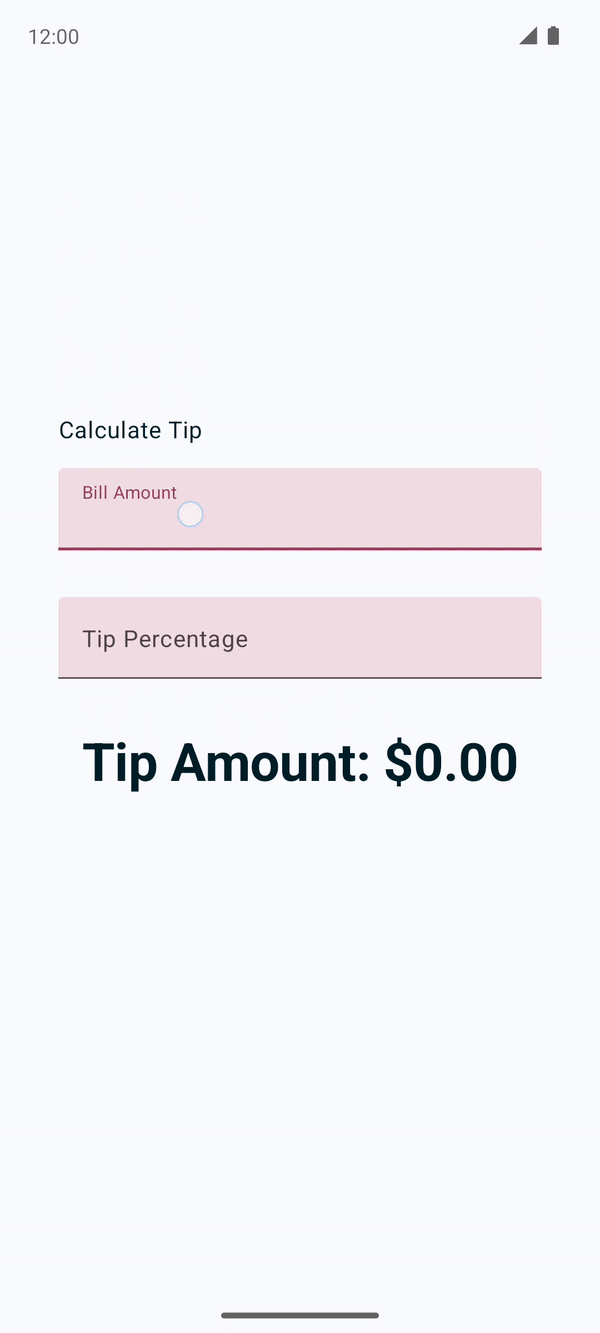
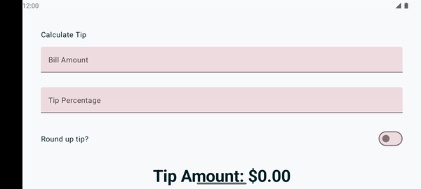
A customer may want to tip more or less based on the quality of the service provided and various other reasons. To accommodate this, the app should let the user calculate a custom tip. In this section, you add a text field for the user to enter a custom tip percentage as you can see in this image:
You already have a Bill Amount text field composable in your app, which is the stateless EditNumberField() composable function. In the previous codelab, you hoisted the amountInput state from the EditNumberField() composable to the TipTimeLayout() composable, which made the EditNumberField() composable stateless.
To add a text field, you can reuse the same EditNumberField() composable, but with a different label. To make this change, you need to pass in the label as a parameter, rather than hard coded it inside the EditNumberField() composable function.
Make the EditNumberField() composable function reusable:
- In the
MainActivity.ktfile in theEditNumberField()composable function's parameters, add alabelstring resource ofInttype:
@Composable
fun EditNumberField(
    label: Int,
    value: String,
    onValueChanged: (String) -> Unit,
    modifier: Modifier = Modifier
)
- In the function body, replace the hardcoded string resource ID with the
labelparameter:
@Composable
fun EditNumberField(
    //...
) {
     TextField(
         //...
         label = { Text(stringResource(label)) },
         //...
     )
}
- To denote that the
labelparameter is expected to be a string resource reference, annotate the function parameter with the@StringResannotation:
@Composable
fun EditNumberField(
    @StringRes label: Int,
    value: String,
    onValueChanged: (String) -> Unit,
    modifier: Modifier = Modifier
)
- Import the following:
import androidx.annotation.StringRes
- In the
TipTimeLayout()composable function'sEditNumberField()function call, set thelabelparameter to theR.string.bill_amountstring resource:
EditNumberField(
    label = R.string.bill_amount,
    value = amountInput,
    onValueChanged = { amountInput = it },
    modifier = Modifier.padding(bottom = 32.dp).fillMaxWidth()
)
- In the Preview pane there should not be any visual changes.

- In the
TipTimeLayout()composable function after theEditNumberField()function call, add another text field for the custom tip percentage. Make a call to theEditNumberField()composable function with these parameters:
EditNumberField(
    label = R.string.how_was_the_service,
    value = "",
    onValueChanged = { },
    modifier = Modifier.padding(bottom = 32.dp).fillMaxWidth()
)
This adds another text box for the custom tip percentage.
- The app preview now shows a Tip Percentage text field as you can see in this image:

- At the top of the
TipTimeLayout()composable function, add avarproperty calledtipInputfor the added text field's state variable. UsemutableStateOf("")to initialize the variable and surround the call withrememberfunction:
var tipInput by remember { mutableStateOf("") }
- In the new
EditNumberField()function call, set thevaluenamed parameter to thetipInputvariable and then update thetipInputvariable in theonValueChangedlambda expression:
EditNumberField(
    label = R.string.how_was_the_service,
    value = tipInput,
    onValueChanged = { tipInput = it },
    modifier = Modifier.padding(bottom = 32.dp).fillMaxWidth()
)
- In the
TipTimeLayout()function after thetipInputvariable's definition. Define avalnamedtipPercentthat converts thetipInputvariable to aDoubletype. Use an Elvis operator and return0, if the value isnull. This value could benullif the text field is empty.
val tipPercent = tipInput.toDoubleOrNull() ?: 0.0
- In the
TipTimeLayout()function, update thecalculateTip()function call, pass in thetipPercentvariable as the second parameter:
val tip = calculateTip(amount, tipPercent)
The code for the TipTimeLayout() function should look like this code snippet now:
@Composable
fun TipTimeLayout() {
    var amountInput by remember { mutableStateOf("") }
    var tipInput by remember { mutableStateOf("") }
    val amount = amountInput.toDoubleOrNull() ?: 0.0
    val tipPercent = tipInput.toDoubleOrNull() ?: 0.0

    val tip = calculateTip(amount, tipPercent)
    Column(
        modifier = Modifier.padding(40.dp),
        horizontalAlignment = Alignment.CenterHorizontally,
        verticalArrangement = Arrangement.Center
    ) {
        Text(
            text = stringResource(R.string.calculate_tip),
            modifier = Modifier
                .padding(bottom = 16.dp)
                .align(alignment = Alignment.Start)
        )
        EditNumberField(
            label = R.string.bill_amount,
            value = amountInput,
            onValueChanged = { amountInput = it },
            modifier = Modifier
                .padding(bottom = 32.dp)
                .fillMaxWidth()
        )
        EditNumberField(
            label = R.string.how_was_the_service,
            value = tipInput,
            onValueChanged = { tipInput = it },
            modifier = Modifier
                .padding(bottom = 32.dp)
                .fillMaxWidth()
        )
        Text(
            text = stringResource(R.string.tip_amount, tip),
            style = MaterialTheme.typography.displaySmall
        )
        Spacer(modifier = Modifier.height(150.dp))
    }
}
- Run the app on an emulator or a device, and then enter a bill amount and the tip percentage. Does the app calculate tip amount correctly?

5. Set an action button
In the previous codelab, you explored how to use the KeyboardOptions class to set the type of the keyboard. In this section, you explore how to set the keyboard action button with the same KeyboardOptions. A keyboard action button is a button at the end of the keyboard. You can see some examples in this table:
Property | Action button on the keyboard |
|
|
|
|
|
|
In this task, you set two different action buttons for the text boxes:
- A Next action button for the Bill Amount text box, which indicates that the user is done with the current input and wants to move to the next text box.
- A Done action button for the Tip Percentage text box, which indicates that the user finished providing input.
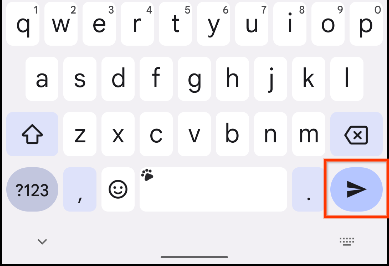
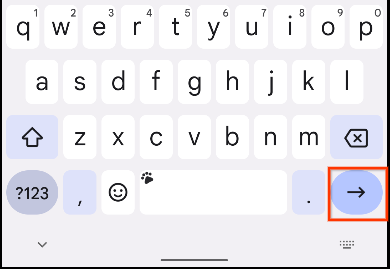
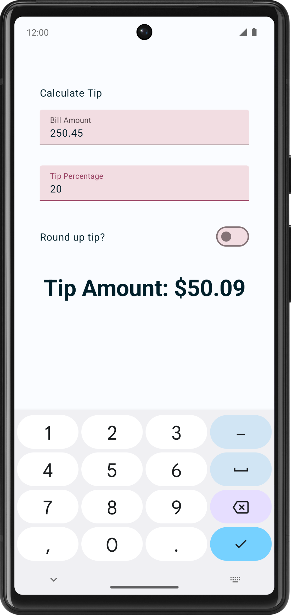
You can see examples of keyboards with these action buttons in these images:
|
|
Add keyboard options:
- In the
EditNumberField()function'sTextField()function call, pass theKeyboardOptionsconstructor animeActionnamed argument set to anImeAction.Nextvalue. Use theKeyboardOptions.Default.copy()function to make sure you use the other default options.
import androidx.compose.ui.text.input.ImeAction


@Composable
fun EditNumberField(
    //...
) {
    TextField(
        //...
        keyboardOptions = KeyboardOptions.Default.copy(
            keyboardType = KeyboardType.Number,
            imeAction = ImeAction.Next
        )
    )
}
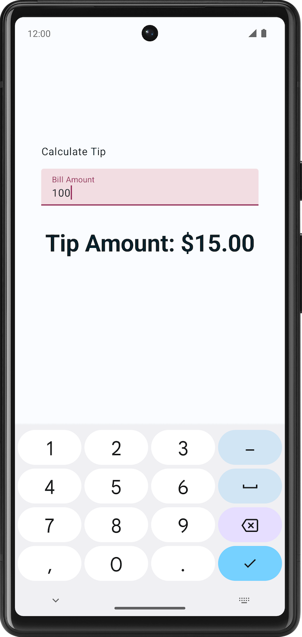
- Run the app on an emulator or a device. The keyboard now displays the Next action button as you can see in this image:
Notice the keyboard displays the same Next action button when the Tip Percentage text field is selected. However, you want two different action buttons for the text fields. You fix this problem shortly.
- Examine the
EditNumberField()function. ThekeyboardOptionsparameter in theTextField()function is hardcoded. To create different action buttons for the text fields, you need to pass in theKeyboardOptionsobject as an argument, which you will do in the next step.
// No need to copy, just examine the code.
fun EditNumberField(
    @StringRes label: Int,
    value: String,
    onValueChanged: (String) -> Unit,
    modifier: Modifier = Modifier
) {
    TextField(
        //...
        keyboardOptions = KeyboardOptions.Default.copy(
           keyboardType = KeyboardType.Number,
           imeAction = ImeAction.Next
        )
    )
}
- In the
EditNumberField()function definition, add akeyboardOptionsparameter of typeKeyboardOptionstype. In the function body, assign it to theTextField()function'skeyboardOptionsnamed parameter:
@Composable
fun EditNumberField(
    @StringRes label: Int,
    keyboardOptions: KeyboardOptions,
    // ...
){
    TextField(
        //...
        keyboardOptions = keyboardOptions
    )
}
- In the
TipTimeLayout()function, update the firstEditNumberField()function call, pass in thekeyboardOptionsnamed parameter for the Bill Amount text field:
EditNumberField(
    label = R.string.bill_amount,
    keyboardOptions = KeyboardOptions.Default.copy(
        keyboardType = KeyboardType.Number,
        imeAction = ImeAction.Next
    ),
    // ...
)
- In the second
EditNumberField()function call, change the Tip Percentage text field'simeActiontoImeAction.Done. Your function should look like this code snippet:
EditNumberField(
    label = R.string.how_was_the_service,
    keyboardOptions = KeyboardOptions.Default.copy(
        keyboardType = KeyboardType.Number,
        imeAction = ImeAction.Done
    ),
    // ...
)
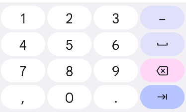
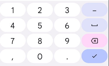
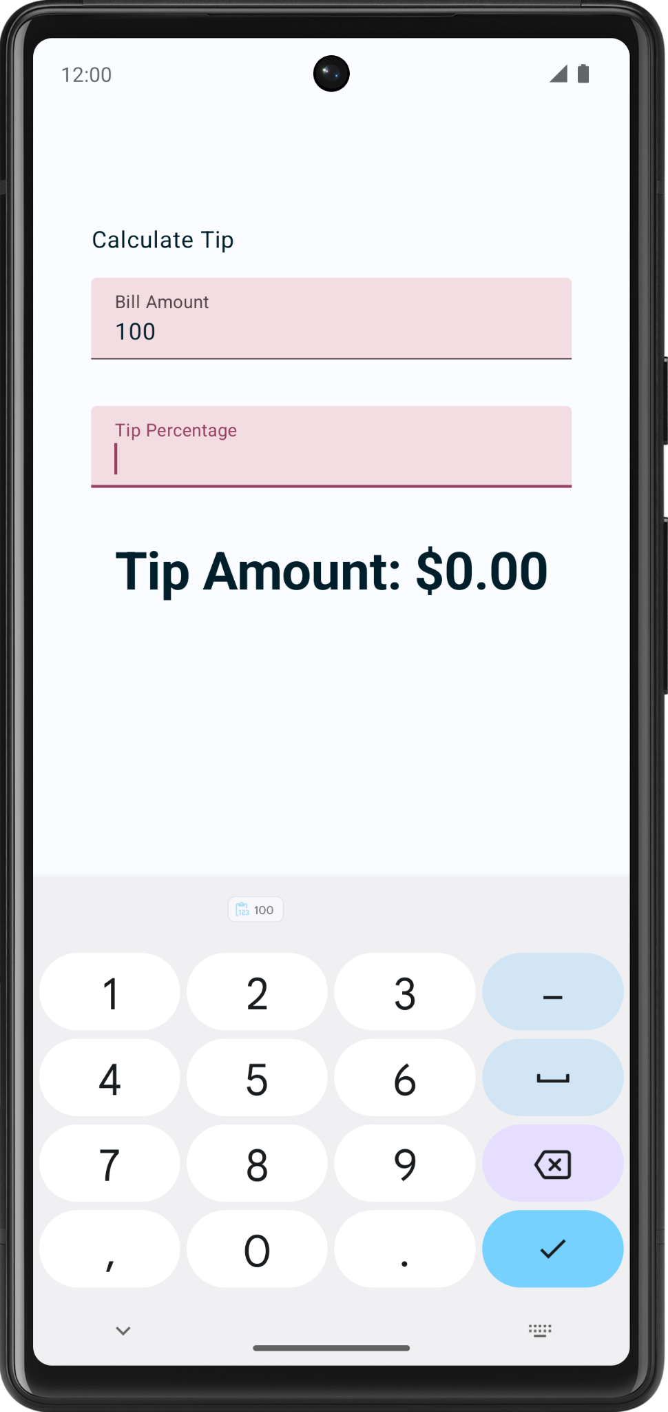
- Run the app. It displays the Next and Done action buttons as you can see in these images:
|
|
- Enter any bill amount and click the Next action button, and then enter any tip percentage and click the Done action button. That closes the keypad.
6. Add a switch
A switch toggles the state of a single item on or off.

There are two-states in a toggle that let the user select between two options. A toggle consists of a track, thumb and an optional icon as you can see in these images:

Switch is a selection control that can be used to enter decisions or declare preferences, such as settings as you can see in this image:

The user may drag the thumb back and forth to choose the selected option, or simply tap the switch to toggle. You can see another example of a toggle in this GIF in which the Visual options setting is toggled to Dark mode:

To learn more about switches, see the Switches documentation.
You use the Switch composable so that the user can choose whether to round up the tip to the nearest whole number as you can see in this image:
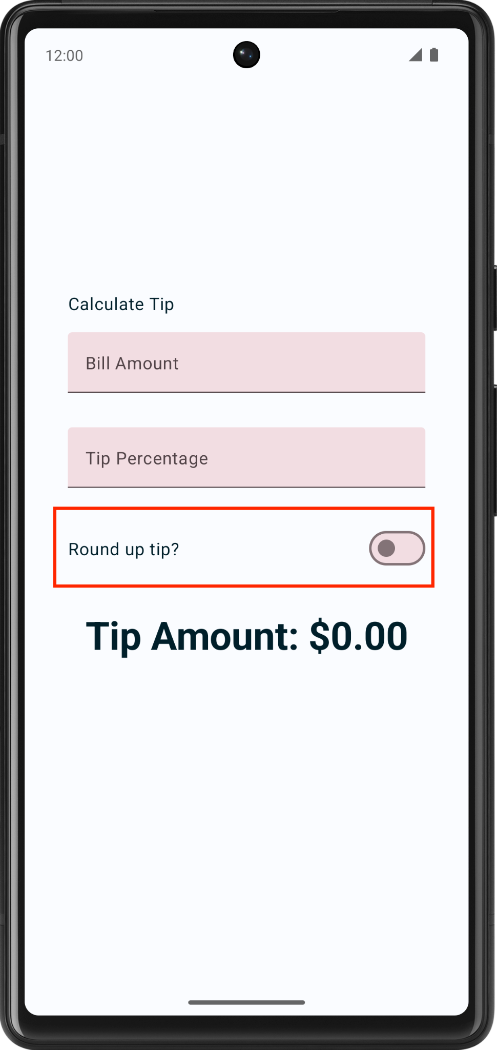
Add a row for the Text and Switch composables:
- After the
EditNumberField()function, add aRoundTheTipRow()composable function and then pass in a defaultModifier, as arguments similar to theEditNumberField()function:
@Composable
fun RoundTheTipRow(modifier: Modifier = Modifier) {
}
- Implement the
RoundTheTipRow()function, add aRowlayout composable with the followingmodifierto set the child elements' width to the maximum on the screen, center the alignment, and ensure a48dpsize:
Row(
   modifier = modifier
       .fillMaxWidth()
       .size(48.dp),
   verticalAlignment = Alignment.CenterVertically
) {
}
- Import the following:
import androidx.compose.foundation.layout.Row
import androidx.compose.foundation.layout.size
- In the
Rowlayout composable's lambda block, add aTextcomposable that uses theR.string.round_up_tipstring resource to display aRound up tip?string:
Text(text = stringResource(R.string.round_up_tip))
- After the
Textcomposable, add aSwitchcomposable, and pass acheckednamed parameter set it toroundUpand anonCheckedChangenamed parameter set it toonRoundUpChanged.
Switch(
    checked = roundUp,
    onCheckedChange = onRoundUpChanged,
)
This table contains information about these parameters, which are the same parameters that you defined for the RoundTheTipRow() function:
Parameter | Description |
| Whether the switch is checked. This is the state of the |
| The callback to be called when the switch is clicked. |
- Import the following:
import androidx.compose.material3.Switch
- In the
RoundTheTipRow()function, add aroundUpparameter ofBooleantype and anonRoundUpChangedlambda function that takes aBooleanand returns nothing:
@Composable
fun RoundTheTipRow(
    roundUp: Boolean,
    onRoundUpChanged: (Boolean) -> Unit,
    modifier: Modifier = Modifier
)
This hoists the switch's state.
- In the
Switchcomposable, add thismodifierto align theSwitchcomposable to the end of the screen:
       Switch(
           modifier = modifier
               .fillMaxWidth()
               .wrapContentWidth(Alignment.End),
           //...
       )
- Import the following:
import androidx.compose.foundation.layout.wrapContentWidth
- In the
TipTimeLayout()function, add a var variable for theSwitchcomposable's state. Create avarvariable namedroundUpset it tomutableStateOf(), withfalseas the initial value. Surround the call withremember { }.
fun TipTimeLayout() {
    //...
    var roundUp by remember { mutableStateOf(false) }

    //...
    Column(
        ...
    ) {
      //...
   }
}
This is the variable for the Switch composable state, and false will be the default state.
- In the
TipTimeLayout()function'sColumnblock after the Tip Percentage text field. Call theRoundTheTipRow()function with the following arguments:roundUpnamed parameter set to aroundUpand anonRoundUpChangednamed parameter set to a lambda callback that updates theroundUpvalue:
@Composable
fun TipTimeLayout() {
    //...

    Column(
        ...
    ) {
        Text(
            ...
        )
        Spacer(...)
        EditNumberField(
            ...
        )
        EditNumberField(
            ...
        )
        RoundTheTipRow(
             roundUp = roundUp,
             onRoundUpChanged = { roundUp = it },
             modifier = Modifier.padding(bottom = 32.dp)
         )
        Text(
            ...
        )
    }
}
This displays the Round up tip? row.
- Run the app. The app displays the Round up tip? toggle.
- Enter a bill amount and tip percentage, and then select the Round up tip? toggle. The tip amount isn't rounded because you still need to update the
calculateTip()function, which you do in the next section.
Update the calculateTip() function to round the tip
Modify the calculateTip() function to accept a Boolean variable to round up the tip to the nearest integer:
- To round up the tip, the
calculateTip()function should know the state of the switch, which is aBoolean. In thecalculateTip()function, add aroundUpparameter ofBooleantype:
private fun calculateTip(
    amount: Double,
    tipPercent: Double = 15.0,
    roundUp: Boolean
): String {
    //...
}
- In the
calculateTip()function before thereturnstatement, add anif()condition that checks theroundUpvalue. If theroundUpistrue, define atipvariable and set tokotlin.math.ceil()function and then pass the functiontipas argument:
if (roundUp) {
    tip = kotlin.math.ceil(tip)
}
The completed calculateTip() function should look like this code snippet:
private fun calculateTip(amount: Double, tipPercent: Double = 15.0, roundUp: Boolean): String {
    var tip = tipPercent / 100 * amount
    if (roundUp) {
        tip = kotlin.math.ceil(tip)
    }
    return NumberFormat.getCurrencyInstance().format(tip)
}
- In the
TipTimeLayout()function, update thecalculateTip()function call and then pass in aroundUpparameter:
val tip = calculateTip(amount, tipPercent, roundUp)
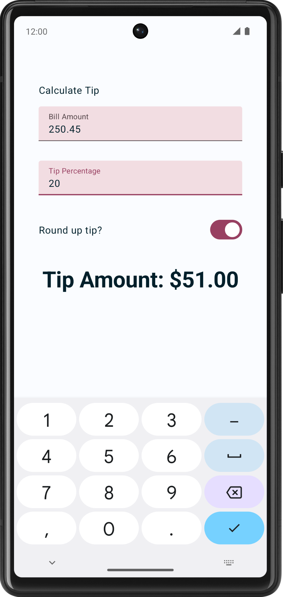
- Run the app. Now it rounds up the tip amount as you can see in these images:
|
|
7. Add support for landscape orientation
Android devices come in a variety of form factors—phones, tablets, foldables, and ChromeOS devices—which have a wide range of screen sizes. Your app should support both orientations portrait and landscape.
- Test your app in landscape mode, turn on the Auto-rotate.
- Rotate your emulator or device left, notice you are not able to see the tip amount. To resolve this you will need a vertical scrollbar, that helps you scroll your app screen.
- Add
.verticalScroll(rememberScrollState())to the modifier to enable the column to scroll vertically. TherememberScrollState()creates and automatically remembers the scroll state.
@Composable
fun TipTimeLayout() {
    // ...
    Column(
        modifier = Modifier
            .padding(40.dp)
            .verticalScroll(rememberScrollState()),
        horizontalAlignment = Alignment.CenterHorizontally,
        verticalArrangement = Arrangement.Center
    ) {
        //...
    }
}
- Import the following:
import androidx.compose.foundation.rememberScrollState
import androidx.compose.foundation.verticalScroll
- Run the app again. Try scrolling in landscape mode!
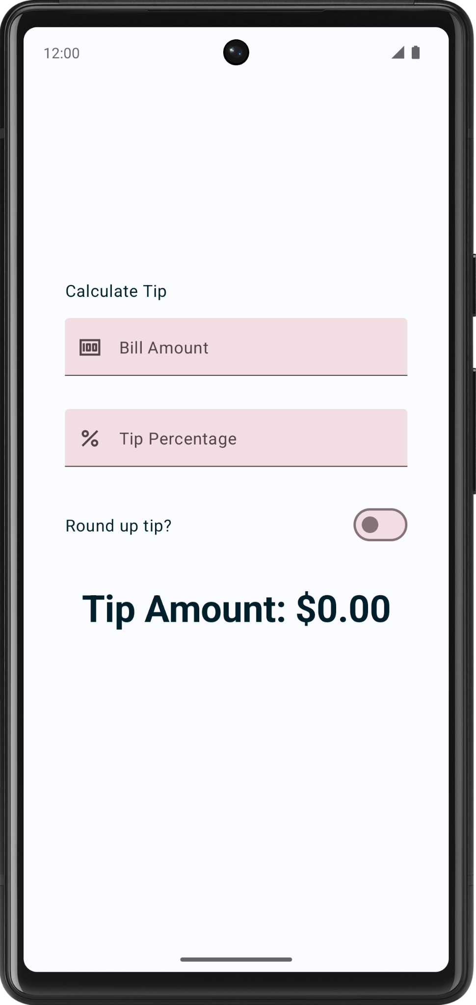
8. Add leading icon to text fields (optional)
Icons can make the text field more visually appealing and provide additional information about the text field. Icons can be used to convey information about the purpose of the text field, such as what type of data is expected or what kind of input is required. For example, an icon of a phone next to a text field might indicate that the user is expected to enter a phone number.
Icons can be used to guide the user's input by providing visual cues about what is expected. For example, an icon of a calendar next to a text field might indicate that the user is expected to enter a date.
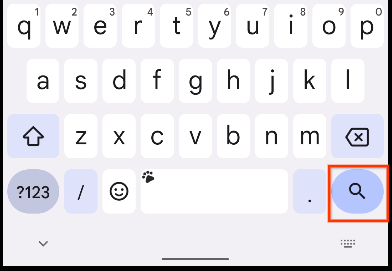
Following is an example of a text field with a search icon, indicating to enter the search term.

Add another parameter to the EditNumberField() composable called leadingIcon of the type Int. Annotate it with @DrawableRes.
@Composable
fun EditNumberField(
    @StringRes label: Int,
    @DrawableRes leadingIcon: Int,
    keyboardOptions: KeyboardOptions,
    value: String,
    onValueChanged: (String) -> Unit,
    modifier: Modifier = Modifier
)
- Import the following:
import androidx.annotation.DrawableRes
import androidx.compose.material3.Icon
- Add the leading icon to the text field. The
leadingIcontakes a composable, you will pass in the followingIconcomposable.
TextField(
    value = value,
    leadingIcon = { Icon(painter = painterResource(id = leadingIcon), null) },
    //...
)
- Pass in the leading icon to the text fields. Icons are already present in the starter code for your convenience.
EditNumberField(
    label = R.string.bill_amount,
    leadingIcon = R.drawable.money,
    // Other arguments
)
EditNumberField(
    label = R.string.how_was_the_service,
    leadingIcon = R.drawable.percent,
    // Other arguments
)
- Run the app.
Congratulations! Your app now has the capability to calculate custom tips.
9. Get the solution code
To download the code for the finished codelab, you can use this git command:
$ git clone https://github.com/google-developer-training/basic-android-kotlin-compose-training-tip-calculator.git
Alternatively you can download the repository as a zip file, unzip it, and open it in Android Studio.
If you want to see the solution code, view it on GitHub.
10. Conclusion
Congratulations! You added custom tip functionality to your Tip Time app. Now your app lets users input a custom tip percentage and round up the tip amount. Share your work on social media with #AndroidBasics!