螢幕相容性總覽
透過集合功能整理內容
你可以依據偏好儲存及分類內容。
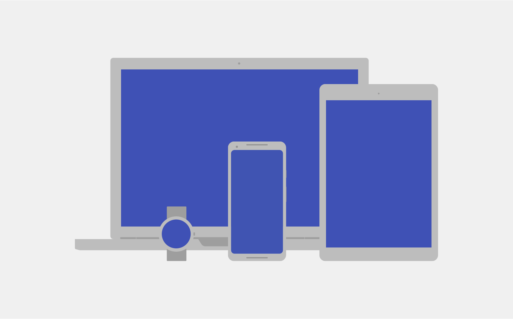
Android 可在各種螢幕尺寸和像素密度的多種裝置上運作。系統會執行基本的縮放和大小調整作業,將使用者介面調整為適合不同螢幕的大小,但您可以透過一些方式協助 UI 根據各種螢幕類型調整介面。
圖 1. Android 可在不同螢幕和像素密度的不同裝置上運作。
本頁概述 Android 提供的功能,可協助您的應用程式進行調整。如要進一步瞭解如何為不同螢幕變化版本建構應用程式,請參閱下列說明文件:
螢幕大小
螢幕大小是指應用程式 UI 的顯示空間。應用程式所識別的螢幕大小並非裝置螢幕的實際大小。應用程式必須考量螢幕方向、系統裝飾 (例如導覽列),以及視窗設定變更 (例如使用者啟用多視窗模式)。
可彈性的版面配置
根據預設,Android 會調整應用程式版面配置,以符合目前螢幕的大小。如要讓版面配置能配合螢幕大小的較小變化版本,適當調整尺寸,請謹慎實作版面配置。請勿以硬式編碼的方式編寫 UI 元件的位置和大小。改為讓檢視畫面大小延展,並指定相對於上層檢視畫面或其他同層級檢視畫面的檢視畫面位置,讓所需順序和相對大小與版面配置成長保持相同。
如要進一步瞭解彈性版面配置,請參閱「回應式設計」。
替代版面配置
彈性版面配置很重要,但您也必須設計不同的版面配置,針對不同裝置的可用空間提供最佳使用者體驗。Android 可讓您提供替代版面配置檔案,讓系統根據目前裝置的螢幕大小在執行階段套用。
圖 2.同一應用程式針對不同的螢幕大小使用不同的版面配置。
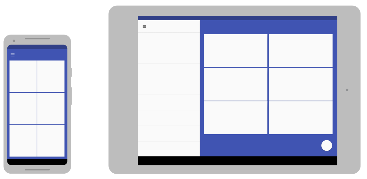
如要瞭解如何建立替代版面配置,請參閱「自動調整式設計」。
可延展圖片
由於版面配置需要延展以符合目前的螢幕,因此請您在附加至任何版面配置檢視畫面的點陣圖。不過,以任意方向延展一般點陣圖,可能會導致縮放構件和圖片歪斜。
為瞭解決這個問題,Android 支援 nine-patch 點陣圖,您可以在此指定可延展的小型像素區域,而圖片的其餘部分則會保持未縮放。
如要進一步瞭解 nine-patch 點陣圖,請參閱 NinePatch 可繪項目。
像素密度
像素密度是指螢幕實體區域內的像素數量。也就是 dpi (每英寸像素數)。這與螢幕解析度不同,後者是螢幕上的像素總數。
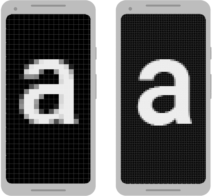
圖 3.兩部尺寸相同但像素密度不同的兩部裝置以誇張的方式呈現。
像素密度獨立性
當應用程式在具有不同像素密度的螢幕上顯示時,如果應用程式能夠根據使用者的視角,保留 UI 設計的實體大小,就會達到「密度獨立性」(如圖 3 所示)。請務必維持密度獨立性,因為如果沒有該元素,按鈕等 UI 元素在低密度螢幕上可能會較大,在高密度螢幕上也會較小。
Android 提供密度獨立像素 (dp 或 dip) 做為測量單位,而不是像素 (px),協助您達成像素密度獨立性。
如要進一步瞭解密度獨立像素,請參閱「使用密度獨立像素」。
替代點陣圖
如要讓圖片在所有螢幕上呈現最佳效果,請提供符合各種螢幕密度的替代點陣圖。如果您的應用程式僅針對低密度的螢幕提供點陣圖,Android 會在高密度螢幕上縮放畫面,讓圖片在螢幕上顯示相同的實體空間。這可能會導致點陣圖中顯示縮放構件。因此,應用程式必須包含高解析度的替代點陣圖。
如要瞭解如何提供替代點陣圖,請參閱「提供替代點陣圖」。
向量圖形
針對簡單的圖片類型 (例如圖示),您可以使用向量圖形,避免為各種密度分別建立圖片。由於向量圖形會使用幾何線路徑 (而非像素) 定義插圖,因此能以任何大小繪製,且不會縮放構件。
如要進一步瞭解如何使用向量圖形,請參閱「偏好向量圖形」。
Wear OS、TV、車輛和 ChromeOS
上述建議適用於所有 Android 板型規格,但如果想建構適用於 Wear OS、Android TV、Android Auto、Android Automotive OS 或 ChromeOS 裝置的應用程式,需執行更多工作。
每種裝置類型都有自己的使用者互動模型,應用程式必須遵循這個模型。在某些情況下 (例如 Wear OS),您必須重新思考應用程式的使用者體驗,並建構該裝置專屬的應用程式。不過,如要支援 ChromeOS 裝置 (例如 Google Pixelbook),可能只需要稍微修改現有應用程式,就能支援鍵盤、滑鼠互動以及大螢幕。
如要支援這類裝置,請參閱以下說明文件:
摺疊式裝置
折疊式裝置通常會提供多個螢幕 (採用不同的螢幕或螢幕組合),進而啟用裝置折疊狀態的不同狀態。請按照本文件中的指南,讓應用程式根據變更的設定進行調整。不過,部分設定可能有特殊的顯示比例,因此請測試應用程式在各種裝置上的行為。
圖 4.折疊及展開。
一般來說,適用於各種視窗大小的多視窗模式的應用程式,在折疊式裝置上也表現良好。
如要進一步瞭解如何建構折疊式裝置的應用程式,請參閱「進一步瞭解折疊式裝置」。
這個頁面中的內容和程式碼範例均受《內容授權》中的授權所規範。Java 與 OpenJDK 是 Oracle 和/或其關係企業的商標或註冊商標。
上次更新時間:2025-07-27 (世界標準時間)。
[[["容易理解","easyToUnderstand","thumb-up"],["確實解決了我的問題","solvedMyProblem","thumb-up"],["其他","otherUp","thumb-up"]],[["缺少我需要的資訊","missingTheInformationINeed","thumb-down"],["過於複雜/步驟過多","tooComplicatedTooManySteps","thumb-down"],["過時","outOfDate","thumb-down"],["翻譯問題","translationIssue","thumb-down"],["示例/程式碼問題","samplesCodeIssue","thumb-down"],["其他","otherDown","thumb-down"]],["上次更新時間:2025-07-27 (世界標準時間)。"],[],[],null,["# Screen compatibility overview\n\nAndroid runs on a variety of devices that have different screen sizes and pixel\ndensities. The system performs basic scaling and resizing to adapt your user\ninterface to different screens, but there are ways to help your UI adapt better\nto each screen type.\n\n\n**Figure 1.** Android runs on different devices that have different screens and pixel densities.\n\n\u003cbr /\u003e\n\nThis page provides an overview of the features available on Android to help your\napp adapt accordingly. For more specific instructions about how to build your\napp for different screen variations, see the following documentation:\n\n- [Support different screen sizes](/training/multiscreen/screensizes)\n- [Support different pixel densities](/training/multiscreen/screendensities)\n\nScreen sizes\n------------\n\nThe screen size is the visible space for your app UI. The screen size, as it's\nrecognized by your app, isn't the actual size of the device screen. Apps must\ntake into account the screen orientation, system decorations---such as the\nnavigation bar---and window configuration changes, such as when the user\nenables [multi-window mode](/guide/topics/ui/multi-window).\n\n### Flexible layouts\n\nBy default, Android resizes your app layout to fit the current screen. To help\nyour layout resize well for small variations in screen size, implement your\nlayout with flexibility in mind. Don't hardcode the position and size of your UI\ncomponents. Instead, let view sizes stretch and specify view positions relative\nto the parent view or other sibling views so that your intended order and\nrelative sizes remain the same as the layout grows.\n\nTo learn more about flexible layouts, see [Responsive design](/training/multiscreen/screensizes#flexible-layout).\n\n### Alternative layouts\n\nA flexible layout is important, but you also need to design different layouts\nthat optimize the user experience for the available space on different devices.\nAndroid lets you provide alternative layout files that the system applies at\nruntime based on the current device's screen size.\n\n\n**Figure 2.** The same app uses a different layout for different screen sizes.\n\n\u003cbr /\u003e\n\nTo learn how to create alternative layouts, see [Adaptive design](/training/multiscreen/screensizes#alternative-layouts).\n\n### Stretchable images\n\nBecause your layout needs to stretch to fit the current screen, so do the\nbitmaps that you attach to any of the layout views. However, stretching an\nordinary bitmap in arbitrary directions can result in strange scaling artifacts\nand skewed images.\n\nTo solve this, Android supports nine-patch bitmaps, in which you specify small\npixel regions that are stretchable, while the rest of the image remains\nunscaled.\n\nTo learn more about nine-patch bitmaps, see [NinePatch drawables](/develop/ui/views/graphics/drawables#nine-patch).\n\nPixel densities\n---------------\n\nThe pixel density is the number of pixels within a physical area of the screen.\nIt is referred to as dpi (dots per inch). This is different from the screen\nresolution, which is the total number of pixels on a screen.\n\n\n**Figure 3.** An exaggerated representation of two devices that are the same size but have different pixel densities.\n\n\u003cbr /\u003e\n\n### Density independence\n\nYour app achieves \"density independence\" when it preserves the physical\nsize---from the user's point of view---of your UI design when displayed\non screens with different pixel densities, as shown in figure 3. Maintaining\ndensity independence is important, because without it, a UI element like a\nbutton might appear larger on a low-density screen and smaller on a high-density\nscreen.\n\nAndroid helps you achieve density independence by providing the\n*density-independent pixel* (dp or dip) as a unit of measurement that you use\ninstead of pixels (px).\n\nTo learn more about density independent pixels, see [Use density-independent\npixels](/training/multiscreen/screendensities#TaskUseDP).\n\n### Alternate bitmaps\n\nTo make your images look their best on all screens, provide alternate bitmaps to\nmatch each screen density. If your app provides bitmaps only for lower-density\nscreens, Android scales them up when on a high-density screen so that the images\noccupy the same physical space on the screen. This can cause visible scaling\nartifacts in bitmaps. So, your app must include alternate bitmaps at a higher\nresolution.\n\nTo learn how to provide alternate bitmaps, see [Provide alternative bitmaps](/training/multiscreen/screendensities#TaskProvideAltBmp).\n\n### Vector graphics\n\nFor simple types of images, like icons, you can avoid creating separate images\nfor each density by using vector graphics. Because vector graphics define the\nillustration with geometric line paths instead of pixels, they can be drawn at\nany size without scaling artifacts.\n\nTo learn more about using vector graphics, see [Prefer vector graphics](/training/multiscreen/screendensities#vector-graphics).\n\nWear OS, TV, Cars, and ChromeOS\n-------------------------------\n\nThe preceding recommendations apply to all Android form factors, but if you want\nto build an app for Wear OS, Android TV, Android Auto, Android Automotive OS, or\nChromeOS devices, you need to do more work.\n\nEach of these device types has its own user interaction model that your app must\naccommodate. In some cases, such as for Wear OS, you need to rethink your app's\nuser experience and build an app that's specialized for that device. On the\nother hand, to support ChromeOS devices, such as the Google Pixelbook, you\nmight need only slight modifications to your existing app to support keyboard or\nmouse interaction and a larger screen.\n\nTo support these devices, refer to the following documentation:\n\n- [Build Wear OS apps](/training/wearables/apps)\n- [Build TV apps](/training/tv/get-started)\n- [Android for Cars overview](/training/cars)\n- [Apps for ChromeOS overview](/chrome-os/intro)\n\nFoldables\n---------\n\nFoldable devices typically have multiple displays, with different\ndisplays---or combinations of displays---becoming active for different\nstates of the device folding. Follow the guidelines in this document to make\nyour app adapt to those changing configurations. However, some configurations\ncan have unusual aspect ratios, so test how your app behaves on a variety of\ndevices.\n\n\n**Figure 4.** Folding and unfolding.\n\n\u003cbr /\u003e\n\nUsually, an app that works well in [multi-window\nmode](/guide/topics/ui/multi-window) for various window sizes also behaves well\non foldable devices.\n\nTo learn more about building apps for foldables, see [Learn about\nfoldables](/guide/topics/ui/foldables)."]]