
In today's competitive gaming market, it's more important than ever to reach as wide an audience as possible. By developing games for different form factors, such as phones, tablets, foldables, and desktop, you can tap into a larger pool of potential players and increase your chances of success.
Support screen resizability
To support different form factors, your game must be resizable. Resizability enables your game to support device configurations such as portrait and landscape orientation, multi-window mode, and folded and unfolded states of foldable devices.
If your game doesn't support all window size and orientation configurations, the platform letterboxes your game in compatibility mode and, if necessary, prompts the player before changing to an unsupported configuration.
For more information see Support large screen resizability.
Multi-window mode
Multi-window mode enables multiple apps to share the same screen simultaneously. Apps can be side by side or one above the other (split-screen mode), one app in a small window overlaying other apps (picture-in-picture mode), or individual apps in separate movable, resizable windows (free-form mode).
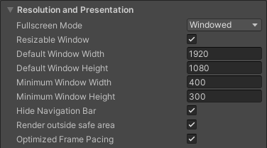
To avoid getting into compatibility mode when your game runs in multi-window mode, declare that your game is able to handle resizability by enabling the Resizable Window option in the Unity build settings.
Display cutouts
A display cutout is an area on some devices that extends into the display surface. Cutouts allow for an edge-to-edge experience while providing space for important sensors on the front of the device.

To bring an edge-to-edge experience to your game, configure the game to be safe-frame aware. Query the Unity safeArea API to get the safe area of the screen in pixels and adjust your game UI and UX accordingly, especially for the elements that users can interact with.
Foldable postures
Foldable devices can be in various folded states, such as
FLAT
(fully open) or
HALF_OPENED
(somewhere between fully open and completely closed). When a device is in the
HALF_OPENED state, two postures are possible, depending on the orientation of
the fold: tabletop posture (horizontal fold) and book posture (vertical fold).
Use tabletop posture to increase player immersion and engagement.
To implement tabletop posture, extend the default Unity activity and then use the Jetpack WindowManager layout library to make your game fold aware.
Unity sample project
The Unity sample project is based on the Unity 2D demonstration project Lost Crypt. The sample project demonstrates how to support large screen resizability in Unity. Large screen and foldable device support requires a number of changes to the Unity build options, as well as considerations in the layout of your camera and UI canvases.
The sample project is available to download now. The project contains four different scenes:
- Original: Support for basic resizable feature
- Anchoring: Same as "Original" scene, but adapts to various aspect ratios and avoids the display cutout
- HingeAware: Same as "Anchoring" scene, but supports tabletop posture
- Mainmenu: Starting scene, allows navigation to the other scenes and fully supports all device orientations, fold, unfold, and tabletop posture
When building for Android, select all the scenes and set the "Mainmenu" scene as the starting scene.

Begin with resizable window support
Implement support for various displays sizes and aspect ratios in your
Android large screen application to ensure your game or application displays
correctly on different devices. Enable your game to resize and change
aspect ratio by setting the Resizable Window property in the Unity build
settings (see the "Multi-window mode" section). Adjust
the camera and canvas aspect ratio to better fit different
screens. View project settings in the Build Settings and in the
Plugins/Android/AndroidManifest.xml file. Experience the full screen
resizable feature in the project's "Original" scene.

Go full-screen immersive while handling display cutouts
Enable your game to use the entire screen to make gameplay immersive for an enhanced user experience. Update your game UI anchoring and camera settings to automatically adjust to the screen size. This allows UI elements to maintain their positions relative to the screen size.
The "Anchoring" scene uses the
CameraAspectLock script to respond to device configuration changes by
means of an extended activity (see
Assets/Plugins/Android/LargeScreenPlayableActivity.java). Unity's
safeArea API is demonstrated in the SafeZoneAPI
script, which binds to the SafeZone object inside the "Anchoring" scene.

Optimize for foldable devices
The last scene of the Unity sample project, "HingeAware", contains a
ConfigurationManager object that responds to the different folding
states of the target device through Jetpack library APIs and an
extended activity (see
Assets/Plugins/Android/LargeScreenPlayableActivity.java). The scene uses
the PanelOnFold script to control the UI based on the fold status
of the device, for example, showing the bottom controller panel when the
device is in tabletop posture and adjusting the camera.
