The `media3-ui-compose` library provides the foundational components for
building a media UI in Jetpack Compose. It's designed for developers who need
more customization than what's offered by the `media3-ui-compose-material3`
library. This page explains how to use the core components and state holders to
create a custom media player UI.
## Mixing Material3 and custom Compose components
The `media3-ui-compose-material3` library is designed to be flexible. You can
use the prebuilt components for most of your UI, but swap out a single component
for a custom implementation when you need more control. This is when
`media3-ui-compose` library comes into play.
For example, imagine you want to use the standard
[`PreviousButton`](https://developer.android.com/reference/kotlin/androidx/media3/ui/compose/material3/buttons/PreviousButton.composable.md.txt#PreviousButton(androidx.media3.common.Player,androidx.compose.ui.Modifier,kotlin.Function1,kotlin.Function1,androidx.compose.material3.IconButtonColors,androidx.compose.ui.graphics.Color,kotlin.Function1)) and [`NextButton`](https://developer.android.com/reference/kotlin/androidx/media3/ui/compose/material3/buttons/NextButton.composable.md.txt#NextButton(androidx.media3.common.Player,androidx.compose.ui.Modifier,kotlin.Function1,kotlin.Function1,androidx.compose.material3.IconButtonColors,androidx.compose.ui.graphics.Color,kotlin.Function1)) from the
Material3 library, but you need a completely custom `PlayPauseButton`. You can
achieve this by using [`PlayPauseButton`](https://developer.android.com/reference/kotlin/androidx/media3/ui/compose/buttons/PlayPauseButton.composable.md.txt#PlayPauseButton(androidx.media3.common.Player,kotlin.Function1)) from the core `media3-ui-compose`
library and place it alongside the prebuilt components.
```kotlin
Row {
// Use prebuilt component from the Media3 UI Compose Material3 library
PreviousButton(player)
// Use the scaffold component from Media3 UI Compose library
PlayPauseButton(player) {
// `this` is PlayPauseButtonState
FilledTonalButton(
onClick = {
Log.d("PlayPauseButton", "Clicking on play-pause button")
this.onClick()
},
enabled = this.isEnabled,
) {
Icon(
imageVector = if (showPlay) Icons.Default.PlayArrow else Icons.Default.Pause,
contentDescription = if (showPlay) "Play" else "Pause",
)
}
}
// Use prebuilt component from the Media3 UI Compose Material3 library
NextButton(player)
}
```
### Available components
The `media3-ui-compose` library provides a set of prebuilt composables for
common player controls. Here are some of the components you can use directly in
your app:
| Component | Description |
|---|---|
| [`PlayPauseButton`](https://developer.android.com/reference/kotlin/androidx/media3/ui/compose/buttons/PlayPauseButton.composable.md.txt#PlayPauseButton(androidx.media3.common.Player,kotlin.Function1)) | A state container for a button that toggles between play and pause. |
| [`SeekBackButton`](https://developer.android.com/reference/kotlin/androidx/media3/ui/compose/material3/buttons/SeekBackButton.composable.md.txt#SeekBackButton(androidx.media3.common.Player,androidx.compose.ui.Modifier,kotlin.Function1,kotlin.Function1,androidx.compose.material3.IconButtonColors,androidx.compose.ui.graphics.Color,kotlin.Function1)) | A state container for a button that seeks backward by a defined increment. |
| [`SeekForwardButton`](https://developer.android.com/reference/kotlin/androidx/media3/ui/compose/material3/buttons/SeekForwardButton.composable.md.txt#SeekForwardButton(androidx.media3.common.Player,androidx.compose.ui.Modifier,kotlin.Function1,kotlin.Function1,androidx.compose.material3.IconButtonColors,androidx.compose.ui.graphics.Color,kotlin.Function1)) | A state container for a button that seeks forward by a defined increment. |
| [`NextButton`](https://developer.android.com/reference/kotlin/androidx/media3/ui/compose/material3/buttons/NextButton.composable.md.txt#NextButton(androidx.media3.common.Player,androidx.compose.ui.Modifier,kotlin.Function1,kotlin.Function1,androidx.compose.material3.IconButtonColors,androidx.compose.ui.graphics.Color,kotlin.Function1)) | A state container for a button that seeks to the next media item. |
| [`PreviousButton`](https://developer.android.com/reference/kotlin/androidx/media3/ui/compose/buttons/PreviousButton.composable.md.txt#PreviousButton(androidx.media3.common.Player,kotlin.Function1)) | A state container for a button that seeks to the previous media item. |
| [`RepeatButton`](https://developer.android.com/reference/kotlin/androidx/media3/ui/compose/material3/buttons/RepeatButton.composable.md.txt#RepeatButton(androidx.media3.common.Player,androidx.compose.ui.Modifier,kotlin.collections.List,kotlin.Function1,kotlin.Function1,androidx.compose.material3.IconButtonColors,androidx.compose.ui.graphics.Color,kotlin.Function1)) | A state container for a button that cycles through repeat modes. |
| [`ShuffleButton`](https://developer.android.com/reference/kotlin/androidx/media3/ui/compose/buttons/ShuffleButton.composable#ShuffleButton(androidx.media3.common.Player,kotlin.Function1)) | A state container for a button that toggles shuffle mode. |
| [`MuteButton`](https://developer.android.com/reference/kotlin/androidx/media3/ui/compose/buttons/MuteButton.composable#MuteButton(androidx.media3.common.Player,kotlin.Function1)) | A state container for a button that mutes and unmutes the player. |
| [`TimeText`](https://developer.android.com/reference/kotlin/androidx/media3/ui/compose/indicators/TimeText.composable#TimeText(androidx.media3.common.Player,kotlin.Int,kotlinx.coroutines.CoroutineScope,kotlin.Function1)) | A state container for a composable that displays the player progress. |
| [`ContentFrame`](https://developer.android.com/reference/kotlin/androidx/media3/ui/compose/ContentFrame.composable.md.txt#ContentFrame(androidx.media3.common.Player,androidx.compose.ui.Modifier,kotlin.Int,androidx.compose.ui.layout.ContentScale,kotlin.Boolean,kotlin.Function0)) | A surface for media content that handles aspect ratio management, resizing, a shutter, artwork, and a subtitles slot. |
| [`PlayerSurface`](https://developer.android.com/reference/kotlin/androidx/media3/ui/compose/PlayerSurface.composable#PlayerSurface(androidx.media3.common.Player,androidx.compose.ui.Modifier,kotlin.Int)) | Raw surface which wraps `SurfaceView` and `TextureView` in `AndroidView`. |
| [`Artwork`](https://developer.android.com/reference/kotlin/androidx/media3/ui/compose/Artwork.composable.md.txt) | A composable that displays the artwork of the current media item, such as an album cover. |
### Customize the `Player` composable
When using the `media3-ui-compose-material3` library, the
[`Player`](https://developer.android.com/reference/kotlin/androidx/media3/ui/compose/material3/Player.composable.md.txt) composable provides a complete media playback
experience. You can customize its layout by providing your own composables to
its content slots, or you can leverage the [`PlayerDefaults`](https://developer.android.com/reference/kotlin/androidx/media3/ui/compose/material3/PlayerDefaults.md.txt) object to
customize specific parts of the UI, such as [`TopControls`](https://developer.android.com/reference/kotlin/androidx/media3/ui/compose/material3/PlayerDefaults.md.txt#TopControls(androidx.media3.common.Player,kotlin.Boolean,androidx.compose.ui.Modifier,kotlin.Function2)), [`CenterControls`](https://developer.android.com/reference/kotlin/androidx/media3/ui/compose/material3/PlayerDefaults.md.txt#CenterControls(androidx.media3.common.Player,kotlin.Boolean,androidx.compose.ui.Modifier,androidx.compose.foundation.layout.Arrangement.Horizontal,androidx.compose.ui.Alignment.Vertical,kotlin.Function1,kotlin.Function1,kotlin.Function1,kotlin.Function1,kotlin.Function1)),
[`BottomControls`](https://developer.android.com/reference/kotlin/androidx/media3/ui/compose/material3/PlayerDefaults.md.txt#BottomControls(androidx.media3.common.Player,kotlin.Boolean,androidx.compose.ui.Modifier,kotlin.Function2,kotlin.Function1,kotlin.Function1,kotlin.Function2,kotlin.Function1)), and [`ErrorOverlay`](https://developer.android.com/reference/kotlin/androidx/media3/ui/compose/material3/PlayerDefaults.md.txt#ErrorOverlay(androidx.media3.common.Player,androidx.compose.ui.Modifier,androidx.compose.ui.graphics.Color,kotlin.CharSequence,androidx.media3.common.ErrorMessageProvider)).
Figure 1 shows where the `Player` composable places its slots. Figure 2 shows
the order in which it draws its layers.
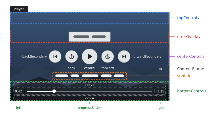 **Figure 1.** The slots of the `Player` composable. The center and bottom controls show the slots of `PlayerDefaults.CenterControls` and `PlayerDefaults.BottomControls`. The `topControls`, `above`, and `below` slots are empty by default. 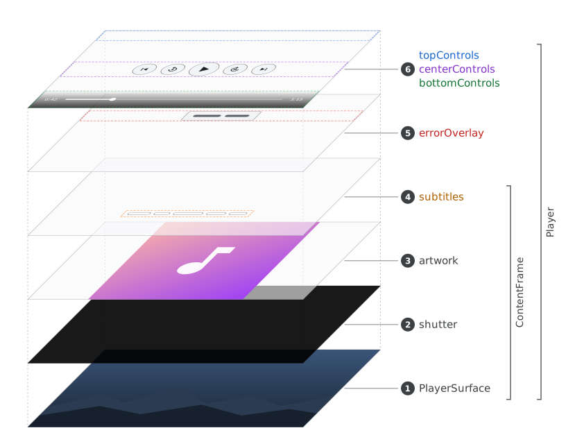 **Figure 2.** The layers of the `Player` composable, numbered in the order they're drawn.
For example, you can use `PlayerDefaults.CenterControls` to override just the
central play/pause button while leaving the rest of the center controls intact.
You can also pass a fully custom composable for a parameter like `topControls`,
and completely omit others like `bottomControls` to leave them at their default.
```kotlin
@Composable
fun CustomPlayerSlots(player: Player, showControls: Boolean, modifier: Modifier = Modifier) {
Player(
player = player,
modifier = modifier,
showControls = showControls,
topControls = {
// Fully custom top controls
Text("My custom title")
},
centerControls = {
// Use default CenterControls but override the central button
PlayerDefaults.CenterControls(
player = player,
central = {
// A custom play/pause button
Material3PlayPauseButton(player, modifier = Modifier.size(64.dp))
},
)
},
// bottomControls are left as default
)
}
```
The `Player` composable also displays subtitles and, when there's no video to
show, the artwork of the current media item. To customize their appearance, pass
your own composables to the `subtitles` and `artwork` slots. To hide them, pass
an empty composable to `subtitles` and `null` to `artwork`.
## UI state holders
If none of the scaffolding components meet your needs, you can also use the
state objects directly. It's generally advisable to use the corresponding
`remember` methods to preserve your UI look between recompositions.
To better understand how you can use the flexibility of UI state holders versus
composables, read about how Compose [manages State](https://developer.android.com/develop/ui/compose/state.md.txt).
### Button state holders
For some UI states, the library makes the assumption that they will most likely
be consumed by button-like composables.
| State | remember\*State | Type |
|---|---|---|
| [`PlayPauseButtonState`](https://developer.android.com/reference/kotlin/androidx/media3/ui/compose/state/PlayPauseButtonState.md.txt#PlayPauseButtonState(androidx.media3.common.Player)) | [`rememberPlayPauseButtonState`](https://developer.android.com/reference/kotlin/androidx/media3/ui/compose/state/rememberPlayPauseButtonState.composable.md.txt#rememberPlayPauseButtonState(androidx.media3.common.Player)) | 2-Toggle or N-Toggle |
| [`PreviousButtonState`](https://developer.android.com/reference/kotlin/androidx/media3/ui/compose/state/PreviousButtonState.md.txt) | [`rememberPreviousButtonState`](https://developer.android.com/reference/kotlin/androidx/media3/ui/compose/state/rememberPreviousButtonState.composable#rememberPreviousButtonState(androidx.media3.common.Player)) | Constant |
| [`NextButtonState`](https://developer.android.com/reference/kotlin/androidx/media3/ui/compose/state/NextButtonState.md.txt) | [`rememberNextButtonState`](https://developer.android.com/reference/kotlin/androidx/media3/ui/compose/state/rememberNextButtonState.composable#rememberNextButtonState(androidx.media3.common.Player)) | Constant |
| [`RepeatButtonState`](https://developer.android.com/reference/kotlin/androidx/media3/ui/compose/state/RepeatButtonState.md.txt) | [`rememberRepeatButtonState`](https://developer.android.com/reference/kotlin/androidx/media3/ui/compose/state/rememberRepeatButtonState.composable#rememberRepeatButtonState(androidx.media3.common.Player,kotlin.collections.List)) | 3-Toggle |
| [`ShuffleButtonState`](https://developer.android.com/reference/kotlin/androidx/media3/ui/compose/state/ShuffleButtonState.md.txt) | [`rememberShuffleButtonState`](https://developer.android.com/reference/kotlin/androidx/media3/ui/compose/state/rememberShuffleButtonState.composable.md.txt#rememberShuffleButtonState(androidx.media3.common.Player)) | 2-Toggle |
| [`PlaybackSpeedState`](https://developer.android.com/reference/kotlin/androidx/media3/ui/compose/state/PlaybackSpeedState.md.txt) | [`rememberPlaybackSpeedState`](https://developer.android.com/reference/kotlin/androidx/media3/ui/compose/state/rememberPlaybackSpeedState.composable.md.txt#rememberPlaybackSpeedState(androidx.media3.common.Player)) | Menu or N-Toggle |
In addition to the play and pause states, `PlayPauseButtonState` exposes
`showBuffering`, `showReplay`, and `showRetry`. Use them to show a buffering
indicator while the player is buffering, a replay icon after playback ends, and
a retry icon after a playback error. `showReplay` and `showRetry` refine
`showPlay`: whenever one of them is `true`, `showPlay` is also `true`, so check
them before `showPlay`. The `onClick` method handles these states as well, for
example by preparing the player again after an error.
To choose which of these states to show, pass a combination of
`SHOW_BUFFERING_WHEN_PLAYING`, `SHOW_BUFFERING_ALWAYS`, `SHOW_REPLAY_ON_ENDED`,
and `SHOW_RETRY_ON_ERROR` to the `displayMode` parameter of
`rememberPlayPauseButtonState`. By default, `displayMode` combines
`SHOW_BUFFERING_ALWAYS`, `SHOW_REPLAY_ON_ENDED`, and `SHOW_RETRY_ON_ERROR`,
which shows all three states, and the buffering state even appears while
playback is paused.
Example usage of `PlayPauseButtonState`:
```kotlin
val state = rememberPlayPauseButtonState(player)
IconButton(onClick = state::onClick, modifier = modifier, enabled = state.isEnabled) {
Icon(
imageVector = if (state.showPlay) Icons.Default.PlayArrow else Icons.Default.Pause,
contentDescription =
if (state.showPlay) stringResource(R.string.playpause_button_play)
else stringResource(R.string.playpause_button_pause),
)
}
```
### Visual output state holders
[`CurrentMediaItemState`](https://developer.android.com/reference/kotlin/androidx/media3/ui/compose/state/CurrentMediaItemState.md.txt) provides information about the currently playing
`MediaItem`, while [`PlaylistState`](https://developer.android.com/reference/kotlin/androidx/media3/ui/compose/state/PlaylistState.md.txt) exposes information about the `MediaItems`
set on the player. These are useful for displaying metadata information in your
custom UI.
[`ErrorState`](https://developer.android.com/reference/kotlin/androidx/media3/ui/compose/state/ErrorState.md.txt) provides information about the current error state of the player,
which can be used to display an error overlay.
[`PlaybackState`](https://developer.android.com/reference/kotlin/androidx/media3/ui/compose/state/PlaybackState.md.txt) exposes the core playback state of the player, such as
`playbackState`, `isPlaying`, and `playerError`, independently of any specific
UI component. Use it to drive overlays or custom layouts, for example to show a
loading indicator while the player is buffering. For a prebuilt Material3
indicator, use [`BufferingIndicator`](https://developer.android.com/reference/kotlin/androidx/media3/ui/compose/material3/indicator/BufferingIndicator.composable.md.txt).
[`PresentationState`](https://developer.android.com/reference/kotlin/androidx/media3/ui/compose/state/PresentationState.md.txt) holds to information for when the video output in a
[`PlayerSurface`](https://developer.android.com/reference/kotlin/androidx/media3/ui/compose/PlayerSurface.composable#PlayerSurface(androidx.media3.common.Player,androidx.compose.ui.Modifier,kotlin.Int)) can be shown or should be covered by a placeholder UI element.
[`ContentFrame`](https://developer.android.com/reference/kotlin/androidx/media3/ui/compose/ContentFrame.composable.md.txt#ContentFrame(androidx.media3.common.Player,androidx.compose.ui.Modifier,kotlin.Int,androidx.compose.ui.layout.ContentScale,kotlin.Boolean,kotlin.Function0)) composable combines the aspect ratio handling with taking care
of showing the shutter over a surface that is not ready yet.
```kotlin
@Composable
fun ContentFrame(
player: Player?,
modifier: Modifier = Modifier,
surfaceType: @SurfaceType Int = SURFACE_TYPE_SURFACE_VIEW,
contentScale: ContentScale = ContentScale.Fit,
keepContentOnReset: Boolean = false,
shutter: @Composable () -> Unit = { Box(Modifier.fillMaxSize().background(Color.Black)) },
) {
val presentationState = rememberPresentationState(player, keepContentOnReset)
val scaledModifier =
modifier.resizeWithContentScale(contentScale, presentationState.videoAspectRatio)
// Always leave PlayerSurface to be part of the Compose tree because it will be initialized in
// the process. If this composable is guarded by some condition, it might never become visible
// because the Player won't emit the relevant event, e.g. the first frame being ready.
PlayerSurface(player, scaledModifier, surfaceType)
if (presentationState.coverSurface) {
// Cover the surface that is being prepared with a shutter
shutter()
}
}
```
Here, we can use both `presentationState.videoAspectRatio` to scale the Surface
to the chosen aspect ratio (see [Content scale](https://developer.android.com/develop/ui/compose/graphics/images/customize.md.txt#content-scale) for more types) and
`presentationState.coverSurface` to know when the timing is not right to be
showing the Surface. In this case, you can position an opaque shutter on top of
the surface, which will disappear when the surface becomes ready.
[`ContentFrame`](https://developer.android.com/reference/kotlin/androidx/media3/ui/compose/ContentFrame.composable.md.txt#ContentFrame(androidx.media3.common.Player,androidx.compose.ui.Modifier,kotlin.Int,androidx.compose.ui.layout.ContentScale,kotlin.Boolean,kotlin.Function0)) lets you customize the shutter as a trailing lambda, but by
default it will be a black `@Composable Box` filling the size of the parent
container.
`PresentationState` also exposes `showArtwork`, which is `true` when the current
media item plays without a video track, such as audio-only content. In
that case, `ContentFrame` displays the [`Artwork`](https://developer.android.com/reference/kotlin/androidx/media3/ui/compose/Artwork.composable.md.txt) composable, which shows the
artwork from the item's `MediaMetadata`. To customize or hide the artwork, pass
your own composable or `null` to the `artwork` slot of `ContentFrame`.
By default, `Artwork` only loads artwork data embedded in the metadata, or from
a `content`, `file`, or `android.resource` URI. To load artwork from remote URIs
or other sources, use one of the following options:
- Pass a `BitmapLoader`, such as `DataSourceBitmapLoader`, to `Artwork`.
- Use the `Artwork` overload that takes a `painter` to load images with the library of your choice.
Unlike the `Player` composable, which renders subtitles by default,
`ContentFrame` leaves its `subtitles` slot empty. To render subtitles in a
`ContentFrame`, or to customize subtitle rendering in `Player`, observe the
player's current cues with [`CuesState`](https://developer.android.com/reference/kotlin/androidx/media3/ui/compose/state/CuesState.md.txt) and render them in the `subtitles`
slot. `ContentFrame` lays out this slot within the bounds of the scaled video
and draws it above the shutter and the artwork, so that subtitles stay visible
when there's no video.
> [!NOTE]
> **Note:** These composables form a hierarchy of convenience: the [`Player`](https://developer.android.com/reference/kotlin/androidx/media3/ui/compose/material3/Player.composable.md.txt) composable consists of a [`ContentFrame`](https://developer.android.com/reference/kotlin/androidx/media3/ui/compose/ContentFrame.composable.md.txt#ContentFrame(androidx.media3.common.Player,androidx.compose.ui.Modifier,kotlin.Int,androidx.compose.ui.layout.ContentScale,kotlin.Boolean,kotlin.Function0)) plus UI control slots, and [`ContentFrame`](https://developer.android.com/reference/kotlin/androidx/media3/ui/compose/ContentFrame.composable.md.txt#ContentFrame(androidx.media3.common.Player,androidx.compose.ui.Modifier,kotlin.Int,androidx.compose.ui.layout.ContentScale,kotlin.Boolean,kotlin.Function0)) consists of a [`PlayerSurface`](https://developer.android.com/reference/kotlin/androidx/media3/ui/compose/PlayerSurface.composable#PlayerSurface(androidx.media3.common.Player,androidx.compose.ui.Modifier,kotlin.Int)) plus resizing, shutter, and artwork logic. You don't need to use the lower-level composables when a higher-level one fits your needs.
### Track selection state holders
[`TrackSelectionState`](https://developer.android.com/reference/kotlin/androidx/media3/ui/compose/state/TrackSelectionState.md.txt) helps you build a menu for a single track type, such as
an audio language or subtitle menu. Create it with
[`rememberTrackSelectionState`](https://developer.android.com/reference/kotlin/androidx/media3/ui/compose/state/rememberTrackSelectionState.composable.md.txt), passing the track type and a combination of
filters, such as `TRACK_FILTER_LANGUAGE` or `TRACK_FILTER_RESOLUTION`, that
determine which track properties distinguish the options. Set `hasOffOption` or
`hasAutoOption` to `true` to add an option that disables the track type or one
that lets the player choose tracks automatically.
The state exposes the available `selectionOptions` and the `selectedOption`.
Each `TrackSelectionOption` indicates whether the device supports it and whether
it's selected. Passing an option to `selectOption` updates the player's track
selection parameters accordingly. Before showing the menu, check
`canSetTrackSelectionParameters` and whether there are enough options to choose
from. For example, the following subtitle menu offers one option for each
subtitle language and an option to turn subtitles off:
```kotlin
@Composable
fun SubtitleMenu(player: Player, modifier: Modifier = Modifier) {
val state =
rememberTrackSelectionState(
player,
trackType = C.TRACK_TYPE_TEXT,
trackFilters = TRACK_FILTER_LANGUAGE,
hasOffOption = true,
)
// Hide the menu if the player can't change tracks or has no subtitles to choose from
if (!state.canSetTrackSelectionParameters || state.selectionOptions.size < 2) return
Column(modifier.selectableGroup()) {
for (option in state.selectionOptions) {
Row(
Modifier.fillMaxWidth()
.heightIn(min = 48.dp)
.selectable(
selected = option.isSelected,
enabled = option.isSupported,
role = Role.RadioButton,
onClick = { state.selectOption(option) },
)
.padding(horizontal = 16.dp),
horizontalArrangement = Arrangement.spacedBy(16.dp),
verticalAlignment = Alignment.CenterVertically,
) {
RadioButton(selected = option.isSelected, onClick = null, enabled = option.isSupported)
Text(
text =
if (option.onOffState == TRACK_SELECTION_OFF) "Off"
else option.language?.let { Locale.forLanguageTag(it).displayName } ?: "Unknown",
color =
if (option.isSupported) Color.Unspecified
else LocalContentColor.current.copy(alpha = 0.38f),
)
}
}
}
}
```
If you need direct access to the player's `Tracks` and
`TrackSelectionParameters`, use [`TrackSelectionParametersState`](https://developer.android.com/reference/kotlin/androidx/media3/ui/compose/state/TrackSelectionParametersState.md.txt) instead. For
more information about how the player selects tracks, see [Track selection](https://developer.android.com/media/media3/exoplayer/track-selection.md.txt).
## Where are Flows?
Many Android developers are familiar with using Kotlin `Flow` objects to collect
ever-changing UI data. For example, you might be on the lookout for
`Player.isPlaying` flow that you can `collect` in a lifecycle-aware manner. Or
something like `Player.eventsFlow` to provide you with a `Flow`
that you can `filter` the way you want.
However, using flows for `Player` UI state has some drawbacks. One of the main
concerns is the asynchronous nature of data transfer. We want to achieve as
little latency as possible between a `Player.Event` and its consumption on the
UI side, avoiding showing UI elements that are out-of-sync with the `Player`.
Other points include:
- A flow with all the `Player.Events` wouldn't adhere to a single responsibility principle, each consumer would have to filter out the relevant events.
- Creating a flow for each `Player.Event` will require you to combine them (with [`combine`](https://kotlinlang.org/api/kotlinx.coroutines/kotlinx-coroutines-core/kotlinx.coroutines.flow/combine.html)) for each UI element. There is a many-to-many mapping between a Player.Event and a UI element change. Having to use `combine` could lead the UI to potentially illegal states.
## Create custom UI states
You can add custom UI states if the existing ones don't fulfill your needs.
Check out the source code of the existing state to copy the pattern. A typical
UI state holder class does the following:
1. Takes in a [`Player`](https://developer.android.com/reference/androidx/media3/common/Player.md.txt) object.
2. Subscribes to the `Player` using coroutines. See [`Player.listen`](https://developer.android.com/reference/kotlin/androidx/media3/common/Player.md.txt#(androidx.media3.common.Player).listen(kotlin.Function2)) for more details.
3. Responds to particular [`Player.Events`](https://developer.android.com/reference/androidx/media3/common/Player.Events.md.txt) by updating its internal state.
4. Accepts business-logic commands that will be transformed into an appropriate `Player` update.
5. Can be created in multiple places across the UI tree and will always maintain a consistent view of Player's state.
6. Exposes Compose `State` fields that can be consumed by a composable to dynamically respond to changes.
7. Comes with a `remember*State` function for remembering the instance between compositions.
What happens behind the scenes:
```kotlin
class SomeButtonState(private val player: Player) {
var isEnabled by mutableStateOf(player.isCommandAvailable(COMMAND_ACTION_A))
private set
var someFieldValue by mutableStateOf(someFieldDefault)
private set
fun onClick() {
player.actionA()
}
suspend fun observe(): Nothing = player.listen { events ->
if (events.containsAny(EVENT_B_CHANGED, EVENT_C_CHANGED, EVENT_AVAILABLE_COMMANDS_CHANGED)) {
someFieldValue = this.someField
isEnabled = this.isCommandAvailable(COMMAND_ACTION_A)
}
}
}
```
To react to your own `Player.Events`, you can catch them using [`Player.listen`](https://developer.android.com/reference/kotlin/androidx/media3/common/Player.md.txt#(androidx.media3.common.Player).listen(kotlin.Function2))
which is a `suspend fun` that lets you enter the coroutine world and
indefinitely listen to `Player.Events`. Media3 implementation of various UI
states helps the end developer not to concern themselves with learning about
`Player.Events`.
> [!NOTE]
> **Note:** `Player` acts as a single source of truth. We shouldn't change `someField` externally because it will cause a divergence between the UI view of the world and that of the `Player`. Acting upon the button (for example, with a click) is an event that comes in. We react to it by sending the appropriate action to the `Player` without updating any fields locally. We receive the update from the `Player` in the form of a `Player.Event` and that updates the UI state. The UI element, like a button, that created the UI state locally, is able to extract the relevant information to display the correct UI element (icon, shape, content description, animation, etc.). Read more about [Compose State and unidirectional
> data flow](https://developer.android.com/develop/ui/compose/state).