# Wear Compose
Write Jetpack Compose applications for Wear OS devices by providing functionality to support different device sizes and navigation gestures.
| Latest Update | Stable Release | Release Candidate | Beta Release | Alpha Release |
|---|---|---|---|---|
| November 04, 2026 | [1.7.1](https://developer.android.com/jetpack/androidx/releases/wear-compose#1.7.1) | - | - | [1.8.0-alpha03](https://developer.android.com/jetpack/androidx/releases/wear-compose#1.8.0-alpha03) |
> [!NOTE]
> **Note:** The `androidx.wear.compose:compose-material` library is superseded by the [`androidx.wear.compose:compose-material3`](https://developer.android.com/jetpack/androidx/releases/wear-compose-m3) library. We recommend that developers use the Wear Compose Material 3 library to get the latest features, including [Material 3 Expressive design](https://android-developers.googleblog.com/2025/05/whats-new-in-wear-os-6.html).
## Declaring dependencies
To add a dependency on Wear, you must add the Google Maven repository to your
project. Read [Google's Maven repository](https://developer.android.com/studio/build/dependencies#google-maven)
for more information.
Add the dependencies for the artifacts you need in the `build.gradle` file for
your app or module:
### Groovy
```groovy
dependencies {
implementation "androidx.wear.compose:compose-foundation:1.7.1"
// For Wear Material Design UX guidelines and specifications
implementation "androidx.wear.compose:compose-material:1.7.1"
// For integration between Wear Compose and Androidx Navigation libraries
implementation "androidx.wear.compose:compose-navigation:1.7.1"
// For Wear preview annotations
implementation("androidx.wear.compose:compose-ui-tooling:1.7.1")
// NOTE: DO NOT INCLUDE a dependency on androidx.compose.material:material.
// androidx.wear.compose:compose-material is designed as a replacement
// not an addition to androidx.compose.material:material.
// If there are features from that you feel are missing from
// androidx.wear.compose:compose-material please raise a bug to let us know.
}
```
### Kotlin
```kotlin
dependencies {
implementation("androidx.wear.compose:compose-foundation:1.7.1")
// For Wear Material Design UX guidelines and specifications
implementation("androidx.wear.compose:compose-material:1.7.1")
// For integration between Wear Compose and Androidx Navigation libraries
implementation("androidx.wear.compose:compose-navigation:1.7.1")
// For Wear preview annotations
implementation("androidx.wear.compose:compose-ui-tooling:1.7.1")
// NOTE: DO NOT INCLUDE a dependency on androidx.compose.material:material.
// androidx.wear.compose:compose-material is designed as a replacement
// not an addition to androidx.compose.material:material.
// If there are features from that you feel are missing from
// androidx.wear.compose:compose-material please raise a bug to let us know.
}
```
For more information about dependencies, see [Add build dependencies](https://developer.android.com/studio/build/dependencies).
## Feedback
Your feedback helps make Jetpack better. Let us know if you discover new issues or have
ideas for improving this library. Please take a look at the
[existing issues](https://issuetracker.google.com/issues?q=componentid:1077552+status:open)
in this library before you create a new one. You can add your vote to an existing issue by
clicking the star button.
[Create a new issue](https://issuetracker.google.com/issues/new?component=1077552&template=1598429)
See the [Issue Tracker documentation](https://developers.google.com/issue-tracker)
for more information.
## Version 1.8
### Version 1.8.0-alpha03
November 04, 2026
`androidx.wear.compose:compose-*:1.8.0-alpha03` is released. Version 1.8.0-alpha03 contains [these commits](https://android.googlesource.com/platform/frameworks/support/+log/3566803898b060d7136357220affc9ece8236019..8c25756316d2436d4c1064969926f34c67bf2bc4/wear/compose).
**API Changes**
- Integrate material3-ripple in Wear material3 and add support for inset focus rings, introduce `LocalRippleThemeConfiguration` and `RippleThemeConfiguration` to support configuring focus indication, and deprecate `RippleConfiguration.rippleAlpha`. ([Ifb63a](https://android-review.googlesource.com/#/q/Ifb63a3c6f150219c262b10f4d40364deaaa2229b))
- Added `LocalTimeSource` to allow overriding `TimeText`'s time source via `CompositionLocal` in tests and previews. ([Ic981a](https://android-review.googlesource.com/#/q/Ic981ae4793be554abb90d953054af83cd84963bc))
- Added `Modifier.suppressStatusBar()` to allow screens and components to suppress the status bar and automatically collapse top status bar insets. Removed the unreleased `StatusBarSuppression()` composables; use `Modifier.suppressStatusBar()` instead. ([I0a0d6](https://android-review.googlesource.com/#/q/I0a0d6d102adc6271ada948007e8da1b62599f5c2))
**Bug Fixes**
- `Dialog` now only uses a full-screen offscreen layer while it is animating or being swiped, reducing GPU memory usage while it is shown and idle. ([I65baf](https://android-review.googlesource.com/#/q/I65bafbca490ba2f454f8ac4bb5e92892d71917a0))
- Fixed an issue where state written from a background thread while `TransformingLazyColumn` was measuring could be lost. ([I3ed10](https://android-review.googlesource.com/#/q/I3ed10502ea07fe102166dcc1296099aee91a29a8))
- Fixed a bug in `OneHandedGestureDefaults.scrollDownToNextItem` so that the first double pinch gesture always scrolls down, even when the list is at the top and the first item sits below the anchor point.
### Version 1.8.0-alpha02
October 21, 2026
`androidx.wear.compose:compose-*:1.8.0-alpha02` is released. Version 1.8.0-alpha02 contains [these commits](https://android.googlesource.com/platform/frameworks/support/+log/988ac9734e8223273eb7f186ee1639ee68deb025..3566803898b060d7136357220affc9ece8236019/wear/compose).
**API Changes**
- Renamed `PullToRefreshDefaults.indicatorShape` to `IndicatorShape` and changed `PullToRefreshState` to an interface. ([I95b98](https://android-review.googlesource.com/#/q/I95b98232b9b07c7ae58c0708ffc5686512cbf7e3))
- Added `showIndicatorDelayMillis` parameter to `Modifier.oneHandedGesture` to customize the delay before `onGestureAvailable` is invoked. Defaults to `OneHandedGestureDefaults.ShowIndicatorDelayMillis` (1 second). ([I38cc7](https://android-review.googlesource.com/#/q/I38cc74260a9669bfedc56a0b4df7f213bd0d0514))
- Added `StatusBarSuppression` overload with a content lambda to allow wrapping `ScreenScaffold` and suppressing the System Status Bar top-down while automatically resetting top content padding to 0.dp. ([I18ff9](https://android-review.googlesource.com/#/q/I18ff997808314a4d0096672ea0d4d98fd4791043))
- Added a discrete integer steps overload and `showMinimumSegment` parameter to Material 3 `Slider`. ([Idce23](https://android-review.googlesource.com/#/q/Idce238de96dd1da2669e8c9b89c8e9aceea1cd15))
- Removed experimental feature flag `WearComposeFoundationFlags.isWarpingCurvedTextEnabled`. Warped curved text is now always enabled by default. ([Ifc5c2](https://android-review.googlesource.com/#/q/Ifc5c2efcaa740cbd6ba74387a8c2ef9689035373))
- Removed experimental feature flag `WearComposeMaterial3Flags.isSwipeToRevealDualFlingThresholdEnabled`. The dual fling threshold behavior in `SwipeToReveal` is now always enabled. ([Ia8036](https://android-review.googlesource.com/#/q/Ia8036186eac7b9e214328bd4293d288c5f956e60))
**Bug Fixes**
- Fixed a 1-frame visual glitch where `TimeText` would momentarily appear when entering composition on an already scrolled-down list. ([Id13da](https://android-review.googlesource.com/#/q/Id13da49dfecdf7f136a9f7ca290852bc83c1bb29))
- Fixed an issue where `ScreenScaffold` `ScrollIndicator` would not reappear on scroll after idling when used without an enclosing `AppScaffold`. ([I445e5](https://android-review.googlesource.com/#/q/I445e56da4e0ec45338e755f175db7374a51e08d6))
- Fixed an issue where `PullToRefreshBox` indicator remained stuck on screen when `onRefresh` did not transition `isRefreshing` to `true`. ([I097e2](https://android-review.googlesource.com/#/q/I097e2ecbeecedb18edf10f8d7e46535fc3ca0852))
- Added `PullToRefresh` to Wear Compose Material 3 baseline profile. ([Ib8e13](https://android-review.googlesource.com/#/q/Ib8e13043d6a78c923215184dbaa700d033c779f8))
- Update `PredictiveBackScene` to switch `LocalScreenIsActive.current` to the target screen on navigation instantly. ([I3904b](https://android-review.googlesource.com/#/q/I3904bfe100994b485a4f94fd3f07679c11b02860))
- Fixed an issue in `TransformingLazyColumn` `ScrollInfoProvider` where `anchorItemOffset` failed to reset to zero when content padding shrank while scrolled. ([I779a0](https://android-review.googlesource.com/#/q/I779a0ad12d3c08e87a1d62e930e395558556b475))
- Fixed `TransformingLazyColumnState.animateScrollToItem` to smoothly center the target item without a final jump when items use `transformedHeight`. ([I429c8](https://android-review.googlesource.com/#/q/I429c8fac5a92675f401e6cd36ec1650792948c74))
- Fixed an issue in `ScalingLazyColumn` `ScrollInfoProvider` where `anchorItemOffset` failed to reset to zero when content padding shrank while scrolled. ([Ie8b06](https://android-review.googlesource.com/#/q/Ie8b06f9c8a4ad54d4454033bd2ab6428bcebdc7d))
- Fixed `TransformingLazyColumn` animation issues by disabling animations during raw scroll passes. ([Iacfb4](https://android-review.googlesource.com/q/Iacfb469970fd282ab1bb99b4a242ddf2859377d7))
- Added AndroidManifest.xml file for Wear Compose Material3, which configures the com.google.wear.ENABLE_GLOBAL_STATUS_BAR meta-data tag([Ic8804](https://android-review.googlesource.com/q/Ic88042646c8ca8f07e23d1df0c0929bd4335a228))
### Version 1.8.0-alpha01
October 07, 2026
`androidx.wear.compose:compose-*:1.8.0-alpha01` is released. Version 1.8.0-alpha01 contains [these commits](https://android.googlesource.com/platform/frameworks/support/+log/974f75a2305793f54e6bb6e29da386db7b44b202..988ac9734e8223273eb7f186ee1639ee68deb025/wear/compose).
**API Changes**
- Added new `AppScaffold` and `ScreenScaffold` overloads without the `timeText` parameter, establishing the recommended direction for Wear Compose 1.8 to migrate to the new System Status Bar. When running on older builds without System Status Bar, these new overloads fall back to default `TimeText`. The existing overloads now migrate to the System Status Bar by default unless an explicit custom `timeText` is provided. ([I40a5e](https://android-review.googlesource.com/#/q/I40a5e4c46bbd40df9a82b09ae7f2014c9eff1cc9))
- Added `StatusBarSuppression` helper composable to suppress the System Status Bar within full-screen and overlay components. ([I387c3](https://android-review.googlesource.com/#/q/I387c3fe3d80e0f94214e678e302dd185b6f1af73))
- Introduced Modifier.`curveToEdge`, which uses a shader to curve a component to the border of the parent container around the center, always treating the container as a circle. Known issues: clickable components will have incorrect clickable bounds and `TalkBack` does not highlight components correctly. ([I8bbaa](https://android-review.googlesource.com/#/q/I8bbaa6b3d06f9c202417d7855d492594c16d6665))
- Added `PullToRefreshBox` and `PullToRefreshState` to Wear Compose Material 3, with drag distances and refresh thresholds tailored for Wear OS devices.([Iee9a5](https://android-review.googlesource.com/#/q/Iee9a5004ec97f4e59a26daf3806222d94e7f19f2))
- Promoted `PullToRefreshBox`, `PullToRefreshDefaults`, and `PullToRefreshState` to stable public APIs in Wear Compose Material 3. ([I079b6](https://android-review.googlesource.com/#/q/I079b6dee5afb83600e6d85b7e1a0522ecc900cf5))
- Adds an overload of `SwipeToReveal` with a transformation parameter to support container transformations in `TransformingLazyColumn`. ([I328ce](https://android-review.googlesource.com/#/q/I328ce29a8b4c353a3b98e580b1c8d4fa8ccfd024))
- Libraries now target Kotlin 2.2 and require kotlinc 2.2 ([I82396](https://android-review.googlesource.com/#/q/I823967fe6b9524b448184ef366c562316bd6a323), [b/498369605](https://issuetracker.google.com/issues/498369605))
- Removed experimental feature flag `WearComposeFoundationFlags.isTransformingLazyColumnClickableThresholdEnabled`. The clickable threshold in `TransformingLazyColumn` is now always enabled. ([Ib68c8](https://android-review.googlesource.com/#/q/Ib68c865a9e4885c2eb0ff2d81332f4db96ed5aac))
- Removed experimental flag `WearComposeFoundationFlags.isTransformingLazyColumnPinnableContainerEnabled`. ([Ibad2e](https://android-review.googlesource.com/#/q/Ibad2e08448f6a121dc556f0a9ea0fa46762a9a6c))
**Bug Fixes**
- Fixed bug in Wear Compose Foundation `HorizontalPager`, where the gesture handling failed to prioritize correctly between paging and swiping to dismiss. ([I54caf](https://android-review.googlesource.com/#/q/I54caf4725b90e6ec9023ddc43e8692d7d0162381))
- Added `Modifier.testTag("time_text")` to `TimeText` so that it can be detected in test cases where System Status Bar falls back to a default `TimeText` composable. ([Iacb09](https://android-review.googlesource.com/#/q/Iacb09641021e36cabeeeacf2f42e9d260642f679))
- Fixed `IllegalStateException` in `OneHandedGestureModifier.updateCompositionLocals` caused by accessing nodes before attachment. ([I662271](https://android-review.googlesource.com/q/I662271d7143a6dd05f6990993b1ecf53940c681f))
- Added `AlertDialog` gesture support, so that scrolling down and `Confirm` button clicks are available by default. ([I51f81](https://android-review.googlesource.com/q/I51f81cf6efd4683583f5cb7af25724c94063152a))
- Fixed in-app `TimeText` flash when transitioning to inherited status bar by improving visibility suppression logic in `ScreenContent`. ([I12dd01](https://android-review.googlesource.com/q/I12dd01e197e9c24efc3891de358d38adc39f75eb))
- Fixed an issue where components suppressing the System Status Bar (such as Stepper) fell back to rendering an in-app `TimeText`. ([I86830](https://android-review.googlesource.com/#/q/I86830c64904d17e693e30c59d670010fbcedb583))
- Fixed `StatusBarSuppression()` to respect `LocalStatusBarEnabled` when the global status bar is disabled, preventing unnecessary layout passes in dialogs. ([I4f77f6](https://android-review.googlesource.com/q/I4f77f6ce80dec8c68d8a29d9fbdf95ccbd37c1cc))
- Fixed an issue in Wear Material3 `Scaffold` where `currentScrollInfoProvider` did not inherit from underlying screens when the top screen provided null. ([I97874](https://android-review.googlesource.com/#/q/I97874ba53612174a22d6d078d70015e11b6d0244))
- Added support for `Dialog` status bar suppression and nested `ScreenScaffold`s in Wear Material3 Scaffold. ([I01772](https://android-review.googlesource.com/#/q/I0177223cf42912eafe2b0070f990209fe2bbbf1b))
- Fixed an issue in `AppScaffold` where the status bar overlay reappeared while scrolling when the top anchor item. ([I421b3](https://android-review.googlesource.com/#/q/I421b38d3310be91da5c23cdd2cc772391d9a972d))
- Fixed an issue where `ScreenScaffold` top padding collapsed when opening screens with a disabled status bar mode. ([I7cf4f](https://android-review.googlesource.com/#/q/I7cf4f3b14fbc86ed133e7117ccc60d756522bdc0))
- Added multi-window status bar orchestration support to Wear Compose Material3 scaffolds, allowing dialogs and separate windows to drive their own system status bar controllers. ([Ibf82c](https://android-review.googlesource.com/#/q/Ibf82c9b9ee2688c4be81a3e7d90feff446ad7857))
- Made `TransformingLazyColumn` robust to negative item spacings ([I99ac7](https://android-review.googlesource.com/#/q/I99ac721e342926b1010c09250e0547fd30586802))
- Optimized gesture indicators by replacing indicator pointer background in the resources with canvas functions using paths. ([Iee2b7](https://android-review.googlesource.com/#/q/Iee2b743f7bfa619343fddfd78bec8fd5a56a9d15))
- Optimized gesture indicators by replacing primary and dismiss AVDs in the resources with draw functions using paths. ([Ib2d05](https://android-review.googlesource.com/#/q/Ib2d05567278d917ac406312e9af84843c5f96193))
- `androidx.lifecycle:lifecycle-runtime` dependency was updated to 2.10.0. This version is required for bundled lifecycle runtime lint checks to run with AGP version 9.5.0-alpha04 or later. ([I99bfd](https://android-review.googlesource.com/#/q/I99bfdb355ffd7f1083dbdac4167b1f5577740116), [b/556807521](https://issuetracker.google.com/issues/556807521))
- Updated baseline profiles for Wear Compose Foundation, Material3, and Navigation3 libraries. ([I9b0a3](https://android-review.googlesource.com/#/q/I9b0a3340a892d8adce9df11fcc35c4591670e702))
## Version 1.7
### Version 1.7.1
October 07, 2026
`androidx.wear.compose:compose-*:1.7.1` is released. Version 1.7.1 contains [these commits](https://android.googlesource.com/platform/frameworks/support/+log/974f75a2305793f54e6bb6e29da386db7b44b202..1bb7f7817e31806882acfe7e83ce184fc89db859/wear/compose).
**Bug Fixes**
- Fix `OneHandedGestureHintScrollIndicator` animation flicker ([I650c6](https://android-review.googlesource.com/#/q/I650c6c7fb9d147294c2b446a8c8838b25c8ae15d))
- Remove scroll lock from `OneHandedGestureScrollIndicator` and manage indicator visibility in `ScreenScaffold` with a composition local ([I13050](https://android-review.googlesource.com/#/q/I13050fd124d53861b6012a1beb236584e21513d3))
- Fix `IllegalStateException` in `Modifier.oneHandedGesture` ([I35151](https://android-review.googlesource.com/#/q/I351518f5b72edca8d46b45f96f9c874865841fc7))
### Version 1.7.0
September 23, 2026
`androidx.wear.compose:compose-*:1.7.0` is released. Version 1.7.0 contains [these commits](https://android.googlesource.com/platform/frameworks/support/+log/f65727cc5cc63d05724c0edb55900bc8790b14e8..974f75a2305793f54e6bb6e29da386db7b44b202/wear/compose).
**Important changes since 1.6.0:**
- Introduced new API for one-handed gestures, consisting of gesture handlers for primary action (double-pinch) and dismiss action (wrist-turn) as well as animated indicators for clicking/scrolling/paging that show when the gestures are available.
- Added `PinnableContainer` support to `TransformingLazyColumn`, for holding an item in memory instead of disposing when the item is scrolled out of the viewport.
- `TransformingLazyColumn` now has support for animating items as they move out of the viewport, allowing them to smoothly slide off-screen instead of fading out.
- Added `firstLayoutItemProvider` to `TransformingLazyColumn` as an optional customization for the first layout item. When specified, the provider defines the item and its edge used as the initial placement reference, which is useful for controlling the direction of content-shifting when items are dynamically updated.
- Improvements to `SwipeToReveal` to support nested scroll, fast flings, a second haptic at the partial reveal state and `actionContentSpacing` for the distance between the main content and the action buttons.
- Introduced `@FrequentlyChangingValue` and `@RememberInComposition` annotations that provide lint warnings to prevent performance issues caused by reading high-frequency state updates or failing to remember objects during composition.
**Bug Fixes**
- `androidx.lifecycle:lifecycle-runtime` dependency was updated to 2.10.0. This version is required for bundled lifecycle runtime lint checks to run with AGP version 9.5.0-alpha04 or later. ([If8e16](https://android-review.googlesource.com/#/q/If8e165062c3055b1dedd62de9c49de33e68a3c10))
### Version 1.7.0-rc01
September 09, 2026
`androidx.wear.compose:compose-*:1.7.0-rc01` is released. Version 1.7.0-rc01 contains [these commits](https://android.googlesource.com/platform/frameworks/support/+log/4d31d8cda78e225595adc4a3d5ebc5b5f1abc1d9..a2a1b8e96fcd22b0386179382a175f617d0f1e09/wear/compose).
- This release updates the Compose for Wear OS 1.7.0 version to a release candidate, but there are otherwise no significant changes from the 1.7.0-beta02 release.
### Version 1.7.0-beta02
August 26, 2026
`androidx.wear.compose:compose-*:1.7.0-beta02` is released. Version 1.7.0-beta02 contains [these commits](https://android.googlesource.com/platform/frameworks/support/+log/73e22c60975d7fb8491f51f0de9d82843e170f82..4d31d8cda78e225595adc4a3d5ebc5b5f1abc1d9/wear/compose).
**Bug Fixes**
- Updated baseline profiles for Wear Compose Foundation, Material3, and Navigation3 libraries. ([I9b0a3](https://android-review.googlesource.com/#/q/I9b0a3340a892d8adce9df11fcc35c4591670e702))
- Fix gesture hint animation flicker in `OneHandedGestureScrollIndicator`. ([6e0c1cb](https://android-review.googlesource.com/#/q/I650c6c7fb9d147294c2b446a8c8838b25c8ae15d))
### Version 1.7.0-beta01
August 12, 2026
`androidx.wear.compose:compose-*:1.7.0-beta01` is released. Version 1.7.0-beta01 contains [these commits](https://android.googlesource.com/platform/frameworks/support/+log/61ee8cd421d0c0252d8db0253b739de537999371..73e22c60975d7fb8491f51f0de9d82843e170f82/wear/compose).
The 1.7.0-beta01 release of Compose for Wear OS indicates that this release of the library is feature complete and the API is locked. Wear Compose 1.7.0-beta01 includes the following new functionality:
- One-handed gesture support, consisting of gesture handlers for primary action (e.g. double-pinch) and dismiss action (e.g. wrist-turn) and animated indicators that show when the gestures are available on clickable UI elements (like buttons and cards), scrollable lists and pagers.
- Added `PinnableContainer` support to `TransformingLazyColumn`, for holding an item in memory instead of disposing when the item is scrolled out of the viewport.
- `TransformingLazyColumn` now has support for animating items as they move out of the viewport, allowing them to smoothly slide off-screen instead of fading out.
- Added `firstLayoutItemProvider` to `TransformingLazyColumn` as an optional customization for the first layout item. When specified, the provider defines the item and its edge used as the initial placement reference, which is useful for controlling the direction of content-shifting when items are dynamically updated.
- Improvements to `SwipeToReveal` to support nested scroll, fast flings, a second haptic at the partial reveal state and `actionContentSpacing` for the distance between the main content and the action buttons.
- Introduced `@FrequentlyChangingValue` and `@RememberInComposition` annotations that provide lint warnings to prevent performance issues caused by reading high-frequency state updates or failing to remember objects during composition.
**API Changes**
- Renamed `GestureAction` to `OneHandedGestureAction`, `GesturePriority` to `OneHandedGesturePriority` and `GestureIndicatorSize` to `OneHandedGestureIndicatorSize` ([Ifc7f4](https://android-review.googlesource.com/#/q/Ifc7f4a79a156d12144352629de14d757655540fb), [b/522761843](https://issuetracker.google.com/issues/522761843))
**Bug Fixes**
- Fixed an issue in `ScrollInfoProvider` which caused `TimeText` to flash or disappear when list items change or resized. ([Ief762](https://android-review.googlesource.com/#/q/Ief7620f204a3addbb051e30d921fd05cdf5b209c), [b/537433564](https://issuetracker.google.com/issues/537433564))
### Version 1.7.0-alpha07
July 29, 2026
`androidx.wear.compose:compose-*:1.7.0-alpha07` is released. Version 1.7.0-alpha07 contains [these commits](https://android.googlesource.com/platform/frameworks/support/+log/e37cf4eae99bdc35def1209921d658612e2edbc3..61ee8cd421d0c0252d8db0253b739de537999371/wear/compose).
**API Changes**
- Refactored `OneHandedGesture` APIs, replacing Boolean indicator state (that required a reset after showing the indicator) with a suspend function to run the animation. Each type of indicator now has its own indicator state class, encapsulating the animation logic for that indicator. Renamed from from `key` to `gestureId` in `GestureConfiguration`. ([I7974f](https://android-review.googlesource.com/#/q/I7974f98ae3a48d8c0a227c93383e1f3b28f37304), [b/522761843](https://issuetracker.google.com/issues/522761843))
- Add `CompactButton` single-slot content overload ([Idaffc](https://android-review.googlesource.com/#/q/Idaffc82f883572f173e79b15d795db86e18baa2f), [b/527889640](https://issuetracker.google.com/issues/527889640))
- Add `PinnableContainer` support to `TransformingLazyColumn` ([Id3dc9](https://android-review.googlesource.com/#/q/Id3dc9beac8153789e2dad81c3c50f67f72556f40), [b/492418172](https://issuetracker.google.com/issues/492418172))
**Bug Fixes**
- Added and updated module-level documentation for Wear Compose Foundation, Material 3, and Navigation 3. ([I111d7](https://android-review.googlesource.com/#/q/I111d783450d1151d4136fc95f671aa12b4ca9500), [b/498153783](https://issuetracker.google.com/issues/498153783))
- Fixed an issue in `ScreenScaffold` where recompositions could cause un-remembered `ScrollInfoProvider` to reset scroll tracking state. ([I8be02](https://android-review.googlesource.com/#/q/I8be022e72c802774951705a52a1422c8b73b3d7b), [b/524620765](https://issuetracker.google.com/issues/524620765))
- Address `IllegalArgumentException: maxWidth must be >= than minWidth` error caused by large horizontal paddings ([I014e8](https://android-review.googlesource.com/#/q/I014e86730f10f1dfa662e3851d1e69389bbbf339), [b/531192734](https://issuetracker.google.com/issues/531192734))
- Fix `EdgeButton` animation on fast fling. ([I9657f](https://android-review.googlesource.com/#/q/I9657f75fdd3730e604d716b541e6f39fd778be9c), [b/512700520](https://issuetracker.google.com/issues/512700520))
### Version 1.7.0-alpha06
July 15, 2026
`androidx.wear.compose:compose-*:1.7.0-alpha06` is released. Version 1.7.0-alpha06 contains [these commits](https://android.googlesource.com/platform/frameworks/support/+log/ba3014c143b9c9782fe30bc766c5dced55e13453..f0448c3c760549b58cec3a154536649d03078780/wear/compose).
**API Changes**
- Move `ButtonContent`, `AppCardContent` and `TitleCardContent` composables for Material3 into `ButtonDefaults` and `CardDefaults` objects respectively. ([I8d589](https://android-review.googlesource.com/#/q/I8d589304d2af298a0ebbb86d8bd346b5d32efd12), [b/527889640](https://issuetracker.google.com/issues/527889640))
- Remove default value from `Modifier.oneHandedGesture` `gestureLabel` parameter ([Ica100](https://android-review.googlesource.com/#/q/Ica100638b932aa61419cdfb71b02fa80c4255b1d), [b/527068051](https://issuetracker.google.com/issues/527068051))
- Rename `gestureLabel` to `onGestureLabel` in `Modifier.oneHandedGesture` and make it nullable, for consistency with other `contentDescription` parameters ([I952a8](https://android-review.googlesource.com/#/q/I952a8af7a5344b1d322e130e18be84f4068b3341), [b/527068051](https://issuetracker.google.com/issues/527068051))
- Introduce `OneHandedGestureIndicatorState` to coordinate visibility and animation between `Modifier.oneHandedGesture()` and gesture indicators. Replace `InteractionSource` with this state-driven approach for improved lifecycle control. Add `wrapAround` parameter to `OneHandedGestureDefaults.scrollToNextPage` for consistency with other default gesture scroll functions. ([I9e1e3](https://android-review.googlesource.com/#/q/I9e1e3ea538da7af52047a82415c5964b1a0e0b49), [b/522761843](https://issuetracker.google.com/issues/522761843))
**Bug Fixes**
- Clarify `interactionSource` documentation for `Modifier.oneHandedGesture` to state which interactions are emitted ([I2dc8d](https://android-review.googlesource.com/#/q/I2dc8da17849ae01bd456539ee07608eed93c1893))
- Support for one-handed gestures in `AlertDialog` by default has been removed temporarily, due to issues with the dependency on the Wear SDK in consumers that are otherwise not using the Wear SDK or one-handed gestures. ([Ib19e0](https://android-review.googlesource.com/#/q/Ib19e0bc4f208dafb97a9acc21a037928cc313b5b), [b/503841738](https://issuetracker.google.com/issues/503841738))
- Enhanced `TransformingLazyColumn` to support placement animations for items moving out of the viewport, allowing them to slide off-screen instead of fading out. Also fixed a visual snapping issue where dynamically scaled items would instantly snap to their target height during placement animations ([I89d84](https://android-review.googlesource.com/#/q/I89d847676e315b7a4b2b0f6ec9e93fe8a08a3ccf), [b/525071281](https://issuetracker.google.com/issues/525071281))
- Use index-based `ItemInfo` in `firstVisibleItemLayoutItemInfo`. ([I256e3](https://android-review.googlesource.com/#/q/I256e3f53fc129e4e83cf060ae57e210ff7e3253d), [b/527881678](https://issuetracker.google.com/issues/527881678))
- Fixed `TimePicker` animation behavior when Reduce Motion is enabled. ([Ic9150](https://android-review.googlesource.com/#/q/Ic9150cba0d88eb04d5c4b1a28bf2995f24091eba), [b/467288916](https://issuetracker.google.com/issues/467288916))
### Version 1.7.0-alpha05
July 01, 2026
`androidx.wear.compose:compose-*:1.7.0-alpha05` is released. Version 1.7.0-alpha05 contains [these commits](https://android.googlesource.com/platform/frameworks/support/+log/a69fea942830b4bac43dd1c2bc9346b0a5282b19..ba3014c143b9c9782fe30bc766c5dced55e13453/wear/compose).
**API Changes**
- Added the `TransformingLazyColumnFirstLayoutItemProvider` interface in Foundation to enable customization of content that shifts direction during content updates, accompanied by out-of-the-box `rememberTransformingLazyColumnFirstLayoutItemProvider` and `rememberTransformingLazyColumnFirstVisibleItemProvider` implementations in Material3. ([I54814](https://android-review.googlesource.com/#/q/I54814a394938dadb417e34d16a7a187b92f092fc), [b/503353428](https://issuetracker.google.com/issues/503353428))
- Renamed the fallback parameter from `current` to `centerItem` in `TransformingLazyColumnFirstLayoutItemProvider`. Added `TransformingLazyColumnState` extensions `firstVisibleItemLayoutItemInfo` and `layoutItemInfoOf`, and updated `rememberTransformingLazyColumnFirstLayoutItemProvider` to use a clean, parameter-based lambda. ([I9a8d9](https://android-review.googlesource.com/#/q/I9a8d94990418f580ba59d5e6b4dac6def8c953dd), [b/503353428](https://issuetracker.google.com/issues/503353428))
- Add overloads for multi-slot Material3 Button and Card content, for use with one-handed gestures. ([I74ccb](https://android-review.googlesource.com/#/q/I74ccbf8c9a64e8426559120f1afc83013f92224b), [b/515718015](https://issuetracker.google.com/issues/515718015), [b/490343658](https://issuetracker.google.com/issues/490343658))
- Add accessibility support to one-handed gestures. ([I0054d](https://android-review.googlesource.com/#/q/I0054d69fd9beb16f5833a5bab2dcd5b2117a9bc6), [b/519085906](https://issuetracker.google.com/issues/519085906))
- Rename `OneHandedGestureDefaults.scrollToNextItem()` to `OneHandedGestureDefaults.scrollDownToNextItem` and add `wrapAround` parameter to `OneHandedGestureDefaults` scroll functions ([I940ce](https://android-review.googlesource.com/#/q/I940ce1acf7f723f5949fd71ef427d3b1c8a90650), [b/509639667](https://issuetracker.google.com/issues/509639667))
- Add non-composable `Modifier.oneHandedGesture()` if developer wants to provide the key manually. ([I191e1](https://android-review.googlesource.com/#/q/I191e1f1b463ecf44b942d577aa63822bed6d9486), [b/504712626](https://issuetracker.google.com/issues/504712626))
- Rename `offsetOf` API in `RevealState` to `positionOf`. ([I2675f](https://android-review.googlesource.com/#/q/I2675f234b169c4d7fc9d5f80dd0cee119140f10f), [b/522387997](https://issuetracker.google.com/issues/522387997))
- Introduced `actionContentSpacing` parameter to `SwipeToReveal`, allowing developers to customize the distance between action slots and the content. ([I2abaf](https://android-review.googlesource.com/#/q/I2abaffb3006cb7fce409c1b0d3d8321049e74a81), [b/507073912](https://issuetracker.google.com/issues/507073912))
**Bug Fixes**
- Fixed an issue in `ScreenScaffold` where recompositions could cause un-remembered `ScrollInfoProvider` to reset scroll tracking state. ([I98f6d](https://android-review.googlesource.com/#/q/I98f6d37223f8a89646fc42e69f89fa04616516ab), [b/524620765](https://issuetracker.google.com/issues/524620765))
- `TransformingLazyColumn` scrollbar color follows gesture indicator background color during indicator animation ([I353fb](https://android-review.googlesource.com/#/q/I353fbc3a69482f1f5f41dc4397134b4d4b83cb40), [b/524915104](https://issuetracker.google.com/issues/524915104))
- Changed `OneHandedGestureIndicator` default `gestureIndicatorTint` to `LocalContentColor` ([I1abd3](https://android-review.googlesource.com/#/q/I1abd338803b0b4ebda8ae9ecb7ccaa0c52c01e45), [b/524228063](https://issuetracker.google.com/issues/524228063))
- Parameterize the content description of `DatePicker`'s day and year pickers to support localization. ([I5dcd9](https://android-review.googlesource.com/#/q/I5dcd93282b696aabaf41ef66e0ae4a9178cca4a3), [b/430563857](https://issuetracker.google.com/issues/430563857))
- Introduce adaptive display frequencies to `GestureIndicators` based on whether an indicator renders inside or outside its host UI component. ([Ic618f](https://android-review.googlesource.com/#/q/Ic618f9bb9d7da96fb83504e4d6c39f843ec6703f), [b/515071642](https://issuetracker.google.com/issues/515071642))
- Fix concurrency issue when triggering one-handed gestures ([I7b95f](https://android-review.googlesource.com/#/q/I7b95fdc4d94a32ef9088cabbe53cf63b06fcbe4f), [b/512086558](https://issuetracker.google.com/issues/512086558))
### Version 1.7.0-alpha04
June 03, 2026
`androidx.wear.compose:compose-*:1.7.0-alpha04` is released. Version 1.7.0-alpha04 contains [these commits](https://android.googlesource.com/platform/frameworks/support/+log/ba1ad80843e7ebc1cd4308ee040181e82066ba73..9b1298adf7e57b8ba7d6b360e5101ab73973afdb/wear/compose).
**API Changes**
- Added `RevealState`.drag(), `SwipeToRevealDragScope`, and exposed custom `flingBehavior` in `SwipeToReveal` to enable programmatic control over swipe gestures, offsets, and settling animations. ([Ibfe56](https://android-review.googlesource.com/#/q/Ibfe560061482f812fdcf4034502ef28298fad1f0), \[b/484185090\]
- Expanded `OneHandedGestureIndicator` to support both Primary and Dismiss actions, migrating its binding architecture to `InteractionSource` for automated lifecycle management. ([I7e893](https://android-review.googlesource.com/#/q/I7e893bf4d2361009e1191a6f067f2a49eddf9b52), \[b/512836472\]
- Added new gesture-based scrolling for ScalingLazyColumn-based components and Alert Dialogs. This update introduces a default 50% screen scroll for better predictability and includes an optional snap-to-item mode for precise navigation. ([Ie9cfb](https://android-review.googlesource.com/#/q/Ie9cfb41d40d8768f7efd2e5b6b79891d9268252d), \[b/509639667\]
- Replace Wear Compose Material3's `isOneHandedGesturesInAlertDialogEnabled` flag with `LocalOneHandedGestureEnabled` `CompositionLocal`, which can be used to disable one-handed gestures across component hierarchies. ([Ib9240](https://android-review.googlesource.com/#/q/Ib9240dbca32f4ec7e530366d72159f653985b94e), \[b/516777416\]
- Deprecated `ButtonDefaults`.`ExtraSmallIconSize` and `ButtonDefaults`.`SmallIconSize`. These defaults were specific to `CompactButton` and have been moved to `CompactButtonDefaults`.`ExtraSmallIconSize` and `CompactButtonDefaults`.`SmallIconSize` respectively. ([Id747c](https://android-review.googlesource.com/#/q/Id747c86188b7f7df01c58f77a7d12e532fbe76d1), \[b/513588028\]
**Bug Fixes**
- Fix `EdgeButton` animation on fast fling. ([I88215](https://android-review.googlesource.com/#/q/I88215003236bed78f01f7976b749dd73b25246f9), \[b/512700520\]
- Fix `AppScaffold` `TimeText` not updating on recomposition. ([Iecea5](https://android-review.googlesource.com/#/q/Iecea5050f981342ad18034a2bf800647f5a1b019), \[b/512439755\]
- `ScreenScaffold` should explicitly use the `PaddingValues` provided by the inner content lambda. ([I20d71](https://android-review.googlesource.com/#/q/I20d71f391cd7a44a7efc583a5b563efc191dcc36), \[b/512355364\]
- Introduced @`FrequentlyChangingValue` and @`RememberInComposition` annotations to provide lint warnings to prevent performance issues caused by reading high-frequency state updates or failing to remember objects during composition. ([I955f4](https://android-review.googlesource.com/#/q/I955f46838ba9be2cb45ef156f2f5b56bd7a3cf15), \[b/409488336\]
- Ensure the ripple effect originates from the center of the button when a one-handed gesture is triggered for `Button` composables. ([Ie61ec](https://android-review.googlesource.com/#/q/Ie61ec20ba4c34f6cc1cd9cf9ce1e8df2ced4be03), \[b/514600304\]
- Resolved a key collision issue in `Modifier.oneHandedGesture` by incorporating gesture action and priority into the auto-generated key. ([I49760](https://android-review.googlesource.com/#/q/I4976095af42d4f44383840972bc6a3ae6ba9b279), \[b/517045657\]
### Version 1.7.0-alpha03
May 19, 2026
`androidx.wear.compose:compose-*:1.7.0-alpha03` is released. Version 1.7.0-alpha03 contains [these commits](https://android.googlesource.com/platform/frameworks/support/+log/89ae1d19a395b3c7bc01d591e3924e35d954ad34..ba1ad80843e7ebc1cd4308ee040181e82066ba73/wear/compose).
**API Changes**
- Add non-composable `Modifier.oneHandedGesture()` if developer wants to provide the key manually. ([I191e1](https://android-review.googlesource.com/#/q/I191e1f1b463ecf44b942d577aa63822bed6d9486), [b/504712626](https://issuetracker.google.com/issues/504712626))
- Remove gesture indicators from `OneHandedGestureDefaults` and add color support to one-handed gestures ([I7934f](https://android-review.googlesource.com/#/q/I7934f80bead49c5c1ae136ad8479163ba3b6c340), [b/505009712](https://issuetracker.google.com/issues/505009712), [b/504712626](https://issuetracker.google.com/issues/504712626))
- Added explicit handling for one-handed dismiss gestures in `AlertDialog`. ([Id71e8](https://android-review.googlesource.com/#/q/Id71e888bae326c3e111868a3b426e8bcb9ed24ac), [b/509675781](https://issuetracker.google.com/issues/509675781))
- `DeferredTargetAnimation` is no longer experimental, please remove opt-in. ([I1e4ae](https://android-review.googlesource.com/#/q/I1e4aeb4d0542a5ef99d7adc3282794e652b0ba49), [b/500030165](https://issuetracker.google.com/issues/500030165))
**Bug Fixes**
- Fix concurrency issue when triggering one-handed gestures ([I7b95f](https://android-review.googlesource.com/#/q/I7b95fdc4d94a32ef9088cabbe53cf63b06fcbe4f), [b/512086558](https://issuetracker.google.com/issues/512086558))
- Fixed that one-handed gesture indicators are mirrored based on wrist orientation rather than `LayoutDirection`. ([I6db5d](https://android-review.googlesource.com/#/q/I6db5d2b2f03db95354baf8393bf91563a4337fdc), [b/512003346](https://issuetracker.google.com/issues/512003346))
- Fix border drawing on TLC items ([I0c3c1](https://android-review.googlesource.com/#/q/I0c3c1a9c04ddc0e99477c28867bf884a7a14708a), [b/510772213](https://issuetracker.google.com/issues/510772213))
- Added inline image previews for samples in Kdoc for `SurfaceTransformation`.kt, `SwitchButton`.kt and `TextButton`.kt. These images will now render in the documentation for Wear Compose Material 3 DAC pages, providing developers with immediate visual context for each button variant and example. ([Ib53ae](https://android-review.googlesource.com/#/q/Ib53ae7447954e5e0565cbf8c79cab32408911437), [b/484905061](https://issuetracker.google.com/issues/484905061))
- Added inline image previews for all samples in Kdoc of Button.kt. These images will now render directly in the documentation on the Wear Compose Material 3 DAC pages, providing developers with immediate visual context for each button variant and example. ([Ie2fb5](https://android-review.googlesource.com/#/q/Ie2fb5bc9d693843d01303649c99f2d0395e4bf6d), [b/484905061](https://issuetracker.google.com/issues/484905061))
- Added inline image previews for samples in KDoc within `Card.kt`, `IconButton.kt`, `LevelIndicator.kt`, and `ListHeader.kt`. These images will now render in the documentation for Wear Compose Material 3 DAC pages. ([I371bc](https://android-review.googlesource.com/#/q/I371bc1604d30750b8003f2b66e643e1ae8235d15), [b/484905061](https://issuetracker.google.com/issues/484905061))
- Added inline image previews for samples in KDoc for `Picker`, `SegmentedCircularProgressIndicator`, `Slider`, and `Stepper`. These images will now render in the documentation for Wear Compose Material 3 DAC pages, providing developers with immediate visual context for these components and examples. ([I6c6ef](https://android-review.googlesource.com/#/q/I6c6ef6ad62b4840d24d90a04afdadf19638b397a), [b/484905061](https://issuetracker.google.com/issues/484905061))
- Added inline image previews for samples in KDoc for `CheckboxButton`, `SplitCheckboxButton`, `CircularProgressIndicator`, `ConfirmationDialog`, `SuccessConfirmationDialog`, `FailureConfirmationDialog`, and `curvedText`. These images will now render in the documentation for Wear Compose Material 3 DAC pages, providing developers with immediate visual context for these components and examples. ([Ie4662](https://android-review.googlesource.com/#/q/Ie466232a9a91b7bef35611bf2c1f2056340cb2c9), [b/484905061](https://issuetracker.google.com/issues/484905061))
- `Fix AlertDialogScreenshotTest test` ([I9be58](https://android-review.googlesource.com/#/q/I9be58a14cb359857133141d0fb33ca0e21f95889), [b/508678506](https://issuetracker.google.com/issues/508678506))
- Added inline image previews for samples in KDoc for `NonClickableCard`, `OpenOnPhoneDialog`, `VerticalPageIndicator`, `VerticalPagerScaffold`, and `RadioButton`. These images will now render in the documentation for Wear Compose Material 3 DAC pages, providing developers with immediate visual context for these components and examples. ([I2aa2d](https://android-review.googlesource.com/#/q/I2aa2d5da7ddd61c6067c891127c768d4db44847b), [b/484905061](https://issuetracker.google.com/issues/484905061))
### Version 1.7.0-alpha02
May 06, 2026
`androidx.wear.compose:compose-*:1.7.0-alpha02` is released. Version 1.7.0-alpha02 contains [these commits](https://android.googlesource.com/platform/frameworks/support/+log/f58bb1c0233dd798effef03a699ace0a84e367ac..91b07a1ba9b7194e13c4584b74e7bd3830d77b28/wear/compose).
**Bug Fixes**
- Fixed `GestureIndicator` size in `AlertDialogs` ([I0c16e](https://android-review.googlesource.com/#/q/I0c16e4ec0d65a2a859c183ba7b7bec7363dde30e), [b/504912009](https://issuetracker.google.com/issues/504912009))
- Adjusted `LeftRevealed`/`RightRevealed` anchors of `SwipeToReveal` for out-of-bounds revealed positioning. ([Id84ff](https://android-review.googlesource.com/#/q/Id84ff5fad36ded043f41a0f722130ab8f4698ac5), [b/498681589](https://issuetracker.google.com/issues/498681589))
- Add state description to `Checkbox` and `Switch` ([Iba12e](https://android-review.googlesource.com/#/q/Iba12e0de27dc6433013cd838d4daa3442fbdaff2), [b/485098874](https://issuetracker.google.com/issues/485098874))
- Fixed a visual bug in `FadingExpandingLabel` where old text would flash when the number of lines decreased. ([Ia40c9](https://android-review.googlesource.com/#/q/Ia40c90ce996105726ca25fcaa00462ebb1cd805f), [b/503709020](https://issuetracker.google.com/issues/503709020))
- Add default one-handed gesture support to `Material3 AlertDialog` ([I5848e](https://android-review.googlesource.com/#/q/I5848e25f3e725f843a978fe337cc285aab158538), [b/479098589](https://issuetracker.google.com/issues/479098589))
- Built-in visibility logic in one-handed has been removed ([I8c602](https://android-review.googlesource.com/#/q/I8c6024d48e39ce71ce652e799144be99dff1b6dd), [b/502903320](https://issuetracker.google.com/issues/502903320))
### Version 1.7.0-alpha01
April 08, 2026
`androidx.wear.compose:compose-*:1.7.0-alpha01` is released. Version 1.7.0-alpha01 contains [these commits](https://android.googlesource.com/platform/frameworks/support/+log/dfff8817db6e7a1f48813f8240bc5c631f499588..f58bb1c0233dd798effef03a699ace0a84e367ac/wear/compose).
**API Changes**
- Introduced new API for one-handed gestures, where prioritized callbacks may be registered for primary and dismiss actions. The system automatically identifies the most relevant on-screen target to ensure gestures and their indicators are only triggered for elements the user can currently see and interact with. Add `Modifier.oneHandedGesture` to the composable associated with the gesture (e.g. Button) and use `OneHandedGestureDefaults.GestureIndicator` to indicate to the user when the gesture action is available. Scrolling and paging can also be triggered with the primary gesture, with `OneHandedGestureDefaults.scrollDown` and `OneHandedGestureDefaults.scrollToNextPage` recommended to be used in the callbacks. `OneHandedGestureDefaults.ScrollGestureIndicator` and `OneHandedGestureDefaults.VerticalPageGestureIndicator` are provided as alternatives to `ScrollIndicator` and `PageIndicator` respectively, to temporarily display a gesture indicator to the user. ([Ic6324](https://android-review.googlesource.com/#/q/Ic6324cdb1363866c0ebf587274176190349b5b5c), [b/479098447](https://issuetracker.google.com/issues/479098447), [b/485488443](https://issuetracker.google.com/issues/485488443))
- Added `requestAnchorItem` to `TransformingLazyColumnState` and introduced `TransformingLazyColumnAnchorType` to provide developers precise control over item expansion direction and layout anchoring. ([I0c1e6](https://android-review.googlesource.com/#/q/I0c1e6ec013814162aac3b7c06ce3d7e820224d7e), [b/494301025](https://issuetracker.google.com/issues/494301025))
- Added `isSwipeToRevealDualFlingThresholdEnabled` flag, which is on by default, but can be disabled if bug fixes to swipe behavior in `SwipeToReveal` in this release cause a regression (in which case, please file a bug as soon as possible) ([Ie6db6](https://android-review.googlesource.com/#/q/Ie6db68fed30cfbf53a329ea058c9145d0763a498), [b/497743775](https://issuetracker.google.com/issues/497743775))
**Bug Fixes**
- Improved `SwipeToReveal` to support fast flings, allowing users to fully reveal actions regardless of swipe distance (this change can be disabled by turning off isSwipeToRevealDualFlingThresholdEnabled flag). ([I833fd](https://android-review.googlesource.com/#/q/I833fd891caad05eefd04fb058cf73f09cb1dc3e0), [b/490728860](https://issuetracker.google.com/issues/490728860))
- Fixed `SwipeToReveal` to trigger the full swipe when swiping over 75% of the screen width (this change can be disabled by turning off `isSwipeToRevealDualFlingThresholdEnabled` flag). ([Id5604](https://android-review.googlesource.com/#/q/Id56043ad442081688bb73fbbfb764dfdeda12eda), [b/490728860](https://issuetracker.google.com/issues/490728860))
- Added a second haptic feedback for `SwipeToReveal` when the swipe reaches the partial reveal state (this change can be disabled by turning off `isSwipeToRevealDualFlingThresholdEnabled` flag). ([Ic27e3](https://android-review.googlesource.com/#/q/Ic27e35b51e9269a84cbc33707b5fee10a0318fb1), [b/492273799](https://issuetracker.google.com/issues/492273799))
- Fixed an issue in `TransformingLazyColumn` where item animations (`Modifier.animateItem`) stopped working. ([I904ec](https://android-review.googlesource.com/#/q/I904ec88174205cb9d9f3c5d33dfda55a9b20910b), [b/493167084](https://issuetracker.google.com/issues/493167084))
- Fixed a bug in `PickerGroup` (and hence `DatePicker`) to prevent multiple touches causing intended scrolling on unselected Picker columns ([Id76c5](https://android-review.googlesource.com/#/q/Id76c5e69645232a1b23a26c11f6fbce8746599f6), [b/378646798](https://issuetracker.google.com/issues/378646798))
## Wear Compose Version 1.6
### Version 1.6.2
May 19, 2026
`androidx.wear.compose:compose-*:1.6.2` is released. Version 1.6.2 contains [these commits](https://android.googlesource.com/platform/frameworks/support/+log/dfff8817db6e7a1f48813f8240bc5c631f499588..f65727cc5cc63d05724c0edb55900bc8790b14e8/wear/compose).
**Bug Fixes**
- Fix border drawing on `TransformingLazyColumn` items ([I0c3c1](https://android-review.googlesource.com/#/q/I0c3c1a9c04ddc0e99477c28867bf884a7a14708a), [b/510772213](https://issuetracker.google.com/issues/510772213))
- Fix `itemSpacing` assignment in `TransformingLazyColumn` content padding measurement strategy ([I12d2f](https://android-review.googlesource.com/#/q/I12d2f00d650323540fa5d2c74d8cff3cc2610484), [b/498137919](https://issuetracker.google.com/issues/498137919))
### Version 1.6.1
April 08, 2026
`androidx.wear.compose:compose-*:1.6.1` is released. Version 1.6.1 contains [these commits](https://android.googlesource.com/platform/frameworks/support/+log/d367d3435230f7062833893131f93932ceb13f9b..dfff8817db6e7a1f48813f8240bc5c631f499588/wear/compose).
**Bug Fixes**
- Fixed an issue where item animations (via `Modifier.animateItem`) stopped working in `TransformingLazyColumn`. ([I904ec](https://android-review.googlesource.com/#/q/I904ec88174205cb9d9f3c5d33dfda55a9b20910b), [b/493167084](https://issuetracker.google.com/issues/493167084))
### Version 1.6.0
March 25, 2026
`androidx.wear.compose:compose-*:1.6.0` is released. Version 1.6.0 contains [these commits](https://android.googlesource.com/platform/frameworks/support/+log/e2ea71e4c4545c2ede5173979110b2a3d6bfc3dc..d367d3435230f7062833893131f93932ceb13f9b/wear/compose).
**Important changes since 1.5.0:**
- Introduced Wear Compose Navigation3 library, which integrates with the Navigation 3 library's `NavDisplay` and `SceneStrategy` components, adding Wear-specific swipe-to-dismiss logic using our new `SwipeDismissableSceneStrategy`.
- Added `TransformingLazyColumn` support for `reverseLayout`, snapping using `TransformingLazyColumnDefaults.snapFlingBehavior` and `Modifier.minimumVerticalContentPadding`, which allows defining a preferred content padding for items in the list when they are at the top or bottom edges.
- Added new overloads for `AlertDialog` which use a `TransformingLazyColumn` for consistency with scrolling in other Material3 screens.
- Improved curved text rendering, particularly for cursive fonts, with the introduction of text-warping via the new `CurvedTextStyle` parameter `warpOffset`, which is turned on by default for API 34 onwards.
- Added `LocalAmbientModeManager`, a new `CompositionLocal` that supports defining different UI and behavior for interactive and ambient modes.
- For a more complete list of the features introduced in version 1.6.0, see the [beta01 release notes](https://developer.android.com/jetpack/androidx/releases/wear-compose#1.6.0-beta01)
### Version 1.6.0-rc01
March 11, 2026
`androidx.wear.compose:compose-*:1.6.0-rc01` is released. Version 1.6.0-rc01 contains [these commits](https://android.googlesource.com/platform/frameworks/support/+log/6e23fc0c137022098ae2d043778ffdc56402ba5e..f0ec8e672666b1686c3e5feb31b77d9d1d089623/wear/compose).
- This release updates the Compose for Wear OS 1.6.0 version to a release candidate, but there are otherwise no significant changes from the 1.6.0-beta01 release.
### Version 1.6.0-beta01
February 25, 2026
`androidx.wear.compose:compose-*:1.6.0-beta01` is released. Version 1.6.0-beta01 contains [these commits](https://android.googlesource.com/platform/frameworks/support/+log/cdf076c6abd0f3125cb0302756fcb77fe981ab7c..6e23fc0c137022098ae2d043778ffdc56402ba5e/wear/compose).
The 1.6.0-beta01 release of Compose for Wear OS indicates that this release of the library is feature complete and the API is locked (except where marked as experimental). Wear Compose 1.6.0-beta01 includes the following new functionality:
- Wear Compose Navigation3 library, which integrates with the Navigation 3 library's `NavDisplay` and `SceneStrategy` components, adding Wear-specific swipe-to-dismiss logic using our new `SwipeDismissableSceneStrategy`.
- Added `TransformingLazyColumn` support for `reverseLayout`, snapping using `TransformingLazyColumnDefaults.snapFlingBehavior` and `Modifier.minimumVerticalContentPadding`, which allows defining a preferred content padding for items in the list when they are at the top or bottom edges.
- Added new overloads for `AlertDialog` which use a `TransformingLazyColumn` for consistency with scrolling in other Material3 screens.
- Improved curved text rendering, particularly for cursive fonts, with the introduction of text-warping via the new `CurvedTextStyle` parameter `warpOffset`, which is turned on by default for API 34 onwards.
- Added `LocalAmbientModeManager`, a new `CompositionLocal` that supports defining different UI and behavior for interactive and ambient modes.
- Updated `TimePicker` to support a new `MinutesSeconds` type and include a new `initialSelection` parameter to specify the initially selected time component.
- New overloads on Cards to provide non-clickable variants where the cards are presentational only and are not intended to respond to user clicks.
- Added `LocalRippleConfiguration` to provide control over ripple appearance.
- Introduced `snapSensitivity` parameter for `RotaryScrollableDefaults.snapBehavior` and `PagerScaffoldDefaults` now includes the recommended default values for `SnapPositionalThreshold` and `HighSnapPositionalThreshold` for use with `PagerDefaults.snapFlingBehavior`.
**API Changes**
- Renamed recommended default values for `Modifier.minimumVerticalContentPadding` from `minimumListVerticalContentPadding` to `minimumVerticalListContentPadding` to emphasize that this content padding refers to the list, and updated associated documentation. ([I496ca](https://android-review.googlesource.com/#/q/I496cabbf46edeed0f448988f58f83c1beb52db00), [b/426154225](https://issuetracker.google.com/issues/426154225))
- Curved text now does warping by default, improving curved text rendering, especially for cursive fonts. ([I6979d](https://android-review.googlesource.com/#/q/I6979d3f250fb7c3aa46173fd8d65d46189cbce3d), [b/450526792](https://issuetracker.google.com/issues/450526792), [b/481617443](https://issuetracker.google.com/issues/481617443))
**Bug Fixes**
- Fix interaction between TLCs `animateItem` and `minimumVerticalContentPadding`. ([Ia865c](https://android-review.googlesource.com/#/q/Ia865c567bb306703810edd7d7c77c4aeda806a34), [b/483663045](https://issuetracker.google.com/issues/483663045))
- Warped offset for curved text is now only on by default for API 34 onwards, due to dependency on `PathIterator` from the `androidx.graphics.path` library which is unavailable for developer testing under Robolectric before API 34 (hence breaking existing developer tests). ([Ie5bae](https://android-review.googlesource.com/#/q/Ie5bae9f6e721379e374f6aa59421998271db9f66), [b/484319336](https://issuetracker.google.com/issues/484319336))
- Make warped curved text more robust. ([If2b34](https://android-review.googlesource.com/#/q/If2b349ca76d299d3a28b234ea37d2790bdc8b663), [b/483390353](https://issuetracker.google.com/issues/483390353))
- Updated `ConfirmationDialogDefaults.SuccessIcon` to ignore RTL layout direction so that the check mark is not reversed. ([Ic6add](https://android-review.googlesource.com/#/q/Ic6add6188923840823635367fdf6361010aac66e), [b/481966029](https://issuetracker.google.com/issues/481966029))
### Version 1.6.0-alpha10
February 11, 2026
`androidx.wear.compose:compose-*:1.6.0-alpha10` is released. Version 1.6.0-alpha10 contains [these commits](https://android.googlesource.com/platform/frameworks/support/+log/c26c6f088b95903b7b9cd5e6f2092988f1e64dc3..cdf076c6abd0f3125cb0302756fcb77fe981ab7c/wear/compose).
**API Changes**
- Renamed `Modifier.responsiveVerticalPadding` to `Modifier.minimumVerticalContentPadding`, with padding parameters as Dp, instead of the `ResponsiveVerticalPadding` interface. Moved recommended defaults from `ResponsiveVerticalPaddingDefaults` into component specific defaults objects such as `ButtonDefaults`, `CardDefaults` and so on ([Icaab2](https://android-review.googlesource.com/#/q/Icaab26777db438f177380afb83b7c989d8f59f2d), [b/426154225](https://issuetracker.google.com/issues/426154225))
- Added `WearComposeFoundationFlags.isTransformingLazyColumnClickableThresholdEnabled` to control new functionality introduced for `TransformingLazyColumn`, which now ignores clicks beyond a 20dp threshold at the top and bottom of the layout, to prevent accidental taps where the item is only partially visible. Also, updated the change to only intercept edge-item clicks on events that are within the touch slop, to avoid ignoring drag gestures. ([I1ba28](https://android-review.googlesource.com/#/q/I1ba28f4f8538b0eeae1baeaca3f8a0de1a08e1af), [b/480910891](https://issuetracker.google.com/issues/480910891))
- `rememberAmbientModeManager` now uses `LocalActivity` in its implementation to obtain the current Activity, rather than taking the Activity as a parameter ([Idf114](https://android-review.googlesource.com/#/q/Idf114816e579b3748d30f439264761b9fc93e40f), [b/473603258](https://issuetracker.google.com/issues/473603258))
- Changed `AmbientMode` to be non-exhaustive for extensibility ([I92cc3](https://android-review.googlesource.com/#/q/I92cc32e8d599ca61bfc4365ddd6eba1580c964c0), [b/473603258](https://issuetracker.google.com/issues/473603258))
- Updated `rememberSwipeDismissableSceneStrategyState` to remove the `swipeToDismissBoxState` parameter, as that is an implementation detail for up to API 35 only ([I5907c](https://android-review.googlesource.com/#/q/I5907c25f81d607f39a318f8469fa7d1f062c1998), [b/476105162](https://issuetracker.google.com/issues/476105162))
- \[TLC\] Added `Modifier.responsiveVerticalPadding` to `TransformingLazyColumn`, enabling automatic content padding adjustments to align with Wear OS Material 3 design guidelines. ([Ia7e73](https://android-review.googlesource.com/#/q/Ia7e73c79c53b104864b368e6d61e22586c18ce3f), [b/426154225](https://issuetracker.google.com/issues/426154225))
**Bug Fixes**
- Updated `TransformingLazyColumn` prefetching condition so that urgency is calculated based on the viewport edges without padding ([I48d85](https://android-review.googlesource.com/#/q/I48d8504d45569752a56b622de4f69ea7a8d097f0), [b/476420552](https://issuetracker.google.com/issues/476420552))
- `Picker` now supports seamless transparency over custom backgrounds like gradients or images, by passing `Color.Unspecified` as the Picker's `gradientColor`. For `TimePicker` and `DatePicker`, this effect can be achieved by locally overriding `MaterialTheme.colorScheme.background` to `Color.Unspecified`. ([Icc476](https://android-review.googlesource.com/#/q/Icc476424cc830eed6abad5abecd2a934ecaa1619), [b/458429791](https://issuetracker.google.com/issues/458429791), [b/458429791](https://issuetracker.google.com/issues/458429791))
- Introduced a 20dp clickability threshold for `TransformingLazyColumn` items at the top and bottom of the screen, to prevent accidental taps when items are largely hidden. ([I2c9cb](https://android-review.googlesource.com/#/q/I2c9cb56f11ca884cbc3764aad51331770b1f8854), [b/443285887](https://issuetracker.google.com/issues/443285887))
- Improved reduced motion handling in `OpenOnPhoneDialog`. ([Ib1d12](https://android-review.googlesource.com/#/q/Ib1d123ba5b1639299458d3b297974f3aca515509), [b/48558283](https://issuetracker.google.com/issues/48558283))
### Version 1.6.0-alpha09
January 28, 2026
`androidx.wear.compose:compose-*:1.6.0-alpha09` is released. Version 1.6.0-alpha09 contains [these commits](https://android.googlesource.com/platform/frameworks/support/+log/adeb519268e4eeff7d0a5a9d024dbe26d88bb6ad..715e22619094effc2ba1fd528cd9a07b1f5d0046/wear/compose).
**API Changes**
- Rename `PagerScaffoldDefaults.SnapPositionalThreshold` to `LowSnapPositionalThreshold` and `RotaryScrollableDefaults.SnapSensitivity` to `LowSnapSensitivity` ([I157ee](https://android-review.googlesource.com/#/q/I157eec4234682eea8f1179d43b449ac827562e4d), [b/449949891](https://issuetracker.google.com/issues/449949891))
- Removed modifier from `SwipeDismissableSceneStrategy`. ([Iff30f](https://android-review.googlesource.com/#/q/Iff30fdadbd3eaae83a2d7645df19440752877f7b), [b/449949891](https://issuetracker.google.com/issues/449949891))
**Bug Fixes**
- Fix rotary over-scroll animation lag in snap behavior ([I7db89](https://android-review.googlesource.com/#/q/I7db89ce826fe42b2211db761d3c9f80a6eced994), [b/474016470](https://issuetracker.google.com/issues/474016470))
- Fix `SwipeDismissableSceneStrategy` blocking system back on API 36+ ([Icf20b](https://android-review.googlesource.com/#/q/Icf20b2217dc07efeb44223fd2c797d03ecaf40fa), [b/476105162](https://issuetracker.google.com/issues/476105162))
- Fix `SwitchButton` animation to scale/fade as a complete shape ([I7a7eb](https://android-review.googlesource.com/#/q/I7a7eb896ce9b1a693150b05ff84399eb62c75770), [b/378644361](https://issuetracker.google.com/issues/378644361))
- Improve `CheckboxButton` check icon intro rotation animation ([I89944](https://android-review.googlesource.com/#/q/I89944a8892edf9ce6700692487076bd83c86ca6f), [b/378646769](https://issuetracker.google.com/issues/378646769))
### Version 1.6.0-alpha08
January 14, 2026
`androidx.wear.compose:compose-*:1.6.0-alpha08` is released. Version 1.6.0-alpha08 contains [these commits](https://android.googlesource.com/platform/frameworks/support/+log/ec985eed3cba8444e5aaa52a748333397a1298f3..adeb519268e4eeff7d0a5a9d024dbe26d88bb6ad/wear/compose).
**API Changes**
- `RotaryScrollableDefaults.snapBehavior` has been updated to take a float `snapSensitivity` parameter, and `PagerScaffoldDefaults` now makes public the recommended default `SnapPositionalThreshold` and `HighSnapPositionalThreshold` values for use with `PagerDefaults.snapFlingBehavior`. ([I7e11c](https://android-review.googlesource.com/#/q/I7e11c2cf9571603d57318b66585b40dafdd936c6), [b/449949891](https://issuetracker.google.com/issues/449949891))
- Added snapping support to `TransformingLazyColumn` for both touch and rotary input. When configuring snapping, It is recommended to provide both `flingBehavior` using `TransformingLazyColumnDefaults.snapFlingBehavior` and `rotaryScrollableBehavior` using `RotaryScrollableDefaults.snapBehavior` for a consistent experience. ([I5326f](https://android-review.googlesource.com/#/q/I5326f82ebd8a7809157caea7715dced8221e1b26), [b/422455104](https://issuetracker.google.com/issues/422455104))
- Introduced `LocalAmbientModeManager`, a new composable to easily define different UI and behavior for interactive and ambient modes. ([I00161](https://android-review.googlesource.com/#/q/I0016170b1ef44293d526654ed8aeadd4204415ae), [b/427724331](https://issuetracker.google.com/issues/427724331))
**Bug Fixes**
- Fixed an issue where lists with rotary snap behavior would not bounce back after overscrolling. ([I05216](https://android-review.googlesource.com/#/q/I05216800c49a85e196668bea0ccf3803fb132625), [b/470317969](https://issuetracker.google.com/issues/470317969))
- Fixed an issue with the ripple effect for the increment and decrement buttons in Material3 Slider. The ripple now correctly extends the full width of the slider component. ([I8c0c4](https://android-review.googlesource.com/#/q/I8c0c4b66b176ed7ed2837f0397e49c1c4a41bb1d), [b/378658409](https://issuetracker.google.com/issues/378658409))
### Version 1.6.0-alpha07
December 17, 2025
`androidx.wear.compose:compose-*:1.6.0-alpha07` is released. Version 1.6.0-alpha07 contains [these commits](https://android.googlesource.com/platform/frameworks/support/+log/deb96499dfe95073f5c1215c1287787683cb1e92..ec985eed3cba8444e5aaa52a748333397a1298f3/wear/compose).
**API Changes**
- Added `wear-compose:compose-navigation3` library artifact ([I01b5c](https://android-review.googlesource.com/#/q/I01b5cb2e9cecc46e6b98655379a32e3d3cdf3415), [b/427463127](https://issuetracker.google.com/issues/427463127))
- Added a `SwipeDismissableSceneStrategy` for Wear integration with `Navigation3`. It can be used with a `NavDisplay` to display Wear Compose content. ([I7aa08](https://android-review.googlesource.com/#/q/I7aa08c636c20977053d99511a1c750293ae13442), [b/427463127](https://issuetracker.google.com/issues/427463127))
- Introduce `ResponsiveTransformingLazyColumn`, a new Material3 component that builds on `TransformingLazyColumn` from wear compose foundation and automatically calculates and applies responsive vertical padding based on the list content type. ([I102f4](https://android-review.googlesource.com/#/q/I102f43406d9027a23f10dfe5f16e569e16468a54), [b/426154225](https://issuetracker.google.com/issues/426154225))
**Bug Fixes**
- Fix an issue where `PageIndicator` was not properly redrawn when the current page index within the `PagerState` changed (e.g., by calling `scrollToPage()` or using `animateScrollToPage()` with reduced motion). ([I97150](https://android-review.googlesource.com/#/q/I97150ec941c79c822f642e1c0f6f71e57b7dff45), [b/465669950](https://issuetracker.google.com/issues/465669950))
- Fix `TransformingLazyColumn` semantics `scrollOffset` calculation ([Idec30](https://android-review.googlesource.com/#/q/Idec30f244bca89f45eacaa60d5c85d558cf2fd3f), [b/417941554](https://issuetracker.google.com/issues/417941554))
- Corrected `SwipeToReveal` undo action padding ([I770f8](https://android-review.googlesource.com/#/q/I770f8f65b14123f1ab5d740b6661c6b05385b3c6), [b/382259843](https://issuetracker.google.com/issues/382259843))
- Implemented `PredictiveBackScene` to handle `Navigation3` for API36+. ([Idedf6](https://android-review.googlesource.com/#/q/Idedf67e6ff11163e80b6626283600a1e23fa4930), [b/427463127](https://issuetracker.google.com/issues/427463127))
### Version 1.6.0-alpha06
December 03, 2025
`androidx.wear.compose:compose-*:1.6.0-alpha06` is released. Version 1.6.0-alpha06 contains [these commits](https://android.googlesource.com/platform/frameworks/support/+log/105aaabed738991983882996b606775c33a1a821..deb96499dfe95073f5c1215c1287787683cb1e92/wear/compose).
**API Changes**
- Added `LocalRippleConfiguration` to provide control over ripple appearance ([I9e0fa](https://android-review.googlesource.com/#/q/I9e0fa8f5e54d3241c374b96de8a365b404ebb4f8), [b/382336566](https://issuetracker.google.com/issues/382336566))
- Added new overloads for `AlertDialog` which use a `TransformingLazyColumn` to provide advanced control over item scrolling animations. Added layout improvements for larger screens. ([I862ff](https://android-review.googlesource.com/#/q/I862ff625e2b84feba387a5dcef4ab0206934a2ac), [b/438468382](https://issuetracker.google.com/issues/438468382))
- Added transformation parameter to `ButtonGroup`, for use with dynamically changing containers like `TransformingLazyColumn`. ([I8743b](https://android-review.googlesource.com/#/q/I8743b2fce7d6fc04acb9a7c635f022f7d6537e92), [b/453710565](https://issuetracker.google.com/issues/453710565))
**Bug Fixes**
- Fix issue with `AlertDialog` title and confirm/dismiss buttons appearing multiple times in composition ([I8e1b0](https://android-review.googlesource.com/#/q/I8e1b06899f772c7155010a4f5b43d0e32ff56297), [b/463955367](https://issuetracker.google.com/issues/463955367))
- Make `TimeText` code more robust when listening for `TimeZone` Changes. ([I1c276](https://android-review.googlesource.com/#/q/I1c276db4daee96b5f4592f4e24bc2c5321becb44), [b/457909952](https://issuetracker.google.com/issues/457909952))
- Improved performance of `SplitRadioButton` and `SplitCheckboxButton` by reducing recomposition counts. ([I3ddc9](https://android-review.googlesource.com/#/q/I3ddc9632f4ea6298f93ee1953d5684e4358a8c1e), [b/455845192](https://issuetracker.google.com/issues/455845192))
### Version 1.6.0-alpha05
November 19, 2025
`androidx.wear.compose:compose-*:1.6.0-alpha05` is released. Version 1.6.0-alpha05 contains [these commits](https://android.googlesource.com/platform/frameworks/support/+log/46bcdef6281ae0f03c3a2bb2812edfc2c0e66d05..105aaabed738991983882996b606775c33a1a821/wear/compose).
**API Changes**
- Introduce `RotarySnapSensitivity` for rotary snap behavior and `PagerSensitivity` for pager fling behavior, to allow applications to adjust the sensitivity level of rotary and fling behavior, especially for pagers. ([Ic3a83](https://android-review.googlesource.com/#/q/Ic3a83af628c1a6917cd903b6fe6671ae01564392), [b/449949891](https://issuetracker.google.com/issues/449949891))
- Simplified changes to `rememberTransformingLazyColumnState` that were made with the introduction of reverse layout for `TransformingLazyColumn`, consolidating to a single function and using a sentinel value to use the default anchor index. ([I09302](https://android-review.googlesource.com/#/q/I093022d57818322126049a6577a327d6314a2db6), [b/453731755](https://issuetracker.google.com/issues/453731755))
- Added a new default `GenericFailureIcon` to be used in `FailureConfirmationDialog`, which shows a generic error icon. Renamed existing `FailureIcon` to `ConnectionFailureIcon`. ([I8e965](https://android-review.googlesource.com/#/q/I8e965334a1d419481debcf5481fde0b4e560678b), [b/453730430](https://issuetracker.google.com/issues/453730430))
**Bug Fixes**
- Made `TimePicker` more robust when parsing complex locale patterns. ([I7b169](https://android-review.googlesource.com/#/q/I7b169fb5fae5c787c6a9d1b486234b1aba288b54), [b/456538838](https://issuetracker.google.com/issues/456538838))
- Fixed the initial `TransformingLazyColumn` layout when `verticalArrangement` is `Arrangement.Center`. ([Id18ef](https://android-review.googlesource.com/#/q/Id18ef7cf84654c3cd5996fc100f39a95d8280b1c), [b/451481233](https://issuetracker.google.com/issues/451481233))
- Aligned `TransformingLazyColumnState` constructor with `rememberTransformingLazyColumnState` function ([I36d6a](https://android-review.googlesource.com/#/q/I36d6a5fd775f294392bbbf343fb6e4923d1d3e4d), [b/453731755](https://issuetracker.google.com/issues/453731755))
- Updated the tick icon for `CheckboxButton` to be rounded. ([Ie645e](https://android-review.googlesource.com/#/q/Ie645e402e9778ff54e305a51455411262bfdcbd2), [b/378645751](https://issuetracker.google.com/issues/378645751))
- Updated the tick icon for `SwitchButton` to be rounded. ([I31fbf](https://android-review.googlesource.com/#/q/I31fbfdb376d27e2c2caf019eef39ae6d2673d816), [b/378642590](https://issuetracker.google.com/issues/378642590))
- Corrected `scrollToItem` offset in `TransformingLazyColumn` which was inverting the scrolling direction. ([Ib2c93](https://android-review.googlesource.com/#/q/Ib2c930e8f4c207df16c2a1aafa81911827191566), [b/451481233](https://issuetracker.google.com/issues/451481233))
- Improved `SwitchButton` and `SplitSwitchButton` performance. ([I708de](https://android-review.googlesource.com/#/q/I708deadaae92927510203479ad9e70d852d27242), [b/448781327](https://issuetracker.google.com/issues/448781327))
### Version 1.6.0-alpha04
October 22, 2025
`androidx.wear.compose:compose-*:1.6.0-alpha04` is released. Version 1.6.0-alpha04 contains [these commits](https://android.googlesource.com/platform/frameworks/support/+log/4350deab5806bf95370a4d012d7eeaa70a10be44..46bcdef6281ae0f03c3a2bb2812edfc2c0e66d05/wear/compose).
**API Changes**
- Implement `reverseLayout` for `TransformingLazyColumn` ([I19f9e](https://android-review.googlesource.com/#/q/I19f9ee983ef07aa43a15c6effb27605e02378c11), [b/352513793](https://issuetracker.google.com/issues/352513793))
- Added `ConfirmationDialogDefaults.VariantFailureIcon` for use in `FailureConfirmationDialog`. This new generic error icon may be preferred in some cases, compared to `ConfirmationDialogDefaults.FailureIcon` which shows a broken connection to the phone. ([Ifc851](https://android-review.googlesource.com/#/q/Ifc8518e2b3d082a93538f3cc5ac12edf61f704e8), [b/443115305](https://issuetracker.google.com/issues/443115305))
**Bug Fixes**
- Improved performance of Picker by refactoring the use of `LaunchedEffect`. ([I94519](https://android-review.googlesource.com/#/q/I94519c8c5308dbc82e1912939091d992db3a27be), [b/418192973](https://issuetracker.google.com/issues/418192973))
- Fixed a bug in `SwipeDismissableNavHost` on API36+, where pressing the back button during predictive back animation interrupted and restarted the animation. The implementation now uses `SeakableTransitionState.animateTo` instead of Animatable, which has a slight performance benefit. ([I2241f](https://android-review.googlesource.com/#/q/I2241f27642374e0fa16c88d245286ded80296473), [b/428156670](https://issuetracker.google.com/issues/428156670))
- Fixed a bug for accessibility announcement ordering in `AlertDialog`, where the confirm button was announced as 'Button. Confirm' rather than the standard 'Confirm. Button'. ([Ic2381](https://android-review.googlesource.com/#/q/Ic2381c9b63446ad1586d804078318b6d276c9bae), [b/429378202](https://issuetracker.google.com/issues/429378202))
- Improve `TimePicker` number visibility on small screens. ([I68386](https://android-review.googlesource.com/#/q/I6838637608393328da734ca3af537886adf57d44), [b/447625365](https://issuetracker.google.com/issues/447625365))
- Removed Lazy Layout fork from Wear Compose Foundation - this means that `TransformingLazyColumn` now uses the Compose Foundation Lazy Layout implementation, including prefetching, and benefits from a performance improvement on frame timings in most cases. ([Idd743](https://android-review.googlesource.com/#/q/Idd743dca6cc1590270b6db5691a810a272b5a7bf), [b/445911630](https://issuetracker.google.com/issues/445911630))
### Version 1.6.0-alpha03
October 08, 2025
`androidx.wear.compose:compose-*:1.6.0-alpha03` is released. Version 1.6.0-alpha03 contains [these commits](https://android.googlesource.com/platform/frameworks/support/+log/3ee4b76dd7f79cd4ce3fbe7aa76816fec0b8186a..4350deab5806bf95370a4d012d7eeaa70a10be44/wear/compose).
**API Changes**
- Added parameter to `TimePicker` to specify the initially focused time component. The selection defaults to the first available component based on the locale and `TimePickerType`. ([Ie5dfe](https://android-review.googlesource.com/#/q/Ie5dfefbfe1a43c172eeb8bc14828471e6de11164), [b/437015874](https://issuetracker.google.com/issues/437015874))
- Removed unused `targetProgress` parameter in `CircularProgressIndicator` `drawCircularProgressIndicator` method. ([Ieeb3c](https://android-review.googlesource.com/#/q/Ieeb3ce5dea49936a01bac9eb240a3f8007589db6), [b/430544552](https://issuetracker.google.com/issues/430544552))
**Bug Fixes**
- Implement missing support for `TransformingLazyColumn` `verticalAlignment` - now supports standard arrangements that are top, bottom or center-based. ([I2e630](https://android-review.googlesource.com/#/q/I2e630205fdfcc8cdf430f051a37d0d5830ee6253), [b/444143326](https://issuetracker.google.com/issues/444143326))
- Improve curved text width computation to account for spaces before and after text (may break screenshots that include curved text, especially when it has a background like `TimeText`). ([I924a4](https://android-review.googlesource.com/#/q/I924a4a6794a0eaee4638f2892764a03b9c6f6f1e), [b/446601899](https://issuetracker.google.com/issues/446601899))
- Updated Compose Foundation's `WarpedCurvedTextRenderer` to opt for `EmojiCompatInitializer` from `androidx.emoji2` to fix a runtime class error. ([I589b4](https://android-review.googlesource.com/#/q/I589b4a9427b93989fde0bcd937fe5059cbc9a011), [b/444422736](https://issuetracker.google.com/issues/444422736))
- Updated `ScalingLazyColumn` to focus on the scrollable node with `CollectionInfo`, so that it works with rotary in more contexts, such as on the `Material3` `AlertDialog`. ([I6be3c](https://android-review.googlesource.com/#/q/I6be3cd527a60eb95679889e4c86e8240530894b0), [b/445332360](https://issuetracker.google.com/issues/445332360))
### Version 1.6.0-alpha02
September 24, 2025
`androidx.wear.compose:compose-*:1.6.0-alpha02` is released. Version 1.6.0-alpha02 contains [these commits](https://android.googlesource.com/platform/frameworks/support/+log/f9ac371e13def566b9138a983e5dd9327a6244ae..3ee4b76dd7f79cd4ce3fbe7aa76816fec0b8186a/wear/compose).
**API Changes**
- Improved curved text rendering, particularly for cursive fonts, with the introduction of text-warping using the new `CurvedTextStyle` parameter `warpOffset`. ([If5dcb](https://android-review.googlesource.com/#/q/If5dcb701b1f1b0d89eb86b6a9d08331264af2c33))
**Bug Fixes**
- Optimized item animation caching during scroll in `TransformingLazyColumn`. ([I62ae8](https://android-review.googlesource.com/#/q/I62ae8823f8c9358c05f4777a0e3f9bb9439b78bd))
- The `OpenOnPhoneDialog` and `ConfirmationDialog` variations have been updated to set `FLAG_KEEP_SCREEN_ON`, so that the animations run to completion and the dialogs self-dismiss as intended. ([Iad7d4](https://android-review.googlesource.com/#/q/Iad7d4197e7eac24c4ac8b0391110d48bf73d1b8e))
- Fixed a bug where `Modifier.edgeSwipeToDismiss` crashed when used with `SwipeDismissableNavHost` on API 36 onwards. ([Ifc13d](https://android-review.googlesource.com/#/q/Ifc13d07639987e61b236c9c1937afd18effe59a5))
- Updated documentation and comments associated with the new `CurvedTextStyle warpOffset` parameter to correctly refer to the Unspecified case. ([I41aa5](https://android-review.googlesource.com/#/q/I41aa511fbdbebcc9c03b15a184cfa6de7c67bc79))
### Version 1.6.0-alpha01
September 10, 2025
`androidx.wear.compose:compose-*:1.6.0-alpha01` is released. Version 1.6.0-alpha01 contains [these commits](https://android.googlesource.com/platform/frameworks/support/+log/ac0232628e5809ea2a906b356273e36e7c734bd5..f9ac371e13def566b9138a983e5dd9327a6244ae/wear/compose).
**API Changes**
- Added non-clickable variants for `Card`, `TitleCard`, `OutlinedCard` and `AppCard` ([I509bb](https://android-review.googlesource.com/#/q/I509bb6a329e2581873673d69b877886c5b2cf36e), [b/406690146](https://issuetracker.google.com/issues/406690146))
- Removed the `interactionSource` parameter from new non-clickable card APIs. ([If0c7a](https://android-review.googlesource.com/#/q/If0c7a05f7e010a8e5887ebf0f80959dce52f622b), [b/440323280](https://issuetracker.google.com/issues/440323280))
- Added a new `MinutesSeconds` type to the `TimePicker` component, which displays only minute and second columns, omitting the hour column ([Ia9e94](https://android-review.googlesource.com/#/q/Ia9e94e91ad7b42dfcc6c2cd1db959c644ba719fe), [b/438004664](https://issuetracker.google.com/issues/438004664))
**Bug Fixes**
- Fix `HorizontalPagerScaffold` usage of its modifier parameter so that `HorizontalPager` does not lose the page indicator if adding a `Modifier.fillMaxSize()` ([I07ae1](https://android-review.googlesource.com/#/q/I07ae13b928ec77b10592b96ca92c1d91538b531a), [b/441682601](https://issuetracker.google.com/issues/441682601))
- Align `ScrollIndicator` direction with content layout direction by default. ([I0da0f](https://android-review.googlesource.com/#/q/I0da0f38228025c59da02f9cc700773085c96c2f4), [b/441489028](https://issuetracker.google.com/issues/441489028))
- Fixed `ScrollAway` issue when used with `TransformingLazyColumn`. `TimeText` was not scrolling correctly after navigating to another screen and back. ([Ic0ef1](https://android-review.googlesource.com/#/q/Ic0ef1dd035a4fcded6736e85f2b3700498f682ca), [b/433549148](https://issuetracker.google.com/issues/433549148))
- Corrected `TransformingLazyColumn` reporting of `SCROLL_BACKWARDS` and `SCROLL_FORWARDS` semantics for edge cases at the top/bottom of the screen. ([I5c28d](https://android-review.googlesource.com/#/q/I5c28da5ce815f6957698b5620622d11518ab9c98), [b/405205994](https://issuetracker.google.com/issues/405205994))
- Fix a bug in `SwipeDismissableNavHost` that in-progress transitions were not marked as completed after swiping back on API 36. ([Ife72e](https://android-review.googlesource.com/#/q/Ife72e78bcee007f49f81494b98e62ab789166809), [b/441089689](https://issuetracker.google.com/issues/441089689))
- Update the default `OpenOnPhoneMaxSweepAngle` to 200 degrees to prevent some translations of 'Check your phone' being truncated. ([Ib2e4c](https://android-review.googlesource.com/#/q/Ib2e4c3a9ed18d003354b29e42db74f663248b342), [b/428243902](https://issuetracker.google.com/issues/428243902))
## Wear Compose Version 1.5
### Version 1.5.6
December 03, 2025
`androidx.wear.compose:compose-*:1.5.6` is released. Version 1.5.6 contains [these commits](https://android.googlesource.com/platform/frameworks/support/+log/01a1cf69f31a0d08503d82bc77f1151a90b5fc84..e2ea71e4c4545c2ede5173979110b2a3d6bfc3dc/wear/compose).
**Bug Fixes**
- Optimize item animation caching during scroll in `TransformingLazyColumn`. ([I62ae8](https://android-review.googlesource.com/#/q/I62ae8823f8c9358c05f4777a0e3f9bb9439b78bd), [b/441701460](https://issuetracker.google.com/issues/441701460))
- The `OpenOnPhoneDialog` and `ConfirmationDialog` variations have been updated to set `FLAG_KEEP_SCREEN_ON`, so that the animations run to completion and the dialogs self-dismiss as intended. ([Iad7d4](https://android-review.googlesource.com/#/q/Iad7d4197e7eac24c4ac8b0391110d48bf73d1b8e), [b/437986990](https://issuetracker.google.com/issues/437986990))
- Fixed a bug where `Modifier.edgeSwipeToDismiss` crashed when used with `SwipeDismissableNavHost` on API 36 onwards. ([Ifc13d](https://android-review.googlesource.com/#/q/Ifc13d07639987e61b236c9c1937afd18effe59a5), [b/441901722](https://issuetracker.google.com/issues/441901722))
### Version 1.5.5
November 05, 2025
`androidx.wear.compose:compose-*:1.5.5` is released. Version 1.5.5 contains [these commits](https://android.googlesource.com/platform/frameworks/support/+log/d600d4f1409804d07c6a4d50c71c333822ed8b03..01a1cf69f31a0d08503d82bc77f1151a90b5fc84/wear/compose).
**Bug Fixes**
- Improve `TimePicker` number visibility on small screens ([I70fbe](https://android-review.googlesource.com/#/q/I70fbe12cda89485cab14f5bb17004b12a5c7d5ba))
### Version 1.5.4
October 22, 2025
`androidx.wear.compose:compose-*:1.5.4` is released. Version 1.5.4 contains [these commits](https://android.googlesource.com/platform/frameworks/support/+log/3e6ff5ea0a2d7e8f262dd7e3356cba69905967eb..d600d4f1409804d07c6a4d50c71c333822ed8b03/wear/compose).
**Bug Fixes**
- Improved performance of Picker by refactoring the use of `LaunchedEffect`. ([I94519](https://android-review.googlesource.com/#/q/I94519c8c5308dbc82e1912939091d992db3a27be), [b/418192973](https://issuetracker.google.com/issues/418192973))
- Fixed a bug in `SwipeDismissableNavHost` on API36+, where pressing the back button during predictive back animation interrupted and restarted the animation. The implementation now uses `SeakableTransitionState.animateTo` instead of Animatable, which has a slight performance benefit. ([I2241f](https://android-review.googlesource.com/#/q/I2241f27642374e0fa16c88d245286ded80296473), [b/428156670](https://issuetracker.google.com/issues/428156670))
- Fixed a bug for accessibility announcement ordering in `AlertDialog`, where the confirm button was announced as 'Button. Confirm' rather than the standard 'Confirm. Button'. ([Ic2381](https://android-review.googlesource.com/#/q/Ic2381c9b63446ad1586d804078318b6d276c9bae), [b/429378202](https://issuetracker.google.com/issues/429378202))
### Version 1.5.3
October 08, 2025
`androidx.wear.compose:compose-*:1.5.3` is released. Version 1.5.3 contains [these commits](https://android.googlesource.com/platform/frameworks/support/+log/62e485dcad67bfaa1945d55bbec0c499ee3eef45..3e6ff5ea0a2d7e8f262dd7e3356cba69905967eb/wear/compose).
**Bug Fixes**
- Implement missing support for `TransformingLazyColumn` `verticalAlignment` - now supports standard arrangements that are top, bottom or center-based. ([I2e630](https://android-review.googlesource.com/#/q/I2e630205fdfcc8cdf430f051a37d0d5830ee6253), [b/444143326](https://issuetracker.google.com/issues/444143326))
### Version 1.5.2
September 24, 2025
`androidx.wear.compose:compose-*:1.5.2` is released. Version 1.5.2 contains [these commits](https://android.googlesource.com/platform/frameworks/support/+log/c26fbf21ab044166369cc3a656cce01b06412740..62e485dcad67bfaa1945d55bbec0c499ee3eef45/wear/compose).
**Bug Fixes**
- Optimized item animation caching during scroll in `TransformingLazyColumn`. ([I62ae8](https://android-review.googlesource.com/#/q/I62ae8823f8c9358c05f4777a0e3f9bb9439b78bd))
- The `OpenOnPhoneDialog` and `ConfirmationDialog` variations have been updated to set FLAG_KEEP_SCREEN_ON, so that the animations run to completion and the dialogs self-dismiss as intended. ([Iad7d4](https://android-review.googlesource.com/#/q/Iad7d4197e7eac24c4ac8b0391110d48bf73d1b8e))
- Fixed a bug where `Modifier.edgeSwipeToDismiss` crashed when used with `SwipeDismissableNavHost` on API 36 onwards. ([Ifc13d](https://android-review.googlesource.com/#/q/Ifc13d07639987e61b236c9c1937afd18effe59a5))
- Updated documentation and comments associated with the new `CurvedTextStyle warpOffset` parameter to correctly refer to the Unspecified case. ([I41aa5](https://android-review.googlesource.com/#/q/I41aa511fbdbebcc9c03b15a184cfa6de7c67bc79))
### Version 1.5.1
September 10, 2025
`androidx.wear.compose:compose-*:1.5.1` is released. Version 1.5.1 contains [these commits](https://android.googlesource.com/platform/frameworks/support/+log/ac0232628e5809ea2a906b356273e36e7c734bd5..c26fbf21ab044166369cc3a656cce01b06412740/wear/compose).
**Bug Fixes**
- Fix `HorizontalPagerScaffold` usage of its modifier parameter so that HorizontalPager does not lose the page indicator if adding a `Modifier.fillMaxSize()` ([I07ae1](https://android-review.googlesource.com/#/q/I07ae13b928ec77b10592b96ca92c1d91538b531a), [b/441682601](https://issuetracker.google.com/issues/441682601))
- Align `ScrollIndicator` direction with content layout direction by default. ([I0da0f](https://android-review.googlesource.com/#/q/I0da0f38228025c59da02f9cc700773085c96c2f4), [b/441489028](https://issuetracker.google.com/issues/441489028))
- Fixed `ScrollAway` issue when used with `TransformingLazyColumn`. `TimeText` was not scrolling correctly after navigating to another screen and back. ([Ic0ef1](https://android-review.googlesource.com/#/q/Ic0ef1dd035a4fcded6736e85f2b3700498f682ca), [b/433549148](https://issuetracker.google.com/issues/433549148))
- Corrected `TransformingLazyColumn` reporting of `SCROLL_BACKWARDS` and `SCROLL_FORWARDS` semantics for edge cases at the top/bottom of the screen. ([I5c28d](https://android-review.googlesource.com/#/q/I5c28da5ce815f6957698b5620622d11518ab9c98), [b/405205994](https://issuetracker.google.com/issues/405205994))
- Fix a bug in `SwipeDismissableNavHost` that in-progress transitions were not marked as completed after swiping back on API 36. ([Ife72e](https://android-review.googlesource.com/#/q/Ife72e78bcee007f49f81494b98e62ab789166809), [b/441089689](https://issuetracker.google.com/issues/441089689))
- Update the default `OpenOnPhoneMaxSweepAngle` to 200 degrees to prevent some translations of 'Check your phone' being truncated. ([Ib2e4c](https://android-review.googlesource.com/#/q/Ib2e4c3a9ed18d003354b29e42db74f663248b342), [b/428243902](https://issuetracker.google.com/issues/428243902))
### Version 1.5.0
August 27, 2025
`androidx.wear.compose:compose-*:1.5.0` is released. Version 1.5.0 contains [these commits](https://android.googlesource.com/platform/frameworks/support/+log/9bb311be04ba2343c1638d5cb466dd6c8ac83a0c..ac0232628e5809ea2a906b356273e36e7c734bd5/wear/compose).
**Important changes since 1.4.0**
First release of the Wear Compose Material 3 library, which supports the new Material 3 Expressive design system. This release includes:
- Updated `MaterialTheme` and dynamic color theming.
- New `AppScaffold, ScreenScaffold`, `HorizontalPagerScaffold`, and `VerticalPagerScaffold` components to lay out the structure of the screen and coordinate `ScrollIndicator`,`TimeText`,`HorizontalPageIndicator`, and `VerticalPageIndicator` animations.
- Shape morphing `IconButton`, `TextButton`, `IconToggleButton`, and `TextToggleButton`, with variations that animate when pressed or checked.
- `EdgeButton`, which has a special shape designed for the bottom of the screen.
- `ButtonGroup` implements an expressive group of buttons, in a row that shape-morphs when touched.
- `AlertDialog` and `ConfirmationDialog` with variations for additional dialog content.
- `TimePicker` and `DatePicker` components.
- Progress indicators include `CircularProgressIndicator` (with segmented variation), `ArcProgressIndicator`, and `LinearProgressIndicator`.
In addition, Wear Compose Foundation 1.5.0 includes the following:
- `TransformingLazyColumn`, a lazy, vertically scrolling list that supports scaling and morphing animations.
- Support for paging in Wear Compose Foundation with `HorizontalPager` and `VerticalPager`.
- Hierarchical Focus Groups - used to annotate composables in an application to keep track of the active part of the composition and coordinate focus.
Read about more about ([Material 3 Expressive for Wear OS](https://android-developers.googleblog.com/2025/08/introducing-material-3-expressive-for-wear-os.html))
**Additional changes**
- For a more complete list of the features introduced in version 1.5.0, see the ([beta01 release notes](https://developer.android.com/jetpack/androidx/releases/%E2%80%8B%E2%80%8Bhttps:/developer.android.com/jetpack/androidx/releases/wear-compose#1.5.0-beta01)).
### Version 1.5.0-rc02
August 13, 2025
`androidx.wear.compose:compose-*:1.5.0-rc02` is released. Version 1.5.0-rc02 contains [these commits](https://android.googlesource.com/platform/frameworks/support/+log/28fb1203e01e0641625f00bce1005f140dd5c198..9bb311be04ba2343c1638d5cb466dd6c8ac83a0c/wear/compose).
**Bug Fixes**
- Fixed a bug in `TimePicker` where long, internationalised strings for the period (AM/PM) could break the layout. ([I0fa81](https://android-review.googlesource.com/#/q/I0fa81d6d1bc0ea9c3f222f8be07247f71e9d7bf7))
### Version 1.5.0-rc01
July 30, 2025
`androidx.wear.compose:compose-*:1.5.0-rc01` is released. Version 1.5.0-rc01 contains [these commits](https://android.googlesource.com/platform/frameworks/support/+log/98552a7cab42f1d19ee63ca0b2cd5f5bb862510d..28fb1203e01e0641625f00bce1005f140dd5c198/wear/compose).
**Bug Fixes**
- `TimePicker` is now fully driven by the user's locale, using `DateFormat.getBestDateTimePattern` to determine the order and content of its pickers and separators. This fixes incorrect column ordering for CJK languages, resolves RTL layout issues in languages like Arabic, uses localized separators, and supports both 0-11 and 1-12 hour formats based on the locale ([I5d543](https://android-review.googlesource.com/#/q/I5d5437ecd195af1c0306f8d06554a700153d6d34))
- `DatePicker` now displays a numeric month in some locales, such as CJK, to avoid mixing numeric and linguistic formats (e.g., 2025 \| 07 \| 02 instead of 2025 \| 7月 \| 02). This change applies a heuristic that checks if the locale uses linguistic suffixes for the year and, if so, switches the month format from textual (MMM) to numeric (MM) for consistency. ([Ia93fe](https://android-review.googlesource.com/#/q/Ia93fe26435d110c341074108ba73dc11a8343834))
- The vertical space for the heading in the Picker component is now constant, preventing a visible shift when a picker column is selected, especially in `Talkback` mode. ([I7f8b7](https://android-review.googlesource.com/#/q/I7f8b76d8a59c88e20dc96248ec30f3b8aa4f1494))
- Fixed an accessibility bug caused by `HorizontalPageIndicator` and `VerticalPageIndicator` being drawn full screen. The page indicators are no longer full-screen, and will be positioned automatically when used with `HorizontalPagerScaffold` or `VerticalPagerScaffold`. When not using a pager scaffold, specify the alignment explicitly using `modifier = Modifier.align(Alignment.BottomCenter)` with `HorizontalPageIndicator` and `modifier =Modifier.align(Alignment.CenterEnd)` with `VerticalPageIndicator`. ([I3a0ad](https://android-review.googlesource.com/#/q/I3a0ad217842220f2b14b02264750ab0d9a5da1da))
- The swipe direction in `SwipeToReveal` is now consistent for both LTR and RTL `LayoutDirections`. ([I6d427](https://android-review.googlesource.com/#/q/I6d42771b5865d6fe51cfc1954baef581584d7a4a))
- Reinstated `SwipeToReveal` vertical centering for actions. If `hasPartiallyRevealedState = true`, `RevealState` should be reset to `RevealValue.Covered` by the caller when scrolling occurs. ([I6473d](https://android-review.googlesource.com/#/q/I6473d355cbf845fb4e707e4004a9dc6c3f07a485))
- `SwipeDismissableNavHost` now correctly clips content for API 36 onwards. ([Ib9a44](https://android-review.googlesource.com/#/q/Ib9a444c322e2e2d8e742f578a47967a4cbcc2ffb))
### Version 1.5.0-beta06
July 16, 2025
`androidx.wear.compose:compose-*:1.5.0-beta06` is released. Version 1.5.0-beta06 contains [these commits](https://android.googlesource.com/platform/frameworks/support/+log/1b437892629a2cdedb46d9b7232575987b2cc6b5..98552a7cab42f1d19ee63ca0b2cd5f5bb862510d/wear/compose).
**Bug Fixes**
- Fix `EdgeButton` animation when `LazyColumn` or `ScalingLazyColumn` have `reverseLayout = true`. ([I46a1a](https://android-review.googlesource.com/#/q/I46a1a10fde27a640469d8712fbf6893293507b08))
- Fixed a bug in `ScreenScaffold` where touch-to-explore was not working under Talkback if a `ScrollIndicator/PageIndicator` was provided. ([I6dcee](https://android-review.googlesource.com/#/q/I6dcee875e99665133102526ddbed79b60c4562b0))
- `TransformingLazyColumn` now allows for custom morphing from `TransformationSpec` by reading `itemHeight` value provided by `TransformationSpec` in the background painter. ([I6a599](https://android-review.googlesource.com/#/q/I6a5998e29f2394a79c77d81a2c3f9d61ae5c3c6c))
- Animated enabled/disabled color transitions for `IconButton`, to be consistent with `IconToggleButton`. ([Ife10a](https://android-review.googlesource.com/#/q/Ife10ab316ba981d305782a210767a54a2c4c3b76))
- Removed the minimum section clamping in `CircularProgressIndicator` to avoid a noticeable jump to the minimum dot size when animating. As part of this change, the `targetProgress` parameter in `drawCircularProgressIndicator` is now unused. ([I33309](https://android-review.googlesource.com/#/q/I333099e618dba74a4ead2dafafa3793e216c2306))
- Picker now has the semantic role `ValuePicker` which can be used by screen readers to make pickers more accessible. Picker also has updated accessibility click labels which differentiate between adjusting the value in read-only mode and selecting the current value otherwise. ([I33309](https://android-review.googlesource.com/#/q/I333099e618dba74a4ead2dafafa3793e216c2306))
### Version 1.5.0-beta05
July 2, 2025
`androidx.wear.compose:compose-*:1.5.0-beta05` is released. Version 1.5.0-beta05 contains [these commits](https://android.googlesource.com/platform/frameworks/support/+log/e8af6ab7417811bf386c52a59ab5d0b94d194eeb..1b437892629a2cdedb46d9b7232575987b2cc6b5/wear/compose).
**Bug Fixes**
- Updated the documentation to clarify usage of `Modifier.edgeSwipeToDismiss` ([I78cb5](https://android-review.googlesource.com/#/q/I78cb5ec2bdc7cb20e955d97dbc6d465fc1523074))
- Addressed bug where multiple revealed items could be shown with `SwipeToReveal` in lazy lists ([I1d4f6](https://android-review.googlesource.com/#/q/I1d4f68415a7f96e5bccc8619f447867a6e97f60a))
- Container shapes in `TransformingLazyColumn` are now scaled, in order to avoid clipping the contents. ([I9221a](https://android-review.googlesource.com/#/q/I9221a2976ef58f6656077fe023b277760365bbd5))
- The `TimePicker` and `DatePicker` label for hour/minute/second or year/month/day now has heading semantics for screen readers ([I77d8b](https://android-review.googlesource.com/#/q/I77d8b950fe9adf767f202c37b96bc8c0c2ec0c0d))
- Removed the pause between loops in the indeterminate `CircularProgressIndicator` ([Iaf0bb](https://android-review.googlesource.com/#/q/Iaf0bb3a7202936972cf249400bafdf979e94e39c))
- Fixed an animation bug in `TransformingLazyColumn` when items are removed. ([I73034](https://android-review.googlesource.com/#/q/I73034d099ab0f2b723e20edd82a824efd5404cc9))
- Corrected handling of anchor items in `TransformingLazyColumn` when items are removed. ([I841a8](https://android-review.googlesource.com/#/q/I841a80455ce4993ad58e513ee91d32d3be4fc128))
- `PickerGroup` now animates the Pickers horizontally when autocentering is turned on and the selected (centered) picker is changed. ([Ic82c4](https://android-review.googlesource.com/#/q/Ic82c477503c828d34fed47f53e6dde223e0f2d7))
### Version 1.5.0-beta04
June 18, 2025
`androidx.wear.compose:compose-*:1.5.0-beta04` is released. Version 1.5.0-beta04 contains [these commits](https://android.googlesource.com/platform/frameworks/support/+log/786176dc2284c87a0e620477608e0aca9adeff15..e8af6ab7417811bf386c52a59ab5d0b94d194eeb/wear/compose).
**Bug Fixes**
- Fix layout bug in `TransformingLazyColumn`, where content that fits within the screen is now aligned correctly from the top of the screen ([I80115](https://android-review.googlesource.com/#/q/I80115d62a9f5437691058b039d1ed054da1ea3c4))
- Fixed an issue with `TransformingLazyColumn` where the bottom item was incorrectly scaled when scrolling to the very bottom of a list with an `EdgeButton`. The scroll progress now follows a gradient descent when restoring the layout. ([Iea375](https://android-review.googlesource.com/#/q/Iea3754059e5e2dbae9a02543c33b13a578c2274c))
- `TransformingLazyColumn` now reads the item height inside the background painter, which allows custom `TransformationSpecs` to implement morphing. ([I022f0](https://android-review.googlesource.com/#/q/I022f01d0cf3eabcd88be0fbb82d6007d26c867dd))
- `SwipeToReveal` now vertically centers the revealed actions correctly. ([I4419b](https://android-review.googlesource.com/#/q/I4419bb5234fff78dfdac131b5b9f3b5df3f22daa))
- Fixed a bug in `SwipeToReveal` that prevented it working correctly with swipe-to-dismiss if both views and compose were in use on the screen. ([I5dc0e](https://android-review.googlesource.com/#/q/I5dc0e98678bf8ab8424aefc5a12c5ceb7d029632))
- Fixed a bug where `SwipeToReveal` actions were drawn with a vertical offset when scrolling. ([I29444](https://android-review.googlesource.com/#/q/I2944450c06cf584077d5d21dc2a3b66f0e01e611))
- `AlertDialog`, `ConfirmationDialog`, `OpenOnPhoneDialog` and `SwipeToReveal` now round up paddings and sizes that are calculated as a percentage of the screen size. ([I76367](https://android-review.googlesource.com/#/q/I76367694089b4499dd4f5b7b160ce165b4e568c6))
- `ButtonDefaults.outlinedButtonBorder` now updates following enabled/disabled state changes size([If2ddd](https://android-review.googlesource.com/#/q/If2dddbbfd6d48103e4b6c056d1bc79f26442397a))
- Fixed a bug in `EdgeButton` height that occurred on complex screens with Pager and `ScreenScaffold`. ([I946e3](https://android-review.googlesource.com/#/q/I946e3cd808e5416a235277d0626e18ac9edb7fca))
- Fixed a race condition that could cause Placeholder animations to stop. ([I53530](https://android-review.googlesource.com/#/q/I53530213901cb972d67fcfb269a762ee55fec164))
- Improved `HorizontalPageIndicator` and `VerticalPageIndicator` performance by drawing to Canvas. ([Ifae1e](https://android-review.googlesource.com/#/q/Ifae1e63d3d37dfe7f4453b3ff7f5bf7458c43dea))
- Refined the shape of EdgeButton to smooth the transitions between the ellipsis and circles that make up the outline. ([I7721e](https://android-review.googlesource.com/#/q/I7721e8cff081c7b2a971ca0c0b6d05f1ffa690ea))
- Fixed a bug in `LevelIndicator` that caused animations to stop, due to unnecessary recompositions. ([I45d08](https://android-review.googlesource.com/#/q/I45d08fb2a3d821130ce953f3d782b71f49e99ec7))
### Version 1.5.0-beta03
June 4, 2025
`androidx.wear.compose:compose-*:1.5.0-beta03` is released. Version 1.5.0-beta03 contains [these commits](https://android.googlesource.com/platform/frameworks/support/+log/cd41781824511ce4d5c4a05d2df4aaaee669f0bc..786176dc2284c87a0e620477608e0aca9adeff15/wear/compose).
**API Changes**
- `OpenOnPhoneDialog` now announces only the message text under TalkBack, and skips the icon semantics. The `OpenOnPhoneDialogDefaults` have been updated to remove the `iconContentDescription` and the `contentDescription` parameter from `icon()`. Also, `ConfirmationDialogDefaults` now has modifier parameters on `SuccessIcon` and `FailureIcon` composables. ([Id2ae2](https://android-review.googlesource.com/#/q/Id2ae2a01db6a94ce63a448693922d92beac10c01))
**Bug Fixes**
- Changed the order in which we apply the effect of `SurfaceTransformation` parameters. Before, the transformations applied to Wear Material3 components were done as follows: background painter, container transformation, content transformation. Now, the first 2 are inverted, and we apply any passed in modifier between them, so it is affected by container transformations. This fixes cases like using a placeholder shimmer effect with elements in a TLC using the transformation parameter. ([I786cf](https://android-review.googlesource.com/#/q/I786cfe1468d88d9c0f36b200d69362b46abdad55))
- `RevealState.Saver` was added to be used to restore the state of `SwipeToReveal` when activity or process is recreated. `rememberRevealState` function now uses this Saver by default. ([Ie0ecb](https://android-review.googlesource.com/#/q/Ie0ecb5568107b73d31ab34f0b47156478cbe06a5))
- `SwipeToReveal` primary and secondary actions buttons should default to `ButtonDefault.Height` (fixed bug where these were filling the maximum height for taller buttons). ([Ibfba1](https://android-review.googlesource.com/#/q/Ibfba1e8afb8b2886bc9f4264fe39789c4e8759d7))
- Changed `SwipeToReveal` to reset the last component interacted with, when the swipe right gesture is performed. ([Ia8450](https://android-review.googlesource.com/#/q/Ia8450d487b714a753af628bb8d2d8a5a42d65a73))
- `SwipeToReveal` was changed to settle on the `Revealing` state when the end position of the swipe is in between the revealing and revealed anchors, and is closer to the Revealing anchor. ([If4458](https://android-review.googlesource.com/#/q/If445848ae32cce0a0d28ca35360967ed07b1bf42))
- Now `ButtonGroup`'s content is properly inverted in a RTL layout ([Ib378d](https://android-review.googlesource.com/#/q/Ib378dab6a641f32bb97adefb9b3440703f747707))
- `AnimatedText` now supports RTL text direction ([I4533c](https://android-review.googlesource.com/#/q/I4533cbdc3ce9b1118920e933e2aa89524d9d68a5))
- `TransformingLazyColumn` now resizes items correctly when the bottom item is removed ([Idacab](https://android-review.googlesource.com/#/q/Idacab201ec5dbb09886cd08666785f1850117aee))
- `TransformingLazyColumn` now makes just one measuring pass, which improves performance by reducing frame times. ([I501a1](https://android-review.googlesource.com/#/q/I501a1ac8048d0b718919a4be042e66e84a22d2de))
### Version 1.5.0-beta02
May 20, 2025
`androidx.wear.compose:compose-*:1.5.0-beta02` is released. Version 1.5.0-beta02 contains [these commits](https://android.googlesource.com/platform/frameworks/support/+log/b6c541571b9fb5471f965fc52612cb280713e5e4..cd41781824511ce4d5c4a05d2df4aaaee669f0bc/wear/compose).
**Bug Fixes**
- Updated baseline profiles for foundation, material \& material3 libraries. ([I53f06](https://android-review.googlesource.com/#/q/I53f068ee058a7a0134eb09b5b9fd68b794ffb3a3))
- Fixed a bug in `TransformingLazyColumn`, where items resized when the bottom item was removed. ([Idacab](https://android-review.googlesource.com/#/q/Idacab201ec5dbb09886cd08666785f1850117aee))
- Fixed a bug with `TransformingLazyColumn`, when the list got stuck at the top or bottom of the list. ([I49d00](https://android-review.googlesource.com/#/q/I49d007b6c0dffc93bb9f06795f9bbc2bc1b619b7))
- `OpenOnPhoneDialog` under TalkBack should announce the curved text, rather than the icon content description. ([I4efe8](https://android-review.googlesource.com/#/q/I4efe8bb83ee1a7cbbbef09461033f2bd6918fdbe))
- Fixed a bug in `SwipeToReveal` that would report the wrong anchor in `RevealState.currentValue` when `hasPartiallyRevealedState` is set to false. ([I9c7cf](https://android-review.googlesource.com/#/q/I9c7cf5ddac9d1b4004ad4390914658eb52fa4a1e))
- `SwipeToReveal` undo buttons are now `ButtonDefaults.Height` by default. ([I1f6c8](https://android-review.googlesource.com/#/q/I1f6c8d47786a1f8ae0894a15fd4b281da86b7b35))
- `BasicSwipeToDismissBox` performance has been improved by eliminating use of Canvas for drawing scrims. ([I68f2c](https://android-review.googlesource.com/#/q/I68f2ccabc036aa778d10485dc19b19b39ac4c5a0))
- Fixed an accessibility bug in Slider, where the announced percentage did not match the value after updates ([I91146](https://android-review.googlesource.com/#/q/I91146a5f4c935076540c871fcad45f401bb4693b))
- Fixed a bug on `placeholderShimmer` implementation. ([Iee39b](https://android-review.googlesource.com/#/q/Iee39b2621d06d1219772bc350108dfbfea582c10)
- `TransformingLazyColumn` performance has been improved, by optimizing `ScrollProgress` calculation by 30%. ([I4c4cb](https://android-review.googlesource.com/#/q/I4c4cbc0971eb75fe1e4b62c89a298e1ae9f48e2b))
### Version 1.5.0-beta01
May 7, 2025
`androidx.wear.compose:compose-*:1.5.0-beta01` is released. Version 1.5.0-beta01 contains [these commits](https://android.googlesource.com/platform/frameworks/support/+log/008cbd021e3a2b4d1f36ea7f48200c4692bfc169..b6c541571b9fb5471f965fc52612cb280713e5e4/wear/compose).
The 1.5.0-beta01 release of Compose for Wear OS indicates that this release of the library is feature complete and the API is locked (except where marked as experimental).
Wear Compose 1.5.0-beta01 includes the Wear Compose Material3 library, which supports the new UI design system called Material 3 Expressive. It is recommended to upgrade from Material to Material3 to embrace the new visual design in apps, and to benefit from the new components as follows:
- `MaterialTheme` for updated and extended color schemes, typography, and shapes to bring both depth and variety to your designs.
- Dynamic Color Theming which automatically generates a color scheme for your app to match the watch face colors.
- New components automatically adapt to larger screen sizes by default
- Shape Morphing - round button components like `IconButton`, `TextButton`, `IconToggleButton` and `TextToggleButton` support variations that animate when pressed or checked.
- `EdgeButton` - a new edge-hugging button with a special shape designed for the bottom of the screen.
- Scaffolds - introducing `AppScaffold` and `ScreenScaffold` to lay out the structure of the screen and coordinate `ScrollIndicator` and `TimeText` animations.
- Buttons - numerous stadium-shaped buttons are supported with flexible, single-slot containers and multi-slot variations for buttons with icons and labels. `CheckboxButton` and `SwitchButton` are provided when toggle buttons are needed, whilst `RadioButton` is the available selection button ('Split' variations of the toggle and selection buttons are also provided).
- `ButtonGroup` - implements an expressive group of buttons in a row that shape-morph when touched.
- `AlertDialog` variations support ok/cancel buttons or an `EdgeButton`.
- `ConfirmationDialog` is available to display a message with a timeout, supporting special animations for success, failure and open-on-phone variations.
- Pickers - `TimePicker` and `DatePicker` variations are supported as well as the Picker and `PickerGroup` components for building your own picker screens.
- `ProgressIndicators` - circular, and linear progress indicators are supported (the `CircularProgressIndicator` has segmented and indeterminate variations).
- Cards - a number of card variations are available, including `TitleCard` which offers specific layouts for cards with title, time, subtitle or content slots. `TitleCard` can also be given an image background to reinforce the meaning of the information in a card.
- Pagers - `HorizontalPagerScaffold`, `VerticalPagerScaffold` and `AnimatedPage` components coordinate `HorizontalPageIndicator` and `VerticalPagerIndicator` animations. `HorizontalPager` and `VerticalPager` are released in the Wear Compose Foundation library.
- Placeholders - draws a skeleton shape over a component, for situations where no provisional content is available.
- Sliders and Steppers - both sliders and steppers allow users to make a selection from a range of values. Sliders are more compact and can be segmented, whereas Stepper is a full screen component typically paired with a `StepperLevelIndicator`.
- `SwipeToReveal` - used to add additional actions to a composable when it is swiped right-to-left.
In addition, Wear Compose Foundation 1.5.0-beta01 includes these new components:
- `TransformingLazyColumn` - a lazy, vertically scrolling list the supports scaling and morphing animations
- Hierarchical Focus Groups - used to annotate composables in an application, to keep track of the active part of the composition and coordinate focus.
- Pagers - `HorizontalPager` and `VerticalPager` components, built on the Compose Foundation components with Wear-specific enhancements to improve performance and adherence to Wear OS guidelines.
**API Changes**
- Updated the Hierarchical Focus API - renamed `Modifier.hierarchicalFocus` to `Modifier.hierarchicalFocusGroup` and removed the callback parameter; removed the overload of `Modifier.hierarchicalFocusRequester` with a `FocusRequester` parameter; created a new `CompositionLocal`, `LocalScreenIsActive` so that components can inform and check which screen is the active one. ([I5ff7c](https://android-review.googlesource.com/#/q/I5ff7cecc4f8e50d3f1a198dae621b3e9545e41e9)).
- Deprecated `SwipeToReveal` from Wear Compose Foundation in favor of `SwipeToReveal` APIs in Wear Compose Material and Wear Compose Material3. Please replace Wear Foundation `SwipeToReveal` imports with Wear Compose Material/ Wear Compose Material3 imports to continue using the APIs. ([Ia147d](https://android-review.googlesource.com/#/q/Ia147d058572f6f1082826b1848993177443780af)).
- Wear Compose Material3 `SwipeToReveal` dependencies on Foundation were moved to the material3 package, e.g. `RevealValue`, `RevealDirection`, `RevealActionType`, `RevealState`, `rememberRevealState`. Developers should change their imports of these classes and functions from `androidx.wear.compose.foundation` to `androidx.wear.compose.material3`. ([I640e6](https://android-review.googlesource.com/#/q/I640e68aa8a8a55a08c052c01b16cdfefaecb1fa0)).
- Updated the Wear Compose Material3 `SwipeToReveal` API as follows: added `primaryAction`, `onFullSwipe`, `secondaryAction`, `undoPrimaryAction`, `undoSecondaryAction` and `hasPartiallyRevealedState` parameters to the `SwipeToReveal` composable; removed the ability to customize `positionalThreshold` and `animationSpec` from `RevealState`; removed `lastActionType`, `revealThreshold` and width from `RevealState`; changed the `RevealState` constructor to accept a `RevealDirection` instead of anchors; removed `createRevealAnchors`, anchors, and `bidirectionalAnchors` functions; `SwipeToRevealScope` functions `primaryAction`, `secondaryAction`, `undoPrimaryAction` and `undoSecondaryAction` were renamed to `PrimaryActionButton`, `SecondaryActionButton`, `UndoActionButton` and made into Composable functions; marked `RevealActionType` as internal. ([I885d0](https://android-review.googlesource.com/#/q/I885d03e3744af23ae8cf63118f7417df273bb888)).
- Further updated `SwipeToReveal` API as follows: renamed `onFullSwipe` to `onSwipePrimaryAction`; renamed `SwipeToRevealNonAnchoredSample` to indicate the use of the `hasPartiallyRevealedState` parameter; removed `actionButtonHeight`, since the default is the Button's default height and the larger height can be set using a modifier; removed the `SmallActionButtonHeight` from `SwipeToRevealDefaults`; made the value parameter in `RevealValue` and `RevealDirection` constructors private. ([I465ce](https://android-review.googlesource.com/#/q/I465cede795a2c3042680176a8fda9c60cd1942d6)).
**Bug Fixes**
- Fixed `ScreenScaffold`'s `EdgeButton` handling so that, after a `TransformingLazyColumn` item is removed, the `EdgeButton` is animated into place. ([I6d366](https://android-review.googlesource.com/#/q/I6d366fcdafa605cb89259bc650087b98109d60ca)).
- Updated Wear Compose dependencies on Compose libraries to version 1.8.0. ([I2ef3f](https://android-review.googlesource.com/#/q/I2ef3fd8f7d7f5a31cfc25c5be0bcc169034a6ee1)).
- Updated the motion of the indeterminate `CircularProgressIndicator` so that it no longer regresses temporarily. ([Ieddb1](https://android-review.googlesource.com/#/q/Ieddb15c3e5b73c6e372ec91e5e34d18c98a7db79)).
- Fixed a `SwipeDismissableNavHost` bug - the focus was not switching correctly after swiping back, causing rotary input to fail (this was for API 36+, which uses predictive back). ([Ieddb1](https://android-review.googlesource.com/#/q/Ieddb15c3e5b73c6e372ec91e5e34d18c98a7db79)).
- Amended documentation for the Hierarchical Focus API ([Idf2ff](https://android-review.googlesource.com/#/q/Idf2fff47b1ba1164e4c36ec108f6a897f492cd6b)).
- Updated the documentation for Button and Card to state how `containerPainter` and `disabledContainerPainter` override `containerColor` and `disabledContainerColor` ([I4a453](https://android-review.googlesource.com/#/q/I4a4534cdc6d5b7e0e86e4182a5be6ee5d3fffdb2)).
- Reverted a change to `TimeText` in the previous [release](https://android-review.googlesource.com/#/q/I1cc5dbfe12675efd77c3fc332f1015d92a64f492) which moved the `BroadcastReceiver` to a worker thread, because it caused issues for apps that manage their own threading during navigation. ([I34d02](https://android-review.googlesource.com/#/q/I34d0292abaa91f7e69524818a130c9c5aa527cfa)).
- Updated the Picker samples to remove unnecessary remember calls and instead use `rememberUpdatedState` in Picker to remember the latest `contentDescription` lambda function. ([Icb5b1](https://android-review.googlesource.com/#/q/Icb5b1bd19f4cff6eeb0d1a57bcef688111bb6602)).
- Updated text styles in `TimePicker` and `DatePicker` so that font changes no longer result in truncation. ([I26194](https://android-review.googlesource.com/#/q/I261945c46f8fe90854c0fae3927de05fe7d5b8d3)).
- `ListHeader` and `ListSubHeader` now default text alignment to center-aligned and start-aligned respectively. ([I78339](https://android-review.googlesource.com/#/q/I78339a880e04108644517e536e287f07fa1fd55a)).
- Updated Foundation and Material Swipe to Reveal samples and demos to announce custom accessibility actions (the custom actions must be added as semantics on the content, not on the `SwipeToReveal` composable itself). ([Ie92a3](https://android-review.googlesource.com/#/q/Ie92a32ca21171abaf215289255651beb0b31e3f8)).
- Updated the default `MaxLines` set on the `EdgeButton` content according to its size - it is now 1 for extra small, 2 for small and medium, and 3 for large. ([Ie35f6](https://android-review.googlesource.com/#/q/Ie35f687595255ec4c8daacaad91dbe0d4111b4a2)).
- Simplified `LocalReduceMotion` so that the observer is only registered once, to improve performance. ([Ib1979](https://android-review.googlesource.com/#/q/Ib197945afc7955a58b76b9c56325b98f12ee46e1)).
- Minimized the number of redraws in `ScrollIndicator`, to improve performance. ([Ia7a67](https://android-review.googlesource.com/#/q/Ia7a67feab96c1f654c9051eb464b4e1ddcf39aab)).
- Fixed a bug in `TransformingLazyColumn`, where the top visible item in the list did not scale correctly when EdgeButton achieved its full height. ([I30580](https://android-review.googlesource.com/#/q/I30580339d0fa8d3940c62b6b9640570adf77235b)).
### Version 1.5.0-alpha14
April 23, 2025
`androidx.wear.compose:compose-*:1.5.0-alpha14` is released. Version 1.5.0-alpha14 contains [these commits](https://android.googlesource.com/platform/frameworks/support/+log/4c37298a97c16270c139eb812ddadaba03e23a52..008cbd021e3a2b4d1f36ea7f48200c4692bfc169/wear/compose).
**API Changes**
- All the Material `SwipeToReveal` dependencies on Foundation `SwipeToReveal` were moved to Material package, e.g. `RevealValue`, `RevealDirection`, `RevealActionType`, `RevealState`, `rememberRevealState`. Developers should change their imports of these classes and functions from `androidx.wear.compose.foundation` to `androidx.wear.compose.material`. ([Ib7cb8](https://android-review.googlesource.com/#/q/Ib7cb8af3a7437aa4a5baa1e164ec17461a3a4275))
- Updated the API of `HierarchicalFocusCoordinator` to be modifiers instead of composables.
- Migration notes:
- `HierarchicalFocusCoordinator(function, content)` can be replaced by adding a `Modifier.hierarchicalFocus(function())` to `content`, or the enclosing composable.
- `ActiveFocusListener { if (it) focusRequester.requestFocus() }` can be replaced by adding `Modifier.hierarchicalFocusRequester(focusRequester)`
- Other rarer uses of `ActiveFocusListener` can use the new parameter on `Modifier.hierarchicalFocus`
- `focusRequester(rememberActiveFocusRequester())` can be replaced by `hierarchicalFocusRequester()`
- `val focusRequester = rememberActiveFocusRequester()` can be replaced by `remember { FocusRequester() }` and adding `Modifier.hierarchicalFocusRequester(focusRequester)`. ([Ie319a](https://android-review.googlesource.com/#/q/Ie319a1ffaf6c696b117253fe81ce3bdb96d0c90e))
**Bug Fixes**
- The velocity threshold that swipe gestures need to exceed to trigger a change of state has been increased for the following components: `SwipeToReveal`, `BasicSwipeToDismissBox` and `SwipeDismissableNavHost` (only for API 35 and below for `SwipeDismissableNavHost`). ([If47bf](https://android-review.googlesource.com/#/q/If47bf30ee1dd8082a8a60b248a4f3d9a0898c23b))
- Fixed an animation issue when new items are added into `TransformingLazyColumn`. ([I589b2](https://android-review.googlesource.com/#/q/I589b2eaf21995e35b003208549b6196750cd24d7))
### Version 1.5.0-alpha13
April 9, 2025
`androidx.wear.compose:compose-*:1.5.0-alpha13` is released. Version 1.5.0-alpha13 contains [these commits](https://android.googlesource.com/platform/frameworks/support/+log/78132378b67c86698d1ade3dc368c9f15d738a71..4c37298a97c16270c139eb812ddadaba03e23a52/wear/compose).
**API Changes**
- Projects released with Kotlin 2.0 require KGP 2.0.0 or newer to be consumed ([Idb6b5](https://android-review.googlesource.com/#/q/Idb6b5d6ae1625ab870ffe74f9790ffabc82a63b4))
- Added `targetPage` property to `PagerState` ([I4de8b](https://android-review.googlesource.com/#/q/I4de8bd987798efc1150fdfcaad8a19e2f92db9c5))
**Bug Fixes**
- Prevent unnecessary recomposition during predictive back. ([Iecd6d](https://android-review.googlesource.com/#/q/Iecd6d67e18f316cb6cadd0783052fe9609af48ce))
- Fixed `ScrollInfoProvider`'s `isScrollable` property to return the current value. ([Icbfb8](https://android-review.googlesource.com/#/q/Icbfb8d0ca90620e7d7693cac28717c6e73aa007d))
### Version 1.5.0-alpha12
March 26, 2025
`androidx.wear.compose:compose-*:1.5.0-alpha12` is released. Version 1.5.0-alpha12 contains [these commits](https://android.googlesource.com/platform/frameworks/support/+log/7a145e052ae61e272e91ffe285e9451b8ab71870..78132378b67c86698d1ade3dc368c9f15d738a71/wear/compose).
**API Changes**
- Improve `SwipeToReveal` default implementation of `gestureInclusion` to only ignore gestures if the state of the component is Covered. ([I7e3d6](https://android-review.googlesource.com/#/q/I7e3d6c1114d8ddab5e350130670a6e0d232dca10))
- For `SwipeToReveal`, made `bidirectionalGestureInclusion` a val instead of a function and added `@FloatRange` to `edgeZoneFraction` param in `gestureInclusion`. ([Ica7c3](https://android-review.googlesource.com/#/q/Ica7c3c681e4e42acd8b219dcf0f2fc1a15264578))
**Bug Fixes**
- Change `SwipeToReveal` `bidirectionalGestureInclusion` to return an object instead of a class. ([I29597](https://android-review.googlesource.com/#/q/I2959731049d2f25319c5e1cf43dd04bde3d34ece))
- Disabled use of haptics when running tests under `RoboElectric`. ([I58bd1](https://android-review.googlesource.com/#/q/I58bd12f13fd5e1c340ededd0441dca04c4a597a6))
- Update `SwipeToReveal` paddings between content and action buttons, and also the padding between the icon and text of the action buttons. ([Ic46cb](https://android-review.googlesource.com/#/q/Ic46cb9adb55f67734983b88880ff17fd8b4e37a6))
### Version 1.5.0-alpha11
March 12, 2025
`androidx.wear.compose:compose-*:1.5.0-alpha11` is released. Version 1.5.0-alpha11 contains [these commits](https://android.googlesource.com/platform/frameworks/support/+log/fd7408b73d9aac0f18431c22580d9ab612278b1e..7a145e052ae61e272e91ffe285e9451b8ab71870/wear/compose).
**API Changes**
- Updated `PagerState`, removing the Compose Foundation `PagerState` as the base class and adding `currentPage`, `currentPageOffsetFraction` and `pageCount` properties. Updated the `GestureInclusion` interface, renaming the method to `ignoreGestureStart`. ([I4ae07](https://android-review.googlesource.com/#/q/I4ae07629b92378473247bd20f37b03b07ef8541a))
- Add `requireOffset` to `SwipeToDismissBoxState` as the recommended way of getting an offset of `SwipeToDismissBoxState`. ([I21042](https://android-review.googlesource.com/#/q/I21042e15e23edad7cfed53210d4768b1d75d4a6c))
- Added `CurvedModifier.semantics`, initially supporting content description and traversal index ([I0b093](https://android-review.googlesource.com/#/q/I0b0931dfb487af484758959dd0f036bc10fd58ba))
- We have added `CurvedModifier.clearAndSetSemantics` to provide a means by which curved semantics can be turned off. `CurvedText` continues to default the content description to the text, but `timeTextCurvedText` and `timeTextSeparator` do not now announce their contents. ([I4b568](https://android-review.googlesource.com/#/q/I4b568e3cced9e028b6efefce3c9f6150172ee05b))
- `HorizontalPager`'s default handling of swipe gestures has been renamed to `PagerDefaults.gestureInclusion`. The default behavior is now to only ignore swipe gestures that start on the left edge of the first page, and only then when Talkback is turned off. In other cases, the default behavior is that swipe gestures will not be ignored by the pager, so they will not be available to swipe-to-dismiss handlers. ([Iee486](https://android-review.googlesource.com/#/q/Iee486edeae3111a069959bc5f516ff20f4652747))
- Added rotary overscroll for `rotaryScrollable` api. Overscroll and nested scroll were added to `rotaryScrollable` fling behavior. This change should bring on-par overscroll and nested scroll functionality between touch scroll and rotary scroll. ([I71926](https://android-review.googlesource.com/#/q/I71926f791c60191596d3333406802f281f61072b))
- Added support for an edge-swipe zone to `SwipeToReveal`. Foundation `SwipeToReveal`'s default behavior is now to disallow swiping when the gesture starts from the edge. Material3 `SwipeToReveal`'s default behavior is now to disallow swiping when the gesture starts from the edge, when the `SwipeDirection` is set to single direction. ([I32ef0](https://android-review.googlesource.com/#/q/I32ef0e9e201fc71cb5c9830c766a933a84b99c74))
- TLC now uses empty contentPadding by default instead of putting first and last items into center. ([I77ab7](https://android-review.googlesource.com/#/q/I77ab73d6005a2013cfc14cf2f4399d4a61427507))
**Bug Fixes**
- Wear Compose libraries have been updated to the Kotlin 2.0 compiler. ([I2de79](https://android-review.googlesource.com/#/q/I2de793d3fa8fb38c7b55f6e26700df5d8a3c3dfc))
- Fixed the curved `LetterSpacing` sample on foundation. ([Iebf7c](https://android-review.googlesource.com/#/q/Iebf7c48edc6ddfeb1bb7af4ab71740638ff01a59))
### Version 1.5.0-alpha10
February 26, 2025
`androidx.wear.compose:compose-*:1.5.0-alpha10` is released. Version 1.5.0-alpha10 contains [these commits](https://android.googlesource.com/platform/frameworks/support/+log/c9a90c7caa35af354574d7b598d32c9ae22b39de..fd7408b73d9aac0f18431c22580d9ab612278b1e/wear/compose).
**API Changes**
- Make `SwipeToRevealDefaults` public. ([I0c34c](https://android-review.googlesource.com/#/q/I0c34cfd04c26aa9b043657cedcaeafffd84ba3ad))
- We have replaced the `swipeToDismissEdgeZoneFraction` parameter in `HorizontalPager`. Instead a new parameter, `gestureInclusion` has been introduced which can be used to achieve necessary swipe to dismiss behaviour. `gestureInclusion` takes in an instance of `GestureInclusion` which decides whether the subsequent scroll event should proceed or not. Allowing a gesture means that the Pager consumes it - otherwise, it will be handled elsewhere such as by a swipe-to-dismiss handler. The new default behaviour is to disallow gestures on the leftmost edge of the first page in the Pager, and hence allow swipe to dismiss in this region. All other pages will permit the Pager to consume all gestures, meaning Swipe to dismiss cannot be triggered from them. To achieve Swipe to dismiss behaviour on all pages, simply provide a custom `GestureInclusion` instance (see `PagerDefaults.disableLeftEdgeOnFirstPage`) that ignores the current page. Another breaking change introduced here is that the Pager component is no longer full screen by default, instead add `Modifier.fillMaxSize()` to achieve this behaviour. ([I9d3aa](https://android-review.googlesource.com/#/q/I9d3aae01b9115c898e6994da9143fb499953d2b8))
- We have renamed `createAnchors` to `createRevealAnchors` in the swipe-to-reveal API([If5999](https://android-review.googlesource.com/#/q/If599938c86f019ec6b9e9030aeb532fa7bc3bcdb))
- We have removed `RevealScope` from the swipe-to-reveal API. ([Ie4ad5](https://android-review.googlesource.com/#/q/Ie4ad5e77a528cc74b5de46d61892944f22063de2))
- We have removed Revealing and Revealed from `RevealValue` in the swipe-to-reveal API. ([I8dbc5](https://android-review.googlesource.com/#/q/I8dbc5512c453eb1f1326c57cb27cca6704b9840e))
- We have renamed `SwipeDirection` to `RevealDirection` in the swipe-to-reveal API. ([I7472f](https://android-review.googlesource.com/#/q/I7472fa6a6bcb115431b15e4468d8ea986ef9a750))
- We have changed the signature of the `positionalThreshold` parameter of `SwipeToReveal`'s `rememberRevealState` function. ([I29c0a](https://android-review.googlesource.com/#/q/I29c0a41c72f2bec4c7342908db8935f87ac30c89))
- We have added a new `overscrollEffect` parameter added to `ScalingLazyColumn`, `TransformingLazyColumn` and `ScreenScaffold`. ([I0cee8](https://android-review.googlesource.com/#/q/I0cee8f98e15b7eb79eb9d08314adb2cae465d85a))
- When using `PagerDefaults#snapFlingBehaviour`, the `pagerSnapDistance` parameter has been replaced with an Int parameter `maxFlingPages`, which can be used to specify the max number of pages the Pager should fling. ([I8cfc0](https://android-review.googlesource.com/#/q/I8cfc03982b9f75488c588303bf8da0e160af623b))
- Wear Pager now has its own `PagerScope` instead of using Compose Foundation `PagerScope`. ([I9195b](https://android-review.googlesource.com/#/q/I9195b6dfac15785f72d54e0e125f614c2756a7fe))
- We have added support for `lineHeight` on Curved text ([I1c936](https://android-review.googlesource.com/#/q/I1c9365e54ae921d20857d43608778b3c82ba15c7))
- We have added `initialAnchorItemIndex` and `initialAnchorItemOffset` to `TransformingLazyColumnState` and `rememberTransformingLazyColumnState` to that the initial scroll position can be specified in `TransformationLazyColumn`. ([I0a0d5](https://android-review.googlesource.com/#/q/I0a0d5de1c58b18d74ebeb268878a2f90e7f75b90))
- Deprecate `runWithTimingDisabled` in favor of `runWithMeasurementDisabled`, which more clearly describes the behavior - all metrics are paused. Additionally, expose the `MicrobenchmarkScope` superclass since redeclaring the `runWithMeasurementDisabled` function to open access isn't possible, since it's inline. ([I9e23b](https://android-review.googlesource.com/#/q/I9e23b0dfcff18f162ca0d2517734f3038870b59c), [b/389149423](https://issuetracker.google.com/issues/389149423), [b/149979716](https://issuetracker.google.com/issues/149979716))
- We have added `TransformingLazyColumnItemScrollProgress.Unspecified` to the API to avoid boxing on `TransformingLazyColumnItemScrollProgress`. ([I0835d](https://android-review.googlesource.com/#/q/I0835d09231217027790d80bee70d415b306da1f4))
**Bug Fixes**
- Improve Kdoc for `CurvedTextStyle` ([Id45e3](https://android-review.googlesource.com/#/q/Id45e3b8fb2140bf3c18bb79b3c68a944c75e30da))
- We have made `SwipeableV2` (part of the `SwipeToReveal` implementation) internal instead of public but restricted to library group. ([Idbb94](https://android-review.googlesource.com/#/q/Idbb9489a95105dc65512a977357c5644e13941b9))
- We have added tests to `HierarchicalFocusCoordinator` ([I1ce54](https://android-review.googlesource.com/#/q/I1ce54d56ef24665053a6179816aefd70cb9d9453), [b/395548918](https://issuetracker.google.com/issues/395548918))
- We have made improvements to `SwipeToReveal` in wear compose foundation samples. ([I5f307](https://android-review.googlesource.com/#/q/I5f307e763f393a6f1f3be8dcb5e10e0b94de3ed0))
- Fix scroll axis semantic data for `verticalScrollAxisRange` in `TransformingLazyColumn` for accessibility ([I68123](https://android-review.googlesource.com/#/q/I6812383db7e04a7ed13263915ed8034564b474f2))
- Improve performance of rotary haptics on Wear4+ by removing unnecessary background threads ([I39cfe](https://android-review.googlesource.com/#/q/I39cfeaeced8043133254d16fddaf40bd863eca63))
- Change `SwipeDismissableNavHost` to use `PredictiveBackNavHost` only on API 36 onwards. ([I59bed](https://android-review.googlesource.com/#/q/I59bedc9a442a9a20deb4dc98c1475fc7c4e136cb))
- We have added a guard against a crash when accessing the reducemotion setting. ([I01e2c](https://android-review.googlesource.com/#/q/I01e2c1aa38cc435ff02c1364d337f33df057bd08))
- We have implemented prefetching for `TransformingLazyColumn` to reduce jank ([Icca88](https://android-review.googlesource.com/#/q/Icca88c2ec1de6eeb899267f223585da1ec08fde6))
### Version 1.5.0-alpha09
January 29, 2025
`androidx.wear.compose:compose-*:1.5.0-alpha09` is released. Version 1.5.0-alpha09 contains [these commits](https://android.googlesource.com/platform/frameworks/support/+log/ad66672b42ec1e9359219e82b7f8189d03df40f5..c9a90c7caa35af354574d7b598d32c9ae22b39de/wear/compose).
**API Changes**
- On `CurvedTextStyle`, we have split letter spacing into clockwise letter spacing and counter clockwise letter spacing. This is required because clockwise letters fan out from the baseline whereas counter-clockwise letters fan in (so larger letter spacing is needed) ([I4b848](https://android-review.googlesource.com/#/q/I4b848bfc0b7603e5110798b6fa5c7c925d461e77))
- The `CompositionLocal` `LocalReduceMotion` has been simplified to return a Boolean instead of a `ReduceMotion` object. The `ReduceMotion` interface has now been deprecated. Previous invocations such as `LocalReduceMotion.current.enabled()` can be replaced with `LocalReduceMotion.current` ([I4937f](https://android-review.googlesource.com/#/q/I4937fdaa4f8e77d00530f860b57e83ffd17ee5b0))
- In `PagerDefaults`, `snapAnimationSpec` has been renamed to `SnapAnimationSpec`. ([I20c9a](https://android-review.googlesource.com/#/q/I20c9aa8c1bad2c91db546f25c450c45467703dc4))
### Version 1.5.0-alpha08
January 15, 2025
`androidx.wear.compose:compose-*:1.5.0-alpha08` is released. Version 1.5.0-alpha08 contains [these commits](https://android.googlesource.com/platform/frameworks/support/+log/46295bc0b75a16f452e8e0090e8de41073d4dbb6..ad66672b42ec1e9359219e82b7f8189d03df40f5/wear/compose).
**API Changes**
- We have updated all Wear Compose libraries to 'explicit API' mode. ([Iebf9f](https://android-review.googlesource.com/#/q/Iebf9ff548336a522274175ab9911ad2643f5cc75))
- We have made the pager's snap animation parameter part of `PagerDefaults`. ([Ifff64](https://android-review.googlesource.com/#/q/Ifff64ff5fb07093740423347e480ce60bc4a62fd))
- We have added an offset parameter was to `SwipeToDismissBoxState`. ([I586bd](https://android-review.googlesource.com/#/q/I586bddf4a1a02656dacbb4cf8832ac66559472fb))
**Bug Fixes**
- Rotary platform haptics are now called for Wear OS versions after V ([Idb03e](https://android-review.googlesource.com/#/q/Idb03e802ede1f77d630fe1942761d1d10999a6d1))
### Version 1.5.0-alpha07
December 11, 2024
`androidx.wear.compose:compose-*:1.5.0-alpha07` is released. Version 1.5.0-alpha07 contains [these commits](https://android.googlesource.com/platform/frameworks/support/+log/6f09cf2ae979e48fdb19485f757a033e4a34bb82..46295bc0b75a16f452e8e0090e8de41073d4dbb6/wear/compose).
**API Changes**
- `TransformingLazyColumnState` now provides a way to observe the current scroll progress based on anchor item indices. ([I72b01](https://android-review.googlesource.com/#/q/I72b0145ee6f41146f2f0a29747f0274c1a7bc729))
- We have added animations to `TransformingLazyColumn` when adding, removing and moving items, if they have the new `Modifier.animateItem`. ([Iecb9c](https://android-review.googlesource.com/#/q/Iecb9cb2cc65e36ebca3378c459ed1db5f9714ff0))
- `TransformingLazyColumn` now exposes values for `beforeContentPadding` and `afterContentPadding`. ([Iccd5f](https://android-review.googlesource.com/#/q/Iccd5f33678875101820e999782e2cc6178feccb0))
- `TransformingLazyColumn` now provides the composition local `LocalTransformingLazyColumnItemScope` which components (such as `Card`s and `Button`s in Material3) can use to automatically morph when placed inside a `TransformingLazyColumn`. Callers can disable automatic morphing using the new `TransformExclusion` wrapper. ([I1652f](https://android-review.googlesource.com/#/q/I1652f87699096f3de1cef247d714099a105647a2))
**Bug Fixes**
- We have updated min and max fling velocities for rotary on devices targeting U onwards. ([I33559](https://android-review.googlesource.com/#/q/I33559a1b3b8c37ebac3f7f363b3323ea14e2cc94))
- We have fixed a crash that occurred if an item in `TransformingLazyColumn` did not contain any composables ([Idb99d](https://android-review.googlesource.com/#/q/Idb99d23985eb1c967930eb2426b1119121f4a0ae))
- We have added `ScrollFeedbackProvider` support for rotary haptics on Android Vanilla ice cream. ([Ibc553](https://android-review.googlesource.com/#/q/Ibc553fa30c3b061586db76345c341df54491edfb))
- We have applied an increased touch slop when using `SwipeToReveal` in order to reduce the chances of accidentally triggering a swipe when vertically scrolling. ([Ic0672](https://android-review.googlesource.com/#/q/Ic0672b13fa481c05bff4017065813f89eeb666b7))
- We have updated `SwipeDismissableNavHost` to use `PredictiveBackHandler` when available with API 35 onwards. In that case, new animations will be applied. ([I08c11](https://android-review.googlesource.com/#/q/I08c119056e5ed164a4b0eec73cd5e802f858a3f1))
### Version 1.5.0-alpha06
November 13, 2024
`androidx.wear.compose:compose-*:1.5.0-alpha06` is released. Version 1.5.0-alpha06 contains [these commits](https://android.googlesource.com/platform/frameworks/support/+log/ccd90a76bd7c4acf4f4f01eca76350e383bc441e..6f09cf2ae979e48fdb19485f757a033e4a34bb82/wear/compose).
**API Changes**
- We have simplified the `ScrollInfoProvider` for `PagerState` by removing the `orientation` parameter, which is no longer needed. The new behavior is for `TimeText` to remain in place for both horizontal and vertical paging. ([I71767](https://android-review.googlesource.com/#/q/I71767df0f68f4109e8ac79aa37a075ff4b3179a3))
- `TransformingLazyColumn` was introduced in earlier releases. We are now removing Wear's `LazyColumn` aliases (which were forwarding to `TransformingLazyColumn`) in favor of the new name `TransformingLazyColumn`. We have also removed `TransformingLazyColumnVisibleItemInfo`'s `height` property - please use `measuredHeight` instead. ([I0ea1e](https://android-review.googlesource.com/#/q/I0ea1ed2751443be3001b93d454c4ad9587956541))
- We have changed the `PagerDefaults.snapFlingBehavior` `snapAnimationSpec` from a `Tween` to a `Spring` spec.([I10d02](https://android-review.googlesource.com/#/q/I10d0275b7f3b957af279893d2ed52d63e42b8115), [b/349781047](https://issuetracker.google.com/issues/349781047), [b/303807950](https://issuetracker.google.com/issues/303807950))
- We have promoted the `LocalReduceMotion` `CompositionLocal` to stable ([Ia6f32](https://android-review.googlesource.com/#/q/Ia6f32294df59ee0a6cd74f44784936b024c0af45))
**Bug Fixes**
- We have updated `Modifier.rotaryScrollable` to use `focusTargetWithSemantics` for better semantics support in rotary. ([Ief0a0](https://android-review.googlesource.com/#/q/Ief0a01182138ba5ce6991a99ccb537e49183d673))
- We have updated the minimum API dependency to 1.7.4 for Compose libraries. ([I88b46](https://android-review.googlesource.com/#/q/I88b4613796d9c9ccccf3f3a1cf0efd3ad6ce2f41))
- We have disabled width morphing in `TransformingLazyColumn` as a workaround to a clipping bug. ([I3dfb8](https://android-review.googlesource.com/#/q/I3dfb80e56cea3fbc5fb21081cc2f163c3fb85119))
- We have fixed a bug that caused disappearing items after overscroll with `TransformingLazyColumn` ([Id7668](https://android-review.googlesource.com/#/q/Id766881e9961d1d0e352dccdb4f62ae91b47a249))
- We have added `LazyLayoutSemantics` for `TransformingLazyColumn`. ([Ia8f56](https://android-review.googlesource.com/#/q/Ia8f56d3967e363a58e3b688258fa884afaa5a83a))
### Version 1.5.0-alpha05
October 30, 2024
`androidx.wear.compose:compose-*:1.5.0-alpha05` is released. Version 1.5.0-alpha05 contains [these commits](https://android.googlesource.com/platform/frameworks/support/+log/b8a68b0896897fa158508d73a31998a26161d9a7..ccd90a76bd7c4acf4f4f01eca76350e383bc441e/wear/compose).
**API Changes**
- We have added support for `animateScrollTo` on `TransformingLazyColumnState` so that scrolling to an item can be animated. ([I4097d](https://android-review.googlesource.com/#/q/I4097d78d645dfda25116eafc93aba6b2abdff3af))
- We have added `requestScrollTo` on `TransformingLazyColumnState` to defer scrolling to the next measurement. ([I20a5e](https://android-review.googlesource.com/#/q/I20a5e716032d422311e7ca6136a9c771c1f1156e))
- We have added support for `contentPadding` in `TransformingLazyColumn`. ([I3a69c](https://android-review.googlesource.com/#/q/I3a69c58a810bb927e8c44a4ff02bef36390d80c1))
**Bug Fixes**
- We have fixed a bug in rendering the `TransformingLazyColumn` when the content height is shorter than the screen height. ([I6c3e1](https://android-review.googlesource.com/#/q/I6c3e1df767684c2cd65c5633bd4f1be2827f0522))
- The `ScrollInfoProvder` for `TransformingLazyColumn` now correctly tracks the first item. ([I1e4a3](https://android-review.googlesource.com/#/q/I1e4a34d68f5e3bd317cdf24e89980e18bd7ce705))
- `TransformingLazyColumnState` now saves its state (`anchorItemIndex` and `anchorItemScrollOffset`). ([I3d265](https://android-review.googlesource.com/#/q/I3d26540cc282a7ade49204f10bb778ae832abf28))
### Version 1.5.0-alpha04
October 16, 2024
`androidx.wear.compose:compose-*:1.5.0-alpha04` is released. Version 1.5.0-alpha04 contains [these commits](https://android.googlesource.com/platform/frameworks/support/+log/b6ae8d0a0e8cd803f7b84f30101eda1af4f1d6b6..b8a68b0896897fa158508d73a31998a26161d9a7/wear/compose).
**API Changes**
- We have renamed the Wear Compose Foundation `LazyColumn` to `TransformingLazyColumn` so that the distinction is clearer between this and the Compose Foundation `LazyColumn`. ([I0608b](https://android-review.googlesource.com/#/q/I0608b1772ce548b97328f4fa888dfd44cb1306ae))
- Added rotary support for Horizontal/Vertical pagers, enabling users to navigate pagers using rotary input devices. ([I9770d](https://android-review.googlesource.com/#/q/I9770d94d93d745228694c50c58360c66a4b82257))
- We have updated the new `PagerDefaults` to make clear that the pager will snap-to-page by default. ([Iff7d0](https://android-review.googlesource.com/#/q/Iff7d026c30a147ca7a40b372dc99cece2ad30665))
- `TransformingLazyColumnItemScrollProgress` is now a value class which should improve the performance. ([Ic399e](https://android-review.googlesource.com/#/q/Ic399eda25eff59b17ea01c02afed457d8535b6b2))
- `TransformingLazyColumn` now supports rotary out of the box. ([I05206](https://android-review.googlesource.com/#/q/I05206ade1df7139035f100ac77dcf645ccd0be86))
- `TransformingLazyColumnState` now supports `scrollToItem`. ([I507b3](https://android-review.googlesource.com/#/q/I507b3768384e1707d9720959be16ef46989daf49))
- Removed `@ExperimentalWearFoundationApi` from `SwipeToReveal` API ([I34a66](https://android-review.googlesource.com/#/q/I34a66f5cf4ef9c49043df7513de7858e58994e2d))
### Version 1.5.0-alpha03
October 2, 2024
`androidx.wear.compose:compose-*:1.5.0-alpha03` is released. Version 1.5.0-alpha03 contains [these commits](https://android.googlesource.com/platform/frameworks/support/+log/0431b84980e97d6bafdfda7c9038bc4d9529564f..b6ae8d0a0e8cd803f7b84f30101eda1af4f1d6b6/wear/compose).
**API Changes**
- We have added support for bi-directional swiping in `SwipeToReveal`, for rare cases where the current screen does not support swipe to dismiss. . The default is still to swipe-to-reveal only on right-to-left swipes and it is strongly advised to respect the default behavior to avoid conflict with swipe to dismiss. ([Ifac04](https://android-review.googlesource.com/#/q/Ifac04be22f302315ff1cd2160a44c24c82f29612))
- We have updated `LazyColumnState` to override `canScrollForward` and `canScrollBackward` - this now stops scrolling when the first or last item is exactly at the center of the screen. ([Ia77d7](https://android-review.googlesource.com/#/q/Ia77d796c29fcb353779b940c930465ba12126557))
- We have added new `HorizontalPager` and `VerticalPager` components which address common issues, such as focus handling and interacting with system swipe to dismiss that could occur on Wear. ([I2902b](https://android-review.googlesource.com/#/q/I2902b5f63e513ee5882194ed5fabb71752b5d980))
- We have added support for `LazyColumn` to expose the client's `key` and `contentType` through `layoutItems`. ([I1bd9c](https://android-review.googlesource.com/#/q/I1bd9c2864b150c7f9432180af4f12181c9fe1914))
**Bug Fixes**
- We have updated the curved text animations to be smoother, using paint flags. ([I73a15](https://android-review.googlesource.com/#/q/I73a1549404b219c99388eb3d1f472a625156c664))
- We have updated the Material Dialog documentation to reflect that `onDismissRequest` is not called after show flag is set to false. ([Ifd8d6](https://android-review.googlesource.com/#/q/Ifd8d6d17abe8b5316a37b56cf08df4226426a058))
- We have fixed a bug with the vignette animation in the Material Dialog ([I126bf](https://android-review.googlesource.com/#/q/I126bf30e2fd2d4ca32c736469bb645d21486c024))
### Version 1.5.0-alpha02
September 18, 2024
`androidx.wear.compose:compose-*:1.5.0-alpha02` is released. Version 1.5.0-alpha02 contains [these commits](https://android.googlesource.com/platform/frameworks/support/+log/80f82d37cb9b40250ee9eb15d9cbe9e93849355e..0431b84980e97d6bafdfda7c9038bc4d9529564f/wear/compose).
**API Changes**
- We have added support for the Wear Compose `LazyColumn` with our `ScreenScaffold` (and added an implementation of `ScrollInfoProvider` for `LazyColumnState`). ([Ib8d29](https://android-review.googlesource.com/#/q/Ib8d2946c22fe8279d08b0f8fc9029cdf5b8e0423))
- We have added `viewportSize` to `LazyColumnLayoutInfo`. ([I4187f](https://android-review.googlesource.com/#/q/I4187fae58a65c69b4c07e3ef99fa64ace50e1078))
**Bug Fixes**
- We have fixed a bug so that rotary scrolling is now disabled in `ScalingLazyColumn` when the `userScrollEnabled` flag is set to `false`. ([I490ab](https://android-review.googlesource.com/#/q/I490ab6859a0ccd7cd12d26acabb8d8a9eade4086), [b/360295825](https://issuetracker.google.com/issues/360295825))
- We have made a bug fix to address unexpected vertical padding on curved text. The curved text height now more closely matches the actual space used by the text. Please note that this is likely to break screenshot tests that involve curved text ([Iaa6ef](https://android-review.googlesource.com/#/q/Iaa6ef3ca880041ece108243dc108f04668d6ac78))
- We have reverted a bug fix to `Dialog` where the `onDismissRequest` callback was called when `showDialog` was set to false, because in some cases this resulted in `onDismissRequest` being called multiple times. ([I64656](https://android-review.googlesource.com/#/q/I64656df176525ed88fd6f6e997d4a85688bfc2ce))
### Version 1.5.0-alpha01
September 4, 2024
`androidx.wear.compose:compose-*:1.5.0-alpha01` is released. Version 1.5.0-alpha01 contains [these commits](https://android.googlesource.com/platform/frameworks/support/+log/cd340f20b7c66762f0fc3710282a91b3e6f94ba9..80f82d37cb9b40250ee9eb15d9cbe9e93849355e/wear/compose).
**API Changes**
- We have added a new `LazyColumn` into the Wear Compose Foundation library with associated `LazyColumnState` and `LazyColumnScope` APIs. This serves as the foundation for building customisable scaling and morphing effects with Wear Compose. ([Ib3b22](https://android-review.googlesource.com/#/q/Ib3b22b3f81d18e074b6de37a3e6ba4e2d60cb548))
- We have added an indexed version of `itemsIndexed` into `LazyColumnScope` as part of the new `LazyColumn` API. ([Ib4a57](https://android-review.googlesource.com/#/q/Ib4a57f61568d5e210cfc8e6187adf85719ee4b52))
- We have added `LazyColumn` modifiers in order to support scaling and morphing behaviors. ([Ie229a](https://android-review.googlesource.com/#/q/Ie229a1aa8b3411881367fbe1f0c1ee3a57c39c91))
- `HierarchicalFocusCoordinator` has been promoted to stable. ([I31035](https://android-review.googlesource.com/#/q/I31035b5d8619074927cb8d80c61d43dbf725f421))
- We have added support for letter spacing to curved text. ([I3c740](https://android-review.googlesource.com/#/q/I3c740555aa285e7663c8ec7cd79b15c785e7d70d))
- Added a `rotationLocked` parameter to `CurvedLayout.curvedComposable` to stop components being rotated. ([I66898](https://android-review.googlesource.com/#/q/I668986bc70f5d46873c43e0ca9755ab71fd296b6))
- The temporary `LocalUseFallbackRippleImplementation` API from wear material and wear material3 has been removed ([I62282](https://android-review.googlesource.com/#/q/I62282046c22960c7421499aef45fd7f7da45cffa))
- Removed `WearDevices.SQUARE` from the `@WearPreviewDevices` multi-preview ([I11c02](https://android-review.googlesource.com/#/q/I11c028c3f2d1a7308df4a164ea962a0bfe90f703))
**Bug Fixes**
- `SwipeToReveal` now positions the revealed items on the visible portion of the screen, this helps when `SwipeToReveal` is used within a list, so the items are always interactable and never fall outside the screen. ([I38929](https://android-review.googlesource.com/#/q/I38929341a0c1b40d1015f6f03497a1612c50470e))
- `SwipeToReveal` now resets the `lastActionType` to None when `animatedTo` has completed. ([I59b03](https://android-review.googlesource.com/#/q/I59b03ea31f1dafa18b1faccdcbce1e50623491e4))
- Improved the documentation for the new `rotationLocked` parameter on `curvedComposable`. ([Ifbd57](https://android-review.googlesource.com/#/q/Ifbd57c96ae03b689bc385f032bec7c6c05a2d518))
- Fixed a crash when passing `NaN` into `ScalingLazyColumnSnapFlingBehavior`'s `performFling`. ([Ic13da](https://android-review.googlesource.com/#/q/Ic13dacc86918a8483e9d0f4f8aa04fe8ad7a059d))
- Fixed bug on curved layout size modifier ([I0fedf](https://android-review.googlesource.com/#/q/I0fedfc722a16b04467c04c4f52d6de48da4efd97))
- We have added support for letter spacing specified in 'sp'. ([I9f6e3](https://android-review.googlesource.com/#/q/I9f6e360c45bfdade1dd5366bb8f040c16475703f))
- We have fixed a bug in Material2 Dialog where the `onDismissRequest` callback was not being called when the dialog became invisible ([I64656](https://android-review.googlesource.com/#/q/I64656df176525ed88fd6f6e997d4a85688bfc2ce))
- Renamed `LayoutCoordinates.introducesFrameOfReference` to `LayoutCoordinates.introducesMotionFrameOfReference` to better reflect its purpose. Renamed related function to calculate coordinates based on that flag. ([I3a330](https://android-review.googlesource.com/#/q/I3a3301164ea2c08728b09faed6cf72ae089ead72))
## Version 1.4
### Version 1.4.1
February 12, 2025
`androidx.wear.compose:compose-*:1.4.1` is released. Version 1.4.1 contains [these commits](https://android.googlesource.com/platform/frameworks/support/+log/4298b754aeb9f34e33c951b346a5fb6ee6dd41a1..6b675cc236924912359c8f06d33ee6a6abbefbd4/wear/compose).
**Bug Fixes**
- We have guarded against a crash when accessing the global reducemotion setting, which was triggered on some platforms where that setting was not provided. ([I01e2c](https://android-review.googlesource.com/q/I01e2c1aa38cc435ff02c1364d337f33df057bd08))
### Version 1.4.0
September 4, 2024
`androidx.wear.compose:compose-*:1.4.0` is released. Version 1.4.0 contains [these commits](https://android.googlesource.com/platform/frameworks/support/+log/cd340f20b7c66762f0fc3710282a91b3e6f94ba9..4298b754aeb9f34e33c951b346a5fb6ee6dd41a1/wear/compose).
**Important changes since 1.3.0**
- `ScalingLazyColumn` and `Picker` now support rotary input by default - it is recommended to remove explicit rotary handling and defer to the default system behavior. If necessary, use the `rotaryScrollableBehavior` parameter to configure either scroll or snap behavior - for snap behavior, it is recommended to provide snap behavior and touch scrolling capabilities using the `flingBehavior` parameter.
- `Modifier.rotaryScrollable` is a new modifier that connects rotary events with scrollable containers, allowing users to scroll using a crown or a rotating bezel on their Wear OS device.
- `SwipeDismissableNavHost` now provides an entry animation for in-app transitions.
- `PositionIndicator` is now shown by default when a screen is first displayed.
**Additional changes**
- For a more complete set of the changes introduced in version 1.3.0, see the [beta01 release notes](https://developer.android.com/jetpack/androidx/releases/wear-compose#1.4.0-beta01).
### Version 1.4.0-rc01
August 21, 2024
`androidx.wear.compose:compose-*:1.4.0-rc01` is released. Version 1.4.0-rc01 contains [these commits](https://android.googlesource.com/platform/frameworks/support/+log/f38af45ab941d981ddb4a0759a4bedc5ade90e00..cd340f20b7c66762f0fc3710282a91b3e6f94ba9/wear/compose).
- We have updated the Compose dependencies to 1.7.0-rc01 and pinned Wear Compose Navigation to androidx.lifecycle 2.8.3
### Version 1.4.0-beta03
June 12, 2024
`androidx.wear.compose:compose-*:1.4.0-beta03` is released. Version 1.4.0-beta03 contains [these commits](https://android.googlesource.com/platform/frameworks/support/+log/fe555cd2859b125be61b919d63c255741025e9d1..3bb7e8ef41a5a1cec16efda4248c7865d2da51c4/wear/compose).
**Bug Fixes**
- We have updated `Modifier.rotaryScrollable` to replace use of 'focusable' with 'focusTarget' which improves performance. ([Id294b](https://android-review.googlesource.com/#/q/Id294b8890b0a043537617a218190991026a75c28))
- We have fixed an issue where the `ProgressIndicator` repeated its announcement under `TalkBack`. ([I94563](https://android-review.googlesource.com/#/q/I945631b73dfaea897c46cf24ce33d191ebbc6f65))
- We have updated the Wear Compose library baseline profiles. ([I3cbc3](https://android-review.googlesource.com/#/q/I3cbc391d29d9f1b3962b3644c40a458a059046e2))
### Version 1.4.0-beta02
May 29, 2024
`androidx.wear.compose:compose-*:1.4.0-beta02` is released. Version 1.4.0-beta02 contains [these commits](https://android.googlesource.com/platform/frameworks/support/+log/6a69101fd0edc8d02aa316df1f43e0552fd2d7c4..fe555cd2859b125be61b919d63c255741025e9d1/wear/compose).
**Bug Fixes**
- We have increased the boundary width passed to screen readers from curved text in order to address issues with truncation ([Id865f](https://android-review.googlesource.com/#/q/Id865f2951c33a8b69017c88d0654e9c7315d775d)).
- We have constrained the boundary of the `HorizontalPageIndicator` that was passed to screen readers - previously the indicator occupied the full screen ([Id8d7a](https://android-review.googlesource.com/#/q/Id8d7a619e4daed577929e94a3aa2b46e4ac977d9)).
### Version 1.4.0-beta01
May 14, 2024
`androidx.wear.compose:compose-*:1.4.0-beta01` is released. Version 1.4.0-beta01 contains [these commits](https://android.googlesource.com/platform/frameworks/support/+log/fbd1ac175922f44c69a13545d194066ee428b342..6a69101fd0edc8d02aa316df1f43e0552fd2d7c4/wear/compose).
The 1.4-beta01 release of Compose for Wear OS indicates that this release of the library is feature complete and the API is locked (except where marked as experimental). Wear Compose 1.4 includes the following new functionality:
- We have added `Modifier.rotaryScrollable`, a new modifier that connects rotary events with scrollable containers, allowing users to scroll via a crown or a rotating bezel on their Wear OS device. In addition, `ScalingLazyColumn` and `Picker` now support rotary input by default. Use the `rotaryScrollableBehavior` parameter to configure either scroll or snap behavior. For snap behavior, it is recommended to provide snap via the `flingBehavior` parameter as well for touch scrolling.
- `SwipeDismissableNavHost` now provides an entry animation for in-app transitions.
- `PositionIndicator` is now shown by default when a screen is first displayed.
- `SelectableChip` and `SplitSelectableChip` have been added as a variation on `ToggleChip` - use this with `RadioButton` in order to provide selectable semantics instead of toggleable semantics for accessibility
- `ListHeader` now supports height adjustments when contents need extra height to accommodate large font sizes.
**Bug Fixes**
- We have fixed a bug where selectable chips announced double tap to toggle when already selected. ([I7ed88](https://android-review.googlesource.com/#/q/I7ed88da3c5f36e6c7484e43d1b245fa5273620ca))
### Version 1.4.0-alpha08
May 1, 2024
`androidx.wear.compose:compose-*:1.4.0-alpha08` is released. Version 1.4.0-alpha08 contains [these commits](https://android.googlesource.com/platform/frameworks/support/+log/67004410fdbff19f90caa4cc43965ab21dca1943..fbd1ac175922f44c69a13545d194066ee428b342/wear/compose).
**API Changes**
- We have made the following changes to the new rotary API: renamed `Modifier.rotary` to `Modifier.rotaryScrollable`; renamed the `RotaryBehavior` interface to `RotaryScrollableBehavior` and its function `handleScrollEvent` to `performScroll`; renamed `RotaryScrollableAdapter` to `RotaryScrollableLayoutInfoProvider` and removed the `scrollableState` property. ([I0c8a6](https://android-review.googlesource.com/#/q/I0c8a6325c2cc2b4d4a8c5ef48fe4204fa91ba969))
- We have made additional changes to the rotary API: renamed `RotaryScrollableLayoutInfoProvider` to `RotarySnapLayoutInfoProvider` (because this provider is only needed for rotary with snap); changed the type of the `snapOffset` parameter in `RotaryScrollableDefaults.snapBehavior snapOffset` from Int to Dp. ([Iddebe](https://android-review.googlesource.com/#/q/Iddebe5662dc30bf33f1f59b44abccea9b0185e0e))
- We have renamed the `clickInteractionSource` parameter on `SplitSelectableChip` to `containerInteractionSource`. ([Ia8f84](https://android-review.googlesource.com/#/q/Ia8f84767410c92572b78acdccafb249286c760ec))
- We have updated the click callback parameter names for `SplitSelectableChip` - from `onClick` to `onSelectionClick` and from `onBodyClick` to `onContainerClick`. ([I32237](https://android-review.googlesource.com/#/q/I32237caea54f0759c9c4c3cc63056c88a3f26399))
**Bug Fixes**
- We have updated the horizontal padding for `PositionIndicator` to 2dp (was 5dp), in order to fix a bug where the `PositionIndicator` (scroll bar) overlaps scrollable content. Please note that this change is expected to break existing screenshots that include the `PositionIndicator` due to the change of padding. ([I57472](https://android-review.googlesource.com/#/q/I5747206005bbc1d83d6882cd03ec5d5846f99626))
- We have improved the documentation for the new rotary API by describing the differences between low-res and hi-res rotary devices. ([I63abe](https://android-review.googlesource.com/#/q/I63abece7d34e61e08ffdd4d77f7a098adba47e09))
- We have addressed an out-of-range exception in `SwipeDismissableNavHost` that could be triggered when interpolated alpha values were less than zero. ([Ib75a1](https://android-review.googlesource.com/#/q/Ib75a1d5d64111400fc56dad3ed1a23587f9bfc67), [b/335782510](https://issuetracker.google.com/issues/335782510))
### Version 1.4.0-alpha07
April 17, 2024
`androidx.wear.compose:compose-*:1.4.0-alpha07` is released. Version 1.4.0-alpha07 contains [these commits](https://android.googlesource.com/platform/frameworks/support/+log/02b55f664eba38e42e362e1af3913be1df552d55..67004410fdbff19f90caa4cc43965ab21dca1943/wear/compose).
**API Changes**
- We have added `Modifier.rotary`, a new modifier that connects rotary events with scrollable containers, allowing users to scroll via a crown or a rotating bezel on their Wear OS device. In addition, `ScalingLazyColumn` and Picker now support rotary input by default, with new overloads that include the `rotaryBehavior` parameter for specifying the configuration of either scroll or snap. If the `rotaryBehavior` parameter is set to snap, then it is recommended to provide snap via the `flingBehavior` parameter as well, for touch scrolling. ([I2ef6f](https://android-review.googlesource.com/#/q/I2ef6f6e4c804e8f2b53f5553ab4e34ddd8bbd9fe))
- `NestedScroll` sources Drag and Fling are being replaced by `UserInput` and `SideEffect` to accommodate for the extended definition of these sources that now include animations (Side Effect) and Mouse Wheel and Keyboard (UserInput). ([I40579](https://android-review.googlesource.com/#/q/I40579c9b053d6bcf477191b212c7a72876a588b7))
- We have added `SelectableChip` and `SplitSelectableChip` to make the distinction clearer between toggle controls such as `Switch/Checkbox` and selectable controls such as `RadioButton`. This replaces the previously added overloads of `ToggleChip/SplitToggleChip` with `selectionControl` parameters. ([Ia0217](https://android-review.googlesource.com/#/q/Ia0217e0c1c71782921ff3daf02c194a1f05dd6d7))
- Updated visibility modifier of `IndeterminateStrokeWidth` in `ProgressIndicatorDefaults` to public. ([I5b5a4](https://android-review.googlesource.com/#/q/I5b5a4927c39c6f9db22ba0e582205855587be626))
### Version 1.4.0-alpha06
April 3, 2024
`androidx.wear.compose:compose-*:1.4.0-alpha06` is released. Version 1.4.0-alpha06 contains [these commits](https://android.googlesource.com/platform/frameworks/support/+log/a57d7d17753695012b58c9ce7ad55a8d39157e62..02b55f664eba38e42e362e1af3913be1df552d55/wear/compose).
**Bug Fixes**
- We have added an internal draft of rotary support, as part of the larger effort of migrating Rotary behavior into AndroidX from Horologist. ([I617d1](https://android-review.googlesource.com/#/q/I617d118b8c76136ea1a6bfa39a49647dbc84949a))
- We have added an internal draft of haptics support, as part of the larger effort of migrating Rotary behavior into AndroidX from Horologist. ([I5568a](https://android-review.googlesource.com/#/q/I5568a40e3aa3620b9777995b31a6e271ab2976df))
### Version 1.4.0-alpha05
March 20, 2024
`androidx.wear.compose:compose-*:1.4.0-alpha05` is released. Version 1.4.0-alpha05 contains [these commits](https://android.googlesource.com/platform/frameworks/support/+log/638a8d3a474af45f6ad5fdc3d6d1836ea42d1778..a57d7d17753695012b58c9ce7ad55a8d39157e62/wear/compose).
**API Changes**
- We have made the `initialCenterItemIndex` and `initialCenterItemScrollOffset` properties of `ScalingLazyListState` public. ([I0c616](https://android-review.googlesource.com/#/q/I0c6164d6a87fbe1d65ea44b8114502e8ebac8818))
- We have made the `FullScreenStrokeWidth` from `ProgressIndicatorDefaults` public. ([Ibea23](https://android-review.googlesource.com/#/q/Ibea23475bb009885c744d09a448954ce61350541))
**Bug Fixes**
- We have improved the performance of `PositionIndicator` by decreasing the number of calls to `layoutInfo` from `ScalingLazyColumn`. ([Idc83d](https://android-review.googlesource.com/#/q/Idc83d2b04c69d011e83972baefe2907ee1d1fbb8))
### Version 1.4.0-alpha04
March 6, 2024
`androidx.wear.compose:compose-*:1.4.0-alpha04` is released. Version 1.4.0-alpha04 contains [these commits](https://android.googlesource.com/platform/frameworks/support/+log/e1b82c49c59d8e976ce558aba5586f6c61bc9054..638a8d3a474af45f6ad5fdc3d6d1836ea42d1778/wear/compose).
**API Changes**
- We have added a new overload for `ToggleChip` and `SplitToggleChip` that takes a `selectionControl` parameter instead of the `toggleControl` parameter. This should be used with the `RadioButton` control in order to provide selectable semantics instead of toggleable semantics for accessibility ([I1d6d9](https://android-review.googlesource.com/#/q/I1d6d99fa8003ef0d9326148dad3ecec5142b6dbb))
- We have updated parameter names for the new `selectionControl` overload from `onSelected` to `onSelect` for `ToggleChip` and `SplitToggleChip` ([I1a971](https://android-review.googlesource.com/#/q/I1a971db9ef5b7cc4c218edc8973d87cfb4602c1c))
### Version 1.4.0-alpha03
February 21, 2024
`androidx.wear.compose:compose-*:1.4.0-alpha03` is released. [Version 1.4.0-alpha03 contains these commits.](https://android.googlesource.com/platform/frameworks/support/+log/ca2a8cf8da3a3502fccc593974f8085653e38261..e1b82c49c59d8e976ce558aba5586f6c61bc9054/wear/compose)
**API Changes**
- The `Modifier.inspectable` wrapper has been deprecated. This API will create more invalidations of your modifier than necessary, so its use is now discouraged. Developers are encouraged to implement the `inspectableProperties()` method on `ModifierNodeElement` if they would like to expose modifier properties to tooling. ([Ib3236](https://android-review.googlesource.com/#/q/Ib323690cdea8d9d4739496b95c6be7909dce7d2f))
**Bug Fixes**
- We have fixed a documentation bug for `WearPreview*` annotations. ([Id526d](https://android-review.googlesource.com/#/q/Id526df9a5fdfefec7864e47bb75584e093cf2e4d))
### Version 1.4.0-alpha02
February 7, 2024
`androidx.wear.compose:compose-*:1.4.0-alpha02` is released. [Version 1.4.0-alpha02 contains these commits.](https://android.googlesource.com/platform/frameworks/support/+log/51191bc12f96f233fc08995e1b4e8ff8b88bc7ce..ca2a8cf8da3a3502fccc593974f8085653e38261/wear/compose)
**Bug Fixes**
- We have fixed a bug in swipe-to-reveal, where it was possible to interact with (and cancel) a committed action on one item by starting to swipe another item.([Ide059](https://android-review.googlesource.com/#/q/Ide059f6818d86e64e98381931c84c1d069de059b))
- We have updated the `ListHeader` to support height adjustments when contents need extra height to accommodate large font sizes. ([I7290c](https://android-review.googlesource.com/#/q/I7290ce63e80f480bf67da630013b875aa0005ee2), [b/251166127](https://issuetracker.google.com/issues/251166127))
### Version 1.4.0-alpha01
January 24, 2024
`androidx.wear.compose:compose-*:1.4.0-alpha01` is released. [Version 1.4.0-alpha01 contains these commits.](https://android.googlesource.com/platform/frameworks/support/+log/51191bc12f96f233fc08995e1b4e8ff8b88bc7ce/wear/compose)
**New Features**
- We have added entry animation to `SwipeDismissableNavHost` for in-app transitions.([cfeb79a](https://android.googlesource.com/platform/frameworks/support/+/cfeb79aea228f03346b7f837340e3d022c0f29cc))
- `PositionIndicator` is now shown by default when a screen is first displayed. This change was introduced in order to help meet Wear Quality guidelines. Unfortunately, it means that screenshot tests will need to be updated on screens that include `PositionIndicator`, as the `PositionIndicator` would not previously have been displayed. ([419cef7](https://android.googlesource.com/platform/frameworks/support/+/419cef709025753de2d4e2e33d57c8359ce51276))
**API Changes**
- We have added a new ripple API in `wear:compose-material` and `wear:compose-material3` libraries which replaces the deprecated `rememberRipple`. Also adds a temporary `CompositionLocal`, `LocalUseFallbackRippleImplementation`, to revert Material components to using the deprecated `rememberRipple/RippleTheme` APIs. This will be removed in the next stable release, and is only intended to be a temporary migration aid for cases where you are providing a custom `RippleTheme`. See developer.android.com for migration information and more background information behind this change. ([af92b21](https://android.googlesource.com/platform/frameworks/support/+/af92b215fa235f565a4b2e2612f195d67adf9a99))
- We have updated `ColorScheme` to be immutable, making individual color updates less efficient, but making more common usage of colors more efficient. The reasoning behind this change is that the majority of apps wouldn't have updating individual colors as a main use case. This is still possible but it will recompose more than before, in turn we significantly decrease the amount of state subscriptions through all of the material code and will impact initialization and runtime cost of more standard use cases. ([f5c48b7](https://android.googlesource.com/platform/frameworks/support/+/f5c48b7f84d5e37e89330f41fb4b3444206ebb98))
- Wear material and Wear material3 components exposing a `MutableInteractionSource` in their API have been updated to now expose a nullable `MutableInteractionSource` that defaults to null. There are no semantic changes here: passing null means that you do not wish to hoist the `MutableInteractionSource`, and it will be created inside the component if needed. Changing to null allows for some components to never allocate a `MutableInteractionSource`, and allows for other components to only lazily create an instance when they need to, which improves performance across these components. If you are not using the `MutableInteractionSource` you pass to these components, it is recommended that you pass null instead. It is also recommended that you make similar changes in your own components. ([f8fa920](https://android.googlesource.com/platform/frameworks/support/+/f8fa920a5a088277028bfa4c186aedb235d253c0))
- We have updated `rememberExpandableState` to save expandable state. This ensures that data is stored when navigating to another screen and restored when coming back to the original screen. ([5c80095](https://android.googlesource.com/platform/frameworks/support/+/5c800956e76db61e0d7436f99bc8472253067633))
**Bug Fixes**
- We have updated the `ReduceMotion` setting to use a lifecycle aware listener. ([7c6b122](https://android.googlesource.com/platform/frameworks/support/+/7c6b12215fdea6e50e0b5374f53eb20a7f93d112))
- We have updated `TouchExplorationStateProvider`'s Listener to be lifecycle aware ([be28b01](https://android.googlesource.com/platform/frameworks/support/+/be28b01faa4c1821eb8b5de0bb5583b1681923e5))
- We have removed the materialcore layer for `CompactButton` to improve performance ([25db8e9](https://android.googlesource.com/platform/frameworks/support/+/25db8e9acd8be3f1bd2634265a8dfadc6683682e))
- We have made `BasicSwipeToDismissBox` more robust to NaN offsets to avoid exceptions ([b983739](https://android.googlesource.com/platform/frameworks/support/+/b983739273a8918d6500319f7376da7e893c2ecc))
- We have updated `BasicSwipeToDismissBox` to ensure alpha values are within the range [0,1](https://developer.android.com/jetpack/androidx/releases/%5B8eb3892%5D(https:/android.googlesource.com/platform/frameworks/support/+/8eb3892aea8625003a33fc921360d3a5e28c724a))
- We have fixed a bug in the `ToggleButton`, `SplitToggleButton`, `Checkbox`, `Switch` and `RadioButton` so that accessibility announcements are not repeated (previously, semantic roles were duplicated) ([d11eeb7](https://android.googlesource.com/platform/frameworks/support/+/d11eeb781c925eaad0acf5502671830a4da62883))
## Version 1.3
### Version 1.3.1
April 3, 2024
`androidx.wear.compose:compose-*:1.3.1` is released. Version 1.3.1 contains [these commits](https://android.googlesource.com/platform/frameworks/support/+log/95bee6d8e62992e7b34e2e9181f811fbbe8f00c6..54c32e5204dcbb910c449dd1f94298bee2537eb6/wear/compose).
**Bug Fixes**
- We have fixed a bug in swipe-to-reveal, where it was possible to interact with (and cancel) a committed action on one item by starting to swipe another item. ([Ide059](https://android-review.googlesource.com/#/q/Ide059f6818d86e64e98381931c84c1d069de059b))
### Version 1.3.0
January 24, 2024
`androidx.wear.compose:compose-*:1.3.0` is released. [Version 1.3.0 contains these commits.](https://android.googlesource.com/platform/frameworks/support/+log/692193fadb173ae728edb0fb3945d5d727129dfb..95bee6d8e62992e7b34e2e9181f811fbbe8f00c6/wear/compose)
**Important changes since 1.2.0**
- The [`SwipeToDismissBoxState`](https://developer.android.com/reference/kotlin/androidx/wear/compose/foundation/SwipeToDismissBoxState) class, [`SwipeToDismissValue`](https://developer.android.com/reference/kotlin/androidx/wear/compose/foundation/SwipeToDismissValue) enumeration, and [`Modifier.edgeSwipeToDismiss`](https://developer.android.com/reference/kotlin/androidx/wear/compose/foundation/edgeSwipeToDismiss.modifier#(androidx.compose.ui.Modifier).edgeSwipeToDismiss(androidx.wear.compose.foundation.SwipeToDismissBoxState,androidx.compose.ui.unit.Dp)) extension function are now each part of the `androidx.wear.compose.foundation` package, instead of the `androidx.wear.compose.material` package. This updated architecture allows you to implement gesture handling independently from other design considerations. Material Design workflows, such as applying colors from a configured theme, are handled separately.
- The [`SwipeToRevealCard`](https://developer.android.com/reference/kotlin/androidx/wear/compose/material/package-summary#SwipeToRevealCard(kotlin.Function1,androidx.wear.compose.foundation.RevealState,kotlin.Function0,androidx.compose.ui.Modifier,kotlin.Function1,kotlin.Function1,kotlin.Function1,androidx.wear.compose.material.SwipeToRevealActionColors,androidx.compose.ui.graphics.Shape,kotlin.Function0)) and [`SwipeToRevealChip`](https://developer.android.com/reference/kotlin/androidx/wear/compose/material/package-summary#SwipeToRevealChip(kotlin.Function1,androidx.wear.compose.foundation.RevealState,kotlin.Function0,androidx.compose.ui.Modifier,kotlin.Function1,kotlin.Function1,kotlin.Function1,androidx.wear.compose.material.SwipeToRevealActionColors,androidx.compose.ui.graphics.Shape,kotlin.Function0)) classes help you implement the [`recommended swipe-to-reveal guidance`](https://developer.android.com/design/ui/wear/guides/components/swipe-to-reveal). The [`SwipeToRevealSample`](https://cs.android.com/androidx/platform/frameworks/support/+/androidx-main:wear/compose/compose-material/samples/src/main/java/androidx/wear/compose/material/samples/SwipeToRevealSample.kt) class demonstrates how to use these components.
- Our 1.3.0-alpha02 release introduced a change that causes [`Chip`](https://developer.android.com/reference/kotlin/androidx/wear/compose/material/Chip.composable#Chip(kotlin.Function1,kotlin.Function0,androidx.compose.ui.Modifier,kotlin.Function1,kotlin.Function1,androidx.wear.compose.material.ChipColors,kotlin.Boolean,androidx.compose.foundation.interaction.MutableInteractionSource,androidx.compose.foundation.layout.PaddingValues,androidx.compose.ui.graphics.Shape,androidx.wear.compose.material.ChipBorder)) and [`ToggleChip`](https://developer.android.com/reference/kotlin/androidx/wear/compose/material/ToggleChip.composable#ToggleChip(kotlin.Boolean,kotlin.Function1,kotlin.Function1,kotlin.Function0,androidx.compose.ui.Modifier,kotlin.Function1,kotlin.Function1,androidx.wear.compose.material.ToggleChipColors,kotlin.Boolean,androidx.compose.foundation.interaction.MutableInteractionSource,androidx.compose.foundation.layout.PaddingValues,androidx.compose.ui.graphics.Shape)) objects to grow in height to better support user-selected font scaling. This can cause some clipping to occur. To fix this issue, the `large` shape for `MaterialTheme` now uses a larger corner radius (26 dp instead of 24 dp). `Chip` and `ToggleChip` objects use this new corner radius to avoid clipping content on the corners of Chip and `ToggleChip`.
- Most `Chips` and `ToggleChips` are unchanged, given their default 52 dp height. However, `Chip` and `ToggleChip` objects that contain multiple lines of primary or secondary label text, or for which the height has been overridden, could cause screenshot tests to break.
**Additional changes**
For a more complete set of the changes introduced in version 1.3.0, see the [beta01 release notes](https://developer.android.com/jetpack/androidx/releases/wear-compose#1.3.0-beta01).
**Recommendations for implementation**
- If your app allows users to pan around the screen's content, such as in a map-based app, turn off swipe handling by setting `userSwipeEnabled` to `false` in the [`SwipeDismissableNavHost`](https://developer.android.com/reference/kotlin/androidx/wear/compose/navigation/SwipeDismissableNavHost.composable#SwipeDismissableNavHost(androidx.navigation.NavHostController,androidx.navigation.NavGraph,androidx.compose.ui.Modifier,kotlin.Boolean,androidx.wear.compose.navigation.SwipeDismissableNavHostState)) composable, and include a button that allows users to go to the previous screen.
- To turn off animations for a position indicator during fade-in and position-change animations within a scrolling list, use a [`SnapSpec`](https://developer.android.com/reference/kotlin/androidx/compose/animation/core/SnapSpec) object.
- While waiting for a media app to load content for playback, show a blank [`Placeholder`](https://developer.android.com/reference/kotlin/androidx/compose/ui/text/Placeholder) composable.
- To create a collection of expandable items on demand, consider using the experimental [`ExpandableStateMapping`](https://developer.android.com/reference/kotlin/androidx/wear/compose/foundation/ExpandableStateMapping) class.
### Version 1.3.0-rc01
January 10, 2024
`androidx.wear.compose:compose-*:1.3.0-rc01` is released. [Version 1.3.0-rc01 contains these commits.](https://android.googlesource.com/platform/frameworks/support/+log/b76585a287cbcfdae38c3e16e5acbc6e26e808e2..37d04ed2f8dfcced119779f812301352786bc623/wear/compose)
**Bug Fixes**
- We have updated the `MaterialTheme` large shape to use a 26dp rounded corner radius and this will now be used by Chip and `ToggleChip`. This change is needed to support height adjustments when contents need extra height to accommodate large font sizes---otherwise, the existing stadium shape clips some text content.
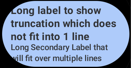 **Figure 1**: Text clipped on corners. 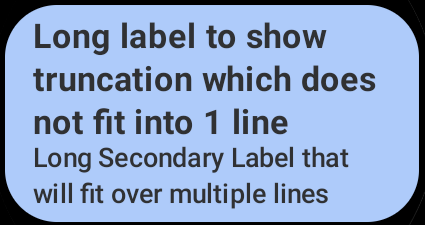 **Figure 2**: Text not clipped.
This change may cause a breakage in screenshot tests.
([I2e6ae](https://android-review.googlesource.com/#/q/I2e6ae57e2c7f47521cf48d518fd9ff67e030f6da))
### Version 1.3.0-beta02
December 13, 2023
`androidx.wear.compose:compose-*:1.3.0-beta02` is released. [Version 1.3.0-beta02 contains these commits.](https://android.googlesource.com/platform/frameworks/support/+log/a8915c4ac4e4bfead52d6b42aaffaa87966ab38b..b76585a287cbcfdae38c3e16e5acbc6e26e808e2/wear/compose)
**Bug Fixes**
- We have restored the intended swipe motion in `BasicSwipeToDismissBox`. This had been altered in a previous release, such that the slide part of the transition occurred while the finger was touching the screen. ([Id8e76](https://android-review.googlesource.com/#/q/Id8e765f2b14ece5e4b38a89a61b3fc8707a80e53))
### Version 1.3.0-beta01
November 15, 2023
`androidx.wear.compose:compose-*:1.3.0-beta01` is released. [Version 1.3.0-beta01 contains these commits.](https://android.googlesource.com/platform/frameworks/support/+log/465c5c5b7a0d79793bddb26a695f67aba8ea2f7e..1f80a6f0c1cb96288c04124001fa2c9bd29617d6/wear/compose)
The 1.3-beta01 release of Compose for Wear OS indicates that this release of the library is feature complete and the API is locked (except where marked as experimental). Wear Compose 1.3 includes the following new functionality:
- `SwipeToDismissBoxState`, `SwipeToDismissValue` and `Modifier.edgeSwipeToDismiss` have been migrated from `androidx.wear.compose.material` to `androidx.wear.compose.foundation`, along with the underlying swipe-to-dismiss implementation in `BasicSwipeToDismissBox`. This allows the gesture handling for swipe-to-dismiss to be used independently of Material Design, for example from the `SwipeDismissableNavHost` in `androidx.wear.compose.navigation`. `SwipeToDismissBox` from `androidx.wear.compose.material` is still recommended to be used with Material Design, because it pulls colors from the `MaterialTheme`, then delegates the remaining implementation to the `BasicSwipeToDismissBox`.
- `SwipeDismissableNavHost` now supports a new `userSwipeEnabled` parameter so that swipe handling can be turned off for screens where it is not required.
- `BasicSwipeToDismissBox` has improved focus handling using `HierarchicalFocusCoordinator`.
- `SwipeToReveal` has new `SwipeToRevealCard` and `SwipeToRevealChip` composables in Material that follow the recommended UX guidance for `Card` and `Chip`. It also has undo support for the secondary action.
- `DefaultTextStyle` now turns off font padding to be consistent across the Android Platform.
- `Chip` and `ToggleChip` now adjust their height to accommodate content that has grown due to large fonts for accessibility
- `PositionIndicator` now has individual animation specs for the fade-in, fade-out and position-change animations. For performance reasons, we recommend that fade-in and position-change are turned off when used with scrollable lists.
- `ExpandableStateMapping` provides a new way to generate `ExpandableStates` when they need to be created on demand and not necessarily with a `@Composable` scope.
- `Placeholder` now allows resetting if the content is no longer in the ready state. Also, the reduce motion setting now applies to the shimmering effect and wipe-off motion on `Placeholder`.
**Known Issues**
- `PositionIndicator` is not initially shown when a screen is first displayed. We intend to make a change in an early 1.4 alpha so that it will be initially shown, but without any animation.
**API Changes**
- We have renamed the Foundation level `SwipeToDismissBox` to `BasicSwipeToDismissBox`. This makes the distinction clearer between the Foundation level component and the Material level `SwipeToDismissBox`. The latter pulls colors from the `MaterialTheme` to be used in scrims and delegates the remaining implementation to the `BasicSwipeToDismissBox`. ([Ibecfc](https://android-review.googlesource.com/#/q/Ibecfc1720eadd2d8e5e1c1cfd6832300775bffb1))
- We have marked `rememberExpandableStateMapping` as experimental and improved the performance of `expandableItem`. ([I5f6bc](https://android-review.googlesource.com/#/q/I5f6bc03b5b0c8b8e4a66f03000a3710c368ebf67))
- We have replaced the `SwipeToRevealAction` class in the Material `SwipeToReveal` Card and Chip APIs with a slot-based API using `SwipeToRevealPrimaryAction`, `SwipeToRevealSecondaryAction` and `SwipeToRevealUndoAction` composables. Please see sample code for examples on how to use the new API. ([Ia8943](https://android-review.googlesource.com/#/q/Ia89431e240b0602bfe08bceb660ff9ef1137d938))
- We have replaced the `PositionIndicator` animation flags with `AnimationSpec` parameters. The individual animations can be disabled by passing `snap` as the `AnimationSpec`. ([I6c523](https://android-review.googlesource.com/#/q/I6c5232868a3e4fcafde3f066a735ae8df203cb54))
**Bug Fixes**
- We have fixed a bug triggered by limited curved text when size is limited ([I50efe](https://android-review.googlesource.com/#/q/I50efee190c03dcb4e9abc433602623ae4ba955d7))
- We have addressed a potential NaN crash related to `curvedComposable` ([I970eb](https://android-review.googlesource.com/#/q/I970ebced07b80bb3b51b6d6cd8329207be79902b))
- We have reverted the removal of the position change highlight animation on `PositionIndicator`. ([Ieb424](https://android-review.googlesource.com/#/q/Ieb4245ffbfde4405f948adc98a79b0c11def424e))
- We have removed the material-core layer for material Chip to improve its performance. ([If2dcb](https://android-review.googlesource.com/#/q/If2dcbbc99bbb6394b85b7fc8f3c9d88bdc78ba4a))
### Version 1.3.0-alpha08
October 18, 2023
`androidx.wear.compose:compose-*:1.3.0-alpha08` is released. [Version 1.3.0-alpha08 contains these commits.](https://android.googlesource.com/platform/frameworks/support/+log/1f7407d4293384a1b91bc142880e3525048b3443..465c5c5b7a0d79793bddb26a695f67aba8ea2f7e/wear/compose)
**API Changes**
- We have added individual flags to `PositionIndicator` overloads, to control different animations: `showFadeInAnimation`, `showFadeOutAnimation` and `showPositionAnimation`. The previous API has been deprecated and forwards calls to the new one. For performance reasons and for UX consistency, when the `PositionIndicator` is used with a scrollable list, we recommend switching off `showFadeInAnimation` and `showPositionAnimation` flags. If `PositionIndicator` is used as a standalone indicator, for example for volume change, then we recommend having all 3 animations turned on. ([I44294](https://android-review.googlesource.com/#/q/I44294ccbb47f244dda839b4659a1b2cd962c7aef))
- We have deprecated the Material `SwipeToDismissBoxState`, `SwipeToDismissValue` and `edgeSwipeToDismiss` following the migration of Swipe-to-Dismiss functionality to `wear.compose.foundation`. Please replace with the `wear.compose.foundation` equivalents. ([Iee8c9](https://android-review.googlesource.com/#/q/Iee8c97aeb50a9109d35fc70d41c57fb755dab699))
**Bug Fixes**
- We have updated the baseline profiles for wear compose foundation, material and navigation libraries. ([Idb060](https://android-review.googlesource.com/#/q/Idb060e09eeb5d708f6bf5c531fe9c01b7e5ae465))
- We have reverted a behavioral change for `PositionIndicator` introduced in a previous CL, such that the `PositionIndicator` was animated when a screen was initially displayed. We intend to make a similar change in an early 1.4 alpha, so that the `PositionIndicator` is initially displayed, but without any animation. ([I41843](https://android-review.googlesource.com/#/q/I41843ef10d4ebad839616c8005070f1989b2e940))
- We have addressed some performance issues in `PositionIndicator`. ([I1c654](https://android-review.googlesource.com/#/q/I1c6546abc834f718c9d8f11d756262d507590acc), [b/302399827](https://issuetracker.google.com/issues/302399827))
- We have optimized performance of the touch exploration state provider default implementation to rely on `State` rather than derived state. ([Ieec4d](https://android-review.googlesource.com/#/q/Ieec4de2ea71eefabb5dbac43d61975e4f36cc5df))
- We have set `systemGestureExclusion` rectangles for Android 13 and higher. ([Ib1f4b](https://android-review.googlesource.com/#/q/Ib1f4b09be3efedc382213b58d80f02bb21608e7d))
### Version 1.3.0-alpha07
October 4, 2023
`androidx.wear.compose:compose-*:1.3.0-alpha07` is released. [Version 1.3.0-alpha07 contains these commits.](https://android.googlesource.com/platform/frameworks/support/+log/91bb8c1f81dcb031bda00fcd8e55f1e890b56f06..1f7407d4293384a1b91bc142880e3525048b3443/wear/compose)
**API Changes**
- We have added individual flags to `PositionIndicator` to control different animations: `showFadeInAnimation`, `showFadeOutAnimation` and `showPositionAnimation`. The previous API has been deprecated and forwards calls to the new one. For performance reasons and for UX consistency, when the `PositionIndicator` is used with a scrollable list, we recommend switching off `showFadeInAnimation` and `showPositionAnimation` flags. If `PositionIndicator` is used as a standalone indicator, for example for volume change, then we recommend having all 3 animations turned on. ([Ia2d63](https://android-review.googlesource.com/#/q/Ia2d63d8ea92ca87b09b11d79c7968f0f72460bab))
**Bug Fixes**
- We have made improvements to the swipe to reveal motion by adding a fade animation to the primary action text, and fading the secondary action/changing the icon scale on full swipe expansion. ([Ib7223](https://android-review.googlesource.com/#/q/Ib72232be1be3c7711282f663570d8a9fa7432216))
- It is recommended that Swipe to Reveal actions are made accessible and we have added custom accessibility actions to our Swipe to Reveal samples. ([I42224](https://android-review.googlesource.com/#/q/I422247105b834eec718b76cbb2b3d77e9085d998))
- We have improved the performance of `SwipeToDismissBox`, including refactoring to ensure that the initial logic does not trigger a recomposition. The `SwipeToDismissBox` is now drawn as the full screen size. ([Ie0aa2](https://android-review.googlesource.com/#/q/Ie0aa2d6ef7c2cea5a96d5b268cfd2e0545b402a1))
- We have fixed a bug when the `PositionIndicator` incorrectly disappeared. ([I2091a](https://android-review.googlesource.com/#/q/I2091a88014bbaccf5ff6171d9bf2c50c96d4ae36))
- Improved performance of `PositionIndicator` by optimizing recompositions. New flags to control the animations (`fadeIn`, `fadeOut` and `positionChange`) have been added subsequently (see API Changes) ([Ifac7d](https://android-review.googlesource.com/#/q/Ifac7de410fc3d68a604cc1212abe19d1de9d6f06))
- We have added Microbenchmark tests for `PositionIndicator` ([Idf875](https://android-review.googlesource.com/#/q/Idf8756cae7809140d50e7de19f60ddedbf8aac03))
### Version 1.3.0-alpha06
September 20, 2023
`androidx.wear.compose:compose-*:1.3.0-alpha06` is released. [Version 1.3.0-alpha06 contains these commits.](https://android.googlesource.com/platform/frameworks/support/+log/9ce75ea1baa2af10dda8f787f69c40c6654bcac1..91bb8c1f81dcb031bda00fcd8e55f1e890b56f06/wear/compose)
**Bug Fixes**
- We have added support for `Modifier.edgeSwipeToDismiss` with `SwipeToReveal`. ([I95774](https://android-review.googlesource.com/#/q/I95774a7df008db12756215dc8a064001008103c5), [b/293444286](https://issuetracker.google.com/issues/293444286))
- We have added samples for the Material `SwipeToRevealChip` and `SwipeToRevealCard`. ([Ieb974](https://android-review.googlesource.com/#/q/Ieb9748b14e08f9bea96fa71df891fa525ae4c013))
- We have updated the baseline profiles for Wear Compose Foundation and Material libraries. ([I1dd1f](https://android-review.googlesource.com/#/q/I1dd1fda77f5a192ddda2c2681644c4f4f246bbb0))
### Version 1.3.0-alpha05
September 6, 2023
`androidx.wear.compose:compose-*:1.3.0-alpha05` is released. [Version 1.3.0-alpha05 contains these commits.](https://android.googlesource.com/platform/frameworks/support/+log/3315f1ef094c312203fe26841287902916fbedf5..9ce75ea1baa2af10dda8f787f69c40c6654bcac1/wear/compose)
**Bug Fixes**
- We have added handling in Swipe to Reveal so that only one item at a time can be swiped. ([I3cd7a](https://android-review.googlesource.com/#/q/I3cd7a5692830ddde9142c11d58c067790fd836ab))
- Improved the documentation of `ScalingLazyColumnDefaults` to better match its actual behavior. ([I886d3](https://android-review.googlesource.com/#/q/I886d362cce1f4c909e27d84b1f2bfc855daae83d))
### Version 1.3.0-alpha04
August 23, 2023
`androidx.wear.compose:compose-*:1.3.0-alpha04` is released. [Version 1.3.0-alpha04 contains these commits.](https://android.googlesource.com/platform/frameworks/support/+log/5d7dd999525725bd038a00ca4e89e0fef624a6da..3315f1ef094c312203fe26841287902916fbedf5/wear/compose)
**New Features**
- We have added undo support for the secondary action of `SwipeToReveal`. ([I7a22d](https://android-review.googlesource.com/#/q/I7a22d3c215e9f7f079685e87aa0c0a267e7b0036))
**API Changes**
- Add `HorizontalPageIndicator` in Wear Material3 library. ([Ifee99](https://android-review.googlesource.com/#/q/Ifee996864667def4d04905328cb5e6667037842a))
- Updated Wear Compose preview tooling to use the `androidx.wear.tooling.preview` library. ([Ib036e](https://android-review.googlesource.com/#/q/Ib036edb1823884c5f9e312d6733e7c3db22f9a0a))
**Bug Fixes**
- Fix a bug in round buttons where modifiers were not chained correctly. ([I5e162](https://android-review.googlesource.com/c/platform/frameworks/support/+/2697934))
### Version 1.3.0-alpha03
August 9, 2023
`androidx.wear.compose:compose-*:1.3.0-alpha03` is released. [Version 1.3.0-alpha03 contains these commits.](https://android.googlesource.com/platform/frameworks/support/+log/4aed940027a19667e67d155563fc5fa8b7279313..5d7dd999525725bd038a00ca4e89e0fef624a6da/wear/compose)
**API Changes**
- We have added two new composables in Material for implementing `SwipeToReveal` with Cards and Chips. These composables follow the recommended UX guidance on the component and make it easier for developers to implement `SwipeToReveal` with the existing components in Wear Material. ([I7ec65](https://android-review.googlesource.com/#/q/I7ec65ff3e6c419685f5f3e80a3073ee78143feb0))
- We have turned on the `FloatRange` annotations as API constraints, which were previously stated in comments. ([Icb401](https://android-review.googlesource.com/#/q/Icb401745b75b2cdda25fa4bdfbe2f1707f8da08e))
**Bug Fixes**
- We have moved the initial scrolling logic of `ScalingLazyColumn` inside `onGloballyPositioned()`. ([Ic90f1](https://android-review.googlesource.com/#/q/Ic90f10c7ba628d89f16d442aa59799a5a1c813a6))
- We are now using `drawWithCache` in `PositionIndicator`, `ProgressIndicator`, and `SelectionControls` to optimize stroke allocations. ([I5f225](https://android-review.googlesource.com/#/q/I5f225ef77dfe39670fb7efb4fda193cd7867eacf), [b/288234617](https://issuetracker.google.com/issues/288234617))
- We have fixed checkbox tick visibility in disabled states. ([Ib25bf](https://android-review.googlesource.com/#/q/Ibd820b96a260ce863a6a3d49bcd86f7a948c6620))
- We have updated `Placeholder` to allow resetting to show the placeholder if the content is no longer in the ready state. ([Ibd820](https://android-review.googlesource.com/#/q/Ib25bfdd5c22eb2686117e6dece1d3c3f5cdab614))
- We have made some fixes to flaky `Placeholder` tests ([Idb560](https://android-review.googlesource.com/#/q/Idb5604b76da1a59c9169a6f61575bcf6a61bc0e4))
### Version 1.3.0-alpha02
July 26, 2023
`androidx.wear.compose:compose-*:1.3.0-alpha02` is released. [Version 1.3.0-alpha02 contains these commits.](https://android.googlesource.com/platform/frameworks/support/+log/3b5b931546a48163444a9eddc533489fcddd7494..4aed940027a19667e67d155563fc5fa8b7279313/wear/compose)
**API Changes**
- We have provided `ExpandableStateMapping`, a new way to generate `ExpandableStates`, for cases in which they need to be created on demand, not necessarily within a `@Composable` scope ([Iff9e0](https://android-review.googlesource.com/#/q/Iff9e0dc927754c763ec0c1c0b9760ec5a8f20ef5))
- `SwipeToDismissBox` has been migrated from `androidx.wear.compose.material` to `androidx.wear.compose.foundation` package. ([I275fb](https://android-review.googlesource.com/#/q/I275fbd752435e183fd99594ae16bca5a8c92f864))
- Updated API files to annotate compatibility suppression. ([I8e87a](https://android-review.googlesource.com/#/q/I8e87ae292b38fac1886001f5317acda1592f174b), [b/287516207](https://issuetracker.google.com/issues/287516207))
- We have made the height constants for `Chip`, `CompactChip` and `ToggleChip` public ([Idbfde](https://android-review.googlesource.com/#/q/Idbfdecfdc391dd2591724d3e6ba9c34f0e20878a))
- We have made the horizontal and vertical paddings for `Chip` and `CompactChip` public. ([Ieeaf7](https://android-review.googlesource.com/#/q/Ieeaf7e002e40394df0b591e8ff1e8d92e55a061f))
- Added functionality to turn off swipe handling in `SwipeDismissableNavHost` via the new `userSwipeEnabled` parameter. ([Id2a0b](https://android-review.googlesource.com/#/q/Id2a0befd6895598967ccc6d617a7d4b52756b8c6), [b/230865655](https://issuetracker.google.com/issues/230865655))
- We have updated the Wear Compose Navigation library to use the new `SwipeToDismissBox` from Wear Compose Foundation. ([I4ff8e](https://android-review.googlesource.com/#/q/I4ff8e566a8975d461b97e7a5a3da3435c564390c))
**Bug Fixes**
- We have fixed a z-order bug where `expandedItem` did not show the correct content after clicking a button's behavior when they have buttons. ([I1899d](https://android-review.googlesource.com/#/q/I1899d8055e5ebd89263fc498964565215452e95c), [b/289991514](https://issuetracker.google.com/issues/289991514))
- Improve focus handling of `SwipeToDismissBox` (and hence `SwipeDismissableNavHost`) using the `HierarchicalFocusCoordinator` ([I45362](https://android-review.googlesource.com/#/q/I45362046141d2460c65f392650000c9b86aef6a5), [b/277852486](https://issuetracker.google.com/issues/277852486))
- We have made a fix to the gesture handling in `SwipeableV2` . ([I89737](https://android-review.googlesource.com/#/q/I89737359b27a8dbf21654c2b811b1269f4a27dc6))
- We have finalized the baseline profiles for our 1.2 release. ([Id5740](https://android-review.googlesource.com/#/q/Id57402fffd2612f99e3e36c74891ce1f06dad1ed))
- Following the migration of `SwipeToDismissBox` to Foundation, the Material `SwipeToDismissBox` implementation now forwards to Foundation and supplies default color values from its theme.([If8451](https://android-review.googlesource.com/#/q/If845146ee4f29d07a950b1bf3b5c9e308e59ab5b))
- We have added heading semantics to `ListHeader`. ([Ic5420](https://android-review.googlesource.com/#/q/Icb25d61b04a3c906f5bc604a5eda803bfb0bc6ff))
- `Chip` and `ToggleChip` will now adjust their height to accommodate content that has grown due to large fonts for accessibility, when required. ([Iaf302](https://android-review.googlesource.com/#/q/Iaf3026bfb19a261821878927b0e0e3aaacca57c1))
- Fixed a bug in the semantic role of `SplitToggleChip`'s tappable area, for accessibility. ([Ieed3a](https://android-review.googlesource.com/#/q/Ieed3a16f8d534fa39dcea1a3ee4c4641ecef0627))
- The reduce motion setting now turns off the shimmering effect and wipe-off motion on placeholders. ([I91046](https://android-review.googlesource.com/#/q/I91046a0ba3a3110a7f041811a630fae8a80c80fd))
- `Stepper` and `InlineSlider` now support repeated clicks on long press so that you can quickly increase/decrease value of `Stepper` and `InlineSlider` by holding the + or - buttons. ([I27359](https://android-review.googlesource.com/#/q/I2735993c5721f8a4142b3ca09bca42364da69059))
### Version 1.3.0-alpha01
June 21, 2023
`androidx.wear.compose:compose-*:1.3.0-alpha01` is released. [Version 1.3.0-alpha01 contains these commits.](https://android.googlesource.com/platform/frameworks/support/+log/df792c9ff86d87f538bab5d7f9dd9f56e2437b15..3b5b931546a48163444a9eddc533489fcddd7494/wear/compose)
**Bug Fixes**
- As announced in `1.2.0-alpha07` and `1.2.0-alpha10`, we are now changing the `DefaultTextStyle` to turn off font padding to be consistent across the Android Platform. This will address some cases of text clipping with large font sizes and may also impact screen layouts, so that screenshot tests need to be updated. For example, we see text clipping here ([Ic6a86](https://android-review.googlesource.com/#/q/Ic6a8606eaa2bb5a360242b61c34c194370521f3b))
 **Figure 1**: Text clipped.
- It is no longer present when font padding is turned off:
 **Figure 2**: Text not clipped.
- We have updated `wear.compose.foundation` to be an API dependency of `wear.compose.material` ([I72004](https://android-review.googlesource.com/#/q/I72004e7a328438e2f0bc8822e0b8e45b5d7225e8), [b/285404743](https://issuetracker.google.com/issues/285404743))
- We have fixed a bug in `SwipeToDismissBox`. Background and content keys are now passed to the remember block so that new modifiers are created when the content or background changes. ([Ib876c](https://android-review.googlesource.com/#/q/Ib876c266c8ec9795e8f2c83a6c0a7e846b0ebc51), [b/280392104](https://issuetracker.google.com/issues/280392104))
- We have updated `TimeText` to use the locale when choosing the format for 12 or 24 hour time. ([If4a3d](https://android-review.googlesource.com/#/q/If4a3d656f72d1e0dd07c1109d457bed75cac8a90))
- We have fixed an inconsistency in `SwipeToDismissBox` `contentScrimColor` default parameters. ([I2d70f](https://android-review.googlesource.com/#/q/I2d70f70ae0d88f5e744808ac9f40546d2a3b6213))
- We have improved the motion handling in `SwipeToReveal`. ([I28fb7](https://android-review.googlesource.com/#/q/I28fb781b9ff141c7953ca32c7db5f5e663a1a786))
**Known Issues**
- Supporting user-configured font sizes is an accessibility requirement. We know that multiline Chips can lead to text-clipping when displayed with large font sizes, so we will be updating Chip in an early 1.3 alpha version to make height adjustments in those cases.
## Version 1.2
### Version 1.2.1
October 18, 2023
`androidx.wear.compose:compose-*:1.2.1` is released. [Version 1.2.1 contains these commits.](https://android.googlesource.com/platform/frameworks/support/+log/2133a18cd930fd58cb9719a4017260320a02a0b8..82384c3670fd9bbfe3fe33de06271c43466457b1/wear/compose)
**Bug Fixes**
- Fixed a bug when the `PositionIndicator` incorrectly disappeared. ([7a167f](https://android-review.googlesource.com/q/7a167f585b81a0e24667c530896569733c03c19c))
### Version 1.2.0
August 9, 2023
`androidx.wear.compose:compose-*:1.2.0` is released. [Version 1.2.0 contains these commits.](https://android.googlesource.com/platform/frameworks/support/+log/9bd7fa609db1063e70090129da84011820751949..2133a18cd930fd58cb9719a4017260320a02a0b8/wear/compose)
**Important changes since 1.1.0**
- Stable release of Compose for Wear OS 1.2.0 ([read more](https://android-developers.googleblog.com/2023/08/compose-for-wear-os-and-tiles-1-2-libraries-now-stable-new-features.html))
- For a list of the key changes in Wear Compose 1.2, see the release notes for ([Compose for Wear OS 1.2 Beta01](https://developer.android.com/jetpack/androidx/releases/wear-compose#1.2.0-beta01))
### Version 1.2.0-rc01
July 26, 2023
`androidx.wear.compose:compose-*:1.2.0-rc01` is released. [Version 1.2.0-rc01 contains these commits.](https://android.googlesource.com/platform/frameworks/support/+log/df792c9ff86d87f538bab5d7f9dd9f56e2437b15..9bd7fa609db1063e70090129da84011820751949/wear)
**Bug Fixes**
- We have finalized the baseline profiles for our 1.2 release ([Id5740](https://android-review.googlesource.com/#/q/Id57402fffd2612f99e3e36c74891ce1f06dad1ed))
### Version 1.2.0-beta02
June 7, 2023
`androidx.wear.compose:compose-*:1.2.0-beta02` is released. [Version 1.2.0-beta02 contains these commits.](https://android.googlesource.com/platform/frameworks/support/+log/06ba27a6a7d155acd0b8eea379b0948333901d86..df792c9ff86d87f538bab5d7f9dd9f56e2437b15/wear/compose)
**New Features**
- We have added the new experimental `LocalReduceMotion` `CompositionLocal` variable which disables scaling and fading on `ScalingLazyColumn`. ([I58024](https://android-review.googlesource.com/#/q/I5802434d7978c582cddeb5667c26cf7b4fcb9c89))
**Bug Fixes**
- We have updated the baseline profiles for the wear compose foundation and material libraries([I4725d](https://android-review.googlesource.com/#/q/I4725dc48f803b7b9d8a416660f27a61e6bfeaff3))
- We have fixed an inconsistency in the default values for `SwipeToDismissBox` `contentScrimColor` parameters ([I2d70f](https://android-review.googlesource.com/#/q/I2d70f70ae0d88f5e744808ac9f40546d2a3b6213))
- We have fixed the `DefaultTextStyle` default value used for the `IncludeFontPadding` setting ([I737ed](https://android-review.googlesource.com/#/q/I737edd967b9997de5fff260728a760ec0a747028))
### Version 1.2.0-beta01
May 24, 2023
`androidx.wear.compose:compose-*:1.2.0-beta01` is released. [Version 1.2.0-beta01 contains these commits.](https://android.googlesource.com/platform/frameworks/support/+log/6f3ac2bd197d5e61ab2708125b57d6ae4003ad68..06ba27a6a7d155acd0b8eea379b0948333901d86/wear/compose)
**What's in Compose for Wear OS 1.2**
The 1.2-beta01 release of Compose for Wear OS indicates that this release of the library is feature complete and the API is locked (except where marked as experimental). Wear Compose 1.2 includes the following new functionality:
- `expandableItem` and `expandableItems` are two new `Foundation` components that support expanding items within a `ScalingLazyColumn`. Use `expandableItem` for a single expandable item, such as Text in which the number of lines. Use `expandableItems` for a group of expandable items and `expandableButton` to simplify creating a button that collapses after the content is expanded.
- `HierarchicalFocusCoordinator` - this experimental composable enables marking sub-trees of the composition as focus enabled or focus disabled.
- `Picker` - the API now includes `userScrollEnabled` to control whether the picker is active for user scrolling.
- `PickerGroup` - a new composable for handling multiple pickers together. It handles focus between the pickers using the `HierarchicalFocusCoordinator` API and enables auto-centering of picker items.
- `Placeholder` - we have made updates to the shimmer and 'Wipe Off' animations. The wipe-off effect is now immediately applied when the content is ready.
- `ScalingLazyColumn` - we have migrated `ScalingLazyColumn` and associated classes from `androidx.wear.compose.material.ScalingLazyColumn` to `androidx.wear.compose.foundation.lazy.ScalingLazyColumn`. Please update to use the `Foundation.Lazy` version.
- `SwipeToReveal` - we have added experimental support for swipe-to-reveal as a means to access secondary actions, supplementing the existing 'long press' pattern.
- `Stepper` - now has an overload with an additional `enableRangeSemantics` parameter to facilitate disabling the default range semantics.
- `Previews` - we have added the following custom annotations for previewing composables on Wear screens: `WearPreviewSmallRound` previews the composable on a small, round device; `WearPreviewLargeRound` previews the composable on a large round device; `WearPreviewSquare` previews the composable on a square device. Also, the following and multi-preview annotations: `WearPreviewFontScales` previews the composables on a wear device with multiple font sizes, while `WearPreviewDevices` previews the composables on different wear devices.
- We have added a `DefaultTextStyle` to Wear Compose which defaults the `PlatformTextStyle.includeFontPadding` property to true (this is the current setting). This will allow us to synchronize turning off font padding by default with the Compose libraries in an early 1.3 alpha version - see [1.2.0-alpha10](https://developer.android.com/jetpack/androidx/releases/wear-compose#1.2.0-alpha10) for more information.
**New Features**
- We have added experimental support for disabled scaling and fading animation when reduce_motion setting is switched on. ([I58024](https://android-review.googlesource.com/#/q/I5802434d7978c582cddeb5667c26cf7b4fcb9c89))
**Bug Fixes**
- Improved documentation for `angularWidthDp` in `CurvedSize.kt` ([Iab75c](https://android-review.googlesource.com/#/q/Iab75c401bafba08ce4f2e07ca686b8f5d0685ec3))
- `SwipeDismissableNavHost` now logs a warning with potential causes of empty backstack. This is done to prevent unexpected crashes caused because of `IllegalArgumentException` which was thrown when the backstack was empty. ([I04a81](https://android-review.googlesource.com/#/q/I04a812325b4a8b5d59d4ce1ba2f770ee75b0ba71), [b/277700155](https://issuetracker.google.com/issues/277700155))
### Version 1.2.0-alpha10
May 10, 2023
`androidx.wear.compose:compose-*:1.2.0-alpha10` is released. [Version 1.2.0-alpha10 contains these commits.](https://android.googlesource.com/platform/frameworks/support/+log/01bd392d5702480f8bfe61a8f8bbbea64cf362a0..6f3ac2bd197d5e61ab2708125b57d6ae4003ad68/wear/compose)
**New Features**
- We have added support for Swipe to Reveal, as a means to access secondary actions. This pattern supplements the 'long press' pattern, the existing way a user could reveal (different) secondary actions. ([I60862](https://android-review.googlesource.com/#/q/I60862f2a9bcb904b0281e3c85b56aaf2a057a976))
**API Changes**
- We have added `RevealScope` to action composables in `SwipeToReveal`, which gives access to the offset at which additional actions are revealed. ([I3fd56](https://android-review.googlesource.com/#/q/I3fd56eb7f8f5f9ec467790988afb9f942766098d))
**Bug Fixes**
- Fixed an issue with `ScalingLazyColumn` being stuck on Wear API 33 after fling ([Ic4599](https://android-review.googlesource.com/#/q/Ic45992479e12e57ef37625ff923cb7980709b124))
- We have made some performance improvements to `PositionIndicator` for jank reduction. ([I35e92](https://android-review.googlesource.com/#/q/I35e9212abd5dfbcfb270442eea7c357db9fc06f5))
- We have fixed a bug in Chip and `CompactChip` where the semantic role was no longer being set to `Role.Button`. ([I93f91](https://android-review.googlesource.com/#/q/I93f91a670052b94387349e6ac9e1373353c1e4e2), [b/277326264](https://issuetracker.google.com/issues/277326264))
**Known Issues**
- We have identified a bug in Android Studio which causes failure in rendering preview when annotated with @WearPreviewDevices and @WearPreviewFontScales - a fix is planned for release soon. Please note that the other wear preview annotations work as intended in Android Studio Giraffe 2022.3.1 and beyond.
- In version [1.2.0-alpha07](https://developer.android.com/jetpack/androidx/releases/wear-compose#1.2.0-alpha07) we added DefaultTextStyle to Wear Compose, maintaining the existing PlatformTextStyle.includeFontPadding value as true - for background, see [Fix font padding in Compose](https://medium.com/androiddevelopers/fixing-font-padding-in-compose-text-768cd232425b). We will be changing the DefaultTextStyle to turn off font padding in an early 1.3 alpha version, to be consistent across the Android Platform. This will address some cases of text clipping with large font sizes and may also impact screen layouts, so that screenshot tests need updating. For example, with large font sizes we see text clipping here:
 **Figure 1**: Text clipped.
- It is no longer present when font padding is turned off:
 **Figure 2**: Text not clipped.
The new setting can be adopted now by overriding the typography in your theme - see [example code](https://gist.github.com/shumelchyk/8450933e176cd9044ead7bb38923a3b6).
### Version 1.2.0-alpha09
April 19, 2023
`androidx.wear.compose:compose-*:1.2.0-alpha09` is released. [Version 1.2.0-alpha09 contains these commits.](https://android.googlesource.com/platform/frameworks/support/+log/a200cb82769634cecdb118ec4f0bfdf0b086e597..01bd392d5702480f8bfe61a8f8bbbea64cf362a0/wear/compose)
**API Changes**
- Add `angularSizeDp` to the `CurvedModifier` api for setting angular width in DP ([I89a52](https://android-review.googlesource.com/#/q/I89a52b7f6ea258dbdbe96ba926e7a51ee20a4e31))
**Bug Fixes**
- We have fixed accessibility issues in our time picker demos([Id0eb7](https://android-review.googlesource.com/#/q/Id0eb7539e87b24210d71be4f2fa291619515e7d2))
### Version 1.2.0-alpha08
April 5, 2023
`androidx.wear.compose:compose-*:1.2.0-alpha08` is released. [Version 1.2.0-alpha08 contains these commits.](https://android.googlesource.com/platform/frameworks/support/+log/5e7d256f82fbafb6d059ab7b18fddd87c7531553..a200cb82769634cecdb118ec4f0bfdf0b086e597/wear/compose)
**API Changes**
- We have renamed `ExpandableItemsState` to `ExpandableState`. ([If85ea](https://android-review.googlesource.com/#/q/If85ea9f010139a42f993f681f74a8e8bf7a43b16))
- We have added `expandableButton` to simplify creating a button that collapses when the content is expanded and also updated the expandables examples. ([Iae309](https://android-review.googlesource.com/#/q/Iae3091470e3f1b531757172e838406fe3e075150))
**Bug Fixes**
- Improved expandable samples to show more possibilities. Modified animation of `expandableItem` to keep its content centered through the animation. ([I2f637](https://android-review.googlesource.com/#/q/I2f63707eb72a61e0f3ae35d7b3995f2fae5d9097))
- Updated `ToggleControls` to avoid extra recompositions when manually animating the colors using State. ([I5d319](https://android-review.googlesource.com/#/q/I5d319f7d1c879ca06910efdc53594baf2d9ccaef))
### Version 1.2.0-alpha07
March 22, 2023
`androidx.wear.compose:compose-*:1.2.0-alpha07` is released. [Version 1.2.0-alpha07 contains these commits.](https://android.googlesource.com/platform/frameworks/support/+log/3f3da5079e3673cd35c9f14ffb59b9d21d6fd1b6..5e7d256f82fbafb6d059ab7b18fddd87c7531553/wear/compose)
**API Changes**
- We have moved the Expandable Item components (added in 1.2.0-alpha06) from material to foundation, since they had no meaningful reference to the `MaterialTheme`. ([Ib0525](https://android-review.googlesource.com/#/q/Ib052565ab33d190655b6fae6e7a2e44f743313dd))
**Bug Fixes**
- We have fixed a crash that occurred in a screen using `PickerGroup`, by ensuring that `PickerGroup` handles focus correctly when no Picker has the focus. Also added support for RSB scrolling in our Picker demos. ([If8c19](https://android-review.googlesource.com/#/q/If8c19c69617d2cad60d8e1897bafa55b632c735e))
- We have improved the dialog transitions - the intro transition is now smoother to match the outro transition. ([Ib5af9](https://android-review.googlesource.com/#/q/Ib5af9b7c468543e8fb5988b50bf712bbfb1a340f))
- We have added a `DefaultTextStyle` to Wear Compose which defaults the `PlatformTextStyle.includeFontPadding` property to true (this is the current setting). This will allows us to synchronize turning off font padding by default with the Compose libraries in the future - see ([Fix font padding in Compose](https://medium.com/androiddevelopers/fixing-font-padding-in-compose-text-768cd232425b)) for background. ([I2aee8](https://android-review.googlesource.com/#/q/I2aee81620b17057aab192c02e888392f3c0c96f6))
- Reverted an `UpsideDownCake` preview dependency via activity-compose that blocked publishing apps to the Google Play Store. ([I6443d](https://android-review.googlesource.com/#/q/I6443d4e7b9b568ad4d7e19d966c23e66e863ddce))
### Version 1.2.0-alpha06
March 8, 2023
`androidx.wear.compose:compose-*:1.2.0-alpha06` is released. [Version 1.2.0-alpha06 contains these commits.](https://android.googlesource.com/platform/frameworks/support/+log/3f3da5079e3673cd35c9f14ffb59b9d21d6fd1b6/wear/compose)
**API Changes**
- Add `CurvedBox` component, which places components on top of each other in the curved world. ([I29200](https://android-review.googlesource.com/#/q/I29200406c7f7ea37d750ffcd8f478d3c8b2ea7b8))
- Added Expandable Item(s) - two new components to support either a group of expandable items in a `ScalingLazyColumn`, or an expandable single item, such as Text in which the number of lines expands. ([I95dd5](https://android-review.googlesource.com/#/q/I95dd5f8d5e1d76ee6cb08b176b109d74c0c543ef))
- We have added the following custom annotations for previewing composables on Wear screens: `WearPreviewSmallRound` previews the composable on a small, round device; `WearPreviewLargeRound` previews the composable on a large round device; `WearPreviewSquare` previews the composable on a square device. Also, the following and multi-preview annotations: `WearPreviewFontScales` previews the composables on a wear device with multiple font sizes, while `WearPreviewDevices` previews the composables on different wear devices. To use these previews, you must be using the latest Android Studio (Giraffe Canary 6) or beyond. Please note that if these annotations do not suit your purpose, Preview can still be used and supports further customisations via parameters. ([I397ff](https://android-review.googlesource.com/#/q/I397fff28367e369c2d6870d9e0da3f068ca67e60))
- We have marked `HierarchicalFocusCoordinator` as experimental while it is considered as a candidate to be moved into core compose libraries, given its wide applicability. ([I3a768](https://android-review.googlesource.com/#/q/I3a768ff9eb2f1cbd46e6ac73cba89561847611e9))
**Bug Fixes**
- Fixed a bug on `HierarchicalFocusCoordinator`, when the lambda passed in for the `focusEnabled` parameter is changed, we now correctly use the new one. ([Icb353](https://android-review.googlesource.com/#/q/Icb3539c74d078f1cfdff7997a0a60ccf481cbbfd))
- We have updated the default disabled content color to Background when using primary colors as the background in `Button`, `CompactButton`, `Chip`, `CompactChip` and `ToggleButton`. This improves the contrast for accessibility. ([I527cc](https://android-review.googlesource.com/#/q/I527cc9200d88cf6ab090620f43d7de1b180189cb))
### Version 1.2.0-alpha05
February 22, 2023
`androidx.wear.compose:compose-*:1.2.0-alpha05` is released. [Version 1.2.0-alpha05 contains these commits.](https://android.googlesource.com/platform/frameworks/support/+log/f7337eab774a6ce3b17367d5f31708564b66e677..87533b4ff06971ed59028936cd9b6da988cd4522/wear/compose)
**API Changes**
- Updated `PickerGroup` API to allow propagating the min constraints to the composable optionally. When set as true, the minimum constraints passed from the parent composable will be allowed on the `PickerGroup`. If set as false, `PickerGroup` will reset the minimum constraints. ([I3e046](https://android-review.googlesource.com/#/q/I3e046ae05db206b34b106c5601891de0e3913e0a))
- We have added `animateScrollToOption` to the Picker API in order to support programmatic animation to a specific Picker option ([I6fe67](https://android-review.googlesource.com/#/q/I6fe679e1c9d168f1da542467ee8041a6ac0a7586))
**Bug Fixes**
- We have updated `HorizontalPageIndicator` to support right-to-left layouts. ([Ia4359](https://android-review.googlesource.com/#/q/Ia4359e82ffcb7f74512888c4b1e53bd913b9e41e))
- Added Screenshot tests for right-to-left layout in `HorizontalPageIndicator` ([I6fbb8](https://android-review.googlesource.com/#/q/I6fbb8de0c7b628f665340a1175bcb59c484b559a))
- Added further tests to `SwipeDismissableNavHostTest` that use `TestNavHostController` ([I61d54](https://android-review.googlesource.com/#/q/I61d54a8a3a67fb6c1984bdbb3b19af5fa506b427))
### Version 1.2.0-alpha04
February 8, 2023
`androidx.wear.compose:compose-*:1.2.0-alpha04` is released. [Version 1.2.0-alpha04 contains these commits.](https://android.googlesource.com/platform/frameworks/support/+log/e5dad1e7d1c225f89f7c2d5a39a7a0de8d637d7b..f7337eab774a6ce3b17367d5f31708564b66e677/wear/compose)
**New Features**
- `PickerGroup` for handling multiple pickers together using the focus API. It handles the focus between the different pickers, enables auto-centering of the pickers based on parameters and allows developers to change the focus between different pickers while handling the events from the group. In talkback mode, the `PickerGroup` handles the talkback focus by moving the focus to the selected Picker from the group. ([I60840](https://android-review.googlesource.com/#/q/I6084092455aabe1b0ae58761d11f72bca6991301))
**API Changes**
- We have added an overload to Stepper with an additional `enableRangeSemantics` parameter in order to facilitate disabling the default range semantics ([Ia61d4](https://android-review.googlesource.com/#/q/Ia61d4b410ac398d253a6debe62bf8c8f01f6565b))
**Bug Fixes**
- Allow `ScalingLazyColumn` to be nested within a horizontally scrolling page ([Iec3f8](https://android-review.googlesource.com/#/q/Iec3f8cd60ec3af87abdb81d12ade6e0b6b005aca), [b/266555016](https://issuetracker.google.com/issues/266555016))
- Improvement of Stepper kdocs and `StepperTest` tests clean-up. ([Ic118e](https://android-review.googlesource.com/#/q/Ic118ef60d6b9c44b769acc33b055f56cc41ace0e))
- Updated `androidx.navigation` dependency to version 2.5.3 ([If58ed](https://android-review.googlesource.com/#/q/If58ed04fd5144c0307d195db1986ec2d37888157))
### Version 1.2.0-alpha03
January 25, 2023
`androidx.wear.compose:compose-*:1.2.0-alpha03` is released. [Version 1.2.0-alpha03 contains these commits.](https://android.googlesource.com/platform/frameworks/support/+log/adf1c279a86ab3886e1666c08e2c3efba783367b..e5dad1e7d1c225f89f7c2d5a39a7a0de8d637d7b/wear/compose)
**API Changes**
- We have migrated `ScalingLazyColumn` (and associated classes) from `androidx.wear.compose.material.ScalingLazyColumn` to `andrdoidx.wear.compose.foundation.lazy.ScalingLazyColumn` (see [this example](https://github.com/android/wear-os-samples/issues/663) for migration). This new location more closely matches that of `compose.foundation.lazy.LazyColumn` and is more natural as it is not an opinionated Material component. The change is happening now in preparation for a new Material3 library, which we will be working on in parallel with the existing Material library. ([I060e7](https://android-review.googlesource.com/#/q/I060e778102ae01b859b0642efd7039b2ed69fd69))
The following changes are part of the `ScalingLazyColumn` migration from Material to `Foundation.Lazy`:
- `PositionIndicator` apis targeting Material `ScalingLazyColumn` have been deprecated - please update to `Foundation.Lazy ScalingLazyColumn`. Additionally `anchorType` field was added to `ScalingLazyListLayoutInfo`. ([I29d95](https://android-review.googlesource.com/#/q/I29d95f1dcb1997a445b5cdb04fe5dd7cd81527d0))
- `ScalingLazyColumn` has been marked as deprecated in the Wear Compose Material package ([I16d34](https://android-review.googlesource.com/#/q/I16d3409dce206c78db9da178d7e736a212544689))
- We have updated the `ScrollAway` modifier to use `ScalingLazyListState` from Wear Compose `Foundation.Lazy` and deprecated the overload that took `ScalingLazyListState` from Wear Compose Material. ([Ifc42c](https://android-review.googlesource.com/#/q/Ifc42c9c35e468b757fd840cfa43df353907b362e))
- We have updated the Dialog APIs to use `ScalingLazyListState` from `Foundation.Lazy` and deprecated the overloads that used Material `ScalingLazyListState` ([Ic8960](https://android-review.googlesource.com/#/q/Ic896024a00faf50c35ff2addae61339ada11904b))
- We have updated the Picker APIs to use `ScalingParams` from `Foundation.Lazy` and deprecated the overloads that used Material `ScalingParams`. ([Idc3d8](https://android-review.googlesource.com/#/q/Idc3d84c55d88489e3adae02a1c197947810c468b))
**Bug Fixes**
- We have fixed a bug that caused unnecessary recompositions in `ScalingLazyListState.centerItemIndex` by ensuring that it only pushes updates when the value actually changes ([Ia9f38](https://android-review.googlesource.com/#/q/Ia9f38b1cbd96eac0598fc3c482f73326b86f06b9))
- We have improved the performance of `SwipeToDismissBox` ([I3933b](https://android-review.googlesource.com/#/q/I3933b64e8b94a5008a37fd1f26315ed4d8df2eb5))
- Added benchmark tests for `ScalingLazyColumn` in Wear Compose Foundation ([Ie00f9](https://android-review.googlesource.com/#/q/Ie00f99910775b6d924bdb73b9917f6bb703937a1))
- We have updated some internal `ScalingLazyColumn` classes methods in Material to use their equivalents from `Foundation.Lazy` ([I38aab](https://android-review.googlesource.com/#/q/I38aab976a9901b6e28a8b4f0d67e332962b6644e))
- We have fixed some issues in Picker tests and add more tests for checking scroll with offset ([I6ac34](https://android-review.googlesource.com/#/q/I6ac34226d3bcd0f7dbbf12818ac27b0dbf73082c))
- We migrated the `ScalingLazyColumn` Integration Demos to depend on `Foundation.Lazy` instead of Material `ScalingLazyColumn` ([Ic6caa](https://android-review.googlesource.com/#/q/Ic6caa03b0fd887bdfb3c5f4dd5a4eb6d22027db1))
- We have added optional `fromDate/toDate` parameters to our `DatePicker` demo ([I961cd](https://android-review.googlesource.com/#/q/I961cd2cf102f8b9537e3923dd646f3db19c3649c))
### Version 1.2.0-alpha02
January 11, 2023
`androidx.wear.compose:compose-*:1.2.0-alpha02` is released. [Version 1.2.0-alpha02 contains these commits.](https://android.googlesource.com/platform/frameworks/support/+log/4a2f5e696614339c1ac21f706c1a17c0285780e7..adf1c279a86ab3886e1666c08e2c3efba783367b/wear/compose)
**API Changes**
- Android Compose UI tests will now run layout passes for each frame when executing frames to get to idle (e.g. via `waitForIdle`). This may affect tests that assert on individual frames of layout animations. ([I8ea08](https://android-review.googlesource.com/#/q/I8ea08728a395665f9ec7965579797e537b2c35e5), [b/222093277](https://issuetracker.google.com/issues/222093277))
- The parameter `minLines` is added to Wear Text for consistent behaviour with `BasicText` ([I24874](https://android-review.googlesource.com/#/q/I24874b28ff5ee0fab36bbcc052560c8590e6e1bb))
- `CompactChipTapTargetPadding` has been made public so that it appears in the documentation ([If1e70](https://android-review.googlesource.com/#/q/If1e709a1c1a1252f54d11907cc2e412fd2818db9), [b/234119038](https://issuetracker.google.com/issues/234119038))
**Bug Fixes**
- Disable multiplatform builds for `wear.compose` packages ([Iad3d7](https://android-review.googlesource.com/#/q/Iad3d746b9ac10e554fc796f7c3d7808da509d945))
- Fix kdocs for `scrollToOption` ([I6f9a0](https://android-review.googlesource.com/#/q/I6f9a0166eae7c64f31ea3839cac180decfdd62b3))
- `PlaceholderState.rememberPlaceholderState()` updated to use `rememberUpdatedState` to that the state will update if the `onContentReady` lambda. ([I02635](https://android-review.googlesource.com/#/q/I02635c21c723a91aa2f5915fe79468a463fd1698), [b/260343754](https://issuetracker.google.com/issues/260343754))
- We have fixed a text jittering issue seen in the `Picker` component by leveraging the new compositing strategy added to `Modifier.graphicsLayer`. ([I99302](https://android-review.googlesource.com/#/q/I993029ef37f128cbb568d4a9b80b8bf8f3534882))
- We have fixed a bug that caused flickering in our `DatePicker` demo ([I660bd](https://android-review.googlesource.com/q/I660bde5d84f6194ce13011117a3cf2102b2ed152))
- We have improved the accessibility for the 12-hour time and date picker demos ([I05e12](https://android-review.googlesource.com/q/I05e12f957e9e386fed9263f103e6ecb2de49c229))
- We have updated our time and date picker demos so that the pickers are not affected by RSB changes when unselected ([I4aecb](https://android-review.googlesource.com/q/I4aecb52deb69d14d2327d148d1518d92fed67902))
### Version 1.2.0-alpha01
December 7, 2022
`androidx.wear.compose:compose-*:1.2.0-alpha01` is released. [Version 1.2.0-alpha01 contains these commits.](https://android.googlesource.com/platform/frameworks/support/+log/4a2f5e696614339c1ac21f706c1a17c0285780e7/wear/compose)
**New Features**
- We've updated the experimental Placeholder functionality so that the "Wipe Off" effect is immediately applied when the content is ready rather than waiting for the next animation loop to start. We have also made some updates to the shimmer and wipe off animations. ([I5a7f4](https://android-review.googlesource.com/#/q/I5a7f45c0ce6f2262716de3c2c8131de663910d7b))
**API Changes**
- We have added a `HierarchicalFocusCoordinator`composable to enable marking sub-trees of the composition as focus enabled or focus disabled.([I827cb](https://android-review.googlesource.com/#/q/I827cb73ace07280bb0ad8677755efdf721c46147))
- We have added a new property to override the semantic role for `ToggleButton`.([I67132](https://android-review.googlesource.com/#/q/I67132c8ae30e1db80864350ce7a8a3edfb5f8e0d))
- We have updated `TimeTextDefaults.TimeFormat12Hours` to remove AM/PM in `TimeText`. This will change the default value of `timeSource` parameters in `TimeText` API. ([I1eb7f](https://android-review.googlesource.com/#/q/I1eb7fa96f7667217e68b44a3f7cf74d36c24075c))
- We have extended the Picker API to improve accessibility for screens with multi-picker. There is a new property `userScrollEnabled` to control whether the picker is active for user scrolling. ([I3c3aa](https://android-review.googlesource.com/#/q/I3c3aa55ce84d0d577f3f7ab53a23be915abbc5a1))
**Bug Fixes**
- We have changed the default border width for an `OutlinedButton/OutlinedCompactButton` from 2.dp to 1.dp to match final UX specs. ([Icf84d](https://android-review.googlesource.com/#/q/Icf84ddb21ab10a8b009632e8e71f428578a70c45))
- In order to reduce the effect of the first item added to an empty `ScalingLazyColumn` appearing to scroll into place we have added an estimated `autoCentering topPadding` when the contents are empty. This change calculates the amount of top padding needed by assuming an initial item of height 0.dp. For `ScalingLazyListAnchorType.ItemStart` this will calculate the correct top padding, for `ScalingLazyListAnchorType.ItemCenter` this calculation will be incorrect as the height of the items is needed to correctly size the contents resulting in a small scroll into place effect based on the items real height.([I239a4](https://android-review.googlesource.com/#/q/I239a415ab2e2427c94d4c23ee74711095b53c309))
- We have updated the background scrim applied to the `SwipeToDismiss` animation to match the Wear platform. ([I9003e](https://android-review.googlesource.com/#/q/I9003e7d6989497f11983b181378f73d998ffeeb6))
- We have fixed `PositionIndicator` handling of `LazyListState` and `ScalingLazyListState` for list items of size 0 to avoid divide by zero errors.([Ic28dd](https://android-review.googlesource.com/#/q/Ic28dd4452db5b6e0a5e64c3eef48a34641df22cf))
## Version 1.1
### Version 1.1.2
February 8, 2023
`androidx.wear.compose:compose-foundation:1.1.2`, `androidx.wear.compose:compose-material:1.1.2`, and `androidx.wear.compose:compose-navigation:1.1.2` are released. [Version 1.1.2 contains these commits.](https://android.googlesource.com/platform/frameworks/support/+log/ab40086b4e9554c4ddbe6f63ad1bce2ce5b777ae..e632c82e764739f3c9b3696e2b936891c0e11442/wear/compose)
**Bug Fixes**
- We have fixed a bug that caused unnecessary recompositions in `ScalingLazyListState.centerItemIndex` by ensuring that it only pushes updates when the value actually changes ([Ia9f38](https://android-review.googlesource.com/q/Ia9f38b1cbd96eac0598fc3c482f73326b86f06b9))
### Version 1.1.1
January 11, 2023
`androidx.wear.compose:compose-foundation:1.1.1`, `androidx.wear.compose:compose-material:1.1.1`, and `androidx.wear.compose:compose-navigation:1.1.1` are released. [Version 1.1.1 contains these commits.](https://android.googlesource.com/platform/frameworks/support/+log/079ef6d6d5921bd986bc5a39c018d4cc92d0c07c..ab40086b4e9554c4ddbe6f63ad1bce2ce5b777ae/wear/compose)
**Bug Fixes**
- `PlaceholderState.rememberPlaceholderState()` updated to use `rememberUpdatedState` to that the state will update if the `onContentReady` lambda. ([I02635](https://android-review.googlesource.com/#/q/I02635c21c723a91aa2f5915fe79468a463fd1698), [b/260343754](https://issuetracker.google.com/issues/260343754))
### Version 1.1.0
December 7, 2022
`androidx.wear.compose:compose-foundation:1.1.0`, `androidx.wear.compose:compose-material:1.1.0`, and `androidx.wear.compose:compose-navigation:1.1.0` are released. [Version 1.1.0 contains these commits.](https://android.googlesource.com/platform/frameworks/support/+log/f76465e42639496c7a831c4d88e4588b7440bec2..079ef6d6d5921bd986bc5a39c018d4cc92d0c07c/wear/compose)
**Important changes since 1.0.0**
- Stable release of Compose for Wear OS 1.1.0 ([read more](https://android-developers.googleblog.com/2022/12/compose-for-wear-os-11-stable.html)).
- For a list of the key changes in Wear Compose 1.1 see the release notes for ([Compose for Wear OS 1.1 Beta01](https://developer.android.com/jetpack/androidx/releases/wear-compose#1.1.0-beta01)).
**New Features**
- We've updated the experimental Placeholder functionality so that the "Wipe Off" effect is immediately applied when the content is ready rather than waiting for the next animation loop to start. We have also made some updates to the shimmer and wipe off animations. ([I5a7f4](https://android-review.googlesource.com/#/q/I5a7f45c0ce6f2262716de3c2c8131de663910d7b))
**Bug Fixes**
- We have changed the default border width for an `OutlinedButton/OutlinedCompactButton` from 2.dp to 1.dp to match final UX specs. ([Icf84d](https://android-review.googlesource.com/#/q/Icf84ddb21ab10a8b009632e8e71f428578a70c45))
- In order to reduce the effect of the first item added to an empty `ScalingLazyColumn` appearing to scroll into place we have added an estimated `autoCentering topPadding` when the contents are empty. This change calculates the amount of top padding needed by assuming an initial item of height 0.dp. For `ScalingLazyListAnchorType.ItemStart` this will calculate the correct top padding, for `ScalingLazyListAnchorType.ItemCenter` this calculation will be incorrect as the height of the items is needed to correctly size the contents resulting in a small scroll into place effect based on the items real height.([I239a4](https://android-review.googlesource.com/#/q/I239a415ab2e2427c94d4c23ee74711095b53c309))
- We have updated the background scrim applied to the `SwipeToDismiss` animation to match the Wear platform.([I9003e](https://android-review.googlesource.com/#/q/I9003e7d6989497f11983b181378f73d998ffeeb6))
- We have fixed `PositionIndicator` handling of `LazyListState` and `ScalingLazyListState` for list items of size 0 to avoid divide by zero errors.([Ic28dd](https://android-review.googlesource.com/#/q/Ic28dd4452db5b6e0a5e64c3eef48a34641df22cf))
### Version 1.1.0-rc01
November 9, 2022
`androidx.wear.compose:compose-foundation:1.1.0-rc01`, `androidx.wear.compose:compose-material:1.1.0-rc01`, and `androidx.wear.compose:compose-navigation:1.1.0-rc01` are released. [Version 1.1.0-rc01 contains these commits.](https://android.googlesource.com/platform/frameworks/support/+log/548c8ac2570ae6cf15798fea1380491f7d93796b..f76465e42639496c7a831c4d88e4588b7440bec2/wear/compose)
**Bug Fixes**
- We have added baseline profile rules for `Placeholders`, `ScrollAway`, `RadioButton`, `Switch`, `Checkbox`, `OutlinedButton`, `OutlinedCompactButton`, `OutlinedChip` and `OutlinedCompactChip`. ([I8249c](https://android-review.googlesource.com/#/q/I8249c85c475cd5e9556be91f5461aea8e4b6d12b))
- We have fixed a bug in `Modifier.scrollAway` so that if the specified `itemIndex` is invalid (for example, if that item index is out of range), then the `TimeText` will now still be displayed. ([I2137a](https://android-review.googlesource.com/#/q/I2137a92f7ff86380b8a438708f10cfb678ba8352))
- We have updated the `SwipeToDismissBox` animation to match the platform implementation. After the initial squeeze animation, the screen now slides off to the right once the dismissal has been triggered. ([I41d34](https://android-review.googlesource.com/q/I41d34964b0c93d1fef4d188fce749b0f1f0a0474))
- As an optimization, we have updated `Modifier.scrollAway` to only read the `scrollState` inside the measure block to avoid recomposing the modifier after each remeasure. ([I4c6f1](https://android-review.googlesource.com/#/q/I4c6f17238ee294d98dc56b86153333d7fd5a1aa4))
- We have added documentation and a sample to placeholders to show the correct ordering for `Modifier.placeholder` and `Modifier.placeholderShimmer` when applied to the same composable. ([Ie96f4](https://android-review.googlesource.com/#/q/Ie96f47734d5ffe91cfbd1f92e1b67543534be41f), [b/256583229](https://issuetracker.google.com/issues/256583229))
- We have changed the default border width for an `OutlinedCompactChip/OutlinedChip` from 2.dp to 1.dp to match final UX specs. ([Ib3d8e](https://android-review.googlesource.com/#/q/Ib3d8e51de7706b22f592b218fbc454e4b7b4f7a1))
- We have fixed a bug in `rememberPickerState` where updated inputs were not saved, so that composables were not updated after changes to the inputs. ([I49ff6](https://android-review.googlesource.com/#/q/I49ff67e95da966aecbdc3d9b9cdd93bec9f662ba), [b/255323197](https://issuetracker.google.com/issues/255323197))
- We have made some UI updates to the placeholders, 1) change the shimmer gradient to 1.5x the screen size, 2) add easing (cubic bezier) of the shimmer progression and 3) speed up the wipe-off animation (250ms). ([Id29c1](https://android-review.googlesource.com/#/q/Id29c1618ef0e680757adc20ba09e483859e56c00))
- We have corrected a UI bug in the placeholder wipeOff effect where Chip and Card backgrounds were wiping off slightly early due to not taking the component's position on screen into account. ([I2c7cb](https://android-review.googlesource.com/#/q/I2c7cb2ed5d27ec425cca21dca7bf74cab3d3d854))
- We have updated the placeholder background drawing to merge colors rather than layer them where possible to reduce the risk of alpha blending of the different cropped layers from allowing underlying colors to bleed through at the placeholder background edges. ([I2ea26](https://android-review.googlesource.com/#/q/I2ea2612412ca1fb3cad61c98cfee71ce85bee99f))
- We have corrected the calculation of `ScalingLazyListState.centerItemIndex/centerItemOffset` so that if two items sit either side of the viewport center line the one that is closest will be considered as the `centerItem`. ([I30709](https://android-review.googlesource.com/#/q/I307091167e04914d1ae29d5324f84ec18ed7b8a8), [b/254257769](https://issuetracker.google.com/issues/254257769))
- We have corrected a bug in the `ScalingLazyListState.layoutInfo.visibleItemsInfo` which was reporting incorrect offsets during `ScalingLazyColumn` initialization. Now an empty list will be returned until all list items are visible and have the correct offsets. Check for `ScalingLazyListState.layoutInfo.visibleItemsInfo.isNotEmpty()` will confirm that the `ScalingLazyColumn` initialization is complete and items are visible. ([I3a3b8](https://android-review.googlesource.com/#/q/I3a3b883d3347784a013b655a0a1e8312d0914ba2))
### Version 1.1.0-beta01
October 24, 2022
`androidx.wear.compose:compose-foundation:1.1.0-beta01`, `androidx.wear.compose:compose-material:1.1.0-beta01`, and `androidx.wear.compose:compose-navigation:1.1.0-beta01` are released. [Version 1.1.0-beta01 contains these commits.](https://android.googlesource.com/platform/frameworks/support/+log/4586cf6e518f0c59410ef2b291e34ff9fdcff4e1..548c8ac2570ae6cf15798fea1380491f7d93796b/wear/compose)
**What's in Compose for Wear OS 1.1**
The 1.1.0-beta01 of Compose for Wear OS indicated that this release of the library is feature complete and the API locked.
- Wear Compose 1.1 release includes the following new functionality:
- Picker - Accessibility improvements to Picker so that multi-picker screens are navigable with screen readers and the content description is accessible
- Picker `contentDescription` parameter is now used only for the selected Picker option and takes a nullable String (in the previous commit, it was necessary to pass a mapping from option to the content description, but only the selected option was used).
- Picker items are now always center-aligned, fixing a bug when setting `gradientRatio` to zero had the side-effect of changing the alignment.
- `Chip/ToggleChip` - We have updated the default gradients for `Chip/ToggleChip` to bring them in line with the latest UX spec. `ChipDefaults.gradientBackgroundChipColors` has been updated to start from 50% of primary rather than 32.5%.
- `Chip/ToggleChip` - Added overloads for modifying Chip shapes
- `Chip/Button/ToggleButton` - Added a new outlined style for Chips and Buttons and new `OutlinedChip` and `OutlinedButton` composables that provide a transparent `Chip/Button` with a thin border.
- Card - Updated the default gradients for Cards to bring them in line with the latest UX spec. `CardDefaults.cardBackgroundPainter` has been updated to start from 30% of primary and end at 20% of `onSurfaceVariant` (was previously 20% to 10% `onSurfaceVariant`). `ToggleChip.toggleChipColors` changes from a linear gradient of 75% surface to 32.5% primary to 0% surface to 50% primary.
- `Button/ToggleButton` - Added properties for modifying button shapes.
- Theme - Updated a number of the default colors in the `MaterialTheme` in order to improve accessibility as the original colors did not have sufficient contrast resulting in difficulties for users to differentiate chip/card/button backgrounds from the theme background color.
- `InlineSlider/Stepper` - Button roles added so that `Talkback` can recognise them as buttons.
- Scaffold - `PositionIndicator` now is positioned and sized so that it only takes the space needed. This is useful, for example, if semantic information is added to it, talkback now gets the correct bounds of the `PositionIndicator` on screen.
- `CurvedText/TimeText` - Added `Modifier.scrollAway`, which scrolls an item vertically in/out of view, based on scroll state (with overloads to work with `Column`, `LazyColumn` and `ScalingLazyColumn`). `ScrollAway` is typically used to scroll a `TimeText` out of view as the user starts to scroll a list of items upwards.
- `CurvedText/TimeText` - Added support for `fontFamily`, `fontStyle` and `fontSynthesis` in `CurvedTextStyle`, usable on `curvedText` and `basicCurvedText`
- `CurvedText/TimeText` - Added `fontWeight` to the constructor and copy method on `CurvedTextStyle`
- `ToggleControls` - Added animated `Checkbox`, `Switch` and `RadioButton` toggle controls for use with `ToggleChip` and `SplitToggleChip`. These can be used instead of the static icons provided by `ToggleChipDefaults` (`switchIcon`, `checkboxIcon` and `radioIcon`).
- Placeholder - Added experimental placeholder support. This has three distinct visual effects designed to work together.
- Firstly a placeholder background brush effect used in containers such as Chip and Cards to draw over the normal background when waiting for content to load.
- Secondly a modifier (`Modifier.placeholder()`) to draw a stadium shaped placeholder widget over the top of content that is being loaded.
- Thirdly a modifier gradient/shimmer effect (`Modifier.placeholderShimmer()`) that is drawn over the top of the other effects to indicate to users that we are waiting for data to load.
- All of these effects are designed to be coordinated and shimmer and wipe-off in an orchestrated fashion.
- Core Compose dependencies updated from 1.2 to 1.3
**API Changes**
- Font parameters (`fontFamily`, `fontWeight`, `fontStyle` \& `fontSynthesis`) can now be specified directly as parameters of `curvedText` ([Idc422](https://android-review.googlesource.com/#/q/Idc422f7433ab3e5bd286a64eb6fcb0f52bece700))
**Bug Fixes**
- `curveText` and `basicCurvedText` will now work properly with talkback (the have a properly sized and placed (but empty) compose-ui node associated with them, using the text as content description) ([I7af7c](https://android-review.googlesource.com/#/q/I7af7ced923180839eee782fe2e45a1976c7e8ab4), [b/210721259](https://issuetracker.google.com/issues/210721259))
- Bug fix to the `Picker` when `PickerState.repeatedItems = false` to add an explicit setting of autoCentering params on the Pickers internal `ScalingLazyColumn` to ensure that it is possible to scroll the zero'th option to the center of the view. ([I8a4d7](https://android-review.googlesource.com/#/q//I8a4d7e2b018b8be0f5a3e74ce19c44c8fafde91e))
### Version 1.1.0-alpha07
October 5, 2022
`androidx.wear.compose:compose-foundation:1.1.0-alpha07`, `androidx.wear.compose:compose-material:1.1.0-alpha07`, and `androidx.wear.compose:compose-navigation:1.1.0-alpha07` are released. [Version 1.1.0-alpha07 contains these commits.](https://android.googlesource.com/platform/frameworks/support/+log/bdce26bd7556b92d2d4d2af3de881dd8e2c51459..4586cf6e518f0c59410ef2b291e34ff9fdcff4e1/wear/compose)
**New Features**
- We have added experimental placeholder support. This has three distinct visual effects designed to work together. Firstly a placeholder background brush effect used in containers such as Chip and Cards to draw over the normal background when waiting for content to load. Secondly a modifier (`Modifier.placeholder()`) to draw a stadium shaped placeholder widget over the top of content that is being loaded. Thirdly a modifier gradient/shimmer effect (`Modifier.placeholderShimmer()`) that is drawn over the top of the other effects to indicate to users that we are waiting for data to load. All of these effects are designed to be coordinated and shimmer and wipe-off in an orchestrated fashion. ([I3c339](https://android-review.googlesource.com/#/q/I3c33961fa8bdda098b9a992896d49550185e2b86))
**API Changes**
- Added support for `fontWeight`, `fontFamily`, `fontStyle` and `fontSynthesis` in `CurvedTextStyle`, usable on `curvedText` and `basicCurvedText`. Those parameter can be used to specify the font and style to use on the curved text.([Iaa1a8](https://android-review.googlesource.com/#/q/Iaa1a817c1763cc3adc0baf4fcebedeb9578ff440)),([I72759](https://android-review.googlesource.com/#/q/I727597b13d3c8bf687076aaae47e03420ef0a8d1))
- Updated `Modifier.scrollAway`'s offset parameter to Dp for consistency with `Modifier.offset` (previously it was in pixels). Also, refactored as a `LayoutModifier` for efficiency. ([I9f94b](https://android-review.googlesource.com/#/q/I9f94b1f482dc787dc12858dc3deab3d6b7ba805a))
- As part of the new toggle controls API, we have renamed `RadioButton's circleColor` to `ringColor`. ([I28fa9](https://android-review.googlesource.com/#/q/I28fa9d0eb30725394d3ec3f7de572ef6d66e7da7))
- We have added animated `Checkbox`, `Switch` and `RadioButton` toggle controls for use with `ToggleChip` and `SplitToggleChip`. These can be used instead of the static icons provided by `ToggleChipDefaults` (`switchIcon`, `checkboxIcon` and `radioIcon`). ([I8a8c4](https://android-review.googlesource.com/#/q/I8a8c495030cd9186bc583a1670db20a8af8db966))
### Version 1.1.0-alpha06
September 21, 2022
`androidx.wear.compose:compose-foundation:1.1.0-alpha06`, `androidx.wear.compose:compose-material:1.1.0-alpha06`, and `androidx.wear.compose:compose-navigation:1.1.0-alpha06` are released. [Version 1.1.0-alpha06 contains these commits.](https://android.googlesource.com/platform/frameworks/support/+log/cce7b70f6a5ebf955cf748a73c18b63228b22c74..bdce26bd7556b92d2d4d2af3de881dd8e2c51459/wear/compose)
**New Features**
- We have added `Modifier.scrollAway`, which scrolls an item vertically in/out of view, based on scroll state (with overloads to work with `Column`, `LazyColumn` and `ScalingLazyColumn`). `ScrollAway` is typically used to scroll a `TimeText` out of view as the user starts to scroll a list of items upwards. ([I61766](https://android-review.googlesource.com/#/q/I61766c2fa771df19a0accbd61b04cd22f6ecd7a2))
**Bug Fixes**
- The `PositionIndicator` now is positioned and sized so that it only takes the space needed. This is useful, for example, if semantic information is added to it, talkback now gets the correct bounds of the `PositionIndicator` on screen. ([Ie6106](https://android-review.googlesource.com/#/q/Ie61067217e778ed0dde816a348e5e116a456d553), [b/244409133](https://issuetracker.google.com/issues/244409133))
### Version 1.1.0-alpha05
September 7, 2022
`androidx.wear.compose:compose-foundation:1.1.0-alpha05`, `androidx.wear.compose:compose-material:1.1.0-alpha05`, and `androidx.wear.compose:compose-navigation:1.1.0-alpha05` are released. [Version 1.1.0-alpha05 contains these commits.](https://android.googlesource.com/platform/frameworks/support/+log/d9910e143f859716fd850a1f0036147622d6089b..cce7b70f6a5ebf955cf748a73c18b63228b22c74/wear/compose)
**Bug Fixes**
- Button roles were added to `InlineSlider` and `Stepper` so that Talkback can recognise them as buttons. ([Icb46c](https://android-review.googlesource.com/#/q/Icb46c83b0362d78abc7bc8ec68b9f8938cefb389), [b/244260275](https://issuetracker.google.com/issues/244260275))
- We have corrected the z-order of position and page indicators in the Scaffold. The indicators will now sit on top of the vignette and so will not be obscured by the vignette if it is present. ([Ib988f](https://android-review.googlesource.com/#/q/Ib988f8f73d99fc2cfe5d29d0ea0198e68c391a18), [b/244207528](https://issuetracker.google.com/issues/244207528))
### Version 1.1.0-alpha04
August 24, 2022
`androidx.wear.compose:compose-foundation:1.1.0-alpha04`, `androidx.wear.compose:compose-material:1.1.0-alpha04`, and `androidx.wear.compose:compose-navigation:1.1.0-alpha04` are released. [Version 1.1.0-alpha04 contains these commits.](https://android.googlesource.com/platform/frameworks/support/+log/bea814b246f89ff7244e3c6b0648f0b57e47897c..d9910e143f859716fd850a1f0036147622d6089b/wear/compose)
**API Changes**
- We have updated a number of the default colors in the MaterialTheme in order to improve accessibility as the original colors did not have sufficient contrast resulting in difficulties for users to differentiate chip/card/button backgrounds from the theme background color. The updated colors are surface(0xFF202124-\>0xFF303133), onPrimary(0xFF202124-\>0xFF303133), onSecondary(0xFF202124-\>0xFF303133), primaryVariant(0xFF669DF6-\>0xFF8AB4F8) and onError(0xFF202124-\>0xFF000000). The changes in colors though relatively subtle may impact existing screenshot tests. ([81ab09](https://android-review.googlesource.com/#/q/81ab090f2e057a2810618a9d2a2f57c11c454d0c))
**Bug Fixes**
- Fix a logic bug in `ScalingLazyColumn` that could result in lists with a small (typically exactly 2) number of list items not completing initialization and as a result being transparent. ([504347](https://android-review.googlesource.com/#/q/50434723b39055b58fbd61b141d97173dbea3a12))
### Version 1.1.0-alpha03
August 10, 2022
`androidx.wear.compose:compose-foundation:1.1.0-alpha03`, `androidx.wear.compose:compose-material:1.1.0-alpha03`, and `androidx.wear.compose:compose-navigation:1.1.0-alpha03` are released. [Version 1.1.0-alpha03 contains these commits.](https://android.googlesource.com/platform/frameworks/support/+log/dd704c46b037e40efa784609230b5f62501f776f..bea814b246f89ff7244e3c6b0648f0b57e47897c/wear/compose)
**New Features**
- We have added a new outlined style for `Chips` and `Buttons` and new `OutlinedChip` and `OutlinedButton` composables that provide a transparent `Chip/Button` with a thin border. ([Id5972](https://android-review.googlesource.com/#/q/Id597231272756493c4261f0aeb2d27357f64bb28))
**API Changes**
- Added overloads for modifying button shapes ([Icccde](https://android-review.googlesource.com/#/q/Icccdea3c8ac26d7ebacd38c2d6f4f4a88c225cbd))
**Bug Fixes**
- We have corrected the size of the toggle control area of the `ToggleChip` as it was not matching its UX spec. The UX Spec calls for a 4.dp spacer between the label and a 24x24.dp toggle control icon area giving a total 28.dp width. However the implementation is incorrectly giving 36x24.dp toggle control area. This results in taking away 8.dp of usable text label area. NOTE: This bug fix gives additional space for the text label and as result can (positively) impact the text layout for overflowing text. If you have screenshot tests including `ToggleChips` they may need to be updated. ([I514c8](https://android-review.googlesource.com/#/q/I514c858bd97dfedf860ac818dc27530a4a9e1a81), [b/240548670](https://issuetracker.google.com/issues/240548670))
### Version 1.1.0-alpha02
July 27, 2022
`androidx.wear.compose:compose-foundation:1.1.0-alpha02`, `androidx.wear.compose:compose-material:1.1.0-alpha02`, and `androidx.wear.compose:compose-navigation:1.1.0-alpha02` are released. [Version 1.1.0-alpha02 contains these commits.](https://android.googlesource.com/platform/frameworks/support/+log/8094b683499b4098092c01028b55a38b49e357f2..dd704c46b037e40efa784609230b5f62501f776f/wear/compose)
**New Features**
- We have switched Compose for Wear OS dependencies on core Compose libraries from 1.2.0 to 1.3.0-alpha0X
**API Changes**
- Added overloads for modifying chip shapes ([I02e87](https://android-review.googlesource.com/#/q/I02e8759a2b4a0ecfb8a58ee3af02ee3d59801fc5))
**Bug Fixes**
- We have animated the visibility of the vignette when showing/hiding Dialog, to be consistent with the existing scaling animation. ([Ida33e](https://android-review.googlesource.com/#/q/Ida33e5c2386ec4268bc64942f469b529ea754c44))
- We have fixed a bug where a divide-by-zero could occur with some fling behavior when scrolling. ([I86cb6](https://android-review.googlesource.com/#/q/I86cb623e42ad97bfda3382f58f1b525b73a6a595))
- Fixed a bug in the `ChipDefaults.childChipColor()` to ensure that the disabled background color is fully transparent. ([I2b3c3](https://android-review.googlesource.com/#/q/I2b3c3ffdf046b9202e56411160ad41a51a1c6fb7), [b/238057342](https://issuetracker.google.com/issues/238057342))
### Version 1.1.0-alpha01
June 29, 2022
`androidx.wear.compose:compose-foundation:1.1.0-alpha01`, `androidx.wear.compose:compose-material:1.1.0-alpha01`, and `androidx.wear.compose:compose-navigation:1.1.0-alpha01` are released. [Version 1.1.0-alpha01 contains these commits.](https://android.googlesource.com/platform/frameworks/support/+log/aa660d501ab7cf1ffb63464e855e86e650838fb6..8094b683499b4098092c01028b55a38b49e357f2/wear/compose)
**API Changes**
- Picker's `contentDescription` parameter is now used only for the selected Picker option and takes a nullable String (previously, it was necessary to pass a mapping from option to the content description, but only the selected option was used). ([Ife6a7](https://android-review.googlesource.com/#/q/Ife6a7cb095c8e76ae2e6b7715e7efada12d971ec))
- We have made accessibility improvements to Picker so that multi-picker screens are navigable with screen readers and the content description is accessible ([I64edb](https://android-review.googlesource.com/#/q/I64edb15386b8e92e4cc33b6a0bb816d333dba961))
**Bug Fixes**
- We have updated the baseline profile rules packaged with the Wear Compose library ([I9c694](https://android-review.googlesource.com/#/q/I9c69474e05395bb28ec62355714700b58923ba07))
- We have corrected the direction of the gradient for Chips in right to left mode. Was top left-\>bottom right, is now top right-\>bottom left. ([Ic2e77](https://android-review.googlesource.com/#/q/Ic2e77f4712f21f6b57cb7bbde63136b70769523e))
- We have updated the default gradients for `Chip/ToggleChip/Card` to bring them in line with latest UX spec. `ChipDefaults.gradientBackgroundChipColors` has been updated to start from 50% of primary rather than 32.5%. `CardDefaults.cardBackgroundPainter` has been updated to start from 30% of primary and end at 20% of `onSurfaceVariant` (was previously 20% to 10% `onSurfaceVariant`). `ToggleChip.toggleChipColors` changes from a linear gradient of 75% surface to 32.5% primary to 0% surface to 50% primary. ([I43bbd](https://android-review.googlesource.com/#/q/I43bbd9804f53013ea65f570bfdd91f9c5d2016f3))
- We have added a background color (`MaterialTheme.color.surface`) behind `Chip/ToggleChips` that have gradient backgrounds in order to ensure that they are properly visible in the unlikely event that a light color is used behind them. ([Ibe1a4](https://android-review.googlesource.com/#/q/Ibe1a442812a48a6d39912b4bbf399a2f4b11ae5b), [b/235937657](https://issuetracker.google.com/issues/235937657))
- Picker items are now always center-aligned, fixing a bug when setting `gradientRatio` to zero had the side-effect of changing the alignment. ([I712b8](https://android-review.googlesource.com/#/q/I712b872a76103fa3365a2a8ef651394a2a0eab32))
## Version 1.0
### Version 1.0.2
September 7, 2022
`androidx.wear.compose:compose-foundation:1.0.2`, `androidx.wear.compose:compose-material:1.0.2`, and `androidx.wear.compose:compose-navigation:1.0.2` are released. [Version 1.0.2 contains these commits.](https://android.googlesource.com/platform/frameworks/support/+log/2c186f5759035b87c6356eeaed807b42af13f672..503d583ad4fd7ea35b4c7747d91a667af30626aa/wear/compose)
**Bug Fixes**
- We have corrected the z-order of position and page indicators in the Scaffold. The indicators will now sit on top of the vignette and so will not be obscured by the vignette if it is present. ([Ib988f](https://android-review.googlesource.com/#/q/Ib988f8f73d99fc2cfe5d29d0ea0198e68c391a18), [b/244207528](https://issuetracker.google.com/issues/244207528))
### Version 1.0.1
August 24, 2022
`androidx.wear.compose:compose-foundation:1.0.1`, `androidx.wear.compose:compose-material:1.0.1`, and `androidx.wear.compose:compose-navigation:1.0.1` are released. [Version 1.0.1 contains these commits.](https://android.googlesource.com/platform/frameworks/support/+log/42400cf27f1a62feb94b39f90c9657094a898639..2c186f5759035b87c6356eeaed807b42af13f672/wear/compose)
**Bug Fixes**
- Fix a logic bug in `ScalingLazyColumn` that could result in lists with a small (typically exactly 2) number of list items not completing initialization and as a result being transparent. ([076c61](https://android-review.googlesource.com/#/q/076c618665ef4cd81af2c2b19e00fcb385d11698))
### Version 1.0.0
July 27, 2022
`androidx.wear.compose:compose-foundation:1.0.0`, `androidx.wear.compose:compose-material:1.0.0`, and `androidx.wear.compose:compose-navigation:1.0.0` are released. [Version 1.0.0 contains these commits.](https://android.googlesource.com/platform/frameworks/support/+log/baff514f1bfb244558d5b134ffe4f2eb582533f5..42400cf27f1a62feb94b39f90c9657094a898639/wear/compose)
**Major features of 1.0.0**
- This is the first stable release of Compose for Wear OS ([read more](https://android-developers.googleblog.com/2022/07/compose-for-wear-os-10-stable.html)).
- Compose for Wear OS builds upon the core Compose libraries providing additional wearable-specific components and, where appropriate, alternate implementations of core Compose components tailored to wearable devices.
- For a list of the key components in Wear Compose see the release notes for ([Compose for Wear OS Beta01](https://developer.android.com/jetpack/androidx/releases/wear-compose#1.0.0-beta01)).
**Bug Fixes**
- We have animated the visibility of the vignette when showing/hiding Dialog, to be consistent with the existing scaling animation. ([Ida33e](https://android-review.googlesource.com/#/q/Ida33e5c2386ec4268bc64942f469b529ea754c44))
- We have fixed a bug where a divide-by-zero could occur with some fling behavior when scrolling. ([I86cb6](https://android-review.googlesource.com/#/q/I86cb623e42ad97bfda3382f58f1b525b73a6a595))
- Fixed a bug in the `ChipDefaults.childChipColor()` to ensure that the disabled background color is fully transparent. ([I2b3c3](https://android-review.googlesource.com/#/q/I2b3c3ffdf046b9202e56411160ad41a51a1c6fb7), [b/238057342](https://issuetracker.google.com/issues/238057342))
### Version 1.0.0-rc02
June 22, 2022
`androidx.wear.compose:compose-foundation:1.0.0-rc02`, `androidx.wear.compose:compose-material:1.0.0-rc02`, and `androidx.wear.compose:compose-navigation:1.0.0-rc02` are released. [Version 1.0.0-rc02 contains these commits.](https://android.googlesource.com/platform/frameworks/support/+log/aa660d501ab7cf1ffb63464e855e86e650838fb6..baff514f1bfb244558d5b134ffe4f2eb582533f5/wear/compose)
**Bug Fixes**
- We have corrected the direction of the gradient for Cards in right to left (RTL) mode. It was top left-\>bottom right, and it is now top right-\>bottom left. ([Ic2e77](https://android-review.googlesource.com/#/q/Ic2e77f4712f21f6b57cb7bbde63136b70769523e))
- We have updated the default gradients for `Chip/ToggleChip/Card` to bring them in line with the latest UX spec. `ChipDefaults.gradientBackgroundChipColors` has been updated to start from 50% of primary rather than 32.5%. `CardDefaults.cardBackgroundPainter` has been updated to start from 30% of primary and end at 20% of `onSurfaceVariant` (was previously 20% to 10% onSurfaceVariant). `ToggleChip.toggleChipColors` changes from a linear gradient of 75% surface to 32.5% primary to 0% surface to 50% primary. ([I43bbd](https://android-review.googlesource.com/#/q/I43bbd9804f53013ea65f570bfdd91f9c5d2016f3))
- We have added a background color (`MaterialTheme.color.surface`) behind `Chip/ToggleChips` that have gradient backgrounds in order to ensure that they are properly visible in the unlikely event that a light color is used behind them. ([Ibe1a4](https://android-review.googlesource.com/#/q/Ibe1a442812a48a6d39912b4bbf399a2f4b11ae5b), [b/235937657](https://issuetracker.google.com/issues/235937657))
- We have updated the baseline profile rules packaged with the Wear Compose library ([I9c694](https://android-review.googlesource.com/#/q/I9c69474e05395bb28ec62355714700b58923ba07))
### Version 1.0.0-rc01
June 15, 2022
`androidx.wear.compose:compose-foundation:1.0.0-rc01`, `androidx.wear.compose:compose-material:1.0.0-rc01`, and `androidx.wear.compose:compose-navigation:1.0.0-rc01` are released. [Version 1.0.0-rc01 contains these commits.](https://android.googlesource.com/platform/frameworks/support/+log/7cbb37cc779160b89644d03e042c129d0ce025d2..aa660d501ab7cf1ffb63464e855e86e650838fb6/wear/compose)
**API Changes**
- Interfaces in compose libraries are now built using jdk8 default interface methods ([I5bcf1](https://android-review.googlesource.com/#/q/I5bcf197603f66ec66177c98c01c3fe4868d60997))
**Bug Fixes**
- We have removed the explicit call to `fillMaxWidth()` on list header as it is not needed and can result in problems if a `ScalinglazyColumn` has a mixture of `ListHeader()` and `Chip()` components as the width will tend to grow/shrink as `ListHeader` items are scrolled in/out of view. ([I37144](https://android-review.googlesource.com/#/q/I3714408eac2c75cd8168162ec94a600b0b87f024), [b/235074035](https://issuetracker.google.com/issues/235074035))
- We have fixed a bug in the `ScalingLazyColumn` that could result in the list items not drawing correctly until scrolled if the 0th list item was large enough (including padding) ([Ic6159](https://android-review.googlesource.com/#/q/Ic6159b18937d97f9bb580cf59810880288ad6d4e), [b/234328517](https://issuetracker.google.com/issues/234328517))
- We have made a small adjustment in the `ScalingLazyColumn` easing as items reach the edge of the screen to match UX spec updates. Old values `CubicBezierEasing(0.25f, 0.00f, 0.75f, 1.00f)` -\> new values `CubicBezierEasing(0.3f, 0f, 0.7f, 1f)`. To keep the old behavior you can override the `scalingParams` of `ScalingLazyColumn` ([Ie375c](https://android-review.googlesource.com/#/q/Ie375ca83655ae09293b6565174787eac1e6b2e3e))
- We have added padding to the `CompactChip` in order to ensure that its tap target size is at least 48.dp high to meet the Material accessibility guidelines. This might impact any layouts you have using `CompactChips` as they will be taking up additional space. ([I3d57c](https://android-review.googlesource.com/#/q/I3d57caebc66e5d4c867f2ce19b4d0d9b5ebc9998))
### Version 1.0.0-beta03
June 1, 2022
`androidx.wear.compose:compose-foundation:1.0.0-beta03`, `androidx.wear.compose:compose-material:1.0.0-beta03`, and `androidx.wear.compose:compose-navigation:1.0.0-beta03` are released. [Version 1.0.0-beta03 contains these commits.](https://android.googlesource.com/platform/frameworks/support/+log/6266a22ad9adaed6fa88fe98aa8adaa46eb96ccc..7cbb37cc779160b89644d03e042c129d0ce025d2/wear/compose)
**New Features**
- We have made `ScalingLazyColumn` work in Compose `@Preview` mode. ([I3b3b6](https://android-review.googlesource.com/#/q/I3b3b61bd2c6bcec0fc8d440e677268c0363ccf4b), [b/232947354](https://issuetracker.google.com/issues/232947354))
**API Changes**
- We have changed the default value for the `ScalingLazyColumn.horizontalAlignment` property from Start to `CenterHorizontally` to ensure that when list items do not fill the entire width of the column they will be aligned for maximum visibility. To switch back to the previous behavior set `horizontalAlignment = Alignment.Start`.([I9ed4b](https://android-review.googlesource.com/#/q/I9ed4b6e01d8b4e6a24066c6ced54240f5a7cefff))
**Known Issues**
- CompactChip's tap/touch height is smaller than Material accessibility guidelines. *This will be corrected in the next release (15th June)* . If you are using CompactChip this *will affect your layouts* as CompactChips will now have additional padding above and below. Please adjust and test your layouts or see the bug comments for a workaround to use the existing behavior. ([b/234332135](https://issuetracker.google.com/issues/234332135))
**Bug Fixes**
- New demo to animate adding or removing a start text on a `TimeText`. ([I16d75](https://android-review.googlesource.com/#/q/I16d75a1b694b50fb625b75a3301f335318d4490e))
- Add tests for `HorizontalPageIndicator.PagesState` ([I64ed0](https://android-review.googlesource.com/#/q/I64ed0ed5b41dd33c1426e7870afd6f96b45fe27c))
- Updating `TimeText` closer to UX specs ([Ib7ea1](https://android-review.googlesource.com/#/q/Ib7ea14c78be53fa46a1b5c66c09d7f6fa77d72d8))
### Version 1.0.0-beta02
May 18, 2022
`androidx.wear.compose:compose-foundation:1.0.0-beta02`, `androidx.wear.compose:compose-material:1.0.0-beta02`, and `androidx.wear.compose:compose-navigation:1.0.0-beta02` are released. [Version 1.0.0-beta02 contains these commits.](https://android.googlesource.com/platform/frameworks/support/+log/53d512be6fd26bc30bffa7cae8e9769ec5c4bfbf..6266a22ad9adaed6fa88fe98aa8adaa46eb96ccc/wear/compose)
**New Features**
- Picker now always responds to scroll events even when in read-only mode. This avoids the need for users to first select a Picker by tapping, before they can scroll. In read-only mode, options other than that currently selected are obscured by a shim in `gradientColor`. ([I72925](https://android-review.googlesource.com/#/q/I72925a66999fa5ad1ec2307189483484aae4c9fc))
- We have changed the UX behavior of `Chip/ToggleChip/CompactChip/SplitToggleChip` to stop them from doing `fillMaxWidth` by default. Instead they will grow to fit their contents. To keep the previous behavior simply add `modifier = Modifier.fillMaxWidth()`([I60a2c](https://android-review.googlesource.com/#/q/I60a2cc1d2a7c1d88483ecbb374beae7fe4a688ff), [b/232206371](https://issuetracker.google.com/issues/232206371))
**Bug Fixes**
- `CurvedTextStyle` constructor taking a `TextStyle` now also respects the `fontWeight`(This may be added to the constructor and copy methods in future revisions of the API) ([Ieebb9](https://android-review.googlesource.com/#/q/Ieebb94f123e1b7d43b90249520bfaff7f62bb5c7))
- Edge swiping improvements. When `Modifier.edgeSwipeToDismiss` is used and a swipe to the left is triggered from the edge area, it no longer triggers swipe-to-dismiss when swipe direction changes to the right. Previously, it was possible to trigger swipe-to-dismiss by swiping to the left and then swiping to the right.([I916ea](https://android-review.googlesource.com/#/q/I916eafd9eb308eca15d4925dc0490a93c5bbb830))
- `HorizontalPageIndicator` now shows up to 6 pages on the screen. If there are more than 6 pages in total, it shows a half-size indicator on the left or right, with a smooth transition between pages.([I2ac29](https://android-review.googlesource.com/#/q/I2ac2920a8f392233d44c6b739ea294fb29d5b80d))
- Improved default snap behavior on `ScalingLazyColumn` and `Picker` ([I49539](https://android-review.googlesource.com/#/q/I495391b07b2cb92b3adcb6e23ae0153c2f176e78))
- Edge swiping improvements. When `Modifier.edgeSwipeToDismiss` is used, swipe-to-dismiss only triggers when first touch lands on the edge and swiped to the right, Previously it was possible to trigger swipe-to-dismiss by swiping from any part of the screen if a scroll reaches the start.([I8ca2a](https://android-review.googlesource.com/#/q/I8ca2a7eb6dd8f73d69de02e0d631c0cd672bfb5b))
### Version 1.0.0-beta01
May 11, 2022
`androidx.wear.compose:compose-foundation:1.0.0-beta01`, `androidx.wear.compose:compose-material:1.0.0-beta01`, and `androidx.wear.compose:compose-navigation:1.0.0-beta01` are released. [Version 1.0.0-beta01 contains these commits.](https://android.googlesource.com/platform/frameworks/support/+log/c0a89ec374961b3015097ab307ebb8196dbe3888..53d512be6fd26bc30bffa7cae8e9769ec5c4bfbf/wear/compose)
**What's in Compose for Wear OS 1.0**
The `1.0.0-beta01` of Compose for Wear OS marks an important milestone as the library is feature complete and the API locked.
Wear Compose Material components in the 1.0 release include:
- Material Theme - used as a replacement for the Compose for Mobile `MaterialTheme`, provides the colors, shapes and typography for building components on Wearables that implement the Wear Material Design UX guidelines out of the box.
- `Button`, `CompactButton` and `ToggleButton` - Button offers a single slot to take an icon, image or short text (3 characters max). Circular in shape with recommended sizes for default, large or small buttons. `CompactButton` offers a single slot to take any content (icon, image or text) and is circular in shape with background size extra small. `CompactButton` has optional transparent padding around the background that increases the clickable area. `ToggleButton` is a button that offers a single slot to take any content (short text, icon or image) and has on/off (checked/unchecked) states with coloring and different icons to show whether checked or not
- Cards - used to display information about applications such as notifications. Flexible design for different use cases with `AppCard` and `TitleCard` giving different layouts and support for images as either card contents or backgrounds.
- Chips - stadium shaped components similar to buttons, but with a larger area and multiple slots to allow for labels, secondary labels and icons. In different sizes and with support for images as backgrounds.
- ToggleChips and SplitToggleChips - a Chip with a checked/unchecked state and the addition of a `ToggleControl` slot to show an icon such as a switch or radio button to show the checked state of the component. In addition, the `SplitToggleChip` has two tappable areas, one clickable and one toggleable.
- CircularProgressIndicator - Wear Material progress indicator with two variations. The first expresses the proportion of completion of an ongoing task and supports a gap in the circular track between start and end angles. The second indicates indeterminate progress for an unspecified wait time.
- curvedText - forms part of the DSL for describing `CurvedLayouts`, along with `curvedRow` and `curvedColumn`, to lay out components around circular devices. See Wear Component Foundation below for more details on `CurvedLayout` and `CurvedModifier` (this plays a similar role to Modifiers in the non curved world and allows for configuration of various aspects of layout, padding, gradients, etc).
- Dialog, Alert and Confirmation - Dialog displays a full-screen dialog, layered over any other content, and supports swipe-to-dismiss. It takes a single slot which is expected to be opinionated Wear Material dialog content such as Alert or Confirmation. Alert is opinionated dialog content with slots for icon, title and message. It has overloads for either two negative and positive buttons shown side-by-side or a slot for one or more vertically stacked chips. Confirmation is opinionated dialog content that displays a message for a given duration. It has a slot for an icon or image (that could be animated).
- HorizontalPageIndicator - shows horizontal page position in a fashion appropriate to the Wearable form factor. Designed to take the full screen and show a curved indicator on round devices. Can be used with the Accompanist page viewer.
- Icon - A Wear implementation of Icon which takes color and alpha from the Wear Material Theme. For a clickable icon, see Button or Chip.
- Picker - displays a scrollable list of items from which to pick. By default, items will be repeated 'infinitely' in both directions. Can be displayed in read-only mode to hide unselected options.
- PositionIndicator - shows scroll position or other positional indication in a fashion appropriate to the Wearable form factor. Designed to take the full screen and shows a curved indicator on round devices.
- Scaffold - implements the basic Wear Material Design visual layout structure. This component provides an API to put together several Wear Material components (such as `TimeText`, `PositionIndicator` and `Vignette`) constructing the screen, ensuring proper layout strategy for them and collecting necessary data so these components will work together correctly.
- ScalingLazyColumn - a scrolling scaling/fisheye list component that forms a key part of the Wear Material Design language. Provides scaling and transparency effects to the content items. `ScalingLazyColumn` is designed to be able to handle potentially large numbers of content items, which are only materialized and composed when needed.
- Slider - allows users to make a selection from a range of values. The range of selections is shown as a bar, which can optionally be displayed with separators.
- Stepper - a full-screen component that allows users to make a selection from a range of values, using increase/decrease buttons at the top and bottom of the screen, with a slot in the middle for Text or a Chip.
- SwipeToDismissBox - handles the swipe-to-dismiss gesture. It takes a single slot for the background (only displayed during the swipe gesture) and the foreground content. Can optionally be combined with the androidx navigation library by using `SwipeDismissableNavHost` (see Wear Compose Navigation library below).
- Text - A Wear implementation of the Compose Material Text component, taking color and alpha from the Wear Material Theme
- TimeText - a component for showing Time and application status at the top of the screen. Adjusts to screen shape by using curved text on round screens.
- Vignette - a screen treatment for use in the Scaffold that blurs top and bottom of screen when scrollable content is in use.
- The following components are also included from Wear Compose Foundation:
- CurvedLayout - Wear Foundation `CurvedLayout` is a layout composable that places its children in an arc, rotating them as needed. This is similar to a Row layout curved into a segment of an annulus. Note that the content of a `CurvedLayout` is not a composable lambda - rather, it is a DSL (domain-specific language). All elements in the CurvedLayout's DSL support an optional modifier parameter, created from `CurvedModifier`.
- basicCurvedText - an element in the `CurvedLayout` DSL, `basicCurvedText` allows developers to easily write curved text following the curvature of a circle (usually at the edge of a circular screen). `basicCurvedText` can be only created within the `CurvedLayout` to ensure the best experience, like being able to specify the positioning, and using `CurvedModifiers`. Note that in most cases curvedText should be used instead, since it uses Material theming.
- curvedComposable - wraps normal composable content so that it can be used with `CurvedLayout`. If `curvedComposable` has several elements inside, they will be drawn on top of each other (like a Box). To put several composables along a curve, wrap each one with `curvedComposable`.
- curvedRow and curvedColumn - similar to Row and Column, `curvedRow` and `curvedColumn` can be nested inside a `CurvedLayout` to lay elements out as needed. For a `curvedRow`, the angular layout direction and radial alignment may be specified. For a `curvedColumn`, the angular alignment and radial direction may be specified.
- CurvedModifier - all curved components accept a modifier parameter that can be created using `CurvedModifier`: background, size, weight and padding are supported.
- The following component is also included from Wear Compose Navigation:
- SwipeDismissableNavHost - provides a place in the Compose hierarchy for self-contained navigation to occur, with backwards navigation provided by a swipe gesture. Content is displayed within a `SwipeToDismissBox`, showing the current navigation level. During a swipe-to-dismiss gesture, the previous navigation level (if any) is shown in the background.
- See previous release notes for the various Alpha releases for more details of what has been delivered.
**API Changes**
- Added `CurvedModifier.padding*` functions. These are used to specify additional space to be added around a curved component. ([I4dbb4](https://android-review.googlesource.com/#/q/I4dbb48de80390332def76f830b1802167bd8df15))
- Removed `CompositionLocal` internal class ([I42490](https://android-review.googlesource.com/#/q/I424907fb374b6195dece35c591cc49665e7130c0))
- We have added constant values for `Button`, `CompactButton` and `ToggleButton` icon sizes, as guidance ([I57cab](https://android-review.googlesource.com/#/q/I57cabdbbf3eb5fcfd2aabf2a4a9e78a0cf9dcf53))
- Add enabled parameter to `AppCard` and `TitleCard`. Now they have a similar API to `androidx.compose.material` Cards. When the parameter is set to false, the card will not be clickable. ([Idc48d](https://android-review.googlesource.com/#/q/Idc48d9088b2f285ba2ecf541ec126f3a79ba7496), [b/228869805](https://issuetracker.google.com/issues/228869805))
**Bug Fixes**
- Stepper now disables the decrease and increase buttons when the lower/upper limits have been reached (and applies ContentAlpha.disabled to the iconColor) ([I4be9f](https://android-review.googlesource.com/#/q/I4be9fb53f859e20b4da89b2040f46d9bcf0e856e))
- We have added 1dp padding around Picker contents when drawn with a gradient to prevent jitter on text seen when swiping. ([I0b7b9](https://android-review.googlesource.com/#/q/I0b7b946c55a3553bd869a2d2add2958fd909a591))
- Add screenshot tests for `PositionIndicator` ([I5e8bc](https://android-review.googlesource.com/#/q/I5e8bc672f7a17e330b5d57f25fd4efc998a87632))
- Add more tests for `AppCard` and `TitleCard` ([I85391](https://android-review.googlesource.com/#/q/I85391f610a7ff821796a10cf94045d0c009c2803), [b/228869805](https://issuetracker.google.com/issues/228869805))
### Version 1.0.0-alpha21
April 20, 2022
`androidx.wear.compose:compose-foundation:1.0.0-alpha21`, `androidx.wear.compose:compose-material:1.0.0-alpha21`, and `androidx.wear.compose:compose-navigation:1.0.0-alpha21` are released. [Version 1.0.0-alpha21 contains these commits.](https://android.googlesource.com/platform/frameworks/support/+log/7ca43e00a517eaeeedc0a21f482b17f06e3d2181..c0a89ec374961b3015097ab307ebb8196dbe3888/wear/compose)
**New Features**
- Added new curved modifiers to specify the background of a curved element: `CurvedModifier.background`, `.radialGradientBackground` and `.angularGradientBackground` ([I8f392](https://android-review.googlesource.com/#/q/I8f3921a9ac17280467ae8f2166e88fd0b2c5aea4))
- Allow curved text overflow mode (clip/ellipsis/visible) to be specified. ([I8e7aa](https://android-review.googlesource.com/#/q/I8e7aa041f072d59eae87c9da0d5aee74a6d9fef1))
- Added `CurvedModifier.weight` modifier, similar to the one in Compose. This can be used on children of curvedRow and CurvedLayout (for width) and children of curvedColumn (for height). ([I8abbd](https://android-review.googlesource.com/#/q/I8abbd06d6b444a4edd2a5c66bc0dd5d2a416978d))
- Added `CurvedModifier.size`, `.angularSize` and `.radialSize` modifiers to specify the size of a curved element. ([I623c7](https://android-review.googlesource.com/#/q/I623c71a99245a91f8cead2f25674487870d77ae9))
**API Changes**
- Reorder parameters to ensure background is before color consistently across the Wear Compose API ([I43208](https://android-review.googlesource.com/#/q/I4320831fdca3c14da7e1e1e290978afa5fcb5a5f))
- Removed clockwise \& `insideOut` parameters and replaced with more expressive constants on new classes. Curved layout direction can now be `LayoutDirection` aware, and it is inherited when not specified ([If0e6a](https://android-review.googlesource.com/#/q/If0e6af67383a62a9e8135d5350b7f2b72fe79fda))
- We have replaced `autoCenter: Boolean` with `autoCenter: AutoCentringParams` in order to fix an API issue with the `ScalingLazyColumn`. ([Ia9c90](https://android-review.googlesource.com/#/q/Ia9c90a1af9226e8c1510fd4199043a619554e85e))
- We have renamed `iconTintColor` and `toggleControlTintColor` to `iconColor` and `toggleControlColor` throughout the API (Chip/ToggleChip/Dialog/Slider/Stepper/...) as the color is applied to the icon/toggleControl slot. ([Ied238](https://android-review.googlesource.com/#/q/Ied23864a671b3cfd241cb0f077f111b762525a33))
- Rewrite `PageIndicatorStyle` enum into value class ([I2dc72](https://android-review.googlesource.com/#/q/I2dc72d7428a681586e2bf47a5bb40b449f43725a))
- We have added `RowScope/ColumnScope/BoxScope` to some of the slots in our Composables to indicate to developers what the layouts assumptions are. This will allow developers to use additional modifiers on some slot content and avoid the need to provide extra layout elements. Additionally we have made some minor updates to the AppCard/TitleCard colors so that `timeColor` and `appColor` default to `contentColor`, these properties can still all be individually overridden if needed. ([I26b59](https://android-review.googlesource.com/#/q/I26b597bb6b2c9db3d8d3833a2dfa36374c7631a2))
- Made `SwipeToDismissBoxState.Companion` object private ([I39e84](https://android-review.googlesource.com/#/q/I39e84b8b16e9450f95147b44d4f10d40efa4cb8f))
- Fix parameters order for `InlineSlider` and `Stepper`. A simple change to follow api guidelines ([I11fec](https://android-review.googlesource.com/#/q/I11fecebf74d60ccf4446e23935ca8e8724d7104a))
- We have removed the Saver object for `SwipeToDismissBoxState` as it was not used. ([Ifb54e](https://android-review.googlesource.com/#/q/Ifb54eef912a95beb4b17f53eaf309c09c560bcac))
- We have updated `CompactChip` to bring it inline with the latest UX Specification. Padding has been reduced to horizontal = 12.dp and vertical = 0.dp. The font for label has been changed from button to caption1. The recommended icon sizes are 20x20 when both icon and label are present and 24x24 for an icon only compact chip. For the icon only use case we have also ensured that the icon is center aligned. ([Iea2be](https://android-review.googlesource.com/#/q/Iea2bef2ab11f750f9fe459c240354f06214f7930))
- We have added a number of new fields to `ScalingLazyListLayoutInfo` to enable developers to know the amount of `contentPadding` and `autoCenteringPadding` that has been applied. These can be useful for developers when calculating fling/scroll ([I7577b](https://android-review.googlesource.com/#/q/I7577bc2830a0a5c2bbbb0d14a691e016c8f9dfc6))
- We have implemented in/out transitions for Dialog. A `showDialog` parameter has been added and the Dialog now controls its own visibility (this enables Dialog to run the intro and outro animations when the Dialog is shown/hidden). Note that the outro animation is not performed when the user leaves the dialog via swipe-to-dismiss. We have also added a default value for state in the recently added `SwipeToDismissBox` overload. ([I682a0](https://android-review.googlesource.com/#/q/I682a03ea9354ed112f2b5be15634b27c41c6f31a))
- In order to better support i18n and a11y we have changed `ToggleChip` and `SplitToggleChip` so that they no longer have a default for the `toggleControl` slot. We have also changed `ToggleChipDefaults` so that the following methods now return ImageVector rather than Icon (note that as they no longer return @Composables they have changed to start with lower case), `SwitchIcon()->switchIcon()`, `CheckboxIcon->checkboxIcon()` and `RadioIcon()->radioIcon()` - this allows and encourages developers to create their own `Icon()` composables with an appropriate `contentDescription` set. ([I5bb5b](https://android-review.googlesource.com/#/q/I5bb5b4158b2818130c314e4020249d96d4da59fb))
- We have added a `SwipeDismissableNavHostState` parameter to `SwipeDismissableNavHost`. This supports use of edge-swiping on screens used as navigation destinations, because `SwipeToDismissBoxState` can now be hoisted and used to initialize both `SwipeDismissableNavHostState` and `Modifier.edgeSwipeToDismiss` on screens that require edge-swiping. ([I819f5](https://android-review.googlesource.com/#/q/I819f5f6daa7084f7c7b536652937d4d1dbdb7ff8), [b/228336555](https://issuetracker.google.com/issues/228336555))
**Bug Fixes**
- Ensure curved layouts are updated when needed. ([Ie8bfa](https://android-review.googlesource.com/#/q/Ie8bfa8217d76aea62d587074d1d67e0dfa2929a6), [b/229079150](https://issuetracker.google.com/issues/229079150))
- Bug fix for https://issuetracker.google.com/issues/226648931 ([Ia0a0a](https://android-review.googlesource.com/#/q/Ia0a0aa4e2e480814665f0687af41506842f36de6), [b/226648931](https://issuetracker.google.com/issues/226648931))
- Removed unnecessary experimental annotations ([I88d7e](https://android-review.googlesource.com/#/q/I88d7e4224b611bee3400db0d228e5c81dea7dab2))
### Version 1.0.0-alpha20
April 6, 2022
`androidx.wear.compose:compose-foundation:1.0.0-alpha20`, `androidx.wear.compose:compose-material:1.0.0-alpha20`, and `androidx.wear.compose:compose-navigation:1.0.0-alpha20` are released. [Version 1.0.0-alpha20 contains these commits.](https://android.googlesource.com/platform/frameworks/support/+log/5ef5671233460b844828e14a816255dbf7904868..7ca43e00a517eaeeedc0a21f482b17f06e3d2181/wear/compose)
**New Features**
- Add `edgeSwipeToDismiss` modifier for `SwipeToDismiss`. Allows `swipeToDismiss` to be active only on the left edge of the viewport. Used when the center of the screen needs to be able to handle horizontal paging, such as 2-d scrolling a Map or swiping horizontally between pages.([I3fcec](https://android-review.googlesource.com/#/q/I3fcec8831b68a87fde85251d0ac9895696b2ca85), [b/200699800](https://issuetracker.google.com/issues/200699800))
**API Changes**
- Base implementation of `CurvedModifiers` , this opens the way to introduce ways to customize curved content (but no `CurvedModifiers` are provided yet, and the ability to create custom modifiers may be available later) ([I9b8df](https://android-review.googlesource.com/#/q/I9b8df1a70179af00a2961b5c132bd1121d064b70))
- `EdgeSwipe`modifier documentation and default values update for better understanding .([I6d00d](https://android-review.googlesource.com/#/q/I6d00db6be4045798fcc5d33dca336f10d78dcf78))
- Add `PageIndicator` slot into Scaffold. By adding `PageIndicator` directly into Scaffold we might assure that it will be correctly shown on circular devices. ([Ia6042](https://android-review.googlesource.com/#/q/Ia6042d3c52ba0e9785102a7a5eb293bca24f8704))
- Remove default Icons from `InlineSlider` and Stepper parameters. This will help developers to be more attentive to localization and accessibility requirements. Usages of default icons were shown in demos and samples. ([I7e6fd](https://android-review.googlesource.com/#/q/I7e6fda508ba23a2f16cd2bb381808711882fe48d))
- Replace Trailing and Leading parameter names with Start and End in TimeText ([Iaac32](https://android-review.googlesource.com/#/q/Iaac32655235950c786cc3bb2868434f63d5e2542))
- We have added a `SwipeToDismissBox` overload with an `onDismissed` parameter to support the common usage of triggering a navigation event when the swipe gesture has completed. ([I50353](https://android-review.googlesource.com/#/q/I503534f8d11045c9446e976764134c05e147ea33), [b/226565726](https://issuetracker.google.com/issues/226565726))
- Removed `ExperimentalWearMaterialApi` annotations from `TimeText` usage ([Ide520](https://android-review.googlesource.com/#/q/Ide5203259e9f1ff6b35074819aff59617e615c63))
- We have marked `ScalingLazyList/Column` scope and info interfaces as sealed as they are not intended for external developers to implement and this will allow us to add new members in them in future without binary breaking changes. ([I7d99f](https://android-review.googlesource.com/#/q/I7d99fb4b2281cf244d495278785d66e2bc1be6b7))
- We have added a new `flingBehaviour` property to the Picker and a `PickerDefaults.flingBehaviour()` method to enable configuration of the fling behavior such as adding RSB support. `PickerState` now implements the `ScrollableState` interface. ([Ib89c7](https://android-review.googlesource.com/#/q/Ib89c7f79787935382ae1bdf3b373f49ee09db29b))
**Bug Fixes**
- Update the Android Runtime (ART) baseline profile rules for Wear Compose libraries. ART can leverage profile rules on devices in order to compile ahead-of-time a specific subset of the application to improve the performance of the application. Note that this will have no effect on debuggable applications. ([Iaa8ef](https://android-review.googlesource.com/#/q/Iaa8efbbef602239ac422244ebb9b448c7eb5f18a))
- Improve documentation ([I2c051](https://android-review.googlesource.com/#/q/I2c0514c3c40169a96d693a39a98b7d0be8c386bf))
### Version 1.0.0-alpha19
March 23, 2022
`androidx.wear.compose:compose-foundation:1.0.0-alpha19`, `androidx.wear.compose:compose-material:1.0.0-alpha19`, and `androidx.wear.compose:compose-navigation:1.0.0-alpha19` are released. [Version 1.0.0-alpha19 contains these commits.](https://android.googlesource.com/platform/frameworks/support/+log/33cb12e8aba043a05b40470a5ef3be1b35114fd5..5ef5671233460b844828e14a816255dbf7904868/wear/compose)
**API Changes**
- Renamed `CurvedRow` to `CurvedLayout`, and reworked to be a scope with a DSL. Using this DSL, more complex curved layouts can be specified using a series of nested `curvedRow` and `curvedColumn` (Which are the curved layout equivalents of Row and Column). Inside these layout elements, three elements can be used: `curvedComposable` (to add any @Composable), `basicCurvedText` (foundation's curved text) and `curvedText` (wear material aware curved text). ([Ib776a](https://android-review.googlesource.com/#/q/Ib776ab1e37f11a89cb1d1176a6790f3538e19132))
- Make the side for the `PositionIndicator` configurable. The basic PositionIndicator's position can now be configured to be End (layout direction-aware), OppositeRsb (takes into account screen rotation, to position itself opposite to the physical RSB), or the absolutes Left \& Right. ([I2f1f3](https://android-review.googlesource.com/#/q/I2f1f3150c8a80a79491c670779925308d587b3c1))
- For `SwipeToDismissBox`, we have renamed `SwipeDismissTarget`.Original to `SwipeToDismissValue.Default` and `SwipeDismissTarget.Dismissal` to `SwipeToDismissValue.Dismissed`. We have also moved `SwipeToDismissBoxDefaults.BackgroundKey` and `SwipeToDismissBoxDefaults.ContentKey` to `SwipeToDismissKeys.Background`, `SwipeToDismissKeys.Content` respectively. ([I47a36](https://android-review.googlesource.com/#/q/I47a36f46bd91b01795e99632837b5c3aa1224f39))
- We have added a read-only mode to Picker, for screens with multiple Pickers where only one Picker is editable at a time. When the Picker is read-only, it displays the currently selected option, and a label if one has been provided. ([I879de](https://android-review.googlesource.com/#/q/I879de7842a21d000d5a2554922be976899f930d3))
- `SwipeToDismissBoxState` has been refactored to restrict the scope of `ExperimentalWearMaterialApi` to `Modifier.swipeable` and `SwipeableState`, which are now used internally. `SwipeToDismissBoxState` now has `currentValue`, `targetValue`, `isAnimationRunning` and `snapTo` members to support common use cases - please let us know if you require any further properties to be made available. Also fixed the behavior of `SwipeableState` in the case where the swipe offset is within a rounding error of an anchor. ([I58302](https://android-review.googlesource.com/#/q/I58302544971da7b904a0b5681c06aae8e3f2ce3f))
**Bug Fixes**
- Simplified and fixed code to detect if the content of a `ScalingLazyColumn` can be scrolled (used to decide if we display a scrollbar or not) ([I7bce0](https://android-review.googlesource.com/#/q/I7bce01d7becc03cd6a77ea1a0056002c30e86dde))
- Fixed a bug on Position Indicator when used with more than one state and switching between them ([I320b5](https://android-review.googlesource.com/#/q/I320b52abbc7649022385ac33919f6e59f92c4f4b))
- We have updated the default Compose for Wear OS theme typography/fonts to match our latest UX guidance. Of note display1 (40.sp) and display2 (34.sp) are now smaller than their previous values and various other minor updates to line height and line spacing have been made. ([Ie3077](https://android-review.googlesource.com/#/q/Ie3077b2941510a5cff490fb93a3a9e90fffc49ba))
- We have added resistance to `SwipeToDismissBox` so that motion only happens when swiping to dismiss and not at all in the opposite direction. ([Ifdfb9](https://android-review.googlesource.com/#/q/Ifdfb90bb5577e5d36dde482eb303e08b9ad7e989))
- We have changed some of the default parameter values for the `CircularProgressIndicator` functions to bring them in-line with Wear Material Design UX guidance. For the Spinner/Indeterminant version the size (40-\>24.dp), indicatorColor (primary-\>onBackground), trackColor transparency (30%-\>10%) and stroke width (4-\>3dp) have been updated. For the Progress/Determinate version the trackColor transparency (30%-\>10%) has been updated. ([I659cc](https://android-review.googlesource.com/#/q/I659cc0bc67125d0af3a502ac5fd76d08d99de07c))
- We have updated the default scaling params of the `ScalingLazyColumn` in-line with the latest Wear Material Design UX specifications. Visually this results in list items starting to be scaled closer to the list center, but being less scaled at the list edge than before. ([Ica8f3](https://android-review.googlesource.com/#/q/Ica8f35ee3860ef8ab48d71a52fb28383597b2ecb))
- Some adjustments to `ScalingLazyColumnDefaults.snapFlingBehavior` to improve the end of the animation ([If3260](https://android-review.googlesource.com/#/q/If32603e8effd6429c99021492321063212059b40))
### Version 1.0.0-alpha18
March 9, 2022
`androidx.wear.compose:compose-foundation:1.0.0-alpha18`, `androidx.wear.compose:compose-material:1.0.0-alpha18`, and `androidx.wear.compose:compose-navigation:1.0.0-alpha18` are released. [Version 1.0.0-alpha18 contains these commits.](https://android.googlesource.com/platform/frameworks/support/+log/9b2b3d8efd5f00bd4af903bbaa926f6a712d0bd8..33cb12e8aba043a05b40470a5ef3be1b35114fd5/wear/compose)
**API Changes**
- Several improvements to PositionIndicator: ShowResult renamed PositionIndicatorVisibility. Some performance improvements to avoid recomputations when not needed ([Iaed9d](https://android-review.googlesource.com/#/q/Iaed9d031fd5e881936abf420f77708e8c34efa66))
- The recommended coloring for the `SplitToggleChip` has been updated. SplitToggleChip's now have a solid colored background when checked or unchecked with the coloring of the ToggleControl being the primary indication of whether the component is checked or not. We have added a new `ToggleDefaults.splitToggleChipColors()` to support the new color scheme. We have also simplified the `toggleChipColors()` methods removing the splitBackgroundOverlayColor ([I7e66e](https://android-review.googlesource.com/#/q/I7e66e3c9a7c74b588edd7db9bca22f807aca68fc))
- We have added unadjustedSize to the `ScalingLazyListItemInfo` as it is not safe to calculate the original item size using the scaled size and scaling factor due to float maths precision. ([I54657](https://android-review.googlesource.com/#/q/I54657254014989469bed08b6ef3859cab814b826), [b/221079441](https://issuetracker.google.com/issues/221079441))
- Add `HorizontalPageIndicator`. It represents a total number of pages and a selected page. Might be linear or curved, depending on the shape of the device. It also supports custom indicator shape, which defines how each indicator is visually represented. ([Iac898](https://android-review.googlesource.com/#/q/Iac8984eb938e64816850c494ffcaa7988e724cc8))
- We have updated `PickerState` so that the numberOfOptions can be updated. This supports use-cases such as a `DatePicker`, when the number of days in the month changes depending on the month selected. The constructor parameter for PickerState has changed to initialNumberOfOptions accordingly. ([Iad066](https://android-review.googlesource.com/#/q/Iad066cbe48265179e09cf17401e4a42344e09f5d))
- Hide the `PositionIndicator` when is a scrollbar and can't scroll. ([Id0a7f](https://android-review.googlesource.com/#/q/Id0a7f131164666f81a95ca4ac1c98a68ec4f7b0f))
- For consistency with Scaffold, our full-screen Dialog component now displays a `PositionIndicator` and a `Vignette`. We are also now using `ScalingLazyColumn` instead of `Column`, which means that the Dialog contents are now in `ScalingLazyListScope` (and typically need to be enclosed by item { /\* content \*/ }). Dialog supports the verticalArrangement parameter accordingly. ([Idea13](https://android-review.googlesource.com/#/q/Idea13159860bce107a0bf2bd492fabfc575038fb))
- We have changed the name of `ToggleChip` and `SplitToggleChip` toggleIcon property to toggleControl to better align with Material Design in order to help designers and developers navigate the API. ([If5921](https://android-review.googlesource.com/#/q/If59219f736c95c54c253f52217335204648364fa), [b/220129803](https://issuetracker.google.com/issues/220129803))
- We have added a new entry caption3 to the Wear Material Theme Typology.Caption3 is a small font used for the extra long-form writing like legal texts. ([I74b13](https://android-review.googlesource.com/#/q/I74b133e3dbb660adf576893cfedf7bec95042c9b), [b/220128356](https://issuetracker.google.com/issues/220128356))
**Bug Fixes**
- Stop the snapping animation when we are there. ([Idb69d](https://android-review.googlesource.com/#/q/Idb69dab09b454f70e59c00492da5db90706f9198))
- Animate changes in PositionIndicator. ([I94cb9](https://android-review.googlesource.com/#/q/I94cb921143f659c44dd166fe0882805ee5e809c5))
- Based on UI/UX feedback we have changed the `ScalingLazyColumn` autoCentering so that it will provide only enough space to make sure the items with index `ScalingLazyListState.initialCenterItemIndex` or higher will be able to be fully scrolled to the center of the viewport. This allows developers to place one or two items about the item initially in the center which are not scrollable into the middle. This will mean that an autoCenter'ing `ScalingLazyColumn` will not be able to scroll above the `initialCenterItemIndex/initialCenterItemScrollOffset` ([I22ee2](https://android-review.googlesource.com/#/q/I22ee2c5d2218cb89b3abfcc474386c26a424430f))
- We have added a demo for a Date Picker and fixed a bug in `PickerState` where the initiallySelectedOption was not applied until the Picker had been displayed. ([Id0d7e](https://android-review.googlesource.com/#/q/Id0d7efdace5625690e444432de7bc2416fce551b))
- In order to reduce the clipping of wider `ScalingLazyColumn` items on circular screens we have increased the default horizontal content padding from 8 to 10 dp. ([I0d609](https://android-review.googlesource.com/#/q/I0d6098cb6bb07ea9b0a1c3e1eac4348543ca24ab))
- Ensure the `PositionIndicator` is shown when scrolling. ([Ied9a2](https://android-review.googlesource.com/#/q/Ied9a23dfb565cefc46486ca3cd16bf0c5984a32e))
### Version 1.0.0-alpha17
February 23, 2022
`androidx.wear.compose:compose-foundation:1.0.0-alpha17`, `androidx.wear.compose:compose-material:1.0.0-alpha17`, and `androidx.wear.compose:compose-navigation:1.0.0-alpha17` are released. [Version 1.0.0-alpha17 contains these commits.](https://android.googlesource.com/platform/frameworks/support/+log/db2ecbef194afcddfaede22e1d884a8959a9277c..9b2b3d8efd5f00bd4af903bbaa926f6a712d0bd8/wear/compose)
**New Features**
- We have added snap support that can be used with `ScalingLazyColumn`. Set `flingBehavior = ScalingLazyColumnDefaults.flingWithSnapBehavior(state)` to enable snap support. ([I068d3](https://android-review.googlesource.com/#/q/I068d3131c38b413df242977c708698bb32047394), [b/217377069](https://issuetracker.google.com/issues/217377069))
- We have added demos for Picker used to select a time in either 24 hour or 12 hour clock. ([Ie5552](https://android-review.googlesource.com/#/q/Ie5552f6989293090c99e659823765e224fe589a9))
**API Changes**
- Fix an issue with `TimeText` custom fonts \& styles on square device ([Iea76e](https://android-review.googlesource.com/#/q/Iea76ec7f02d57211b2455abbad36199f483b39b8))
- `ScalingLazyListLayoutInfo` now has `reverseLayout`, `viewportSize` and orientation properties matching those from `LazyListLayoutInfo` ([I4f258](https://android-review.googlesource.com/#/q/I4f2581c8e4c85d3530b428de6ca7d3088de439ca), [b/217917020](https://issuetracker.google.com/issues/217917020))
- `ScalingLazyColumn` now has a `userScrollEnabled` property matching that from `LazyList` ([I164d0](https://android-review.googlesource.com/#/q/I164d091a910d47c6a2a1297264b053a32e12b406), [b/217912513](https://issuetracker.google.com/issues/217912513))
- Pickers now have a gradient on the top and bottom by default ([Iab92a](https://android-review.googlesource.com/#/q/Iab92ab2f2776a3cb28938861824a6611ec9298da))
**Bug Fixes**
- We have modified `ScalingLazyColumn` so that it no longer greedily fills all of the space in its parent. Instead it will take its size from the size of its contents. This makes it consistent with the behaviour of `LazyColumn`. If you want to reinstate the old behaviour then pass `Modifier.fillMaxWidth()/width()/widthIn()` to the `ScalingLazyColumn` ([I51bf8](https://android-review.googlesource.com/#/q/I51bf811c2e31e8dd797634e3ce42f7ce9805d79c))
- We have improved the exception message in `SwipeDismissableNavHost.kt` that was triggered if the navigation backstack was empty. ([I1b1dc](https://android-review.googlesource.com/#/q/I1b1dc975025dae2e49536a6ab04eb36233592d17))
### Version 1.0.0-alpha16
February 9, 2022
`androidx.wear.compose:compose-foundation:1.0.0-alpha16`, `androidx.wear.compose:compose-material:1.0.0-alpha16`, and `androidx.wear.compose:compose-navigation:1.0.0-alpha16` are released. [Version 1.0.0-alpha16 contains these commits.](https://android.googlesource.com/platform/frameworks/support/+log/9dceceb54300ed028a7e8fc7a3454f270337ffde..db2ecbef194afcddfaede22e1d884a8959a9277c/wear/compose)
**New Features**
- Add `CircularProgressIndicator`. Progress indicators display the length of a process or an unspecified wait time. Supports a gap (cutout) for TimeText or other components if used full-screen. ([Iab8da](https://android-review.googlesource.com/#/q/Iab8daa0e5355391bc09d78690d4690e489f7621c))
**API Changes**
- Pickers now have a `flingBehavior` parameter, the default value makes them snap to the closest option when scrolling/flinging. ([I09000](https://android-review.googlesource.com/#/q/I09000fa7ce9e02b5bd75d3ddfc278e04bb5c547c))
- Additional integer API for InlineSlider and Stepper ([I1b5d6](https://android-review.googlesource.com/#/q/I1b5d66881cec976f5d2c2c3fb272f9eabd5a8ddd))
**Bug Fixes**
- We have changed the default initialCenterItemIndex for the `ScalingLazyListState` from 0-\>1. This means that unless overridden on state construction with `ScalingLazyListState.rememberScalingLazyListState(initialCenterItemIndex =``)` then the 2nd list item (index == 1) will be placed in the center of the viewport at initialization and the 1st (index == 0) item will be placed before it. This allows for a better default visual effect out of the box as most of the viewport will be filled with list items. ([I0c623](https://android-review.googlesource.com/#/q/I0c62304ff98c3233e48f38a3641ef856491b5838), [b/217344252](https://issuetracker.google.com/issues/217344252))
- We have reduced the `ScalingLazyColumn` default `extraPadding` that is provided to ensure that there are plenty of list items to draw (even when we are scaling some of them down in size) from 10% to 5%. This will avoid composing extra list items that might not appear in the viewport. If non standard scalingParams are being used (more extreme scaling for instance) the developer can adjust extra padding using `viewportVerticalOffsetResolver`. ([I76be4](https://android-review.googlesource.com/#/q/I76be4dff5489bc7c07e3a1c0b2857ba4edf9f6bd))
- Fix an issue with TimeText on multiple lines on square device ([Ibd3fb](https://android-review.googlesource.com/#/q/Ibd3fbea3a09e9bd1871e8fb153bd2d72658ad3d7))
- We have modified `ScalingLazyColumn` so that it no longer greedily fills all of the space in its parent. Instead it will take its size from the size of its contents. This makes it consistent with the behavior of `LazyColumn`. If you want to reinstate the old behavior then pass `Modifier.fillMaxSize()` to the `ScalingLazyColumn` - NOTE: This change is incomplete and will be addressed in a follow up change in the next Alpha release. ([I3cbfa](https://android-review.googlesource.com/#/q/I3cbfa038e71a6137d052fa5f41224df1563d5bd7))
### Version 1.0.0-alpha15
January 26, 2022
`androidx.wear.compose:compose-foundation:1.0.0-alpha15`, `androidx.wear.compose:compose-material:1.0.0-alpha15`, and `androidx.wear.compose:compose-navigation:1.0.0-alpha15` are released. [Version 1.0.0-alpha15 contains these commits.](https://android.googlesource.com/platform/frameworks/support/+log/f09f3e0f47cacc65a631115deac08ee8cc132ceb..9dceceb54300ed028a7e8fc7a3454f270337ffde/wear/compose)
**API Changes**
- We have added a new property `autoCentering` to the `ScalingLazyColumn`. When true (the default) this will ensure that all items including the first and last can be scrolled so that they are visible in the center of the lists viewport. Note that if using auto-centering you will probably want to set vertical content padding to 0.dp. If both autoCentering and vertical content padding are provided then they will both result in additional space being available before the first and after the last list items allowing them to be scrolled even further. ([I2a282](https://android-review.googlesource.com/#/q/I2a2827ad79ea6cf1cb5d9a623b600417def9cc2f), [b/214922490](https://issuetracker.google.com/issues/214922490))
- We have added a `Dialog` component that enables any composable to trigger a full screen dialog that sits on top of other content. When shown, the dialog supports swipe-to-dismiss and will show its parent's content in the background during the swipe gesture. The dialog content is expected to be `Alert` or `Confirmation` (renamed from earlier components `AlertDialog` and `ConfirmationDialog`) - `Alert`, `Confirmation` and `Dialog` are all in the `androidx.wear.compose.material.dialog` package. Alert and Confirmation can be used as navigation destinations. Also, added ColumnScope to Alert and Confirmation parameters as necessary. ([Ia9014](https://android-review.googlesource.com/#/q/Ia90143b7a387f4197861e0a1a338970692d4e057))
- We have removed `onSurfaceVariant2` from the Compose for WearOS Material Theme Colors and replaced uses in the library with `onSurfaceVariant`. ([Icd592](https://android-review.googlesource.com/#/q/Icd592e345414f0f9d4901578d761a20556777686))
- Added a method to programmatically select an option on the `PickerState`, the initially selected option can now also be specified when creating a `PickerState`. ([I92bdf](https://android-review.googlesource.com/#/q/I92bdf1ba853a6f53ff1264dbdbe6b4d0f6128941))
- We have added support for customizing the fling behavior of the `ScalingLazyColumn`. ([I1ad2e](https://android-review.googlesource.com/#/q/I1ad2e27966d6fbd84ce3c226b42729cbe47db1af), [b/208842968](https://issuetracker.google.com/issues/208842968))
- We have added `NavController.currentBackStackEntryAsState()` to the `Wear.Compose.Navigation` library. ([If9028](https://android-review.googlesource.com/#/q/If90286c7debe623df926a091f15766abf04f2ecc), [b/212739653](https://issuetracker.google.com/issues/212739653))
- Added `Modifier.onRotaryScrollEvent()` and `Modifier.onPreRotaryScrollEvent()` for Wear devices with a rotating side button.([I18bf5](https://android-review.googlesource.com/#/q/I18bf59262881d9c4a2edea159751164340ac3ed5), [b/210748686](https://issuetracker.google.com/issues/210748686))
### Version 1.0.0-alpha14
January 12, 2022
`androidx.wear.compose:compose-foundation:1.0.0-alpha14`, `androidx.wear.compose:compose-material:1.0.0-alpha14`, and `androidx.wear.compose:compose-navigation:1.0.0-alpha14` are released. [Version 1.0.0-alpha14 contains these commits.](https://android.googlesource.com/platform/frameworks/support/+log/301586664b5aad60548f21866cad502d524dbf9f..f09f3e0f47cacc65a631115deac08ee8cc132ceb/wear/compose)
**New Features**
- We have added a number of methods to `ScalingLazyListState` to allow developer control over scrolling to specific list items and also setting the initial list item and offset.
As part of this change we have also modified the ScalingLazyList so that it is oriented around the center of the viewport of the ScalingLazyList rather than the start of the viewport.
A new property `anchorType: ScalingLazyListAnchorType = ScalingLazyListAnchorType.ItemCenter` has been added to the `ScalingLazyList` to control whether the center (`ScalingLazyListAnchorType.ItemCenter`) or `Edge` (`ScalingLazyListAnchorType.ItemStart`) should be aligned to the viewport's centerline.
As a result the `ScalingLazyListItemInfo.offset` and `ScalingLazyListItemInfo.adjustedOffset` have changed and will now reflect the offset of the item with respect to both the position of the list item and the `anchorType` of the list. E.g. for a `ScalingLazyColumn` with `anchorType` of `ItemCenter` and an list item positioned with its center on the centerline of the viewport the offset would be `0`.
The new methods are `scrollTo`, `animatedScrollTo`, `centerItemIndex`, and `centerItemOffset`.
([I61b61](https://android-review.googlesource.com/#/q/I61b61fbed9539408138216fb9acef46c9bd94479))
- We have added a back button handler to `SwipeDismissableNavHost`, so that pressing back navigates to the previous level in the navigation hierarchy. ([I5b086](https://android-review.googlesource.com/#/q/I5b08689b1651c1aae5f038f058956007df398909), [b/210205624](https://issuetracker.google.com/issues/210205624))
### Version 1.0.0-alpha13
December 15, 2021
`androidx.wear.compose:compose-foundation:1.0.0-alpha13`, `androidx.wear.compose:compose-material:1.0.0-alpha13`, and `androidx.wear.compose:compose-navigation:1.0.0-alpha13` are released. [Version 1.0.0-alpha13 contains these commits.](https://android.googlesource.com/platform/frameworks/support/+log/75784ce6dbac6faa5320e5898e9472f02ab8710c..301586664b5aad60548f21866cad502d524dbf9f/wear/compose)
**API Changes**
- We have made `RangeIcons` internal (referenced internally by `InlineSlider` and `Stepper`). ([I927ec](https://android-review.googlesource.com/#/q/I927ec058650a49adb0bf5603410b962c025446bc))
**Bug Fixes**
- Fixed an issue where `SwipeDismissableNavHost` would add a destination to the Compose hierarchy before it has reached the `CREATED` Lifecycle state, resulting in an `IllegalStateException`. This fix was a prerequisite to updating dependency on `navigation-compose` to `2.4.0-beta02` and beyond. ([I40a2b](https://android-review.googlesource.com/#/q/I40a2ba51ec8805007dd11f531a5807e60f595a0d), [b/207328687](https://issuetracker.google.com/issues/207328687))
- Added a Drawables enum class for getting drawable resources within the Wear Compose library, so that reflection is no longer needed. This fixes a bug where library drawables were removed when `minifyEnabled=true` or `shrinkResources=true`).
([Ib2a98](https://android-review.googlesource.com/q/Ib2a98513706c9d2ec080498742ae6d6810ae6be3))
- Added tests for `Stepper` in Wear Compose ([I2d03a](https://android-review.googlesource.com/#/q/I2d03a3e12fe55d6f98fa9be31a4f8511e8ca69b2))
- Added samples for `SwipeDismissableNavHost` in Wear Compose Navigation. ([I85f06](https://android-review.googlesource.com/#/q/I85f063563bd521badf131943dbe49754a408c153))
### Version 1.0.0-alpha12
December 1, 2021
`androidx.wear.compose:compose-foundation:1.0.0-alpha12`, `androidx.wear.compose:compose-material:1.0.0-alpha12`, and `androidx.wear.compose:compose-navigation:1.0.0-alpha12` are released. [Version 1.0.0-alpha12 contains these commits.](https://android.googlesource.com/platform/frameworks/support/+log/cc1240d00b28657ee0c1a937f60430eaf1b03b09..75784ce6dbac6faa5320e5898e9472f02ab8710c/wear/compose)
**New Features**
- We have added a Stepper component which allows users to make a selection from a range of values. Stepper is a full-screen control with increase and decrease buttons at the top and bottom, and a slot in the middle (expected to take either a Chip or Text). The button icons can be customized if required. ([I625fe](https://android-review.googlesource.com/#/q/I625fe06a1b1e90d1e59cb20be9fc5b8b19f387bf))
- We have added 2 new composables for displaying dialogs:
AlertDialog waits for a response from the user and displays a title, icon, message and either a) two buttons for simple positive/negative choices or b) vertically stacked chips or toggle chips for more flexible choices,
ConfirmationDialog displays an acknowledgement with a timeout. This simple dialog has slots for a title and an (animated) icon. ([Ic2cf8](https://android-review.googlesource.com/#/q/Ic2cf88647bf55c8c93d7b3d8140249c98af0ccbb))
**API Changes**
- Add units (millis) to suggested dialog duration values. ([I09b48](https://android-review.googlesource.com/#/q/I09b484c76b9c4f3291b1fdd5024340fef95d377b))
### Version 1.0.0-alpha11
November 17, 2021
`androidx.wear.compose:compose-foundation:1.0.0-alpha11`, `androidx.wear.compose:compose-material:1.0.0-alpha11`, and `androidx.wear.compose:compose-navigation:1.0.0-alpha11` are released. [Version 1.0.0-alpha11 contains these commits.](https://android.googlesource.com/platform/frameworks/support/+log/f07d12061370a603549747200c79b60239706330..cc1240d00b28657ee0c1a937f60430eaf1b03b09/wear/compose)
**New Features**
- We have added a picker component that lets the user select an item from a scrolling list. By default, the list of selectable items is repeated 'infinitely' in both directions, to give the impression of a rotating cylinder seen from the side. Two features will be added in later releases: snapping to a value after a swipe/fling; adding a function to PickerState to set/scroll to the current value. ([I6461b](https://android-review.googlesource.com/#/q/I6461b07145e55d7e3d5f9db6653227d0f9670d75))
**API Changes**
- Added a ScalingLazyItemScope and some new modifiers fillParentMaxSize/fillParentMaxWidth/fillParentMaxHeight to allow list items to be sized based on the size of the parent container. Items can be set to fill all or a fraction of the parent's size. This exposes functionality already available in the LazyRow/Column ([I4612f](https://android-review.googlesource.com/#/q/I4612f5088090567fe9fcec598ffbd04642fa9aa5))
- Added support to ScalingLazyColumn to allow items to have a key. Also added convenience methods to allow adding of items from Arrays and Lists. ([Ic1f89](https://android-review.googlesource.com/#/q/Ic1f89a6c4ffd58f6e5a043e4148fe6f7fdc130f9))
**Bug Fixes**
- Additional examples for TimeText ([I8cb64](https://android-review.googlesource.com/#/q/I8cb64484b2b15756bc155aa642418cdb4791709e))
### Version 1.0.0-alpha10
November 3, 2021
`androidx.wear.compose:compose-foundation:1.0.0-alpha10`, `androidx.wear.compose:compose-material:1.0.0-alpha10`, and `androidx.wear.compose:compose-navigation:1.0.0-alpha10` are released. [Version 1.0.0-alpha10 contains these commits.](https://android.googlesource.com/platform/frameworks/support/+log/b5f9c6b124ab46a4c5eee7f15d2443287f8a539d..f07d12061370a603549747200c79b60239706330/wear/compose)
**New Features**
- Added an InlineSlider for wear compose. InlineSlider allows users to make a selection from a range of values. The range of selections is shown as a bar between the minimum and maximum values of the range, from which users may select a single value. ([If0148](https://android-review.googlesource.com/#/q/If01485d8dd34fc309770c843709a8bceae10e2fd))
- Check out the new Compose for [WearOS Codelab](https://developer.android.com/codelabs/compose-for-wear-os#1)!
**API Changes**
- Macrobenchmark now has a `minSdkVersion` of `23`. ([If2655](https://android-review.googlesource.com/#/q/If265556949897999b3841e99bb59919fcdfa2c15))
**Bug Fixes**
- Update transition handling in SwipeDismissableNavHost in a SideEffect ([I04994](https://android-review.googlesource.com/#/q/I04994074e7d024dcf857c156c8c265b57e3769f8), [b/202863359](https://issuetracker.google.com/issues/202863359))
- Update transition handling in SwipeDismissableNavHost ([I1cbe0](https://android-review.googlesource.com/#/q/I1cbe09cd902f785dcb68f11f098b340e4da1e55a), [b/202863359](https://issuetracker.google.com/issues/202863359))
### Version 1.0.0-alpha09
October 27, 2021
`androidx.wear.compose:compose-foundation:1.0.0-alpha09`, `androidx.wear.compose:compose-material:1.0.0-alpha09`, and `androidx.wear.compose:compose-navigation:1.0.0-alpha09` are released. [Version 1.0.0-alpha09 contains these commits.](https://android.googlesource.com/platform/frameworks/support/+log/db0888af4fa9a8eaeaf55cc1f120724bc67bdb20..b5f9c6b124ab46a4c5eee7f15d2443287f8a539d/wear/compose)
**New Features**
- We have launched the Developer Preview of Compose on Wear OS - see our [blog post](https://android-developers.googleblog.com/2021/10/compose-for-wear-os-now-in-developer.html) which reviews the main composables and links to further resources to starting using them.
**API Changes**
- We have added support for developers to be able to customize all of the colors in the Wear Material Design Color theme. ([I4759b](https://android-review.googlesource.com/#/q/I4759baf83e4f76138fd3769a1292ebe5da927b21), [b/199754668](https://issuetracker.google.com/issues/199754668))
**Bug Fixes**
- Added SwipeToDismissBox samples that persist state ([Ibaffe](https://android-review.googlesource.com/#/q/Ibaffe1d598d15c8b4105f7455ade42628b481c56))
- Added links to developer.android.com guides from KDocs for CurvedText, TimeText and SwipeToDismissBox. ([I399d4](https://android-review.googlesource.com/#/q/I399d4c3ba7fe520772c3746da17080907ac764cf))
- SwipeDismissableNavHost now throws if there's no current destination (indicates that the NavGraph was not built with the wear.compose.navigation.composable utility function) ([I91403](https://android-review.googlesource.com/#/q/I91403cb5ce05de34a522dccb5e380c356b496e31))
- Added additional documentation and examples for time source usage in TimeText ([I4f6f0](https://android-review.googlesource.com/#/q/I4f6f0b374b8bbef5080569b3942c7760be46781a))
### Version 1.0.0-alpha08
October 13, 2021
`androidx.wear.compose:compose-foundation:1.0.0-alpha08`, `androidx.wear.compose:compose-material:1.0.0-alpha08`, and `androidx.wear.compose:compose-navigation:1.0.0-alpha08` are released. [Version 1.0.0-alpha08 contains these commits.](https://android.googlesource.com/platform/frameworks/support/+log/1f6bc4d47b7be46a5af151ed726e84db0a1cf9f9..db0888af4fa9a8eaeaf55cc1f120724bc67bdb20/wear/compose)
**API Changes**
- We have renamed AppCard and TitleCard `body` properties to `content` and moved them to the end of the property list to allow them to be provided as a trailing lambda. Also renamed `bodyColor` to `contentColor` for consistency with the new slot names. ([I57e78](https://android-review.googlesource.com/#/q/I57e78a7565904d5c32f7ee39888ea48bcf3478e8))
**Bug Fixes**
- Added links to developer.android.com guides from KDocs for button, card, chip, theme, position indicator and scaling lazy column components. ([I22428](https://android-review.googlesource.com/#/q/I22428bd80dbfb5730d834880ca4575679129e6da))
- Fix WearOS SwipeToDismissBox sometimes not handling swipes. ([I9387e](https://android-review.googlesource.com/#/q/I9387e6584e9d04d7ffda3a4319e3da2da13788b5))
- Added samples for Button, CompactButton, Chip, CompactChip, AppCard, TitleCard, ToggleButton, ToggleChip, SplitToggleChip ([Iddc15](https://android-review.googlesource.com/#/q/Iddc15f775b02598716517ecca66d92d82416a035))
- Added microbenchmark performance tests for Card, Chip, ToggleChip, TimeText and ScalingLazyColumn. ([If2fe9](https://android-review.googlesource.com/#/q/If2fe9ad7e36e89ef96fb7310ae359386ec8c6f1b))
### Version 1.0.0-alpha07
September 29, 2021
`androidx.wear.compose:compose-foundation:1.0.0-alpha07`, `androidx.wear.compose:compose-material:1.0.0-alpha07`, and `androidx.wear.compose:compose-navigation:1.0.0-alpha07` are released. [Version 1.0.0-alpha07 contains these commits.](https://android.googlesource.com/platform/frameworks/support/+log/1a3dcfb231517d6104969f17063fcc6c97ba6eeb..1f6bc4d47b7be46a5af151ed726e84db0a1cf9f9/wear/compose)
**New Features**
- Added a CurvedText component in material, a component allowing developers to easily write curved text following the curvature of a circle (usually at the edge of a circular screen). ([I19593](https://android-review.googlesource.com/#/q/I19593cf0f2b84d7b9f5f212a43ba61592604d696))
**API Changes**
- Added tests for TimeText ([Idfead](https://android-review.googlesource.com/#/q/Idfead382f43fa40bcfffbe4cda4226260a61ca70))
- Transform ArcPaddingValues into an interface. ([Iecd4c](https://android-review.googlesource.com/#/q/Iecd4c7061fc380b4d4b089d12c982be70d9ec59f))
- Added animation to SwipeToDismissBox ([I9ad1b](https://android-review.googlesource.com/#/q/I9ad1b2d18112932681cc05a0daaf6a5cf5682e60))
- Added hasBackground parameter to the SwipeToDismissBox API so that the swipe gesture can be disabled when there is no background content to display. ([I313d8](https://android-review.googlesource.com/#/q/I313d86797efcef05eaf9d5ef4d86ae1b0c761a17))
- `rememberNavController()` now takes a optional set of `Navigator` instances that will be added to the returned `NavController` to better support optional Navigators such as those from [Accompanist Navigation Material](https://google.github.io/accompanist/navigation-material/). ([I4619e](https://android-review.googlesource.com/#/q/I4619e6c4b47fc76c45a64c68085519fd8d18f699))
- Reference NamedNavArgument from navigation-common and remove copy from wear.compose.navigation. ([I43af6](https://android-review.googlesource.com/#/q/I43af6b58f3d508619fd55cc6615f7edba8d3e1c8))
**Bug Fixes**
- Fixed CurvedRow test flakiness on smaller devices. ([If7941](https://android-review.googlesource.com/#/q/If7941323c02917d3cf5355bc41c893d16639c92f))
- Fixed possible flickering on CurvedRow when the content updates, and ensures the curved row is remeasured ([Ie4e06](https://android-review.googlesource.com/#/q/Ie4e06fa0f9a7cc74b5c5a22cdc133091a6591990))
- ChipDefaults.gradientBackgroundChipColors() has been updated in line with UX Spec changes. The gradient now starts with MaterialTheme.colors.primary with alpha 32.5% and ends with MaterialTheme.colors.surface with alpha @ 0% over a background of MaterialTheme.colors.surface @ 75% alpha. ([Id1548](https://android-review.googlesource.com/#/q/Id1548a3032807886b9ae5d8ff2f50a3ccc07e658))
- We have updated the colors for ToggleChips when in the selected state to match the latest Wear Material Design UX Spec guidance. When selected ToggleChips now have a gradient background from MaterialTheme.color.surface @ 0% alpha, top left, to MaterialTheme.color.primary @ 32% alpha, bottom right, over a background of MaterialTheme.color.surface @ 75% alpha. This results in a more subtle difference between checked and unchecked for the ToggleChip. ([Idd40b](https://android-review.googlesource.com/#/q/Idd40b198511486abe037773008c23a731f055779))
### Version 1.0.0-alpha06
September 15, 2021
`androidx.wear.compose:compose-foundation:1.0.0-alpha06`, `androidx.wear.compose:compose-material:1.0.0-alpha06`, and `androidx.wear.compose:compose-navigation:1.0.0-alpha06` are released. [Version 1.0.0-alpha06 contains these commits.](https://android.googlesource.com/platform/frameworks/support/+log/1a3dcfb231517d6104969f17063fcc6c97ba6eeb/wear/compose)
**New Features**
- We have added Scaffold a top level application composable that provides a structure for handling PositionIndicators (like Scroll or Volume) position, an area at the top of the screen for displaying the time and application status, and also supports a Vignette to blur the screen top and bottom edge for scrollable content. The main area of the Scaffold is where the application contents are placed. ([I5e0bf](https://android-review.googlesource.com/#/q/I5e0bf5d3b7fe6ebc247a8b9ba255b00167fe35c4))
- Added TimeText implementation for Wear Compose ([I5654c](https://android-review.googlesource.com/#/q/I5654cc5c2e02a3eff5fd48317b5a8600d3b17644))
**Wear Compose Navigation Library**
- We have added the first release of the Wear Compose Navigation library, which provides integration between the Wear Compose and Androidx Navigation libraries. It provides a simple means to navigate between @Composable functions as the destinations in your application.
- This initial release provides:
- A `SwipeDismissableNavHost` composable that hosts a navigation graph and provides backwards navigation via swipe gestures
- `NavGraphBuilder.composable` extension to assist with constructing navigation graphs
- `rememberSwipeDismissableNavController()` to allow hoisting state
- Example usage where we create two screens and navigate between them:
val navController = rememberSwipeDismissableNavController()
SwipeDismissableNavHost(
navController = navController,
startDestination = "start"
) {
composable("start") {
Column(
horizontalAlignment = Alignment.CenterHorizontally,
verticalArrangement = Arrangement.Center,
modifier = Modifier.fillMaxSize(),
) {
Button(onClick = { navController.navigate("next") }) {
Text("Go")
}
}
}
composable("next") {
Column(
horizontalAlignment = Alignment.CenterHorizontally,
verticalArrangement = Arrangement.Center,
modifier = Modifier.fillMaxSize(),
) {
Text("Swipe to go back")
}
}
}
- Wear Compose Navigation is packaged as a separate library so that simple WearCompose applications that implement their own hand-rolled navigation are not required to depend on the Androidx Navigation library.
**API Changes**
- Updated `SwipeDismissableNavHost` to support `rememberSaveable` by setting the key identity for background and content ([I746fd](https://android-review.googlesource.com/#/q/I746fd6214b2f58bee625a86fd3f422122a0528ed))
- We have added a PositionIndicator adapter that can handle LazyListState ([I21b88](https://android-review.googlesource.com/#/q/I21b88fee904f4e63dfb8d9dcf305547c1e148f2b))
- Updated SwipeToDismissBox to support rememberSaveable ([Ie728b](https://android-review.googlesource.com/#/q/Ie728bdfcb0d77b1098188009b57b7e0c21218ab5))
- We have added reverseLayout support to the ScalingLazyColumn. This allows for the reversing of the direction of scrolling and layout ([I9e2fc](https://android-review.googlesource.com/#/q/I9e2fcb9d90e498d199224b9abad55dcf4bdf3068))
- Deprecated `performGesture` and `GestureScope`, which have been replaced by `performTouchInput` and `TouchInjectionScope`. ([Ia5f3f](https://android-review.googlesource.com/#/q/Ia5f3f740c51a1add60fa82189d583d8a5192dd31), [b/190493367](https://issuetracker.google.com/issues/190493367))
- We have renamed VignetteValue to VignettePosition and renamed VignetteValue.Both renamed to VignettePosition.TopAndBottom. ([I57ad7](https://android-review.googlesource.com/#/q/I57ad7bca7ceaaf0ff3f0341a691f78b94630dcbc))
- We have renamed ScalingLazyColumnState to ScalingLazyListState, ScalingLazyColumnItemInfo to ScalingLazyListItemInfo, ScalingLazyColumnLayoutInfo to ScalingLazyListLayoutInfo and ScalingLazyColumnScope to ScalingLazyListScope in case we decide to add a ScalingLazyRow implementation in the future. ([I22734](https://android-review.googlesource.com/#/q/I22734a2d2e5068935c7281007612e3fc088b4a88))
**Bug Fixes**
- Updated CompactChip documentation to describe what happens if neither an icon nor a label is provided. ([I4ba88](https://android-review.googlesource.com/#/q/I4ba881d111185c316f39840f626d6f37f931b520))
- We have made some adjustments to the Wear card components. ([I6b3d0](https://android-review.googlesource.com/#/q/I6b3d039916cae8f8dcda9306090ac127b771f0a8))
1. TitleCard spacing between Title and Body reduced from 8.dp to 2.dp.
2. TitleCard header font changed from body to title3.
3. Card background gradient changed to make the background appear darker.
### Version 1.0.0-alpha05
September 1, 2021
`androidx.wear.compose:compose-foundation:1.0.0-alpha05` and `androidx.wear.compose:compose-material:1.0.0-alpha05` are released. [Version 1.0.0-alpha05 contains these commits.](https://android.googlesource.com/platform/frameworks/support/+log/1e0ab9e58c3c2ebe8152b7507938aef7e9c1acdc..bf63d633b292368932b7ea1994e4116f95a94b5c/wear/compose)
**API Changes**
- Mark ArcPaddingValues as @Stable ([I57deb](https://android-review.googlesource.com/#/q/I57deba17572c7df792ed5db80eb70f0915e6fc3d))
- ScalingLazyColumnState now implements the ScrollableState interface giving developers programmatic access to scroll the component. ([I47dbc](https://android-review.googlesource.com/#/q/I47dbcd941fd5b9c70f297245d2f4e5bd4eb81c96))
**Bug Fixes**
- We have reduced the spacing between Icon and Text in Chip and ToggleChip to bring them in line with updates to the UX Spec. ([I83802](https://android-review.googlesource.com/#/q/I838026ae034d9e8b9a2c302647cc9d3d19ce653a))
### Version 1.0.0-alpha04
August 18, 2021
`androidx.wear.compose:compose-foundation:1.0.0-alpha04` and `androidx.wear.compose:compose-material:1.0.0-alpha04` are released. [Version 1.0.0-alpha04 contains these commits.](https://android.googlesource.com/platform/frameworks/support/+log/d725303accfa9be6d5c3d61c7603ed1b9a780cbd..1e0ab9e58c3c2ebe8152b7507938aef7e9c1acdc/wear/compose)
**New Features**
- Added a SwipeToDismissBox and swipeable modifier that can be used to support a left-to-right swipe-to-dismiss gesture. Although independent of navigation components, this is expected to be used to exit one screen and navigate to another. Added integration tests to demo swipe-to-dismiss. ([I7bbaa](https://android-review.googlesource.com/#/q/I7bbaa6256c170c7e46cd9d7a8de5af0ea45d2a06))
- We have added ScalingLazyColumnItemInfo and ScalingLazyColumnLayoutInfo interfaces to ScalingLazyColumnState class to enable developers to know the actual positions and sizes of items in the ScalingLazyColumn after scaling has been applied. We have also fixed a bug with the way that scaling was calculated when 'top' content padding is applied to the ScalingLazyColumn. ([I27c07](https://android-review.googlesource.com/#/q/I27c07d0048f076da4d30e3b602f86fa417f1f1f9))
**API Changes**
- Add CurvedTextStyle class to specify curved text styling Options. Similar to TextStyle, but now only supports color, fontSize and background. More styling options will be added in the future. ([I96ac3](https://android-review.googlesource.com/#/q/I96ac3539ec781ecbbc00085c06d33e9cce014646))
- We have added ScalingLazyColumnItemInfo and ScalingLazyColumnLayoutInfo interfaces to ScalingLazyColumnState class to enable developers to know the actual positions and sizes of items in the ScalingLazyColumn after scaling has been applied. We have also fixed a bug with the way that scaling was calculated when 'top' content padding is applied to the ScalingLazyColumn. ([I27c07](https://android-review.googlesource.com/#/q/I27c07d0048f076da4d30e3b602f86fa417f1f1f9))
- Added `@ExperimentalWearMaterialApi` to `SwipeDismissTarget` enum, part of the `SwipeToDismissBox` API. ([I48b5e](https://android-review.googlesource.com/#/q/I48b5e453dfac2f72517b56c26f398c74a1aeacc2))
**Bug Fixes**
- Added test material for SwipeToDismissBox ([I9febc](https://android-review.googlesource.com/#/q/I9febcf2ff228d7a2887e064ea9c587e7423db201))
### Version 1.0.0-alpha03
August 4, 2021
`androidx.wear.compose:compose-foundation:1.0.0-alpha03` and `androidx.wear.compose:compose-material:1.0.0-alpha03` are released. [Version 1.0.0-alpha03 contains these commits.](https://android.googlesource.com/platform/frameworks/support/+log/97264aa4532db7f7db1ffb3f42f3a9204971dbfc..d725303accfa9be6d5c3d61c7603ed1b9a780cbd/wear/compose)
**API Changes**
- Added CurvedText component, that allows developers to easily write text following the curvature a circle (usually at the edge of a circular screen) ([Id1267](https://android-review.googlesource.com/#/q/Id1267f2b4bc88780b7a91b77a51c31d3606fc9aa))
- We have renamed `CardDefaults.imageBackgroundPainter()` to `CardDefaults.imageWithScrimBackgroundPainter()` to make it clear that the background image with have a scrim drawn over it. ([I53206](https://android-review.googlesource.com/#/q/I5320680f975d6ec32e00648b08f82c29cfc4884d))
- Adding ScalingLazyColumn component that provides a list component for Wear Material that gives a fisheye view with the list contents scaling down in size and becoming transparent as they scale towards the edge of the component. ([I7070c](https://android-review.googlesource.com/#/q/I7070cd6a7250352dc4d9c0a110a9e7468dc02c0a))
**Bug Fixes**
- We changed the default color of the appName content in AppCard in response to a UX Spec update. The default color for the appName is now `MaterialTheme.colors.onSurfaceVariant`. Additionally added a missing parameter doc description for the title slot. ([Ic4ad1](https://android-review.googlesource.com/#/q/Ic4ad16cbf62de5c4ba89de1062c42b0025ec7db5))
### Version 1.0.0-alpha02
July 21, 2021
`androidx.wear.compose:compose-foundation:1.0.0-alpha02` and `androidx.wear.compose:compose-material:1.0.0-alpha02` are released. [Version 1.0.0-alpha02 contains these commits.](https://android.googlesource.com/platform/frameworks/support/+log/19ae3a88ff0824d615355b492cb56049e16991f2..97264aa4532db7f7db1ffb3f42f3a9204971dbfc/wear/compose)
**New Features**
- Added a new class CurvedRow to laid out composables in an arc ([I29941](https://android-review.googlesource.com/#/q/I29941d2f915c3da65194402367dcd30898a4d0b2))
- Added a new type of card for use in applications (TitleCard), also add support for having images as the background to Cards to emphasize their contents ([I53b0f](https://android-review.googlesource.com/#/q/I53b0f56021b718041832202707613b2e2667cd72))
**API Changes**
- Add support for radial alignment to CurvedRow (similar to the vertical alignment in a row) ([Id9de5](https://android-review.googlesource.com/#/q/Id9de5375161076290a6ec3935724381f8fa8e403))
- Add a new class CurvedRow to laid out composables in an arc ([I29941](https://android-review.googlesource.com/#/q/I29941d2f915c3da65194402367dcd30898a4d0b2))
- Added a new type of card for use in applications (TitleCard), also add support for having images as the background to Cards to emphasize their contents ([I53b0f](https://android-review.googlesource.com/#/q/I53b0f56021b718041832202707613b2e2667cd72))
- Added toggle icons (checkbox, switch and radio buttons) to ToggleChipDefaults to make it easier for developers to configure ToggleChip and SplitToggleChips ([I7b639](https://android-review.googlesource.com/#/q/I7b6395b8daffdb656f5092e23af8a39196a5cbf6))
- The start and end content padding for Chips has been updated so that it is consistently 14.dp regardless of whether the Chip has an icon present or not (was previously 12.dp if icon present and 14.dp if not) ([I34c86](https://android-review.googlesource.com/#/q/I34c8671e43deff8c262f5208c342de1859ce7ee6))
**Bug Fixes**
- Add tests for CurvedRow ([I93cdb](https://android-review.googlesource.com/#/q/I93cdbc88ff3fcf8c87e8d51184b043abd9acbb14))
- Tying Wear Compose dependencies to Compose 1.0.0-rc01. ([Ie6bc9](https://android-review.googlesource.com/#/q/Ie6bc96b55141518fe956d21119318db5734bd64f))
- Changed the handing of background image painting in Cards and Chips so that the image is Cropped rather than being stretched in order to maintain image proportions. ([I29b41](https://android-review.googlesource.com/#/q/I29b41e2dc4dcfc789e2349da986bc070eca9b874))
- Added more demos and integration tests for Button and ToggleButton. ([5e27ed2](https://android-review.googlesource.com/#/q/Id6461620cb501d1108d2c24e0f0894014ffd9434))
- Added more Chip tests to cover the content colors for imageBackgroundChips ([Ia9183](https://android-review.googlesource.com/#/q/Ia9183927d1b1bd37da6e2b6a76498e7cbe320cf5))
### Version 1.0.0-alpha01
July 1, 2021
`androidx.wear.compose:compose-foundation:1.0.0-alpha01` and `androidx.wear.compose:compose-material:1.0.0-alpha01` are released. [Version 1.0.0-alpha01 contains these commits.](https://android.googlesource.com/platform/frameworks/support/+log/19ae3a88ff0824d615355b492cb56049e16991f2/wear/compose)
**New Features**
Wear Compose is a Kotlin, Compose-based library that supports Wear Material design, an extension of Material Design for WearOS wearables. This first alpha release contains early, functional implementations of the following:
- Material theme - configures the colors, typography and shapes consistently across the components used from this library.
- Chip, CompactChip - chips are stadium shaped and variations are available to take icon, label and secondary label content.
- - ToggleChip, SplitToggleChip - a specialized type of chip that includes a slot for a bi-state toggle icon such as a radio button or checkbox. In addition, the SplitToggleChip has two tappable areas, one clickable and one toggleable.
- Button, CompactButton - buttons are circular in shape, with a single content slot for an icon or minimal text (maximum 3 characters).
- ToggleButton - a button that turns an action on or off, with a single slot for icon or minimal text (maximum 3 characters).
- Card, AppCard - rectangular shaped with rounded corners, offering slots for content such as app icon, time, title and body.
Future releases will extend the Widget set adding support for Wear Material Design pickers, sliders, lists, page indicators, dialogs, scroll rsb indicators, toasts and more.
Additionally support will be provided for other Wearable Specific features such as curved layouts and text, as well as scaffolding to make it easy for developers to build Wearable apps/overlays.
Wear Compose Material is designed with the same principles as Compose Material, although being targeted at wearables. The Wear Compose Material library should be used in place of the Compose Material library when building for a Wearable device.
The two "Material" libraries should be considered mutually exclusive and should not be mixed in the same app. If developers find themselves including the Compose Material library in their dependencies it would suggest that either a) there are components missing from the Wear Compose Material library, please let us know what you need, or b) are using a component that we do not recommend for use on a Wearable Device.