> [!NOTE]
> **Note:** Documentation across [developer.android.com](https://developer.android.com/) is being refactored to show how to accomplish tasks with Compose. We recommend using Compose for your app, but you can still access the Views-specific information for the concepts on this page at [Principles for improving app accessibility (Views)](https://developer.android.com/guide/topics/ui/accessibility/views/principles-views.md.txt).
To assist users with accessibility needs, the Android framework lets you
create an accessibility service that can present content from apps to users
and also operate apps on their behalf.
Android provides several system accessibility services, including the following:
- **[TalkBack](https://support.google.com/accessibility/android/answer/6283677)**: helps people who have low vision or are blind. It announces content through a synthesized voice and performs actions on an app in response to user gestures.
- **[Switch Access](https://support.google.com/accessibility/android/answer/6122836)**: helps people who have motor disabilities. It highlights interactive elements and performs actions in response to the user pressing a button. It allows for controlling the device using only one or two buttons.
To help people with accessibility needs use your app successfully, your
app must follow the best practices described on this page, which build on
the guidelines described in [Make apps more
accessible](https://developer.android.com/guide/topics/ui/accessibility/apps).
Each of these best practices, described in the sections that follow,
can further improve your app's accessibility:
[Label elements](https://developer.android.com/guide/topics/ui/accessibility/principles.md.txt#label-elements)
: Users must be able to understand the content and purpose of each interactive
and meaningful UI element within your app.
[Add accessibility actions](https://developer.android.com/guide/topics/ui/accessibility/principles.md.txt#accessibility-actions)
: By adding accessibility actions, you can enable users of accessibility
services to complete critical user flows within your app.
[Use built-in accessibility features](https://developer.android.com/guide/topics/ui/accessibility/principles.md.txt#built-in-a11y)
: Compose offers many accessibility behaviors by default. Take advantage of
predefined accessibility behaviors to make your components accessible with
little or no additional work. Compose also provides ways to support more
specific accessibility requirements not covered by the default features.
[Use cues other than color](https://developer.android.com/guide/topics/ui/accessibility/principles.md.txt#cues-other-than-color)
: Users must be able to clearly distinguish between categories of elements in
a UI. To do so, use patterns and position, along with color, to express these
differences.
[Make media content more accessible](https://developer.android.com/guide/topics/ui/accessibility/principles.md.txt#media-content)
: Add descriptions to your app's video or audio content so that users
who consume this content don't need to rely on entirely visual or aural cues.
## Label elements
It's important to provide users with useful and descriptive labels for each
interactive UI element in your app. Each label must explain the semantics
of a particular element---that is, the element's meaning and purpose. Screen
readers such as TalkBack can announce these labels to users.
In most cases, Compose APIs and Material have
[default accessibility support](https://developer.android.com/develop/ui/compose/accessibility/api-defaults.md.txt) in place. However, if you need to manually
specify a UI element's semantic properties, use the `semantics` modifier and
the `contentDescription` property. For more information about semantics, see
[Semantics](https://developer.android.com/develop/ui/compose/accessibility/semantics.md.txt).
The following sections describe several other labeling techniques.
### Editable elements
When labeling editable elements, such as text fields, it's helpful to show
text that gives an example of valid input in the element itself, in addition to
making this example text available to screen readers. In these situations, you
can use placeholder text, also called hint text.
In the following example, the `TextField` has a `placeholder` parameter that
provides hint text.
```kotlin
val usernameState = rememberTextFieldState()
TextField(
state = usernameState,
lineLimits = TextFieldLineLimits.SingleLine,
placeholder = { Text("Enter Username") }
)
```
It's also common for a text field to have a corresponding
descriptive label that describes what users must enter as input.
In the following example, the `TextField` has a `label` parameter that provides
an accessibility description.
```kotlin
TextField(
state = rememberTextFieldState(initialText = "Hello"),
label = { Text("Label") }
)
```
For more information about text and user input, see [Configure text fields](https://developer.android.com/develop/ui/compose/text/user-input.md.txt).
### Elements in a collection
When adding labels to the elements of a collection, each label must be unique.
This way, the system's accessibility services can refer to exactly one on-screen
element when announcing a label. This correspondence lets users know when
they cycle through the UI or when they move focus to an element that
they already discovered.
For example, when you have a `LazyColumn` or `LazyRow`, use the `semantics`
modifier to assign a unique `collectionItemInfo` to each item, as shown in the
following snippet:
```kotlin
MilkyWayList(
modifier = Modifier
.semantics {
collectionInfo = CollectionInfo(
rowCount = milkyWay.count(),
columnCount = 1
)
}
) {
milkyWay.forEachIndexed { index, text ->
Text(
text = text,
modifier = Modifier.semantics {
collectionItemInfo =
CollectionItemInfo(index, 0, 0, 0)
}
)
}
}
```
For more information about semantics properties for lists and grids, see
[List and item information](https://developer.android.com/develop/ui/compose/accessibility/semantics.md.txt#list-item-info).
### Groups of related content
If your app displays several UI elements that form a natural group, such as
details of a song or attributes of a message, arrange these elements within a
parent container (like `Column`, `Row`, or `Box`). Use the parent container's
`semantics` modifier to set `mergeDescendants` to `true`.
This way, accessibility services can present the inner elements' content
descriptions one after the other, in a single announcement. Consolidating
related elements helps users of assistive technology discover the information
on the screen more efficiently.
In the following snippet, the `Row` composable acts as the parent container.
Within the `Row` are related elements that show metadata for a blog
post---the author's avatar, the author's name, and the estimated reading time.
Setting `mergeDescendants` to `true` groups these inner elements, so
accessibility services can treat them as one unit.
```kotlin
@Composable
private fun PostMetadata(metadata: Metadata) {
// Merge elements below for accessibility purposes
Row(modifier = Modifier.semantics(mergeDescendants = true) {}) {
Image(
imageVector = Icons.Filled.AccountCircle,
contentDescription = null // decorative
)
Column {
Text(metadata.author.name)
Text("${metadata.date} • ${metadata.readTimeMinutes} min read")
}
}
}
```
When grouping related elements like in the previous example, make only the
parent container interactive. Avoid adding `clickable` or `focusable` modifiers
to the inner child elements. Instead, apply the modifiers to the parent `Row`
or `Column`.
Because accessibility services announce the inner elements' descriptions in a
single utterance, it's important to keep each description as short as possible
while still conveying the element's meaning.
**Note:** In general, when
creating a content description for a group, avoid aggregating the text of its
children. Doing so makes the group's description brittle, and when the text of a
child changes, the group's description might no longer match the visible text.
In a list or a grid context, a screen reader might consolidate the text of a
list or grid element's child text nodes. It is best to avoid modifying this
announcement.
For more information about merging semantics, see [Merging and clearing](https://developer.android.com/develop/ui/compose/accessibility/merging-clearing.md.txt).
### Headings within text
Some apps use *headings* to summarize groups of text that appear on screen. If
a particular element represents a heading, you can indicate its purpose
for accessibility services by setting the `heading` property in the `semantics`
modifier.
```kotlin
@Composable
private fun Subsection(text: String) {
Text(
text = text,
style = MaterialTheme.typography.headlineSmall,
modifier = Modifier.semantics { heading() }
)
}
```
Users of accessibility services can choose to navigate between headings
instead of between paragraphs or between words. This flexibility improves the
text navigation experience.
For more information about the `heading` semantics property, see [Headings](https://developer.android.com/develop/ui/compose/accessibility/semantics.md.txt#headings).
### Accessibility pane titles
In Android 9 (API level 28) and higher, you can provide
accessibility-friendly titles for a screen's *panes*. For accessibility
purposes, a pane is a visually distinct portion of a window.
For accessibility services to understand a
pane's window-like behavior, give descriptive titles to your app's
panes. Accessibility services can then provide more granular information to
users when a pane's appearance or content changes.
```kotlin
ShareSheet(
message = "Choose how to share this photo",
modifier = Modifier
.fillMaxWidth()
.align(Alignment.TopCenter)
.semantics { paneTitle = "New bottom sheet" }
)
```
> [!NOTE]
> **Note:** Use unique pane titles across your app. Because TalkBack uses pane titles as identifiers, reusing generic titles (like "List" or "Details") on completely independent screens can cause unintended side effects and unpredictable accessibility behavior.
For more information about the `paneTitle` semantics property, see
[Window-like components](https://developer.android.com/develop/ui/compose/accessibility/semantics.md.txt#window-like).
### Decorative elements
If an element in your UI exists only for visual spacing or visual appearance
purposes, set the appropriate properties on the element to indicate that
accessibility services can ignore it.
For `Image` or `Icon` composables, set `contentDescription = null`. For other
purely decorative elements that provide no context or functionality, you can
use `hideFromAccessibility`. This semantics property tells accessibility
services to ignore the item.
If an interactive composable contains decorative, non-interactive child
elements, use `clearAndSetSemantics` to make sure that accessibility services
don't traverse them. Note that `clearAndSetSemantics` fully erases the default
semantics of an element and its children. This lets you define a new, unified
accessibility element. Normally, you use this approach for complex custom
components.
In the following example, `Icon` and `Text` are decorative child elements
inside a custom toggle. To prevent accessibility services from traversing
these children individually, you can clear their semantics by using
`clearAndSetSemantics` on the parent `Row`. This tells accessibility services
to treat the entire `Row` as a traversable toggle:
```kotlin
// Developer might intend this to be a toggleable.
// Using `clearAndSetSemantics`, on the Row, a clickable modifier is applied,
// a custom description is set, and a Role is applied.
@Composable
fun FavoriteToggle() {
val checked = remember { mutableStateOf(true) }
Row(
modifier = Modifier
.toggleable(
value = checked.value,
onValueChange = { checked.value = it }
)
.clearAndSetSemantics {
stateDescription = if (checked.value) "Favorited" else "Not favorited"
toggleableState = ToggleableState(checked.value)
role = Role.Switch
},
) {
Icon(
imageVector = Icons.Default.Favorite,
contentDescription = null // not needed here
)
Text("Favorite?")
}
}
```
For more information about clearing semantics, see
[Clear and set semantics](https://developer.android.com/develop/ui/compose/accessibility/merging-clearing.md.txt#clear-and-set).
## Add accessibility actions
It's important to make sure that users of accessibility services have a way to
complete all user flows in your app.
If your custom composable's interaction changes the app's state in a way that
isn't obvious, provide descriptive labels for standard tap actions using
parameters like `onClickLabel` or `onLongClickLabel` in `Modifier.clickable`
or `Modifier.combinedClickable`.
For complex interactions not mappable to standard taps, use `customActions`.
For example, if your app lets users drag an item to another location or swipe
on an item in a list, you can provide an alternate way to complete these user
flows by exposing the action to accessibility services. This way, users of
TalkBack, [Voice Access](https://support.google.com/accessibility/android/answer/6151848), or Switch Access can perform actions that might
otherwise be available only through gestures.
In Compose, you can define custom accessibility actions through the
`customActions` property in the `semantics` modifier, using
`CustomAccessibilityAction`.
For example, if your app lets users swipe on an item to dismiss it, you can
expose the functionality through a custom accessibility action:
```kotlin
SwipeToDismissBox(
modifier = Modifier.semantics {
// Represents the swipe to dismiss for accessibility
customActions = listOf(
CustomAccessibilityAction(
label = "Remove article from list",
action = {
removeArticle()
true
}
)
)
},
state = rememberSwipeToDismissBoxState(),
backgroundContent = {}
) {
ArticleListItem()
}
```
With the custom accessibility action implemented, users can access the
action through the actions menu.
For more information about custom actions, see [Custom actions](https://developer.android.com/develop/ui/compose/accessibility/semantics.md.txt#custom-actions).
### Make available actions understandable
When a UI element supports actions like touch \& hold, an accessibility service
such as TalkBack announces it as "Double tap and hold to long press."
This generic announcement doesn't give the user any context about what a
touch \& hold action does.
To make this announcement more useful, specify a meaningful description for
the action.
In Compose, standard interaction modifiers like `clickable` and
`combinedClickable` have built-in parameters (namely `onClickLabel` and
`onLongClickLabel`) that you can use to provide descriptions for the actions,
as in the following example:
```kotlin
var contextMenuPhotoId by rememberSaveable { mutableStateOf(null) }
val haptics = LocalHapticFeedback.current
LazyVerticalGrid(columns = GridCells.Adaptive(minSize = 128.dp)) {
items(photos, { it.id }) { photo ->
ImageItem(
photo,
Modifier
.combinedClickable(
onClick = { activePhotoId = photo.id },
onLongClick = {
haptics.performHapticFeedback(HapticFeedbackType.LongPress)
contextMenuPhotoId = photo.id
},
onLongClickLabel = stringResource(R.string.open_context_menu)
)
)
}
}
if (contextMenuPhotoId != null) {
PhotoActionsSheet(
photo = photos.first { it.id == contextMenuPhotoId },
onDismissSheet = { contextMenuPhotoId = null }
)
}
```
This results in TalkBack announcing "Open context menu," helping
users understand the purpose of the action.
You can also specify a label directly in the `semantics` modifier.
For more information about responding to taps and clicks, see
[Tap and press](https://developer.android.com/develop/ui/compose/touch-input/pointer-input/tap-and-press.md.txt) and [Interactive elements](https://developer.android.com/develop/ui/compose/accessibility/api-defaults.md.txt#interactive-elements).
## Use built-in accessibility features
When designing your app's UI, take advantage of built-in accessibility features
to avoid reimplementing functionality that already exists. Material, Compose UI,
and Foundation APIs implement and offer many accessible practices by default.
In Jetpack Compose, use built-in composables like `Button`, `Switch`, and
`Checkbox` to create accessible UIs. These components come prepackaged with
`semantics` modifiers, such as `role` and `stateDescription`, that you can use
to make your apps more accessible.
### Apply semantics to custom components
When creating a custom component, be mindful of what kind of accessibility
support this component requires to fulfill its role. Often, the standard
Compose APIs that you're already using---such as `clickable`, `toggleable`, or
`selectable`---are sufficient because they automatically populate the semantics
tree for you.
However, some components require more specific information than standard
modifiers provide. In these cases, look for specialized modifiers (like
`triStateToggleable`) or, if none exist, explicitly provide semantics using
the low-level `Modifier.semantics`.
For example, consider a `TriStateSwitch`, a switch with three states (On,
Off, and Indeterminate).
While a standard `toggleable` modifier assumes two states, the
`triStateToggleable` modifier handles the complexity of the third state. It
automatically sets the accessibility `Role` (`Switch`) and `State`. This way,
accessibility services receive accurate information, and you don't need to
manually define the semantics.
The following code snippet shows a `TriStateSwitch` using this approach:
```kotlin
@Composable
fun TriStateSwitch(
state: ToggleableState,
onClick: () -> Unit,
modifier: Modifier = Modifier
) {
// A real implementation would include custom drawing for the switch.
// This example uses a Box to demonstrate the semantics.
Box(
modifier = modifier
.size(width = 64.dp, height = 40.dp)
// triStateToggleable handles the semantics (Role and State)
// automatically, so explicit Modifier.semantics is not needed here.
.triStateToggleable(
state = state,
onClick = onClick,
role = Role.Switch
)
// Add visual feedback based on the state
.background(
when (state) {
ToggleableState.On -> Color.Green
ToggleableState.Off -> Color.Gray
ToggleableState.Indeterminate -> Color.Yellow
}
)
)
}
// Usage within another composable:
var state by remember { mutableStateOf(ToggleableState.Off) }
TriStateSwitch(
state = state,
onClick = {
state = when (state) {
ToggleableState.Off -> ToggleableState.Indeterminate
ToggleableState.Indeterminate -> ToggleableState.On
ToggleableState.On -> ToggleableState.Off
}
}
)
```
> [!NOTE]
> **Note:** If you need highly custom UI elements not covered by standard composables, you can build them using lower-level drawing APIs (like `androidx.compose.ui.graphics.Canvas`) or `Layout` composables. In such cases, you must explicitly define their accessibility properties using `Modifier.semantics`.
When building a custom component, make sure you provide all relevant semantic
properties for accessibility purposes. For example, if your component mimics
a standard control like a switch or button, these properties include the
component's role (such as `Role.Switch` or `Role.Button`), `stateDescription`
(such as "On", "Off", "Checked", or "Not checked"), and any relevant action
labels. For more information, see [Custom components](https://developer.android.com/develop/ui/compose/accessibility/api-defaults.md.txt#custom-components).
## Use cues other than color
To assist users with color vision deficiencies, use cues other than color to
distinguish UI elements within your app's screens. These techniques can
include using different shapes or sizes, providing text or visual patterns,
or adding audio- or touch-based (haptic) feedback to mark the elements'
differences.
Figure 1 shows two versions of an activity. One version uses only color to
distinguish between two possible actions in a workflow. The other version uses
the best practice of including shapes and text in addition to color to
highlight the differences between the two options:
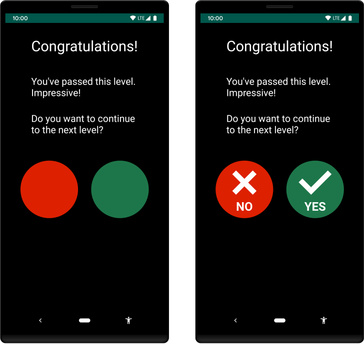 **Figure 1.** Examples of creating UI elements using color only (left) and using color, shapes, and text (right).
## Make media content more accessible
If you're developing an app that includes media content, such as a video clip
or an audio recording, try to support users with different types of
accessibility needs in understanding the material. In particular, try
to do the following:
- Include controls that allow users to pause or stop the media, change the volume, and toggle subtitles (captions).
- If a video presents information that is vital to completing a workflow, provide the same content in an alternate format, such as a transcript.
## Additional resources
For more information about making your app more accessible, see the following
additional resources:
### Codelabs
- [Accessibility in Jetpack Compose](https://developer.android.com/codelabs/jetpack-compose-accessibility#0)
### Views content
- [Principles for improving app accessibility (Views)](https://developer.android.com/guide/topics/ui/accessibility/views/principles-views.md.txt)