Applicable XR devices This guidance helps you build experiences for these types of XR devices. [Learn about XR device types →](https://developer.android.com/develop/xr/devices.md.txt)  Display Glasses [](https://developer.android.com/develop/xr/devices.md.txt#audio-display) [Learn about XR device types →](https://developer.android.com/develop/xr/devices.md.txt)
In Jetpack Compose Glimmer, a [`ToggleButton`](https://developer.android.com/reference/kotlin/androidx/xr/glimmer/ToggleButton.composable.md.txt) is an interactive component
that changes its appearance based on a checked state. Toggle buttons are
optimized for display glasses to provide clear visual transitions in shape and
color. These transitions indicate when an action or setting is active.
Use toggle buttons to expose actions that can be switched on or off. Unlike
icon-only toggles, a toggle button primarily displays text content, though it
supports optional icon slots for additional context.
For other use cases, there are also [standard buttons](https://developer.android.com/develop/xr/jetpack-xr-sdk/jetpack-compose-glimmer/buttons) and [icon buttons](https://developer.android.com/develop/xr/jetpack-xr-sdk/jetpack-compose-glimmer/icon-buttons).
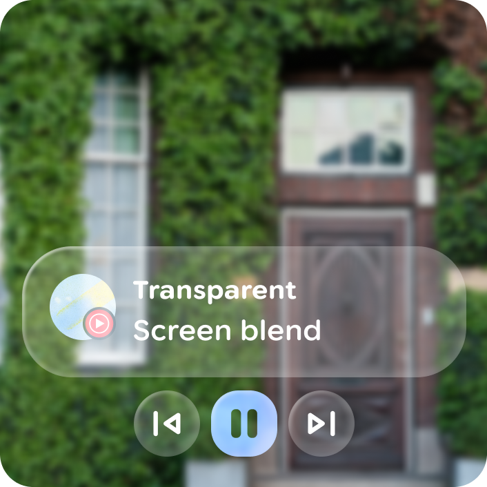 **Figure 1.** An example of a toggle button in Jetpack Compose Glimmer used for the play and pause actions in a UI layout.
## Anatomy
A toggle button consists of a container that morphs between states and a label
with optional icons.
| Part | Description |
|---|---|
| Container | Animates between a circular shape (unchecked) and a rounded rectangle (checked). |
| Label | Typically a [`Text`](https://developer.android.com/reference/kotlin/androidx/xr/glimmer/Text.composable.md.txt) composable. |
| Icons (optional) | Leading or trailing slots that can vary based on state. |
## Sizes
Like [standard buttons](https://developer.android.com/develop/xr/jetpack-xr-sdk/jetpack-compose-glimmer/buttons), toggle buttons support two size variants:
| Size | Minimum height | Default usage |
|---|---|---|
| Medium | 48.dp | Default interactive size. |
| Large | 72.dp | Primary or high-emphasis toggles. |
## Toggle button defaults
By default, toggle buttons use `ToggleButtonDefaults.animateShape`. This creates
a smooth transition between the following states:
- **Unchecked** : [`GlimmerTheme.shapes.large`](https://developer.android.com/reference/kotlin/androidx/xr/glimmer/Shapes.md.txt#large()) (typically a [`CircleShape`](https://developer.android.com/reference/kotlin/androidx/compose/foundation/shape/package-summary.md.txt#CircleShape())).
- **Checked** : `ToggleButtonDefaults.CheckedShape` (a [`RoundedCornerShape`](https://developer.android.com/reference/kotlin/androidx/compose/foundation/shape/package-summary.md.txt#RoundedCornerShape(androidx.compose.ui.unit.Dp)) with `20.dp` corners).
The `ToggleButtonColors` class manages color resolution for the following
states:
- **Unchecked** : Defaults to [`GlimmerTheme.colors.surface`](https://developer.android.com/reference/kotlin/androidx/xr/glimmer/Colors.md.txt#surface()).
- **Checked** : Defaults to [`GlimmerTheme.colors.surface`](https://developer.android.com/reference/kotlin/androidx/xr/glimmer/Colors.md.txt#outline()).
### Animation
Toggle buttons use the following defaults for animation:
- `animateShape`: Provides a `Shape` that interpolates corner sizes using a spring animation spec (`stiffness = 600f`).
- `colors`: A factory function to customize the background and content colors for both states.
- `CheckedShape`: A static `RoundedCornerShape(20.dp)` used for the checked state.
- `contentPadding`: Inherits from [`ButtonDefaults.contentPadding`](https://developer.android.com/reference/kotlin/androidx/xr/glimmer/ButtonDefaults.md.txt#contentPadding(androidx.xr.glimmer.ButtonSize)).
## Example: Toggle button
The following code creates a basic toggle button:
```kotlin
@Composable
fun ToggleButtonSample() {
var checked by remember { mutableStateOf(false) }
val text = if (checked) "Toggle on" else "Toggle off"
ToggleButton(
checked = checked,
onCheckedChange = { checked = it }
) {
Text(text)
}
}
```
## Example: Toggle button with leading icon
The following code creates a toggle button with a leading icon:
```kotlin
@Composable
fun ToggleButtonWithLeadingIconSample() {
var checked by remember { mutableStateOf(false) }
ToggleButton(
checked = checked,
leadingIcon = {
Icon(
if (checked) FavoriteIcon else OutlinedFavoriteIcon,
contentDescription = "Toggle favorite"
)
},
onCheckedChange = { checked = it }
) {
Text(if (checked) "On" else "Off")
}
}
```