Applicable XR devices This guidance helps you build experiences for these types of XR devices. [Learn about XR device types →](https://developer.android.com/develop/xr/devices.md.txt)  Display Glasses [](https://developer.android.com/develop/xr/devices.md.txt#audio-display) [Learn about XR device types →](https://developer.android.com/develop/xr/devices.md.txt)
In Jetpack Compose Glimmer, [surfaces](https://developer.android.com/develop/xr/jetpack-xr-sdk/jetpack-compose-glimmer/surfaces) use shapes to define their visual
boundaries and roundedness. The [`Shapes`](https://developer.android.com/reference/kotlin/androidx/xr/glimmer/Shapes.md.txt) class provides different levels of
roundedness intended for various types of components.
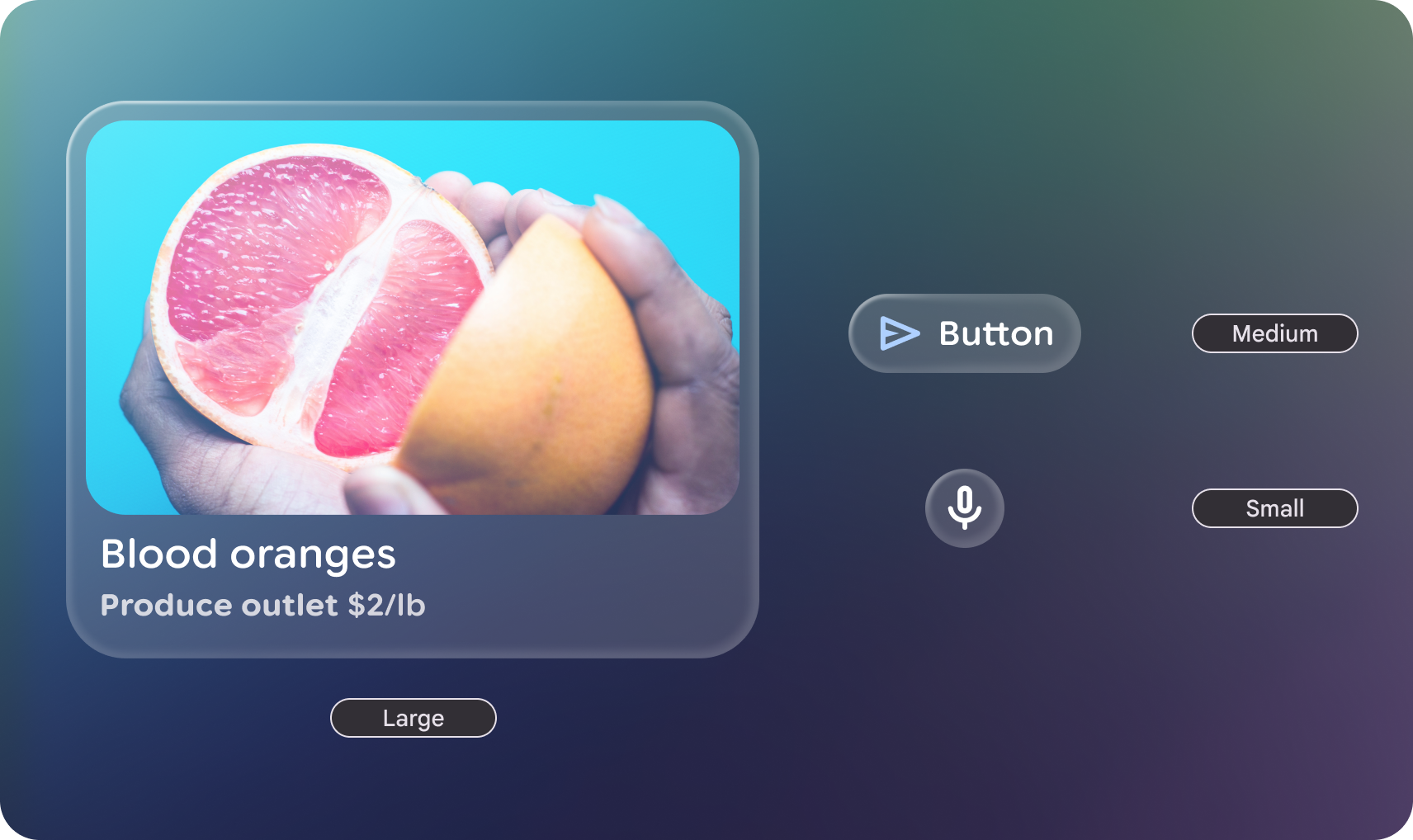 **Figure 1.** An example of large, medium, and small shapes in Jetpack Compose Glimmer.
## Shape categories
The [`GlimmerTheme`](https://developer.android.com/reference/kotlin/androidx/xr/glimmer/GlimmerTheme.md.txt) class defines three standard shape sizes:
- **Small** : A shape with four same-sized corners. It is used for components such as cards. By default, this is a `RoundedCornerShape` of **24.dp**.
- **Medium** : A shape with four same-sized corners sized between small and large. This is the most commonly used shape and is the default used in surface. By default, this is a `RoundedCornerShape` of **36.dp**.
- **Large** : A shape with four fully rounded corners. This shape is used for components such as buttons. By default, this is a `CircleShape`.
### Example: Get shapes from GlimmerTheme and apply them to components
First, get the defined shapes from [`GlimmerTheme.shapes`](https://developer.android.com/reference/kotlin/androidx/xr/glimmer/GlimmerTheme.md.txt#shapes()), and then apply
those shapes to some components:
```kotlin
@Composable
fun ShapesSample() {
val shapes = GlimmerTheme.shapes
GlimmerLazyColumn {
item { ShapeItem("small", shape = shapes.small) }
item { ShapeItem("medium", shape = shapes.medium) }
item { ShapeItem("large", shape = shapes.large) }
}
}
@Composable
private fun ShapeItem(name: String, shape: Shape, modifier: Modifier = Modifier) {
val interactionSource = remember { MutableInteractionSource() }
Box(
modifier
.aspectRatio(2.5f)
.fillMaxWidth()
.surface(interactionSource = interactionSource, shape = shape),
contentAlignment = Alignment.Center,
) {
Text(name)
}
}
```
## Customize shapes
The `Shapes` class is `@Immutable`. You can create a copy of the existing theme
shapes and override specific values using the copy function. Do this to maintain
the theme's structure while adjusting specific radii for your app's brand.
### Example: Override specific shape values
The following code overrides specific shape values:
```kotlin
@Composable
fun CustomShapesSample() {
val customShapes = GlimmerTheme.shapes.copy(
small = RoundedCornerShape(12.dp),
medium = RoundedCornerShape(20.dp)
)
val interactionSource = remember { MutableInteractionSource() }
Box(
Modifier
.aspectRatio(2.5f)
.fillMaxWidth()
.surface(interactionSource = interactionSource, shape = customShapes.small),
contentAlignment = Alignment.Center,
) {
Text("custom small")
}
}
```
### Default values
If not otherwise specified in the `GlimmerTheme`, the system defaults to the
following values:
| Token | Default shape | Size or radius |
|---|---|---|
| `small` | `RoundedCornerShape` | 24.dp |
| `medium` | `RoundedCornerShape` | 36.dp |
| `large` | `CircleShape` | Fully Rounded |