Applicable XR devices This guidance helps you build experiences for these types of XR devices. [Learn about XR device types →](https://developer.android.com/develop/xr/devices.md.txt)  Display Glasses [](https://developer.android.com/develop/xr/devices.md.txt#audio-display) [Learn about XR device types →](https://developer.android.com/develop/xr/devices.md.txt)
In Jetpack Compose Glimmer, a [`Button`](https://developer.android.com/reference/kotlin/androidx/xr/glimmer/Button.composable.md.txt) is an interactive component that's
optimized for display glasses input, offering clear visual feedback through its
states to guide user actions.
Buttons are built on the Jetpack Compose Glimmer [surface system](https://developer.android.com/develop/xr/jetpack-xr-sdk/jetpack-compose-glimmer/surface), which
automatically handles physical properties like borders and depth.
The standard button contains a text label and optional icons. You can use it for
primary or secondary actions. There are also specialized buttons, such as [icon
buttons](https://developer.android.com/develop/xr/jetpack-xr-sdk/jetpack-compose-glimmer/icon-buttons) and [toggle buttons](https://developer.android.com/develop/xr/jetpack-xr-sdk/jetpack-compose-glimmer/toggle-buttons), which are defined as separate components in
Jetpack Compose Glimmer.
### Default
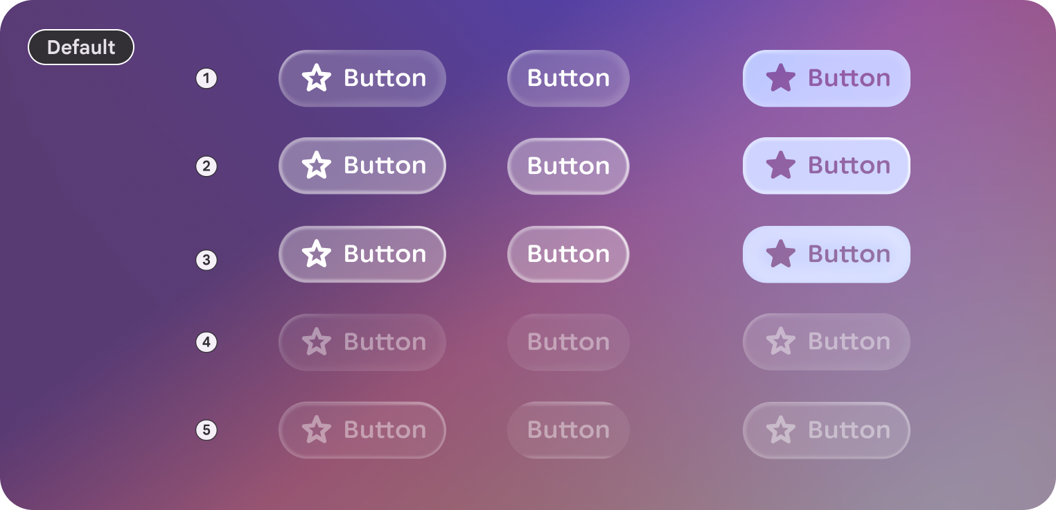 An example of some different styles of buttons in Jetpack Compose Glimmer. These examples show default, medium-sized buttons with three button states: Enabled (1), Focused (2), and Pressed (3).
### Large
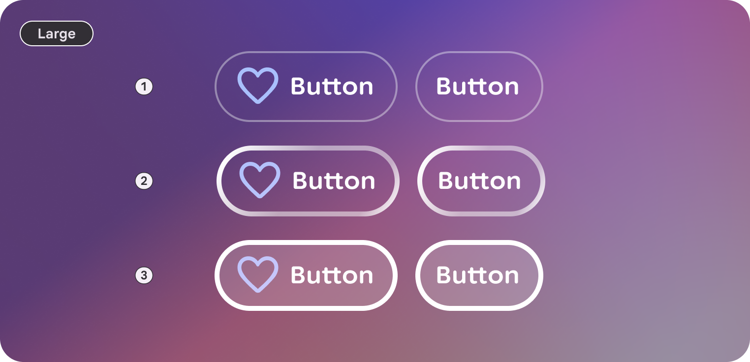 An example of some different styles of buttons in Jetpack Compose Glimmer. These examples show large-sized buttons with three button states: Enabled (1), Focused (2), and Pressed (3).
## Anatomy
A button consists of a container and a label, with optional leading and trailing
icons.
| Part | Description |
|---|---|
| Container | The background surface of the button. |
| Label | The text describing the action. |
| Icon (optional) | Leading or trailing visual indicators. |
## Sizes
Jetpack Compose Glimmer buttons support two size variants. These affect the
minimum height and internal padding.
| Size | Minimum height | Default usage |
|---|---|---|
| Medium | 48.dp | Standard actions and lists (default). |
| Large | 72.dp | High-emphasis actions or primary screen entry points. |
## States
Buttons in Jetpack Compose Glimmer change their appearance to communicate their
state.
- **Enabled**: The default state for an interactive button.
- **Focused** : When focused, the button applies a [`GlimmerTheme.depthEffectLevels.level1`](https://developer.android.com/reference/kotlin/androidx/xr/glimmer/DepthEffectLevels.md.txt#level1()) and a focused border highlight.
- **Pressed**: When activated, a semi-transparent white overlay is applied to the surface.
- **Disabled**: The button doesn't respond to input and its visual appearance is adjusted.
## Button defaults
The following defaults apply to standard buttons:
- By default, buttons use [`GlimmerTheme.typography.bodySmall`](https://developer.android.com/reference/kotlin/androidx/xr/glimmer/Typography.md.txt#bodySmall()). Make sure that text within buttons is concise and clearly describes the action.
- The default shape for a button is [`GlimmerTheme.shapes.large`](https://developer.android.com/reference/kotlin/androidx/xr/glimmer/Shapes.md.txt#large()). This consistent rounding helps users identify buttons across the display glasses interface.
> [!NOTE]
> **Note:** Any modifier passed to the `Button` composable is applied to the outer layout. While [`ButtonSize`](https://developer.android.com/reference/kotlin/androidx/xr/glimmer/ButtonSize.md.txt) sets the default minimum height, you can also apply custom size modifiers to control the button's final layout, such as [`Modifier.fillMaxWidth`](https://developer.android.com/reference/kotlin/androidx/compose/foundation/layout/fillMaxWidth.modifier).
## Example: Button with text and icons
A basic button includes only a text label, but you can also add icons to the
start (using `leadingIcon`) or end (using `trailingIcon`) of the text to provide
additional context.
The following code creates a button with both a leading and trailing icon:
```kotlin
Button(
onClick = { /* Handle navigation or action */ },
leadingIcon = { Icon(FavoriteIcon, contentDescription = null) },
trailingIcon = { Icon(SendIcon, contentDescription = null) }
) {
Text("Text Label", style = GlimmerTheme.typography.titleSmall)
}
```
## Button groups
The [`ButtonGroup`](https://developer.android.com/reference/kotlin/androidx/xr/glimmer/ButtonGroup.composable.md.txt) composable lets you group buttons into a scrollable row
that acts as a focus controller. As the user scrolls, focus automatically moves
to highlight the button corresponding to the current scroll position.
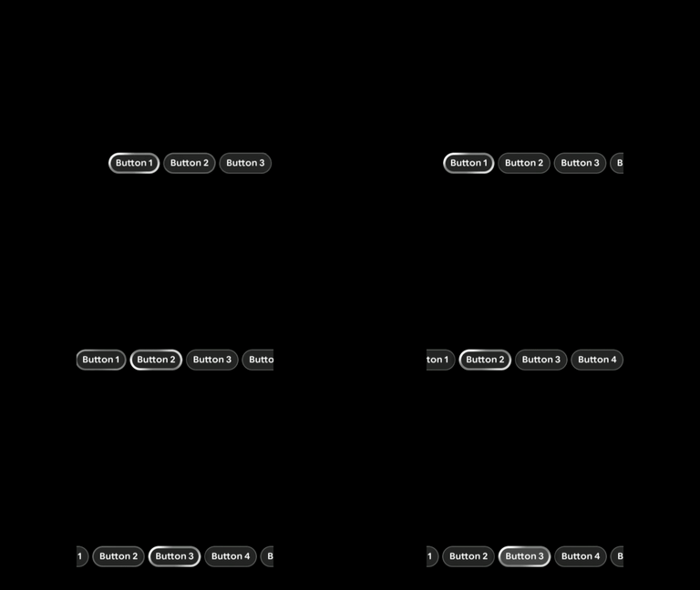 An example of a button group scrolling and focusing features.
## Example: Button groups
```kotlin
ButtonGroup(modifier = Modifier.fillMaxWidth()) {
Button(onClick = {}) { Text("Button 1") }
Button(onClick = {}) { Text("Button 2") }
Button(onClick = {}) { Text("Button 3") }
Button(onClick = {}) { Text("Button 4") }
Button(onClick = {}) { Text("Button 5") }
}
```
## Focus control in button groups
You can move the focus to any button in a group to manually control the
selection.
Customize and control scrolling behavior using the `ButtonGroup` state:
1. Declare the state with `rememberButtonGroupState`.
2. Pass it to the `ButtonGroup` composable.
3. Call [`animateScrollToItem`](https://developer.android.com/reference/kotlin/androidx/xr/glimmer/ButtonGroupState.md.txt#animateScrollToItem(kotlin.Int,androidx.compose.animation.core.FiniteAnimationSpec)) (or [`scrollToItem`](https://developer.android.com/reference/kotlin/androidx/xr/glimmer/ButtonGroupState.md.txt#scrollToItem(kotlin.Int)) for instant scrolling) to scroll to a specific item and automatically move focus to it.
The following code moves the focus from one button to another upon click:
```kotlin
val scope = rememberCoroutineScope()
val state = rememberButtonGroupState()
ButtonGroup(modifier = Modifier.fillMaxWidth(), state = state) {
Button(onClick = { scope.launch { state.animateScrollToItem(1) } }) {
Text("Select last item")
}
Button(onClick = { scope.launch { state.animateScrollToItem(0) } }) {
Text("Select first item")
}
}
```