The [`Dialog`](https://developer.android.com/reference/kotlin/androidx/compose/ui/window/Dialog.composable.md.txt#Dialog(kotlin.Function0,androidx.compose.ui.window.DialogProperties,kotlin.Function0)) component displays pop-up messages or requests user input on a
layer above the main app content. It creates an interruptive UI experience to
capture user attention.
Among the use cases for a dialog are the following:
- Confirming user action, such as when deleting a file.
- Requesting user input, such as in a to-do list app.
- Presenting a list of options for user selection, like choosing a country in a profile setup.
This topic provides the following implementations:
- [Alert](https://developer.android.com/develop/ui/compose/quick-guides/content/display-user-input.md.txt#alert)
- [Basic dialog](https://developer.android.com/develop/ui/compose/quick-guides/content/display-user-input.md.txt#basic)
- [Advanced dialog](https://developer.android.com/develop/ui/compose/quick-guides/content/display-user-input.md.txt#advanced)
## Version compatibility
This implementation requires that your project minSDK be set to API level 21 or
higher.
### Dependencies
## Create an Alert dialog
The [`AlertDialog`](https://developer.android.com/reference/kotlin/androidx/compose/material3/AlertDialog.composable.md.txt#AlertDialog(kotlin.Function0,kotlin.Function0,androidx.compose.ui.Modifier,kotlin.Function0,kotlin.Function0,kotlin.Function0,kotlin.Function0,androidx.compose.ui.graphics.Shape,androidx.compose.ui.graphics.Color,androidx.compose.ui.graphics.Color,androidx.compose.ui.graphics.Color,androidx.compose.ui.graphics.Color,androidx.compose.ui.unit.Dp,androidx.compose.ui.window.DialogProperties)) composable provides a convenient API for creating a
Material Design themed dialog. The following example implements two buttons in
an alert dialog, one that dismisses the dialog, and another that confirms its
request:
This implementation implies a parent composable that passes arguments to the
child composable in this way:
### Results
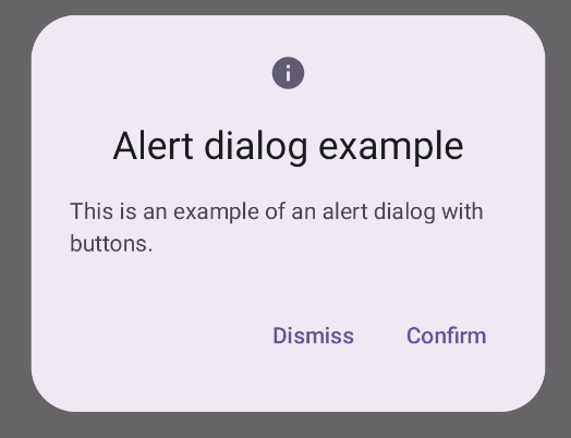 **Figure 1.** An alert dialog with buttons.
### Key points
`AlertDialog` has specific parameters for handling particular elements of the
dialog. Among them are the following:
- `title`: The text that appears along the top of the dialog.
- `text`: The text that appears centered within the dialog.
- `icon`: The graphic that appears at the top of the dialog.
- `onDismissRequest`: The function called when the user dismisses the dialog, such as by tapping outside of it.
- `dismissButton`: A composable that serves as the dismiss button.
- `confirmButton`: A composable that serves as the confirm button.
- When the user clicks either of the buttons, the dialog closes. When the user
clicks confirm, it calls a function that also handles the confirmation. In
this example, those functions are `onDismissRequest()` and
`onConfirmRequest()`.
In cases where your dialog requires a more complex set of buttons, you may
benefit from using the `Dialog` composable and populating it in a more
freeform manner.
## Create a dialog
[`Dialog`](https://developer.android.com/reference/kotlin/androidx/compose/ui/window/Dialog.composable.md.txt#Dialog(kotlin.Function0,androidx.compose.ui.window.DialogProperties,kotlin.Function0)) is a basic composable that doesn't provide any styling or
predefined slots for content. It is a straightforward container that you should
populate with a container such as `Card`. The following are some of the key
parameters of a dialog:
- **`onDismissRequest`**: The lambda called when the user closes the dialog.
- **`properties`** : An instance of [`DialogProperties`](https://developer.android.com/reference/kotlin/androidx/compose/ui/window/DialogProperties.md.txt) that provides some additional scope for customization.
> [!CAUTION]
> **Caution:** You must manually specify the size and shape of `Dialog`. You also must provide an inner container.
### Create a basic dialog
The following example is a basic implementation of the `Dialog` composable. Note
that it uses a `Card` as the secondary container. Without the `Card`, the `Text`
component would appear alone above the main app content.
### Result
Note that when the dialog is open, the main app content beneath it appears
darkened and grayed out:
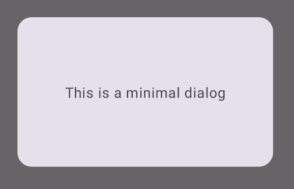 **Figure 2.** Minimal dialog.
### Create an advanced dialog
The following is a more advanced implemented of the `Dialog` composable. In this
case, the component manually implements a similar interface to the preceding
`AlertDialog` example.
> [!CAUTION]
> **Caution:** If you only need to display a two-button dialog as in this example, you should use `AlertDialog` and its more convenient API. However, if you want to create a more complex dialog, perhaps with forms and multiple buttons, you should use `Dialog` with custom content, as in the following example.
### Result
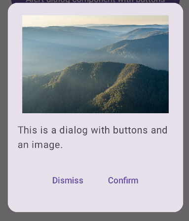 **Figure 3.** A dialog that includes an image.
## Collections that contain this guide
This guide is part of these curated Quick Guide collections that cover
broader Android development goals:
 
### Display text
Text is a central piece of any UI. Find out different ways you can present text in your app to provide a delightful user experience. [Quick guide collection](https://developer.android.com/develop/ui/compose/quick-guides/collections/display-text)  
### Request user input
Learn how to implement ways for users to interact with your app by entering text and using other means of input. [Quick guide collection](https://developer.android.com/develop/ui/compose/quick-guides/collections/request-user-input)  
### Display interactive components
Learn how composable functions can enable you to easily create beautiful UI components based on the Material Design design system. [Quick guide collection](https://developer.android.com/develop/ui/compose/quick-guides/collections/display-interactive-components) 
## Have questions or feedback
Go to our frequently asked questions page and learn about quick guides or reach out and let us know your thoughts. [Go to FAQ](https://developer.android.com/quick-guides/faq.md.txt) [Leave feedback](https://issuetracker.google.com/issues/new?component=1573691&template=1993320)