The [`Slider`](https://developer.android.com/reference/kotlin/androidx/compose/material3/Slider.composable.md.txt#Slider(androidx.compose.material3.SliderState,androidx.compose.ui.Modifier,kotlin.Boolean,androidx.compose.material3.SliderColors,androidx.compose.foundation.interaction.MutableInteractionSource,kotlin.Function1,kotlin.Function1)) composable lets users make selections from a range of
values. You might use a slider to let the user do the following:
- Adjust settings that use a range of values, such as volume, and brightness.
- Filter data in a graph, as when setting a price range.
- User input, like setting a rating in a review.
The slider contains a track, thumb, value label, and tick marks:
- **Track**: The track is the horizontal bar that represents the range of values the slider can take.
- **Thumb**: The thumb is a draggable control element on the slider that allows the user to select a specific value within the range defined by the track.
- **Tick marks**: Tick marks are optional visual markers or indicators that appear along the track of the slider.
This topic shows the following slider implementations:
- [Basic](https://developer.android.com/develop/ui/compose/quick-guides/content/create-range-slider.md.txt#basic-implementation)
- [Advanced](https://developer.android.com/develop/ui/compose/quick-guides/content/create-range-slider.md.txt#advanced-implementation)
- [Range](https://developer.android.com/develop/ui/compose/quick-guides/content/create-range-slider.md.txt#range-slider)
## Version compatibility
This implementation requires that your project minSDK be set to API level 21 or
higher.
### Dependencies
## Create a basic slider
The following example is a straightforward slider. That allows the user to
select a value from `0.0` to `1.0`. Because the user can select any value in
that range, the slider is *continuous*.
### Results
 **Figure 1.** A basic implementation of a slider.
## Create an advanced slider
The following snippet implements a slider that has three steps, with a range
from `0.0` to `50.0`. Because the thumb snaps to each step, this slider is
*discrete*.
### Results
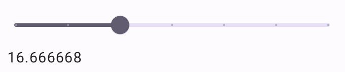 **Figure 2.** A slider with steps and a set value range.
> [!NOTE]
> **Note:** The very beginning and end of a slider count as "steps". In the preceding example where the range is `0f..50f` and the number of `steps` is `3`, each interval along the range is `12.5` because the beginning and end of the slider are also intervals the user can select.
## Range slider
You can also use the dedicated [`RangeSlider`](https://developer.android.com/reference/kotlin/androidx/compose/material3/RangeSlider.composable.md.txt#RangeSlider(kotlin.ranges.ClosedFloatingPointRange,kotlin.Function1,androidx.compose.ui.Modifier,kotlin.Boolean,kotlin.ranges.ClosedFloatingPointRange,kotlin.Int,kotlin.Function0,androidx.compose.material3.SliderColors)) composable. This allows the user to
select two values. This can be useful in cases such as when the user wishes to
select a minimum and maximum price.
The following example is a relatively straightforward example of a continuous
range slider:
### Results
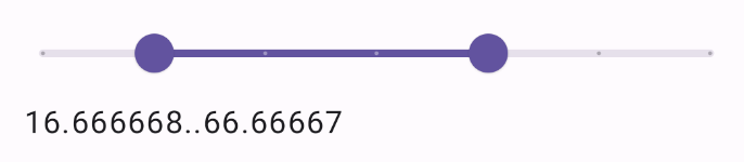 **Figure 3.** An implementation of a range slider.
## Key points
See the [`Slider`](https://developer.android.com/reference/kotlin/androidx/compose/material3/Slider.composable.md.txt#Slider(androidx.compose.material3.SliderState,androidx.compose.ui.Modifier,kotlin.Boolean,androidx.compose.material3.SliderColors,androidx.compose.foundation.interaction.MutableInteractionSource,kotlin.Function1,kotlin.Function1)) reference for a full API definition. Some of the key
parameters for the `Slider` composable are the following:
- **`value`**: The current value of the slider.
- **`onValueChange`**: A lambda that gets called every time the value is changed.
- **`enabled`**: A boolean value that indicates if the user can interact with the slider.
When implementing a more complex slider, you can additionally make use of the
following parameters.
- **`colors`** : An instance of `SliderColors` that lets you control the colors of the slider.
- **`valueRange`**: The range of values that the slider can take.
- **`steps`**: The number of notches on the slider to which the thumb snaps.
You can also pass `Slider` a `thumb` and `track` composable to more
thoroughly customize the appearance of the component.
## Collections that contain this guide
This guide is part of these curated Quick Guide collections that cover
broader Android development goals:
 
### Display interactive components
Learn how composable functions can enable you to easily create beautiful UI components based on the Material Design design system. [Quick guide collection](https://developer.android.com/develop/ui/compose/quick-guides/collections/display-interactive-components) 
## Have questions or feedback
Go to our frequently asked questions page and learn about quick guides or reach out and let us know your thoughts. [Go to FAQ](https://developer.android.com/quick-guides/faq.md.txt) [Leave feedback](https://issuetracker.google.com/issues/new?component=1573691&template=1993320)