Buttons let the user trigger a defined action. There are five types of
button:
| Type | Appearance | Purpose |
|---|---|---|
| [Filled](https://developer.android.com/develop/ui/compose/quick-guides/content/create-button.md.txt#create-filled) | Solid background with contrasting text. | For primary actions, such as "Submit" and "Save." The shadow effect emphasizes the button's importance. |
| [Tonal](https://developer.android.com/develop/ui/compose/quick-guides/content/create-button.md.txt#create-filled-tonal) | Background color varies to match the surface. | For primary or significant actions. Filled buttons provide visual weight and are appropriate for actions like "Add to cart" and "Sign in." |
| [Elevated](https://developer.android.com/develop/ui/compose/quick-guides/content/create-button.md.txt#create-elevated) | Shadow makes it stand out. | For primary or significant actions. Increase elevation to make the button more prominent. |
| [Outlined](https://developer.android.com/develop/ui/compose/quick-guides/content/create-button.md.txt#create-outlined) | Features a border with no fill. | For actions that are important but not primary. Outlined buttons pair well with other buttons to indicate alternative, secondary actions like "Cancel" or "Back." |
| [Text](https://developer.android.com/develop/ui/compose/quick-guides/content/create-button.md.txt#create-text) | Text with no background or border. | For less critical actions such as navigational links, or secondary actions like "Learn more" or "View details." |
## Version compatibility
This implementation requires that your project minSDK be set to API level 21 or
higher.
### Dependencies
## Create a filled button
The filled button component uses the basic [`Button`](https://developer.android.com/reference/kotlin/androidx/compose/material3/Button.composable.md.txt#Button(kotlin.Function0,androidx.compose.ui.Modifier,kotlin.Boolean,androidx.compose.ui.graphics.Shape,androidx.compose.material3.ButtonColors,androidx.compose.material3.ButtonElevation,androidx.compose.foundation.BorderStroke,androidx.compose.foundation.layout.PaddingValues,androidx.compose.foundation.interaction.MutableInteractionSource,kotlin.Function1)) composable. It is
filled with a solid color by default.
### Results
 **Figure 1.** A filled button.
## Create a filled tonal button
The filled tonal button component uses the [`FilledTonalButton`](https://developer.android.com/reference/kotlin/androidx/compose/material3/FilledTonalButton.composable.md.txt#FilledTonalButton(kotlin.Function0,androidx.compose.ui.Modifier,kotlin.Boolean,androidx.compose.ui.graphics.Shape,androidx.compose.material3.ButtonColors,androidx.compose.material3.ButtonElevation,androidx.compose.foundation.BorderStroke,androidx.compose.foundation.layout.PaddingValues,androidx.compose.foundation.interaction.MutableInteractionSource,kotlin.Function1)) composable.
It is filled with a tonal color by default.
### Results
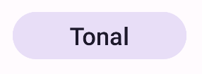 **Figure 2.** A tonal button.
## Create an outlined button
The outlined button component uses the [`OutlinedButton`](https://developer.android.com/reference/kotlin/androidx/compose/material3/OutlinedButton.composable.md.txt#OutlinedButton(kotlin.Function0,androidx.compose.ui.Modifier,kotlin.Boolean,androidx.compose.ui.graphics.Shape,androidx.compose.material3.ButtonColors,androidx.compose.material3.ButtonElevation,androidx.compose.foundation.BorderStroke,androidx.compose.foundation.layout.PaddingValues,androidx.compose.foundation.interaction.MutableInteractionSource,kotlin.Function1)) composable. It
appears with an outline by default.
### Results
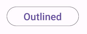 **Figure 3.** An outlined button.
## Create an elevated button
The elevated button component uses the [`ElevatedButton`](https://developer.android.com/reference/kotlin/androidx/compose/material3/ElevatedButton.composable.md.txt#ElevatedButton(kotlin.Function0,androidx.compose.ui.Modifier,kotlin.Boolean,androidx.compose.ui.graphics.Shape,androidx.compose.material3.ButtonColors,androidx.compose.material3.ButtonElevation,androidx.compose.foundation.BorderStroke,androidx.compose.foundation.layout.PaddingValues,androidx.compose.foundation.interaction.MutableInteractionSource,kotlin.Function1)) composable. It has
a shadow that represents the elevation effect by default and appears as
an outlined button with a shadow.
### Results
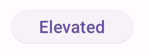 **Figure 4.** An elevated button.
## Create a text button
The text button component uses the [`TextButton`](https://developer.android.com/reference/kotlin/androidx/compose/material3/TextButton.composable.md.txt#TextButton(kotlin.Function0,androidx.compose.ui.Modifier,kotlin.Boolean,androidx.compose.ui.graphics.Shape,androidx.compose.material3.ButtonColors,androidx.compose.material3.ButtonElevation,androidx.compose.foundation.BorderStroke,androidx.compose.foundation.layout.PaddingValues,androidx.compose.foundation.interaction.MutableInteractionSource,kotlin.Function1)) composable. Until clicked,
it appears only as text. It does not have a solid fill or outline by default.
### Results
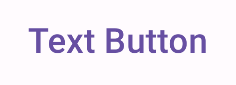 **Figure 5.** A text button.
## Key points
- `onClick`: The function called when the user presses the button.
- `enabled`: When false, this parameter causes the button to appear unavailable and inactive.
- `colors`: An instance of `ButtonColors` that determines the colors used in the button.
- `contentPadding`: The padding within the button.
## Collections that contain this guide
This guide is part of these curated Quick Guide collections that cover
broader Android development goals:
 
### Display interactive components
Learn how composable functions can enable you to easily create beautiful UI components based on the Material Design design system. [Quick guide collection](https://developer.android.com/develop/ui/compose/quick-guides/collections/display-interactive-components) 
## Have questions or feedback
Go to our frequently asked questions page and learn about quick guides or reach out and let us know your thoughts. [Go to FAQ](https://developer.android.com/quick-guides/faq.md.txt) [Leave feedback](https://issuetracker.google.com/issues/new?component=1573691&template=1993320)