While the `Grid` config defines the overall structure,
you use the [`gridItem`](https://developer.android.com/reference/kotlin/androidx/compose/foundation/layout/GridScope.md.txt#(androidx.compose.ui.Modifier).gridItem(kotlin.Int,kotlin.Int,kotlin.Int,kotlin.Int,androidx.compose.ui.Alignment)) modifier to control the position, spanning,
and alignment of items within that structure.
## Set the item position
Place an item into a specific track or cell
with the `row` and `column` parameters.
Coordinate indexes work best for straightforward grid layouts.
For larger or more complex layouts, define [named areas](https://developer.android.com/develop/ui/compose/layouts/adaptive/grid/container-properties.md.txt#named-area) instead.
The `row` and `column` parameters specify the row and column track indexes
that the item is placed in.
Track indexes are 1-based---they start at one.
Specifying only `row` or `column` (not both) places the item
in the next available space in that track.
Specifying both places the item into that cell.
Use a positive integer to specify the track index from the start.
For example, to place an item in the first row and column,
use `gridItem(row = 1, column = 1)`.
Use a negative integer to specify the track relative to the end.
For example, to place an item in the second-to-last row and column, use
`gridItem(row = -2, column = -2)`.
In the following example, Card **#2** is placed
in the second row and the second column.
Card **#3** is assigned to the last row (indexed by -1),
where it automatically occupies
the first available column in that track (Figure 1).
```kotlin
Grid(
config = {
repeat(2) {
column(160.dp)
}
repeat(3) {
row(90.dp)
}
gap(8.dp)
}
) {
Card1()
Card2(modifier = Modifier.gridItem(row = 2, column = 2))
Card3(modifier = Modifier.gridItem(row = -1, column = -2))
}
```
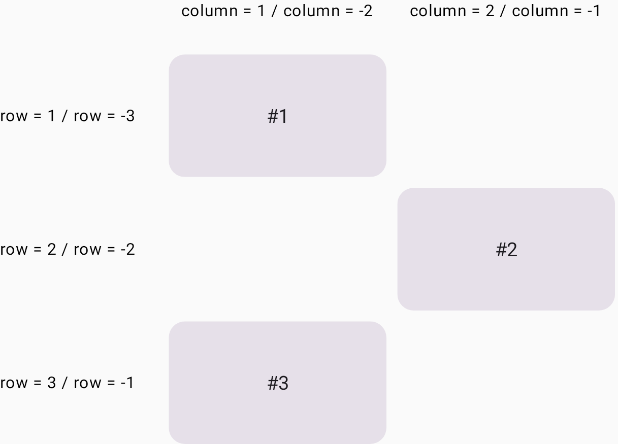 **Figure 1** . Card **#2** is placed in the grid cell in the second row and the second column, and Card **#3** is placed in the first column in the third row.
## Span rows and columns
Use the `rowSpan` and `columnSpan` parameters
to span an item over multiple cells.
You can place a UI element into a [grid area](https://developer.android.com/develop/ui/compose/layouts/adaptive/grid.md.txt#grid-area),
which is the area consisting of several [grid cells](https://developer.android.com/develop/ui/compose/layouts/adaptive/grid.md.txt#grid-cell).
The `gridItem` modifier lets you specify the grid area
with the `rowSpan` and `columnSpan` parameters.
In the following example,
Card **#1** is placed in the area consisting of two rows and two columns
(Figure 2).
```kotlin
Grid(
config = {
repeat(3) {
column(160.dp)
}
repeat(3) {
row(90.dp)
}
rowGap(8.dp)
columnGap(8.dp)
}
) {
Card1(modifier = Modifier.gridItem(rowSpan = 2, columnSpan = 2))
Card2()
Card3()
Card4(modifier = Modifier.gridItem(columnSpan = 3))
}
```
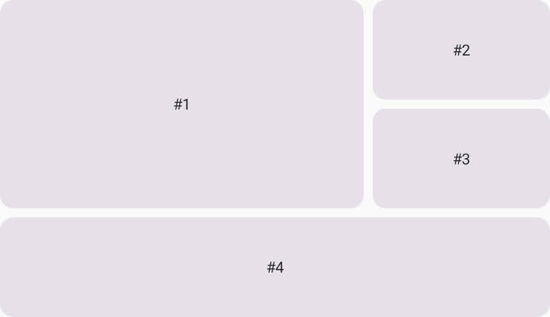 **Figure 2** . Card **#4** spans three columns.
## Set the alignment in a grid area
You can set the alignment of the UI element in a grid area
by specifying it in the `alignment` parameter of the [`gridItem`](https://developer.android.com/reference/kotlin/androidx/compose/foundation/layout/GridScope.md.txt#(androidx.compose.ui.Modifier).gridItem(kotlin.Int,kotlin.Int,kotlin.Int,kotlin.Int,androidx.compose.ui.Alignment)) modifier.
In the following example, **#1** is placed in the center of the grid area
consisting of two columns and two rows.
```kotlin
Grid(
config = {
repeat(3) {
column(160.dp)
}
repeat(3) {
row(90.dp)
}
rowGap(8.dp)
columnGap(8.dp)
},
) {
Text(
text = "#1",
modifier = Modifier
.gridItem(
rowSpan = 2,
columnSpan = 2,
alignment = Alignment.Center
),
)
Card2()
Card3()
Card4(modifier = Modifier.gridItem(columnSpan = 3))
}
```
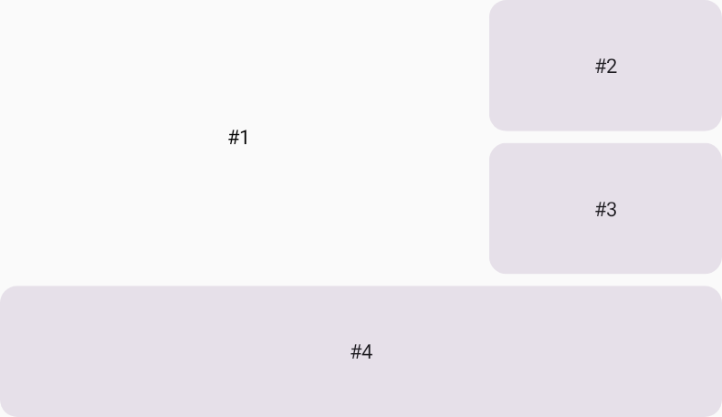 **Figure 3** . The Text with **#1** is placed in the center of the grid area consisting of two rows and two columns.
## Auto-placement mixed with placed items
A UI element in `Grid`
that has no position specification undergoes auto-placement.
This example shows how you can mix auto-placed elements
and the UI elements with specified grid cells.
Card **#2** and Card **#4** are placed in specified grid cells,
and the other items are auto-placed.
```kotlin
Grid(
config = {
repeat(2) {
column(160.dp)
}
repeat(3) {
row(90.dp)
}
rowGap(16.dp)
columnGap(8.dp)
}
) {
Card1()
Card2(modifier = Modifier.gridItem(row = 2, column = 2))
Card3()
Card4(modifier = Modifier.gridItem(row = 3, column = 1))
Card5()
Card6()
}
```
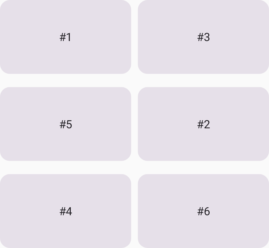 **Figure 4** . Card **#3** is placed next to Card **#1**, as it is an auto-placement.