Use `Modifier.flex` to control how an item changes size, order, and is aligned
inside a `FlexBox`.
## Item size
Use the `basis`, `grow`, and `shrink` functions to control an item's size.
```kotlin
FlexBox {
RedRoundedBox(
modifier = Modifier.flex {
basis(FlexBasis.Auto)
grow(1.0f)
shrink(0.5f)
}
)
}
```
### Set initial size
Use `basis` to specify the item's initial size before any extra space is
distributed. You can think of this as the item's *preferred* size.
|---|---|---|---|
| **Value type** | **Behavior** | **Code snippet** Note: The boxes have a maximum intrinsic size of `100dp` | **Example using container width `600dp`** |
| `Auto` (default) | Use the item's maximum intrinsic size. For example, a `Text` composable's maximum intrinsic width is the width of all its text on a single line - no wrapping. | ```kotlin FlexBox { RedRoundedBox( Modifier.flex { basis(FlexBasis.Auto) } ) BlueRoundedBox( Modifier.flex { basis(FlexBasis.Auto) } ) } ``` |  |
| Fixed `dp` | A fixed size in Dp. | ```kotlin FlexBox { RedRoundedBox( Modifier.flex { basis(200.dp) } ) BlueRoundedBox( Modifier.flex { basis(100.dp) } ) } ``` |  |
| Percentage | A percentage of the container size. | ```kotlin FlexBox { RedRoundedBox( Modifier.flex { basis(0.7f) } ) BlueRoundedBox( Modifier.flex { basis(0.3f) } ) } ``` |  |
If the basis value is less than the item's intrinsic minimum size, the intrinsic
minimum size is used instead. For example, if a `Text` item that contains a word
requires `50dp` to display, but also has `basis = 10.dp`, a
value of `50dp` is used.
### Grow items when there's space
Use `grow` to specify how much an item grows when there is extra space. This is
space remaining in the `FlexBox` container after all the items' `basis` values
have been added up. The `grow` value indicates *how much* of the extra space a
given child will receive, relative to its siblings. By default, items won't
grow.
The following example shows a `FlexBox` with three child items. Each has a basis
value of `100dp`. The first child has a positive `grow` value. Since there is
only one child with a `grow` value, the actual value is irrelevant - as long as
it's positive, the child receives all the extra space.
The images show the `FlexBox` behavior when its container size is `600dp`.
|---|---|
| ```kotlin FlexBox { RedRoundedBox( title = "400dp", modifier = Modifier.flex { grow(1f) } ) BlueRoundedBox(title = "100dp") GreenRoundedBox(title = "100dp") } ``` | Each child has a basis value of `100dp`. There is `300dp` of extra space.  Child 1 grows by `300dp` to fill the extra space.  |
In the following example, the container size and `basis` size are the same. The
difference is that each child has a different `grow` value.
|---|---|
| ```kotlin FlexBox { RedRoundedBox( title = "150dp", modifier = Modifier.flex { grow(1f) } ) BlueRoundedBox( title = "200dp", modifier = Modifier.flex { grow(2f) } ) GreenRoundedBox( title = "250dp", modifier = Modifier.flex { grow(3f) } ) } ``` | Each child has a basis value of `100dp`. There is `300dp` of extra space.  The total grow value is 6. Child 1 grows by (1 / 6) \* 300 = `50dp` Child 2 grows by (2 / 6) \* 300 = `100dp` Child 3 grows by (3 / 6) \* 300 = `150dp`  |
### Shrink items when there's insufficient space
Use `shrink` to specify how much an item shrinks when the `FlexBox` container
has insufficient space for all the items. `shrink` works the same way as `grow`
except that, instead of distributing *extra space* to items, the *space deficit*
is distributed to items. The `shrink` value specifies how much of the space
deficit the item receives, or rather, how much the item will shrink by. By
default, items have a `shrink` value of `1f`, meaning they shrink equally.
The following example shows two `Text` composables with the same text. The first
child has a shrink value of `1f`, meaning it shrinks to absorb all the space
deficit.
```kotlin
FlexBox {
Text(
"The quick brown fox",
fontSize = 36.sp,
modifier = Modifier
.background(PastelRed)
.flex { shrink(1f) }
)
Text(
"The quick brown fox",
fontSize = 36.sp,
modifier = Modifier
.background(PastelBlue)
.flex { shrink(0f) }
)
}
```
As the container size shrinks, Child 1 shrinks.
|---|---|
| **Container size** | **FlexBox UI** |
| `700dp` |  |
| `500dp` |  |
| `450dp` | 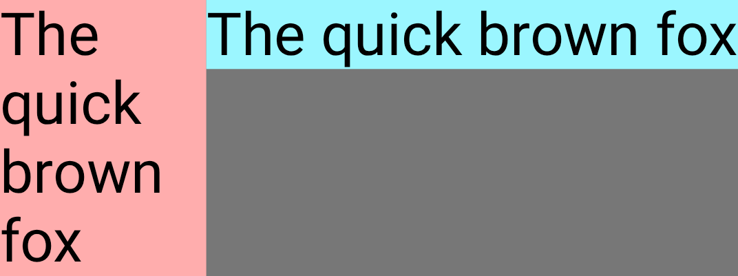 |
## Item alignment
Use `alignSelf` to control how an item is aligned to the cross axis. This
overrides the [`alignItems` property](https://developer.android.com/develop/ui/compose/layouts/adaptive/flexbox/container-behavior.md.txt#align-distribute) of the container for this item. It
has all the same possible values, with the addition of `Auto` which inherits the
behavior of the `FlexBox` container.
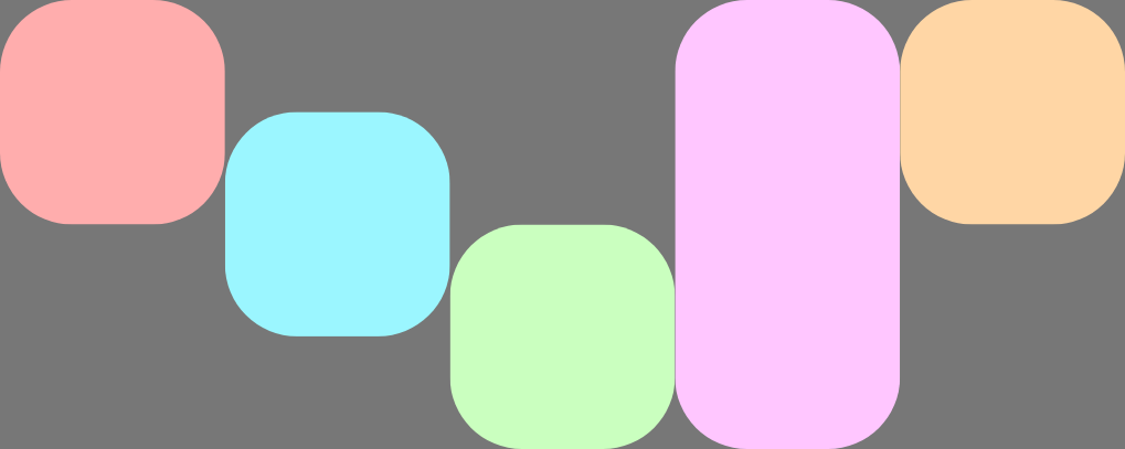
For example, this `FlexBox` has `alignItems` set to `Start` and five children
which override the cross axis alignment.
```kotlin
FlexBox(
config = {
alignItems(FlexAlignItems.Start)
}
) {
RedRoundedBox()
BlueRoundedBox(modifier = Modifier.flex { alignSelf(FlexAlignSelf.Center) })
GreenRoundedBox(modifier = Modifier.flex { alignSelf(FlexAlignSelf.End) })
PinkRoundedBox(modifier = Modifier.flex { alignSelf(FlexAlignSelf.Stretch) })
OrangeRoundedBox(modifier = Modifier.flex { alignSelf(FlexAlignSelf.Baseline) })
}
```
## Item order
By default, `FlexBox` lays out items in the order that they are declared in
code. Override this behavior using `order`.
The default value for `order` is zero, and `FlexBox` sorts items based on this
value in ascending order. Any items that have the same `order` value are
laid out in the same order they are declared in. Use negative and positive
`order` values to move items to the start or end of a layout without changing
where they are declared.
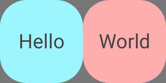
The following example shows two child items. The first has the default `order`
of zero, and the second has an order of `-1`. After sorting, Child 1 appears
after Child 2.
```kotlin
FlexBox {
// Declared first, but will be placed after visually
RedRoundedBox(
title = "World"
)
// Declared second, but will be placed first visually
BlueRoundedBox(
title = "Hello",
modifier = Modifier.flex {
order(-1)
}
)
}
```