The following sections describe how to create a basic app widget with Glance.
> [!IMPORTANT]
> **Key Point:** Glance provides a modern approach to build app widgets using Compose, but is restricted by the limitations of `AppWidgets` and `RemoteViews`. Therefore, Glance uses different *composables* from the Jetpack Compose UI.
## Declare the `AppWidget` in the Manifest
After completing the [setup steps](https://developer.android.com/develop/ui/compose/glance/setup), declare the [`AppWidget`](https://developer.android.com/guide/topics/appwidgets) and its
metadata in your app.
1. Extend the `AppWidget` receiver from `GlanceAppWidgetReceiver`:
```kotlin
class MyAppWidgetReceiver : GlanceAppWidgetReceiver() {
override val glanceAppWidget: GlanceAppWidget = TODO("Create GlanceAppWidget")
}
```
2. Register the provider of the app widget in your `AndroidManifest.xml` file
and the associated metadata file:
## Add the `AppWidgetProviderInfo` metadata
Next, follow the [Create a widget](https://developer.android.com/guide/topics/appwidgets#MetaData) guide to create and define the app
widget info in the `@xml/my_app_widget_info` file.
The only difference for Glance is that there is no `initialLayout` XML, but you
must define one. You can use the predefined loading layout provided in the
library:
## Declare the AppWidgetProviderInfo XML
The `AppWidgetProviderInfo` object defines the essential qualities of your
widget. Define the `AppWidgetProviderInfo` in your XML metadata resource file
(`res/xml/my_app_widget_info.xml`) inside an `` element:
### Widget sizing attributes
The default home screen positions widgets in its window based on a grid of cells
that have a defined height and width. Most home screens only let widgets take on
sizes that are integer multiples of the grid cells---for example, two cells
horizontally by three cells vertically.
The widget sizing attributes let you specify a default size for your widget and
provide lower and upper bounds on the size of the widget. In this context, the
default size of a widget is the size that the widget takes on when it is first
added to the home screen.
The following table describes the `` attributes pertaining
to widget sizing:
| Attributes and description ||
|---|---|
| `targetCellWidth` and `targetCellHeight` (Android 12), `minWidth` and `minHeight` | - Starting in Android 12, the `targetCellWidth` and `targetCellHeight` attributes specify the default size of the widget in terms of grid cells. These attributes *are* ignored in Android 11 and lower, and *can* be ignored if the home screen doesn't support a grid-based layout. - The `minWidth` and `minHeight` attributes specify the default size of the widget in dp. If the values for a widget's minimum width or height don't match the dimensions of the cells, then the values are rounded up to the nearest cell size. We recommend specifying both sets of attributes---`targetCellWidth` and `targetCellHeight`, and `minWidth` and `minHeight`---so that your app can fall back to using `minWidth` and `minHeight` if the user's device doesn't support `targetCellWidth` and `targetCellHeight`. If supported, the `targetCellWidth` and `targetCellHeight` attributes take precedence over the `minWidth` and `minHeight` attributes. |
| `minResizeWidth` and `minResizeHeight` | Specify the widget's absolute minimum size. These values specify the size under which the widget is illegible or otherwise unusable. Using these attributes lets the user resize the widget to a size that is smaller than the default widget size. The `minResizeWidth` attribute is ignored if it is greater than `minWidth` or if horizontal resizing isn't enabled. See `resizeMode`. Likewise, the `minResizeHeight` attribute is ignored if it is greater than `minHeight` or if vertical resizing isn't enabled. |
| `maxResizeWidth` and `maxResizeHeight` | Specify the widget's recommended maximum size. If the values aren't a multiple of the grid cell dimensions, they are rounded up to the nearest cell size. The `maxResizeWidth` attribute is ignored if it is smaller than `minWidth` or if horizontal resizing isn't enabled. See `resizeMode`. Likewise, the `maxResizeHeight` attribute is ignored if it is smaller than `minHeight` or if vertical resizing isn't enabled. Introduced in Android 12. |
| `resizeMode` | Specifies the rules by which a widget can be resized. You can use this attribute to make home screen widgets resizable horizontally, vertically, or on both axes. Users touch \& hold a widget to show its resize handles, then drag the horizontal or vertical handles to change its size on the layout grid. Values for the `resizeMode` attribute include `horizontal`, `vertical`, and `none`. To declare a widget as resizable horizontally and vertically, use `horizontal|vertical`. |
#### Example
To illustrate how the attributes in the preceding table affect widget sizing,
assume the following specifications:
- A grid cell is 30 dp wide and 50 dp tall.
- The following attribute specification is provided:
**Starting with Android 12:**
Use the `targetCellWidth` and `targetCellHeight` attributes as the default size
of the widget.
The widget's size is 2x2 by default. The widget can be resized down to 2x1 or up
to 4x3.
**Android 11 and lower:**
Use the `minWidth` and `minHeight` attributes to compute the default size of the
widget.
The default width = `Math.ceil(80 / 30)` = 3
The default height = `Math.ceil(80 / 50)` = 2
The widget's size is 3x2 by default. The widget can be resized down to 2x1 or up
to full screen.
> [!NOTE]
> **Note:** Jetpack Glance handles layout changes inside `provideGlance` responding to dynamic cell scaling if you use `SizeMode.Responsive` or `SizeMode.Exact`. See the [Build UI with Glance guide](https://developer.android.com/develop/ui/compose/glance/build-ui) to leverage these modes.
### Additional widget attributes
The following table describes the `` attributes pertaining
to qualities other than widget sizing.
| Attributes and description ||
|---|---|
| `updatePeriodMillis` | Defines how often the widget framework requests an update from the `GlanceAppWidgetReceiver` by calling the `onUpdate()` callback method. We recommend updating as infrequently as possible---no more than once an hour---to conserve the battery. For details, see the [When to update widgets](https://developer.android.com/develop/ui/compose/glance/glance-app-widget#when-to-update-widgets) section in Glance state management. |
| `initialLayout` | Points to the layout resource that defines the loading layout of the widget before the Glance UI compositions render. You can use the predefined loading layout provided in the library: `@layout/glance_default_loading_layout`. |
| `configure` | Defines the configuration activity that launches when the user adds the widget. See the [Enable users to configure app widgets](https://developer.android.com/develop/ui/compose/glance/configuration) guide. |
| `description` | Specifies the description for the widget picker to display for your widget. Introduced in Android 12. |
| `previewLayout` (Android 12) and `previewImage` (Android 11 and lower) | - Starting in Android 12, the `previewLayout` attribute specifies a scalable preview, which you provide as an XML layout set to the widget's default size. Ideally, this points to a static XML mapping matching your design layout. - In Android 11 or lower, the `previewImage` attribute specifies a static image drawable screenshot of what the widget looks like, appearing in the widget picker. We recommend specifying both so your app falls back gracefully on older platforms. For newer platforms (Android 15+), you can define live generated previews in Kotlin using \`GlanceAppWidget.providePreview\`. See the [Generated Previews guide](https://developer.android.com/develop/ui/compose/glance/generated-previews). |
| `autoAdvanceViewId` | Specifies the view ID of the widget subview that is auto-advanced by the widget's host. |
| `widgetCategory` | Declares whether your widget can be displayed on the home screen (`home_screen`), the lock screen (`keyguard`), or both. For Android 5.0 and higher, only `home_screen` is valid. |
| `widgetFeatures` | Declares features supported by the widget. For example, if your widget's configuration is optional, specify both `configuration_optional` and `reconfigurable`. |
## Define `GlanceAppWidget`
1. Create a new class that extends from [`GlanceAppWidget`](https://developer.android.com/reference/kotlin/androidx/glance/appwidget/GlanceAppWidget) and overrides
the `provideGlance` method. This is the method where you can load data that
is needed to render your widget:
> [!NOTE]
> **Note:** `provideGlance` runs on the main thread. To perform any long running operations in `provideGlance`, switch to another thread using `withContext`. See [Use coroutines for main-safety](https://developer.android.com/kotlin/coroutines/coroutines-adv#main-safety) for more details on how to run outside of the main thread.
```kotlin
class MyAppWidget : GlanceAppWidget() {
override suspend fun provideGlance(context: Context, id: GlanceId) {
// In this method, load data needed to render the AppWidget.
// Use `withContext` to switch to another thread for long running
// operations.
provideContent {
// create your AppWidget here
Text("Hello World")
}
}
}
```
2. Instantiate it in the `glanceAppWidget` on your `GlanceAppWidgetReceiver`:
```kotlin
class MyAppWidgetReceiver : GlanceAppWidgetReceiver() {
// Let MyAppWidgetReceiver know which GlanceAppWidget to use
override val glanceAppWidget: GlanceAppWidget = MyAppWidget()
}
```
You've now configured an `AppWidget` using Glance.
## Use the GlanceAppWidgetReceiver class to handle widget broadcasts
The `GlanceAppWidgetReceiver` coordinates widget broadcasts and platform state
updates by extending the underlying [`AppWidgetProvider`](https://developer.android.com/guide/topics/appwidgets). It receives
platform events when your widget is updated, deleted, enabled, or disabled,
translating them into Compose lifecycle requests.
### Declare a widget in the manifest
Declare your `GlanceAppWidgetReceiver` class subclass as a broadcast receiver in
your `AndroidManifest.xml` file:
The `` element requires the `android:name` attribute, which specifies
the receiver class. The receiver must accept the `ACTION_APPWIDGET_UPDATE`
broadcast action inside the ``.
The `` element must identify its name as
`android.appwidget.provider`, and the `android:resource` attribute must point to
your AppWidgetProviderInfo XML metadata resource (`@xml/my_app_widget_info`).
### Implement the GlanceAppWidgetReceiver class
In Glance, you extend **`GlanceAppWidgetReceiver`** instead of
`AppWidgetProvider` directly. Implement it by linking your receiver to your
`GlanceAppWidget` instance. The primary callbacks available in
`GlanceAppWidgetReceiver` operate as follows:
- **`onUpdate()`** : Automatically overridden by Glance to execute composition updates. If you manually override `onUpdate`, you **must call
`super.onUpdate`** to allow Glance to successfully launch composition threads.
- **`onAppWidgetOptionsChanged()`**: Called when the widget is first placed or resized. Glance reads options bundle items under the hood so your layout adjusts seamlessly based on runtime dimensions.
- **`onDeleted(Context, IntArray)`**: Invoked whenever a specific widget instance is deleted by the user.
- **`onEnabled(Context)`**: Triggered when the first instance of your widget is successfully created. Excellent for running global migrations.
- **`onDisabled(Context)`**: Called when the last active instance of the provider is removed.
- **`onReceive(Context, Intent)`** : Intercepts every platform broadcast before specific callback methods. You must ensure that any custom receiver logic you write calls `super.onReceive(context, intent)` and **must never call
`goAsync`** yourself since Glance automatically routes work asynchronously.
> [!WARNING]
> **Warning:** Because receivers are subject to strict **10-second background
> limits** , long-running actions should never run in receiver callbacks. If you need to perform complex database queries or network lookups, delegate the task to `WorkManager` and execute `GlanceAppWidget().update()` upon completion.
### Receive widget broadcast intents
Under the hood, `GlanceAppWidgetReceiver` filters and handles the following
foundational platform widget broadcast intents:
- [`ACTION_APPWIDGET_UPDATE`](https://developer.android.com/reference/android/appwidget/AppWidgetManager#ACTION_APPWIDGET_UPDATE)
- [`ACTION_APPWIDGET_DELETED`](https://developer.android.com/reference/android/appwidget/AppWidgetManager#ACTION_APPWIDGET_DELETED)
- [`ACTION_APPWIDGET_ENABLED`](https://developer.android.com/reference/android/appwidget/AppWidgetManager#ACTION_APPWIDGET_ENABLED)
- [`ACTION_APPWIDGET_DISABLED`](https://developer.android.com/reference/android/appwidget/AppWidgetManager#ACTION_APPWIDGET_DISABLED)
- [`ACTION_APPWIDGET_OPTIONS_CHANGED`](https://developer.android.com/reference/android/appwidget/AppWidgetManager#ACTION_APPWIDGET_OPTIONS_CHANGED)
## Create UI
The following snippet demonstrates how to create the UI:
```kotlin
/* Import Glance Composables
In the event there is a name clash with the Compose classes of the same name,
you may rename the imports per https://kotlinlang.org/docs/packages.html#imports
using the `as` keyword.
import androidx.glance.Button
import androidx.glance.layout.Column
import androidx.glance.layout.Row
import androidx.glance.text.Text
*/
class MyAppWidget : GlanceAppWidget() {
override suspend fun provideGlance(context: Context, id: GlanceId) {
// Load data needed to render the AppWidget.
// Use `withContext` to switch to another thread for long running
// operations.
provideContent {
// create your AppWidget here
MyContent()
}
}
@Composable
private fun MyContent() {
Column(
modifier = GlanceModifier.fillMaxSize(),
verticalAlignment = Alignment.Top,
horizontalAlignment = Alignment.CenterHorizontally
) {
Text(text = "Where to?", modifier = GlanceModifier.padding(12.dp))
Row(horizontalAlignment = Alignment.CenterHorizontally) {
Button(
text = "Home",
onClick = actionStartActivity()
)
Button(
text = "Work",
onClick = actionStartActivity()
)
}
}
}
}
```
The preceding code sample does the following:
- In the top level [`Column`](https://developer.android.com/reference/kotlin/androidx/glance/layout/package-summary#column), items are placed vertically one after each other.
- The `Column` expands its size to match the available space (via the [`GlanceModifier`](https://developer.android.com/reference/kotlin/androidx/glance/GlanceModifier) and aligns its content to the top (`verticalAlignment`) and centers it horizontally (`horizontalAlignment`).
- The `Column`'s content is defined using the lambda. The order matters.
- The first item in the `Column` is a `Text` component with `12.dp` of padding.
- The second item is a [`Row`](https://developer.android.com/reference/kotlin/androidx/glance/layout/package-summary#row), where items are placed horizontally one after each other, with two [`Buttons`](https://developer.android.com/reference/kotlin/androidx/glance/package-summary#button) centered horizontally (`horizontalAlignment`). The final display depends on the available space. The following image is an example of what it may look like:
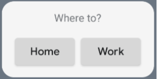 **Figure 1.** An example UI.
You can change the alignment values or apply different modifier values (such as
padding) to change the placement and size of the components. See the [reference
documentation](https://developer.android.com/reference/kotlin/androidx/glance/package-summary) for a full list of components, parameters, and available
modifiers for each class.
## Implement rounded corners
Android 12 introduces system parameters to customize the corner radii of your
app widgets dynamically:
- [`system_app_widget_background_radius`](https://developer.android.com/reference/android/R.dimen#system_app_widget_background_radius): Specifies the corner radius of the widget background container (never larger than 28 dp).
- **Inner radius:** To prevent content clipping, calculate a proportional radius for your inner content based on the system background outline: `systemRadiusValue - widgetPadding`
In Glance, you can apply corner radius sizing properties dynamically in
composition using
`GlanceModifier.cornerRadius(android.R.dimen.system_app_widget_background_radius)`.
For backward compatibility on devices running Android 11 (API level 30) or
lower, implement custom attributes and custom theme resource fallbacks:
- **`/values/attrs.xml`**
- **`/values/styles.xml`**
- **`/values-31/styles.xml`**
- **`/drawable/my_widget_background.xml`**