> Documentation index: https://developer.android.com/develop/ui/compose/components/llms.txt
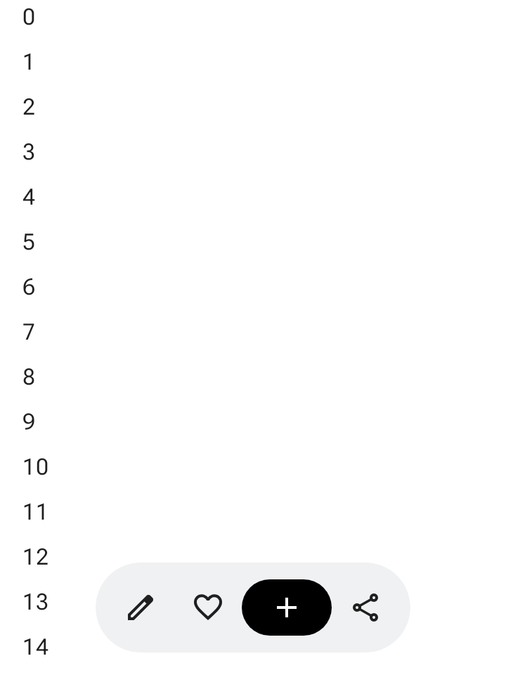
The floating toolbar floats above the body content. It's best used for
contextual actions relevant to the body content or the specific page.
You can position a floating toolbar anywhere on the screen to float over the
rest of the content, offering versatile placement and space for multiple
actions.
## Using the floating toolbar
- Floating toolbars show controls relevant to the current page.
- Floating toolbars can act as navigation controls between related pages in a product hierarchy.
- If more actions are needed, use an overflow menu.
- The floating toolbar's container should remain fully visible on screen.
- Choose the most essential actions to show on screen by default.
## Layout and colors
Floating toolbars can be horizontal ([`HorizontalFloatingToolbar`](https://developer.android.com/reference/kotlin/androidx/compose/material3/HorizontalFloatingToolbar.composable.md.txt)) or
vertical ([`VerticalFloatingToolbar`](https://developer.android.com/reference/kotlin/androidx/compose/material3/VerticalFloatingToolbar.composable.md.txt)), and can use standard or vibrant
color schemes from [`FloatingToolbarDefaults`](https://developer.android.com/reference/kotlin/androidx/compose/material3/FloatingToolbarDefaults.md.txt).
  **Figure 1.** Horizontal and vertical floating toolbars.
## Floating toolbar with a FAB
Use an accompanying floating action button (FAB) for the highest-priority action
in the view, or to complement the toolbar's controls.
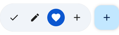 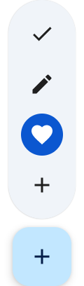 **Figure 2.** Floating toolbars with FAB.
## Examples
### Expandable horizontal floating toolbar
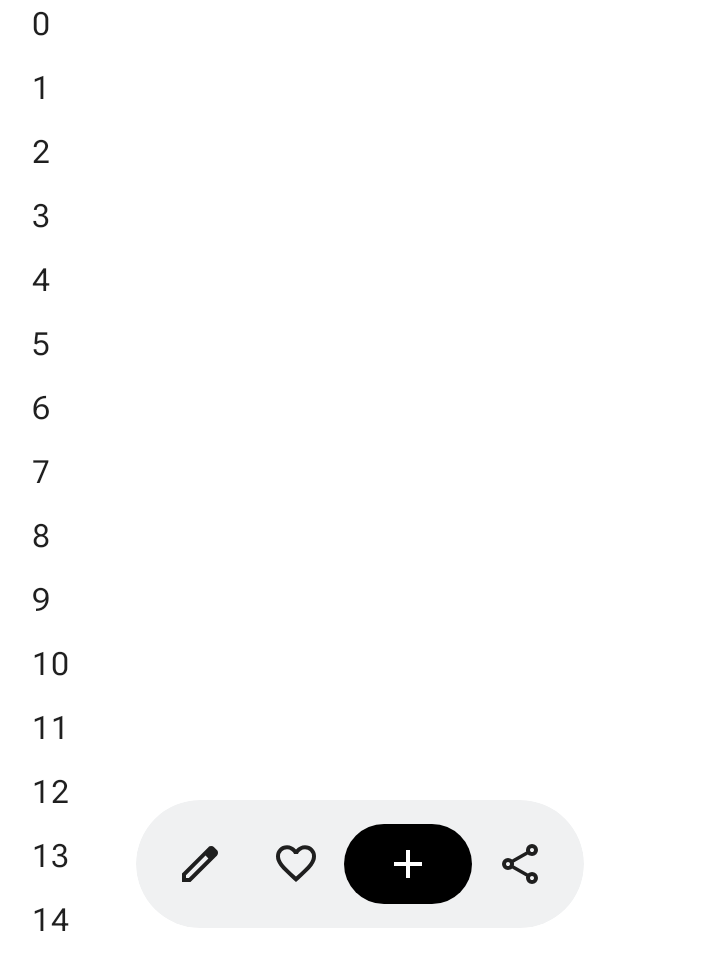
Apply `Modifier.floatingToolbarVerticalNestedScroll` to a scrollable container
so [`HorizontalFloatingToolbar`](https://developer.android.com/reference/kotlin/androidx/compose/material3/HorizontalFloatingToolbar.composable.md.txt) automatically collapses its leading and
trailing actions when the user scrolls down and expands when scrolling up:
```kotlin
@Composable
fun ExpandableHorizontalFloatingToolbarSample() {
var expanded by rememberSaveable { mutableStateOf(true) }
Scaffold { innerPadding ->
Box(Modifier.padding(innerPadding)) {
HorizontalFloatingToolbar(
modifier =
Modifier.align(Alignment.BottomCenter)
.offset(y = -FloatingToolbarDefaults.ScreenOffset)
.zIndex(1f),
expanded = expanded,
leadingContent = {
IconButton(onClick = { /* doSomething() */ }) {
Icon(painter = rememberVectorPainter(AppIcons.Edit), contentDescription = "Edit")
}
IconButton(onClick = { /* doSomething() */ }) {
Icon(painter = rememberVectorPainter(AppIcons.Favorite), contentDescription = "Favorite")
}
},
trailingContent = {
IconButton(onClick = { /* doSomething() */ }) {
Icon(painter = rememberVectorPainter(AppIcons.Share), contentDescription = "Share")
}
},
content = {
FilledIconButton(
modifier = Modifier.width(64.dp),
onClick = { /* doSomething() */ },
) {
Icon(painter = rememberVectorPainter(AppIcons.Add), contentDescription = "Add")
}
},
)
// ...
}
}
}
```
### Expandable vertical floating toolbar
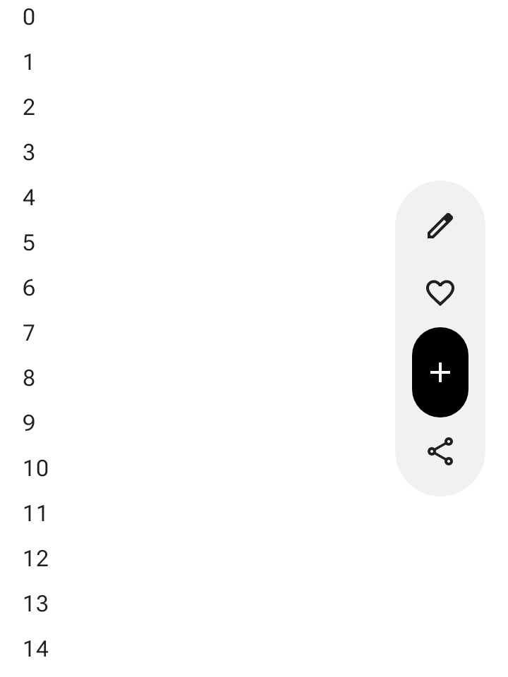
Use [`VerticalFloatingToolbar`](https://developer.android.com/reference/kotlin/androidx/compose/material3/VerticalFloatingToolbar.composable.md.txt) anchored to the side of the screen when
vertical layout space suits your screen hierarchy. Like the horizontal variant,
it can expand and collapse in response to scroll gestures:
```kotlin
@Composable
fun ExpandableVerticalFloatingToolbarSample() {
var expanded by rememberSaveable { mutableStateOf(true) }
Scaffold { innerPadding ->
Box(Modifier.padding(innerPadding)) {
VerticalFloatingToolbar(
modifier =
Modifier.align(Alignment.CenterEnd)
.offset(x = -FloatingToolbarDefaults.ScreenOffset)
.zIndex(1f),
expanded = expanded,
leadingContent = {
IconButton(onClick = { /* doSomething() */ }) {
Icon(painter = rememberVectorPainter(AppIcons.Edit), contentDescription = "Edit")
}
IconButton(onClick = { /* doSomething() */ }) {
Icon(painter = rememberVectorPainter(AppIcons.Favorite), contentDescription = "Favorite")
}
},
trailingContent = {
IconButton(onClick = { /* doSomething() */ }) {
Icon(painter = rememberVectorPainter(AppIcons.Share), contentDescription = "Share")
}
},
content = {
FilledIconButton(
modifier = Modifier.height(64.dp),
onClick = { /* doSomething() */ },
) {
Icon(painter = rememberVectorPainter(AppIcons.Add), contentDescription = "Add")
}
},
)
// ...
}
}
}
```
### Scrollable floating toolbar
To slide the entire floating toolbar off screen while scrolling rather than
collapsing its items, pass `FloatingToolbarDefaults.exitAlwaysScrollBehavior` to
both `Modifier.nestedScroll` and the toolbar's `scrollBehavior` parameter:
```kotlin
@Composable
fun ScrollableHorizontalFloatingToolbarSample() {
val exitAlwaysScrollBehavior =
FloatingToolbarDefaults.exitAlwaysScrollBehavior(
exitDirection = FloatingToolbarExitDirection.Bottom
)
Scaffold(modifier = Modifier.nestedScroll(exitAlwaysScrollBehavior)) { innerPadding ->
Box(Modifier.padding(innerPadding)) {
HorizontalFloatingToolbar(
modifier =
Modifier.align(Alignment.BottomCenter)
.offset(y = -FloatingToolbarDefaults.ScreenOffset)
.zIndex(1f),
expanded = true,
leadingContent = {
IconButton(onClick = { /* doSomething() */ }) {
Icon(painter = rememberVectorPainter(AppIcons.Edit), contentDescription = "Edit")
}
IconButton(onClick = { /* doSomething() */ }) {
Icon(painter = rememberVectorPainter(AppIcons.Favorite), contentDescription = "Favorite")
}
},
trailingContent = {
IconButton(onClick = { /* doSomething() */ }) {
Icon(painter = rememberVectorPainter(AppIcons.Share), contentDescription = "Share")
}
},
content = {
FilledIconButton(
modifier = Modifier.width(64.dp),
onClick = { /* doSomething() */ },
) {
Icon(painter = rememberVectorPainter(AppIcons.Add), contentDescription = "Add")
}
},
scrollBehavior = exitAlwaysScrollBehavior,
)
// ...
}
}
}
```