The [`Card`](https://developer.android.com/reference/kotlin/androidx/compose/material3/Card.composable.md.txt#Card(androidx.compose.ui.Modifier,androidx.compose.ui.graphics.Shape,androidx.compose.material3.CardColors,androidx.compose.material3.CardElevation,androidx.compose.foundation.BorderStroke,kotlin.Function1)) composable acts as a Material Design container for your UI.
Cards typically present a single coherent piece of content. The following
examples show where you might use a card:
- A product in a shopping app.
- A news story in a news app.
- A message in a communications app.
It is the focus on portraying a single piece of content that distinguishes
`Card` from other containers. For example, `Scaffold` provides general structure
to a whole screen. Card is generally a smaller UI element inside a larger
layout, whereas a layout component such as `Column` or `Row` provides a simpler
and more generic API.
 **Figure 1.** An example of a card populated with text and icons.
## Basic implementation
`Card` behaves much like other containers in Compose. You declare its content by
calling other composables within it. For example, consider how `Card` contains a
call to `Text` in the following minimal example:
```kotlin
@Composable
fun CardMinimalExample() {
Card() {
Text(text = "Hello, world!")
}
}
```
> [!NOTE]
> **Note:** By default, a `Card` wraps its content in a `Column` composable and places each item inside the card below the previous one.
## Advanced implementations
See the [reference](https://developer.android.com/reference/kotlin/androidx/compose/material3/Card.composable.md.txt#Card(androidx.compose.ui.Modifier,androidx.compose.ui.graphics.Shape,androidx.compose.material3.CardColors,androidx.compose.material3.CardElevation,androidx.compose.foundation.BorderStroke,kotlin.Function1)) for the API definition of `Card`. It defines several
parameters that allow you to customize the appearance and behavior of the
component.
Some key parameters to note are the following:
- **`elevation`**: Adds a shadow to the component that makes it appear elevated above the background.
- **`colors`** : Uses the `CardColors` type to set the default color of both the container and any children.
- **`enabled`** : If you pass `false` for this parameter, the card appears as disabled and does not respond to user input.
- **`onClick`** : Ordinarily, a `Card` does not accept click events. As such, the primary overload you would like to note is that which defines an `onClick` parameter. You should use this overload if you would like your implementation of `Card` to respond to presses from the user.
The following example demonstrates how you might use these parameters, as well
as other common parameters such as `shape` and `modifier`.
### Filled card
The following is an example of how you can implement a filled card.
The key here is the use of the `colors` property to change the filled
color.
```kotlin
@Composable
fun FilledCardExample() {
Card(
colors = CardDefaults.cardColors(
containerColor = MaterialTheme.colorScheme.surfaceVariant,
),
modifier = Modifier
.size(width = 240.dp, height = 100.dp)
) {
Text(
text = "Filled",
modifier = Modifier
.padding(16.dp),
textAlign = TextAlign.Center,
)
}
}
```
This implementation appears as follows:
 **Figure 2.** Example of a filled card.
### Elevated Card
The following snippet demonstrates how to implement an elevated card. Use the
dedicated [`ElevatedCard`](https://developer.android.com/reference/kotlin/androidx/compose/material3/ElevatedCard.composable.md.txt#ElevatedCard(androidx.compose.ui.Modifier,androidx.compose.ui.graphics.Shape,androidx.compose.material3.CardColors,androidx.compose.material3.CardElevation,kotlin.Function1)) composable.
You can use the `elevation` property to control the appearance of elevation and
the resulting shadow.
```kotlin
@Composable
fun ElevatedCardExample() {
ElevatedCard(
elevation = CardDefaults.cardElevation(
defaultElevation = 6.dp
),
modifier = Modifier
.size(width = 240.dp, height = 100.dp)
) {
Text(
text = "Elevated",
modifier = Modifier
.padding(16.dp),
textAlign = TextAlign.Center,
)
}
}
```
This implementation appears as follows:
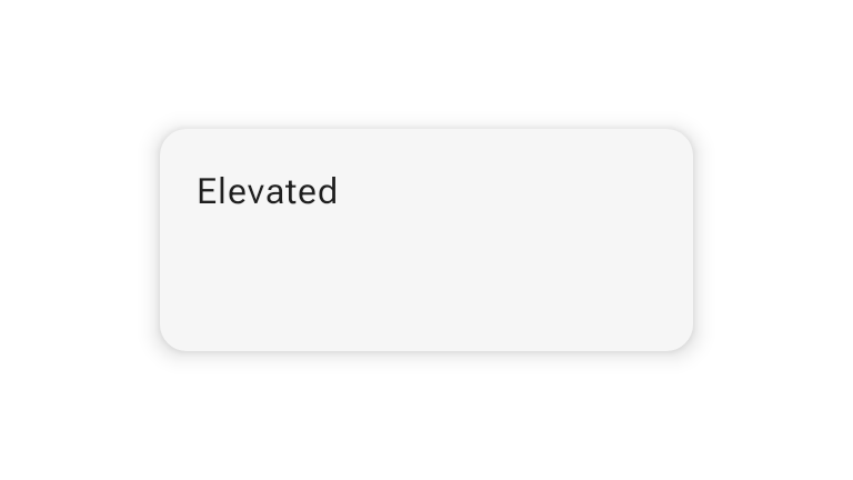 **Figure 3.** Example of an elevated card.
### Outlined Card
The following is an example of an outlined card. Use the dedicated
[`OutlinedCard`](https://developer.android.com/reference/kotlin/androidx/compose/material3/OutlinedCard.composable.md.txt#OutlinedCard(androidx.compose.ui.Modifier,androidx.compose.ui.graphics.Shape,androidx.compose.material3.CardColors,androidx.compose.material3.CardElevation,androidx.compose.foundation.BorderStroke,kotlin.Function1)) composable.
```kotlin
@Composable
fun OutlinedCardExample() {
OutlinedCard(
colors = CardDefaults.cardColors(
containerColor = MaterialTheme.colorScheme.surface,
),
border = BorderStroke(1.dp, Color.Black),
modifier = Modifier
.size(width = 240.dp, height = 100.dp)
) {
Text(
text = "Outlined",
modifier = Modifier
.padding(16.dp),
textAlign = TextAlign.Center,
)
}
}
```
This implementation appears as follows:
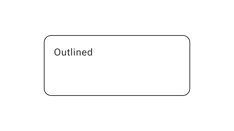 **Figure 4.** Example of an outlined card.
## Limitations
Cards don't come with inherent scroll or dismiss actions, but can integrate into
composables offering these features. For example, to implement swipe to dismiss
on a card, integrate it with the [`SwipeToDismiss`](https://developer.android.com/reference/kotlin/androidx/compose/material3/SwipeToDismissBox.composable.md.txt) composable. To integrate
with scroll, use scroll modifiers such as [`verticalScroll`](https://developer.android.com/reference/kotlin/androidx/compose/foundation/verticalScroll.modifier.md.txt#(androidx.compose.ui.Modifier).verticalScroll(androidx.compose.foundation.ScrollState,kotlin.Boolean,androidx.compose.foundation.gestures.FlingBehavior,kotlin.Boolean)). See the [Scroll
documentation](https://developer.android.com/develop/ui/compose/touch-input/pointer-input/scroll) for more information.
## Additional resources
- [Material UI docs](https://m3.material.io/components/cards/overview)