
The TV app design guidelines define a card variant
called the [Wide classic card](https://developer.android.com/design/ui/tv/guides/components/cards.md.txt#wide-classic-card),
which displays an image and its descriptive content block side by side.
When building complex two-dimensional layouts for TV screens,
using traditional coordinate-based positioning
or deeply nested `Row` and `Column` containers can make your code difficult
to read, maintain, and refactor.
The Wide classic card is an ideal use case for the Jetpack Compose `Grid` API,
helping you structure side-by-side elements cleanly using semantic,
user-defined 2D layout areas.
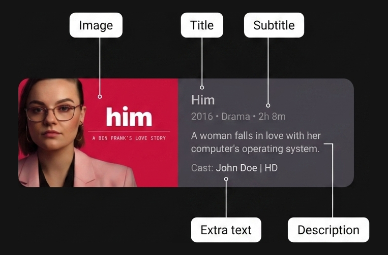 **Figure 1.** Wide classic card five named areas: Image area and four text areas in content block.
## Best practices
Implement the card layout with `Grid`.
Using the `Grid` container improves code readability
by decoupling physical layout dimensions from child item placement.
Rather than relying on exact track indexes,
define semantic named areas with the `area` function
and place child composables with the `gridItem` modifier.
Combine flexible track sizing, such as `GridTrackSize.Auto`
and `minmax(0.dp, 1.fr)`,
with exact track gaps (`gap(row = 8.dp, column = 16.dp)`)
to organize complex side-by-side card components clearly and robustly.
## Ingredients
- [`Grid`](https://developer.android.com/reference/kotlin/androidx/compose/foundation/layout/Grid.composable.md.txt): A 2D container layout in Jetpack Compose that arranges child composables into rows and columns based on a configuration lambda
- [`gridItem`](https://developer.android.com/reference/kotlin/androidx/compose/foundation/layout/GridScope.md.txt): A `Modifier` extension that associates a child UI element with a specific named `areaId` inside a `Grid` layout
- [`area`](https://developer.android.com/reference/kotlin/androidx/compose/foundation/layout/GridConfigurationScope.md.txt): A configuration DSL function within [`GridConfigurationScope`](https://developer.android.com/reference/kotlin/androidx/compose/foundation/layout/GridConfigurationScope.md.txt) that maps a semantic `areaId` to specific row and column spans or ranges
- [`Card`](https://developer.android.com/reference/kotlin/androidx/compose/material3/Card.composable.md.txt): A Material Design container composable that groups related UI elements and styling
- [`GridTrackSize.MinMax`](https://developer.android.com/develop/adaptive-apps/guides/grid/container-properties.md.txt): A track sizing property that defines flexible bounds (`min` and `max`) for row or column dimensions
- [`GridTrackSize.Auto`](https://developer.android.com/reference/kotlin/androidx/compose/foundation/layout/GridTrackSize.md.txt#Auto()): A track sizing property that sizes the row or column track automatically to fit its content (`column(GridTrackSize.Auto)`)
- [`gap`](https://developer.android.com/reference/kotlin/androidx/compose/foundation/layout/GridConfigurationScope.md.txt#gap(androidx.compose.ui.unit.Dp,androidx.compose.ui.unit.Dp)): A configuration function that specifies the vertical (`row`) and horizontal (`column`) spacing between grid tracks
## Steps
Define area identifiers, configure the grid tracks and areas,
then place the child composables.
### 1. Define semantic area identifiers
First, create a type-safe representation of the regions inside your Wide classic
card layout. An `enum` class avoids string typos and provides
compile-time safety when mapping tracks and placing child items.
```kotlin
enum class CardArea {
Image,
Title,
Subtitle,
Description,
ExtraText,
}
```
### 2. Configure the 2D grid tracks and named areas
Inside your `Grid` composable's `config` lambda, define the columns and rows
that make up the card structure. Use `GridTrackSize.Auto` for the image column
so it wraps the thumbnail width cleanly. Use `minmax(0.dp, 1.fr)` for the
content column so it expands flexibly across the remaining card width. Specify
track spacing with `gap(row = 8.dp, column = 16.dp)`. Map your `CardArea`
identifiers to their physical track coordinates using the `area` function.
```kotlin
Grid(
config = {
// Define columns: left column for image, right for content
column(GridTrackSize.Auto)
column(minmax(0.dp, 1.fr))
// Define row tracks for the vertical content stack
row(GridTrackSize.Auto)
row(GridTrackSize.Auto)
row(GridTrackSize.Auto)
row(GridTrackSize.Auto)
// Map semantic identifiers to grid coordinates and spans
area(CardArea.Image, row = 1, column = 1, rowSpan = 4)
area(CardArea.Title, row = 1, column = 2)
area(CardArea.Subtitle, row = 2, column = 2)
area(CardArea.Description, row = 3, column = 2)
area(CardArea.ExtraText, row = 4, column = 2)
gap(row = 8.dp, column = 16.dp)
}
) {
// Child elements placed in Step 3
}
```
### 3. Place child composables using the gridItem modifier
With your tracks and areas configured, place each child UI element purely by
semantic intent using the `gridItem` modifier. You can declare child
composables in any order. The `Grid` container positions each element
directly into its assigned 2D region automatically.
```kotlin
@Composable
fun WideClassicCard(
imageContent: @Composable () -> Unit,
title: String,
subtitle: String,
description: String,
extraText: String,
modifier: Modifier = Modifier,
) {
Card(modifier = modifier) {
Grid(
config = {
// Define columns: left column for image, right for content
column(GridTrackSize.Auto)
column(minmax(0.dp, 1.fr))
// Define row tracks for the vertical content stack
row(GridTrackSize.Auto)
row(GridTrackSize.Auto)
row(GridTrackSize.Auto)
row(GridTrackSize.Auto)
// Map semantic identifiers to grid coordinates and spans
area(CardArea.Image, row = 1, column = 1, rowSpan = 4)
area(CardArea.Title, row = 1, column = 2)
area(CardArea.Subtitle, row = 2, column = 2)
area(CardArea.Description, row = 3, column = 2)
area(CardArea.ExtraText, row = 4, column = 2)
gap(row = 8.dp, column = 16.dp)
},
) {
Box(modifier = Modifier.gridItem(CardArea.Image)) {
imageContent()
}
Text(
text = title,
style = MaterialTheme.typography.titleLarge,
modifier = Modifier
.gridItem(CardArea.Title)
.padding(top = 16.dp, end = 16.dp),
)
Text(
text = subtitle,
style = MaterialTheme.typography.titleMedium,
modifier = Modifier
.gridItem(CardArea.Subtitle)
.padding(end = 16.dp),
)
Text(
text = description,
style = MaterialTheme.typography.bodyMedium,
modifier = Modifier
.gridItem(CardArea.Description)
.padding(end = 16.dp),
)
Text(
text = extraText,
style = MaterialTheme.typography.labelSmall,
modifier = Modifier
.gridItem(CardArea.ExtraText)
.padding(bottom = 16.dp, end = 16.dp),
)
}
}
}
```
## Results
By organizing your Wide classic card with `Grid` and named areas,
you achieve a clean separation between physical layout tracks, area
coordinates, and child composable placement.
This structure makes your layout readable and maintainable
while following TV app design guidelines
for side-by-side thumbnail and description components.
## Additional resources
- [TV design guidelines: Cards](https://developer.android.com/design/ui/tv/guides/components/cards.md.txt#wide-classic-card)
- [Adaptive apps guide: Grid container properties](https://developer.android.com/develop/adaptive-apps/guides/grid/container-properties.md.txt)