
## Low latency
Low latency input turns the stylus into a precision tool, providing a natural,
organic writing or drawing experience.
[Learn more](https://developer.android.com/develop/ui/compose/touch-input/stylus-input/advanced-stylus-features#low_latency)
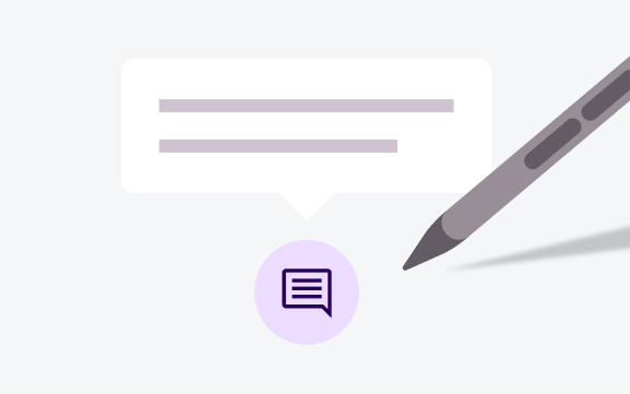
## Hover
Stylus hover enables contextual information and feedback, such as tooltips, UI
highlighting, and messaging.
[Learn more](https://developer.android.com/develop/ui/compose/touch-input/stylus-input/advanced-stylus-features#hover)
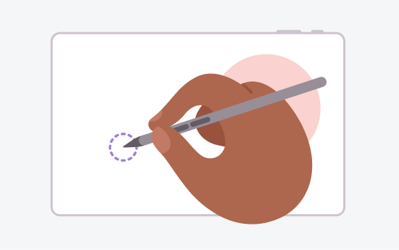
## Palm rejection
Palm detection and rejection eliminate inadvertent screen touches for
comfortable, natural stylus control.
[Learn more](https://developer.android.com/develop/ui/compose/touch-input/stylus-input/advanced-stylus-features#palm_rejection)
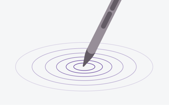
## Tilt and pressure
Tilt and pressure support enable advanced input capabilities, such as variation
in stroke width, color saturation, or touch intensity.
[Learn more](https://developer.android.com/develop/ui/compose/touch-input/stylus-input/advanced-stylus-features#pressure)
## Hover to display
Instantly display media playbacks and file previews with stylus hover.
## Hover to preview
Hover the stylus over the canvas to preview the selected brush size and shape.
*** ** * ** ***
## Android AdaptiveUI Samples
Explore inspiring, optimized designs for large screen devices. Browse UI/UX
templates for popular app categories, including media, creativity, games, and
more.
[View Figma
Kit](https://www.figma.com/community/file/1539759053650269019/android-adaptive-ui-samples)
## Implement a supporting pane
A mobile view may require supporting content or controls, typically in the form
of sheets or dialogs, to help the primary view stay focused and uncluttered.
[Learn
more](https://developer.android.com/develop/ui/compose/layouts/adaptive/canonical-layouts#supporting-pane)
[Material Design
website](https://material.io/foundations/layout/canonical-layouts/supporting-pane)