Design for clarity, legibility, and minimal distraction.
Visual design principles emphasize clarity, legibility, and minimal distraction,
adapted to the unique constraints of a small, near-eye display on display
glasses. Consider the limited display area and the user's primary focus on the
real world. Visual elements should be designed to be crisp, high-contrast, and
appear only when necessary, quickly fading when no longer relevant.

Jetpack Compose Glimmer's design language features a simplified theme for
optimal visibility on glasses. Color and type can be customized for semantic
expression and app cohesion.
 Compose Glimmer includes a color scheme.  Compose Glimmer includes its own typescale. 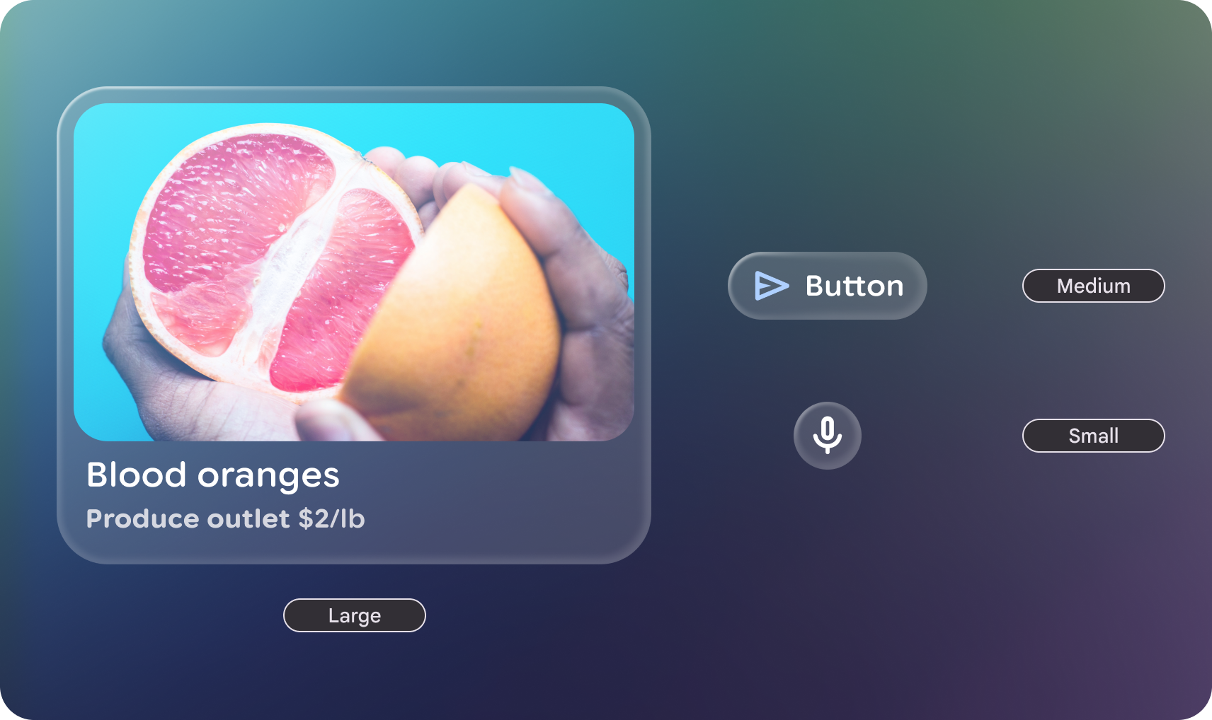 Compose Glimmer shape styles include three sizes for border radius. 
### Do
Embrace rounded corners to avoid drawing the user's attention into component corners. 
### Don't
Overly customize shape with sharp corners, they can create visual pockets that lead the user's eye into, which on immersive and augmented experiences have greater affect.