Icons must be considered to be glanceable and discernible on glasses displays. Use rounded icon styles with a heavier weight to prevent halation effects.
| **Note:** If you don't need custom iconography, use Material Symbols Rounded.
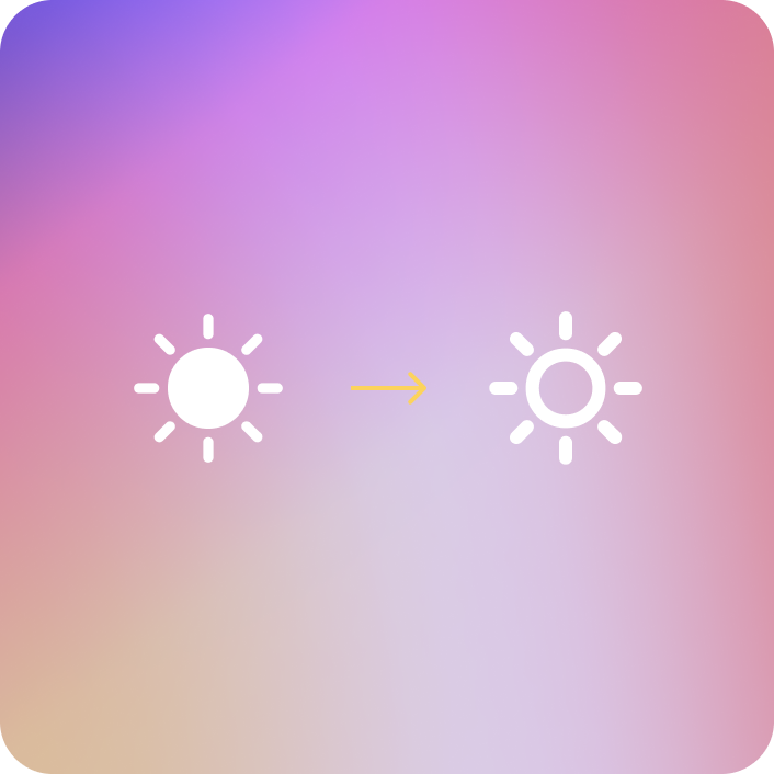**Unfilled**Icons should be unfilled to avoid halation, or "light bleed".
**Heavier stroke weight**To ensure readability and harmonize with system typography, system icons should use a heavier weight to avoid thin strokes. Used rounded icon variants.
| **Note:** Note: For icons, check out Material Symbols. Available on[Google Fonts](https://fonts.google.com/icons).