Title chips provide a small snippet of information.

### Principles
**Contextual**: The primary purpose of a Title Chip is to provide clear and
immediate context for the content it's associated with.
**Concise**: Title Chips are designed for brief information, typically a short
title, name, or status.
**Visually Distinct**: While sharing the Jetpack Compose Glimmer aesthetic, its
appearance should be distinct enough to be recognized as a label rather than an
interactive button.
## Usage \& Placement
The title chip is a read-only component, by default.

### Do
Use a title chip for a static or decorative element, to inform the user and label. 
### Don't
Use title chips as a tapable action prompt, since they do not have a focus state, use a button instead.

Title chips can be compared to a static mobile app bar.
**A** Title chip
**B** App Bar in Mobile app
### Within a layout
The title chip is a read-only component, by default.
Alas, your browser doesn't support HTML5 video. That's OK! You can still [download the video](https://developer.android.com/static/images/design/ui/glasses/guides/glasses_components_titlechip_default.mp4) and watch it with a video player. Chips scroll with the layout. Alas, your browser doesn't support HTML5 video. That's OK! You can still [download the video](https://developer.android.com/static/images/design/ui/glasses/guides/glasses_components_titlechip_sticky.mp4) and watch it with a video player. Alternatively, chips can be fixed within the layout.
## Anatomy
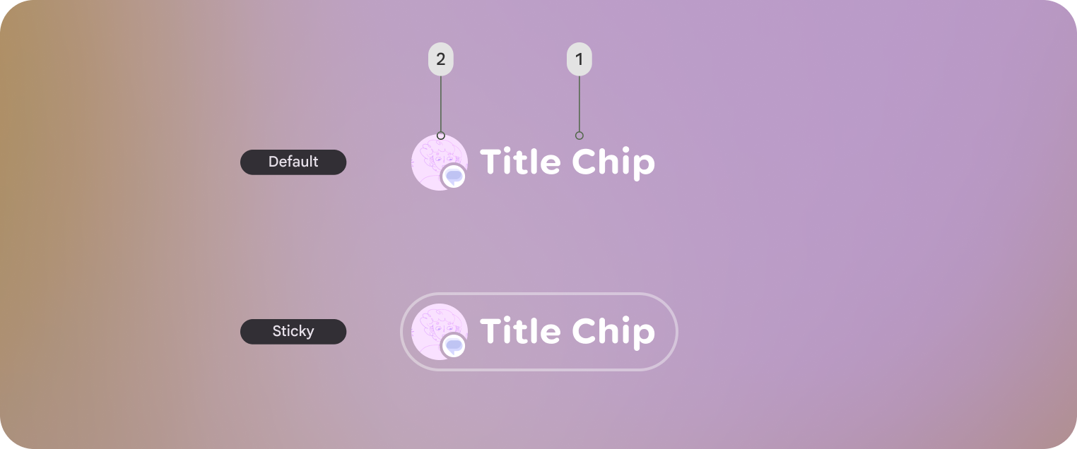
Default title chip and Sticky title chip shown. Sticky title chips are displayed
with an outline.
**1.** Title chips label
**2.** Optional leading icon or entity
## Customization
Title chips can be displayed with or without an icon along with other style
properties.
| Properties | Customization | Defaults |
|---|---|---|
| Shape | Yes | Large, Circle |
| Padding | Yes | 16 dp, 8 dp |
| Border | Yes | 2 dp, #606460 |
| Text | Yes | Body Small |
| Leading icon | Yes | 40 dp |
| Depth | Yes | 0 |
| Max Width | No | 352 dp |
| Min Height | Yes | 56 dp |