The progress indicator communicates the status of a known or unknown process
time.

### Principles
**Clear Feedback**: The progress indicator provides immediate feedback.
**Consistent**: All progress indicators should share a core visual language to
be instantly recognizable.
**Flexible**: Variety of progress indicators and states provide flexibility to
communicate progress.
## Usage \& Placement
Progress indicators show the status of a process in real time.
Indication can express determinate progress, with a known process time, like a
timer.
Or indeterminate progress, with unknown process time, like loading.

### Do
Use an indeterminate progress indication to show unknown processing times, like loading. 
### Don't
Use a determinate indicator when the processing time is unknown. This will give users a false sense of progress. 
### Do
Keep to one progress indicator at a time when there is sufficient time or progress to communicate. 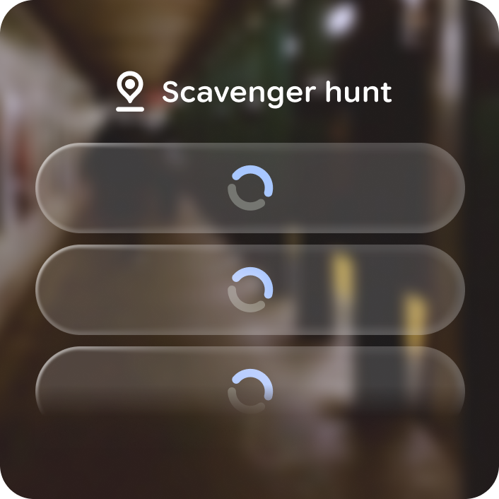
### Don't
Overuse progress indicators or use them when there isn't sufficient time and progress to communicate.
## Anatomy
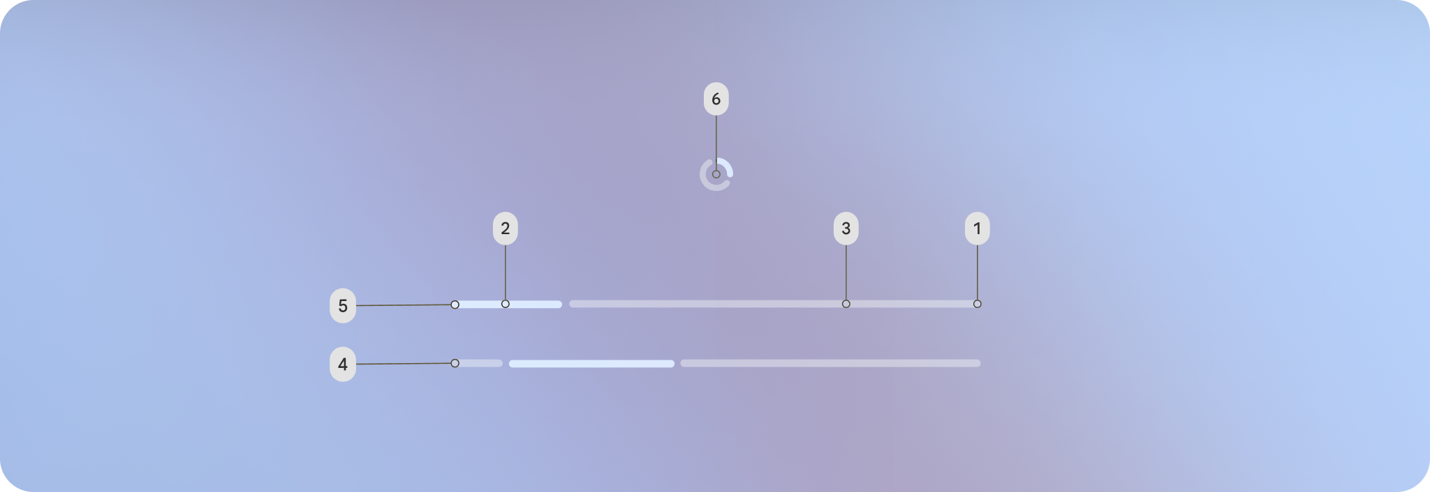
**1.** Determinate progress stop - shows the definite endpoint.
**2.** Current progress
**3.** Future progress
**4.** Indeterminate processing
**5.** Linear
**6.** Circular
## Customization
Besides determinate and indeterminate, progress indicators also come in linear,
circular, and wavy variations.
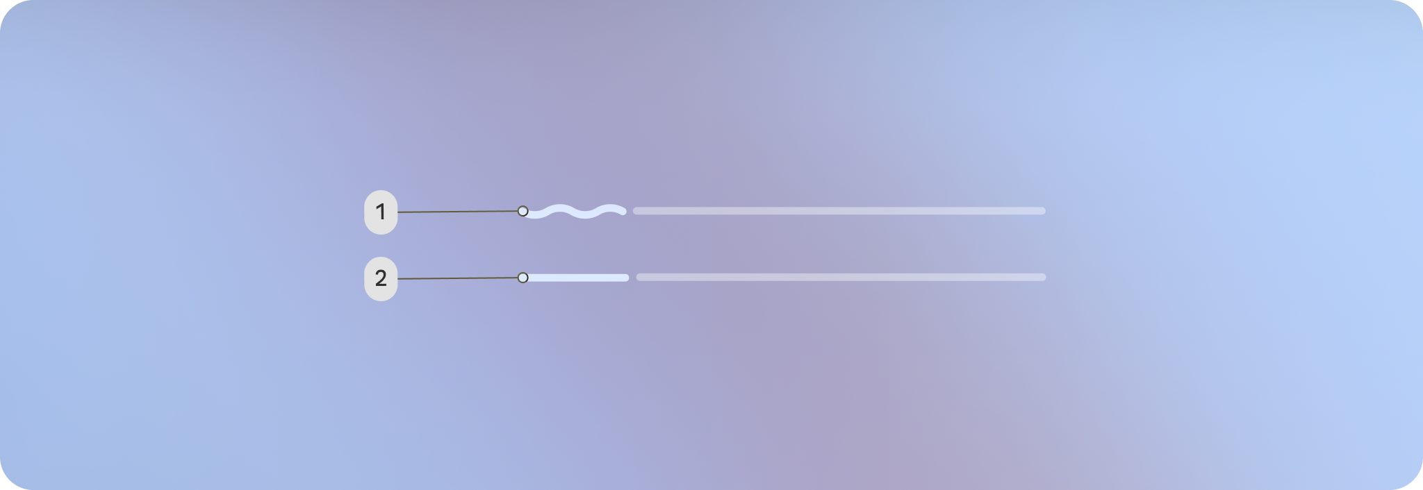
**1.** Wavy
**2.** Linear
All of the wavy and linear variants of progress indicators share the same
properties, customization options, and defaults. The following table describes
these details.
### Linear
| Properties | Customization | Defaults |
|---|---|---|
| Thickness | Yes | 6 dp |
| Indicator color | Yes | Primary |
| Track color | Yes | Outline |
| Size | Yes | 360 dp |
### Circular
| Properties | Customization | Defaults |
|---|---|---|
| Thickness | Yes | 6 dp |
| Indicator color | Yes | Primary |
| Track color | Yes | Outline |
| Size | Yes | 40 dp |