The page indicator represents the currently active page and total pages of an
overlay that lets you navigate horizontally between content.

### Principles
Stack are a container component, so they share design principles with cards and
lists:
**Clear Feedback**: Pagers communicate where the user is within a carousel of
content.
**Contextual**: The primary purpose of a pager is to provide clear and
immediate context for the content it's associated with.
**Concise**: Pagers are small and precise in visual language.
## Usage \& Placement
Pagers show the user their current position within a linear sequence of content.
Alas, your browser doesn't support HTML5 video. That's OK! You can still [download the video](https://developer.android.com/static/images/design/ui/glasses/guides/glasses_components_pagers.mp4) and watch it with a video player.
Alas, your browser doesn't support HTML5 video. That's OK! You can still [download the video](https://developer.android.com/static/images/design/ui/glasses/guides/glasses_components_pagers_swipe.mp4) and watch it with a video player.
A user can quickly swipe through pagers.
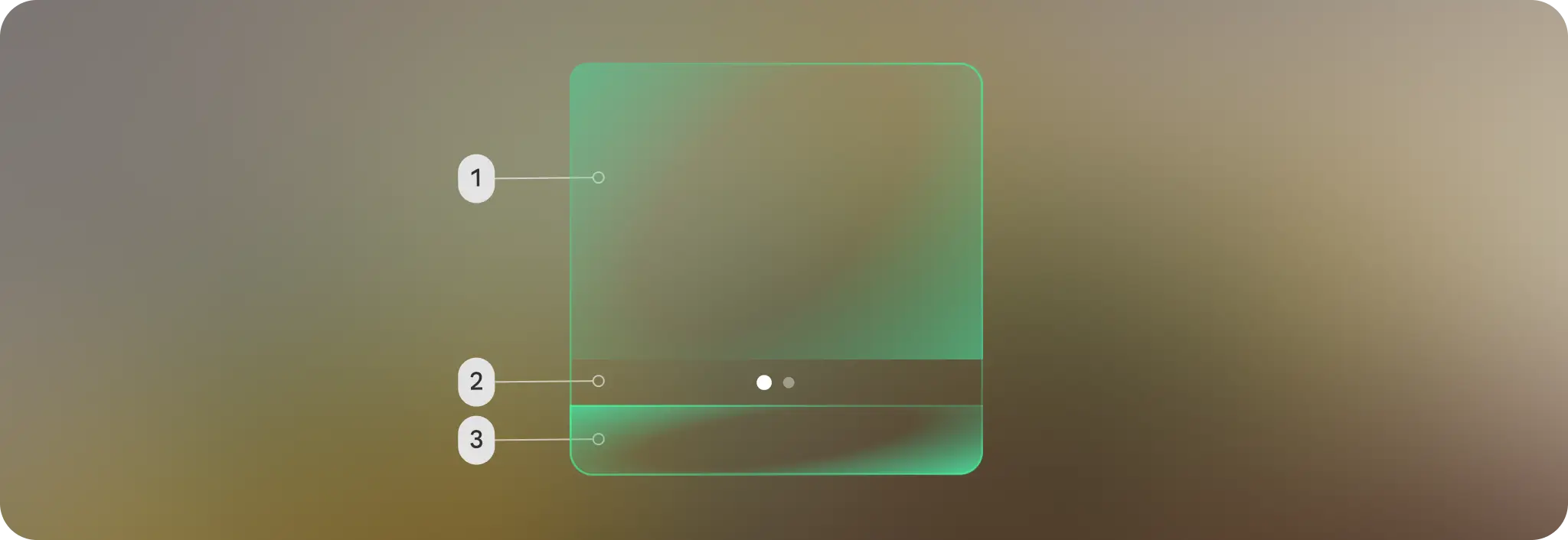
They are placed above the system bar area and under the content area.
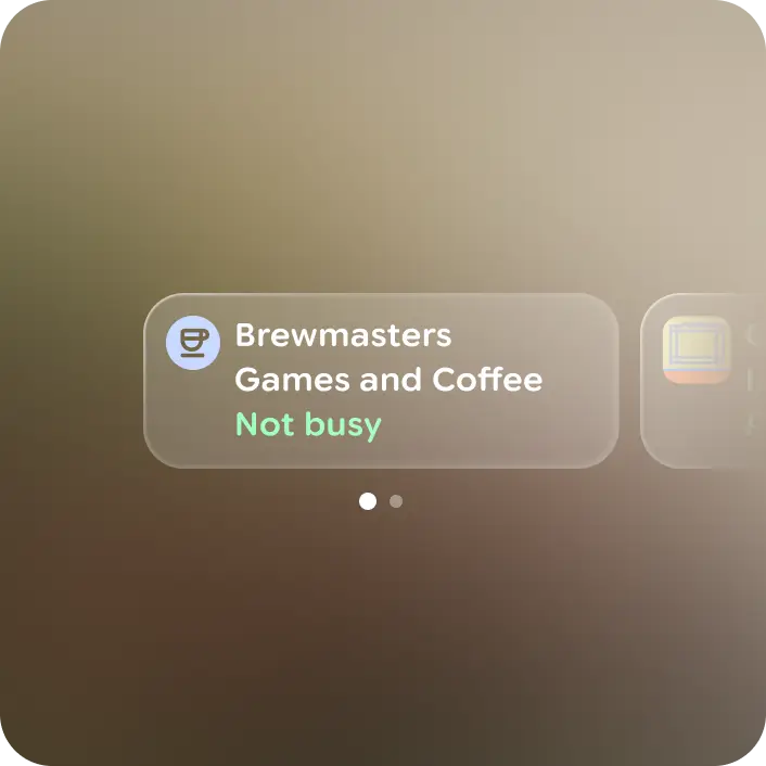
### Do
Cards are arranged in a row with no overlap 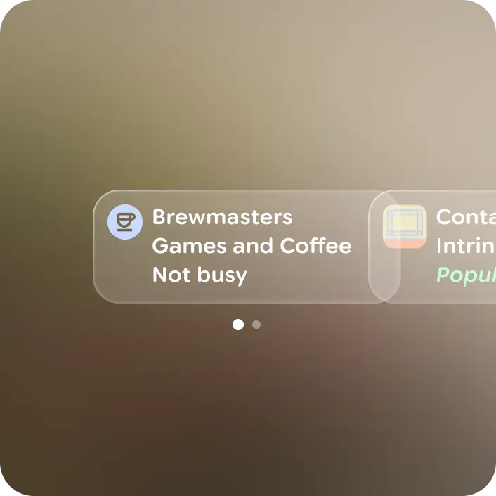
### Don't
Allow cards to overlap. Only one card is visible at a time.
## Anatomy
A pager is composed of a row of indication dots in active and inactive states.

**A.** Active (Current page)
**B.** Inactive page
Alas, your browser doesn't support HTML5 video. That's OK! You can still [download the video](https://developer.android.com/static/images/design/ui/glasses/guides/glasses_components_pagers_wrong.mp4) and watch it with a video player.
Pager indicating swiping in the wrong direction.

When five or more dots are present, the additional dots are indicated with a
smaller first dot and slide the entire row until the end is reached.
## Customization
Pagers have built-in scrim, paging, and animations that can't be customized.
Rather the content within the stacks pager is customized.