The icon marker is part of the spatial annotation system. Use icon markers to
help annotate real world objects.
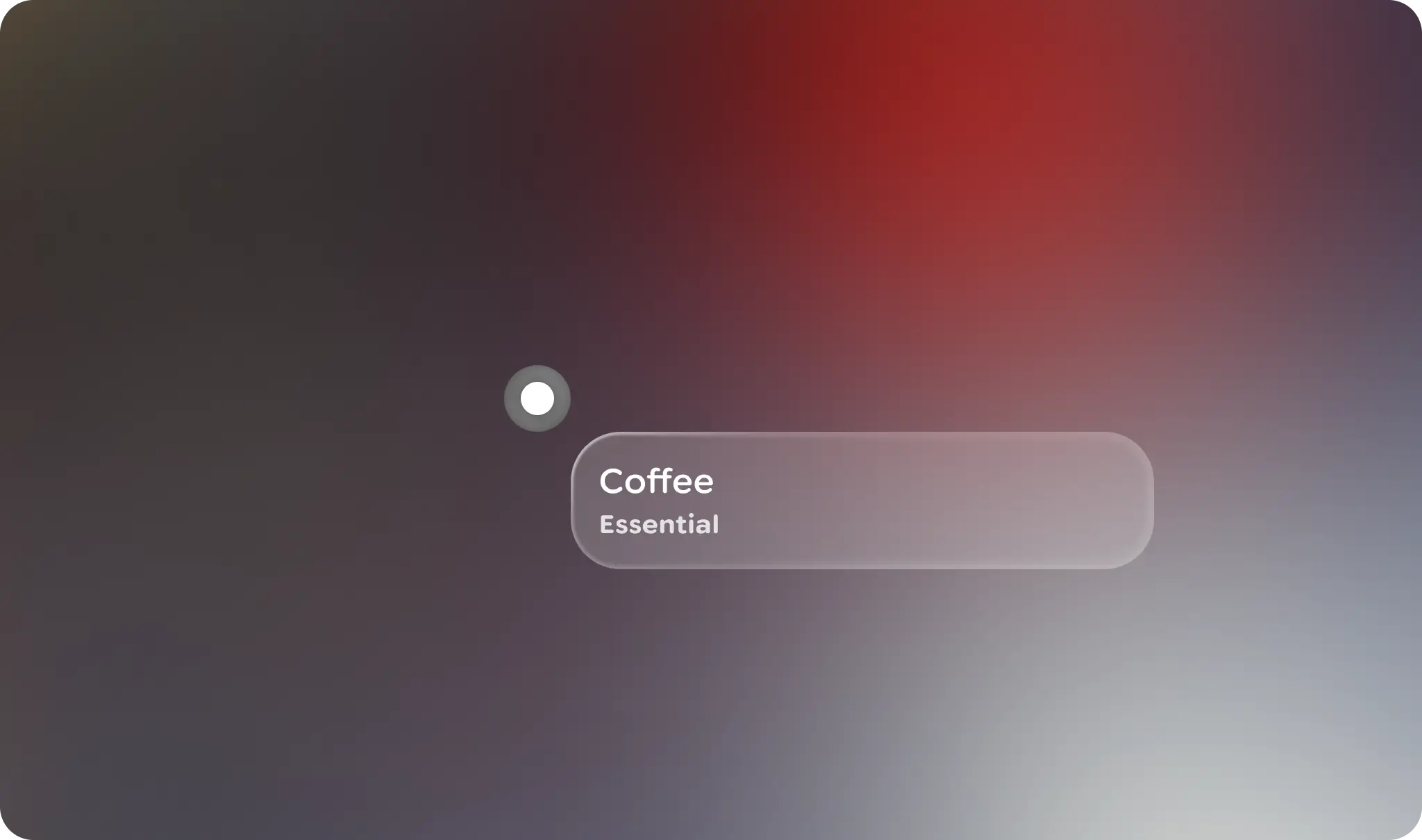
### Principles
**Contextual**: Icon markers are locked to real world objects or points.
**Concise**: Icon markers are abbreviated visual indicators of a spatial anchor.
## Usage \& Placement
An icon marker is an icon-button-like UI element that marks objects of interest
in the user's environment. The icon marker is a type of spatial marker, used for
[spatial anchoring](https://developer.android.com/design/ui/xr/guides/spatial-anchor).

### Do
Use an icon marker to annotate real world objects. 
### Don't
Use icon markers for decorative elements or non-real world object annotation, when an icon button is better suited.
Any other Jetpack Compose Glimmer component can be paired with a marker for
greater clarification or insight on the user's surroundings.
Alas, your browser doesn't support HTML5 video. That's OK! You can still [download the video](https://developer.android.com/static/images/design/ui/glasses/guides/anchor_iconmarker.mp4) and watch it with a video player.

### Do
Use progressive disclosure to allow the user to navigate through to further information. 
### Don't
Overload markers with additional UI, this will cause greater interference with the user's environment.
Content and labels can be placed at different orientations. Markers, and any
attached UI, should behave as spatial UI, meaning the actual distance of the
marked object should be reflected in the size of the UI, using a constant
angular DP size.

Clearly define markers to avoid visual clutter, and limit the number of markers
within view. If multiple markers are needed, cluster them together as one,
more-prominent marker that can be progressively viewed.
### States
The icon marker is very similar to an icon button. The main difference is that
rather than a disabled state, it has a non-interactive state.
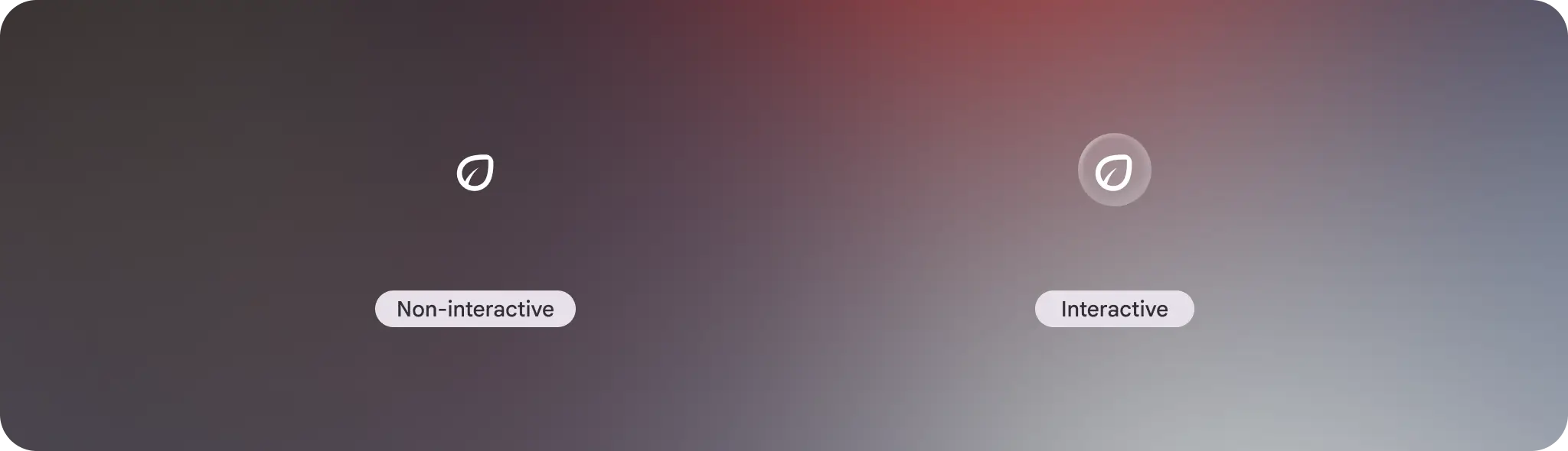
Annotate the physical world with the non-interactive state, like marking a point
of interest.
If there is more information that might be available, you can use the
interactive state that has a button affordance. If the user taps the icon
marker, a Glimmer card with more information is displayed.
## Anatomy
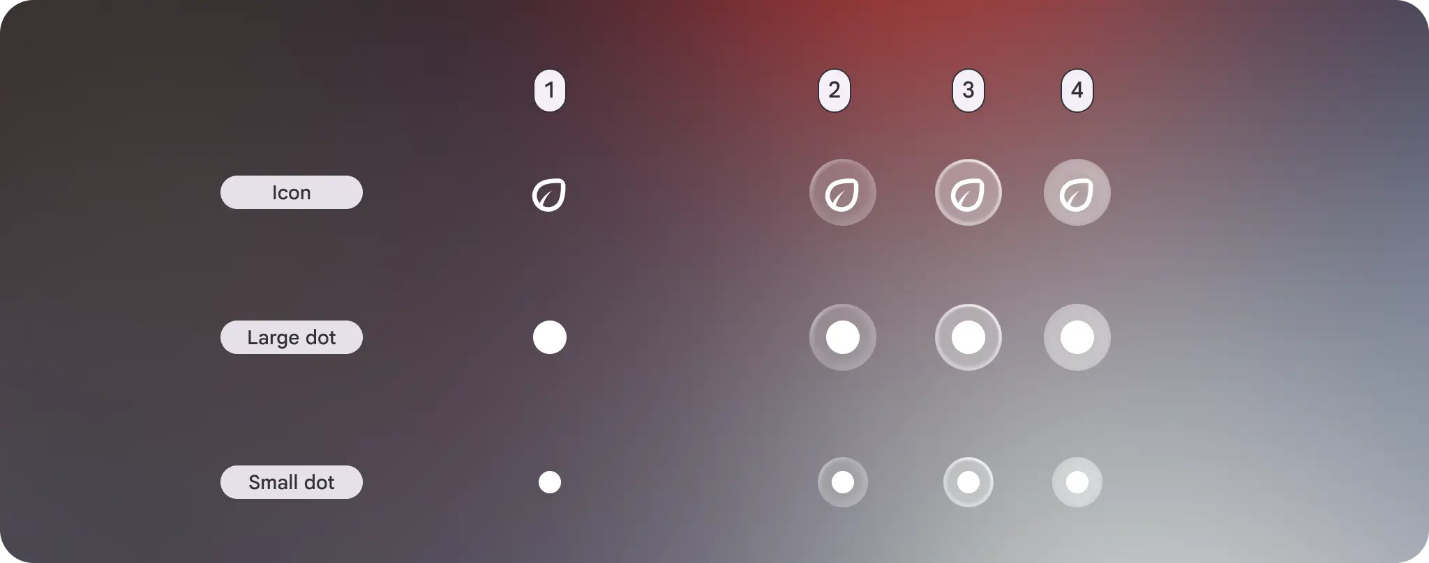
The icon marker itself is a small icon button UI element with padding allowing
for a fixed UI alignment and orientation. The icon marker can also use a large
or small dot instead of an icon. The interactive state includes a visual
affordance to denote the button state.
### Padding
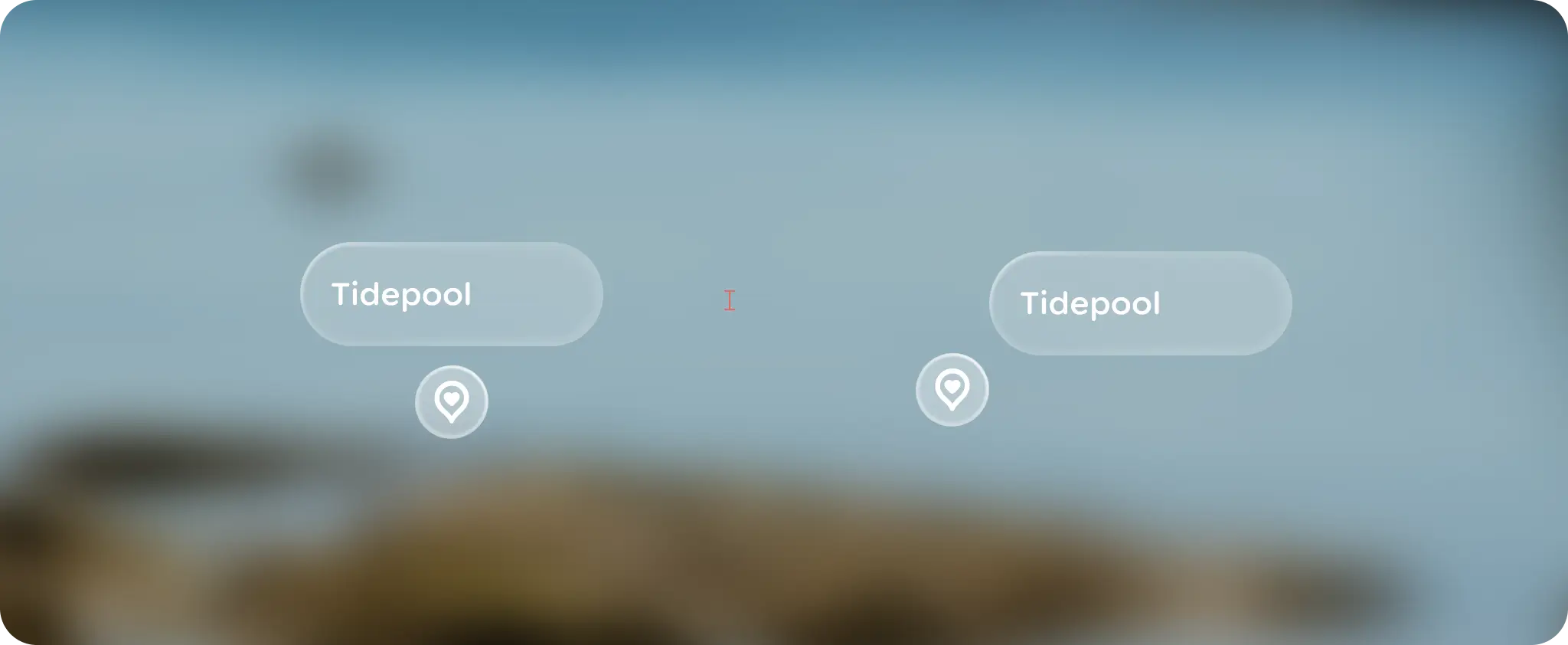
Horizontal and vertically positioned UI have a medium padding, while diagonally
paired elements have a 0 dp default padding.

### Alignment
UI elements can be positioned at horizontal, vertical, or diagonal points.
### Orientation
Content should billboard toward the user, while respecting gravity to make the
content feel organized.
## Customization
To keep a consistent visual affordance, avoid customizing icon markers. However,
you can customize the orientation and alignment of the attached UI elements.
| Properties | Customization | Defaults |
|---|---|---|
| Icon | Yes | Large dot, small dot, Icon |
| Padding | No | Top Center, Center Right, Bottom Center, Center Left = medium Top Left, Top Right, Bottom Right, Bottom Left = 0 dp |
| Alignment | Yes | TopLeft, TopCenter, TopRight, CenterLeft, CenterRight, BottomLeft, BottomCenter, BottomRight |
| Orientation | Yes | RotateToLookAtUser: The dot billboards towards the user no matter angle of rotation. |