Buttons are the primary visual indicator for a user's actions.
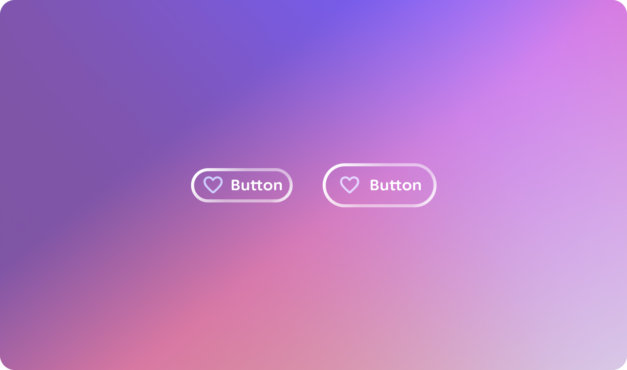
### Principles
**Action-Oriented**: Buttons should clearly communicate that they trigger an
action.
**Clear Feedback**: The button's appearance must change distinctly across
different interaction states (hover, press, focus) to provide immediate
feedback.
**Consistent**: All buttons should share a core visual language to be instantly
recognizable.
**Flexible**: The button component should accommodate common variations, such as
including icons and different sizes, without sacrificing consistency.
## Usage \& Placement
A button should be placed closely to its relevant content. They can be placed
alone or with other components, like cards and lists.
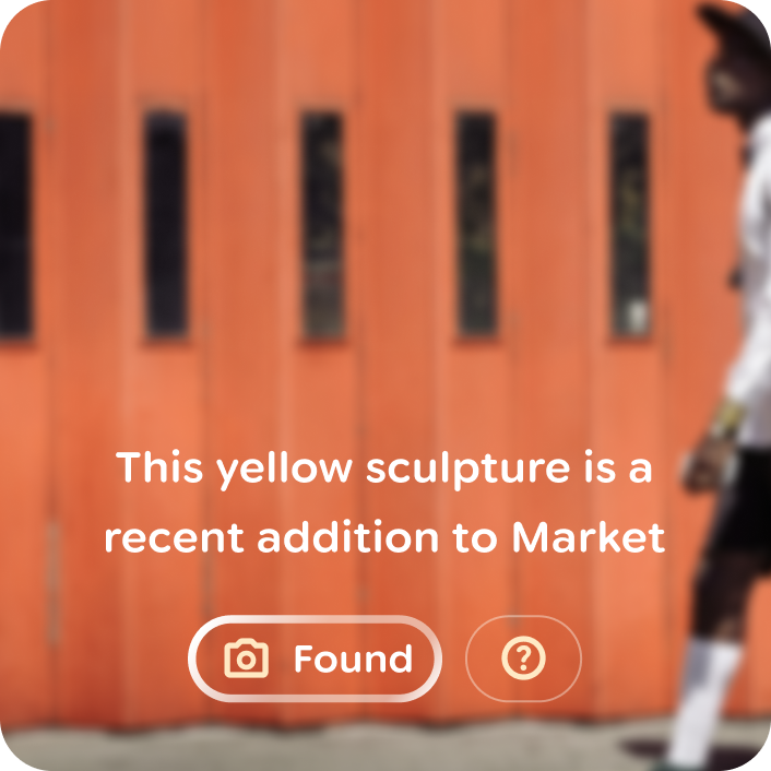
### Do
Use progressive disclosure to reveal less relevant actions. 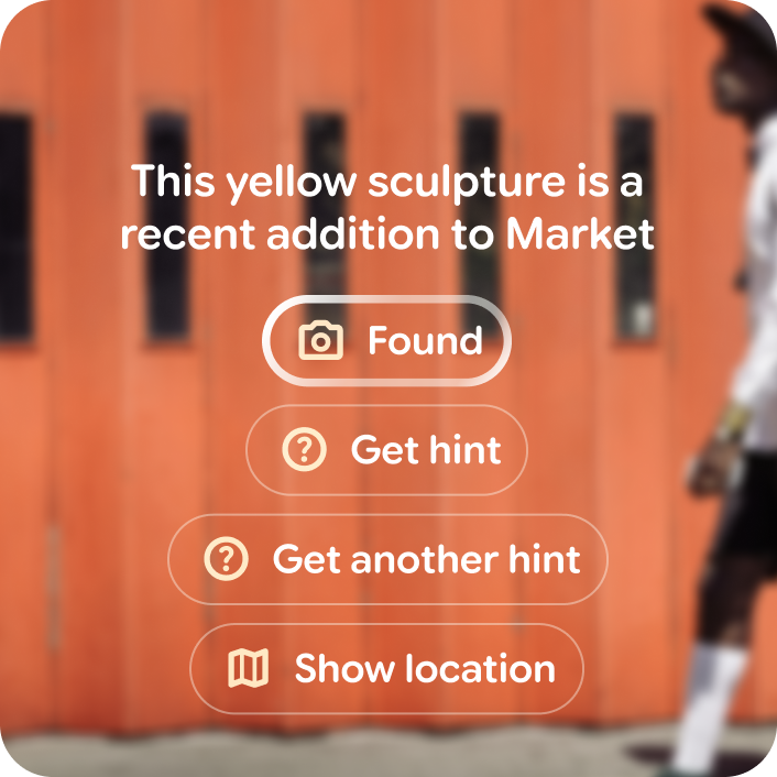
### Don't
Overwhelm the user's view with too many buttons. Use a button group instead. 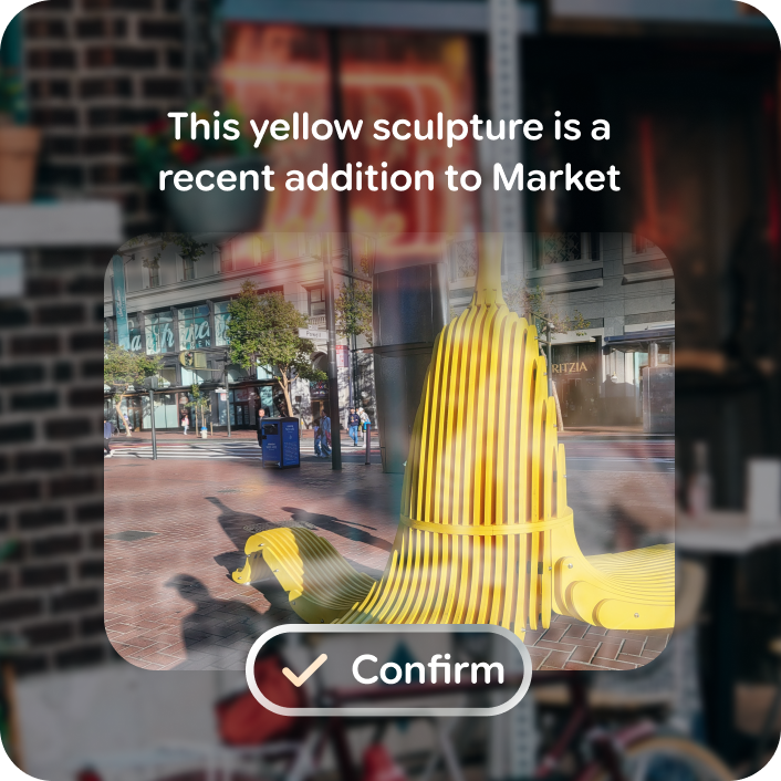
### Do
Use buttons to prompt an action. Or use a title chip for a static element. 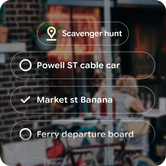
### Don't
Use a button as a static decorative element.
### Icon buttons
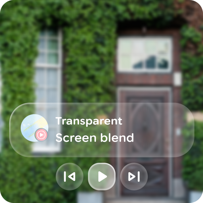
Icon buttons are available to reduce content density. Use icon buttons when the
icon clearly illustrates an action, otherwise include a button label.
### Do
Use an icon button for common highly recognizable actions. 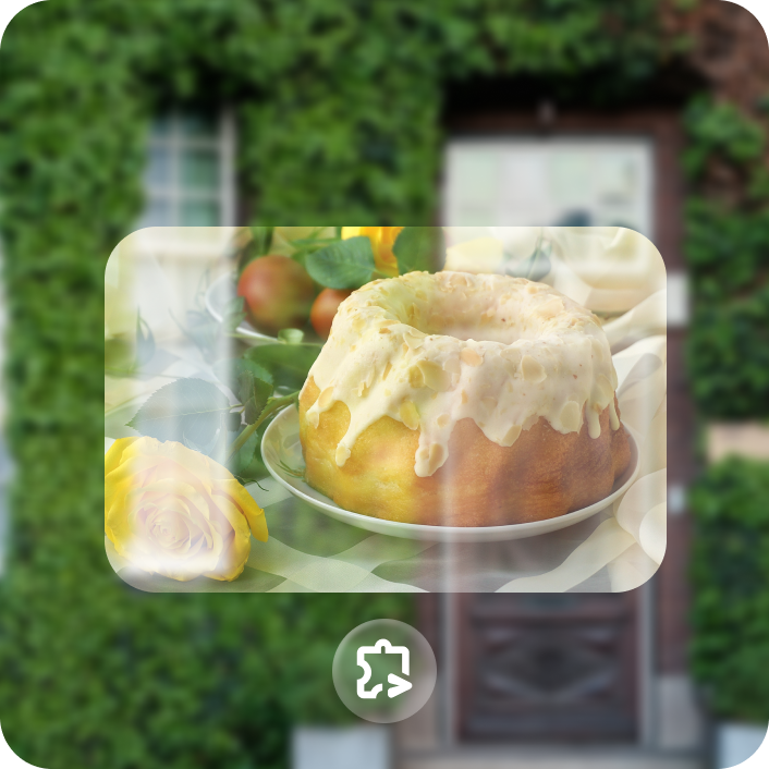
### Don't
Use an icon button for very obscure actions.
### Toggable
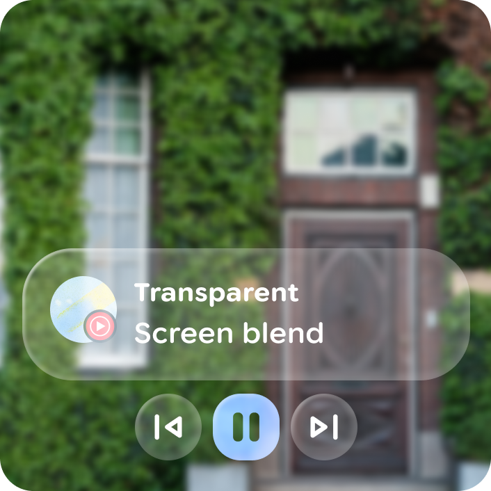
For actions with boolean states, like favorite, a toggle variant is available
for each button type. Swapping icons in between toggle states makes the
interaction glanceable and responsive.
### Do
Use a toggle button if there are boolean options for an action. Like start/stop. 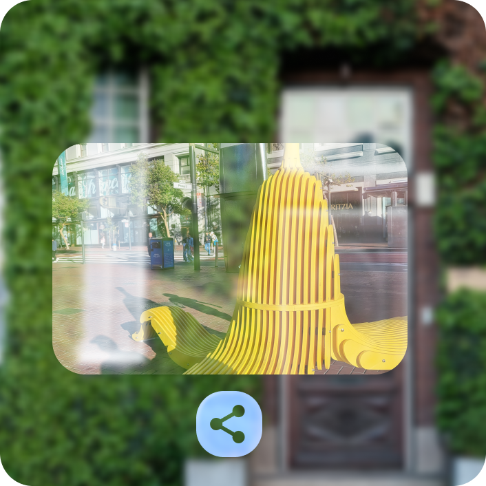
### Don't
Use a toggle button for non binary actions.
## Anatomy
Buttons are composed of a label and optional icon leading or trailing icon.
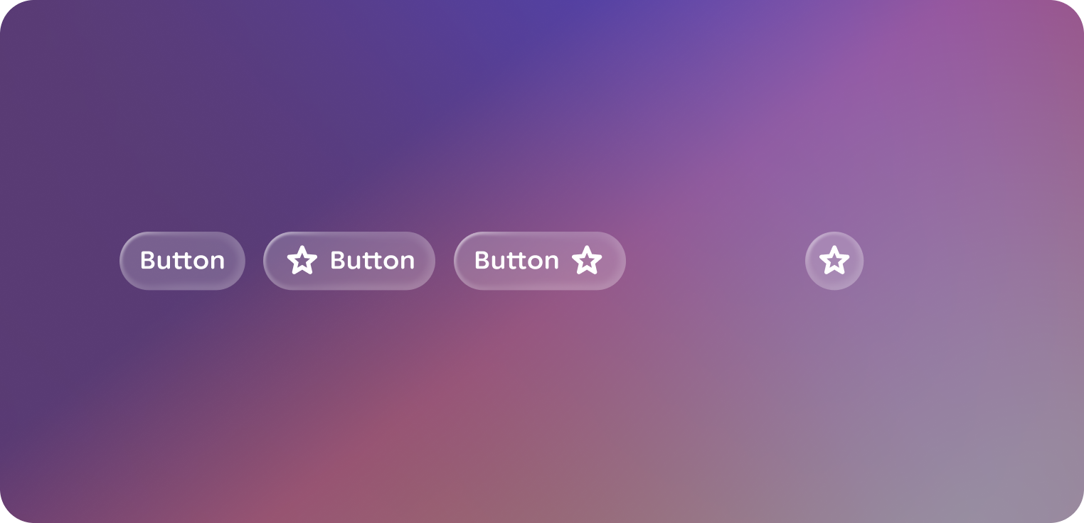
Icon buttons are composed of only a recognizable icon.
Both have a togglable variant.
### Default
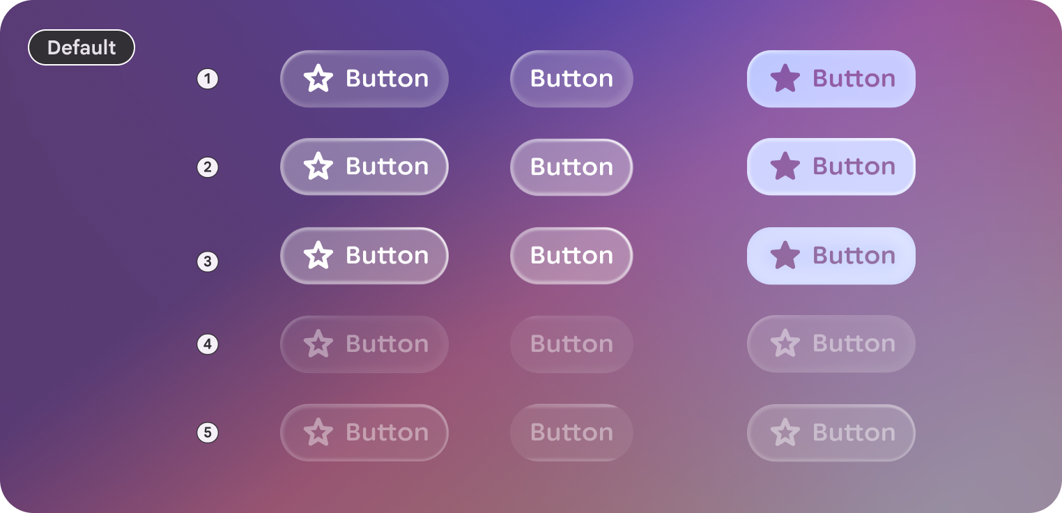
**1.** Rest
**2.** Focused
**3.** Pressed
**4.** Disabled
**5.** Disabled \& focused
### Large
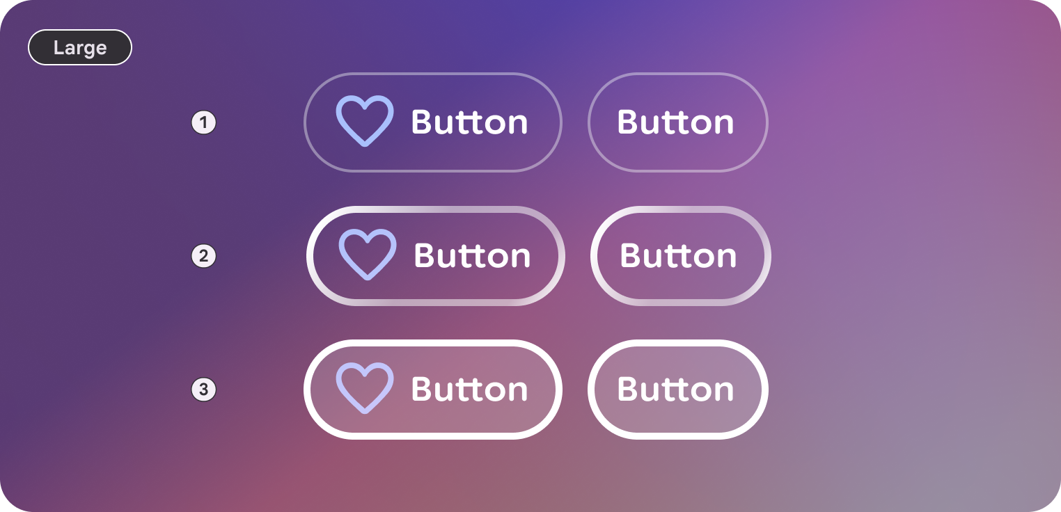
**1.** Rest
**2.** Focused
**3.** Pressed
**4.** Disabled
**5.** Disabled \& focused
### Icon
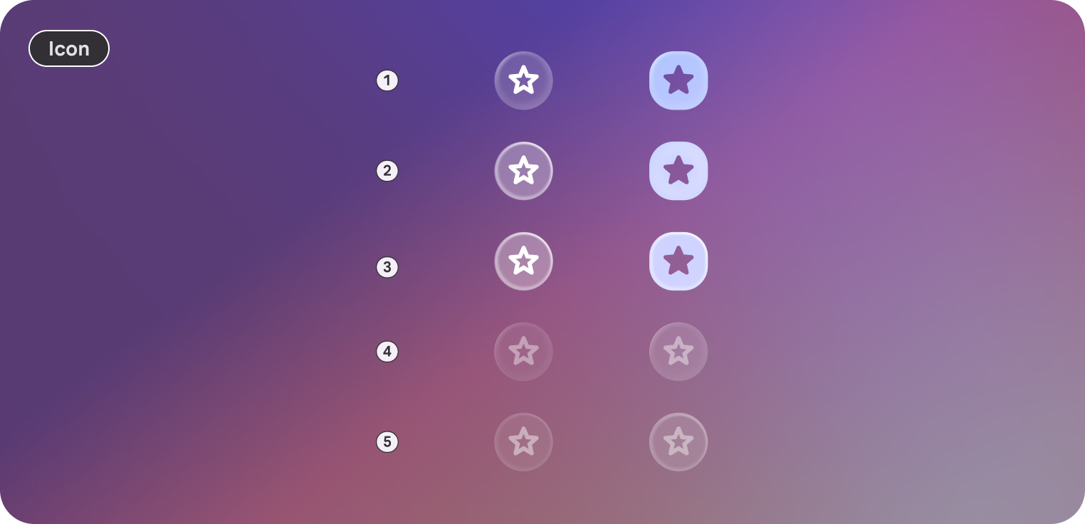
**1.** Rest
**2.** Focused
**3.** Pressed
**4.** Disabled
**5.** Disabled \& focused
### Icon
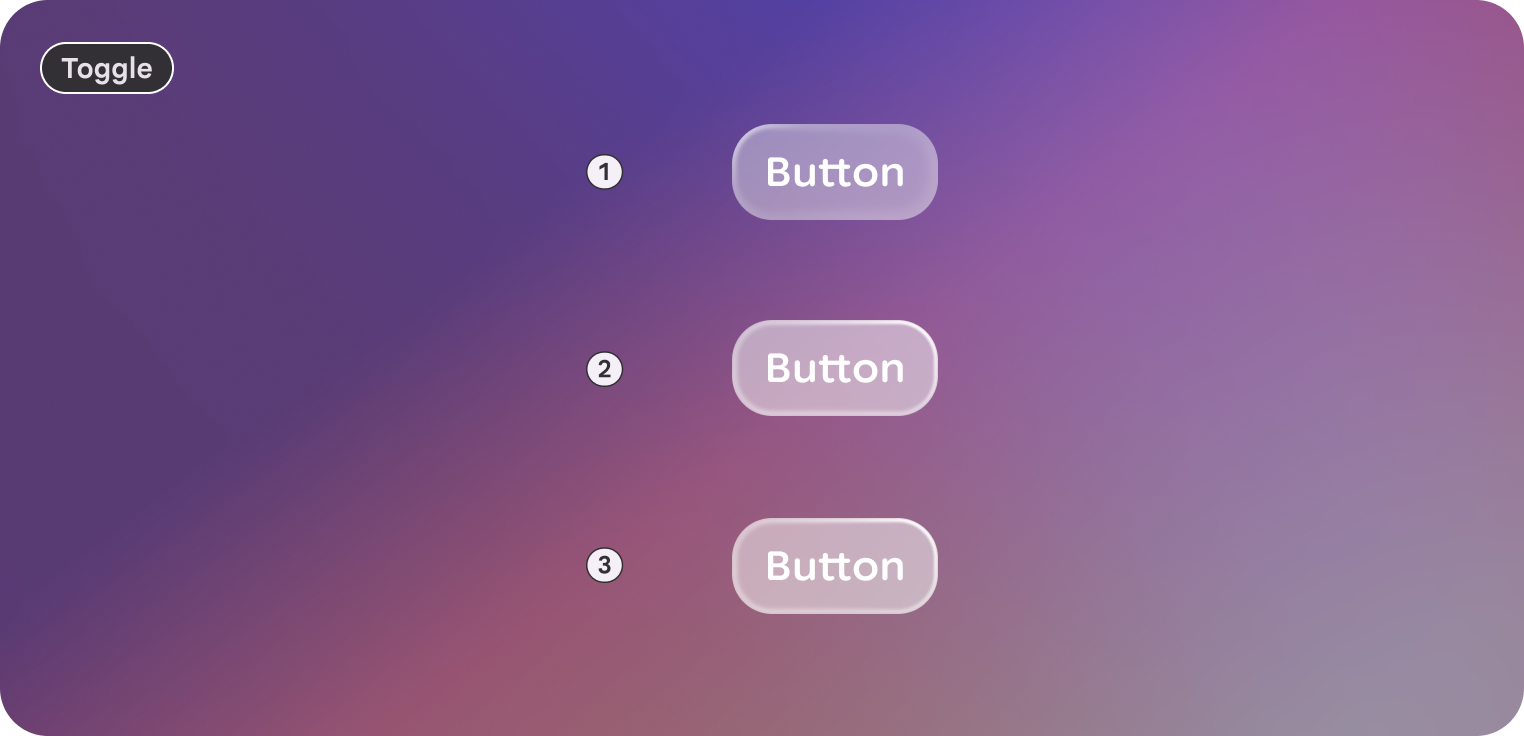
**1.** Rest
**2.** Focused
**3.** Pressed
**4.** Disabled
**5.** Disabled \& focused
## Customization
Buttons contain a default and large style. Large size can help emphasize
importance.
Icons can be used to give greater emphasis, clarification, and recognition to
the button in a trailing or leading position.
### Default
| Properties | Customization | Defaults |
|---|---|---|
| Shape | Yes | Large, Circle |
| Padding | Yes | 16 dp, 8 dp |
| Border | Yes | Default, 2 dp, #606460 |
| Text | Yes | Body Small |
| Leading icon | Yes | 32 dp |
| Trailing icon | Yes | 32 dp |
| Size | Yes | 48 dp min height |
| Depth | Yes | 0 |
| Gap | Yes | Between label and icon: Extra small |
### Large
| Properties | Customization | Defaults |
|---|---|---|
| Shape | Yes | Large, Circle |
| Padding | Yes | 16 dp, 16 dp |
| Border | Yes | 2 dp, #606460 |
| Text | Yes | Body Small |
| Leading icon | Yes | 32 dp |
| Trailing icon | Yes | 32 dp |
| Size | Yes | 72 dp min height |
| Depth | Yes | 0 |
| Gap | Yes | Between label and icon: Extra small |
### Icon
| Properties | Customization | Defaults |
|---|---|---|
| Shape | Yes | Large, Circle |
| Padding | Yes | Small, Small |
| Border | Yes | Default |
| Icon | Yes | Default = 32 dp, On Surface |
| Size | Yes | 48 dp min height |
| Depth | Yes | 0 |
### Toggable
| Properties | Customization | Defaults |
|---|---|---|
| Selected | Yes | Boolean |
| Default corners | Yes | 16 dp, 8 dp |
| Selected corners | Yes | Default focus |
| Selected Surface color | Yes | Outline |
| All other properties | Yes | Same as buttons |
### Toggable icon
| Properties | Customization | Defaults |
|---|---|---|
| Selected | Yes | Boolean |
| Default corners | Yes | 100 dp |
| Selected corners | Yes | 20 dp |
| Selected Surface color | Yes | Outline |
| All other properties | Yes | Same as buttons |