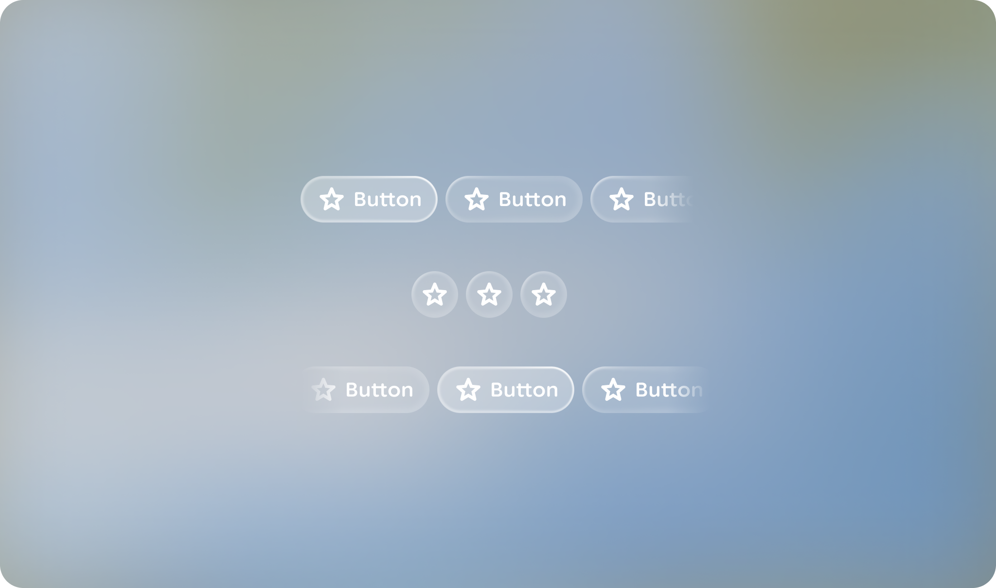
A button group provides a navigable container of buttons.
> [!NOTE]
> **Note:** This component is not yet available in Jetpack Compose Glimmer library, but the design guidance and Figma component is available to explore.
### Principles
**Action-Oriented**: Contains actionable buttons, rather than groups of labels.
**Containment**: Groups actions together with motion and focus.
**Flexible**: Can consist of multiple button types.
## Usage \& Placement
Use a button group to display more than one button. When presenting multiple
buttons, use a button group component rather than laying each out independently.
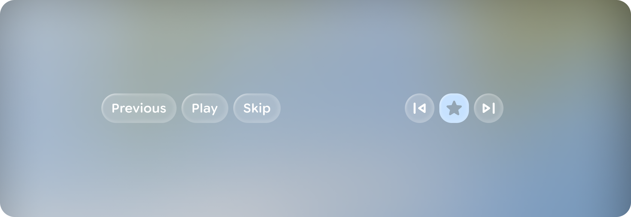
A button group can consist of any combination of button types of the same
button height.
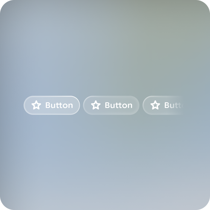
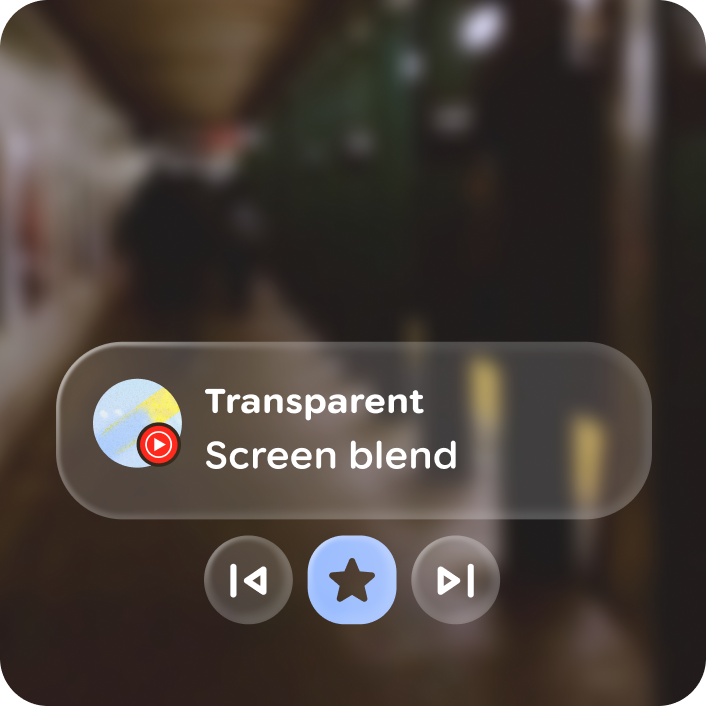
### Do
Keep button heights consistent in a button group. 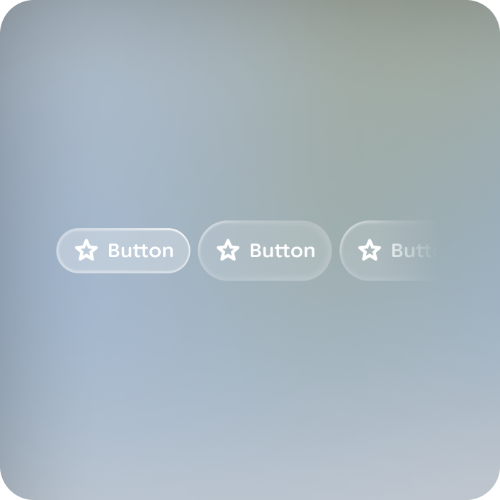
### Don't
Group buttons of different heights together.
Button groups can be paired with other elements, like cards or stacks, to act as
related actions.
### Do
Keep to one button group per layout. 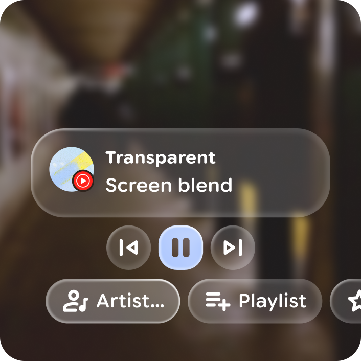
### Don't
Stack multiple button groups.
A button group layout can be contained or overflow, with 1 to 10 buttons.
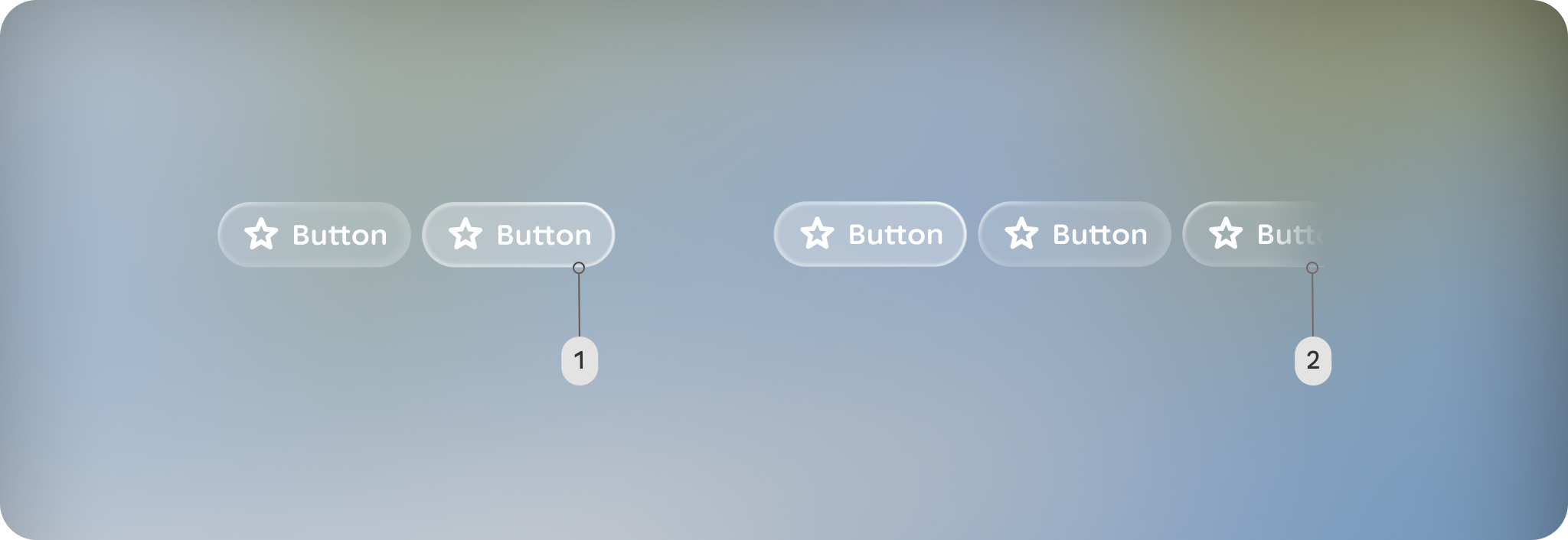
**A.** Contained: The button group fits within the container's width without
any elements cut off.
**B.** Overflow: The button group's width is wider than the space available in
the container.
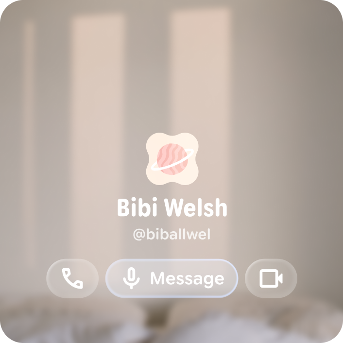
### Do
Keep your buttons under 10 and essential only to minimize swipes. 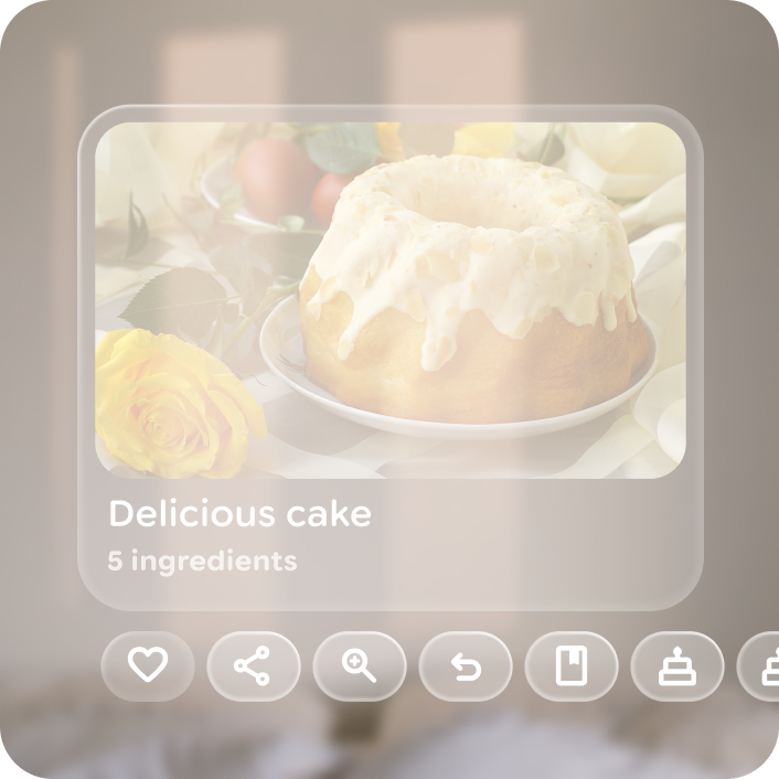
### Don't
Grow the button group past 10 buttons.
### Focus
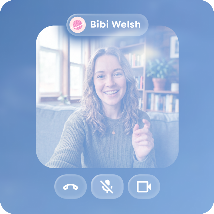
Initial focus defaults to the left most button, but can be configured to be
centered for symmetrical button groups.
### Do
Configure focus to highlight most access or higher importance features. 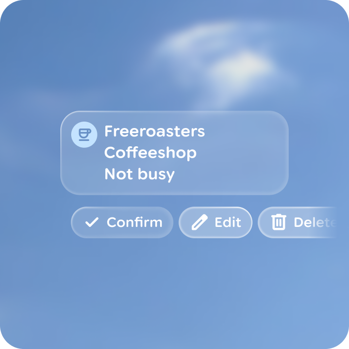
### Don't
Override default initial focus if all items are of similar use case importance.

A center aligned button group based on the initial focus element, that slides
focus over per swipe. Avoid using an overflow layout, as all buttons should be
visable and contained in a centered layout.
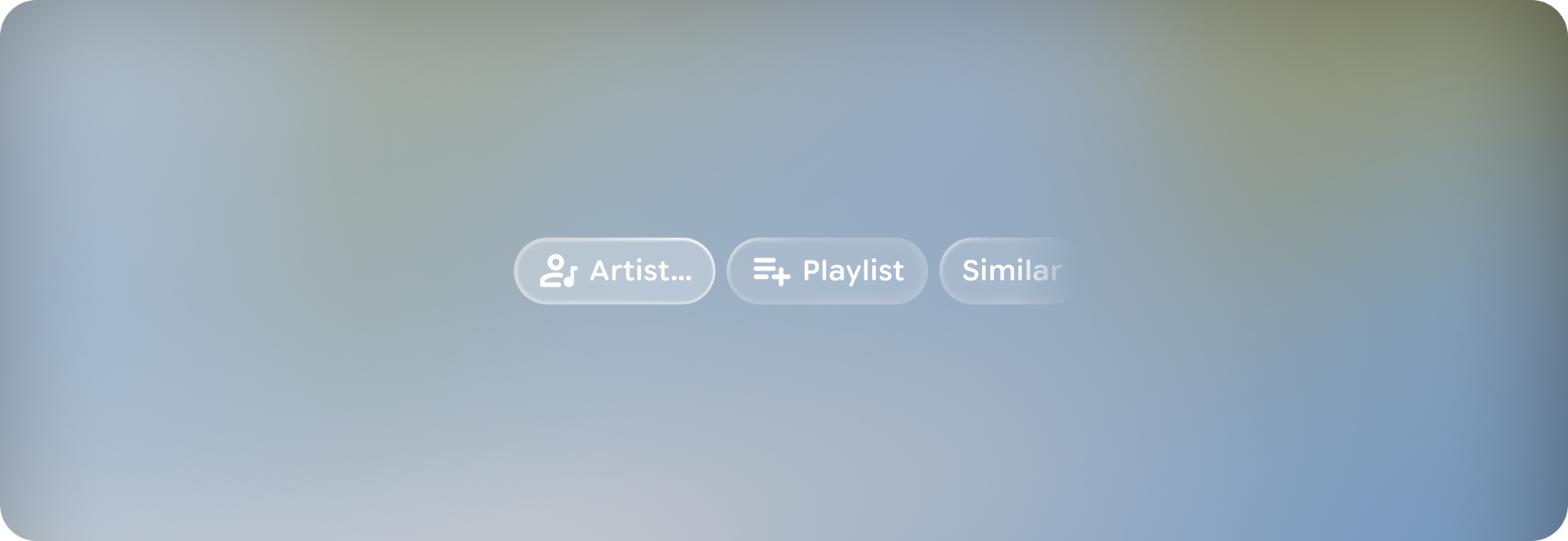
Left aligned button group layout include start and end margins of 44dp from
edges. Buttons smoothly scroll over to the center over 3 steps on swipe and
ramp up as they slide.
## Anatomy
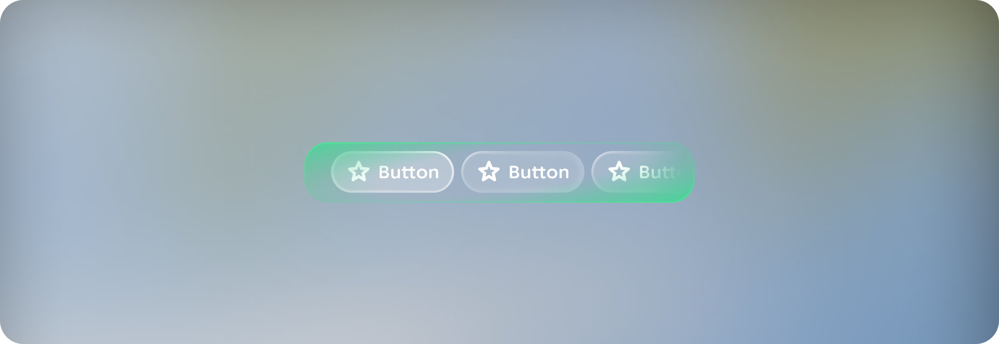
The button group is a container component, grouping 1 to 10 buttons of any type
and consistent height. For more on buttons, read the [button](https://developer.android.com/design/ui/ai-glasses/guides/components/buttons) guidance.
## Customization
A button group set can consist of any combination of button types of the
same button height.
| Properties | Customization | Defaults |
|---|---|---|
| Initial focus | Yes | 0 |