1. Introduction
Being a UI toolkit, Compose makes it easy to implement your app's designs. You describe how you want your UI to look, and Compose takes care of drawing it on screen. This codelab teaches you how to write Compose UIs. It assumes you understand the concepts taught in the basics codelab, so make sure that you complete that codelab first. In the Basics codelab, you learned how to implement simple layouts using Surfaces, Rows and Columns. You also augmented these layouts with modifiers like padding, fillMaxWidth, and size.
In this codelab you implement a more realistic and complex layout, learning about various out of the box composables and modifiers along the way. After finishing this codelab, you should be able to transform a basic app's design into working code.
This codelab does not add any actual behavior to the app. To learn about state and interaction instead, complete the State in Compose codelab instead.
For more support as you're walking through this codelab, check out the following code-along:
What you'll learn
In this codelab, you will learn:
- How modifiers help you augment your composables.
- How standard layout components like Column and LazyRow position child composables.
- How alignments and arrangements change the position of child composables in their parent.
- How Material composables like Scaffold and Bottom Navigation help you create comprehensive layouts.
- How to build flexible composables using slot APIs.
- How to build layouts for different screen configurations.
What you'll need
- Latest Android Studio.
- Experience with Kotlin syntax, including lambdas.
- Basic experience with Compose. If you haven't already, complete the Jetpack Compose basics codelab before starting this codelab.
- Basic knowledge of what a composable is, and what modifiers are.
What you'll build
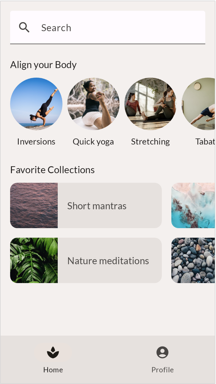
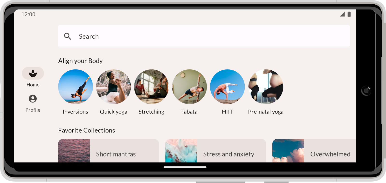
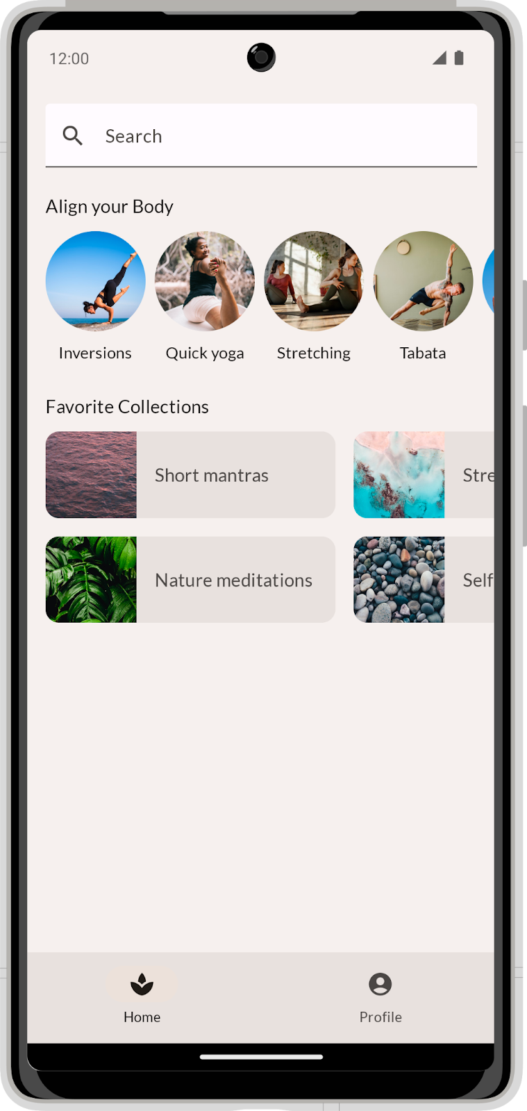
In this codelab, you implement a realistic app design based on mocks provided by a designer. MySoothe is a well-being app that lists various ways to improve your body and mind. It contains a section that lists your favorite collections, and a section with physical exercises. This is what the app looks like:

2. Getting set up
In this step, you download code that contains theming and some basic setup.
Get the code
The code for this codelab can be found in the codelab-android-compose GitHub repository. To clone it, run:
$ git clone https://github.com/android/codelab-android-compose
Alternatively, you can download two zip files:
Check out the code
The downloaded code contains code for all available Compose codelabs. To complete this codelab, open the BasicLayoutsCodelab project inside Android Studio.
We recommend that you start with the code in the main branch and follow the codelab step by step at your own pace.
3. Start with a plan
We will start by implementing the portrait design of the app - let's take a closer look:
When you're asked to implement a design, a good way to start is by getting a clear understanding of its structure. Don't start coding straight away, but instead analyze the design itself. How can you split this UI into multiple reusable parts?
So let's give this a go with our design. At the highest abstraction level, we can break this design down into two pieces:
- The screen's content.
- The bottom navigation.
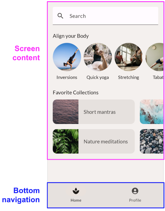
Drilling down, the screen content contains three sub-parts:
- The Search bar.
- A section called "Align your body".
- A section called "Favorite collections".
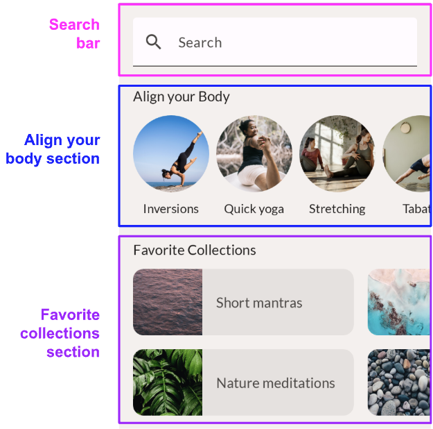
Inside each section, you can also see some lower level components that are re-used:
- The "align your body" element that's shown in a horizontally scrollable row.
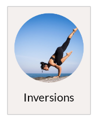
- The "favorite collection" card that's shown in a horizontally scrollable grid.
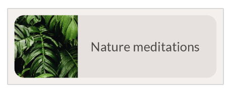
Now that you've analyzed the design, you can start implementing composables for every identified piece of the UI. Start with the lowest level composables and continue to combine these into more complex ones. By the end of the codelab, your new app will look like the provided design.
4. Search bar - Modifiers
The first element to transform into a composable is the Search bar. Let's take another look at the design:
 Based on this screenshot alone, it would be quite difficult to implement this design in a pixel-perfect way. Generally, a designer conveys more information about the design. They can give you access to their design tool, or share so-called redlining designs. In this case, our designer handed off the redlining designs, which you can use to read off any sizing values. The design is shown with an 8dp grid overlay, so you can easily see how much space is between and around elements. Additionally, some spacings are added explicitly to clarify certain sizes.

You can see that the search bar should have a height of 56 density-independent pixels. It should also fill the full width of its parent.
To implement the search bar, use a Material component called Text field. The Compose Material library contains a composable called TextField, which is the implementation of this Material component.
Start with a basic TextField implementation. In your code base, open MainActivity.kt and search for the SearchBar composable.
Inside the composable called SearchBar, write the basic TextField implementation:
import androidx.compose.material3.TextField

@Composable
fun SearchBar(
   modifier: Modifier = Modifier
) {
   TextField(
       value = "",
       onValueChange = {},
       modifier = modifier
   )
}
Some points to notice:
- You hardcoded the text field's value, and the
onValueChangecallback doesn't do anything. Since this is a layout-focused codelab, you ignore anything that has to do with state.
- The
SearchBarcomposable function accepts amodifierparameter and passes this on to theTextField. This is a best practice as per Compose guidelines. This allows the method's caller to modify the composable's look & feel, which makes it more flexible and reusable. You'll continue this best practice for all composables in this codelab.
Let's look at the preview of this composable. Remember that you can use the Preview functionality in Android Studio to quickly iterate on your individual composables. MainActivity.kt contains previews for all the composables you'll build in this codelab. In this case, the method SearchBarPreview renders our SearchBar composable, with some background and padding to give it a bit more context. With the implementation you just added, it should look like this:
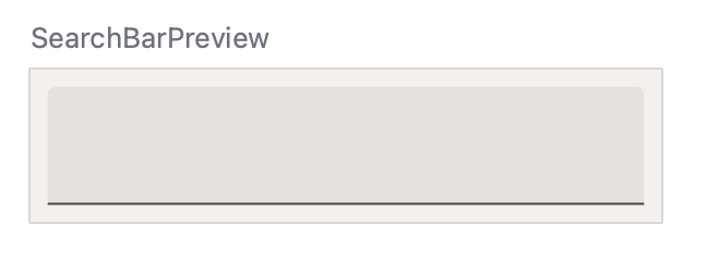
There are some things missing. First, let's fix the size of the composable using modifiers.
When writing composables, you use modifiers to:
- Change the composable's size, layout, behavior, and appearance.
- Add information, like accessibility labels.
- Process user input.
- Add high-level interactions, like making an element clickable, scrollable, draggable, or zoomable.
Each composable that you call has a modifier parameter that you can set to adapt that composable's look, feel and behavior. When you set the modifier, you can chain multiple modifier methods to create a more complex adaptation.
In this case, the search bar should be at least 56dp high, and fill its parent's width. To find the right modifiers for this, you can go through the list of modifiers and look at the Size section. For the height, you can use the heightIn modifier. This makes sure that the composable has a specific minimum height. It can, however, become larger when, for example, the user enlarges their system font size. For the width you can use the fillMaxWidth modifier. This modifier makes sure that the search bar uses up all the horizontal space of its parent.
Update the modifier to match the code below:
import androidx.compose.foundation.layout.fillMaxWidth
import androidx.compose.foundation.layout.heightIn
import androidx.compose.material3.TextField

@Composable
fun SearchBar(
   modifier: Modifier = Modifier
) {
   TextField(
       value = "",
       onValueChange = {},
       modifier = modifier
           .fillMaxWidth()
           .heightIn(min = 56.dp)
   )
}
In this case, because one modifier influences the width, and the other the height, the order of these modifiers doesn't matter.
You also have to set some parameters of the TextField. Try to make the composable look like the design by setting the parameter values. Here's the design again as a reference:

These are the steps that you should take to update your implementation:
- Add the search icon.
TextFieldcontains a parameterleadingIconthat accepts another composable. Inside, you can set anIcon, which in our case should be theSearchicon. Make sure to use the right ComposeIconimport. - You can use the
TextFieldDefaults.colorsto override specific colors. Set thefocusedContainerColorand theunfocusedContainerColorof the text field to MaterialTheme'ssurfacecolor. - Add a placeholder text "Search" (you can find this as string resource
R.string.placeholder_search).
When you're done, your composable should look similar to this:
import androidx.compose.foundation.layout.fillMaxWidth
import androidx.compose.foundation.layout.heightIn
import androidx.compose.ui.res.stringResource
import androidx.compose.material3.Icon
import androidx.compose.material3.MaterialTheme
import androidx.compose.material3.Text
import androidx.compose.material3.TextField
import androidx.compose.material3.TextFieldDefaults
import androidx.compose.material.icons.Icons
import androidx.compose.material.icons.filled.Search


@Composable
fun SearchBar(
   modifier: Modifier = Modifier
) {
   TextField(
       value = "",
       onValueChange = {},
       leadingIcon = {
           Icon(
               imageVector = Icons.Default.Search,
               contentDescription = null
           )
       },
       colors = TextFieldDefaults.colors(
           unfocusedContainerColor = MaterialTheme.colorScheme.surface,
           focusedContainerColor = MaterialTheme.colorScheme.surface
       ),
       placeholder = {
           Text(stringResource(R.string.placeholder_search))
       },
       modifier = modifier
           .fillMaxWidth()
           .heightIn(min = 56.dp)
   )
}
Notice that:
- You added a
leadingIconshowing the search icon. This icon does not need a content description, as the text field's placeholder already describes the meaning of the text field. Remember that a content description is normally used for accessibility purposes and gives the user of your app a textual representation of an image or icon.
- To adapt the background color of the text field, you set the
colorsproperty. Instead of a separate parameter for each color, the composable contains one combined parameter. Here you pass in a copy of theTextFieldDefaultsdata class, where you update only the colors that are different. In this case, that's only theunfocusedContainerColorandfocusedContainerColorcolor.
In this step you saw how you can use composable parameters and modifiers to change a composable's look and feel. This applies to both composables provided by the Compose and Material libraries, and to the ones you write yourself. You should always think about providing parameters to customize the composable you're writing. You should also add a modifier property so the composable's look and feel can be adapted from the outside.
5. Align your body - Alignment
The next composable you'll implement is the "Align your body" element. Let's take a look at its design, including the redlines design next to it:
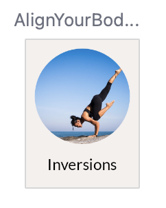
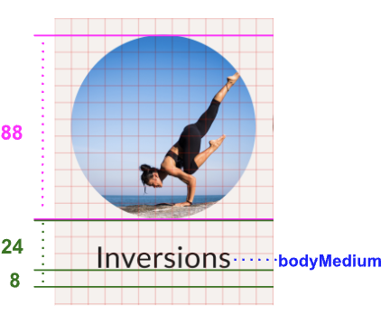
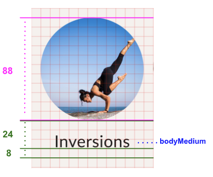
The redlines design now also contains baseline-oriented spacings. Here's the information we get from it:
- The image should be 88dp high.
- The spacing between the baseline of the text and the image should be 24dp.
- The spacing between the baseline and the bottom of the element should be 8dp.
- The text should have a typography style of bodyMedium.
To implement this composable, you need an Image and a Text composable. They need to be included in a Column, so they are positioned underneath each other.
Find the AlignYourBodyElement composable in your code and update its content with this basic implementation:
import androidx.compose.foundation.Image
import androidx.compose.foundation.layout.Column
import androidx.compose.ui.res.painterResource

@Composable
fun AlignYourBodyElement(
   modifier: Modifier = Modifier
) {
   Column(
       modifier = modifier
   ) {
       Image(
           painter = painterResource(R.drawable.ab1_inversions),
           contentDescription = null
       )
       Text(text = stringResource(R.string.ab1_inversions))
   }
}
Notice that:
- You set the
contentDescriptionof the image to null, as this image is purely decorative. The text below the image describes enough of the meaning, so the image does not need an extra description. - You are using a hard-coded image and text. In the next step, you'll move these to use parameters provided in the
AlignYourBodyElementcomposable to make them dynamic.
Take a look at the preview of this composable:
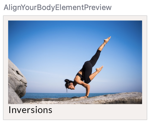
There are some improvements to be made. Most noticeably, the image is too large and not shaped as a circle. You can adapt the Image composable with the size and clip modifiers and the contentScale parameter.
The size modifier adapts the composable to fit a certain size, similar to the fillMaxWidth and heightIn modifiers that you saw in the previous step. The clip modifier works differently and adapts the composable's appearance. You can set it to any Shape and it clips the composable's content to that shape.
import androidx.compose.foundation.layout.size
import androidx.compose.foundation.shape.CircleShape
import androidx.compose.ui.draw.clip
@Composable
fun AlignYourBodyElement(
   modifier: Modifier = Modifier
) {
   Column(
       modifier = modifier
   ) {
       Image(
           painter = painterResource(R.drawable.ab1_inversions),
           contentDescription = null,
           modifier = Modifier
               .size(88.dp)
               .clip(CircleShape)
       )
       Text(text = stringResource(R.string.ab1_inversions))
   }
}
Currently your design in the Preview looks like this:
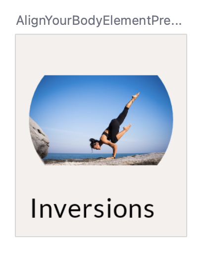
The image also needs to be scaled correctly. To do so, we can use the Image's contentScale parameter. There are several options, most notably:
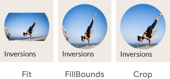
In this case, the crop type is the correct one to use. After applying the modifiers and the parameter, your code should look like this:
import androidx.compose.foundation.layout.size
import androidx.compose.foundation.shape.CircleShape
import androidx.compose.ui.draw.clip
import androidx.compose.ui.layout.ContentScale
@Composable
fun AlignYourBodyElement(
   modifier: Modifier = Modifier
) {
   Column(
       modifier = modifier
   ) {
       Image(
           painter = painterResource(R.drawable.ab1_inversions),
           contentDescription = null,
           contentScale = ContentScale.Crop,
           modifier = Modifier
               .size(88.dp)
               .clip(CircleShape)
       )
       Text( text = stringResource(R.string.ab1_inversions) )
   }
}
Your design should now look like this:
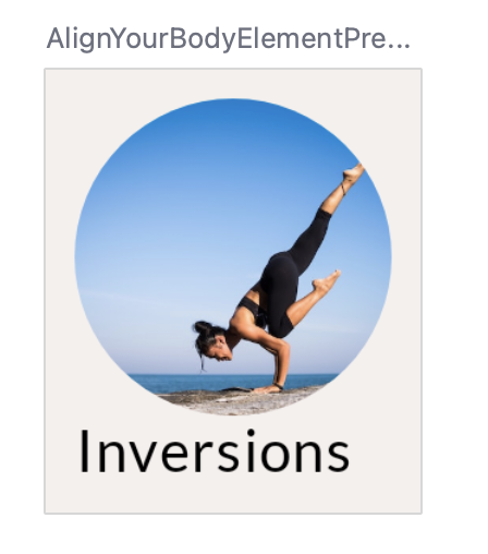
As a next step, align the text horizontally by setting the alignment of the Column.
In general, to align composables inside a parent container, you set the alignment of that parent container. So instead of telling the child to position itself in its parent, you tell the parent how to align its children.
For a Column, you decide how its children should be aligned horizontally. The options are:
- Start
- CenterHorizontally
- End
For a Row, you set the vertical alignment. The options are similar to those of the Column:
- Top
- CenterVertically
- Bottom
For a Box, you combine both horizontal and vertical alignment. The options are:
- TopStart
- TopCenter
- TopEnd
- CenterStart
- Center
- CenterEnd
- BottomStart
- BottomCenter
- BottomEnd
All of the container's children will follow this same alignment pattern. You can override the behavior of a single child by adding an align modifier to it.
For this design, the text should be centered horizontally. To do that, set the Column's horizontalAlignment to center horizontally:
import androidx.compose.ui.Alignment
@Composable
fun AlignYourBodyElement(
   modifier: Modifier = Modifier
) {
   Column(
       horizontalAlignment = Alignment.CenterHorizontally,
       modifier = modifier
   ) {
       Image(
           //..
       )
       Text(
           //..
       )
   }
}
With these parts implemented, there are only some minor changes that you need to make the composable identical to the design. Try to implement these by yourself or reference the final code if you get stuck. Think of the following steps:
- Make the image and text dynamic. Pass them as arguments to the composable function. Don't forget to update the corresponding Preview and pass in some hard-coded data.
- Update the text to use the bodyMedium typography style.
- Update the baseline spacings of the text element per the diagram.
When you're done implementing these steps, your code should look similar to this:
import androidx.compose.foundation.layout.paddingFromBaseline
import androidx.compose.ui.Alignment
import androidx.compose.ui.layout.ContentScale

@Composable
fun AlignYourBodyElement(
   @DrawableRes drawable: Int,
   @StringRes text: Int,
   modifier: Modifier = Modifier
) {
   Column(
       modifier = modifier,
       horizontalAlignment = Alignment.CenterHorizontally
   ) {
       Image(
           painter = painterResource(drawable),
           contentDescription = null,
           contentScale = ContentScale.Crop,
           modifier = Modifier
               .size(88.dp)
               .clip(CircleShape)
       )
       Text(
           text = stringResource(text),
           modifier = Modifier.paddingFromBaseline(top = 24.dp, bottom = 8.dp),
           style = MaterialTheme.typography.bodyMedium
       )
   }
}


@Preview(showBackground = true, backgroundColor = 0xFFF5F0EE)
@Composable
fun AlignYourBodyElementPreview() {
   MySootheTheme {
       AlignYourBodyElement(
           text = R.string.ab1_inversions,
           drawable = R.drawable.ab1_inversions,
           modifier = Modifier.padding(8.dp)
       )
   }
}
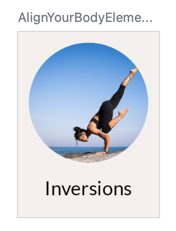
Check out the AlignYourBodyElement in the Design tab.
6. Favorite collection card - Material Surface
The next composable to implement is in a way similar to the "Align the body" element. Here's the design, including the redlines:
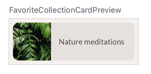

In this case, the full size of the composable is provided. You can see that the text should be titleMedium.
This container uses surfaceVariant as its background color which is different from the background of the whole screen. It also has rounded corners. We specify these for the favorite collection card using Material's Surface composable.
You can adapt the Surface to your needs by setting its parameters and modifier. In this case, the surface should have rounded corners. You can use the shape parameter for this. Instead of setting the shape to a Shape as for the Image in the previous step, you'll use a value coming from our Material theme.
Let's see what this would look like:
import androidx.compose.foundation.layout.Row
import androidx.compose.material3.Surface

@Composable
fun FavoriteCollectionCard(
   modifier: Modifier = Modifier
) {
   Surface(
       shape = MaterialTheme.shapes.medium,
       modifier = modifier
   ) {
       Row {
           Image(
               painter = painterResource(R.drawable.fc2_nature_meditations),
               contentDescription = null
           )
           Text(text = stringResource(R.string.fc2_nature_meditations))
       }
   }
}
And let's see the Preview of this implementation:
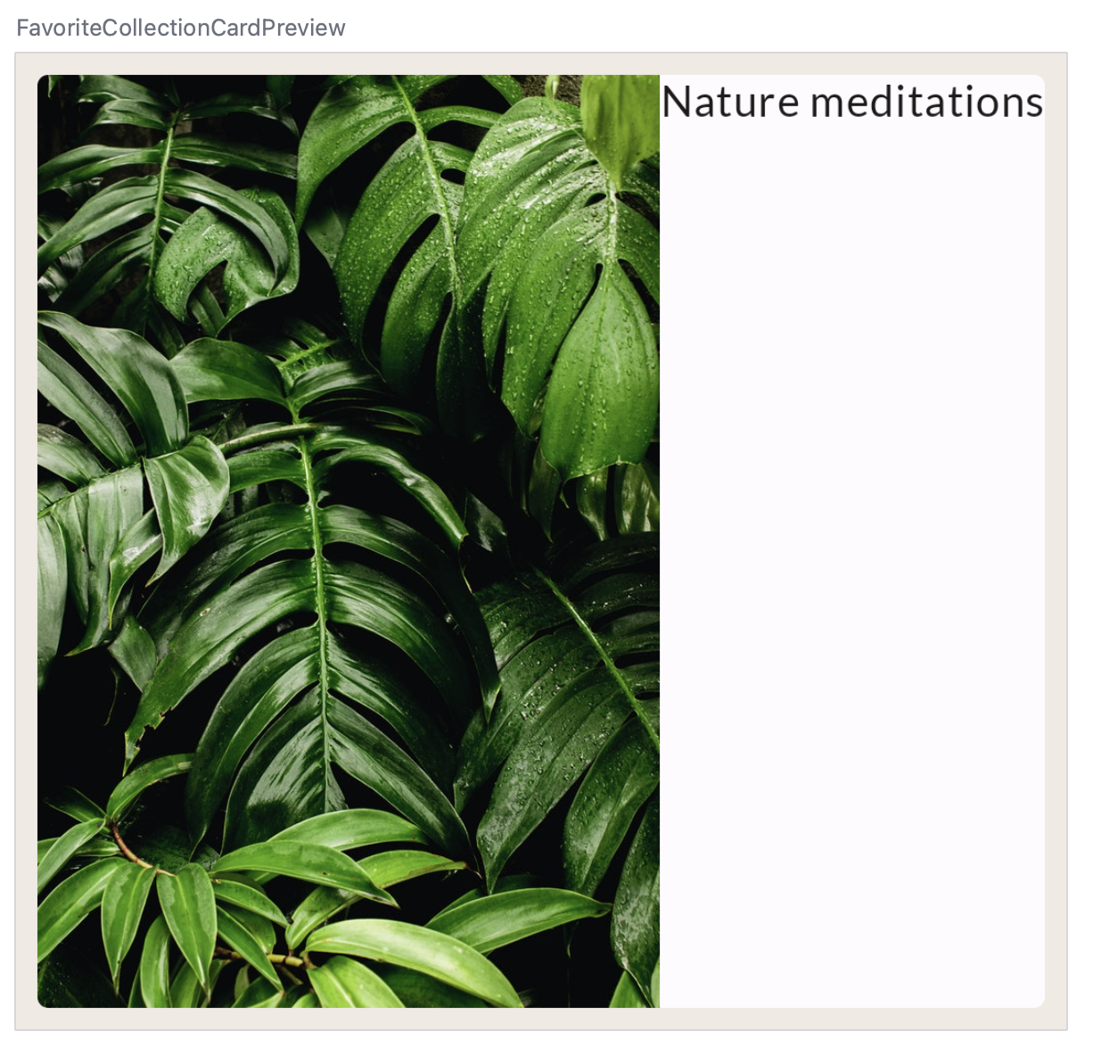
Next, apply the lessons learned in the previous step.
- Set the width of the
Row, and align its children vertically. - Set the size of the image per the diagram and crop it in its container.
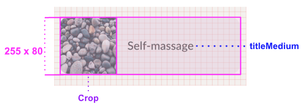
Try to implement these changes yourself before looking at the solution code!
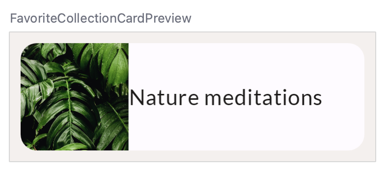
Your code would now look something like this:
import androidx.compose.foundation.layout.width

@Composable
fun FavoriteCollectionCard(
   modifier: Modifier = Modifier
) {
   Surface(
       shape = MaterialTheme.shapes.medium,
       modifier = modifier
   ) {
       Row(
           verticalAlignment = Alignment.CenterVertically,
           modifier = Modifier.width(255.dp)
       ) {
           Image(
               painter = painterResource(R.drawable.fc2_nature_meditations),
               contentDescription = null,
               contentScale = ContentScale.Crop,
               modifier = Modifier.size(80.dp)
           )
           Text(
               text = stringResource(R.string.fc2_nature_meditations)
           )
       }
   }
}
The preview should now look like this:
To finish up this composable, implement the following steps:
- Make the image and text dynamic. Pass them in as arguments to the composable function.
- Update the color to surfaceVariant.
- Update the text to use the titleMedium typography style.
- Update the spacing between the image and the text.
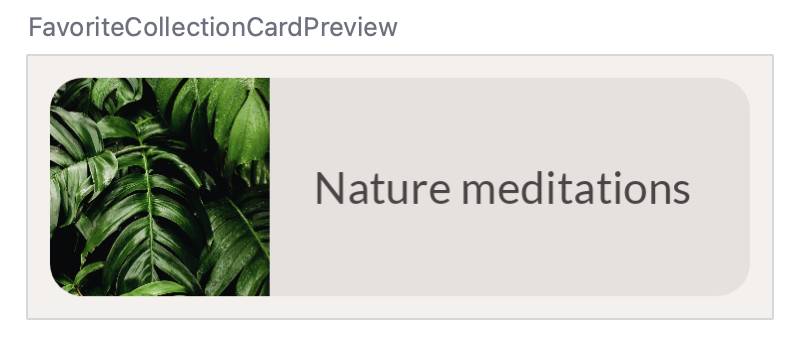
Your end result should look similar to this:
@Composable
fun FavoriteCollectionCard(
   @DrawableRes drawable: Int,
   @StringRes text: Int,
   modifier: Modifier = Modifier
) {
   Surface(
       shape = MaterialTheme.shapes.medium,
       color = MaterialTheme.colorScheme.surfaceVariant,
       modifier = modifier
   ) {
       Row(
           verticalAlignment = Alignment.CenterVertically,
           modifier = Modifier.width(255.dp)
       ) {
           Image(
               painter = painterResource(drawable),
               contentDescription = null,
               contentScale = ContentScale.Crop,
               modifier = Modifier.size(80.dp)
           )
           Text(
               text = stringResource(text),
               style = MaterialTheme.typography.titleMedium,
               modifier = Modifier.padding(horizontal = 16.dp)
           )
       }
   }
}


//..


@Preview(showBackground = true, backgroundColor = 0xFFF5F0EE)
@Composable
fun FavoriteCollectionCardPreview() {
   MySootheTheme {
       FavoriteCollectionCard(
           text = R.string.fc2_nature_meditations,
           drawable = R.drawable.fc2_nature_meditations,
           modifier = Modifier.padding(8.dp)
       )
   }
}
Check out the Preview of the FavoriteCollectionCardPreview.
7. Align your body row - Arrangements
Now that you've created the basic composables that are shown on the screen, you can start creating the different sections of the screen.
Start with the "Align your body" scrollable row.

Here's the redline design for this component:

Remember that one block of the grid represents 8dp. So in this design there's 16dp space before the first item, and after the last item in the row. There's 8dp of spacing between each item.
In Compose, you can implement a scrollable row like this using the LazyRow composable. The documentation on lists contains much more information about Lazy lists like LazyRow and LazyColumn. For this codelab, it's enough to know that the LazyRow only renders the elements that are shown on screen instead of all elements at the same time, which helps keep your app performant.
Start with a basic implementation of this LazyRow:
import androidx.compose.foundation.lazy.LazyRow
import androidx.compose.foundation.lazy.items

@Composable
fun AlignYourBodyRow(
   modifier: Modifier = Modifier
) {
   LazyRow(
       modifier = modifier
   ) {
       items(alignYourBodyData) { item ->
           AlignYourBodyElement(item.drawable, item.text)
       }
   }
}
As you can see, the children of a LazyRow aren't composables. Instead, you use the Lazy list DSL that provides methods like item and items that emit composables as list items. For each item in the provided alignYourBodyData, you emit a AlignYourBodyElement composable that you implemented earlier.
Notice how this is displayed:

The spacings that we saw in the redlines design are still missing. To implement these, you'll have to learn about arrangements.
In the previous step you learned about alignments, which are used to align a container's children on the cross-axis. For a Column, the cross-axis is the horizontal axis, while for a Row, the cross-axis is the vertical axis.
However, we can also make a decision on how to place child composables on a container's main axis (horizontal for Row, vertical for Column).
For a Row, you can choose the following arrangements:
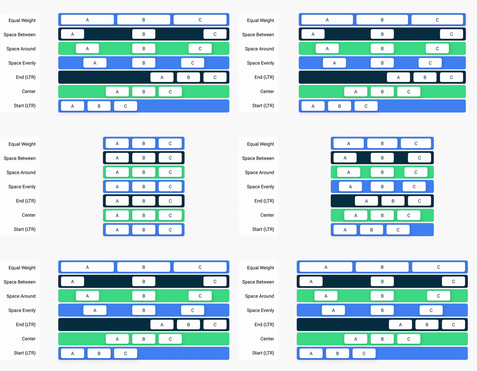
And for a Column:
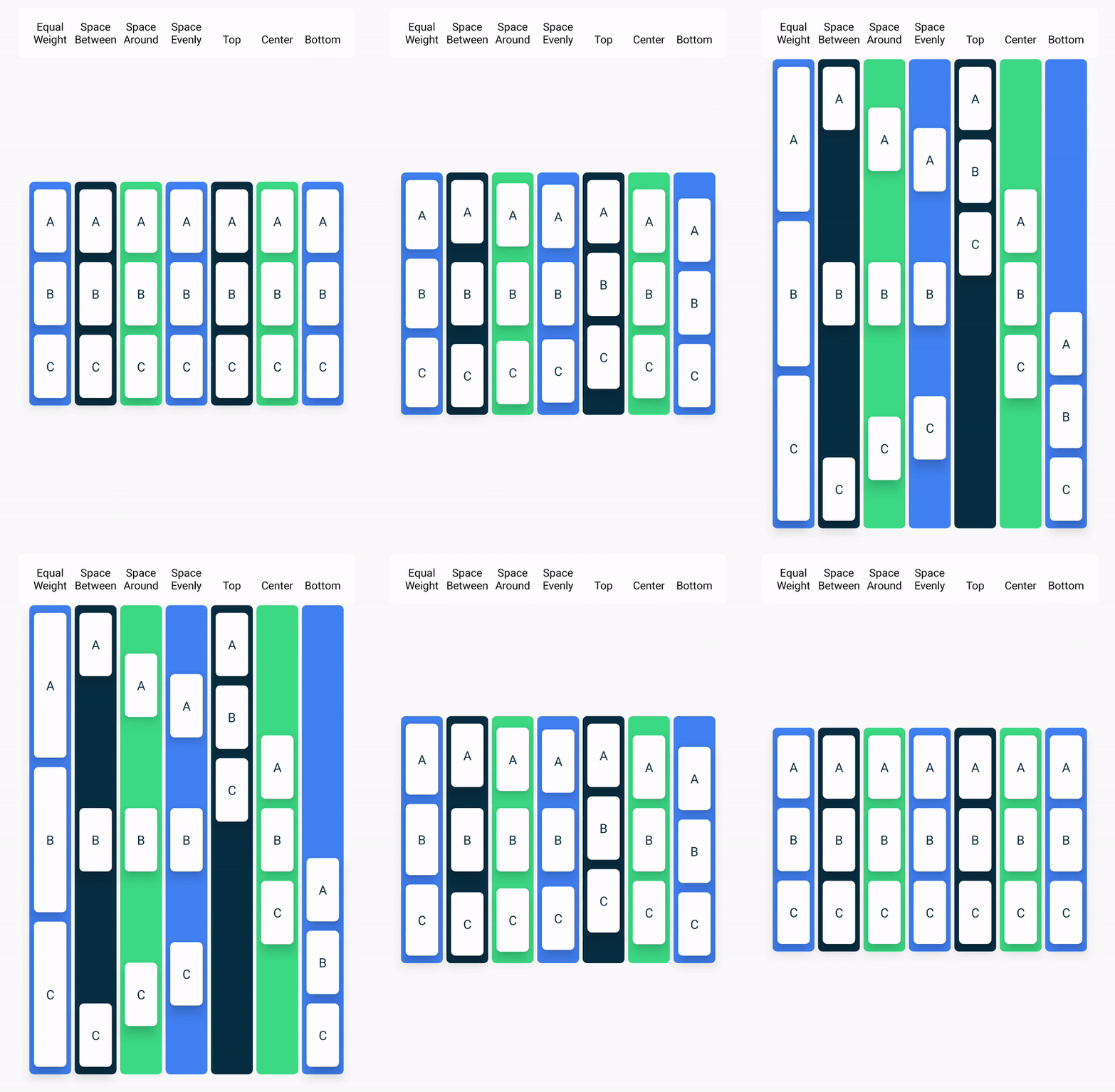
In addition to these arrangements, you can also use the Arrangement.spacedBy() method to add a fixed space in between each child composable.
In the example, the spacedBy method is the one you need to use, as you want to place 8dp of spacing between each item in the LazyRow.
import androidx.compose.foundation.layout.Arrangement

@Composable
fun AlignYourBodyRow(
   modifier: Modifier = Modifier
) {
   LazyRow(
       horizontalArrangement = Arrangement.spacedBy(8.dp),
       modifier = modifier
   ) {
       items(alignYourBodyData) { item ->
           AlignYourBodyElement(item.drawable, item.text)
       }
   }
}
Now the design looks like this:

You need to add some padding on the sides of the LazyRow as well. Adding a simple padding modifier will not do the trick in this case. Try adding padding to the LazyRow and see how it behaves using the interactive preview:
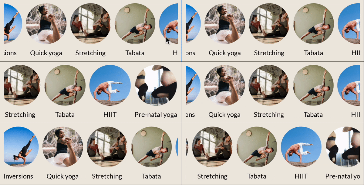
As you can see, when scrolling, the first and last visible item are cut off on both sides of the screen.
To maintain the same padding, but still scroll your content within the bounds of your parent list without clipping it, all lists provide a parameter to the LazyRow called contentPadding and set it to 16.dp.
import androidx.compose.foundation.layout.PaddingValues

@Composable
fun AlignYourBodyRow(
   modifier: Modifier = Modifier
) {
   LazyRow(
       horizontalArrangement = Arrangement.spacedBy(8.dp),
       contentPadding = PaddingValues(horizontal = 16.dp),
       modifier = modifier
   ) {
       items(alignYourBodyData) { item ->
           AlignYourBodyElement(item.drawable, item.text)
       }
   }
}
8. Favorite collections grid - Lazy grids
The next section to implement is the "Favorite collections" part of the screen. Instead of a single row, this composable needs a grid:
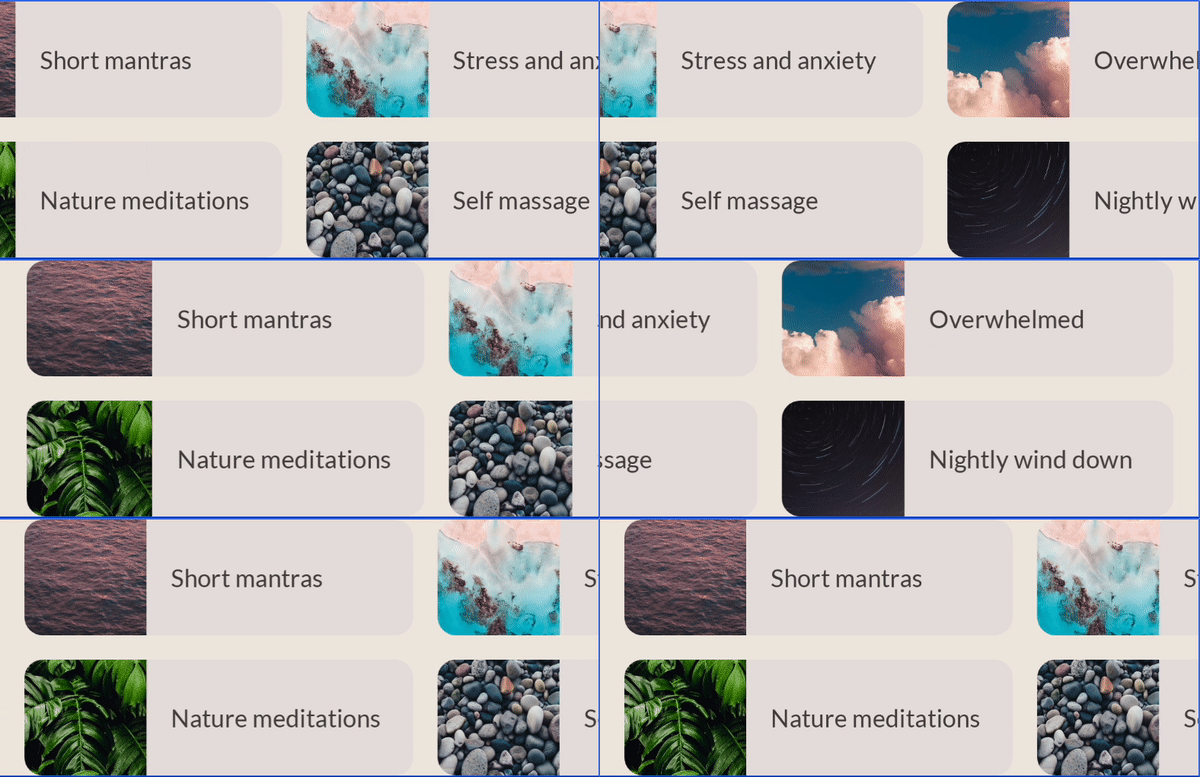
You could implement this section similarly to the previous section, by creating a LazyRow and let each item hold a Column with two FavoriteCollectionCard instances. However, in this step you'll use the LazyHorizontalGrid, which provides a nicer mapping from items to grid elements.
Start with a simple implementation of the grid with two fixed rows:
import androidx.compose.foundation.lazy.grid.GridCells
import androidx.compose.foundation.lazy.grid.LazyHorizontalGrid
import androidx.compose.foundation.lazy.grid.items

@Composable
fun FavoriteCollectionsGrid(
   modifier: Modifier = Modifier
) {
   LazyHorizontalGrid(
       rows = GridCells.Fixed(2),
       modifier = modifier
   ) {
       items(favoriteCollectionsData) { item ->
           FavoriteCollectionCard(item.drawable, item.text)
       }
   }
}
As you can see, you simply replaced the LazyRow from the previous step with a LazyHorizontalGrid. However, this won't give you the correct result just yet:
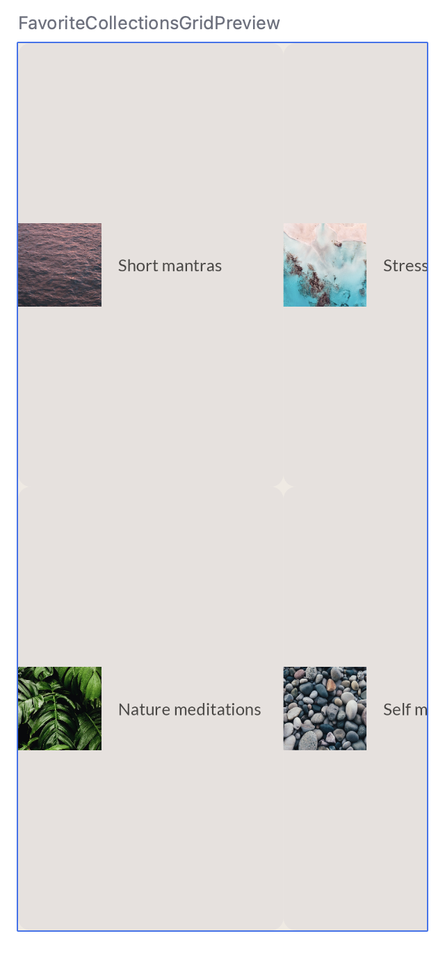
The grid takes up as much space as its parent, which means the favorite collection cards are stretched way too much vertically.
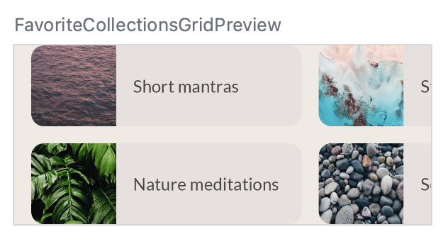
Adapt the composable, so that
- The grid has horizontal contentPadding of 16.dp.
- The horizontal and vertical arrangement is spaced by 16.dp.
- The height of the grid is 168.dp.
- The modifier of the FavoriteCollectionCard specifies a height of 80.dp.
The final code should look like this:
@Composable
fun FavoriteCollectionsGrid(
   modifier: Modifier = Modifier
) {
   LazyHorizontalGrid(
       rows = GridCells.Fixed(2),
       contentPadding = PaddingValues(horizontal = 16.dp),
       horizontalArrangement = Arrangement.spacedBy(16.dp),
       verticalArrangement = Arrangement.spacedBy(16.dp),
       modifier = modifier.height(168.dp)
   ) {
       items(favoriteCollectionsData) { item ->
           FavoriteCollectionCard(item.drawable, item.text, Modifier.height(80.dp))
       }
   }
}
The Preview should look like this:
9. Home section - Slot APIs
In the MySoothe home screen, there are multiple sections that follow the same pattern. They each have a title, with some content varying depending on the section. Here's the design we want to implement:
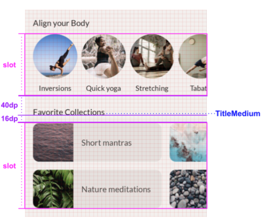
As you can see, each section has a title and a slot. The title has some spacing and style information associated with it. The slot can be filled in dynamically with different content, depending on the section.
To implement this flexible section container, you use so-called slot APIs. Before you implement this, read the section on the documentation page about slot-based layouts. This will help you understand what a slot-based layout is and how you can use slot APIs to build such a layout.
Adapt the HomeSection composable to receive the title and slot content. You should also adapt the associated Preview to call this HomeSection with the "Align your body" title and content:
@Composable
fun HomeSection(
   @StringRes title: Int,
   modifier: Modifier = Modifier,
   content: @Composable () -> Unit
) {
   Column(modifier) {
       Text(stringResource(title))
       content()
   }
}

@Preview(showBackground = true, backgroundColor = 0xFFF5F0EE)
@Composable
fun HomeSectionPreview() {
   MySootheTheme {
       HomeSection(R.string.align_your_body) {
           AlignYourBodyRow()
       }
   }
}
You can use the content parameter for the composable's slot. This way, when you use the HomeSection composable, you can use a trailing lambda to fill the content slot. When a composable provides multiple slots to fill in, you can give them meaningful names that represent their function in the bigger composable container. For example, Material's TopAppBar provides the slots for title, navigationIcon, and actions.
Let's see how the section looks with this implementation:
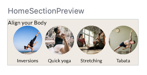
The Text composable needs some more information to make it align with the design.
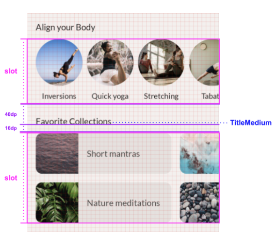
Update it so that:
- It uses the titleMedium typography.
- The spacing between the baseline of the text and the top is 40dp.
- The spacing between the baseline and the bottom of the element is 16dp.
- The horizontal padding is 16dp.
Your final solution should look something like this:
@Composable
fun HomeSection(
   @StringRes title: Int,
   modifier: Modifier = Modifier,
   content: @Composable () -> Unit
) {
   Column(modifier) {
       Text(
           text = stringResource(title),
           style = MaterialTheme.typography.titleMedium,
           modifier = Modifier
               .paddingFromBaseline(top = 40.dp, bottom = 16.dp)
               .padding(horizontal = 16.dp)
       )
       content()
   }
}
10. Home screen - Scrolling
Now that you have created all the separate building blocks, you can combine them into a full screen implementation.
Here's the design you're trying to implement:
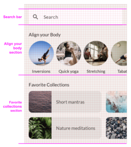
We're simply placing the search bar and the two sections below one another. There's some spacing that you need to add to make everything fit the design. One composable that we haven't used before is the Spacer, which helps us to put extra room inside our Column. If you would instead set the Column's padding, you'd get the same cut-off behavior that we saw before in the Favorite Collections grid.
@Composable
fun HomeScreen(modifier: Modifier = Modifier) {
   Column(modifier) {
       Spacer(Modifier.height(16.dp))
       SearchBar(Modifier.padding(horizontal = 16.dp))
       HomeSection(title = R.string.align_your_body) {
           AlignYourBodyRow()
       }
       HomeSection(title = R.string.favorite_collections) {
           FavoriteCollectionsGrid()
       }
       Spacer(Modifier.height(16.dp))
   }
}
Although the design fits well on most device sizes, it needs to be scrollable vertically in case the device is not high enough - for example in landscape mode. This requires that you add scrolling behavior.
As we saw earlier, Lazy layouts such as LazyRow and LazyHorizontalGrid automatically add scrolling behavior. However, you don't always need a Lazy layout. In general, you use a Lazy layout when you have many elements in a list or large data sets to load, so emitting all items at once would come at a performance cost and would slow down your app. When a list has only a limited number of elements, you can instead choose to use a simple Column or Row and add the scroll behavior manually. To do so, you use the verticalScroll or horizontalScroll modifiers. These require a ScrollState, which contains the current state of the scroll, used to modify the scroll state from outside. In this case, you're not looking to modify the scroll state, so you simply create a persistent ScrollState instance using rememberScrollState.
Your final result should look like this:
import androidx.compose.foundation.layout.Spacer
import androidx.compose.foundation.rememberScrollState
import androidx.compose.foundation.verticalScroll

@Composable
fun HomeScreen(modifier: Modifier = Modifier) {
   Column(
       modifier
           .verticalScroll(rememberScrollState())
   ) {
       Spacer(Modifier.height(16.dp))
       SearchBar(Modifier.padding(horizontal = 16.dp))
       HomeSection(title = R.string.align_your_body) {
           AlignYourBodyRow()
       }
       HomeSection(title = R.string.favorite_collections) {
           FavoriteCollectionsGrid()
       }
       Spacer(Modifier.height(16.dp))
   }
}
To verify the composable's scrolling behavior, limit the Preview's height and run it in interactive preview:
@Preview(showBackground = true, backgroundColor = 0xFFF5F0EE, heightDp = 180)
@Composable
fun ScreenContentPreview() {
   MySootheTheme { HomeScreen() }
}
11. Bottom navigation - Material
Now that you've implemented the content of the screen, you're ready to add the window decoration. In the case of MySoothe, there's a navigation bar that lets the user switch between different screens.
First, implement the navigation bar composable, and then include it in your app.
Let's take a look at the design:

Thankfully, you don't have to implement this entire composable from scratch by yourself. You can use the NavigationBar composable that's a part of the Compose Material library. Inside the NavigationBar composable, you can add one or more NavigationBarItem elements, that will then get styled automatically by the Material library.
Start with a basic implementation of this bottom navigation:
import androidx.compose.material3.NavigationBar
import androidx.compose.material3.NavigationBarItem
import androidx.compose.material.icons.filled.AccountCircle
import androidx.compose.material.icons.filled.Spa

@Composable
private fun SootheBottomNavigation(modifier: Modifier = Modifier) {
   NavigationBar(
       modifier = modifier
   ) {
       NavigationBarItem(
           icon = {
               Icon(
                   imageVector = Icons.Default.Spa,
                   contentDescription = null
               )
           },
           label = {
               Text(
                   text = stringResource(R.string.bottom_navigation_home)
               )
           },
           selected = true,
           onClick = {}
       )
       NavigationBarItem(
           icon = {
               Icon(
                   imageVector = Icons.Default.AccountCircle,
                   contentDescription = null
               )
           },
           label = {
               Text(
                   text = stringResource(R.string.bottom_navigation_profile)
               )
           },
           selected = false,
           onClick = {}
       )
   }
}
This is what the basic implementation looks like - there isn't a lot of contrast between the content color and the navigation bar's color.

There are some style adaptations you should make. First of all, you can update the background color of the bottom navigation by setting its containerColor parameter. You can use the surfaceVariant color from the Material theme for this. Your final solution should look something like this:
@Composable
private fun SootheBottomNavigation(modifier: Modifier = Modifier) {
   NavigationBar(
       containerColor = MaterialTheme.colorScheme.surfaceVariant,
       modifier = modifier
   ) {
       NavigationBarItem(
           icon = {
               Icon(
                   imageVector = Icons.Default.Spa,
                   contentDescription = null
               )
           },
           label = {
               Text(stringResource(R.string.bottom_navigation_home))
           },
           selected = true,
           onClick = {}
       )
       NavigationBarItem(
           icon = {
               Icon(
                   imageVector = Icons.Default.AccountCircle,
                   contentDescription = null
               )
           },
           label = {
               Text(stringResource(R.string.bottom_navigation_profile))
           },
           selected = false,
           onClick = {}
       )
   }
}
Now the navigation bar should look like this, notice how it provides more contrast.

12. MySoothe App - Scaffold
For this step, create the full screen implementation, including the bottom navigation. Use Material's Scaffold composable. Scaffold gives you a top-level configurable composable for apps that implement Material design. It contains slots for various Material concepts, one of which is the bottom bar. In this bottom bar, you can place the bottom navigation composable that you created in the previous step.
Implement the MySootheAppPortrait() composable. This is the top level composable for your app, so you should:
- Apply the
MySootheThemeMaterial theme. - Add the
Scaffold. - Set the bottom bar to be your
SootheBottomNavigationcomposable. - Set the content to be your
HomeScreencomposable.
Your final result should be:
import androidx.compose.material3.Scaffold

@Composable
fun MySootheAppPortrait() {
   MySootheTheme {
       Scaffold(
           bottomBar = { SootheBottomNavigation() }
       ) { padding ->
           HomeScreen(Modifier.padding(padding))
       }
   }
}
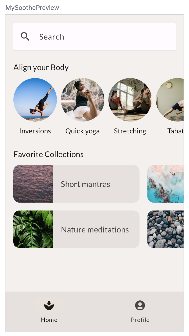
Your implementation is now complete! If you want to check if your version is implemented in a pixel-perfect way, you can compare this image to your own Preview implementation.
13. Navigation Rail - Material
When creating layouts for apps, you also need to be mindful of what it will look like in multiple configurations including landscape mode on your phone. Here is the design for the app in landscape mode, notice how the bottom navigation turns into a rail on the left of the screen content.
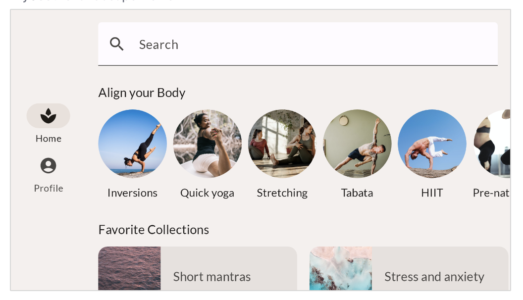
To implement this you will use the NavigationRail composable which is part of the Compose Material library and has a similar implementation to the NavigationBar that was used to create the bottom navigation bar. Inside the NavigationRail composable, you will add NavigationRailItem elements for Home and Profile.
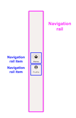
Let's start with the basic implementation for a Navigation Rail.
import androidx.compose.material3.NavigationRail
import androidx.compose.material3.NavigationRailItem

@Composable
private fun SootheNavigationRail(modifier: Modifier = Modifier) {
   NavigationRail(
   ) {
       Column(
       ) {
           NavigationRailItem(
               icon = {
                   Icon(
                       imageVector = Icons.Default.Spa,
                       contentDescription = null
                   )
               },
               label = {
                   Text(stringResource(R.string.bottom_navigation_home))
               },
               selected = true,
               onClick = {}
           )

           NavigationRailItem(
               icon = {
                   Icon(
                       imageVector = Icons.Default.AccountCircle,
                       contentDescription = null
                   )
               },
               label = {
                   Text(stringResource(R.string.bottom_navigation_profile))
               },
               selected = false,
               onClick = {}
           )
       }
   }
}

There are some style adaptations you should make.
- Add 8.dp of padding at the start and end of the rail.
- Update the background color of the navigation rail by setting its
containerColorparameter using the background color from the Material Theme for this. By setting the background color, the color of the icons and texts automatically adapts to theonBackgroundcolor of the theme. - The column should fill the maximum height.
- Set the column's vertical arrangement to center.
- Set the column's horizontal alignment to center horizontally.
- Add 8.dp of padding between the two icons.
Your final solution should look something like this:
import androidx.compose.foundation.layout.fillMaxHeight

@Composable
private fun SootheNavigationRail(modifier: Modifier = Modifier) {
   NavigationRail(
       modifier = modifier.padding(start = 8.dp, end = 8.dp),
       containerColor = MaterialTheme.colorScheme.background,
   ) {
       Column(
           modifier = modifier.fillMaxHeight(),
           verticalArrangement = Arrangement.Center,
           horizontalAlignment = Alignment.CenterHorizontally
       ) {
           NavigationRailItem(
               icon = {
                   Icon(
                       imageVector = Icons.Default.Spa,
                       contentDescription = null
                   )
               },
               label = {
                   Text(stringResource(R.string.bottom_navigation_home))
               },
               selected = true,
               onClick = {}
           )
           Spacer(modifier = Modifier.height(8.dp))
           NavigationRailItem(
               icon = {
                   Icon(
                       imageVector = Icons.Default.AccountCircle,
                       contentDescription = null
                   )
               },
               label = {
                   Text(stringResource(R.string.bottom_navigation_profile))
               },
               selected = false,
               onClick = {}
           )
       }
   }
}

Now, let's add the Navigation Rail into the landscape layout.
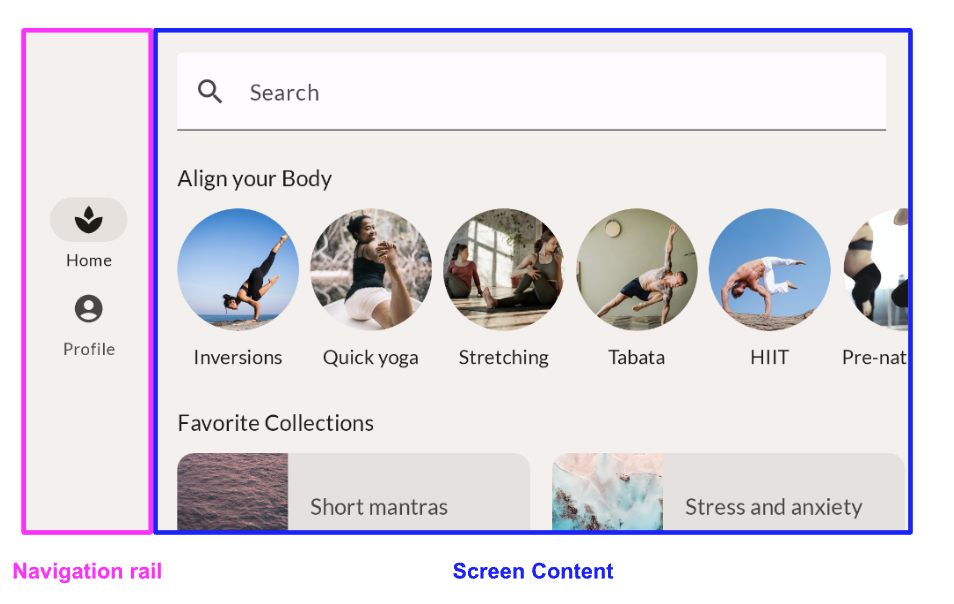
For the portrait version of the app you used a Scaffold. However, for landscape you'll use a Row and place the navigation rail and screen content next to each other.
@Composable
fun MySootheAppLandscape() {
   MySootheTheme {
       Row {
           SootheNavigationRail()
           HomeScreen()
       }
   }
}
When you used a Scaffold in the portrait version, it also took care of setting the content color to background for you. To set the color of the Navigation Rail, wrap the Row in a Surface and set it to background color.
@Composable
fun MySootheAppLandscape() {
   MySootheTheme {
       Surface(color = MaterialTheme.colorScheme.background) {
           Row {
               SootheNavigationRail()
               HomeScreen()
           }
       }
   }
}
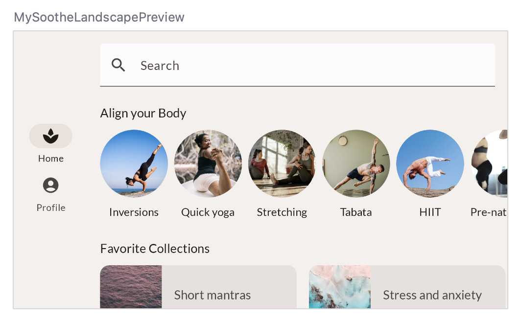
14. MySoothe App - Window size
You have the Preview for landscape mode looking great. However, if you run the app on a device or emulator and turn it to the side, it won't show you the landscape version. That is because we need to tell the app when to show which configuration of the app. To do this, use the calculateWindowSizeClass() function to see what configuration the phone is in.
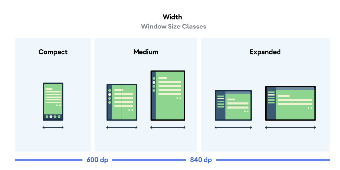
There are three window size class widths: Compact, Medium and Expanded. When the app is in portrait mode it is Compact width, when it is in landscape mode it is Expanded width. For the purposes of this codelab, you won't be working with Medium width.
In the MySootheApp Composable, update it to take in the device's WindowSizeClass. If it is compact, pass in the portrait version of the app. If it is landscape, pass in the landscape version of the app.
import androidx.compose.material3.windowsizeclass.WindowSizeClass
import androidx.compose.material3.windowsizeclass.WindowWidthSizeClass
@Composable
fun MySootheApp(windowSize: WindowSizeClass) {
   when (windowSize.widthSizeClass) {
       WindowWidthSizeClass.Compact -> {
           MySootheAppPortrait()
       }
       WindowWidthSizeClass.Expanded -> {
           MySootheAppLandscape()
       }
   }
}
In setContent() create a val called windowSizeClass set to calculateWindowSize() and pass it into MySootheApp().
Since calculateWindowSize() is still experimental you will need to opt into the ExperimentalMaterial3WindowSizeClassApi class.
import androidx.compose.material3.windowsizeclass.ExperimentalMaterial3WindowSizeClassApi
import androidx.compose.material3.windowsizeclass.calculateWindowSizeClass

class MainActivity : ComponentActivity() {
   @OptIn(ExperimentalMaterial3WindowSizeClassApi::class)
   override fun onCreate(savedInstanceState: Bundle?) {
       super.onCreate(savedInstanceState)
       setContent {
           val windowSizeClass = calculateWindowSizeClass(this)
           MySootheApp(windowSizeClass)
       }
   }
}
Now - run the app on your emulator or device and observe how the display changes on rotation.

15. Congratulations
Congratulations, you've successfully completed this codelab and learned more about layouts in Compose. Through implementing a real-world design, you learned about modifiers, alignments, arrangements, Lazy layouts, slot APIs, scrolling, Material components and layout specific designs.
Check out the other codelabs on the Compose pathway. And check out the code samples.
Documentation
For more information and guidance about these topics, check out the following documentation:

