屏幕兼容性概览
使用集合让一切井井有条
根据您的偏好保存内容并对其进行分类。
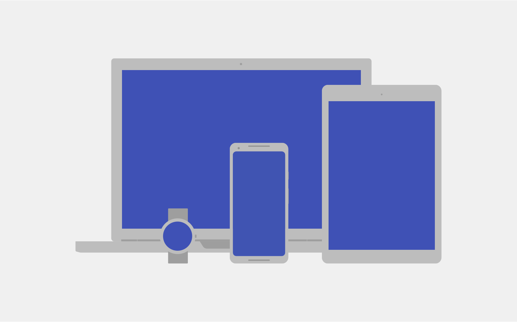
运行 Android 的设备多种多样,它们具有不同的屏幕尺寸和像素密度。系统会执行基本的缩放和大小调整,以使界面适应不同的屏幕,但有一些方法可以帮助您的界面更好地适应每种屏幕类型。
图 1. Android 可以在具有不同屏幕和像素密度的不同设备上运行。
本页将概述 Android 上的可用功能,以帮助您的应用进行相应调整。如需关于如何针对不同屏幕变体构建应用的更具体的说明,请参阅以下文档:
屏幕尺寸
屏幕尺寸是应用界面的可见空间。您的应用可以识别屏幕尺寸,而不是设备屏幕的实际尺寸。应用必须考虑屏幕方向、系统装饰(如导航栏)和窗口配置更改(例如当用户启用多窗口模式时)。
灵活布局
默认情况下,Android 会调整应用布局的大小以适应当前屏幕。为了使布局能够很好地适应屏幕尺寸的细微变化,请在实现布局时考虑灵活性。请勿对界面组件的位置和大小进行硬编码。您应让视图尺寸拉伸并指定视图相对于父视图或其他同级视图的位置,这样当布局扩大时,预期顺序和相对尺寸会保持不变。
如需详细了解灵活布局,请参阅自适应设计。
替代布局
灵活的布局很重要,但您还需要设计不同的布局,以针对不同设备上的可用空间优化用户体验。Android 允许您提供系统根据当前设备的屏幕尺寸在运行时应用的备用布局文件。
图 2. 同一应用针对不同屏幕尺寸使用不同的布局。
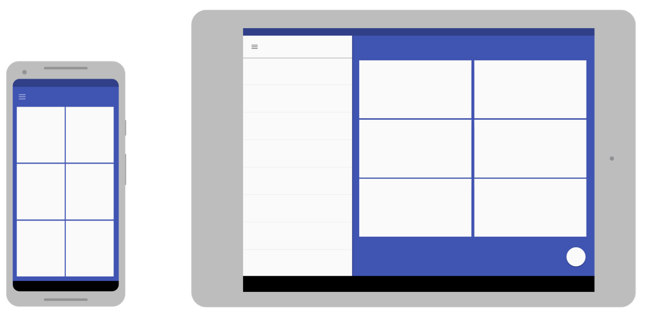
如需了解如何创建备用布局,请参阅自适应设计。
可拉伸图片
由于布局需要通过拉伸来适应当前屏幕,因此您附加到任何布局视图的位图也同样会进行拉伸。但是,朝任意方向拉伸普通位图可能会导致奇怪的缩放失真和图像倾斜。
为了解决此问题,Android 支持 9-patch 位图,您可以在其中指定可拉伸的小像素区域,而图像的其余部分保持不缩放。
如需详细了解九宫图位图,请参阅 NinePatch 可绘制对象。
像素密度
像素密度是屏幕上单位面积内的像素数。称为 dpi(每英寸的点数)。它与屏幕分辨率不同,后者是屏幕上像素的总数。
图 3. 此图夸张地展示两款尺寸相同但像素密度不同的设备。
密度独立性
如果应用在不同像素密度的屏幕上显示时保留了界面设计的物理尺寸(从用户角度来看),则可实现“不受密度制约”,如图 3 所示。保持密度独立性非常重要,因为如果没有它,像按钮这样的界面元素在低密度屏幕上看起来较大,在高密度屏幕上看起来较小。
Android 通过提供密度无关像素(dp 或 dip)而不是像素 (px) 作为您使用的测量单位,来帮助您实现不受密度制约。
如需详细了解密度无关像素,请参阅使用密度无关像素。
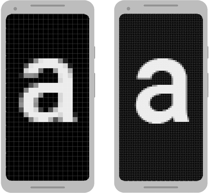
备用位图
为了让图片在所有屏幕上都能呈现最佳效果,请提供备用位图以匹配各种屏幕密度。如果您的应用仅针对低密度屏幕提供位图,Android 会在高密度屏幕上放大这些位图,以使图片在屏幕上占用相同的物理空间。这可能会导致位图中出现明显的缩放失真。因此,应用必须包含分辨率更高的备用位图。
如需了解如何提供备用位图,请参阅提供备用位图。
矢量图形
对于简单类型的图片(如图标),您可以使用矢量图形来避免为每种密度创建单独的图片。由于矢量图形使用几何线条路径(而不是像素)来定义插图,因此可以任意尺寸绘制它们而不会产生缩放失真。
如需详细了解如何使用矢量图形,请参阅首选矢量图形。
Wear OS、TV、汽车和 ChromeOS
上述建议适用于所有 Android 设备类型,但如果您想构建适用于 Wear OS、Android TV、Android Auto、Android Automotive OS 或 ChromeOS 设备的应用,则需要执行更多操作。
其中每种设备类型都有自己的用户互动模型,您的应用必须支持该模型。在某些情况下(例如对于 Wear OS),您需要重新考虑应用的用户体验,并构建专用于该设备的应用。另一方面,若要支持 ChromeOS 设备(例如 Google Pixelbook),您可能只需对现有应用进行细微修改即可支持键盘或鼠标互动以及更大的屏幕。
如需支持这些设备,请参阅以下文档:
可折叠设备
可折叠设备通常具有多个显示屏,这些显示屏(或显示屏组合)会在设备折叠状态的不同下生效。请遵循本文档中的准则,确保您的应用适应这些变化的配置。不过,某些配置的宽高比可能会有异常,因此请测试应用在各种设备上的行为方式。
图 4. 折叠和展开。
通常情况下,在多窗口模式下能够很好地适应各种窗口大小的应用在可折叠设备上也能正常运行。
如需详细了解如何构建适用于可折叠设备的应用,请参阅了解可折叠设备。
本页面上的内容和代码示例受内容许可部分所述许可的限制。Java 和 OpenJDK 是 Oracle 和/或其关联公司的注册商标。
最后更新时间 (UTC):2025-07-27。
[[["易于理解","easyToUnderstand","thumb-up"],["解决了我的问题","solvedMyProblem","thumb-up"],["其他","otherUp","thumb-up"]],[["没有我需要的信息","missingTheInformationINeed","thumb-down"],["太复杂/步骤太多","tooComplicatedTooManySteps","thumb-down"],["内容需要更新","outOfDate","thumb-down"],["翻译问题","translationIssue","thumb-down"],["示例/代码问题","samplesCodeIssue","thumb-down"],["其他","otherDown","thumb-down"]],["最后更新时间 (UTC):2025-07-27。"],[],[],null,["# Screen compatibility overview\n\nAndroid runs on a variety of devices that have different screen sizes and pixel\ndensities. The system performs basic scaling and resizing to adapt your user\ninterface to different screens, but there are ways to help your UI adapt better\nto each screen type.\n\n\n**Figure 1.** Android runs on different devices that have different screens and pixel densities.\n\n\u003cbr /\u003e\n\nThis page provides an overview of the features available on Android to help your\napp adapt accordingly. For more specific instructions about how to build your\napp for different screen variations, see the following documentation:\n\n- [Support different screen sizes](/training/multiscreen/screensizes)\n- [Support different pixel densities](/training/multiscreen/screendensities)\n\nScreen sizes\n------------\n\nThe screen size is the visible space for your app UI. The screen size, as it's\nrecognized by your app, isn't the actual size of the device screen. Apps must\ntake into account the screen orientation, system decorations---such as the\nnavigation bar---and window configuration changes, such as when the user\nenables [multi-window mode](/guide/topics/ui/multi-window).\n\n### Flexible layouts\n\nBy default, Android resizes your app layout to fit the current screen. To help\nyour layout resize well for small variations in screen size, implement your\nlayout with flexibility in mind. Don't hardcode the position and size of your UI\ncomponents. Instead, let view sizes stretch and specify view positions relative\nto the parent view or other sibling views so that your intended order and\nrelative sizes remain the same as the layout grows.\n\nTo learn more about flexible layouts, see [Responsive design](/training/multiscreen/screensizes#flexible-layout).\n\n### Alternative layouts\n\nA flexible layout is important, but you also need to design different layouts\nthat optimize the user experience for the available space on different devices.\nAndroid lets you provide alternative layout files that the system applies at\nruntime based on the current device's screen size.\n\n\n**Figure 2.** The same app uses a different layout for different screen sizes.\n\n\u003cbr /\u003e\n\nTo learn how to create alternative layouts, see [Adaptive design](/training/multiscreen/screensizes#alternative-layouts).\n\n### Stretchable images\n\nBecause your layout needs to stretch to fit the current screen, so do the\nbitmaps that you attach to any of the layout views. However, stretching an\nordinary bitmap in arbitrary directions can result in strange scaling artifacts\nand skewed images.\n\nTo solve this, Android supports nine-patch bitmaps, in which you specify small\npixel regions that are stretchable, while the rest of the image remains\nunscaled.\n\nTo learn more about nine-patch bitmaps, see [NinePatch drawables](/develop/ui/views/graphics/drawables#nine-patch).\n\nPixel densities\n---------------\n\nThe pixel density is the number of pixels within a physical area of the screen.\nIt is referred to as dpi (dots per inch). This is different from the screen\nresolution, which is the total number of pixels on a screen.\n\n\n**Figure 3.** An exaggerated representation of two devices that are the same size but have different pixel densities.\n\n\u003cbr /\u003e\n\n### Density independence\n\nYour app achieves \"density independence\" when it preserves the physical\nsize---from the user's point of view---of your UI design when displayed\non screens with different pixel densities, as shown in figure 3. Maintaining\ndensity independence is important, because without it, a UI element like a\nbutton might appear larger on a low-density screen and smaller on a high-density\nscreen.\n\nAndroid helps you achieve density independence by providing the\n*density-independent pixel* (dp or dip) as a unit of measurement that you use\ninstead of pixels (px).\n\nTo learn more about density independent pixels, see [Use density-independent\npixels](/training/multiscreen/screendensities#TaskUseDP).\n\n### Alternate bitmaps\n\nTo make your images look their best on all screens, provide alternate bitmaps to\nmatch each screen density. If your app provides bitmaps only for lower-density\nscreens, Android scales them up when on a high-density screen so that the images\noccupy the same physical space on the screen. This can cause visible scaling\nartifacts in bitmaps. So, your app must include alternate bitmaps at a higher\nresolution.\n\nTo learn how to provide alternate bitmaps, see [Provide alternative bitmaps](/training/multiscreen/screendensities#TaskProvideAltBmp).\n\n### Vector graphics\n\nFor simple types of images, like icons, you can avoid creating separate images\nfor each density by using vector graphics. Because vector graphics define the\nillustration with geometric line paths instead of pixels, they can be drawn at\nany size without scaling artifacts.\n\nTo learn more about using vector graphics, see [Prefer vector graphics](/training/multiscreen/screendensities#vector-graphics).\n\nWear OS, TV, Cars, and ChromeOS\n-------------------------------\n\nThe preceding recommendations apply to all Android form factors, but if you want\nto build an app for Wear OS, Android TV, Android Auto, Android Automotive OS, or\nChromeOS devices, you need to do more work.\n\nEach of these device types has its own user interaction model that your app must\naccommodate. In some cases, such as for Wear OS, you need to rethink your app's\nuser experience and build an app that's specialized for that device. On the\nother hand, to support ChromeOS devices, such as the Google Pixelbook, you\nmight need only slight modifications to your existing app to support keyboard or\nmouse interaction and a larger screen.\n\nTo support these devices, refer to the following documentation:\n\n- [Build Wear OS apps](/training/wearables/apps)\n- [Build TV apps](/training/tv/get-started)\n- [Android for Cars overview](/training/cars)\n- [Apps for ChromeOS overview](/chrome-os/intro)\n\nFoldables\n---------\n\nFoldable devices typically have multiple displays, with different\ndisplays---or combinations of displays---becoming active for different\nstates of the device folding. Follow the guidelines in this document to make\nyour app adapt to those changing configurations. However, some configurations\ncan have unusual aspect ratios, so test how your app behaves on a variety of\ndevices.\n\n\n**Figure 4.** Folding and unfolding.\n\n\u003cbr /\u003e\n\nUsually, an app that works well in [multi-window\nmode](/guide/topics/ui/multi-window) for various window sizes also behaves well\non foldable devices.\n\nTo learn more about building apps for foldables, see [Learn about\nfoldables](/guide/topics/ui/foldables)."]]